Well, we’ve finally gotten our hands on the much anticipated Christopher Ward C900 Single Pusher Chronograph. This watch was first announced in August, and I found the news so exciting (come on, it’s not everyday that a brand bucks the trends of the watch market and brings out an in-house chronograph for just above 3k) that I wrote up a fairly detailed article on it back then. So, to not write the same thing twice and get on with the review, I’ll defer you to that article for the meat of this intro. Needless to say, with the C900 the C. Ward brand has once again proven that in the internet age, a watch company can provide quality, innovation and mechanics normally believed to be the province of luxury brands at an affordable price.
 Case: Stainless Steel
Movement: C. Ward JJ02
Dial: Black and White
Lume: no
Lens: Sapphire
Strap: Alligator
Water Res.: 50m
Dimensions: 43×51 mm
Thickness: 15.9 mm
Lug Width: 20 mm
Crown: 8 x 5 mm screw down
Warranty: 5 year on movement
Price: $3,365
And yes, the C900 at $3,365 dollars is, to this date, the most expensive watch we have reviewed on w&w. And no, we haven’t become so jaded as to think this is affordable in the traditional sense of the term. The C900 represents a stellar entry into the next tier of watches, one we could call “accessible luxury”. Where in-house calibers and technical innovation are more commonplace. That being said, at $3,365 the C900 costs much less than it ought. There are many watches with the same or similar Swiss movements we often see (2824-2’s and 2892-2’s and -3’s) in watches under $1,000 that cost upwards of 5k. In the watch market as a whole, the C900 is a very affordable offering, and regardless, is an interesting watch we know you want to read about.
Movement
The obvious star of the show here is the in-house developed Calibre JJ02 single pusher chronograph movement at the heart of the watch. Built off of the workhorse Unitas 6497, the JJ02 is unlike any other movement we’ve come across. While proprietary and visually mesmerizing, the JJ02 puts an emphasis not on decoration, but on function. By using the 6497, the canvas for Johannes Jahnke and Jean Fillon was quite large, allowing them to maximize both the scale of the components and the space around them. The result is a chronograph where one can easily identify what is going on. Hit the button and your action is directly translated into the turning of the column wheel, the movement of the sliding gear and clutch, as well as the obvious start of the seconds counter. Considering the goal of the Harrison series of C Ward watches is to bring a higher level of watch making to a more accessible market, developing a movement that is understandable speaks strongly to the brand’s philosophy. Simply put, by achieving this I find the watch to be a conceptual success.
Functionally speaking, this is not likely a chronograph you’ll be timing races with, it’s a study in watch making on the wrist. This is for a few of reasons: 1. The Unitas 6497 movement has a frequency of 18,000 bph / 2.5 hz, which translates to 5 ticks per second. Compared to the industry standard Valjoux 7750, with a frequency of 28,800 / 4 hz or 8 ticks per second, this makes for a lower precision chronograph (as in it can’t be read to the same fraction of a second) and a choppier sweep of the chronograph seconds counter. 2. The dial is oriented towards time telling not recording as it lacks markers with a greater precision than 1 second. 3. The nature of a single pusher chronograph is that it only goes through one series of actions: start, stop, reset. That being said, for less precise needs, it is a perfectly well functioning chronograph and let’s be honest, that isn’t the point of the watch anyway. Also, stylistically, in both the design of the watch and the implementation of a single pusher, the watch hearkens to an earlier era of the chronograph, making the lack of precision actually more appropriate.
I found using the single pusher through the crown to be an oddly pleasant sensation. There is something very intuitive about pushing a button located at the position of the crown to control all of the functions of the chronograph. The button itself also has a very well tuned feeling, requiring enough pressure that it would not be accidentally pressed, yet not so much as to be stiff. The large flat face of the button is also larger than most chrono pushers, giving it more a substantial and viscerally enjoyable button sensation.
Case
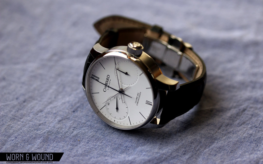
The C900 is a fairly large and robust watch for one with relatively dressy styling. The stainless steel case measures 43mm in diameter, 51mm lug-to-lug and has a towering 15.9mm height. Of course, the case isn’t oversized so much as it is scaled in proportion to the larger than average movement inside. The design is very straightforward with a classic profile that consists of slab sides and gently curved lugs. The bezel, which is narrow but tall, has a graceful curve that leads the eye nicely into the domed sapphire crystal.
An elegant but simple mix of finishes elevates the case nicely. The bezel, tops of the lugs and the case back are all pristinely polished. The side of the case is brushed laterally which, given the height of the watch, does a good job of breaking up the sheen of the case and adding more visual intrigue. Case finishing is certainly something to consider on a watch in this price range and while the case doesn’t scream luxury, the styling and finishing are well executed and appropriate.
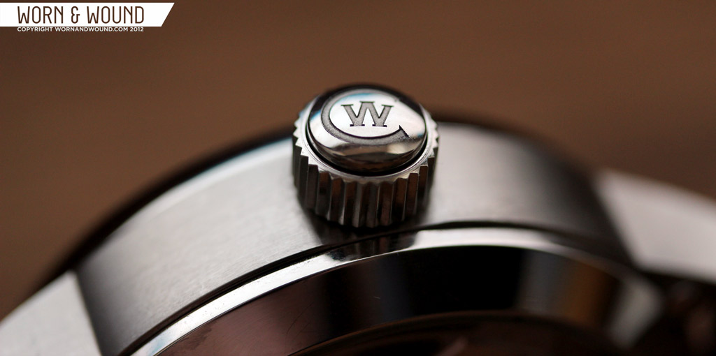
The crown/pusher at 3 is also nicely executed. It’s a fairly large crown, measuring 8 x 5mm, but it does not feel disproportionate to the case. Also, considering that the watch is hand wound, it is nice to have something solid to grasp. The crown has a simple toothed design to make it more tactile on the sides and a CW logo on the flat side. As I mentioned before, the chrono pusher actually runs through the center of the crown, so while it looks like a solid piece, it actually has a piston/cylinder design.
Dial
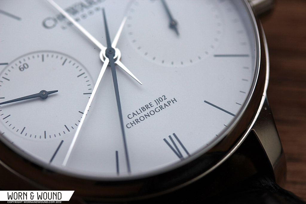
Aside from the achievement found in the JJ02 movement, the dial and hands of the C900 mark a highpoint in design for the brand. Subtle, refined and sophisticated, the dial mixes formal elements of a dress watch with the inherent sportiness of chronograph. The dial is actually very simple, consisting only of a clean white face and black markers with a bi-compax sub-dial arrangement. No applied markers, no lume, just clean black on white. The primary hours, minute and chronograph seconds register, are defined by thin black lines for the individual minutes/seconds, longer and slightly bolder lines for the hours and roman numerals for 12 and 6. The font for the roman numerals is tall and thin, which matches the lithe hours markers well. Under 12 is the “Chr. Ward London” logo and above 6 are the words “JJ02 Calibre Chronograph”. The text in both instances is well sized and not overbearing.
At 9 and 3 are the continuous seconds and 30-minute totalizer, respectively. Both dials have the same large diameter, which is perfectly proportioned to the 38mm dial. This is perhaps the most crucial detail to the design of the dial, as the bi-compax registers immediately draw the eye and affect the overall symmetry of the dial. Both registers are debossed into the dial, which creates a slight elevation change that in turn creates the boundary of the sub-dials. This is a nice and subtler way of demarcating the dials than with a printed line. Both dials also have paired down indexes with small black markers and a single numeral, 60 on the seconds and 30 on the minutes.
The hands suit the look of the dial as well. The hour, minute and chronograph seconds are all long thin needle shapes that taper to a very fine point. The hour and minutes are polished steel while the chronograph seconds is black, making them easier to distinguish from each other. The long thin shape was clearly designed to match the very thin markers on the main index, and the balance between the two works very well. Both of the sub-dials have smaller black hands that match their larger counterparts. Overall, the hands make for an easy watch to read at-a-glance, though I did initially find the lengths of the minute and hour hand to be a bit too similar.
I would imagine that when designing this dial there was a point when they debated designing for the price tag. Being that the C900 is their most expensive watch to date by a large margin, one might have expected the various elements of the watch to speak to that fact. After all, most people judge a book by its cover. Well, the discipline of the designers is seen in that the dial, while no more complicated in construction than your average watch, is best suited for the personality of the movement and the brand. The aesthetic achieved is reminiscent of the era of streamline design by the likes of Raymond Loewy and his contemporaries, which works exceptionally with both the dress and sport elements of the watch.
Strap and Wearability
The C900 is available with two strap options, either a black or brown genuine Alligator. The 20-18mm tapering strap is very elegant and well made, as is to be expected, and as is the case with all C. Ward straps, features quick release spring bars and a deployment clasp. The black variation suits the watch very well, adding a distinctly formal element to the look. I was glad to see that the leather had a satin sheen rather than a high gloss, which would have been too decadent for the watch. While I don’t see this watch working with a NATO, I do think a sportier leather strap, something a bit racing inspired, could play nicely as an alternative.
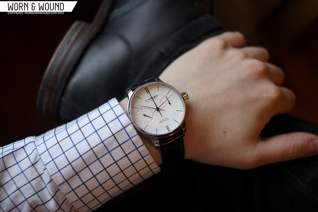
The C900 is a large watch, as I said before, but on the wrist it feels very nice. No dimension is so big as to be uncomfortable and the lack of any shocking design details make the watch surprisingly subtle. That being said, it is simultaneously a watch with a strong and masculine appearance. The brand is positioning the watch as a dress watch, which I think is apt aesthetically, though the height of the watch should be considered, as a tight cuff would not make it over. At the same time I don’t think the C900 would feel too formal with a more casual outfit, though a t-shirt might be pushing it.
Conclusion
 So, are you ready to make the leap to a 3,365 dollar watch? Perhaps yes, perhaps no…either way, the C900 is a really interesting watch that if you have the money to spend would make a very unique addition to one’s collection. And beyond just the movement, it’s a damn nice looking watch. And like the C9 Jump Hour before it, I think there is a great potential for these watches to gain in value down the road. It is a very limited edition of only 250 and is a milestone for a brand that is clearly here for the duration. Regardless, as watch nerds new and old, I think everyone can appreciate what the brand did, and that they took the approach not of making something ornate and flashy, but rather sophisticated and with the intention of illuminating the workings of a column-wheel chronograph. Hopefully, C Ward will keep up this tradition of releasing one high-end but accessible watch a year (and we’ll keep reviewing them), and I’ll keep saving for that $5,000 tourbillon. (yes, that’s a joke)
watch kindly provided by C. Ward
By Zach Weiss




 Featured Videos




Wow. Very cool watch indeed. While the Chr. Ward I own is literally 1/10th the price of this one, it’s very cool to see the direction this brand is heading in. It makes me proud to own my C5 MK II because of what the brand might become in a few years.
You sure like your videos to be private 🙂
Very stylish timepiece, clean and refined. Reminds me a bit of Nomos, only bigger. Is it available in other colors?
argh! sorry about that everyone… it should be fully viewable now, but yes, I messed up and forgot to switch it to public when the review went up. thanks for letting us know!
regarding your question, the only variation is between black or brown strap.
-zach
such a beautiful watch and they are so well built! If you need to find some more obscure branded watches check out stagfashion.com
.
Jean Fillon also works for Epos