Around this time every year, we have the chance to show you Christopher Ward’s newest mechanical creation in collaboration with Johannes Jahnke. First was their C9 Jump Hour, then came their C900 Monopusher chronograph. Continuing this series is the new C900 Worldtimer, which takes a different approach to a multi-timezone watch and has a very unique and sculptural dial. These watches are particularly notable, especially given our general philosophy at worn&wound, as they tend to challenge what is generally perceived as possible in this price range. By creating bespoke mechanical complications, even if based off of ebauches, and maintaing prices well under $5k, they seem to be doing what so many larger brands cant or wont do.
Inside, the new JJ03 caliber, base ETA 2893, has a couple tricks up its sleeve. First, it is a dual 24-hr time watch, so local and dual-time are on a 24-hr scale. Second, is its very unique and graphic way of indicating locations around the world, which we’ll elaborate on later. When combined with the most elaborate dial C Ward has attempted, you have a watch that is unique, clever and quite interesting
When we first announced the C900 Worldtimer a few months ago, the question was raised as to whether or not it really is a “worldtimer” as most people would define one. Well…I think the answer is no, it’s not a worldtimer, since it does not indicate time in each of the major 24-hr timezones simultaneously. Rather I would call this a dual 24hr-time watch with location indicator. That’s not as sexy sounding as “worldtimer”, so from a marketing perspective, I understand the choice. In the end, it’s semantics and doesn’t effect the actual functionality or one’s enjoyment of the watch.
The C900 Worldtimer comes in at $2,165, which includes beyond the JJ03 caliber, a domed sapphire crystal, genuine Alligator strap and C Wards excellent warranty and servicing commitment. While on the high end for C Ward, it’s quite low for what the watch is achieving. The fine folks over at C Ward have given us the exclusive opportunity to be the first with a review, so on with the show.
 Case: 316L Steel
Movement: JJ03/ETA 2893
Dial: Silver/Blue
Lume: Yes
Lens: Sapphire
Strap: Alligator
Water Res.: 50M
Dimensions: 43 x 51mm
Thickness: 12.4 mm
Lug Width: 22 mm
Crown: 7 x 3 mm
Warranty: CW360
Price: $2,165
Case
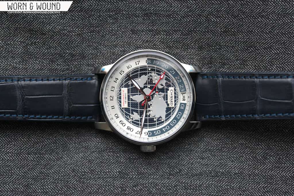
The C900 WorldTimer features an elegant, though surprisingly large case. Measuring 43 x 51 x 12.4mm it is bigger than one would expect from a formal watch, yet with the highly detailed dial and relatively thin profile, it looks and feels in proportion. The design itself has fairly standard, almost conservative lines, which result in a refined and masculine look. The central case is a simple slab-sided cylinder with a fairly thin bezel, flaunting the wonderful dial, with strong and slightly tapered lugs.
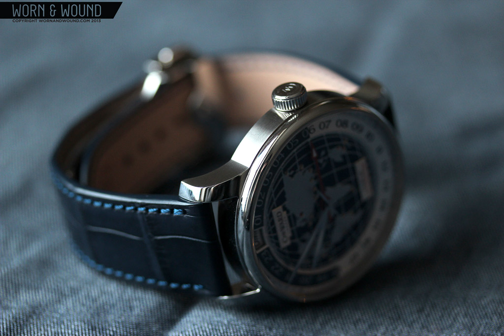
The top surface of the case has a clean high-polish while the sides are horizontally brushed. The finishing, though not complex, is well executed, giving the case sharp edges and a very clean look. Flipping the watch over reveals the display case back, which shows off the nicely decorated JJ03 calibre. Around the aperture is a grid that indicates the airport codes and associated cities for reference when setting the second time-zone on the watch.
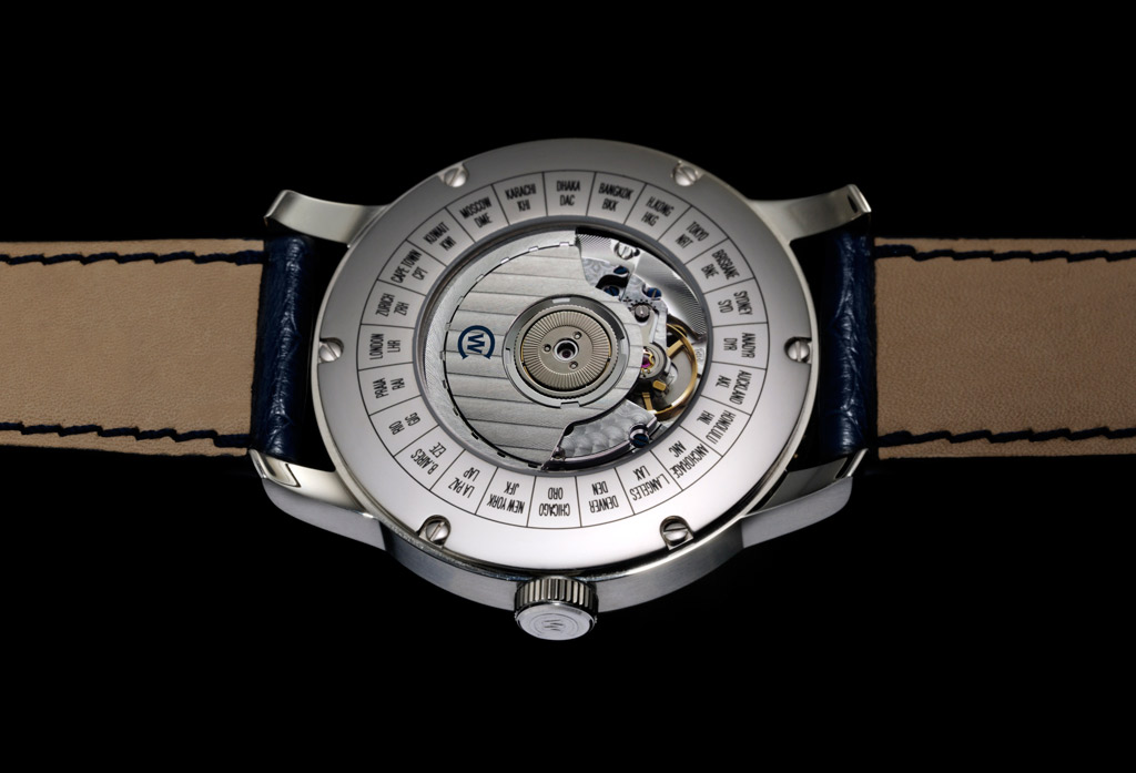
Though not the most exciting case unto itself, the design works well with the watch and is suitably handsome. The thin, rounded bezel catches light nicely, while the domed sapphire crystal adds a pleasant bit of distortion at oblique angles. The crown at 3, which is wide but thin at 7 x 3.25mm, fits the case size well. Though the watch is an automatic, having a nicely graspable crown for winding the watch up in the morning is a welcome addition.
Dial
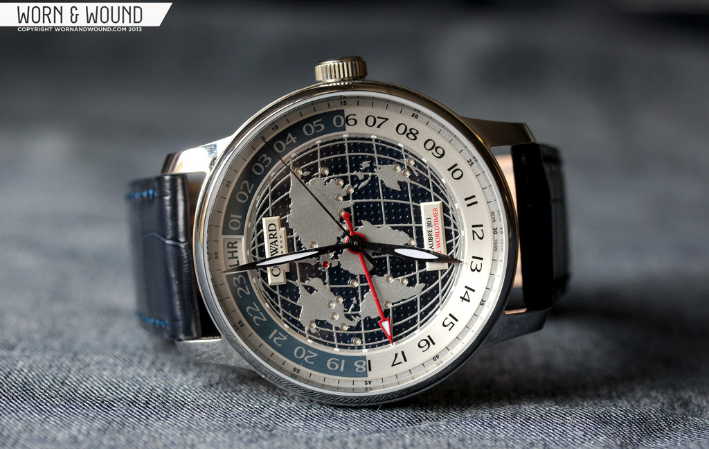
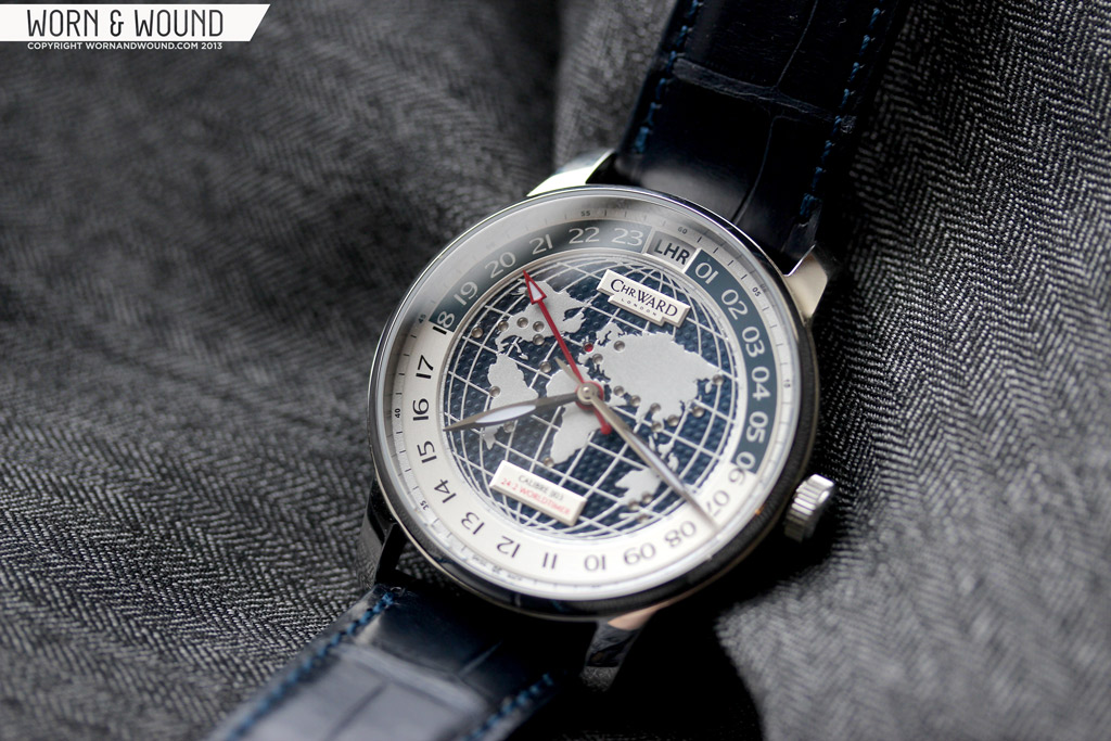
On to the heart of the matter… The dial of the C900 WorldTimer breaks new ground for C Ward. This is the first dial we’ve seen from them with such a high level of detail and craft. Mixing texture, relief and color, the dial is mesmerizing and complicated, yet, there is an emphasis on legibility that keeps it practical. That said, there is a lot going on. The dial reflects the unique functionality of the watch, with 24-hr time for both primary and secondary timezones, a full world map and their clever airport-code/map dot system.
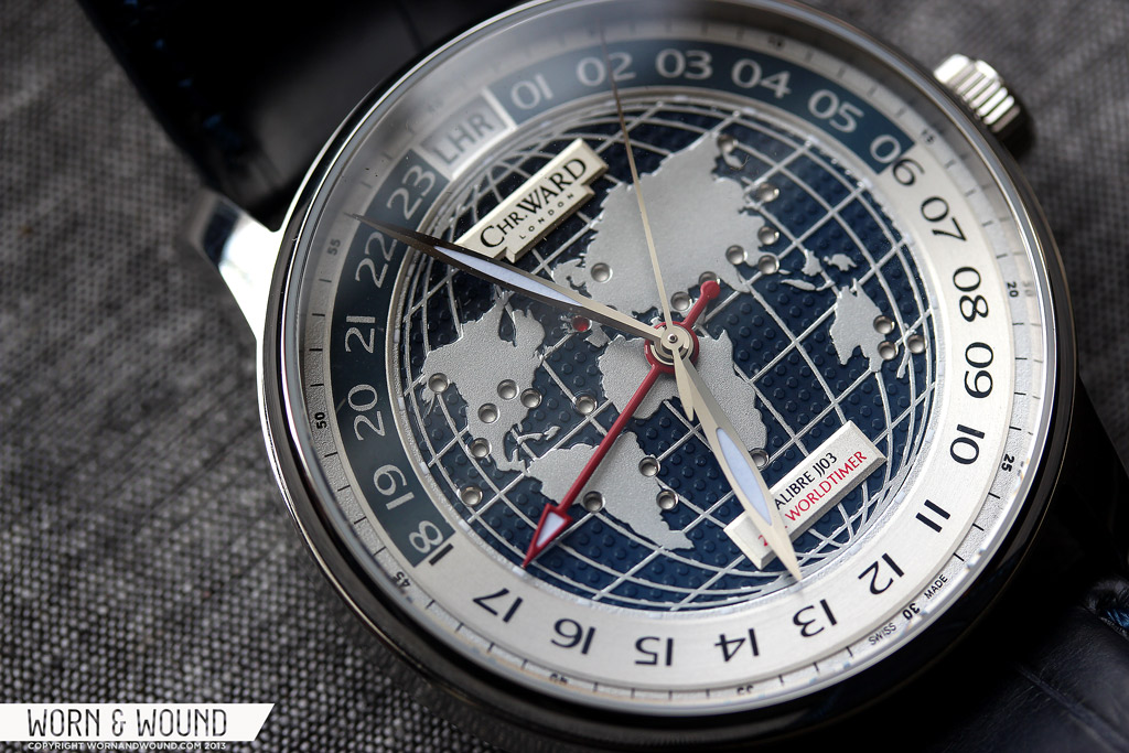
The primary index, which is in 24-hr time, is printed on a raised metallic ring. The numerals are all displayed as double digits in a wide and somewhat figurative font. The index is broken up into am and pm in a logical way, ranging from 6 – 18 and back again. The two halves are presented as negative space on a blue back drop and blue text on a silver backdrop, giving one a “night time” look and the other “day”. As an American, I am not quite use to telling time using a 24-hr scale, so it took me a little while to get used to reading the dial. Also, not seeing the hour hand where you expect at the hour is a bit disconcerting. That said, once I got used to it, I could read the time at a glance.
The idea behind having both home and second time in 24-hrs is very practical when in use. The distance between the two hour hands is consistent, which creates a clear relationship between the two locations. More obviously, you don’t have to recalibrate your mind to two different scales, which just makes things simpler. At the 24th hour marker, there is a window through the dial showing a three letter code. This code indicates a major international airport, one per each major 24hr timezone (there are locations in India and around the Himalayas with time-zones at smaller than 1 hour intervals). The idea is to set this code to your second time.
On the outer edge of the ring, down a step, is a minute index which consists of small numerals and lines in black on a metallic surface. Though the printing is quite small, it is a useful index for precise reading of the minutes. It is easy to use a 12-hr index, which is common, for minutes as the hours align to 5 minute intervals, but on a 24-hr scale, they are at 2.5 minutes, which is less useful.
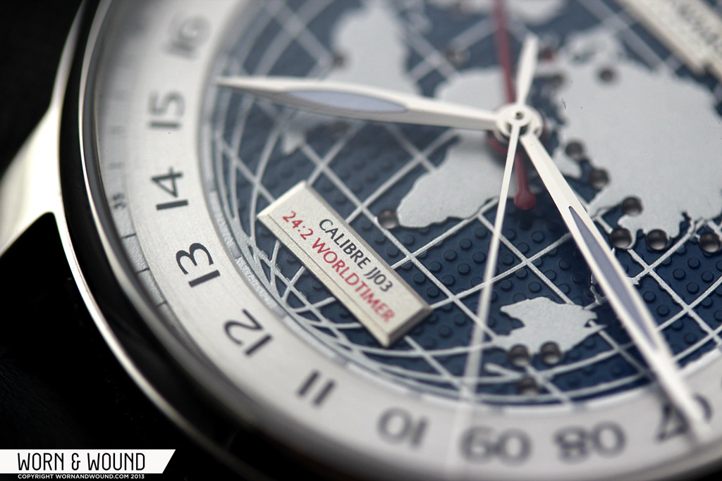
The entire center of the dial consists of a large world map in relief, with all of the continents, longitude and latitude lines and oceans. On the map, the seas are deep blue and textured with a “dimple” pattern. They physically appear to be below the continents and longitude/latitude lines, as they were likely machined down. The dimples pick up light in a cool way that makes the continents appear as though they are floating above the blue. The sense of 3-dimensionality Christopher Ward achieved here is great, making the dial very dynamic. This is clearly the most detailed thing they’ve tried, and they were very successful with it.
The map here isn’t just for decoration though, as it is used to indicate the location of the second time zone. Corresponding to the airport code window, throughout the map are small holes at the locations of the major international airports. At the location of whichever code is displayed up top will be a red dot. So… if your second time zone is set to LHR, London Heathrow will be highlighted, etc… This is certainly a unique function with an interesting graphic twist, though it is perhaps a bit redundant. That said, as someone who has yet to travel around the world…nay venture too far outside of New York City, seeing the location on the globe was more profound than the airport code above. Regardless, gold-star for doing something different.
The hour and minute hands for the local time are long, elegant leaf shapes in polished steel with lume fiiling. The design plays off of the font chosen for the primary index, being somewhat soft and humanistic. The dual-time hand is a red stick with a lume filled arrow pointer. The contrast between the two hand styles makes distinguishing between local and second time all the more easy. The red of the dual-time hand also pops off of the blue dial, increasing legibility. The seconds hand is a thin polished steel stick that recedes into the complexity of the dial below.
Movement
Inside of the C900 WorldTimer is the Caliber JJ03. Based on an ETA 2893, this automatic movement features 24-hr time, dual-time, location indicator, hand winding, hacking and a power reserve of about 40hrs. The movement has also been decorated with perlage, blue screws and the rotor has Geneva stripes and a C Ward logo. The decoration is standard, but well executed and certainly attractive.
Every function of the JJ03 is operated through the primary crown. In first position, turning the crown clockwise will jump the dual-time hand forward one hour at a time. Turning it counter-clockwise will change the location indicator in both the window and through the map, one timezone at a time. I believe what they did is co-opt the date mechanism to create the location indicator, which is static. In the second position, one can adjust the local time. So, to set up the watch, the likely order of operations is to set your local time, adjust the dual time hand to be the correct amount of hours different. And then set the location indicator to the second time. It’s simpler than it sounds in practice.
Straps and Wearability
The C900 comes mounted on a gorgeous 22mm blue CITES certified Lousiana Alligator strap. The deep, midnight blue matches the blue on the dial, creating a nice harmony between the two. The strap itself has a classic dress design, with a nice texture and a slightly tapering design. Finishing the strap off is a Bader deployment clasp. This one-sided deployment sends the tail of the strap under the other side, to create a very clean look. The clasp then has double button release for security. All-in-all a great design and well made.
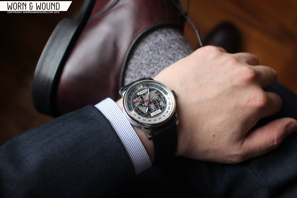
On the wrist, the C900 wears very well. The 43mm case wears smaller, in my mind more like a 40, perhaps do to the proportioning and complexity of the dial. It’s so packed with detail that it feels dense and compact. The 12.4mm height makes it hug the wrist, as well as fit under a shirt sleeve. On my 7″ wrist, I felt it looked appropriate and not oversized.
The look of the watch is sophisticated and mature. It’s a business person’s watch, one who travels or has need of multiple timezone tracking. The watch would likely be categorized as a dress watch, which I agree with in the sense that it is formal and not sporty, but it’s really just a conservative watch. That said, the globe is a strong image that pulls it away from being a dress watch for formal occasions, like a wedding. (I mean, no one would look twice, but it’s not the thin, reserved and modest design that a classic “dress” watch is typically defined by)
The extremely textural dial makes it quite eye-catching, though not a watch that shouts. As something that will peak out from under your cuff, it’s very interesting looking, more so than your typical dual-time watch. Having not worn a watch with such a strong graphic image on it before, I found myself constantly looking back at the dial, ogling the 3D map. I also felt slightly nefarious with the whole world on my wrist.
The blue color and silver coloration is also surprisingly versatile. It is dark enough to be mistakable for black, thus working with black, brown, grey and some blues as well. Because of the formal design, it makes the most sense with a blue or grey suit, your choice of black or brown shoes.
Conclusion
The C900 Worldtimer is another successful venture for Christopher Ward into the accessible luxury range. The refined case, beautiful dial and unique functionality not only set the watch apart from C Ward’s existing line, it sets it apart from what else is available on the market. Sure, the watch is not a “Worldtimer” by classic definitions, but as a dual-time watch, it is one of the more easy to read and functional models. With or without the location indicator, the double 24hr time works very well and is, in my opinion, an improvement over the standard dual-time setup.
At $2,165 the C900 is not cheap, but well priced for something with bespoke complication and the execution and build are spot on. I also don’t think this is a watch for everyone, and this price makes sense for a business person, likely one who finds themselves flying often. Someone who needs a solid watch that will look appropriate wherever they are, whether their career is just taking off or they’ve been at it for a while.
Needless to say, we’re still very excited to see C Ward pursuing this level of horology at their still quite affordable prices. Their collaborations with Johannes Janke continue to be very successful and we look forward to what they have next. I would assume that tourbillons are still pretty far off, but there are many complications and innovations they can pursue. The C900 Worldtimer is currently avail be for pre-order, shipping in mid November.
Review watch supplied by Christopher Ward Watches
By Zach Weiss




 Featured Videos







What would be your preference with this C900 versus the worldtimers from Frédérique Constant or Alpina?
They’re actually very different in functionality… since this isn’t really a wolrdtimer, I wouldn’t use it as such. As a dual time watch, it’s spot on and one of the easier to read models.
If I were looking for a genuine worldtimer, and had the cash, the FC/Alpina is the best value for a manufacture out their. The FC in particular is pretty damn classy.
If I could go all out, it would be the Nomos Zurich Weltzeit
I thought about getting a Zurich Weltzeit. It has a wonderful clean design despite all that’s going on, on the dial, but it’s only a dual timer too isn’t it?
I decided on the Alpina because I like the pilot watch aspects of it as well.
Cool movement, but the watch is just so…unattractive…
If I just had money to buy all the C Ward watches!