Dial
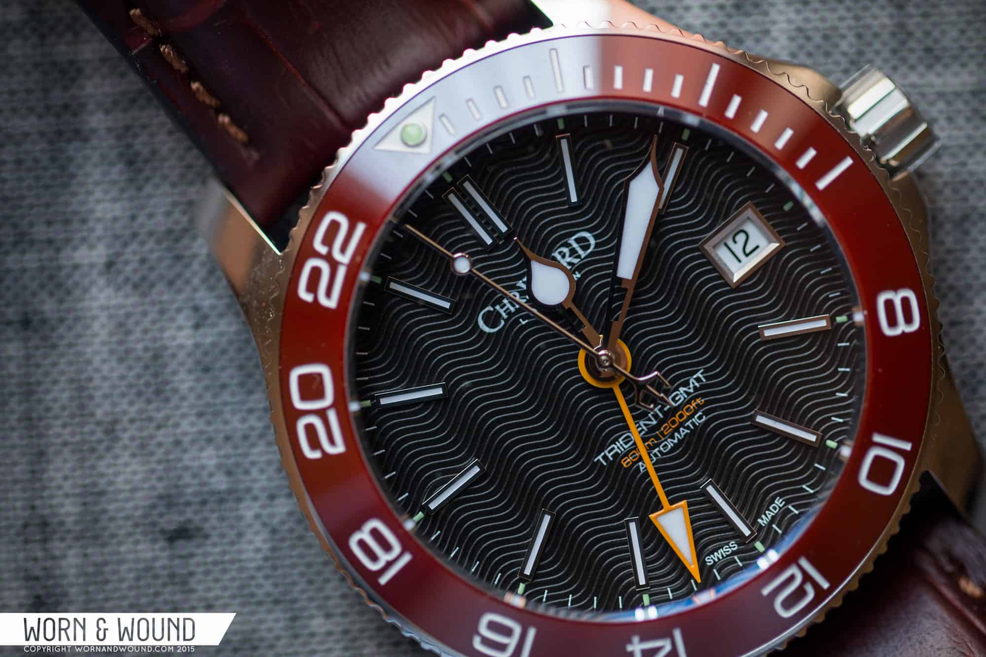
The dial departs more from the original, but keeps some core design elements. Namely, the elegant wave texture is still present. Though they aren’t the only brand to do this, they’ve stuck with it, and it has become a distinct and attractive element to the design. It adds depth and plays with light in a cool way. It’s noticeable at all times, yet not distracting or overwhelming.
![CWARD_C60_GMT_600_38_DIAL8]()
The markers have been switched up though, moving away from sub/supermarine-esque lines and dots, and over to just applied rectangles. On one hand, the make the watch look less obviously like something else, and more modern, but they do lack personality a bit. Not enough to call the watch generic, but they don’t feel like a unique element. I can live with it though as the other elements…the waves, the bezel… bring in more character.
One update I was very glad to see was that the date was moved from 4.5 to 3. This cleans up the dial a bit, and doesn’t make the date seem like an afterthought. That said, with these markers, a 6 o’clock position might have looked even cleaner, and/or a cyclops might have been appropriate. On the dial as well is the predictable dive watch text; a logo at 12, and a few lines at 6. The only thing worth mentioning here is that 600M | 2000ft line is in a pleasant yellow/gold that matches with the GMT hand.
![CWARD_C60_GMT_600_38_DIAL6]()
Taking a closer look at the bezel insert, the first thing that pops is that the index is, well, odd. It has dive-esque markings for the first 15 minutes in the form of dashes, and then switches over to a 24-hr scale, for use with the GMT hand. It’s a bit off putting when you think about it, though it doesn’t much effect the use of the watch. Considering the Tridents were originally inspired by GMT Masters, which weren’t dive watches, I’m surprised by the conflicted message here. I suppose it comes from the now 600m WR… like they wanted to communicate both features simultaneously.
Regardless, the deep red/burgundy bezel contrasts with the white, non-lumed index well, making for an easy read. The only lume available is in the pip at 24/0/60, which is a bit of a disappointment, thought not uncommon for ceramic. In fact, the Pelagos might be the only ceramic bezeled watch with full lume markers. The color is what really matters here and as I said before, it’s quite attractive. It’s a deep masculine red that verges on brown, making it match well with clothing. It’s not a “look at me” red, or a warning red, but rather something far more subtle and handsome.
![CWARD_C60_GMT_600_38_BEZEL1]()
The hour and minute hands appear to have remained the same from the previous model. They are sort of baroque versions of dive hands, giving a sort of early 20th century feel. I don’t dislike them, but I don’t love them either, especially on the new dial. There was a bit more of a rhythm when the dial had circular markers as well. Now with the applied batons, the styles clash a bit, as thought the watch wants a more modern hand set. The second hand still has the trident counter-weight, a signature of the line, but they replace the red tip with a circular, lume filled pip. The GMT hand has been updated from a thin red arrow, to a broad yellow arrow. This was an improvement. Though it feels pulled from the Explorer II, the bolder hand works on the watch, and the yellow/gold is a nice change of pace.




 Featured Videos







You know, I want to like Christopher Ward, but they keep putting out watches like this one that have such horribly clashing design elements. It’s like the dial guy, the hands guy, and the bezel guy all went away and designed their separate parts without talking to anybody else, and then put everything together and stuck it in a box.
Also, confidential to the Christopher Ward dial guy: Hey man, you ought to see if you can give the crown guy a call and borrow that cool “Cw” logo he’s using. It’s way nicer than that terrible “CHRWARD” nonsense you’ve been using.
I agree, the design just doesn’t work. The hands don’t match the dial markers any more, and the GMT bezel is silly with the diver markings for the first 15 minutes. I understand why they wanted to get away from the round sub-style markers of the previous generation, but I think shorter & thicker batons would have worked better and they should have updated the hand set at the same time. Perhaps a simple sword hand style would have worked well here.
Also 600m WR is great, but really unnecessary on a watch like this. I would have been happy if they kept to 300m WR and made it a little thinner.
there are lots of dial and bezel options to choose from but I’ll wait till one Trident goes on sale…picked up a C11 for half price a few weeks ago
Worth noting that US residents who purchase the Trident GMT using the Christopher Ward EU site with a credit card that does not impose a surcharge for foreign transactions, the price of the watch is about $885 at the current USD/Euro exchange rate. I recently made such a purchase and consider the new Trident to be a great bargain.
Less, I feel, than the sum of it’s parts. Dreadful hands and dull markers. There are so many reasonably priced divers on the market that a watch in this style has got to be spot on.
I’ve been looking for a half decent 38mm sized diver for ages and Christopher Ward seem to be the only option going… problem is though these are hideous and far too expensive.
In my opinion a diver should be toolish (ie. drilled lugs), below 40mm and be generally of a reserved design for the gentleman that likes adventure… the Trident in my opinion seems to be the dodgy love child of a Rolex Submariner and a Omega Sea Master, trying desperately to pull all of their nice design elements into one model, slapping on some horrific hands and ending up with a Frankenstein .
I can sea James Bond rolling around on the floor laughing if ever offered one of these?!
Have a look at the Mk II Nassau – 39mm and approximately the same price as this thing. Mine is fantastic and wears very well.
Thanks for the tip, unfortunately the custom taxes (about 20% i think) would make make it a little expensive to have sent to the UK.
I also like the look of the Kemmner 007, word is Kemmner might be doing another production run sometime in the future, and being German/EU based, no custom charges to the UK.
FYI – kemmner 007s are up for sale on ebay (kemmner’s seller name is ‘erkahund’). They just sold out of one batch of the white logo/dial markers but the ‘aged dial marker’ 007 is still available.
Wow, harsh thoughts so far on a beautiful watch! I guess I’m in the minority in seeing this as a great step up from their previous efforts and an all-around beautiful watch … Hope you guys don’t enter the giveaway if/when W&W does it for this piece!
I love this watch, the colors work well and GMT options are limited indeed. I personally would pick the 42mm version. However, I am still not sure if it is worth double the price of the previous generation C60, and I’ll keep my older one.
C.W just does nothing for me, meh. For their price range there are a number of other options I would go with.
there are three things that raises my curiosity about this watch: first, the bezel looks like a marriage between 15-minutes countdown diver bezel and GMT bezel. that’s just too brave. functionality is a question here. second, the hour markers are too thin. Third, for Chr. Ward as a whole watch collection, I personally feel that they are crawling a bit too fast (or perhaps, too brave) for their pricing. $1,100 is a bit too much. It would be more attractive for me if they put the price for $950.
on the other hand, Chr. Ward are trying to get away from the standard diver watch. the standard Rolex Sub look alike diver. They’re not using the round hour markers which is a very good sign. In comparison to what their watch department looks like in the past, this is way much better.
The sizing – YES! The dial – OK. The hands/ceramic – Meh. The innovation – ? (where). The point/heritage/originality – None (beyond marketing). The colouring – Gross. The price – Fair do’s… Ultimately – Why?
I prefer the 3 hand model as I’m not a fan of the mixed dive & GMT bezel. Interchangable dive and GMT bezels would be better, though, I think a dive bezel combined with a 12h GMT hand using the main scale would be optimal.
The dial makes this watch rather dressy. That gives it alot of flexibility for everyday desk diving; however, do the hour markers hold enough lume to make this a good watch for actual diving?
Interesting to read this review and comments…. I find the watch absolutely well thought out! I really prefer the straight thin (Aqua Terralike) hourmarkers over the pips. Looks as a much more professional finish. The wave dial is gorgeous and being a hater of Arabic numerals I love the way Ward has combined gmt with diving functions. This watch is Seamaster/Oris alike…for a very reasonable price. It all shows again how arbitrary the watch world is…I wouldnt want this watch to be any other way…it is just perfect! Only a pity they sacrifice the 3oclock marker for the 38mm version but that is understandable.
The is the worst watch purchase I have ever made. The stem fell off the crown, it was not accurate, and there is no US service. They would not eve send me the part to have it fixed locally. Way over priced give the level of quality. No brand recognition. No customer service. Save your money until you can afford a real luxury level watch or buy a much cheaper watch if you just need a time piece. Either way you will be happier in the long run.
I could get into the design, despite the clashes. Most important question: Is the main hour hand independent of the minutes? It doesn’t sound like it in the review. That renders the function awkward as a travel GMT because you mess up your sync every time you change time zones. Major bummer.
Do not buy from this company!
Christoper Ward’s 60 day ‘no quibble’ return policy is a complete sham. If you purchase a watch and attempt to return it, they will claim that it has been “scratched” and there is no other choice but to resend the item with no refund. This is a terrible way to do business, and I highly encourage you to shop elsewhere. I have never experienced worse customer service in my entire life.