Exclusive 1st Review: The Porsche 911 Inspired REC 901

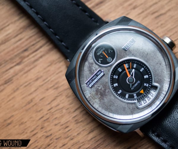
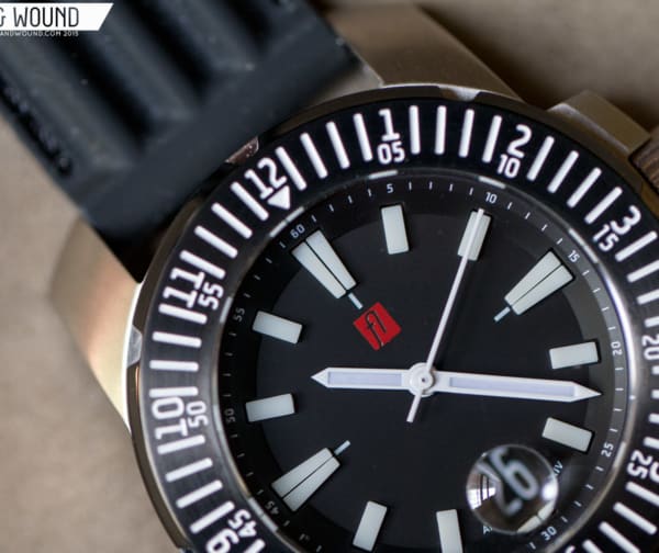
Denmark’s REC is a brand we’ve been fans of at worn&wound since we first saw their simple, quartz Mini-Cooper based watches a few years back. By utilizing reclaimed pieces of junked cars in their watches, they created a brand that celebrates iconic automobiles, giving owners a rare experience typically saved for high-priced luxury watches. The brand has matured greatly since then with last year’s P-51, Ford Mustang watch becoming a huge hit and gaining global recognition.

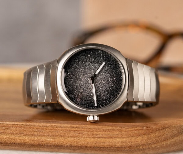
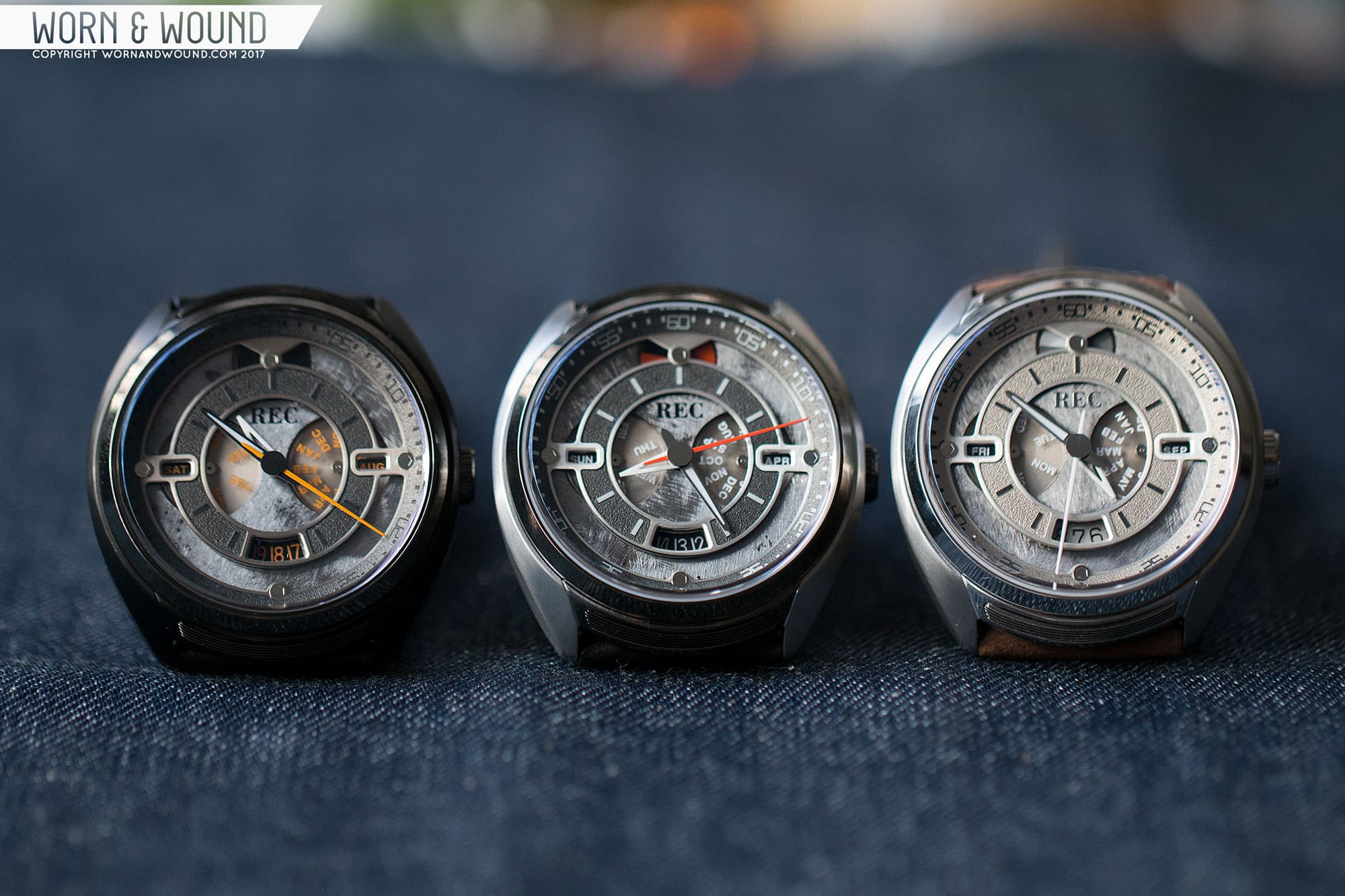
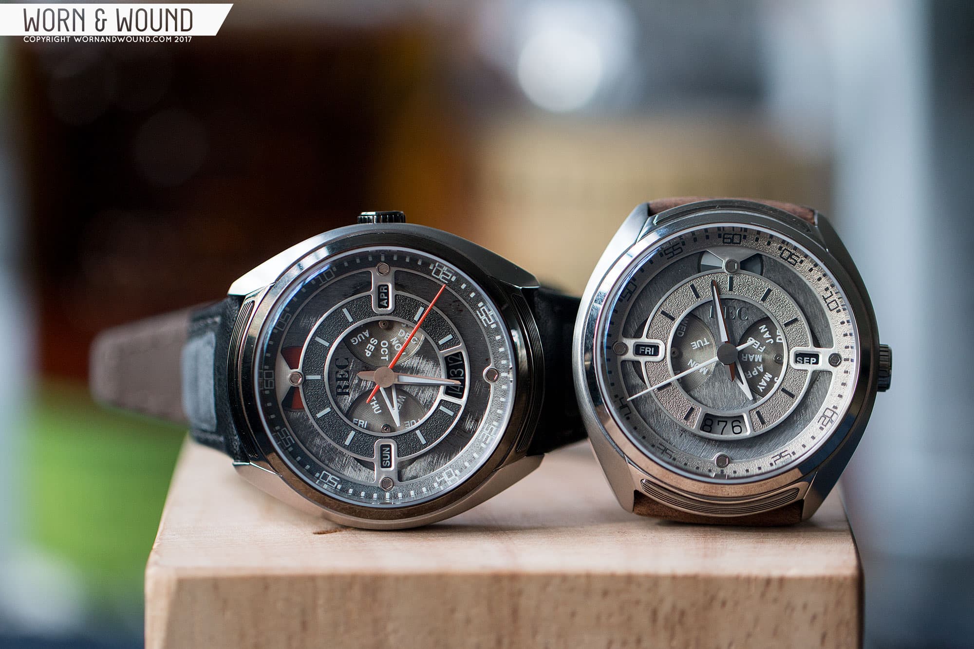
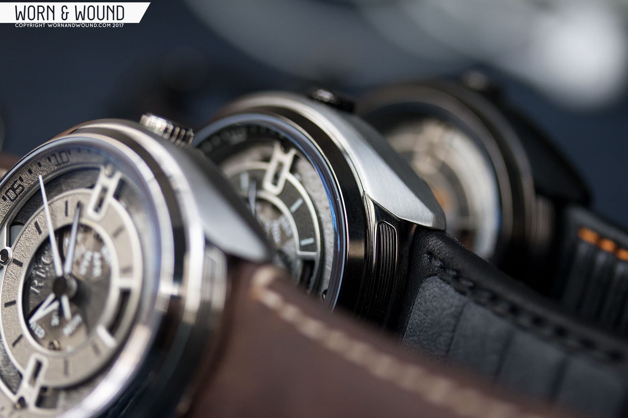
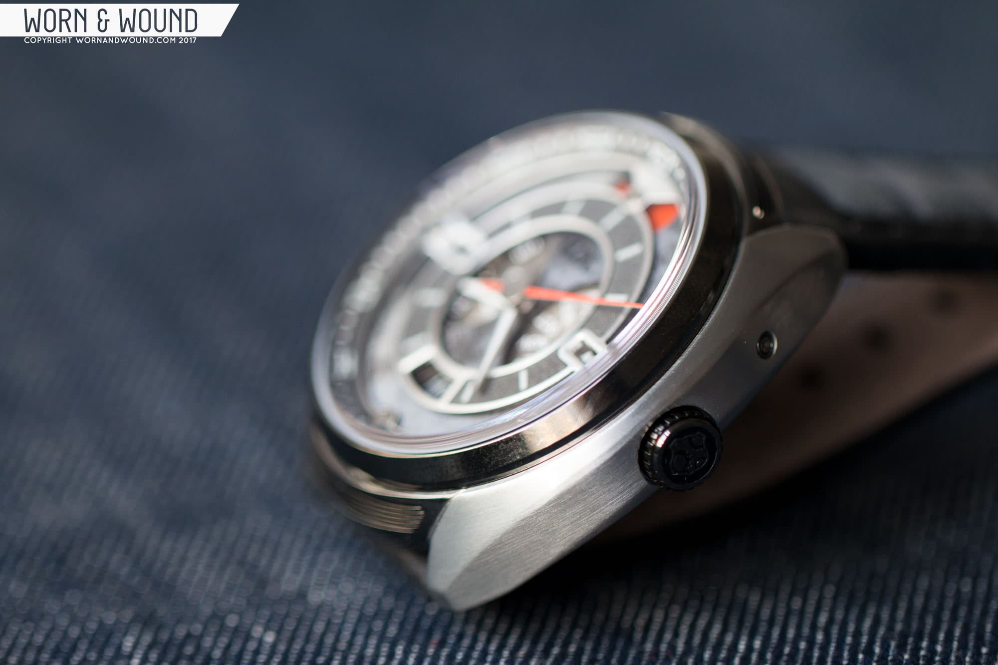
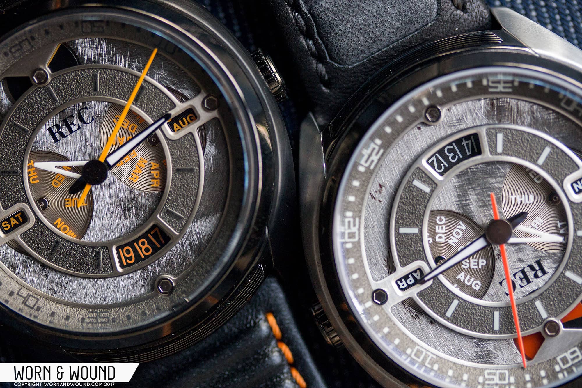
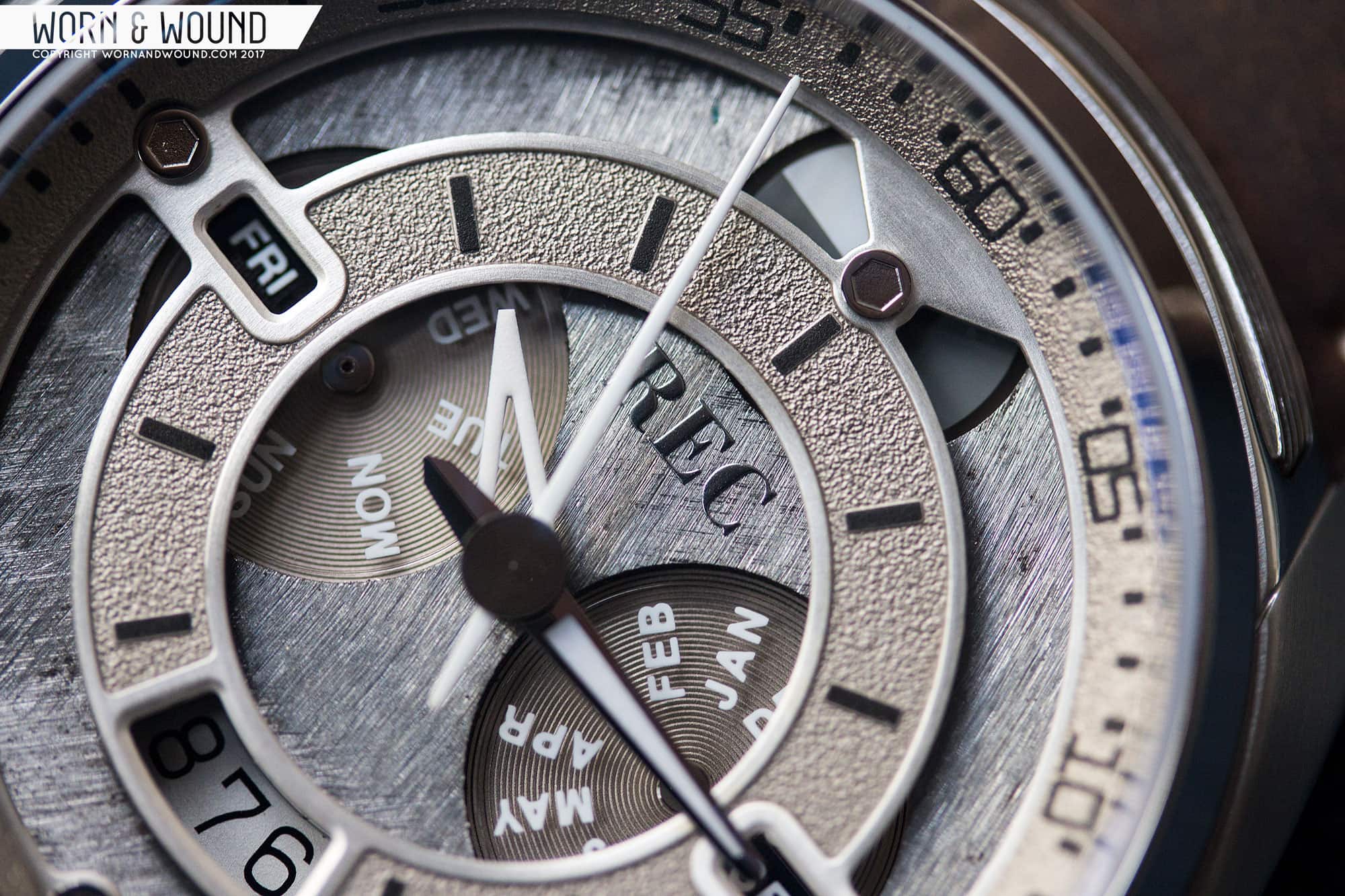
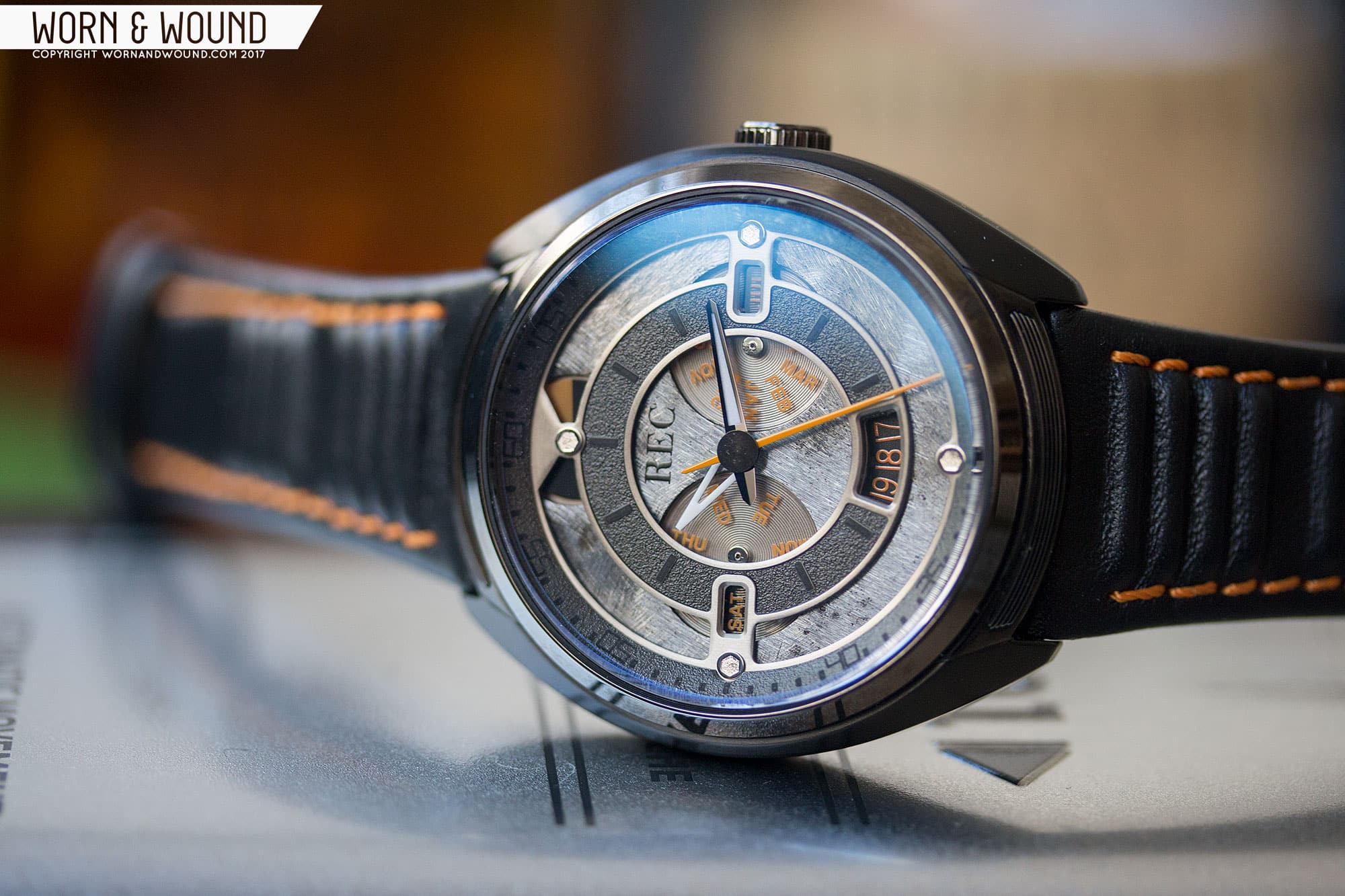
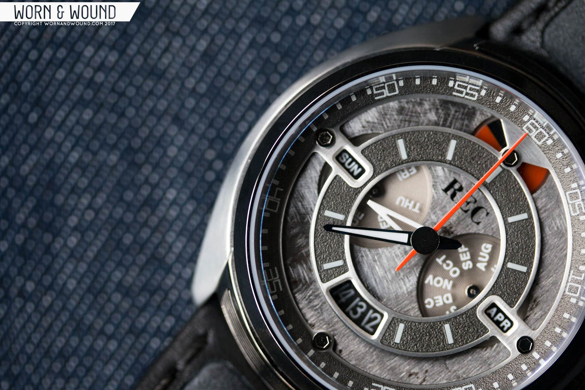
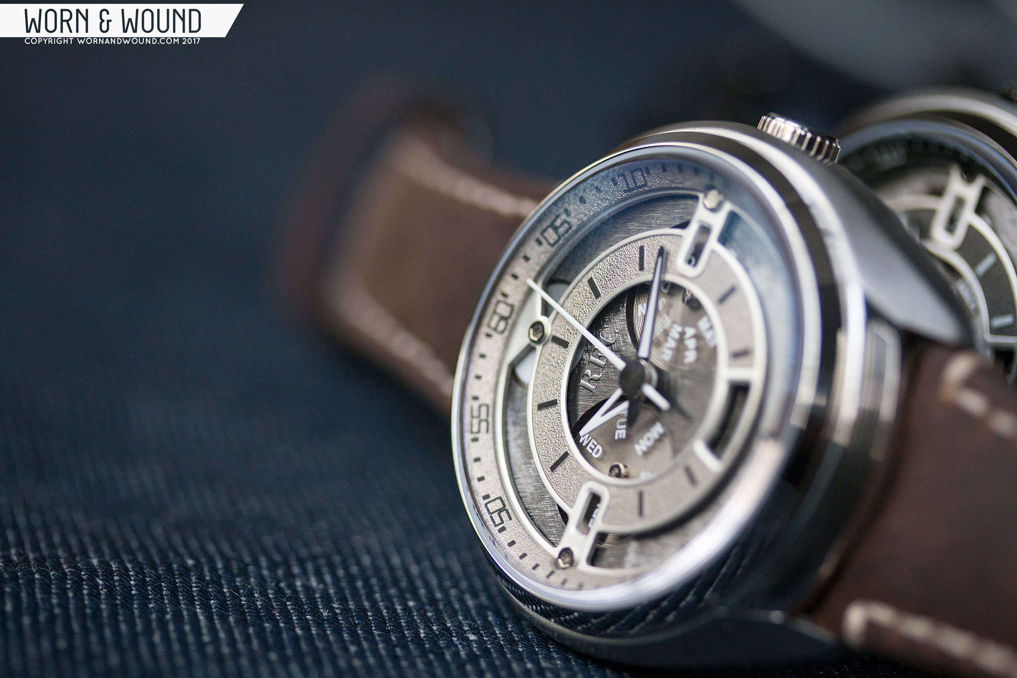
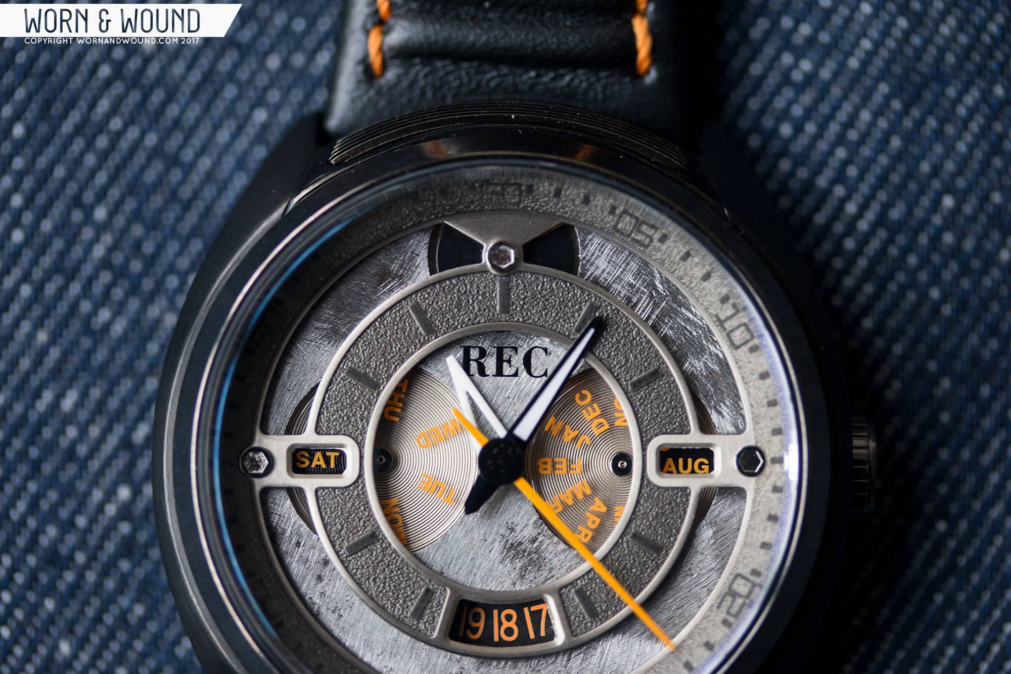
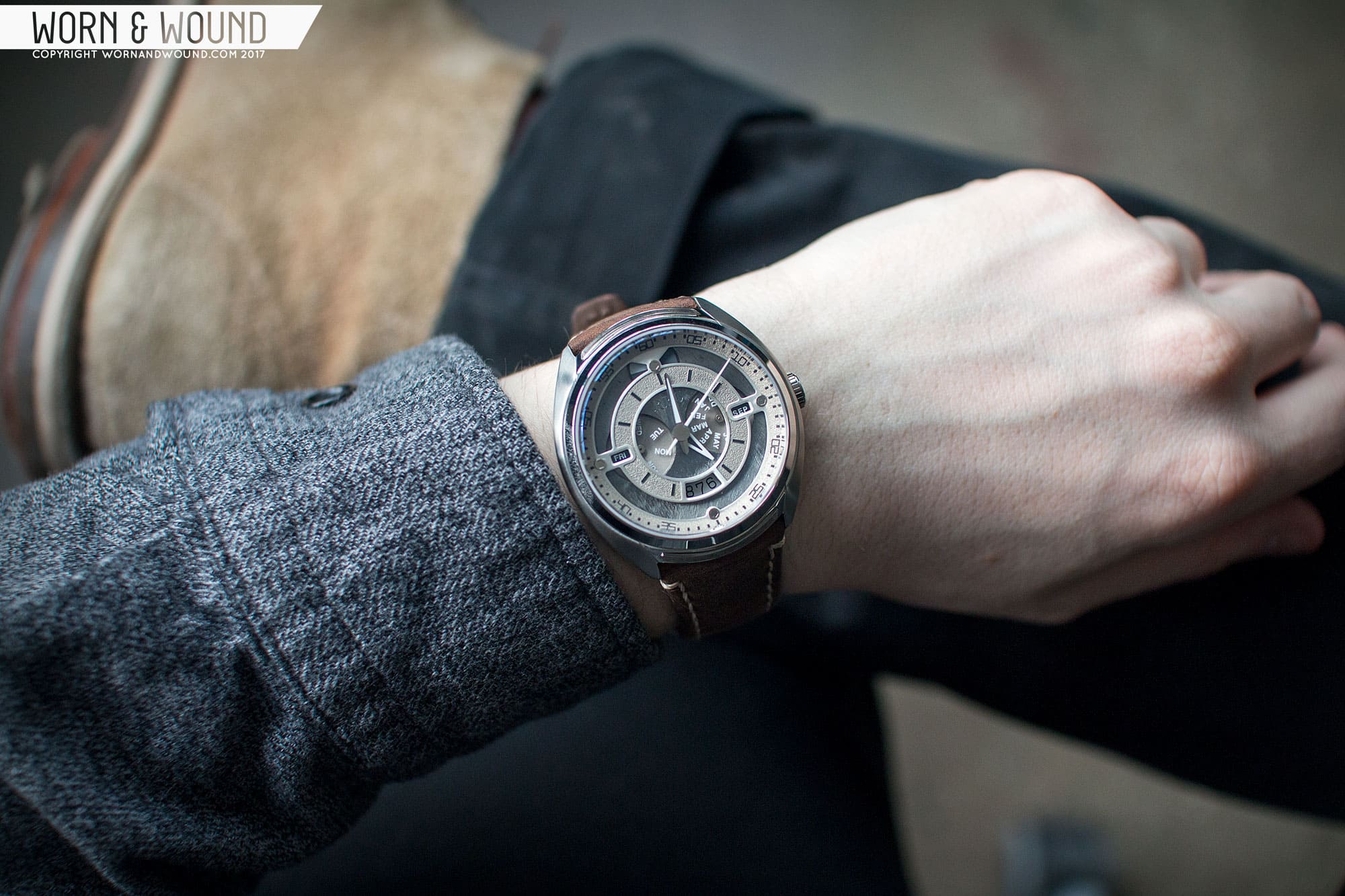
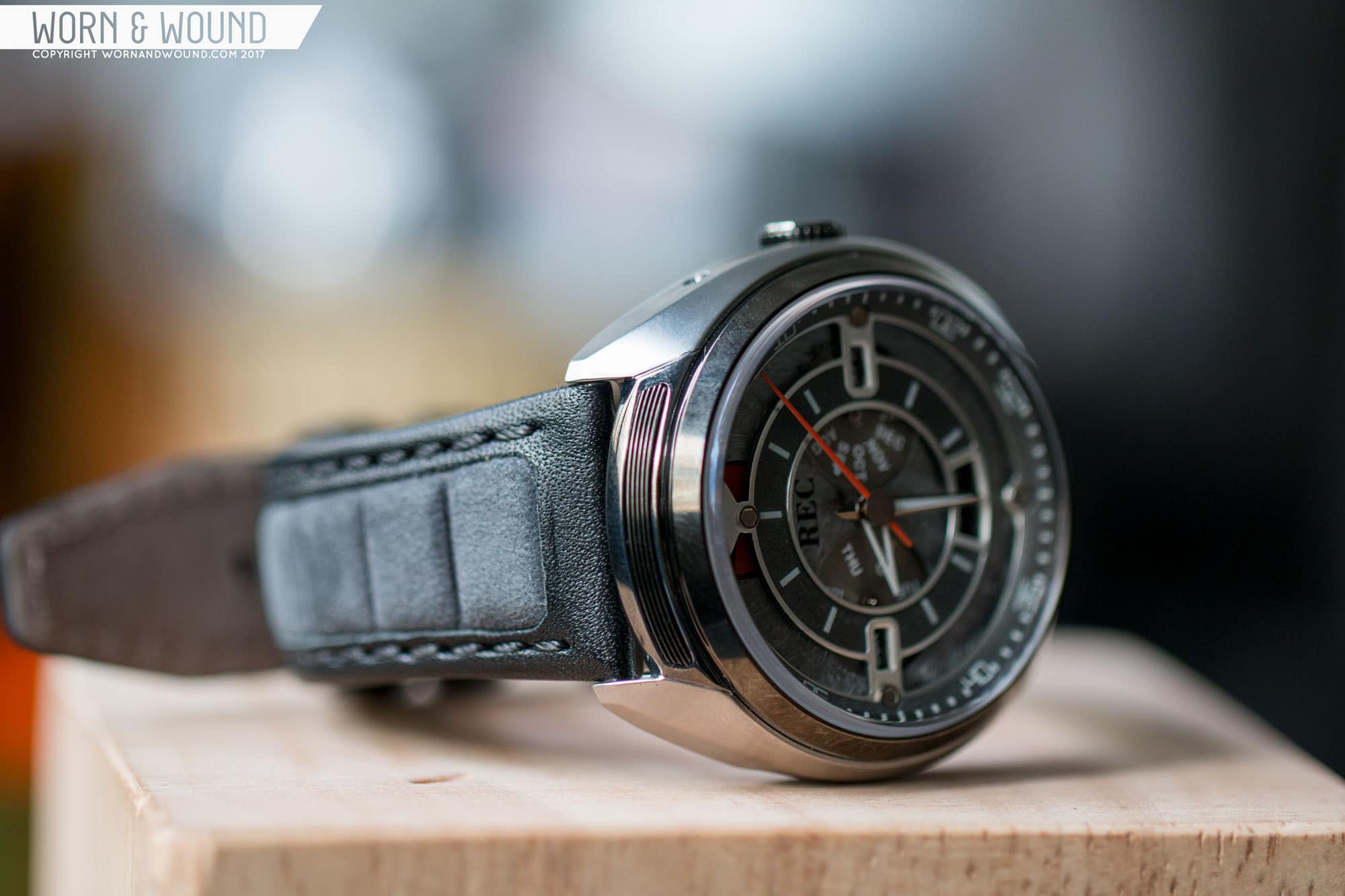
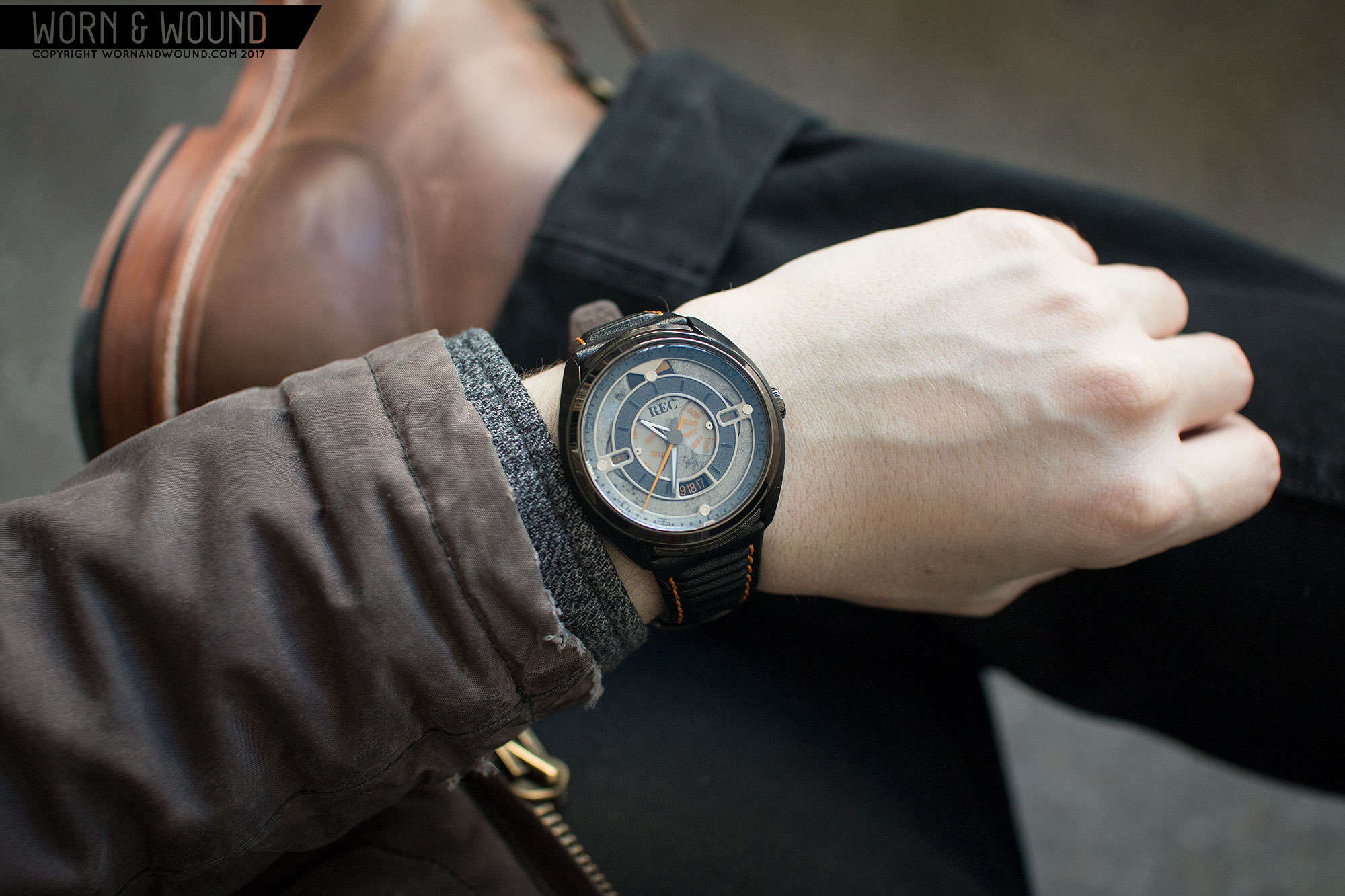
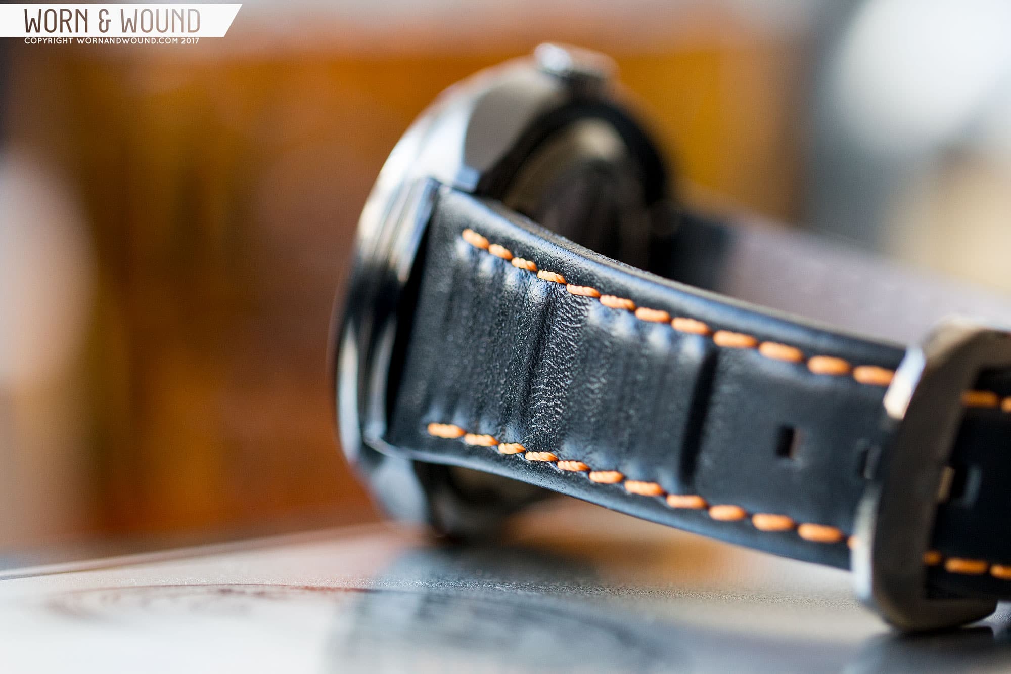
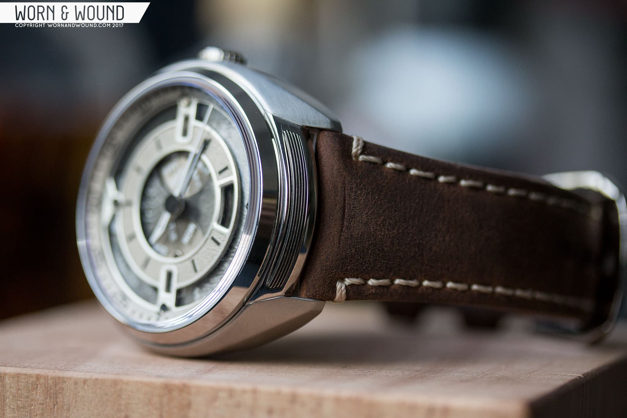
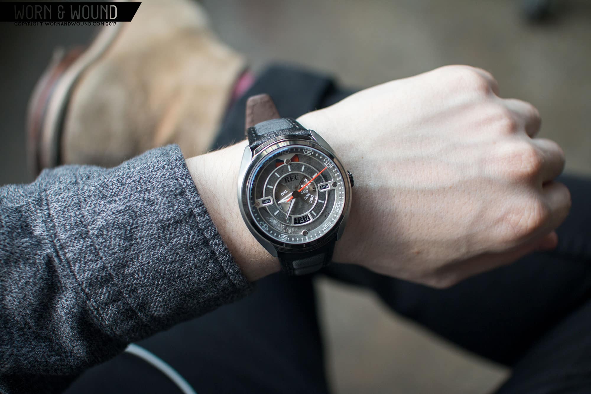
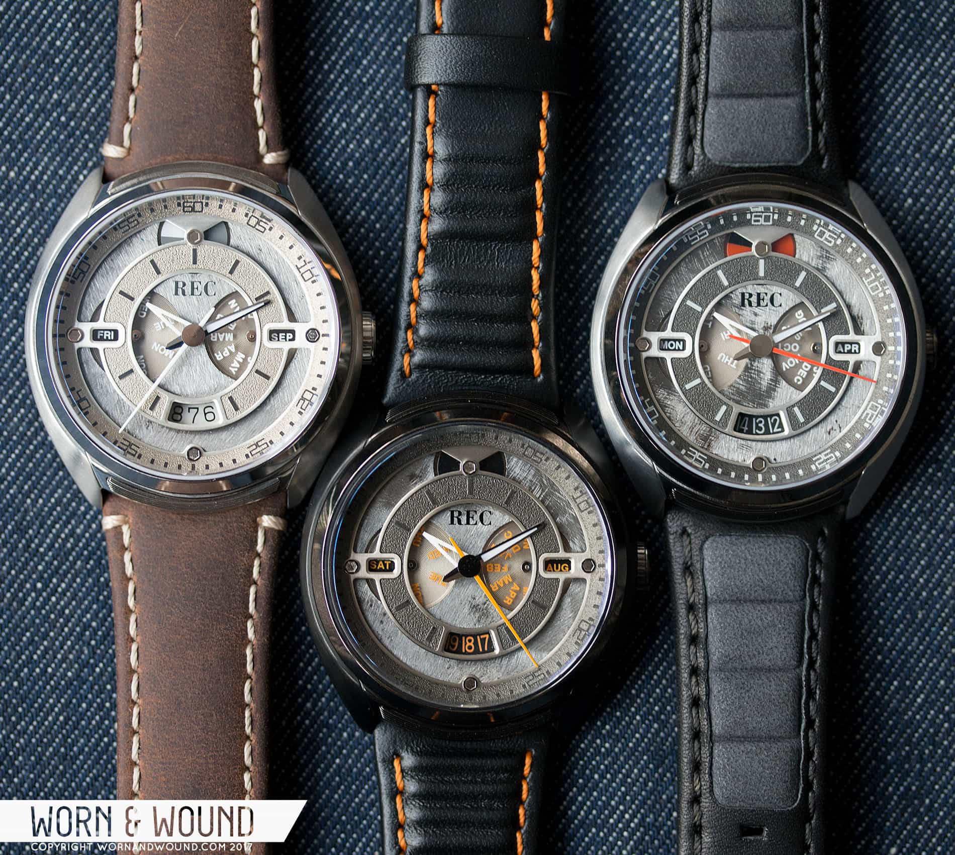
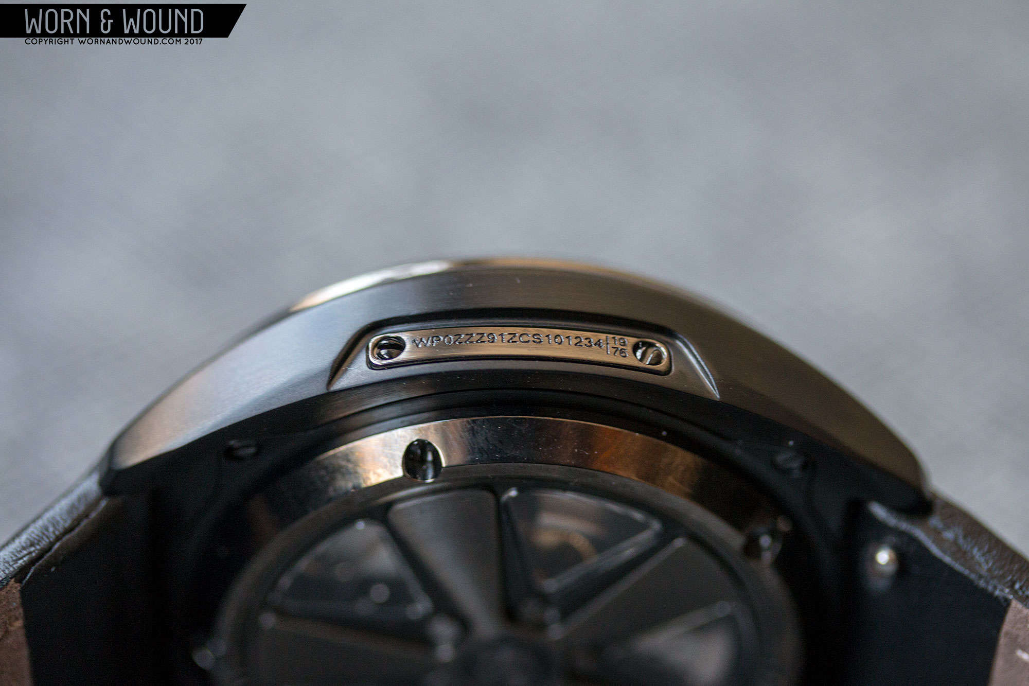
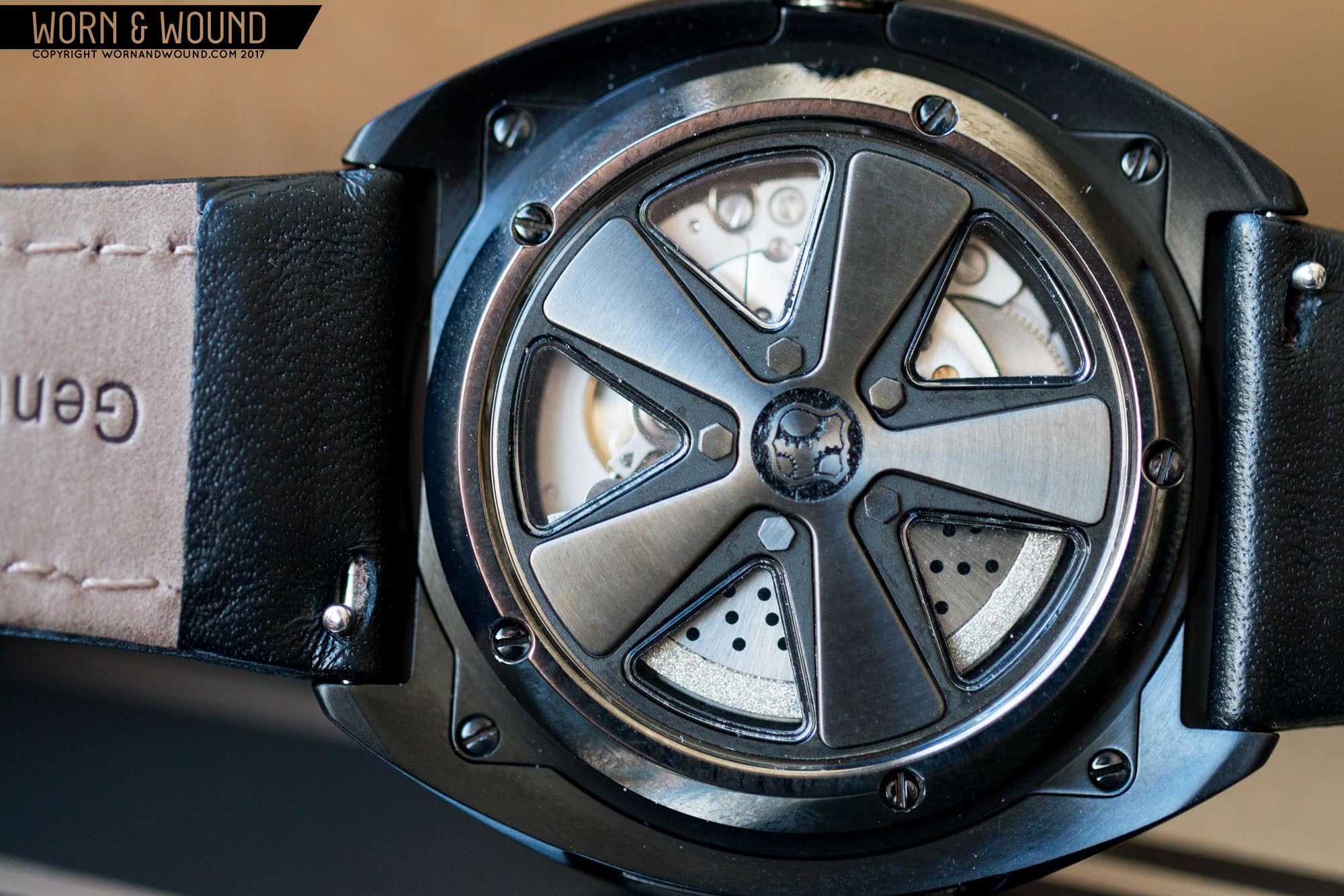
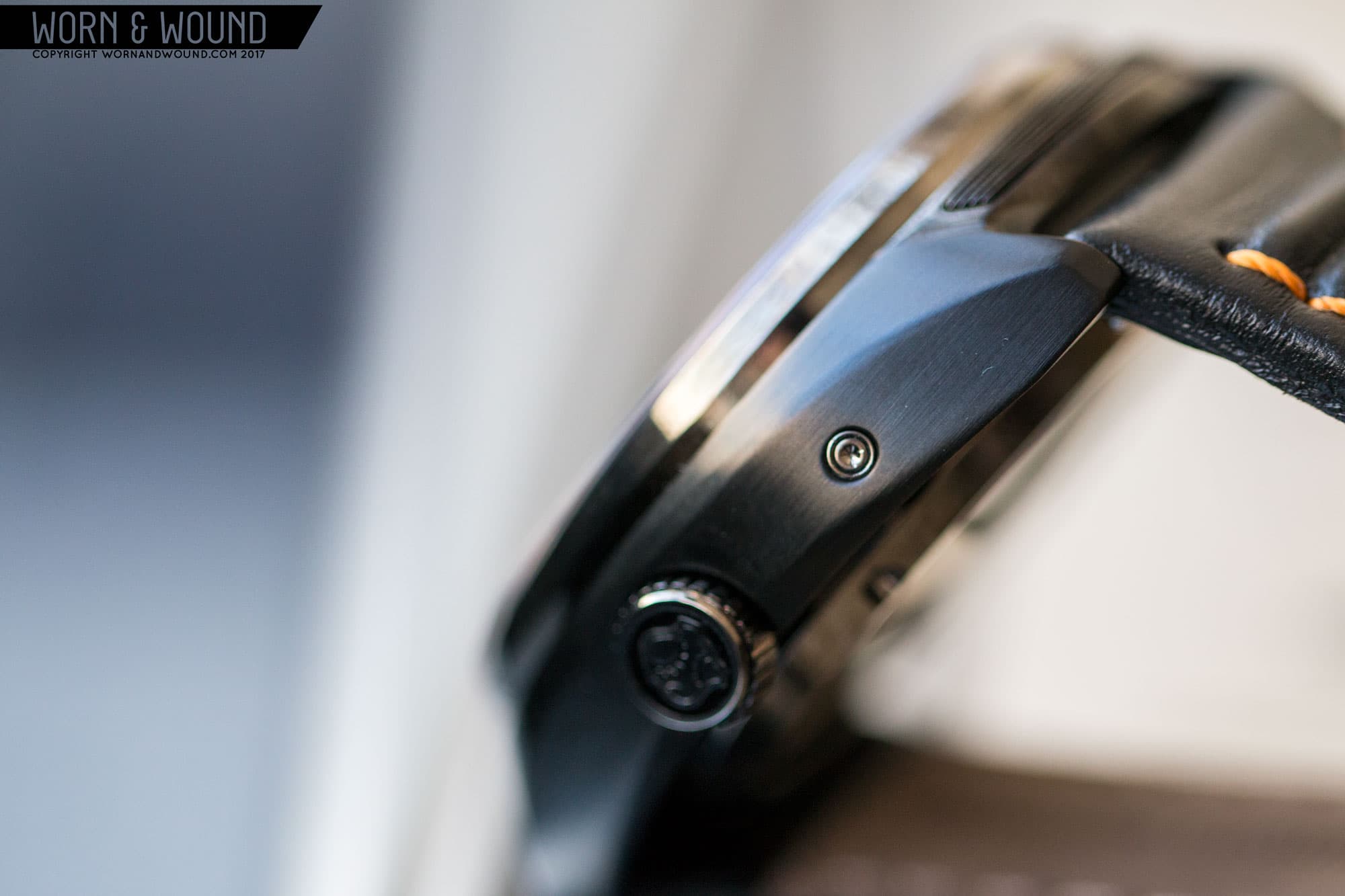
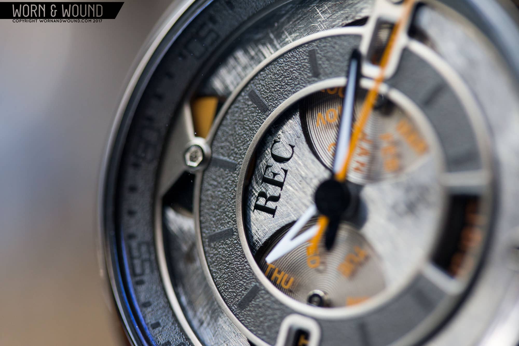
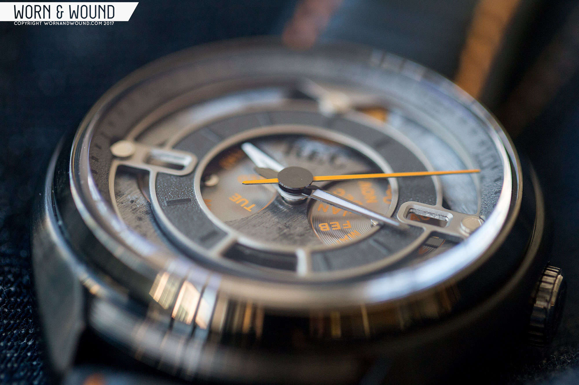
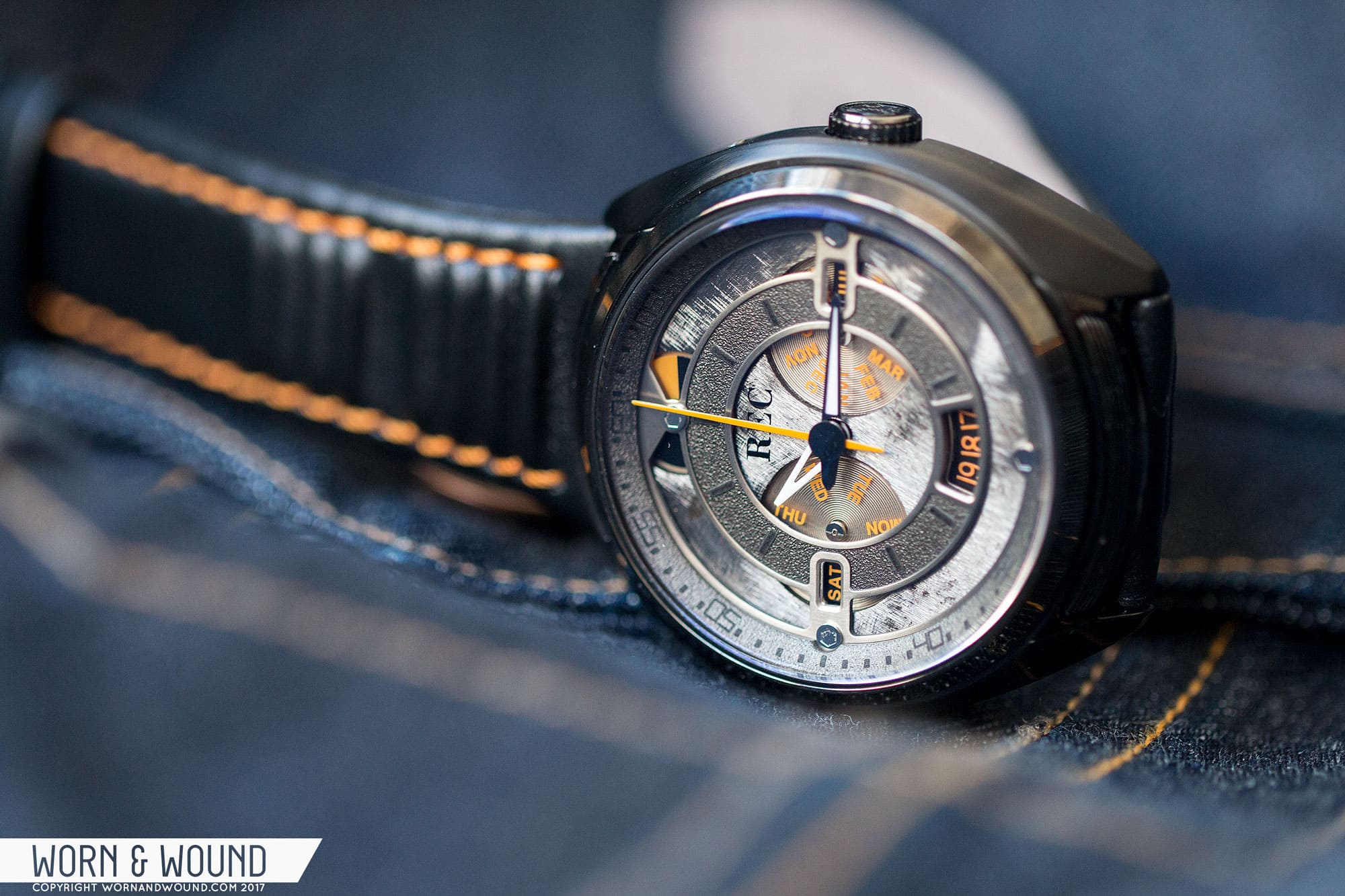
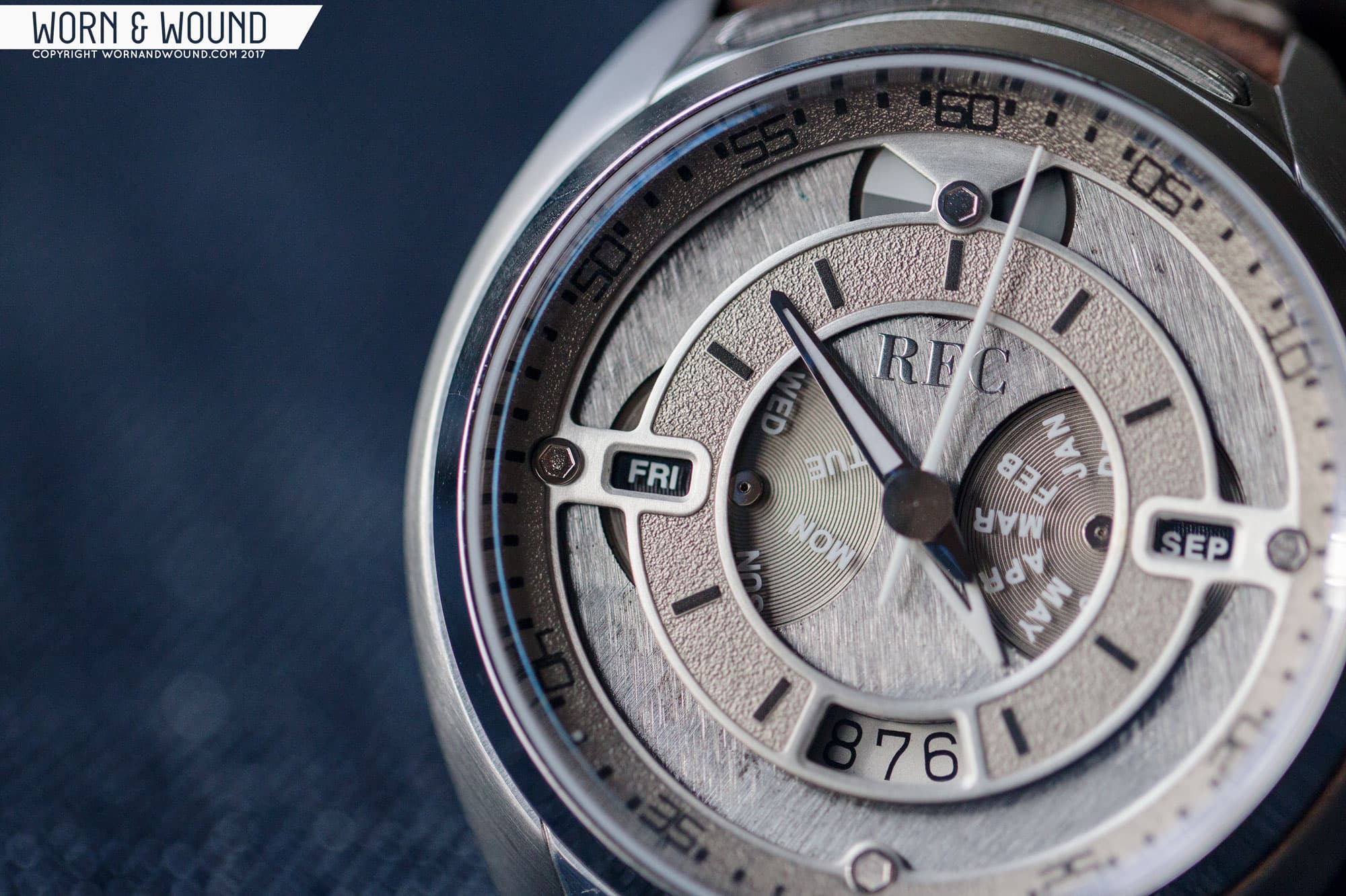
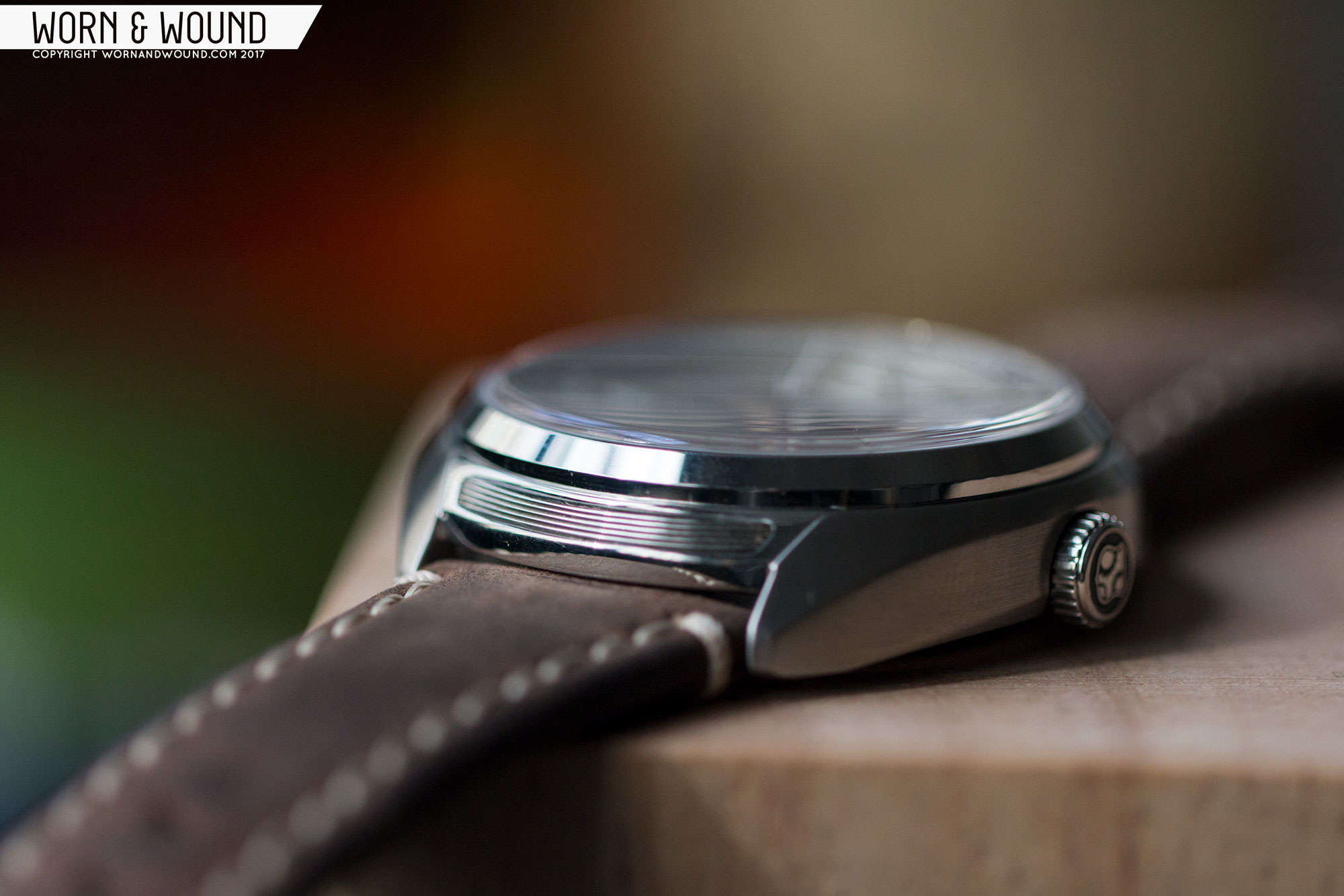
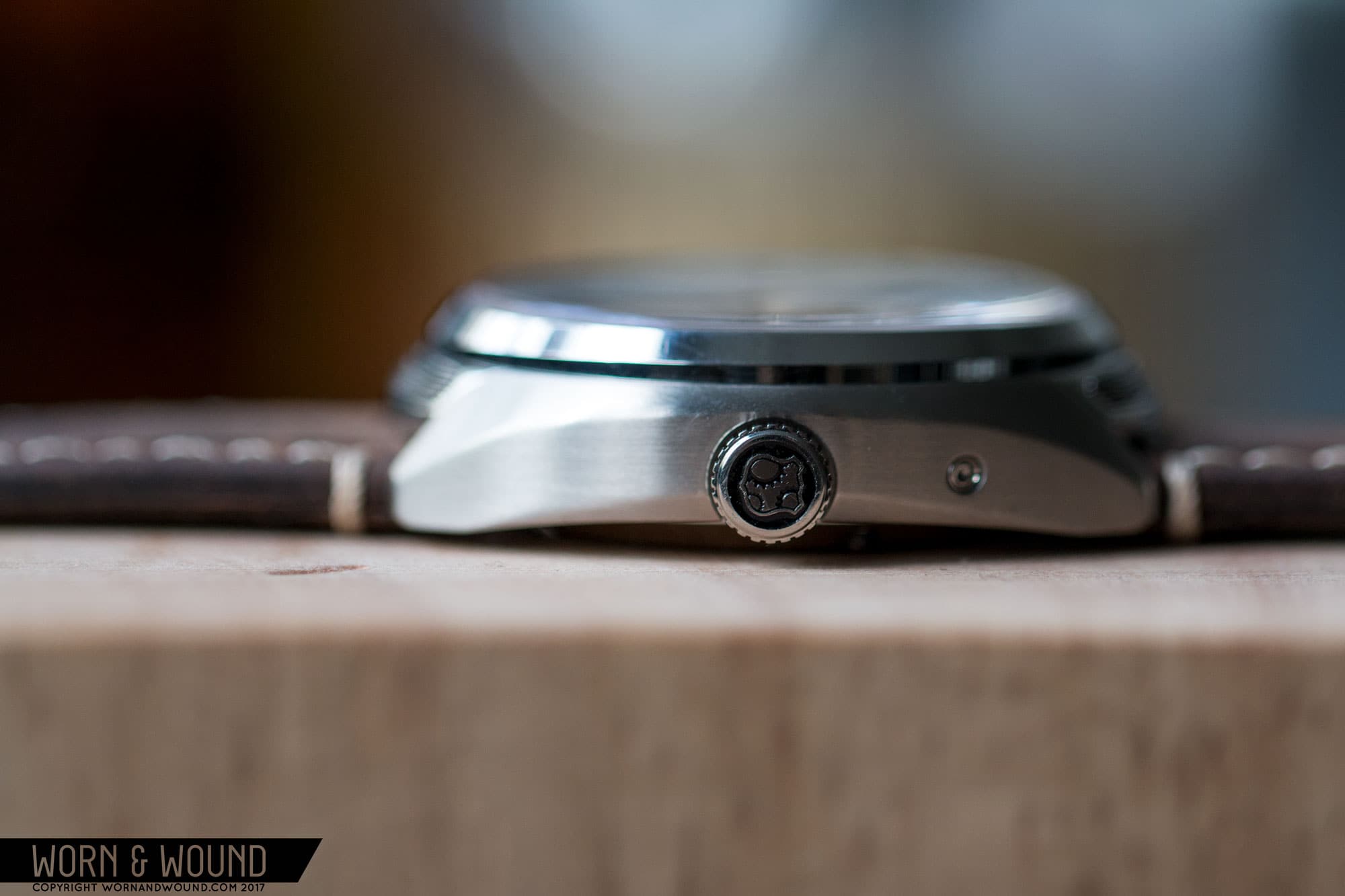
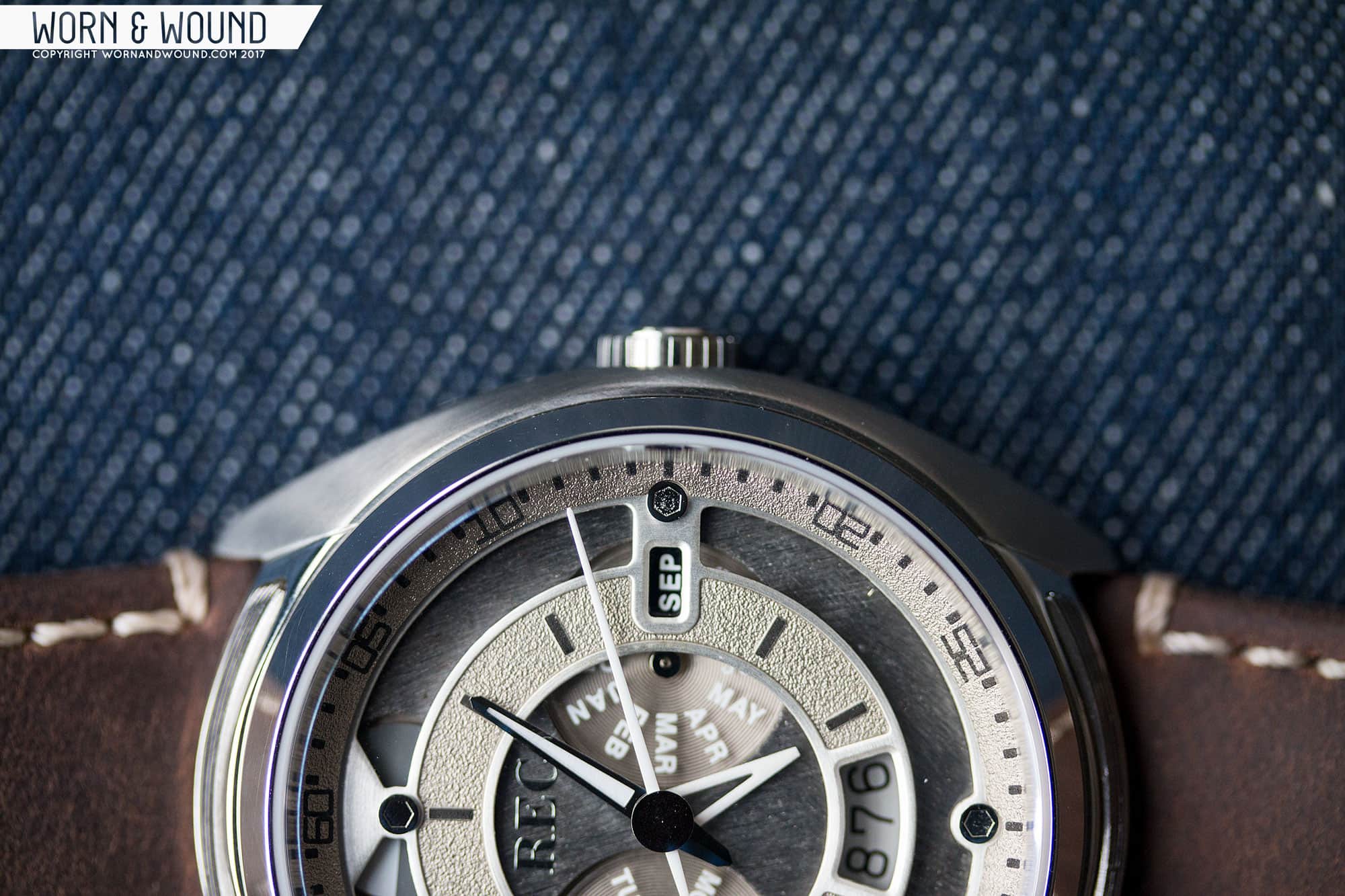
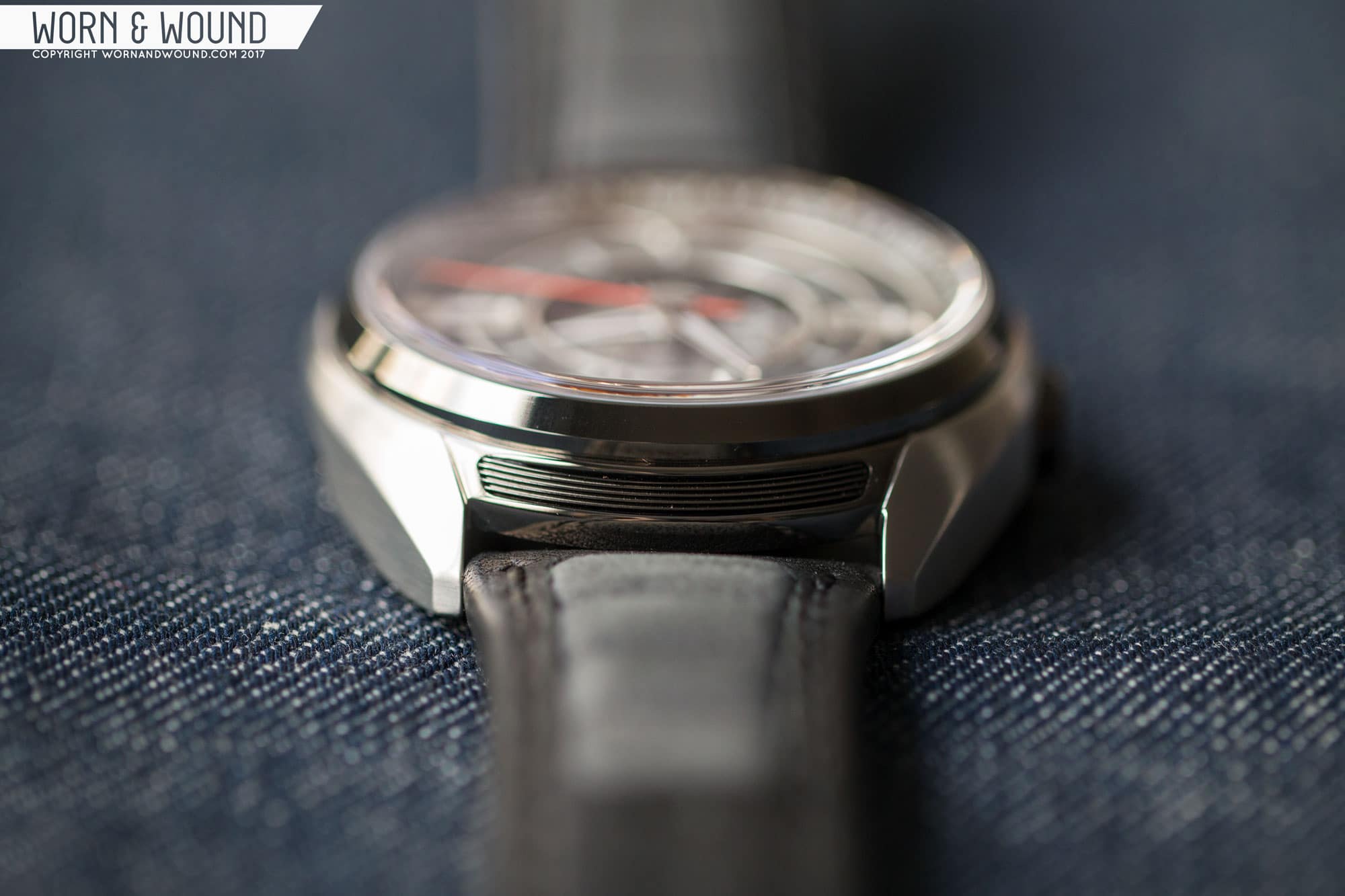
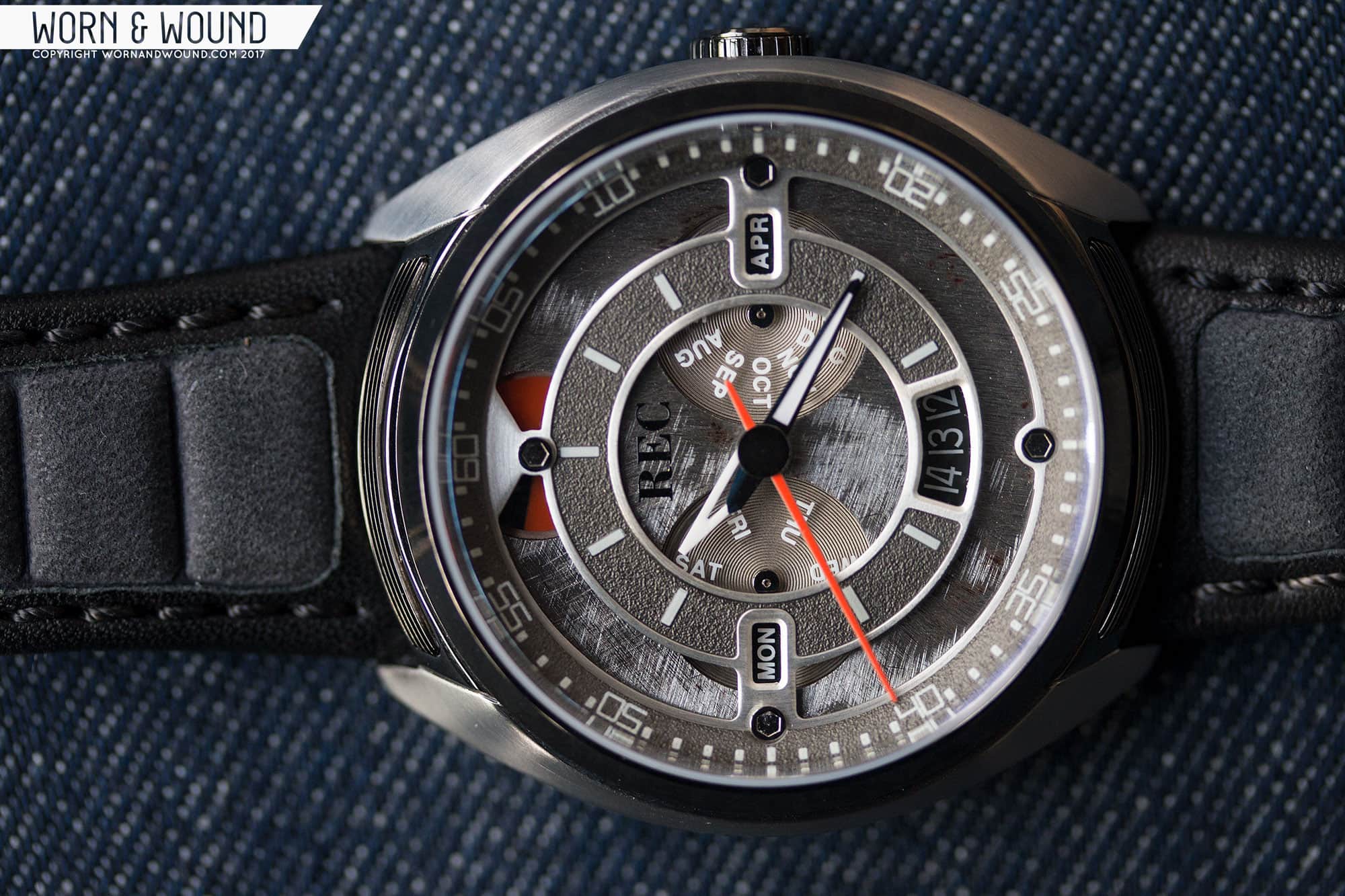
Today, we’re excited to have an exclusive first-look at their newest line of watches, the 901’s. These watches pick up the mantle of the P-51s, but set their eyes on another icon, the Porsche 911. Easily one of the most famous, coveted and recognizable vehicles ever created, the 911 is a fantastic source for inspiration that will drum up fans from around the world. As with all of their previous watches, these too feature a nice chunk of reclaimed 911 material that serves as the base of the dial. The rest of the watch takes cues from the car as well, but also has a distinct style of its own. It’s unique, aggressive and features some wild detailing.

There are three styles of the 901, each with a slightly different attitude, and all quite striking. Inside, the 901 features the Miyota 9100 movement, which has an array of useful complications, adding to the functionality of the watch. Through Kickstarter, the 901 has a starting price of $895, with an eventual retail of $1795, making it a bit of an investment, but one that 911 fans will likely jump on.

Advertisement
$1795

Exclusive 1st Review: The Porsche 911 Inspired REC 901

Case
Steel w/ Mixed finishes
Movement
Miyota 9100
Dial
Open
Lume
Yes
Lens
Sapphire
Strap
Leather
Water Resistance
NA
Dimensions
44 x 45mm
Thickness
13mm
Lug Width
24mm
Crown
Push-pull
Warranty
Yes
Price
$1795

Case

The case of the 901 oozes bravado with a stout design and occasional cues from the 911. Measuring 44 x 45 x 13mm, the 901 is a bit wide, but not long, which balances out on the wrist. the shape is then closest to a barrel concept, with flowing lines meant to emote the iconic shape of the 911. From above, the barrel shape is formed by wings of brushed metal, with a line of polished metal running between the lugs and through the bezel. This is particularly emphasized on the 901-01 model, where the central area is gunmetal PVD, adding contrast.

Also between the lugs you’ll find one of the most literal of 911 details, a grooved region based on the rear engine air grille. For Porche-fans this is a nice nod to the vehicular source material, for those who are here just for the watch, it adds a unique bit of texture that activates an otherwise plain area. On the left side of the case you’ll find an indented area with a plaque that features the watch’s “VIN” number. It’s a cool detail that is unique to REC and relates to each specific watch and the car it came from.

REC_901_GROUP_5

A detail I really enjoyed is the sunken crown at 3. A simple detail, but one that looks sleek and increases wearability, the sizable crown nestles within the case, creating a natural crown guard. Since the watch is 44mm, a large crown on the side would likely dig into your wrist/hand during wear, and this totally gets around that.

Flipping the watch over, you have a rather dramatic case back. In fact, I’d go so far as to say there is more sculptural detail and complexity here than on the rest of the case. What you have is a display case back with multiple screwed-on components, the first a plate and then the display back itself. The latter is essentially a sculpture of a “rim”, specifically that of the iconic Otto Fuchs design. It’s beautifully executed, with mixed finishing and plating. Between each leg of the rim is then a gap through which the Miyota 9100 can be seen. As if that weren’t enough, each triangular portal is its own crystal… so 5 crystals total. Not sure if that would be great for water resistance, but it’s certainly cool looking. Lastly, adding to the effect, the rotor of the 9100 has been decorated with dots to appear like a disc brake.

All in all, it’s a very cool case. It has some nice detailing and references to the 911 without hitting you over the head with literal cues. That said, as a semi-car person, if I saw the watch not knowing it was based on 911s, I might not guess that. It’s a very aggressive design with a lot of machismo that to my eyes brings to mind muscle cars more immediately than the more elegant Porsche.

Dial

The REC 901 dial features a multitude of layers, textures and other techniques creating a lot of depth and intrigue. Adding to this is the Miyota 9100 movement, which features a power reserve, day, date and month complications, all set within REC’s signature reclaimed metal.

Starting with the latter, the base of the dial is a rough, scraped up hunk of metal with scars and marks unique to each watch, that has been taken from wrecked 911’s. No microscopic piece of metal embedded in the rotor, no chip of paint only visible through a loupe… the majority of the dial is the source material. Once again, if you’re a Porsche fan, being able to wear a piece of this iconic watch should have obvious appeal. If you’re just into the watch because of it’s aesthetics, the fact that your watch has certain elements that are one-of-a-kind should make it all the more special.

REC_901_GROUP_1

The reclaimed metal is then basically left alone, save some milled out areas for the complications. The indexes of the dial are then on a raised, skeletonized layer consisting of two rings, connected by thin flanges. In a cool move, this platform-of-sorts has a very raw look to it, with a rough sand-blasted surface, emphasizing that it’s made of thick metal and playing off of the salvaged metal below. Depending on which version of the watch you are looking at, this area will also have different coloration.

As for the indexes, the inner ring of the platform has raised rectangular markers indicating the hour. The outer ring then has a minute/second index printed on it in a contrasting color. The typeface used is meant to be similar to a typeface created and owned by Porsche. Honestly, the printing feels like a bit of a miss here. It’s the only printed element and it feels flat compared what’s around it. The faux-typeface then feels a bit crowded in the space.

The execution of the power reserve and date functions stand out for their unique look, utilizing the raised platform to create a sort of “peak under the hood”. The power reserve is located at 12 and is a disc that is partially visible under the raised platform. The disc will be split into two colors, black and an accent. When the counter is all black, it’s full; all color, empty. The date is then at six, and visible through a cutout in the hour index. It’s a wide, arcing window, showing the day, as well as next and prior. Typically, I find this style of window annoying, but here it works. It balances with other elements and suits the automotive concept.

The day and month complications really stand out in a good way. Both are disks that are placed within milled out portions of the base surface and are fully visible. Rather than the stock disks, which would have been boring, they are made out of semi-transparent material with a sort of corrugated texture. The day/month is then printed in a highlight color, with the specified date visible through apertures in the upper index platform… it’s hard to describe but quite a clever way of doing things.

REC_901_03_1

The hands chosen are based, surprise surprise, on those found on early 911 gauges. The second hand in particular has that long needle shape, and is capped off with a black disc, blocking the central axis. The hour hand is then a short, skeletonized triangle, and the minute is a broader, black edged needle. Both the hour and the minute are lumed. They look good with the dial, perhaps a touch flat, but I do have one real gripe. I don’t usually complain about shorter hands, but here the minute hand really feels like it’s lacking a few millimeters. It lands on the inner index, which reads as an hour index. The minutes/seconds index is then far away. It feels like the hour hand could have been as long as the minute hand, the minute hand then 5-7mm longer, and the seconds hand could have gone to the edge.

Advertisement

Movement

Inside of the REC 901 is the Miyota 9100. Based on the 9015 platform, the 9100 takes the same thin, 28,800bph automatic movement and adds four additional complications (the 9015 already has a date); power reserve, day, month and 24-hour. On the 901, they ditch the 24-hour complication, which was likely a smart move as there would have been too much going on with it. Apart from the complications, the 9100 has 26-jewels, is hacking and hand-winding. Setting the 9100 is straightforward, but it has an additional pusher at 2 for quick-setting the month.

Straps and Wearability

The 901s come mounted to some pretty intense straps. Each style has its own strap that complements that specific model’s accents and coloring, though they all share the same profile. They are 24mm straps that quickly taper to 20mm, which continues the smooth flow of the case. From there, everything is different, well other than being made of leather.

The 901-01 is made of black leather and features a region of grey nubuck by the lugs that is padded. It’s a really cool looking strap that is a nice alternative to a rally strap, but reminiscent of the “big hole” style. It plays off of the two-tone case. The 901-02, which is the lightest of the three, is then paired with a brown strap with a more classic design. The highlight here is the leather, which is nice and oily, with a beautiful grain. It gives the watch an overall more “vintage” feel which works well with the coloration. Lastly, you have the dark and aggressive 901-03, which has a black leather strap with ribbed padding and hot orange accent stitching. The padding adds some slick style to the watch, giving it a particularly 80’s Knight Rider sort of feel. The orange stitch is a bit much for me, but I get the idea.

Advertisement

On the wrist, the 901 at first seems large, but then settles in. The 44mm diameter is obviously big, but the 45mm lug-to-lug is quite modest, so no overhang, and the fluid lines and gentle overall curve of the case make it surprisingly ergonomic. After a few minutes, it feels right at home. Then the watch just looks gnarly. The layering and texturing of the dial really comes through, giving the dial a wonderful amount of depth. The case finishing plays well in the light, making sure there is no angle that looks bad or dull.

While I personally didn’t think it screamed Porsche all the time, as someone who isn’t a gear head, that made the watch all the more palatable. What I did get was a seriously manly watch with clear automotive influence and a very enjoyable, roughed up aesthetic. Thanks to the scratched up plate in the dial, this is a watch that will also only look better with age and battle scars.

REC_901_GROUP_3

Conclusion

REC had a big task on their hands with the 901. Not only did they have to follow up their very successful P-51 watch, but they are working with some very touchy subject matter on the new one. I’d imagine pleasing diehard Porsche fans is a hard thing to do. Like anyone who collects and admires a specific thing (ahem, watches…), they are hyper knowledgeable about that thing and generally touchy about how it’s used and represented. As someone who is not one of those people in this instance, I can’t comment as to what their opinion of this watch will be, and I (and I imagine the guys at REC) are very curious as to what their reaction will be. But, as a watch enthusiast, I can say, they made a very cool series of watches.

The 901s are tough, stylish sports watches with tons of fun details to get into and gawk at. From the case to the layering of the dial, everything has been finessed and detailed with the intent of creating this 911-inspired design. Yes, the watch is big, but it doesn’t feel too big for what it is, and like the P-51 (and other Studio Divine designs) the way the complications are used requires more breathing space. As is, there really isn’t a “dull” moment on the watch, and the proportions of everything but the hands feels spot on.

REC_901_02_1

As for pricing, through the Kickstarter campaign live as of publishing this (March 31st, 2017) the 901 can be had for $895, which seems quite reasonable for the level of complexity, finishing present, and of course the hunk of metal from the 911. After the KS, the price will go up to $1,795, which is a different conversation. The price isn’t unexpected, the P-51 is $1,495, and it’s been very successful for the brand. $1,795 isn’t far from there, and given the material inside and over all complexity, could very well cost more to make. And, for a watch with a “relic,” still well-priced. But, it’s a substantial sum of money and while nothing compared to a 911, an amount that puts the watch into a different category, competing with mechanical chronographs, German-made watches, etc… That said, with the 911 being a globally recognizable icon, tapping into the fascination with the car is a powerful thing that will likely be a tipping point for many a fan.


For more info, check out: REC 901

To head directly to the 901 Kickstarter, click here

Advertisement
Images from this post:
Related Reviews
Zach is the Co-Founder and Executive Editor of Worn & Wound. Before diving headfirst into the world of watches, he spent his days as a product and graphic designer. Zach views watches as the perfect synergy of 2D and 3D design: the place where form, function, fashion and mechanical wonderment come together.
wornandwound zsw
Categories: