Farer Barnato GMT Review

With all the new brands popping up these days, it’s hard for one to stand out. Many try and most fail, with only those with solid brand concepts and serious design skills fairing the storm. One such brand is Farer, who despite their young age, having only been founded in 2015, have created a line of watches that are hard not to like. Designed in Britain and made in Switzerland, their watches take cues from mid-century timepieces and design, and mix them up with a more contemporary edge, creating stylish, sophisticated yet fun watches.

FARER_BARNATO_DIAL_5

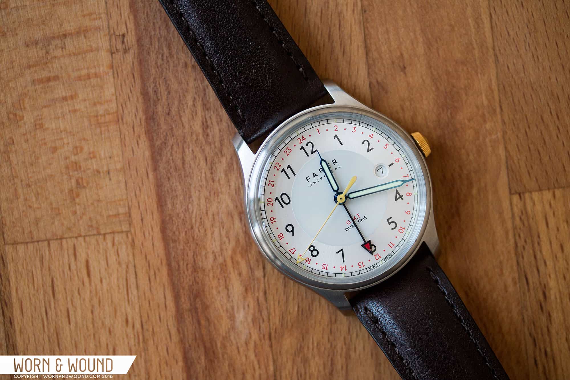
Today we’ll be looking at one of their two GMT models, the Barnato. Named for the British adventurer Diana Walker Barnato, the watch has a pale dial with a focus on typography, and a 39.5mm case that speaks to classic gentleman’s sport watches. It’s at once a nod to vintage and a fresh, energetic take on the casual watch. Powered by the Ronda 515.24h Quartz movement, the Barnato has an MSRP of £440 w/ VAT or around $460 w/o VAT.

Advertisement
$460

Farer Barnato GMT Review

Case
Steel
Movement
Ronda 515.24h
Dial
Silver
Lume
Yes
Lens
Mineral Crystal with Sapphire Coating
Strap
Leather
Water Resistance
5 ATM
Dimensions
39.5 x 45.8mm
Thickness
11.25mm
Lug Width
20mm
Crown
6×3
Warranty
Yes
Price
$460

Case

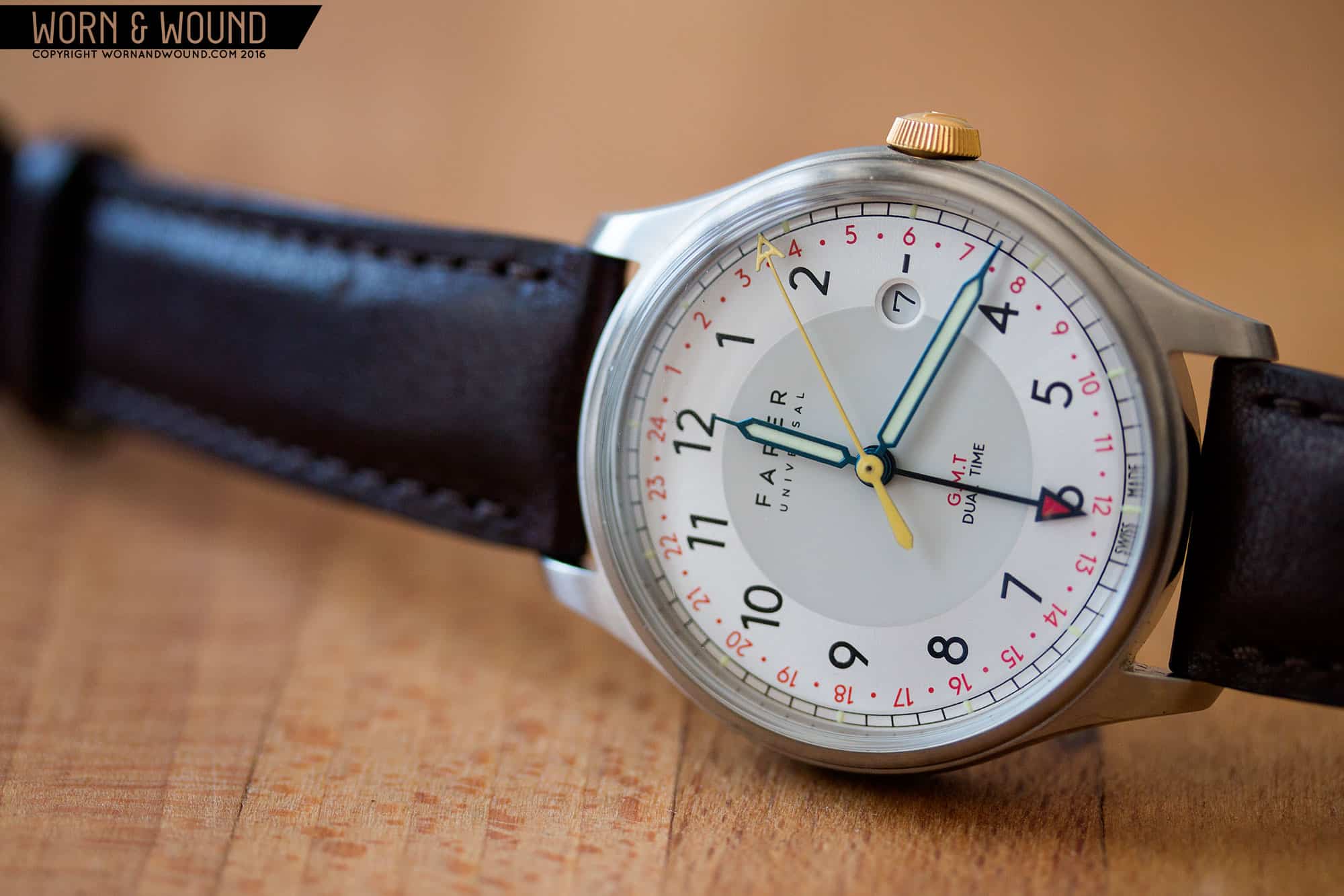
The brushed steel case of the Barnato calls to mind classic designs, such as that of Rolex Oyster, but has its own personality thanks to a few details. Measuring 39.5 x 45.8 x 11.25mm (to the top of the domed crystal) it’s a nice modest size. The diameter ensures presence while the lug-to-lug will fit many wrists. Moreover, while hearkening to vintage designs, the watch doesn’t feel like it’s trying to be vintage. Rather, it’s a modern concept with mid-century styling.

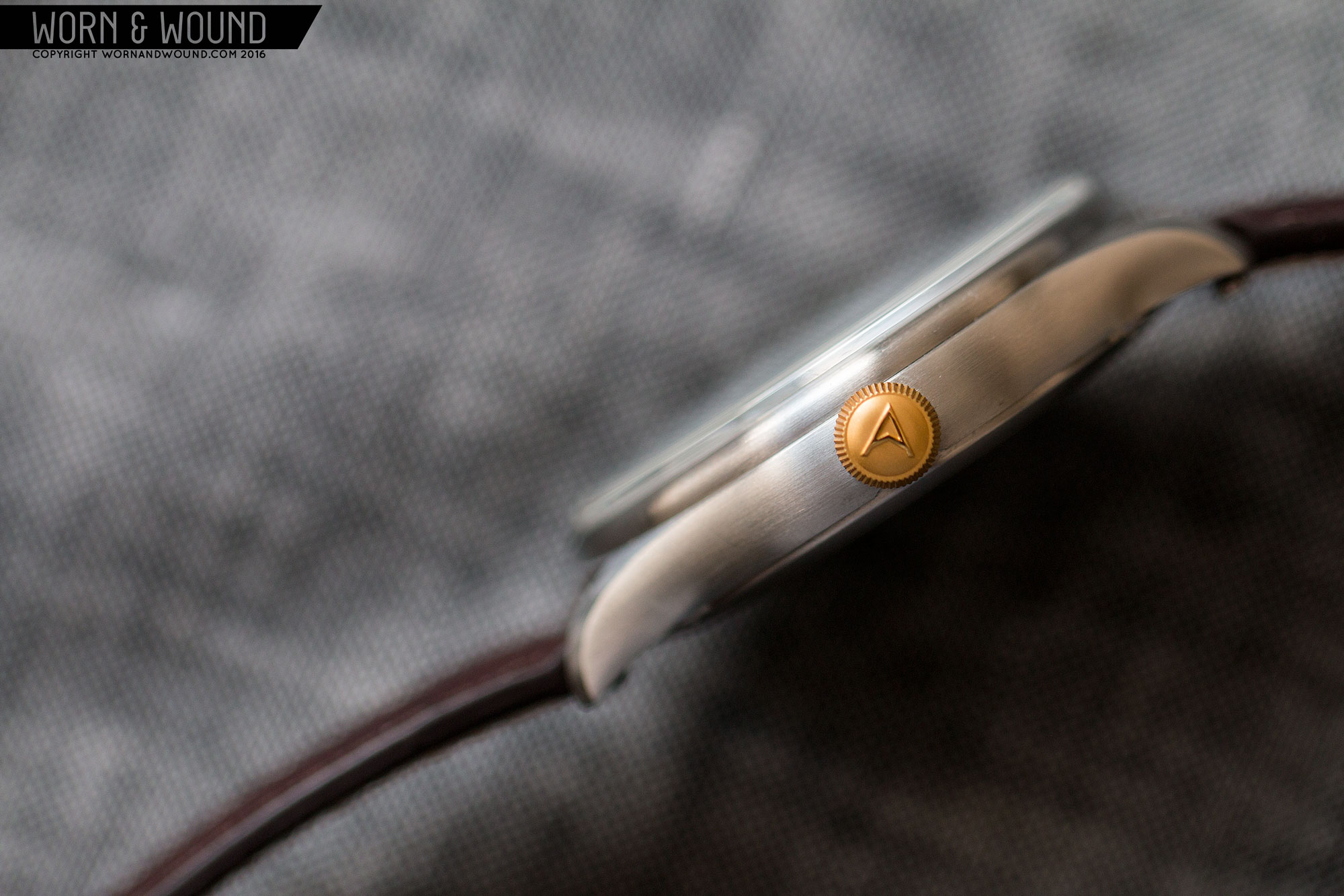
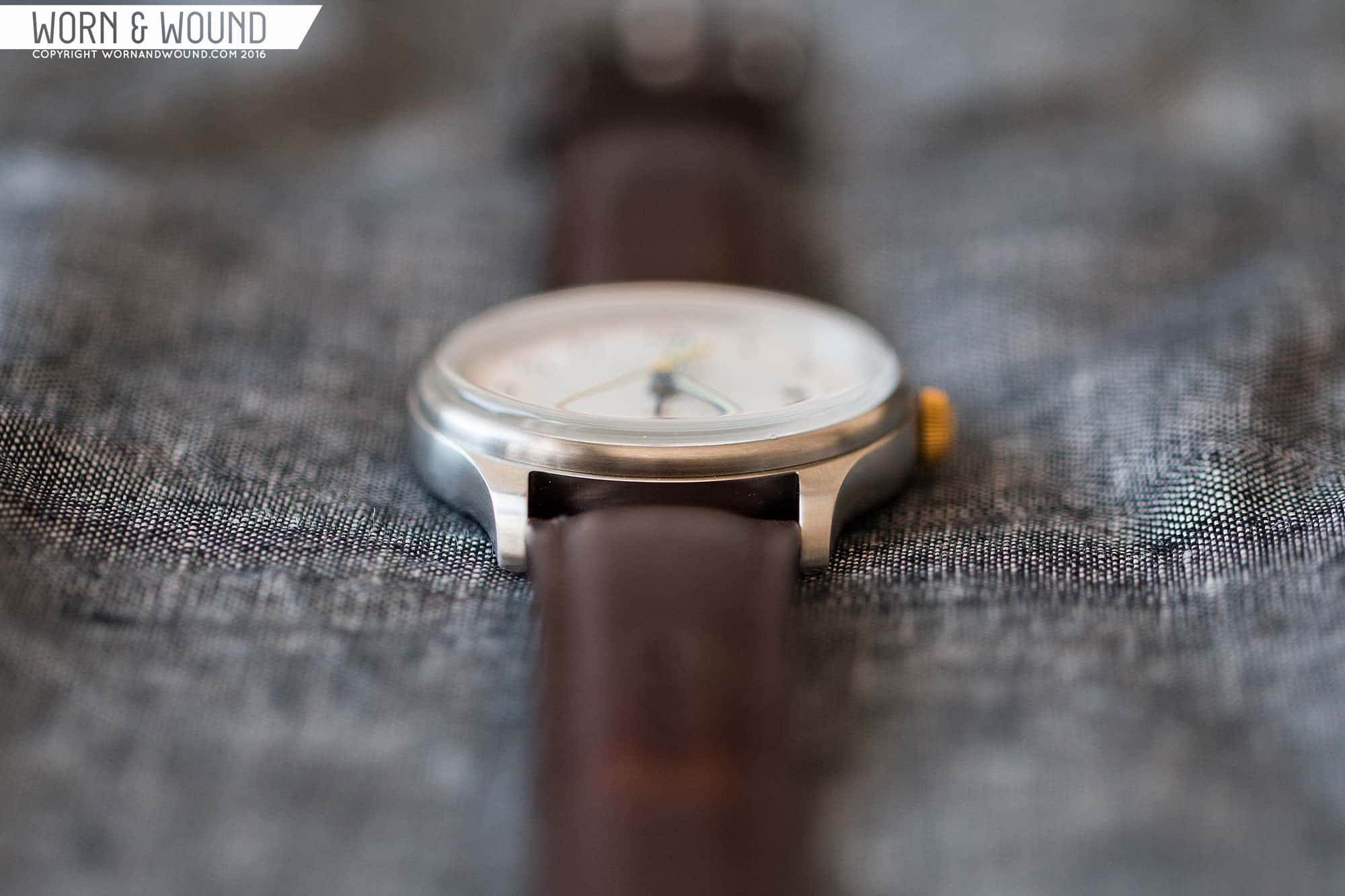
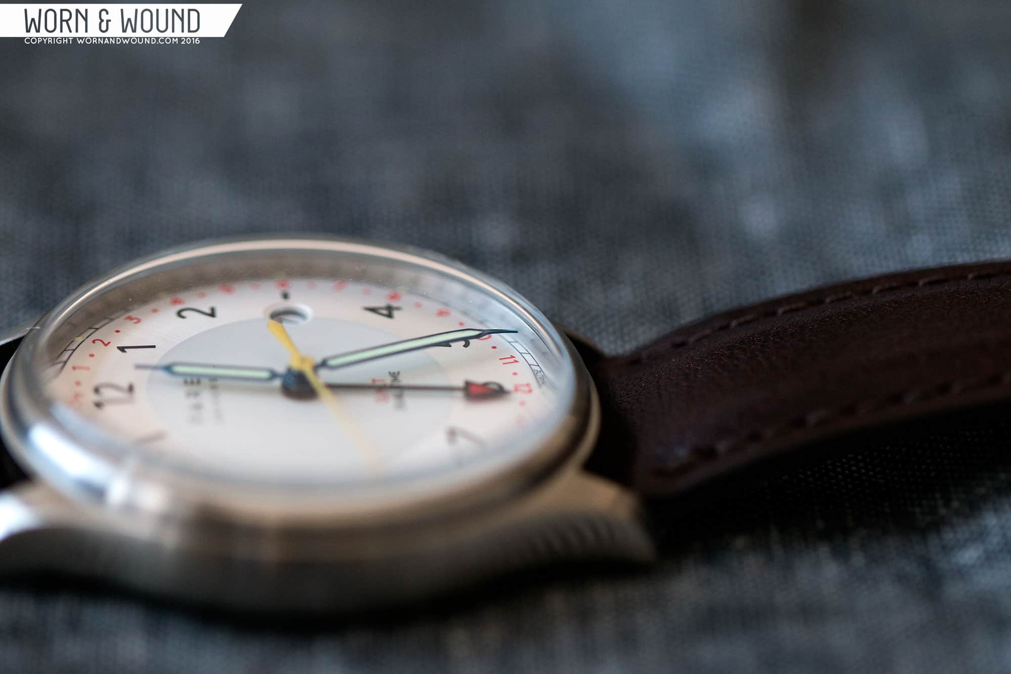
From above, the design is very simple; big round bezel, contouring lugs and clean brushing throughout. From the side, things are a bit more interesting. Rather than being slab sided, the case has fully rounded sides. This gives the watch a softer, more elegant look, really speaking to the gentleman’s sport watches of the 50’s and 60’s. From the side, the geometry of the crystal is more pronounced as well. It’s steps up, then domes over, like a vintage box crystal. It’s attractive, but unfortunately made of mineral with a sapphire coating. While it gets the job done, since this is a pricier quartz watch, I certainly expected sapphire, or acrylic for aesthetic reasons. There were also two small imperfections in the form of small bumps on the crystal of the sample, one by 12 and one by 5. They are hard to notice, but there.

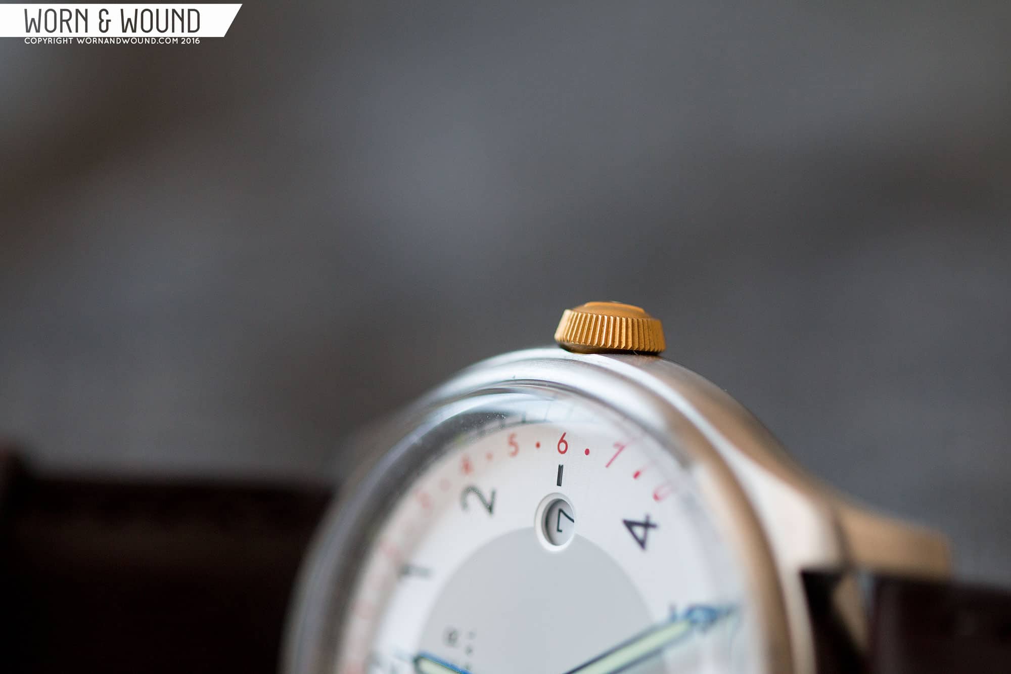
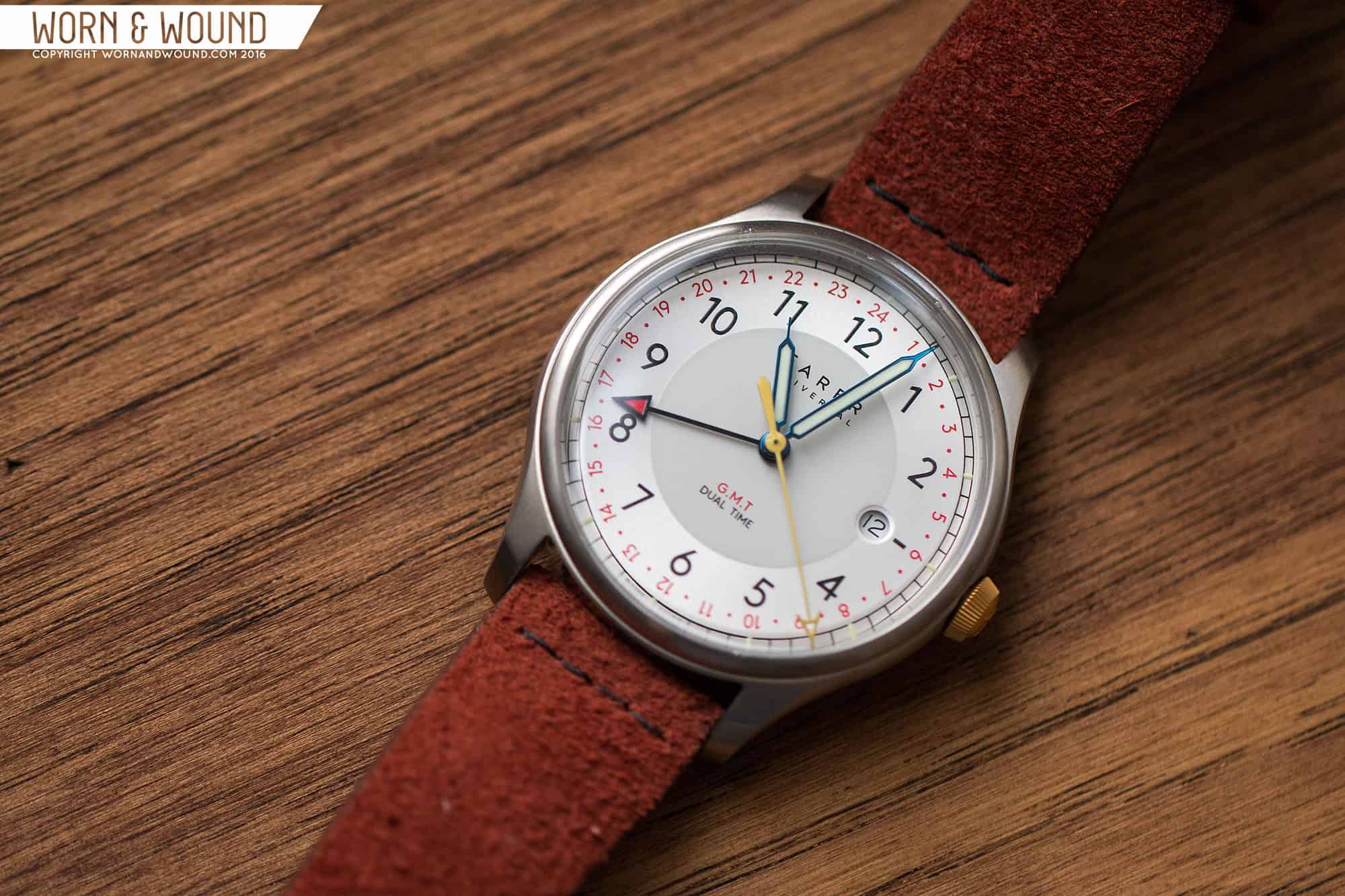
On the right side of the case, you have Farer’s signature crown design. A bit of divisive detail, but one I am fully in favor, the crown is a unique tapering shape, getting narrower away from the case, presented in bronze. The contrasting crown material draws attention to it, making it stick out, but not in a loud or ostentatious way. The effect is more subtle, playing off of the feel of two-tone cases, without going the whole way. The crown design is also interesting and well executed. It’s wide and thin, with coining for grip. The tapering shape brings the eye back to the case, rather than out and away. On the outside face, there is a very well executed Farer “A” logo, which is raised up from a matte surface and polished.

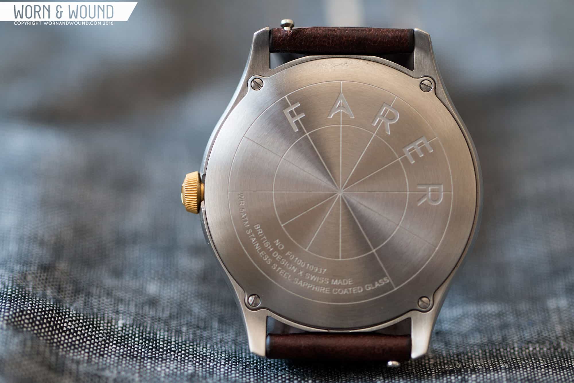
Flipping the watch over, you’ll find a solid caseback that is held on with four screws. The back features a single large graphic with a compass-like layout and a large Farer logo. In an open area, they have listed some of the watches specs, including “British design x Swiss Made”. It’s a nice looking graphic that ties into the brand’s adventure/travel concept.

Dial

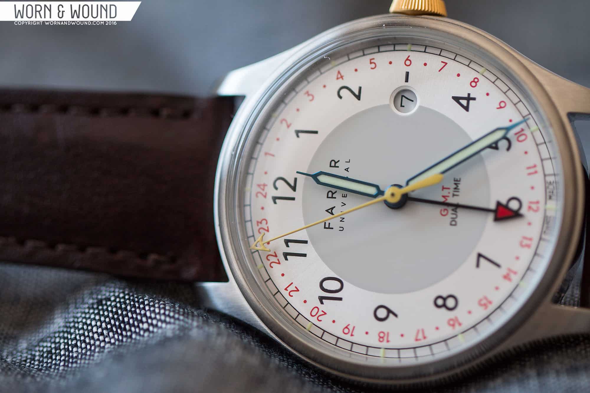
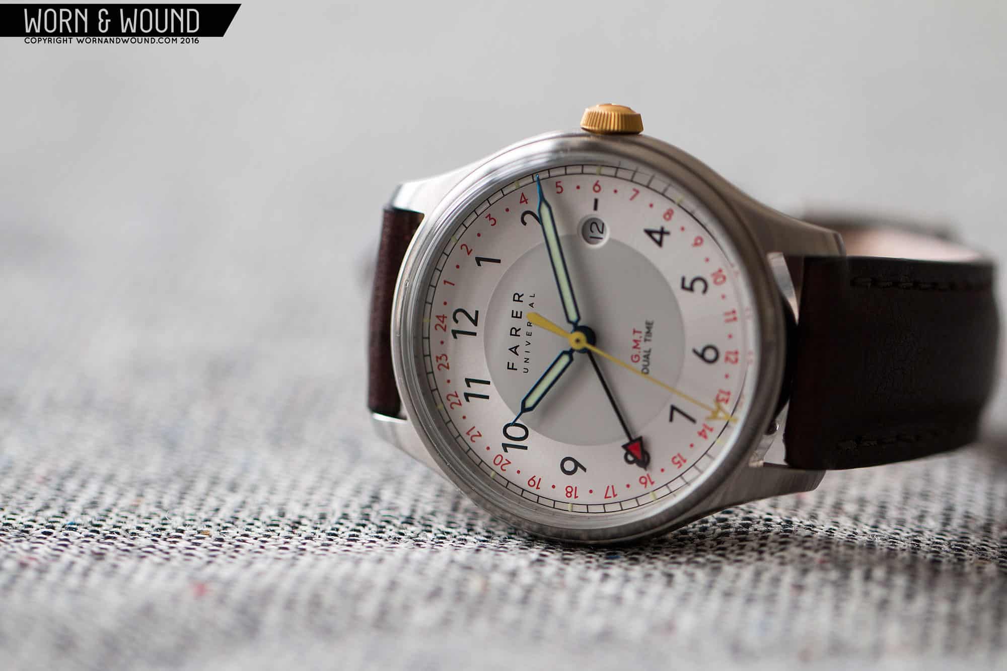
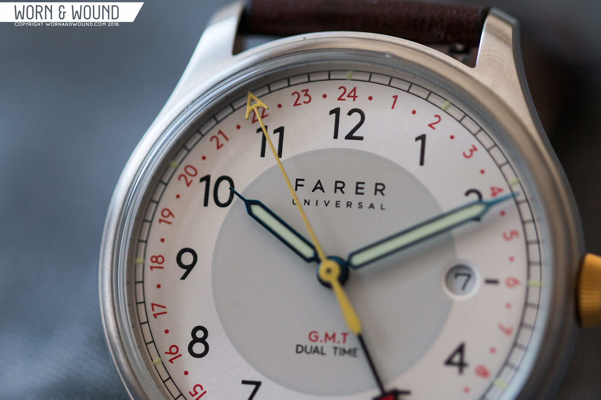
The dial of the Barnato is really where it comes to life, utilizing a mix of colors and textures with good typography. The surface is a light silver sunburst, with a subtle texture. It’s not one of those sunbursts with a very dramatic effect, instead coming across as a sort of satin metallic finish. In an interesting move, the center region of the dial has a large, matte grey circle printed on it. This contrasts the surrounding area, creating a nice play of textures and finishes, though the color itself is similar to the silver, so it doesn’t look like a distracting dot.

FARER_BARNATO_DIAL_12

On the silver surface you then have a series of indexes. The main index consists of large black arabic numerals in a sans-serif typeface. They are very legible and the type is very attractive, a bit more design-focused than what one typically finds. Around the hour index you have a 24hr index for the GMT/Dual time function of the watch, presented in smaller pinkish/red numerals with dots in between. The color is very nice, a bit softer than a true red, making it less in your face, but still very legible. It also brings to mind some vintage classics like the Gallet Decimal Chronograph.

Following the 24hr index, you have a simple railroad index in black for the minutes/seconds on the outer edge of the dial. At intervals of 5, you also have some applied lume, which has a hand painted look in a cool way. It’s a bit tricky to tell, but the dial also curves down here, just a bit. Another vintage inspired detail that adds to the overall character of the watch. The last feature worth calling out is the date window. Placed at 3, it’s a small circular window showing a black on white date. While I’m not 100% certain, it looks like the date is a custom typeface, as it is a bit nicer than standard dates tend to be. The date is well executed overall. They compensated for the location of the date being a bit towards the center of the dial by adding a line on its right side. Simple, but effective, balancing it with the numerals.

For the hour and minute hands of the Barnato, they went with blue steel syringe-type hands with lume filling. They don’t appear to be heat tempered blue, as they are a bit “too” blue for that, but the color looks very good on the dial. The GMT hand is then a black stick with a point tip that is filled in red, clearly linking it to the GMT index. Lastly, there is a yellow seconds hand that is a long stick with a skeletonized Farer “A” logo for a tip. Since they A is an arrow, this works well and doesn’t look like over the top branding. A very cool detail that I love to see is that the seconds and minute hands both bend down towards their tips, following the curve of the dial. They actually curve more than the dial, and are much more noticeable, adding some nice depth.

Straps and Wearbility

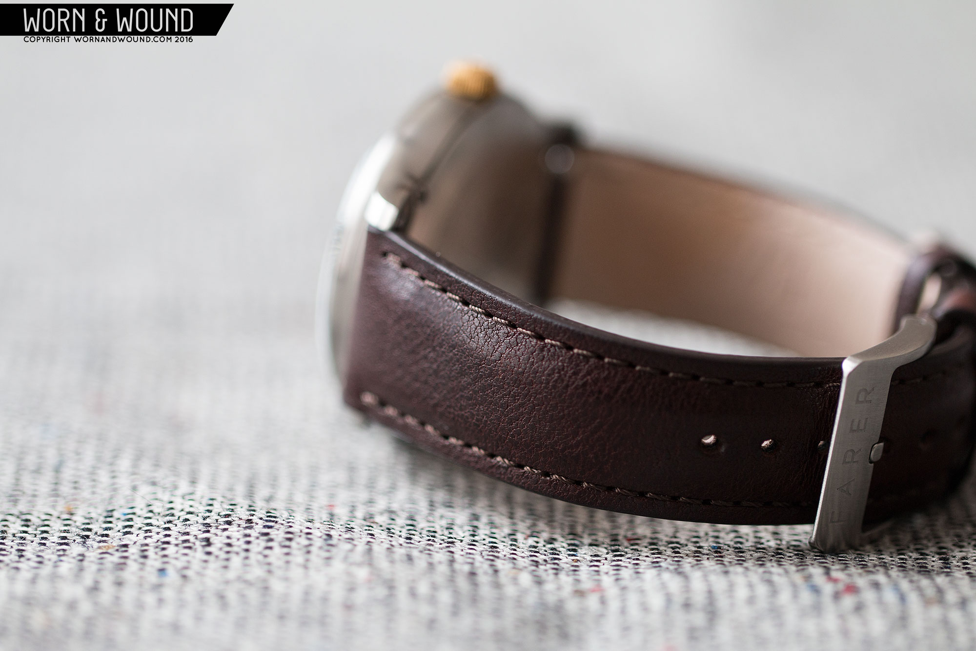
The Barnato comes with your choice of 10 different straps; 9 leather and 1 metal. The leather all cost the same, while the steel milanese adds a little cost. The 9 leathers come in various tones from black to a pale bone, with a nice range of browns in between. The sample came on their chocolate leather, which while a standard combo, does look good against the silver dial. The straps are 20mm, feature a subtle taper, edge stitching, padding, lining and quick release springbars. The quality is solid, what you’d expect on a $400 watch. The buckle is quite nice, and while simple, clearly their own design.

Just for the hell of it, I threw one of our Saffron Suede High Craft – Vintage straps on there too. It looked great, as the burnt red of the saffron picked up the coral red on the dial, while the rough suede contrasted the metallic surface.

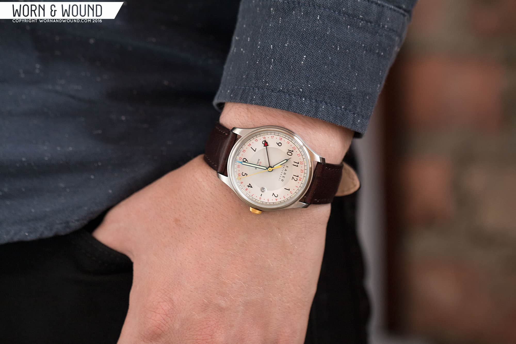
On the wrist, the Barnato really comes to life, and you can see how well the proportions are considered. The case has just the right amount of presence at 39.5 to be a solid day-to-day casual watch, while the 45mm lug to lug keeps it comfortably on top of the wrist. This is true on my 7” wrist, and would be true on smaller wrists as well. And it just looks so good. The subtle use of color gives it a lot of style, while not seeming garish or silly. Meanwhile the smooth flowing case catches the light beautifully and the tall box crystal adds a vintage vibe. It’s a very versatile design too, working great with everyday casual clothes, while looking a bit more fun and daring with more formal attire.

Conclusion

For a new brand, Farer has got a lot right with the Barnato. It’s still very much in the vocabulary of what “watch people” will accept, but looks and feels more fashionable than what most brands produce. Sometimes we get watches in for review, and while I like them, I don’t feel overly compelled to wear them all the time… the Barnato has been on my wrist very regularly since it arrived. It looks good, it’s comfortable and it’s simply fun to wear.

So, as far as design and aesthetic go, they nailed it. Of course, their is a downside and that’s the price for a quartz watch with a mineral crystal. Coming in at around $440, it’s just a bit of hard pill to swallow. At this point, I’m willing to accept a $4-500 quartz watches, when everything else is beyond reproach. Heck, a lot of major Swiss brands (and Shinola) charge a lot more for quartz watches with not even half the style of the Barnato. So, the mineral crystal just feels out of place. With that said, minerals aren’t actually bad, it’s really a perception thing.

FARER_BARNATO_DIAL_7

The other side of it, is how much extra is being added on for the Barnato to be Swiss made? Do we really care about that anymore? Especially on a watch at this price point? For the public at large, the answer is probably “yes, Swiss is good”, but for watch fans, it’s pretty irrelevant around $500 as Asian made watches are certainly as good, sometimes even better. So, had they made it in Asia and the price been $250 – $300, would it have been a less compelling watch? In the end it’s splitting hairs, and the price, while higher than I’d want, isn’t totally offensive, and the watch itself is still gorgeous. The other side of the coin, had it been a mechanical GMT and cost $1200 – 1500 (and had a sapphire) the watch would still be very compelling with all other details being the same.

In the end, it’s still a great watch that I think a lot of people will enjoy, and a fantastic first offering from the brand. A quick look at their website will show you how well considered and polished their branding and presentation are as well. This is definitely a brand that will be doing great things in the years to come.

Advertisement
Images from this post:
Related Reviews
Zach is the Co-Founder and Executive Editor of Worn & Wound. Before diving headfirst into the world of watches, he spent his days as a product and graphic designer. Zach views watches as the perfect synergy of 2D and 3D design: the place where form, function, fashion and mechanical wonderment come together.
wornandwound zsw