When we first mentioned G. Gerlach a couple of years ago it was because it seemed like a neat novelty for a brand to manufacturing watches in Poland. The first watch of theirs we reviewed, the Otago, was cool, but it had a lot of room for improvement. Well, since then we’ve reviewed the awesome automotive Lux-Sport and the stylish vintage-inspired Navigator. Both showed great improvement from the brand and that they weren’t just a novelty. Rather, they quickly established themselves as a serious brand to keep in mind for quality affordable watches. The fact that they make them in Poland, totally bucking industry trends, is just a feather in their cap.
Today we’re going to look at the ORP Orzel 85A, a spiritual follow up to their first watches, the ORP Dzik and the ORP Sokol. The common thread is that they all celebrate WWII-era Polish military submarines. The Orzel also was at the center of what seems like a movie-worthy escape from an Estonian port where they were held under German orders known as the Orzel Incident. The watch is a curious tribute to the era with a distinctly Gerlach approach to WWII-era military watch aesthetic. Featuring a complex dial, stylized case, domed sapphire, a 200m WR and a Seiko NH35A, the Orzel is a solid watch offered at a reasonable price of around $380.
G. Gerlach ORP Orzel 85A Review
 Case: Steel w/ PVD
Movement: Seiko NH35A
Dial: gradient black
Lume: Yes
Lens: Sapphire
Strap: Leather
Water Res.: 200M
Dimensions: 43 x 52 mm
Thickness: 13 mm
Lug Width: 22mm
Crown: 8 x 5 mm
Warranty: yes
Price: ~$380
Case
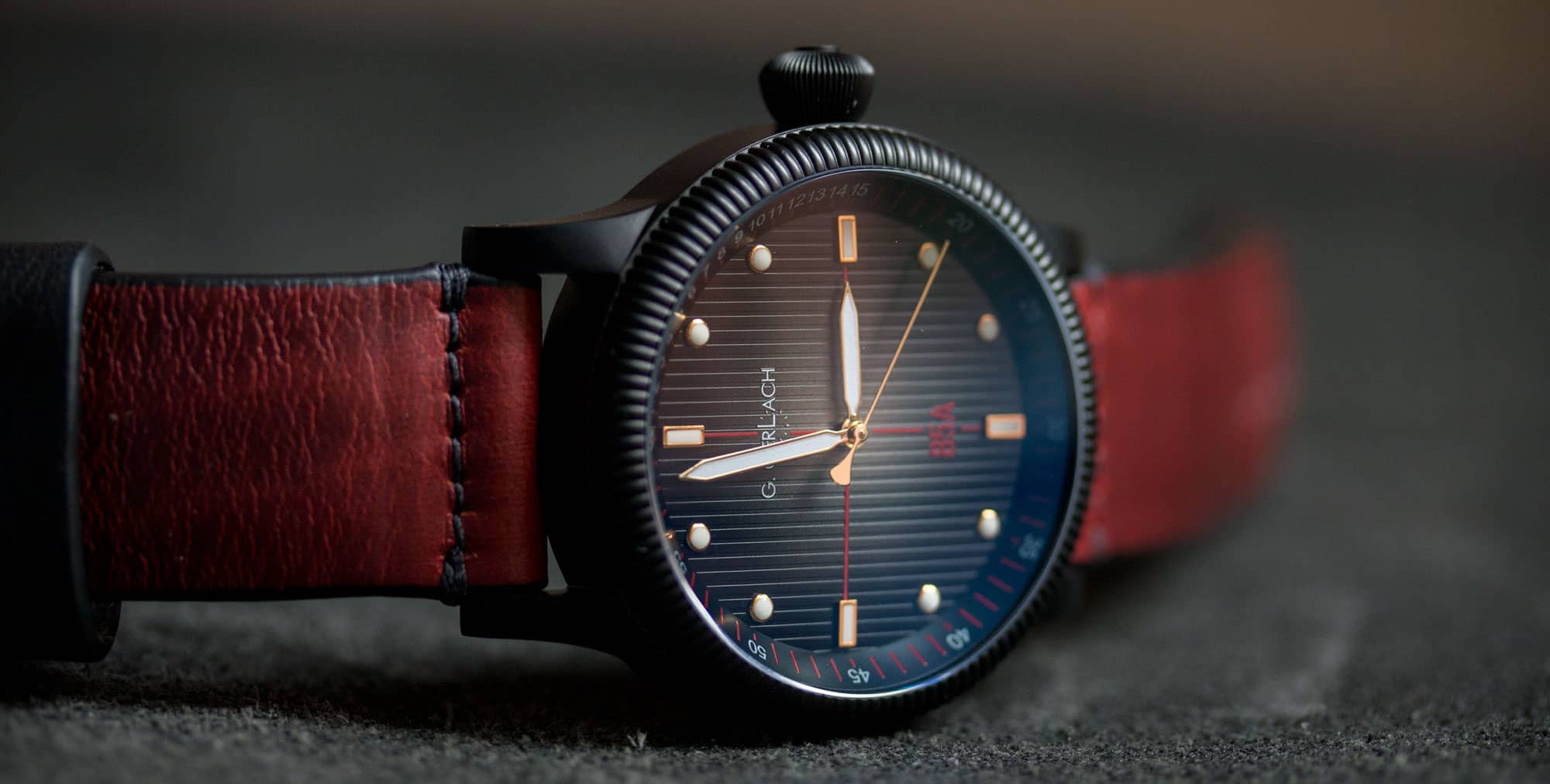
The case design of the Orzel 85A immediately brings to mind WWII era military watches, with its coin-edged bezel and soft, onion crown. Measuring 43 x 52 x 13mm it’s medium/large, but doesn’t look too big do to the proportions, and the optional PVD on the model depicted. Design-wise, it’s ver clean and simple, with slab sides and slightly contouring lugs. From the side, the lugs have more shaping than expected, with nicely curved top surfaces and a gentle angle down toward the wrist. They are also drilled through, which I love to see.
The coin-edge bezel adds a lot of personality to the watch. Without it, the case might have been too plain or simple. It’s also well-executed, with great tolerances where it meets the center case, and a clean flow into the subtly domed sapphire crystal. On the 9 side of the case “ORZEL 85A” is engraved in large letters. It’s fairly subtle with the PVD finish, but noticeable if you stop to look. I think this was a nice touch too, as it breaks up the slab side. On the 3 side is a large 8 x 5 screw-down onion crown. It’s one of the nicest onion crown designs I’ve seen, with flowing, soft lines, very fine grooves and even a hairline logo on the very end. It’s is sizable, so you will feel it against your wrist from time to time.
The case-back is screw-down and PVD coated as well. It features a line etching of various details and a drawing of the Ozel 85A. Unfortunately, it’s so fine and shallow that it’s very difficult to see or read. Perhaps this is because of the PVD, or perhaps it’s just very light, either way it’s disappointing as the art seems cool. I’d love to see them do a more 3-dimensional stamped back on future models.
Dial
The dial of the Orzel 85A is surprising and quite interesting, with many layers that reveal themselves on inspection. It mixes elements of dive and field watches for something that is neither one or the other… Perhaps it’s more of a proto-diver given the WWII influences. Regardless, there is quite a bit going on, mixing color, texture, metal and gradients.
To start, the main surface has a gradient effect that makes it look as though it’s aging from the middle out, revealing a metallic surface beneath. There is a sort of brassy-grey haze in the center that darkens to a warm black by the edge. It’s a cool look, one that I’ve not seen on a watch we’ve reviewed before. It immediately changes the overall feel of the surface, making it seem as though it could be recycled or found material. It does bare some resemblance to the Fume dials found on the Heuer Silverstone and H.Moser & Cie watches, though that’s a pretty loose comparison.
Additionally, the main surface is textured with vertical lines, adding yet another layer of detail. Once again it works, and like the coloration, further pushes that sense of the material being found. The primary index consists of small applied markers with lume fillings and gold-plated edges in classic dive shapes. There are rectangles and 12, 3, 6 and 9, and circles for the rest. The use of gold was smart as it pics up the warmth from the surface beneath, and adds a certain formal element… not dressy, just refined, perhaps suggesting this was a watch for someone of higher rank.
Connecting the 12-6 and 3-9 markers are dark red crosshairs on the dial surface. Another unexpected detail, the use of red is surprising, but works. it doesn’t feel like a red that is meant to draw attention or be sporty, but rather to be more subtle than white, easily ignorable at a glance, and play off of the warm tones. They also balance the relatively small size of the applied markers, which might have left the surface too open. Within the 12-6 line is the G. Gerlach logo in white below 12 and a red “85A” above 6.
On the perimeter of the dial is a tall, angled chapter ring in matte black with a minute/seconds index. It features numerals in white and lines in red, giving the numerals visual dominance. Perhaps as a reference to dive bezels, the first 15 minutes are each marked with a white numeral and a line, where as the rest of the index is in intervals of 5. This is the one detail I think could have been left out. It’s cluttered, especially from 10-15, which pulls the eye to it, though it doesn’t really add to the functionality or aesthetic of the watch.
Gerlach went with a simple, classic military handset for the 85A. The hour and minute hands are both long diamond shapes with lume filling and the second hand is a thin stick with a sort of fan-shaped counter weight. They are all in a light, polished yellow gold, which picks up the gold of the markers and, once again, the warm tones. They complete the look well. The lume on the markers is fairly decent, but the hands could be better, which is the inverse of what we typically see. Oddly, under UV-light (what I use to charge watches for lume shots) the hands glow blue at first, almost as though they have BGW9 lume, but then glow a dull green.
Straps and Wearability
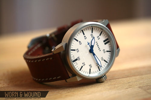
The Orzel 85A typically comes with either a leather (like what we saw on the Navigator) or rubber strap. The model reviewed came on a 22mm 2-piece faux-pass through strap made of olive nylon. To be honest, when the guys over at Gerlach asked which model I wanted to review, I said the “PVD one on the site, with the green strap”, or something to that effect.. not realizing it wasn’t the stock strap. With that said, it’s not a bad look, playing off the obvious military aesthetic. If I were ordering one though, I’d probably go for a brown leather. I also tried it out on one of our Crimson Model 1 straps, which worked really well with both the PVD case and dial coloration, picking up the red in the dial just enough.
On the wrist, the Orzel 85A wears well, though it is a sizable watch. I found on my 7″ wrist that it was at about the max I can wear, especially lug-to-lug. With that said, it wore decently for a large watch. It’s not too tall, so it doesn’t feel clunky, and the PVD helps it look a bit less daunting. The large crown will push against your hand if it’s bent back, but since it has soft curves, it doesn’t hurt as onion crowns occasionally do.
Aesthetically, it’s a very interesting watch. It’s modern in scale, yet sort of vintage in styling, it’s rugged, but has refined elements as well… It’s quite unique. I found the mix worked well and the watch had a nice style of it’s own. I think the PVD worked particularly well with the rest of the palette, toning the watch down overall, but also making it a bit more aggressive. Given the size and style, it’s definitely a casual, everyday watch, and with the 200m WR, one that could be used for active purposes.
Conclusion
To be completely blunt, when I first pulled the Orzel 85A out of the box, it didn’t quite do it for me. There was a lot going on, some strange color and texture combos… it was a bit of an overload, especially as my tastes run towards the minimal. But as I’ve worn it, and had some time to parse the various elements, it’s grown on me a lot. Now I see a harmony in the elements that create an altogether unique take on an early 20th century military watch… Which is exactly what I’ve come to expect from the G. Gerlach brand. Forgetting the whole Polish-made thing for a second, as a watch brand, they’ve really shown how clever they are now with several cool, unique and attractive offerings now.
And, it’s a great value, another hallmark of the Gerlach brand. At around $380, it’s a good value for a well built watch with unique components and design, a sapphire crystal and a Seiko NH35A. The 200m WR is also great to have, as it makes the watch much more versatile and rugged. The only real disappointment was the very faint case back, but that hardly is a reason to pass if the rest does it for you. The blue dial option is also interesting if you’re looking to add some color to your collection.




 Featured Videos





Great watch! And we recommend http://luksusportal.pl/pl/bizuteria-i-zegarki/prezentacje/tourbillon-hublot 🙂
Anyone else having trouble with images not auto-loading on this site? It’s been going on for a month or 2. First they didn’t load through the rss feed. Now even when I click through, they still don’t load.
If I click the individual images, they do load.
I have adblock, but disabled it, and they still don’t auto load.
Tips?
Happens to me all the time too. I think one of their servers must be corrupted.
No, it’s not that… we’re looking into it. It has something to do with a caching plug-in that helps the site load faster
I hope you’re able to get it fixed! I love seeing the pics you post, even if I don’t always love every watch.
Any chance you can just shut that plugin off? Because the site is unusable for me (and it seems, others) as is.
I’ve got that watch but in silver case, is also nice 🙂 Where did you take that red strap from?
Hi Seb,
It’s one of our Model 1 Crimson straps: http://shop.wornandwound.com/collections/straps/products/model-1-horween-crimson
Thank you! 🙂
Until the brand works on being decent with their customer service. Does not matter what products it churns out. Having bought from them and experiencing their pathetic & arrogant service, I can only wish anyone the best of luck in dealing with this brand. Sure, interesting and nice looking pieces but wait till you run into the need for service.
Works great with your Crimson strap, much better than with olive ballistic imo
Yup, that’s a winning combination. The watch is black with dark red accents, the strap is dark red with black accents, and the two look great together.
thanks!
G_GERLACH_ORZEL_85A_WRIST1 <- This is my favorite pic!!!! My style 100%