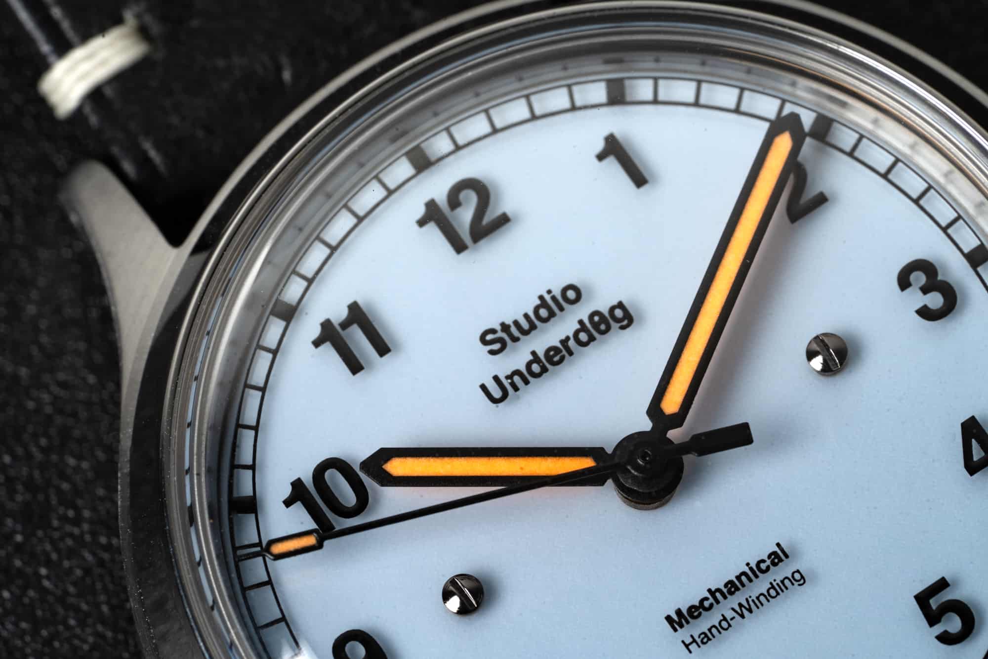
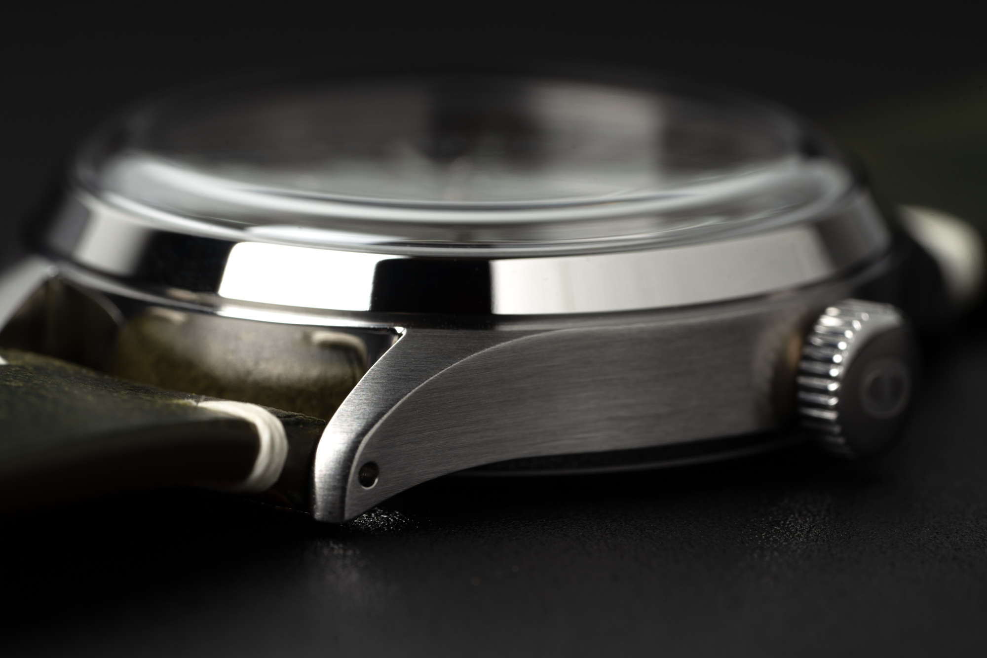
The other reason I like it is because it reinforces the idea that Studio Underd0g, in spite of making a watch that appears more reserved at first than their debut, have upped their watchmaking chops considerably. Because this isn’t just a visually striking dial design, it’s a new manufacturing technique that the brand has employed to achieve a specific artistic vision. Not to take anything away from the intricacy and attention to detail that went into the 01SERIES chronos, but this is a clear step up in terms of degree of difficulty, and those little screws serve as a reminder.
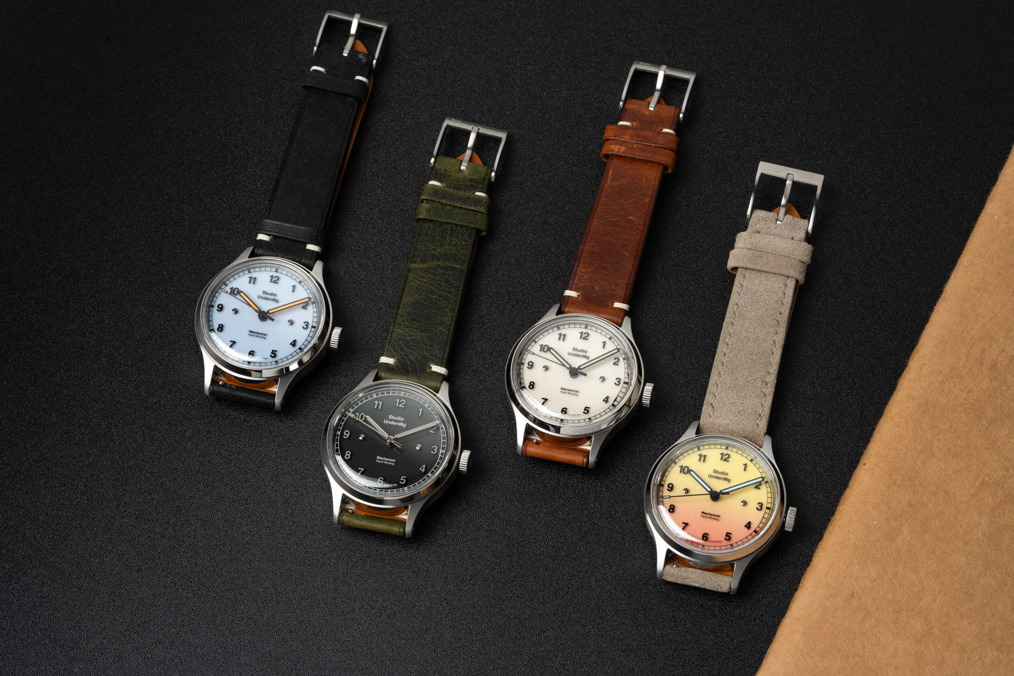
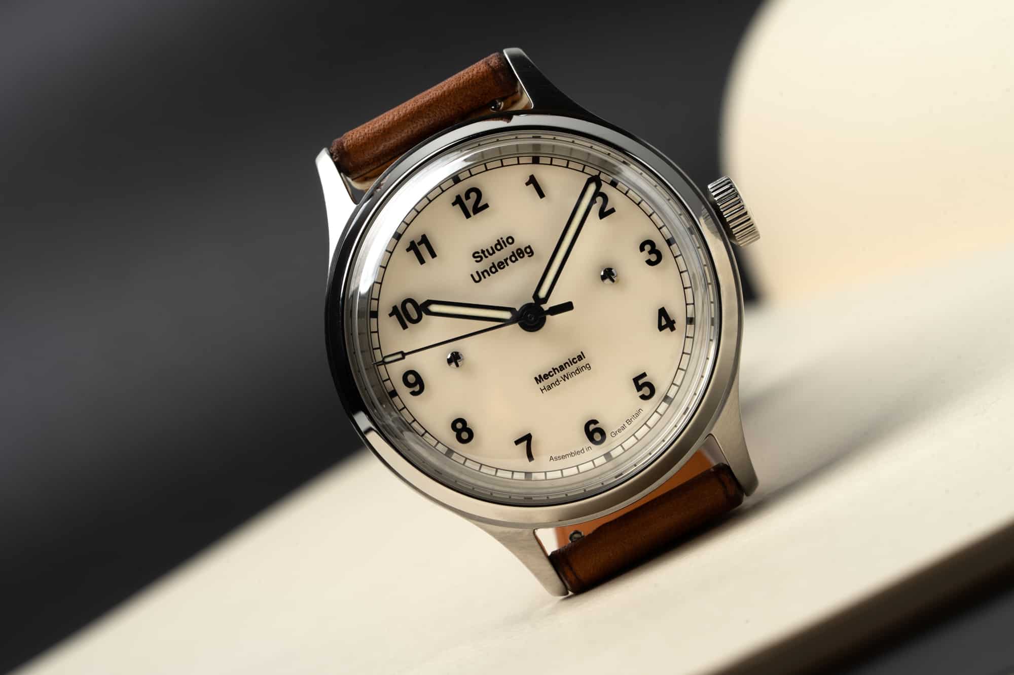
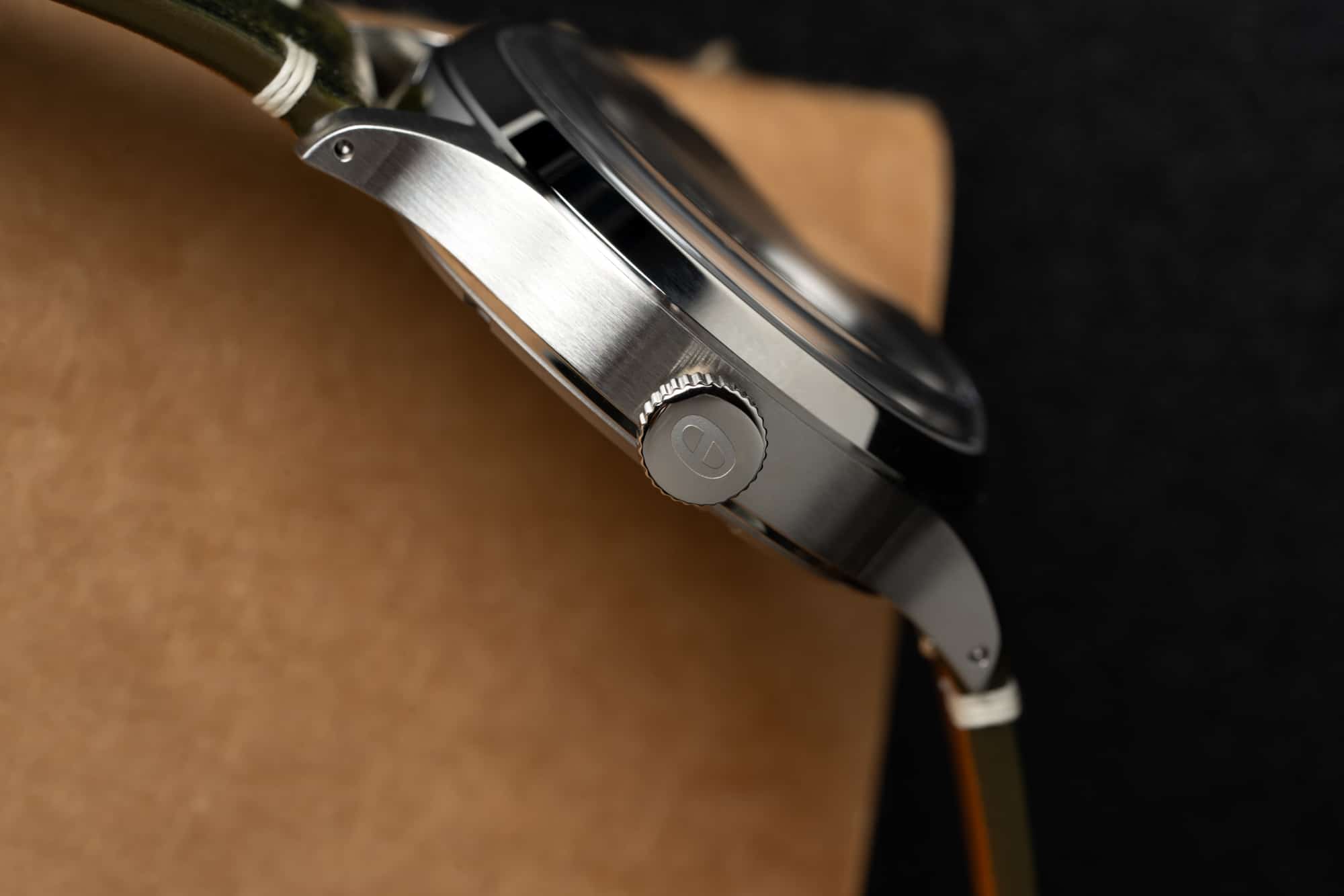
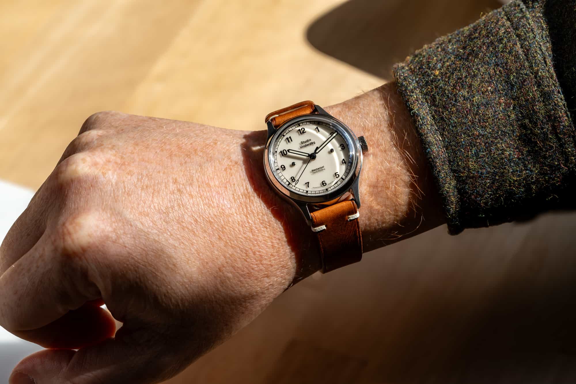
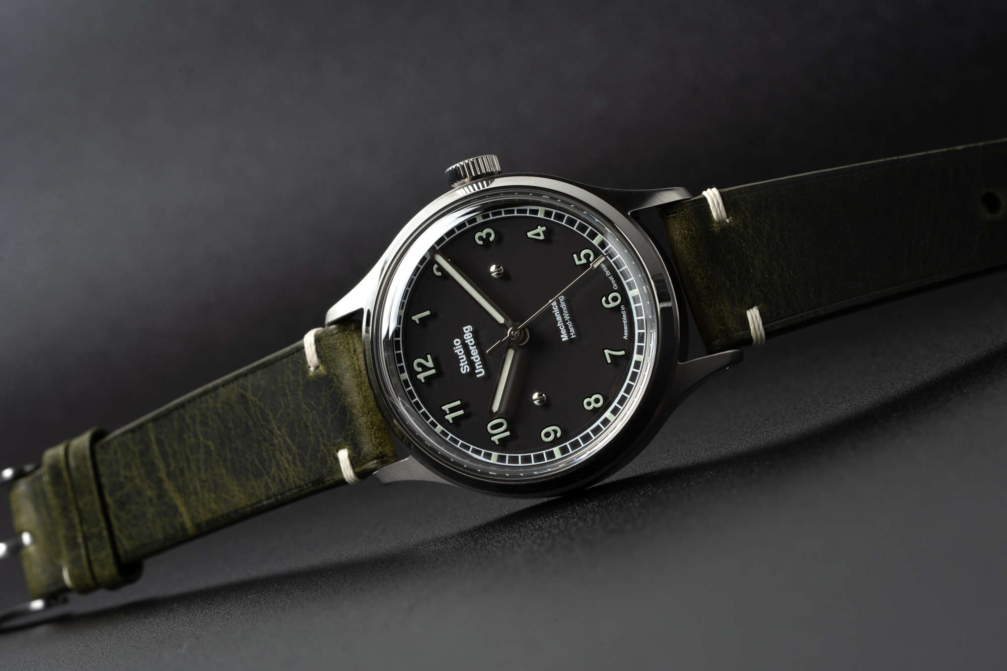
Like the classic field watches the 02SERIES is based on, the case used for these watches is, almost by definition, not really the center of attention. It serves mainly as a vessel for the dials and the ideas contained within them. Measuring 37mm across and 12mm tall, it’s a compact and easy to wear size. I wouldn’t want the case to be some radical creation for this collection – simple definitely makes the most sense – but I do wonder if there’s a sketch somewhere at Studio Underd0g HQ of a more creative case design that they’re just not ready to swing for quite yet. Perhaps an eventual 03SERIES will see the brand shift some of the ingenuity we see here in the dial execution to the case work, but the brand is not quite there, and I think that’s completely fine.

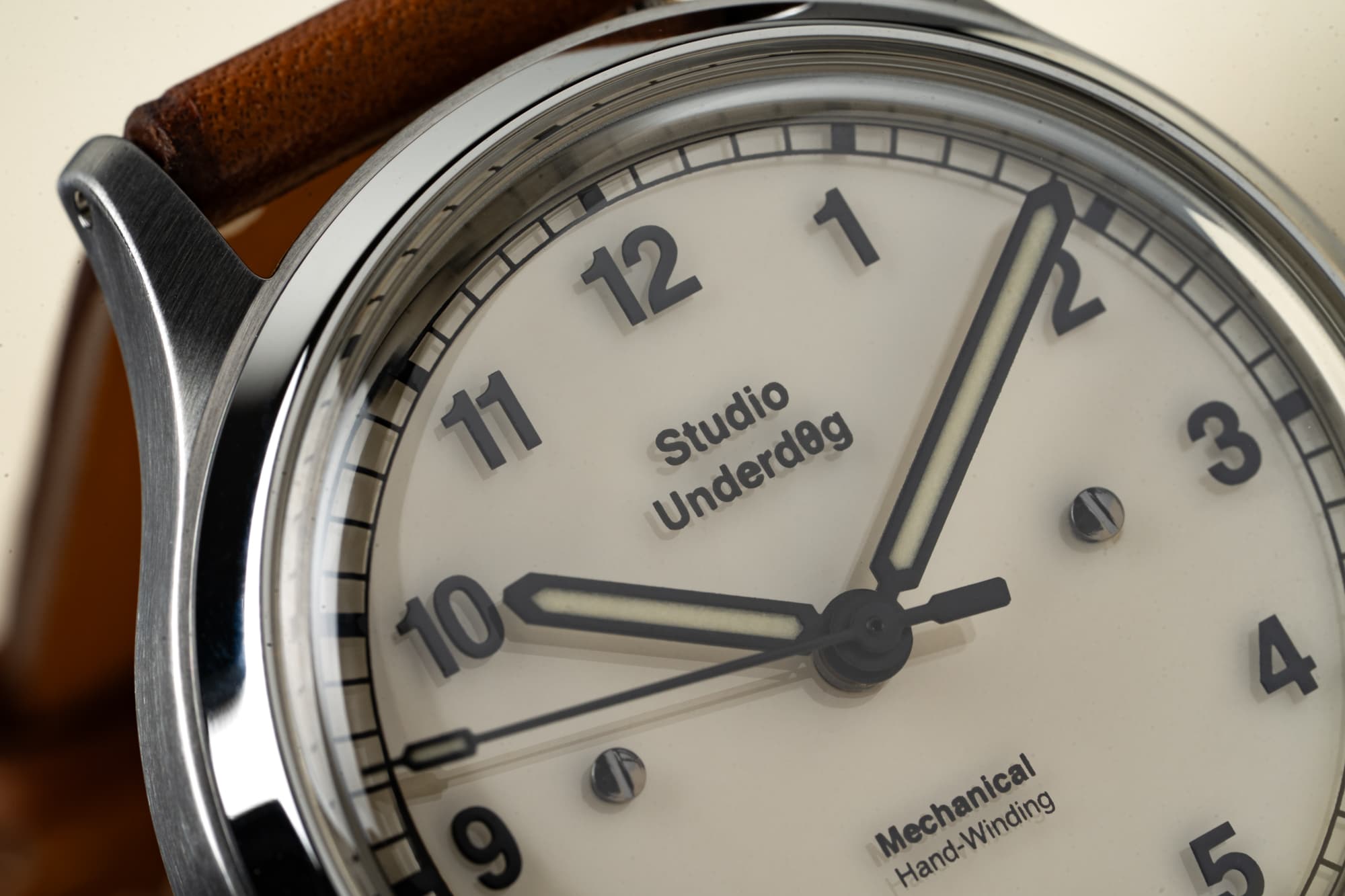
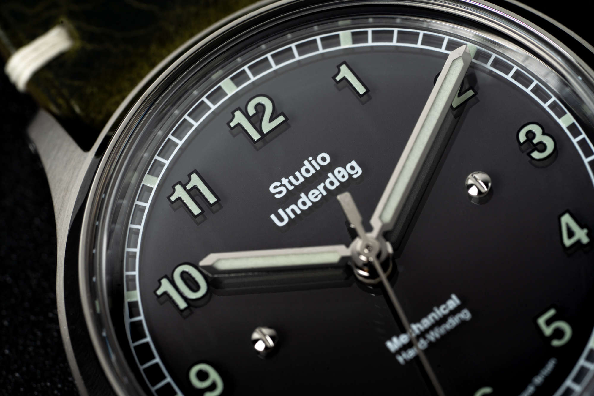
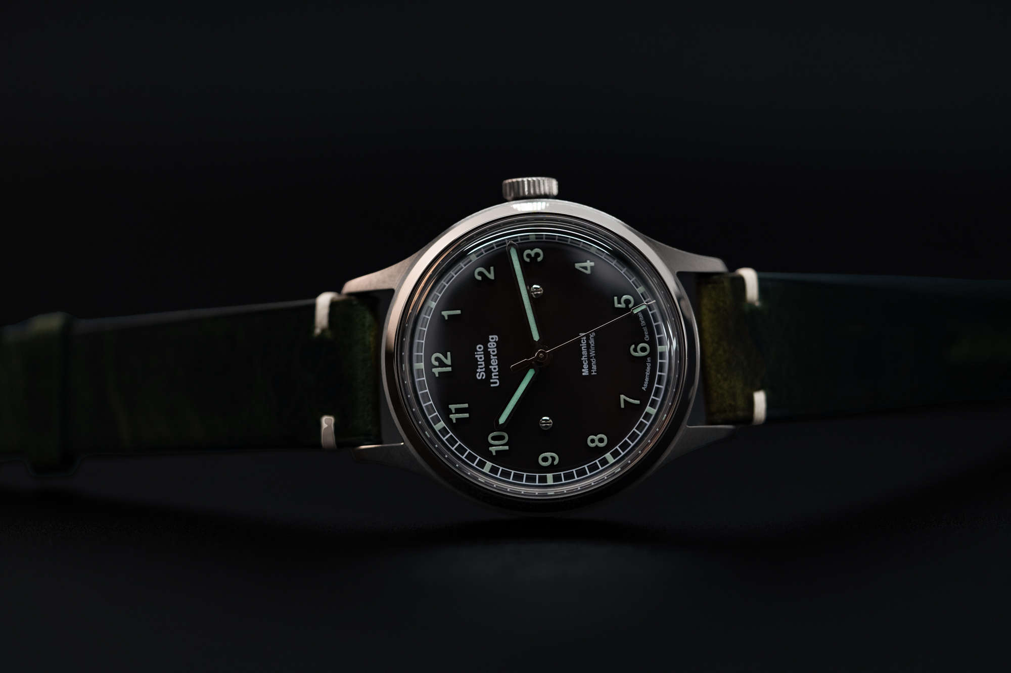
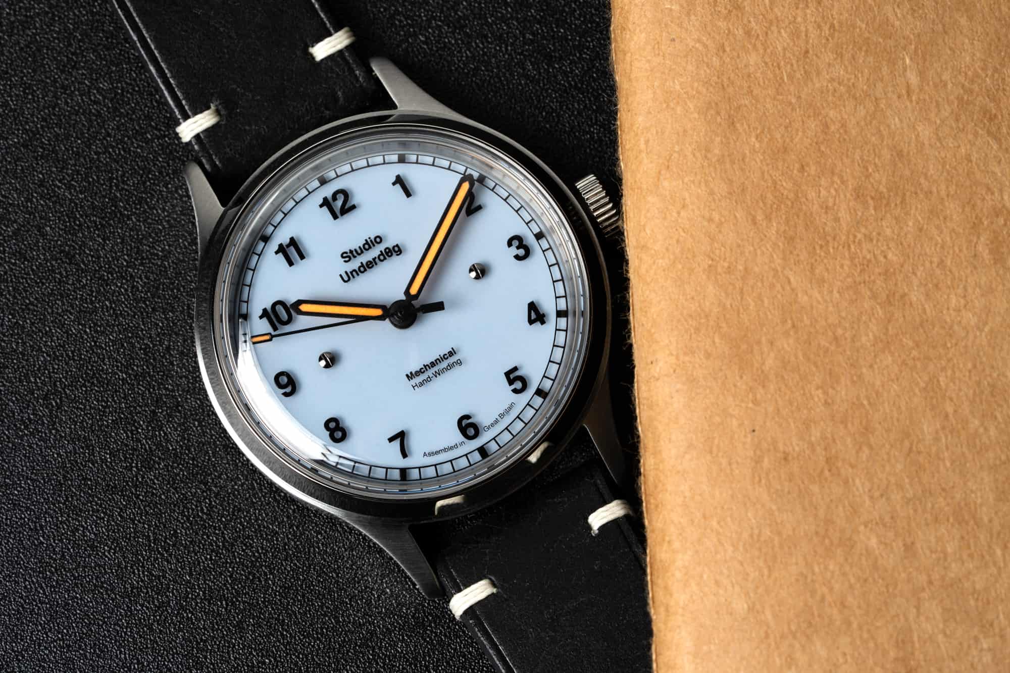
Of course, this is Studio Underd0g, so there’s naturally going to be a focus on dial color. There are a total of four 02SERIES watches at launch, ranging from truly subdued to Watermelon Chrono level colorful. It will be a matter of personal preference when it comes to what you’re drawn to. The most sedate dial, by far, is the Midnight variant, which is the only example to not feature a lumed base layer. Instead, the base is black, and the printed elements on the top sapphire layer are lumed. You lose the “shadow” effect with this watch, but gain some dial clarity. Still, it’s not only the most straightforward of these four watches, but kind of straightforward in general. It’s the only watch that, on that surface level that we’re supposed to look beyond, feels like it could have been made by many other brands.
Then you’ve got Full Mo0n and Steffany Blue, with the former using a cream colored base layer of lume, and the latter a shade of blue that is reminiscent of the incredibly popular shade associated with a major jeweler that has become so collectible these last few years. The Steffany is my personal favorite of the bunch, not just because I happen to like the color, but because it feels like Studio Underd0g founder and designer Richard Benc inserting some subtle commentary into the watch itself through its name. Giving your creations a name that forces an audience to think about them in a larger context is actually a very rock and roll thing to do. Returning to our earlier metaphor, you can look up what “White light, white heat” means easily enough. Suffice it to say, it’s not merely an evocative way to describe the sound of the record.
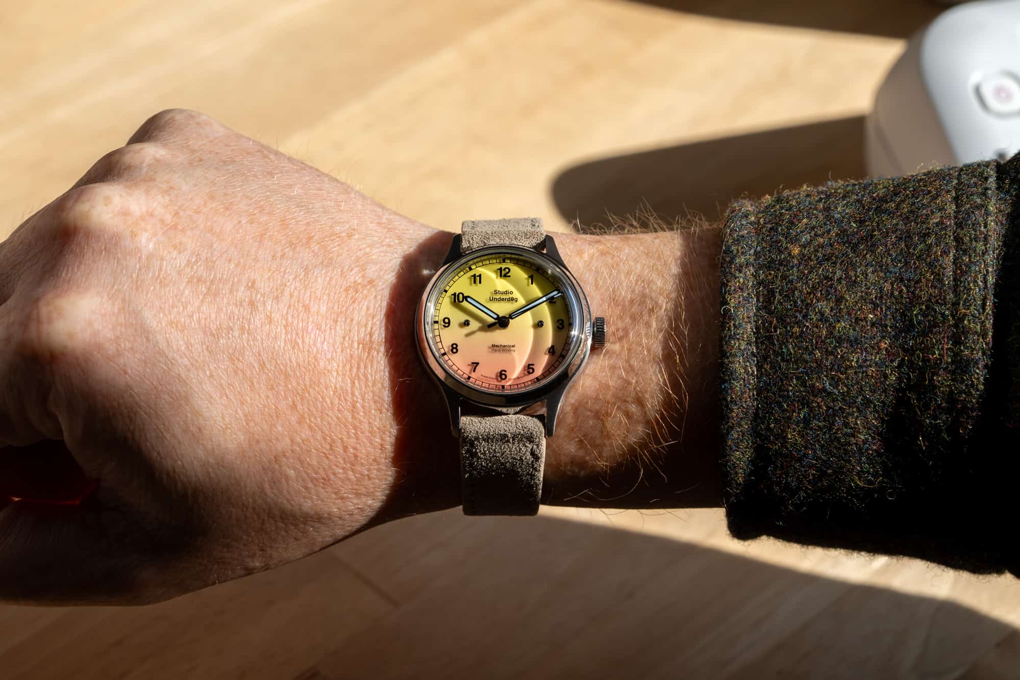
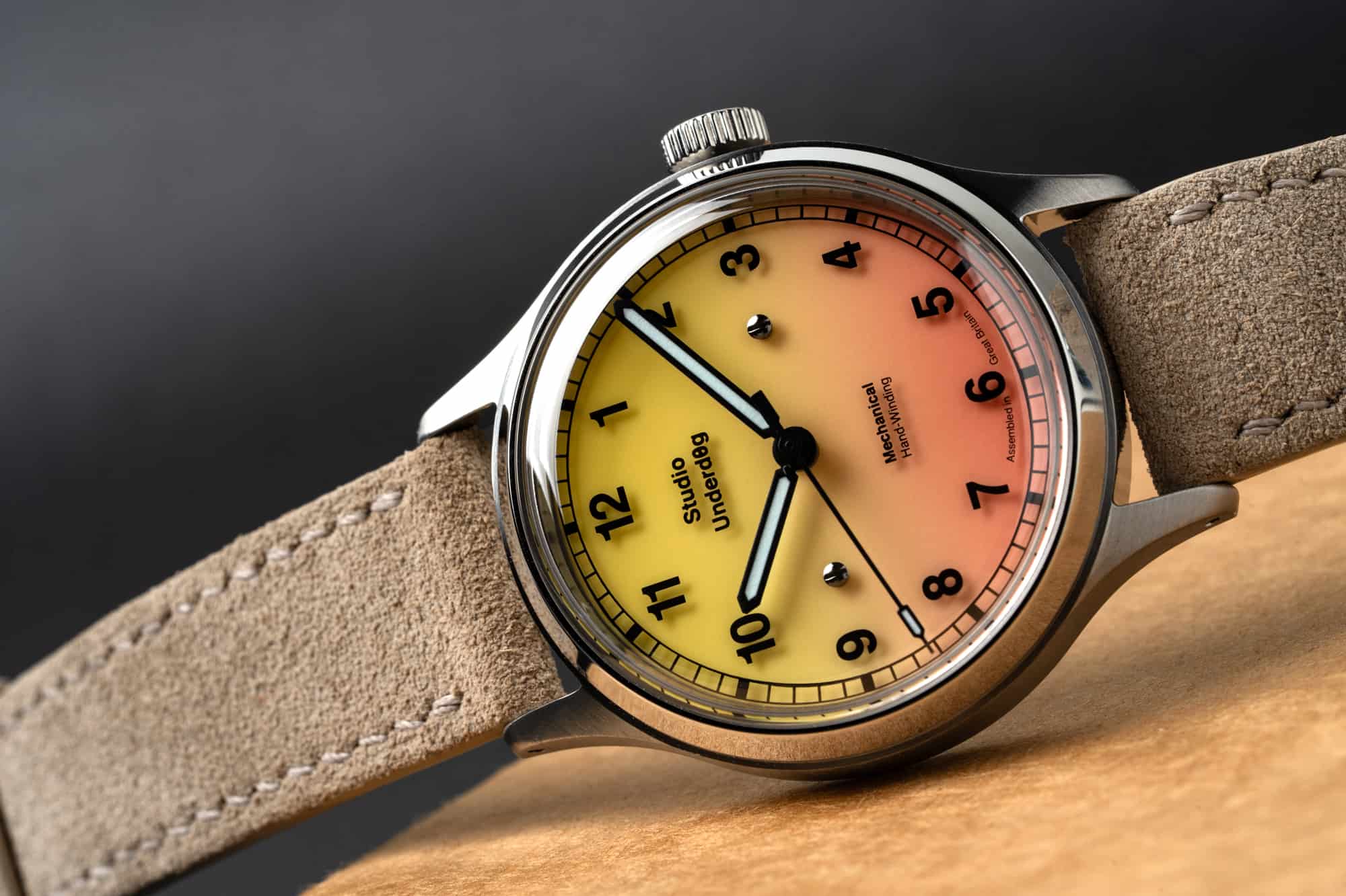
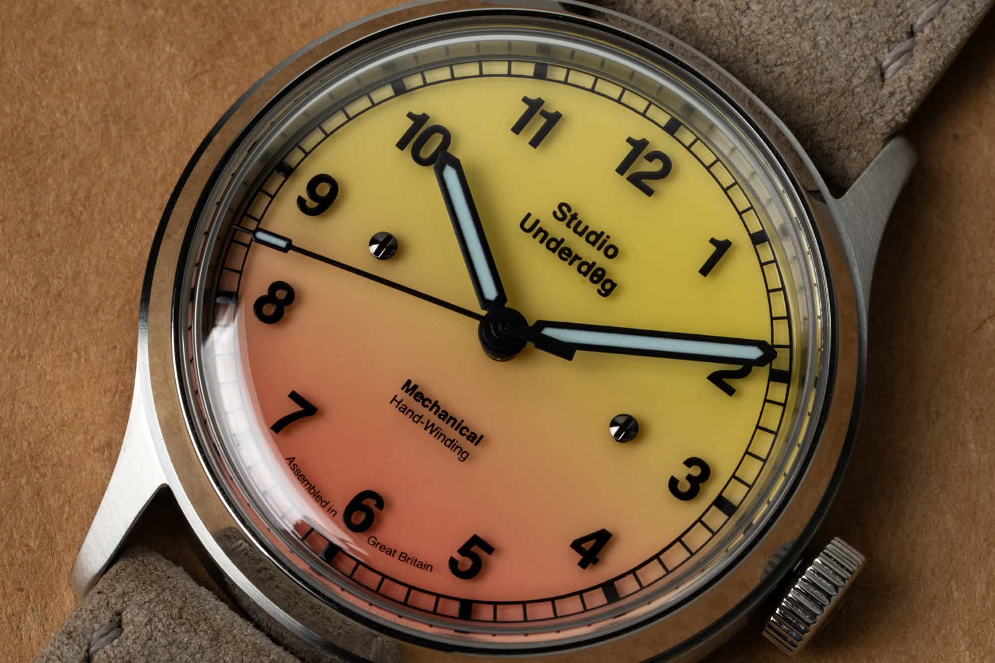
Both of these variants glow an intense shade of blue when the dial is fully charged, lighting the printed numerals from behind. The same is true for what I imagine will be the star attraction of this 02SERIES release, the Pink Lem0nade, with it’s gradient dial that moves from yellow at 12:00 to pink at 6:00. This one is clearly the most reminiscent of the watches that got the brand so much attention initially, and it’s very cool and a lot of fun in person, but part of me thinks it’s almost unnecessary for this collection, which feels so much like it’s all about shifting the brand’s template a little. It’s the lead single of the follow up album that’s a big hit, gets licensed for prime time TV commercials, and gets played on the radio (remember the radio?) but is maybe not the best example of what the rest of the record is all about.
The 02SERIES from Studio Underd0g was easily one of the most anticipated releases of the year in the small, affordable indie space that they occupy, and the reaction among enthusiasts and collectors at Windup in New York City recently appeared to be overwhelmingly positive. That’s heartening to see, because I think it means that the crowd these watches are aimed at already understands what I’ve been getting at in this review, which is that they represent a step forward for the brand that initially appears to be a step to the side, at best. It means that people are already doing the work of peeling back the layers of these watches and finding the rewarding pieces on their own, even before they’ve shipped. That’s a good thing, because there’s also a world where these watches are too easily dismissed, where fans just ask for more fruit themes with bright colors. It seems to me that Studio Underd0g has loftier ambitions than making that type of watch exclusively, and it’s fun to see them move toward those goals incrementally. Studio Underd0g


 Featured Videos


