Hands-On: the Beaufort Pulsatimer

So far 2024 is a year where brands have been belting out bombastic bangers of watches one after another. So, when a different take on a beloved complication is dropped, we naturally crane our necks to peek at what’s new. The first Swiss chronograph in New Zealand based Beaufort’s lineup highlights the old school idea of a doctor/medic’s watch with a pulsometer as the primary complication. It takes this complication and sets it inside a case and dial that are elegant, yet industrial, but some of the changes made to the chronograph functionality caused me to ask some questions. 

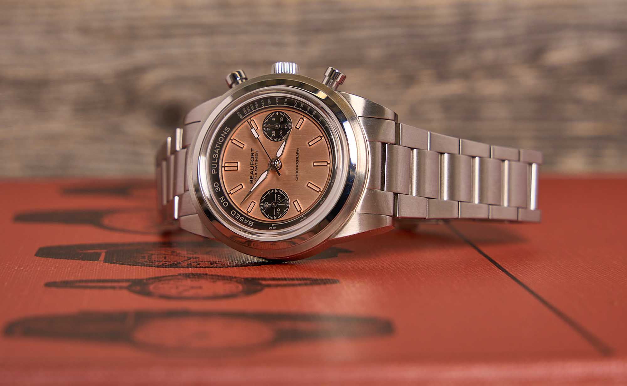
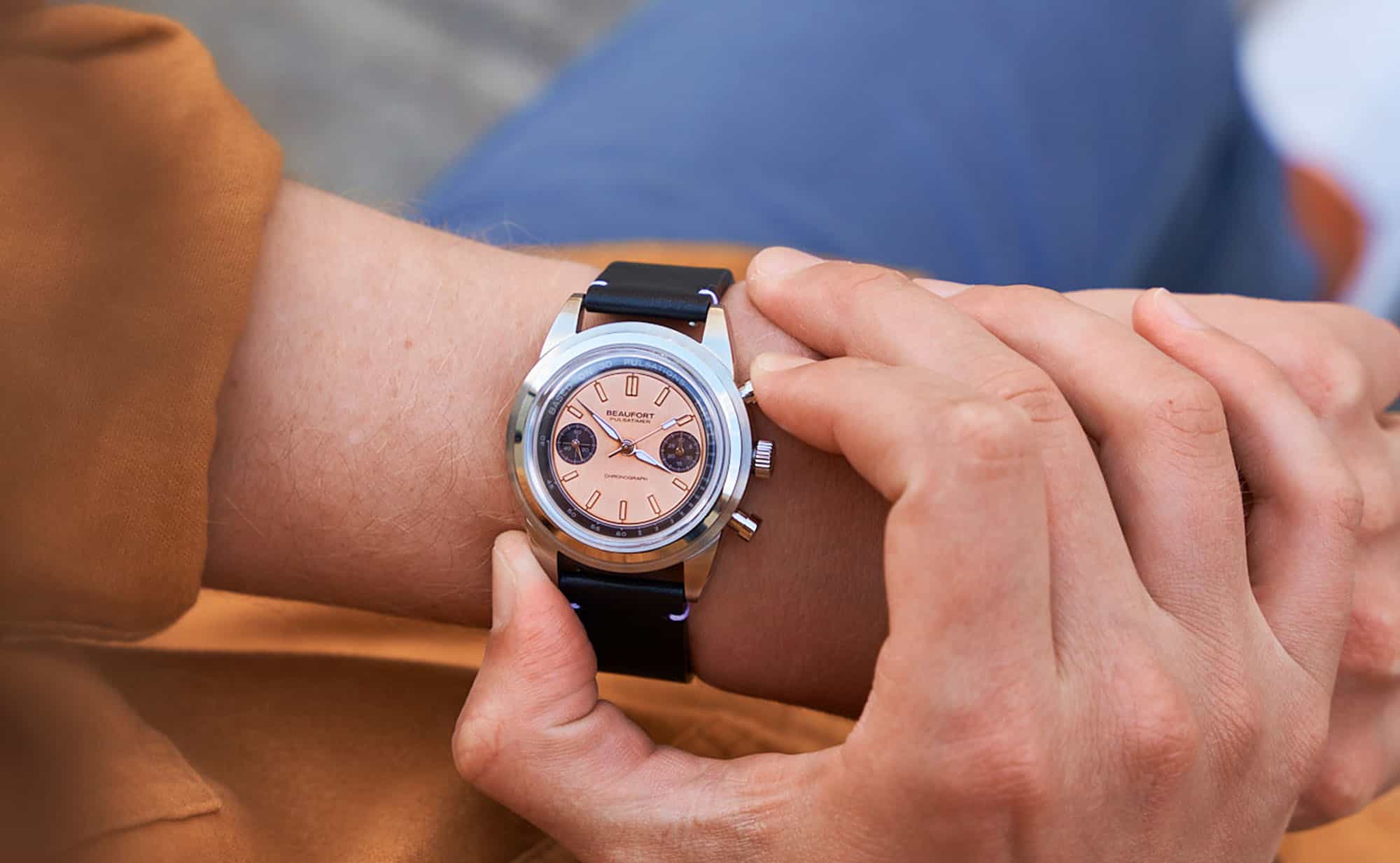
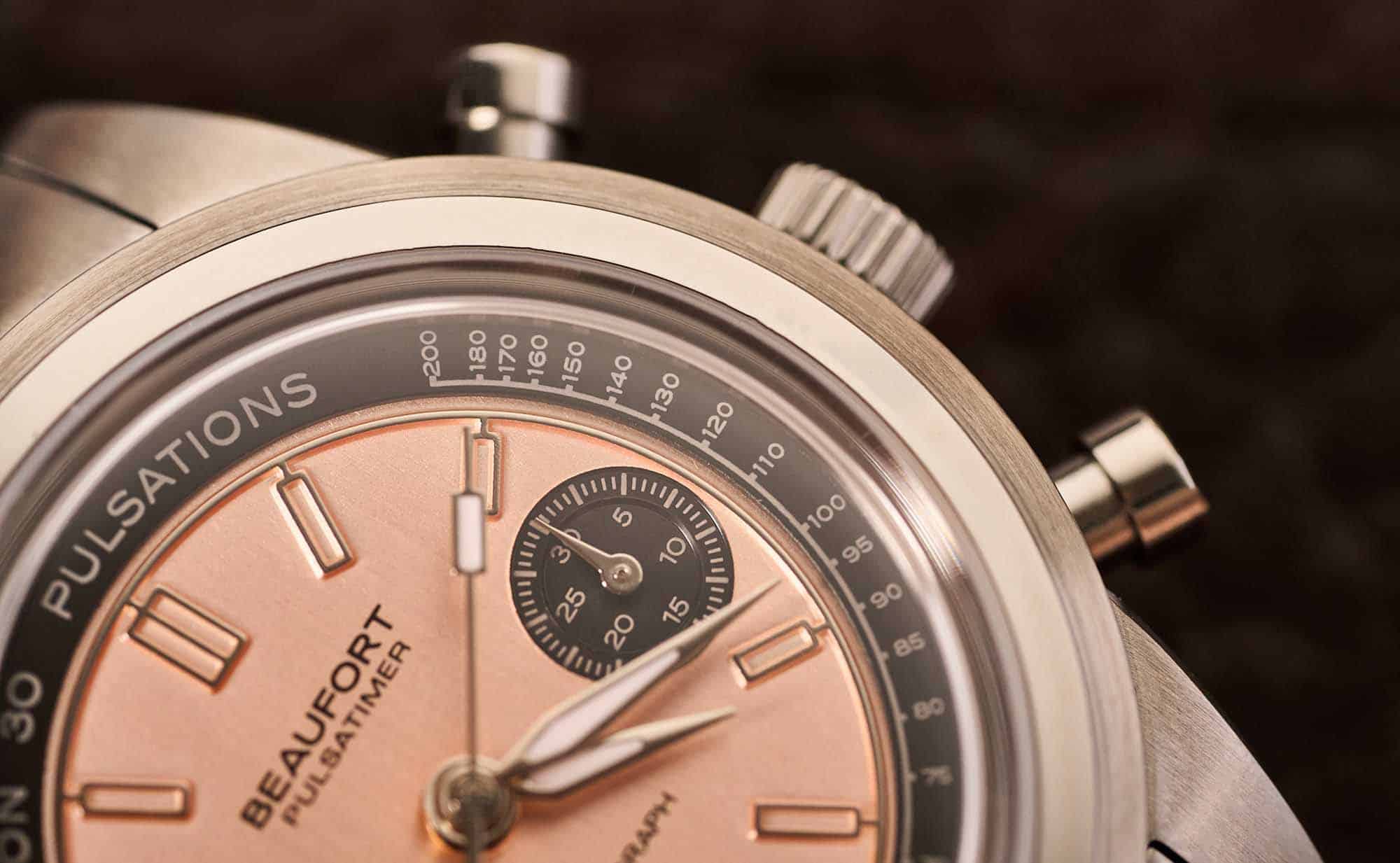
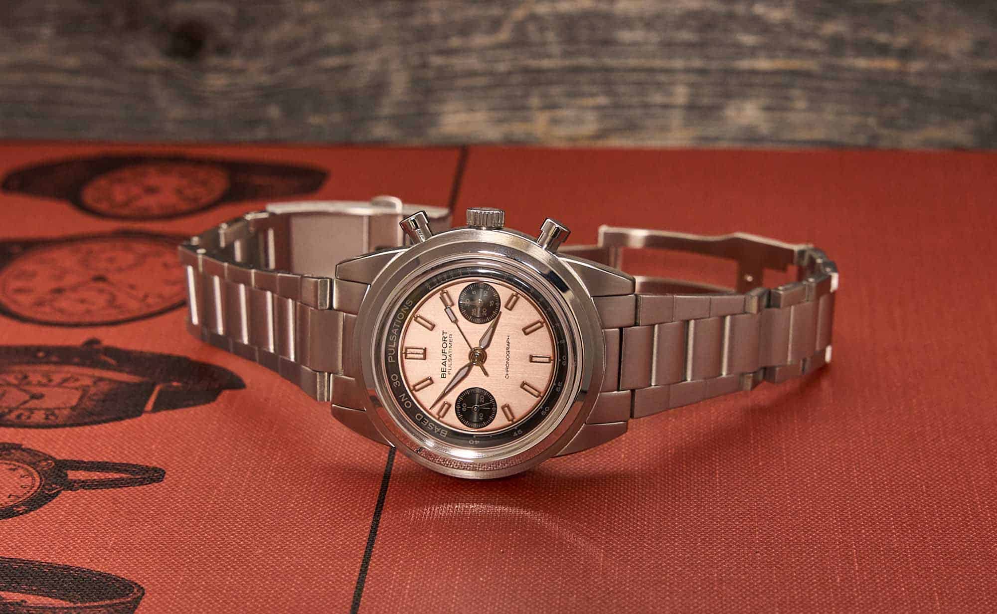
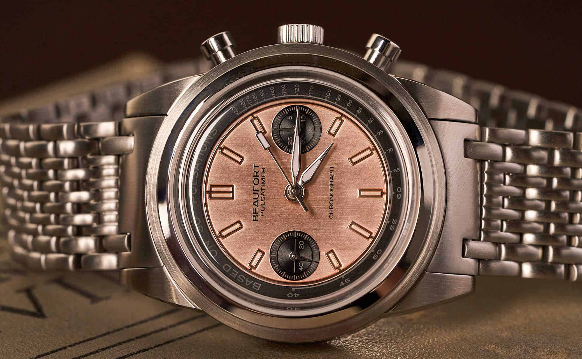
The Beaufort Pulsatimer, upon quick inspection, might look like your average chrono, but the longer you linger over its construction, the more you’ll start to notice its unique styling. The case is almost totally brushed, with the exception of thinly polished chamfered edges and a polished inner bezel ring. The polished ring steps up from a brushed base bezel ring like the watch is laying its own foundation. And rising once more from the step bezel is a significantly raised box sapphire crystal. All this architecture pulls your eye into a dial that dramatically drops from the crystal with the sloped pulsometer chapter ring. Then we find a beautiful, vertically brushed copper-colored dial that Beaufort calls “Salmon.” They also have an all black, DLC coated version, a reverse panda black and silver dial, and an all silver dial version of the Pulsatimer. The architectural nuances of the case, mixed with the industrial design of the dial itself is eye-catching, and makes for a pleasing overall package.

Advertisement
$1501

Hands-On: the Beaufort Pulsatimer

Case
Stainless steel
Movement
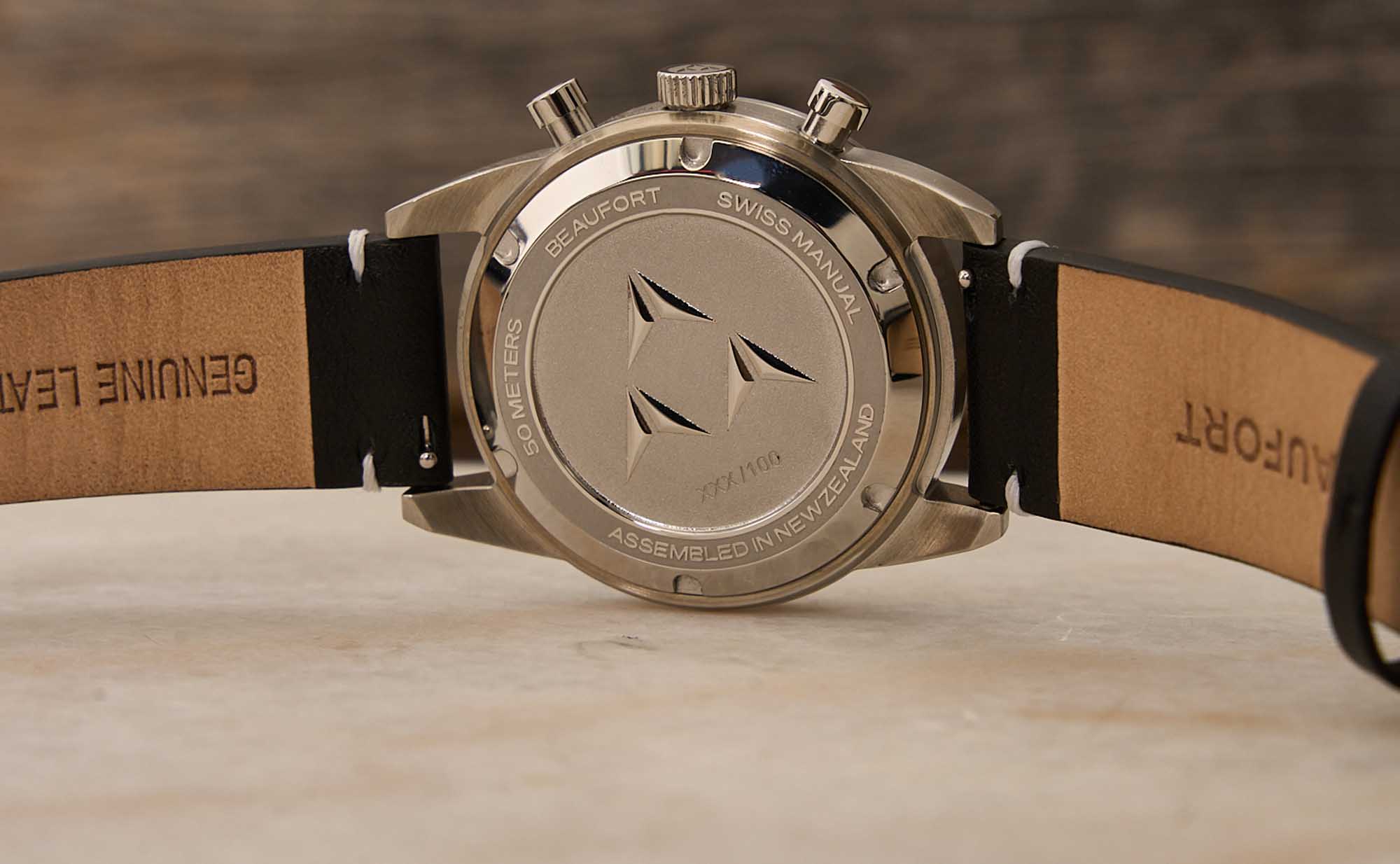
Sellita SW510M BH b
Dial
Salmon
Lume
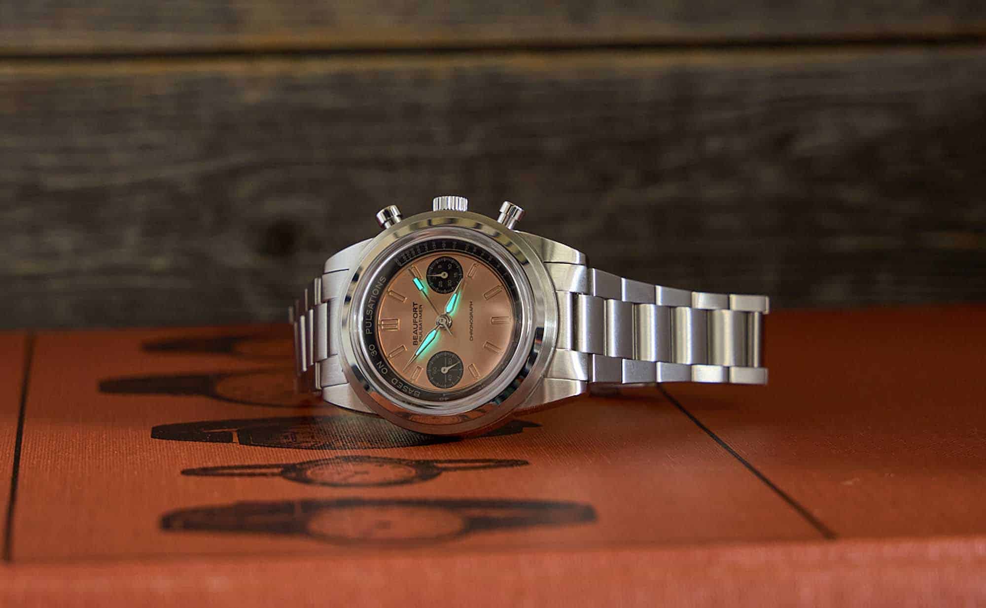
C1 Super-Luminova applied to the hands
Lens
Sapphire
Strap
Stainless steel bracelet/leather strap
Water Resistance
50 meters
Dimensions
39 x 47mm
Thickness
13.8mm
Lug Width
20mm
Crown
Push/pull
Warranty
Yes
Price
$1501

Upon closer inspection of the dial you will find some significant departures from most chronographs. The dial itself appears much smaller than most dials inside a 39mm case, as the architecture of the bezel takes up a few more millimeters of real estate than usual. The indices around the dial are interconnected, in that they are all attached to one another by a continuous polished line circumnavigating the entirety of the dial. Each index is a rectangular block that shoots out and comes back with the same running line. It’s definitely the most intriguing aspect of the dial design, and it’s quite mesmerizing to follow that polished ring, especially as it shimmers in the light against the brushed backdrop. 

Yet it is this design aspect that leads to two decisions that many might find unusual on a chronograph. 

First, there are no minute markers aside from the indices dedicated to the five minute intervals. Some might find this to be frustrating as it means that you won’t be able to accurately gauge exactly what second the chronograph hand is on when you stop it. At first this decision confused me. I even glanced at the markers on the pulsometer to see if I was missing something. But they were simply not there. I suspected the decision was made to make the dial clean and cohesive, which is certainly not unprecedented. Take Zenith and their Chronomaster Revival Shadow, which also omits the minute track, while other colorways in the Chronomaster Revival lineup do not. 

Secondly, and perhaps more noteworthy, is the matter of the 3 o’clock sub-register. This is the chronograph’s 30 minute counter, and it has 10 dial markers for every five minutes. This means that the sub-register hand jumps two markers for each passing minute. I activated the chronograph and watched as the chronograph seconds went around a few times and paid attention to what the hand in the 30 minute counter did. At the end of five minutes it correctly landed on the five, and after 10 minutes, the 10. But after one minute, the sub-register hand was on the second marker. After two minutes, it was on the fourth, and so on. I found myself confused at times regarding how many minutes have gone by without taking a few seconds to count.  

These two decisions combined make it difficult to use the chronograph as an accurate timer, as at a glance it’s difficult to tell how many minutes went by, and because there are no minute markers on the outer track, it’s near impossible to tell exactly what second you’ve stopped the chronograph hand at. 

I reached out to Beaufort to inquire about these stylistic decisions, and their director, Robert Kwok, was kind enough to explain his designs. Regarding the omitted minute markers, he told me that since the main use of the watch is the pulsations scale (on the chapter ring), the minute markers themselves would not be needed for this, and their inclusion would have disrupted the dial proportions and overall aesthetic. I agree with Robert that adding minute markers to that lovely polished ring connecting all the five-minute indices would have ruined the entire vibe of the dial. Which then caused me to question, was this the right design choice for this type of watch? I like using the chronograph function on my watches to time things. Even though I’m never timing anything important, I like the fact that I have a watch that can do it accurately if I wanted it to. 

Regarding the 3 o’clock sub-register, Robert told me that the 10 markers per five minute decision was also aesthetic in nature and to help break up the passing five minutes into halves, “as many of us tend to think in terms of we’re ‘halfway there’, this would allow the user to check that at a glance instead of counting the individual markers.” While I understood the design decision of omitting the outer minute markers, this aesthetic decision was not one I could wrap my head around. There are plenty of watches, single-handed watches like those made by Meistersigner or the Vario NAVI released earlier this year, where evaluating the time with less precision might be acceptable. But the Pulsatimer, in its very name, presents itself as a precision instrument, and wanting an accurate reading of the number of minutes that have passed at a glance seems like a small ask for a chronograph. Still, it’s important to keep in mind the single-minded nature of this watch’s conceit, and I have to give it credit where due: it functions well in its intended purpose. 

It is evident that Beaufort intended for the chronograph complication to be used solely for the reading of a pulse, and if using it to time anything else, you’d have to make do with a more vague reading. I just can’t help but wish I could do both. There are certainly watches with similarly specialized chronograph functionality that also function flawlessly to time things more generally. For instance, I own a Brew Retrograph, which has added markers from 0-35 seconds as the watch was meant to time the perfect espresso shot pull (between 25 and 35 seconds). Yet the Retrograph still has pronounced minute markers all the way around, in case you wanted to use the chronograph function for something beyond timing your espresso shots. It would be nice if the same choice was there on the Pulsatimer.

I want to add that this watch had me checking the heart rate of a few friends and family members. Harvard Health Publishing has an easy-to-use little article on how to do this. And once you get the hang of it, you can use the Pulsatimer to more accurately calculate the beats per minute of your loved ones. I’m no doctor, but I think a couple of my friends may need to go see one based on my findings. Pro Tip: Do not stand outside a CVS and ask strangers if you can check their heart rates. It’s frowned upon, and they will threaten to call the cops.

Beaufort has a lineup of uniquely positioned watches. They seem to take popular watch styles and add their own flair to them in style, color, and functionality. The Pulsatimer is definitely an eye-catcher that boasts a bold design, but it also begs the question: does unique design go too far when it sacrifices functionality? 

For me, that answer is “yes.” I recognize that all watches are luxuries, and will admit that I don’t often use my own watches for their intended purposes beyond telling time. I don’t go diving with my dive watches. And I certainly don’t time anything of note with my chronographs. I’ve even gone on record in saying that I value unique design above all. And while I appreciate the beautiful design elements of this watch, especially the dial motif and layout of the indices, I just wish it was on another watch. A time only dress watch or sports watch would’ve blended so well with the design. I can’t help but think about how easy it would’ve been to add more functionality to this watch as a chronograph. Beaufort 

Images from this post:
Related Reviews
Chris Antzoulis is a published poet and comic book writer who over-romanticizes watches. Ever since his mom walked him through a department store at the budding age of six and he spotted that black quartz watch with a hologram of Darth Vader’s face on the crystal, he knew he was lost to the dark side of horology. He is currently eye-balling the next watch contenders now caught in his tractor beam.
@PoppingCrowns
Categories:
Tags: