Hands-on with the Atowak Ettore Drift – an Affordable Wandering Hour Watch

I’ll start this review with a perhaps pretentious admission – if you send me an email with “the Bugatti of luxury” in the subject line, I probably won’t open it (or anything about redefining luxury, for that matter). Call me arrogant or a snob, but after doing this for 10 years, my “red flag filter” starts with the very subject line of an email. Too grandiose or pompous, and I’m likely to glaze over it. Well, on some fate-filled day a few months ago, my eyes caught on an email with that very phrase in the subject, and I opened it up. What I was met with was, well, surprising.

While I wouldn’t call the Atowak Ettore Drift the watch of my dreams, I was very excited to see it. An oddly shaped “supercar-inspired” timepiece, at first blush it was at least quite different. But what made it interesting, and frankly worth getting in for review, was that it featured a wandering hour complication – built on a Miyota 9015, with a pre-launch price of $550 (on a now ended Kickstarter campaign) and a retail of $1,199.

The wandering hour is a complication I’ve always personally admired. Like a jump hour in motion, it’s digital-analog, though completely mechanical, leading to a totally different experience of reading the time on a watch. As an alternative to the standard three-hander, you can’t go much further while still mechanical, easily earning a spot in one’s collection. But, they typically cost a not-so-small fortune.
Advertisement
$1199

Hands-on with the Atowak Ettore Drift – an Affordable Wandering Hour Watch

Case
PVD Steel
Movement
Mioyta 9015 w/ Wandering Hour
Dial
Black, Layered
Lume
Yes
Lens
Sapphire
Strap
Leather
Water Resistance
30m
Dimensions
47 x 41mm
Thickness
13.5mm
Lug Width
22mm
Crown
Push-pull
Warranty
Yes
Price
$1199

These days when people think of wandering hour watches, they think of Urwerk. The brand’s mechanical marvels tend to feature the complication as the core method for indicating the time, yet the ways in which they go about creating it tend to be exceptionally complicated, building to the mystique of the watches. Though associated with Urwerk, it’s actually a complication that has been around for a long time – a few hundreds of years in fact, supposedly dating to the 17th century. That said, the first wristwatch that allegedly used the complication was the Audemars Piguet Star Wheel, launched in 1991.

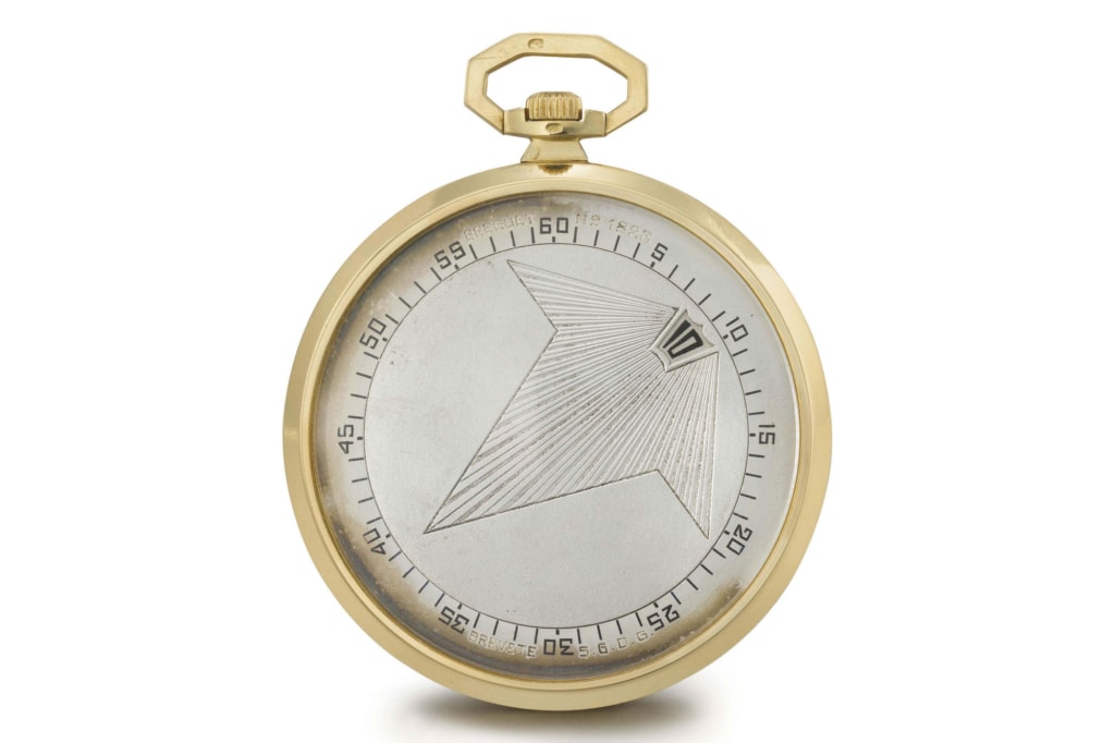
My personal favorite execution of the wandering hour, however, can be found in Breguet pocket watches from the 1920’s. Image Courtesy of Christie’s

In recent years, we have seen a push downmarket for watches with said complication, most notably by Gorilla watches and their “drift” line (hmmm, two drifts?..), which featured Vaucher-made movements, designs that mix materials to evoke haute-horology and price tags around $4k. Not inexpensive, but a far cry from the five-figure to six-figure tags often associated with brands like Urwerk and Moser. Now, there is a new breed popping up built off of Miyota movements that represent a new level of accessibility.

The Atowak is clearly one of this group, but first credit where credit is due. Grupo Gamma has a very steampunk-esque execution with their Nexus, which features a single wandering hour satellite, visible through a large hand that then indicates the minutes. Powered by a Miyota 8215, it has a reasonable price tag of $800. And then there is the Xeric Vendetta, which uses a three satellite version of the wandering hour, built on the Miyota 90S5 (date-free 9015). Priced from $1,250 – $1,500, it’s still a solid deal.

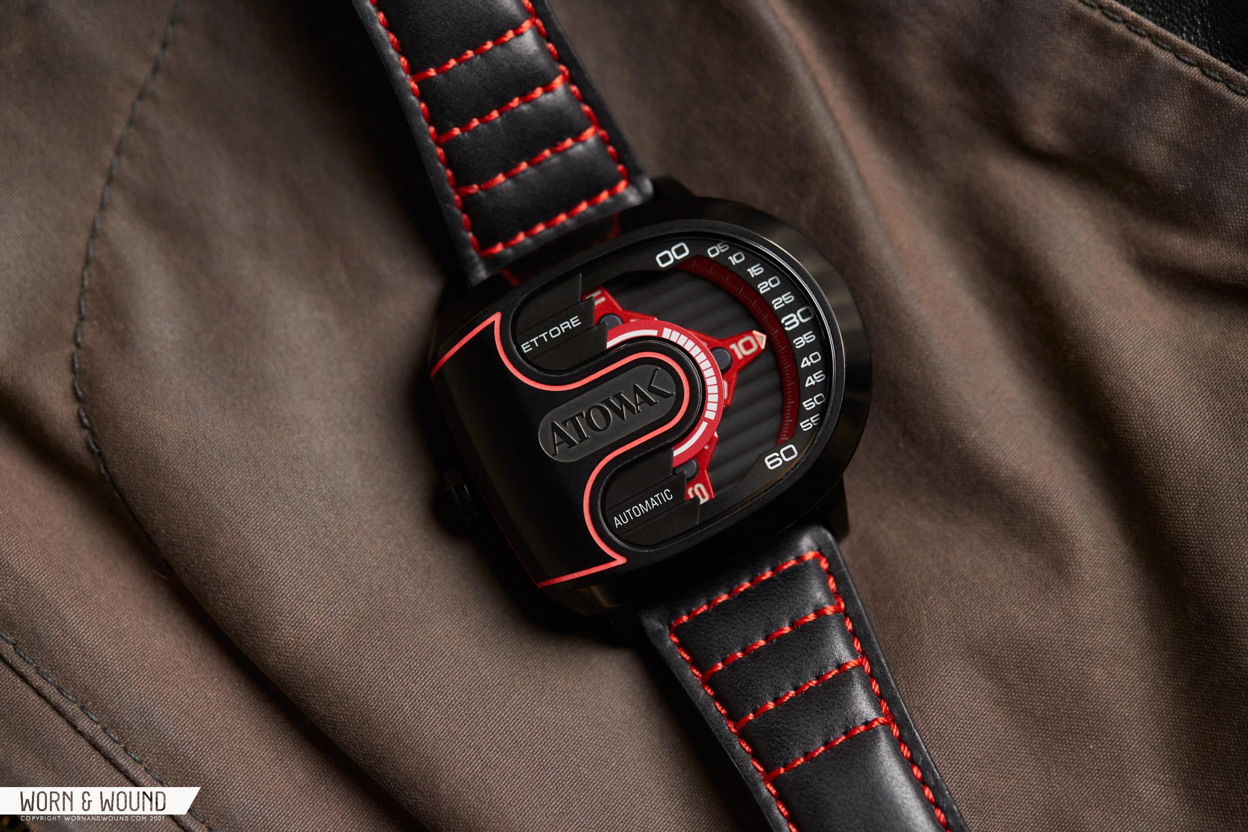
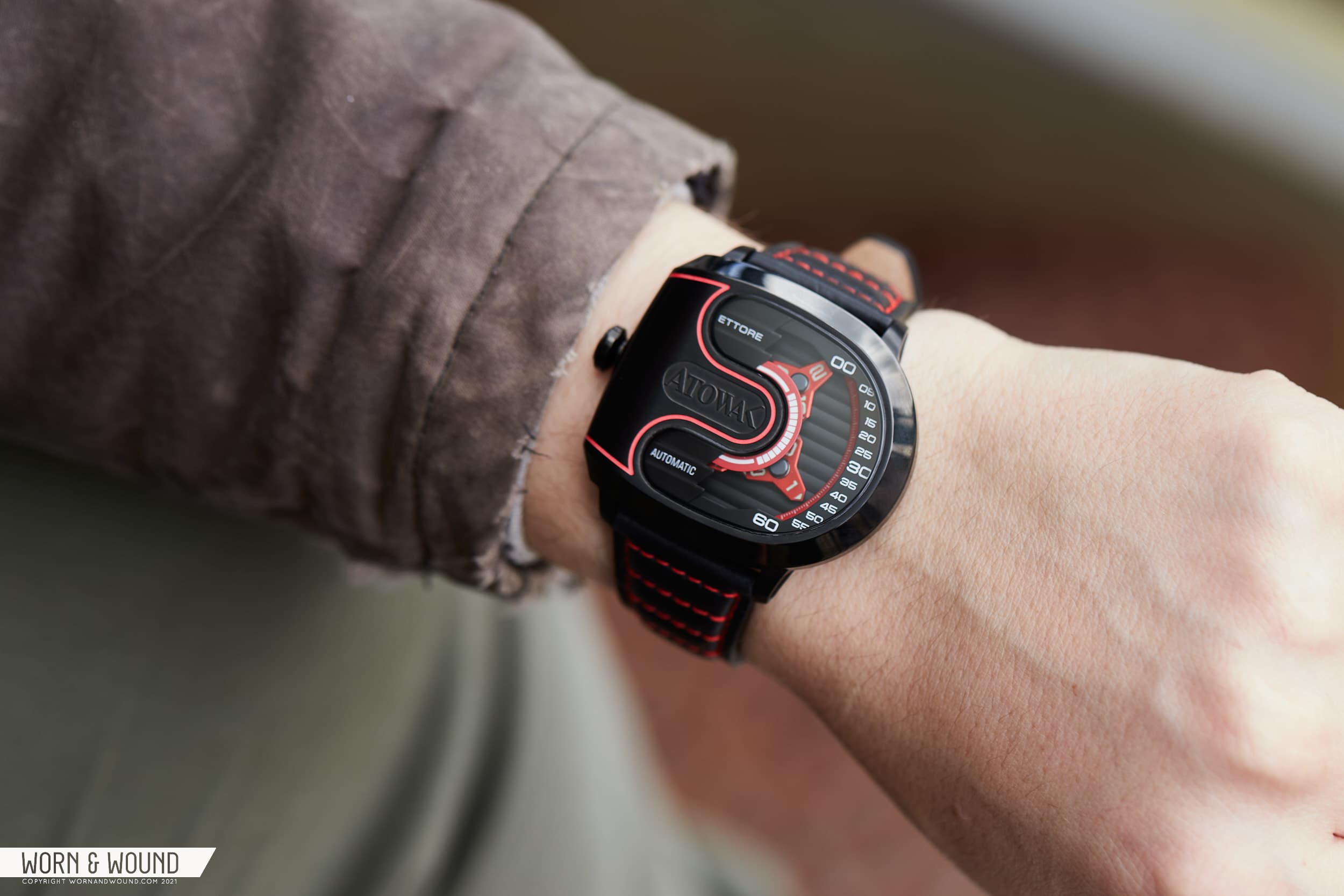
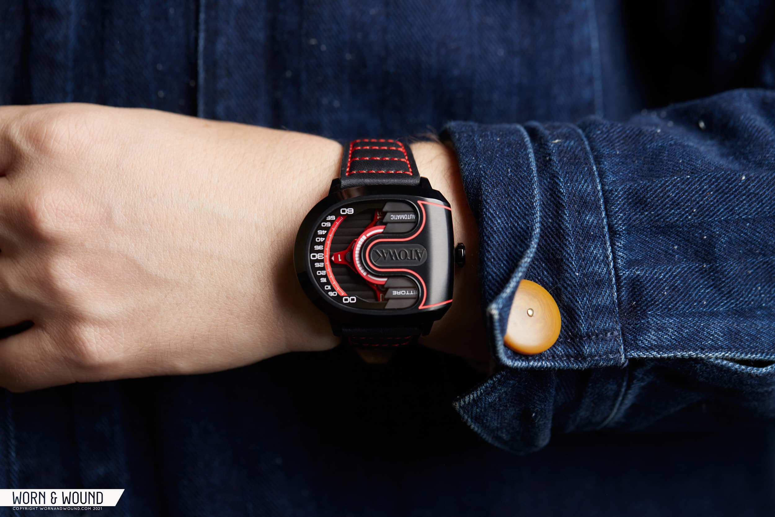
The Atowak Ettore Drift is the newest of the wandering Miyota gang, mixing both affordability and a flair for the exotic that higher-cost wandering hours have in droves. The Ettore goes for flash from the starting line by featuring a peculiar, but oddly appealing, asymmetrical case design. Squat but wide, it measures 47mm from left to right side, 41mm from top to bottom, 47mm lug to lug, and 13.4mm tall, which is surprisingly slim given the complication. Though square in terms of width/lug-to-lug, it wears as a wide watch, protruding to the right side as the lugs don’t sit exactly center on the case.

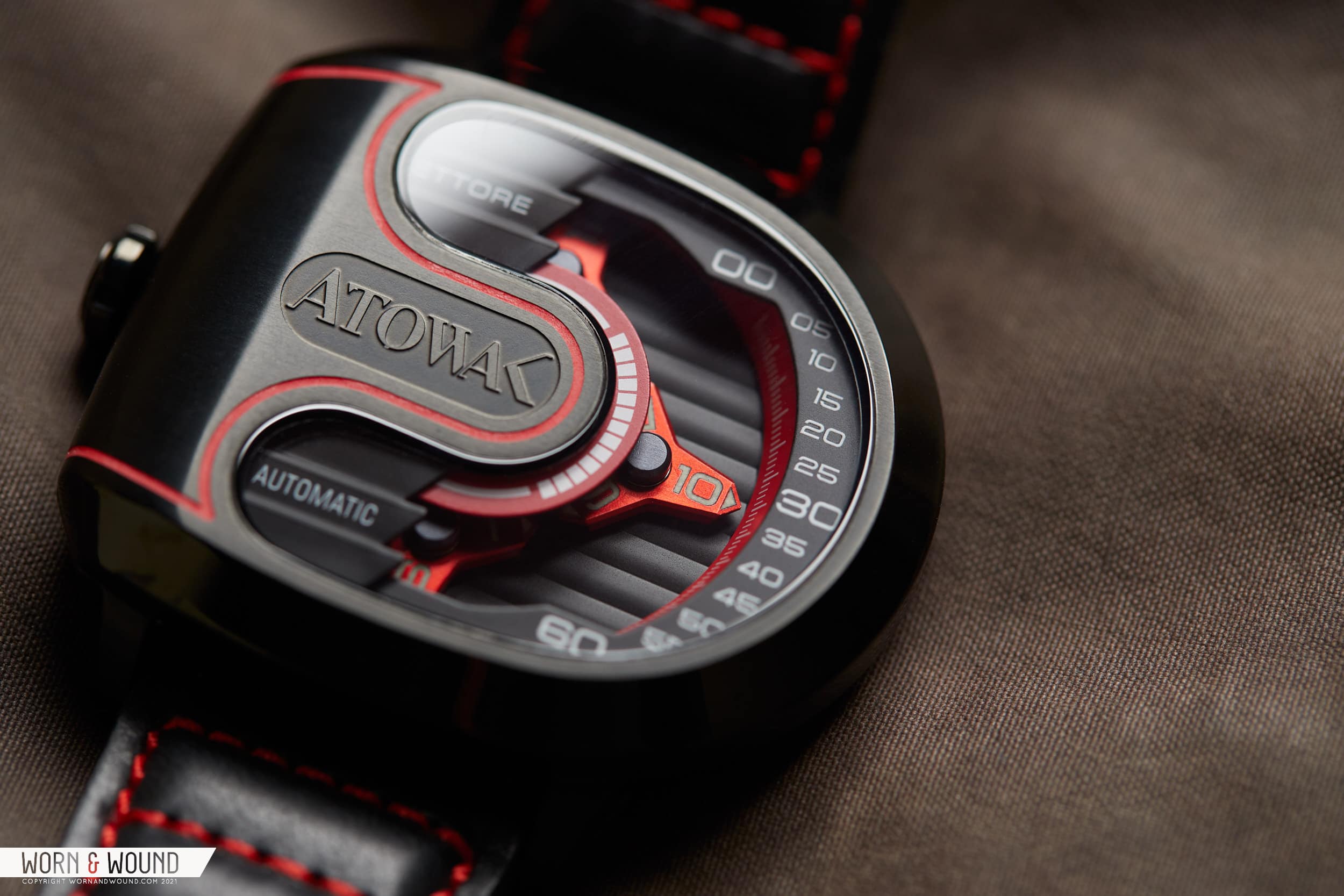
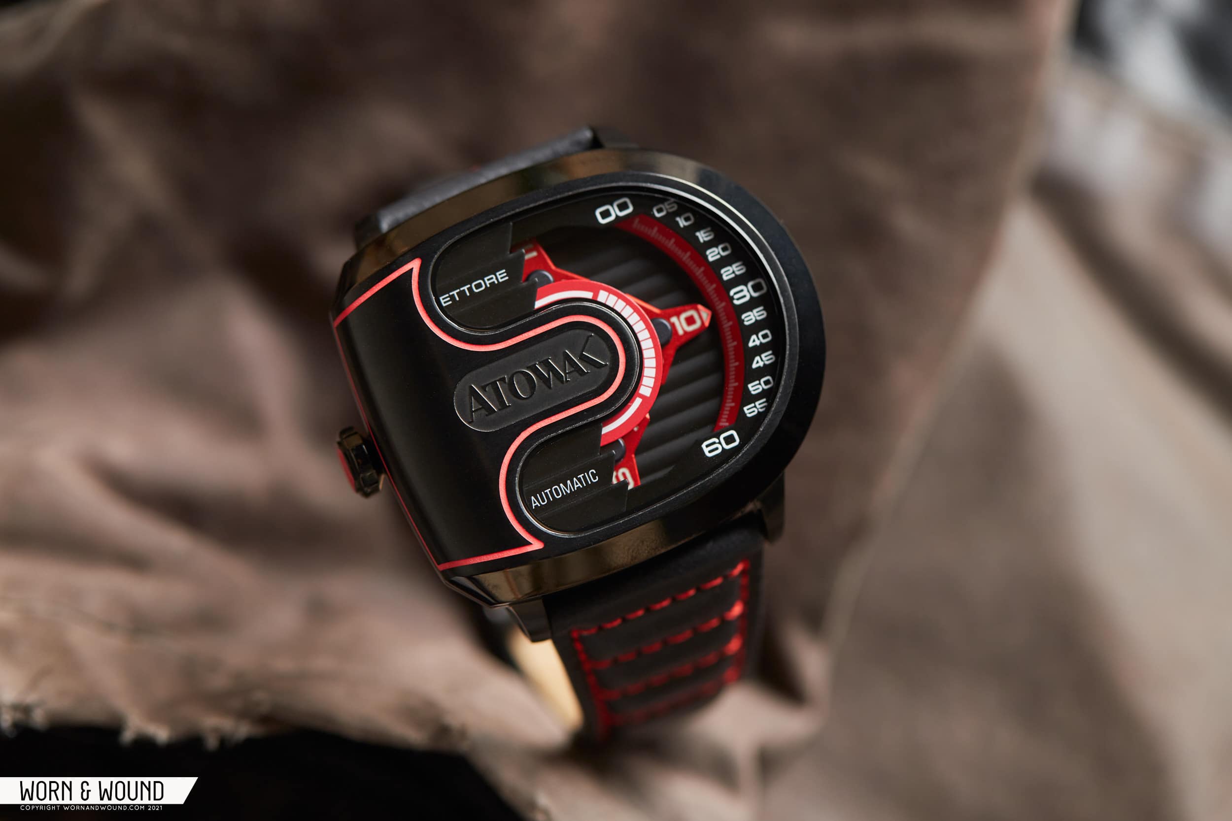
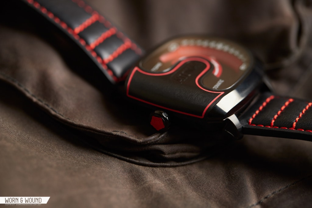
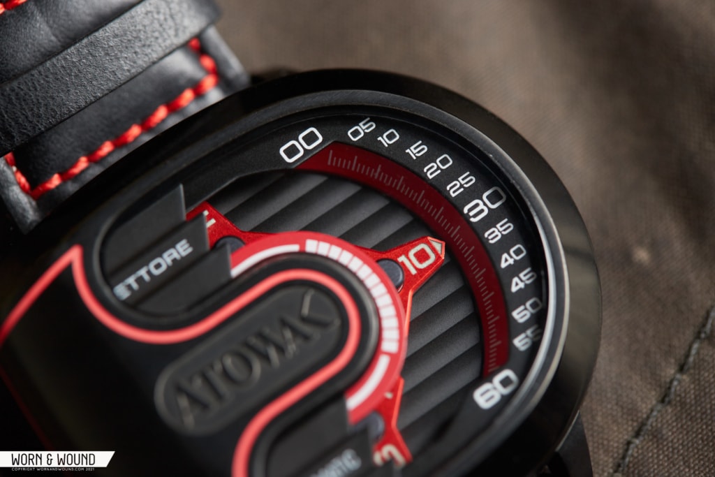
While I might not see a supercar when I look at the watch, I do get the idea as the shape flows in a cool and unusual manner. The left side of the case curves down, and is all metal, whereas the right side features a curve. The crown is on the left, while the time is read on the right. A U-shaped crystal gives a partial view to the workings within, where the four wandering satellites orbit and tell the time.

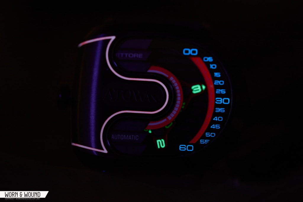
The case of the model we received is coated in black PVD, and features a mix of polished and brushed surfaces. The quality of the finishing is nothing special, but the use of it on different surfaces to add texture is a nice touch. A line of lumed red fill is also an unexpected detail, highlighting the unusual surface on the left side of the top surface. Though it reminded me of Tron on occasion, I’m not sure if it’s a detail I like overall, especially as it draws attention to the oversized logo – but more on the branding later.

While the case is captivating in its own way, we’re here for the dial – if you can call it that. On wandering hour watches, the dial becomes more of an environment as hands are combined with indexes, and much of it is in motion, if not visibly moving. So, underneath the u-shaped crystal is a partial view into a world consisting of a bottom surface featuring raised rows. Sort of like Côtes de Genève, but without the graining effect.

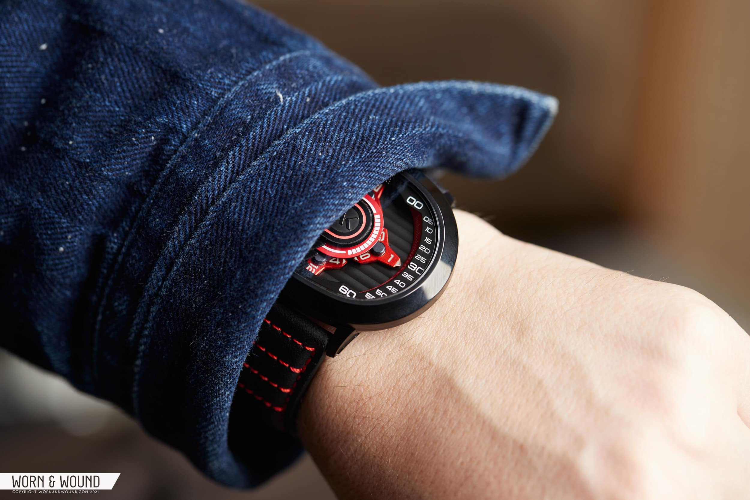
Floating above this are the four-satellite hands. On this model, they are all rendered in metallic red and feature three points, each with numerals and a little arrow filled with lume. A black armature attaches to the center of each, acting as the rotation point. The rest of the mechanism is obscured from view.

Spanning from the lower surface up to nearly the crystal is a red chapter ring with a steep angle. The minute index is printed here in lines that correspond to numerals on a black surface that is then sandwiched up against the crystal. A curious effect of how wandering hour complications work is that the arc that the time is read on is determined by how many satellites there are. Since there are four, the arc is 90 degrees, which is a fairly compact area to contain markings for all 60 minutes. As such, I found this watch easier to read in approximations to the closest 5-minute interval, as trying to read the exact minute required too much effort.

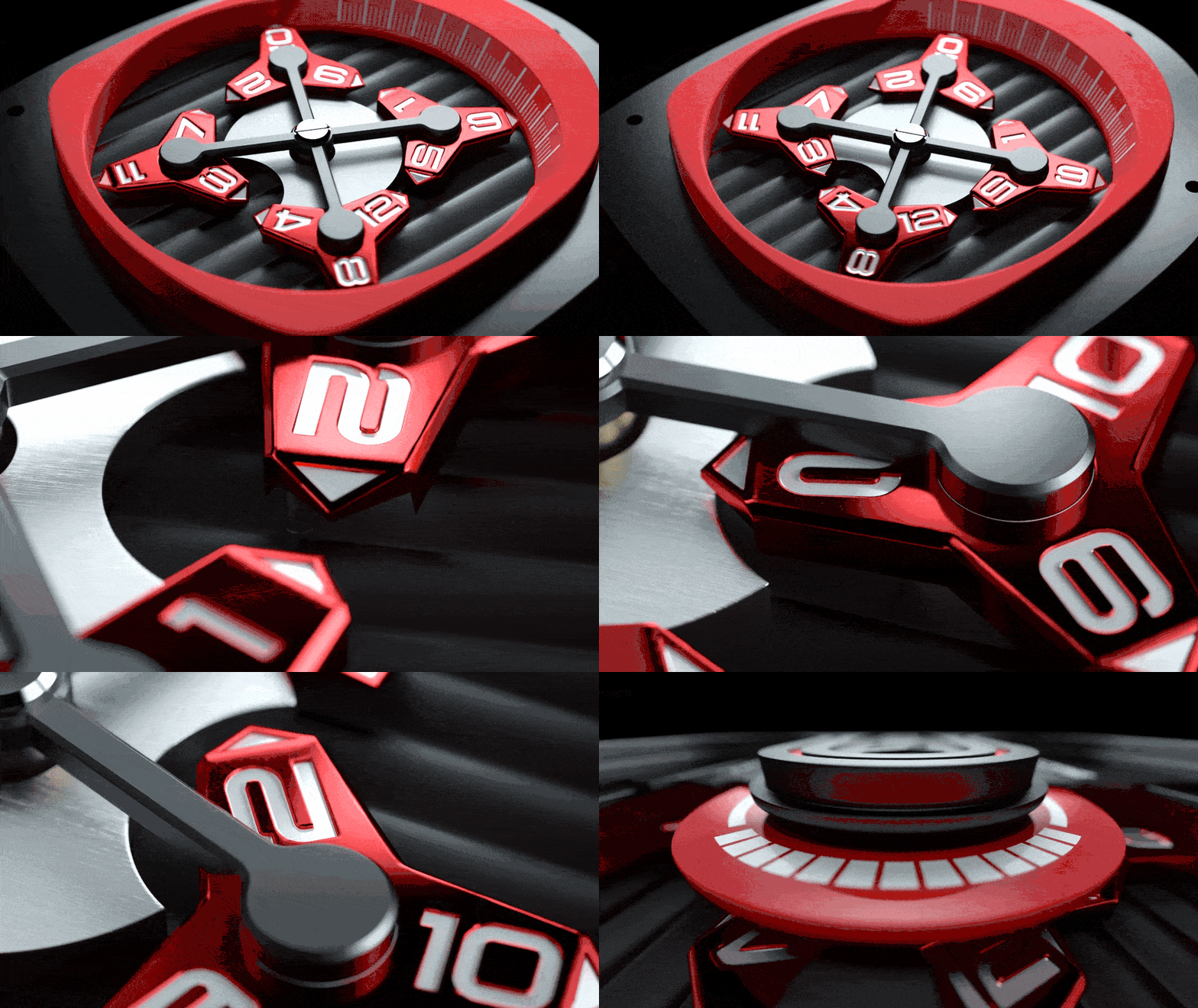
Typically only two of the satellites are visible at any time, with “inactive” ones hiding under a covered area on the left side of the watch. It is within this mysterious chamber that the numbers switch over, seemingly magically coming out the other side with the correct number locked and loaded. According to the GIF below from the brand, it’s far from magic that is happening here as the reality of the complication is boiled down to a rod and a semi-circular cutout that essentially allows for the satellite to rotate at only one location.

At first, I found something almost disappointingly simple about this. I suppose I had secretly hoped Atowak had engineered something on par with an Urwerk, hid it under the hood, and made it affordable. But then it occurred to me that simplicity is beauty in its own right, and it is this stripping down of the complication that makes it possible. Also, brands like Ochs Und Junior are lauded for their complications, which often use only a few parts to achieve the incredible. Fewer parts also means fewer potential problems for both manufacturing and servicing.

Advertisement

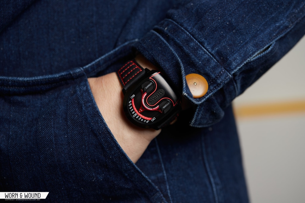
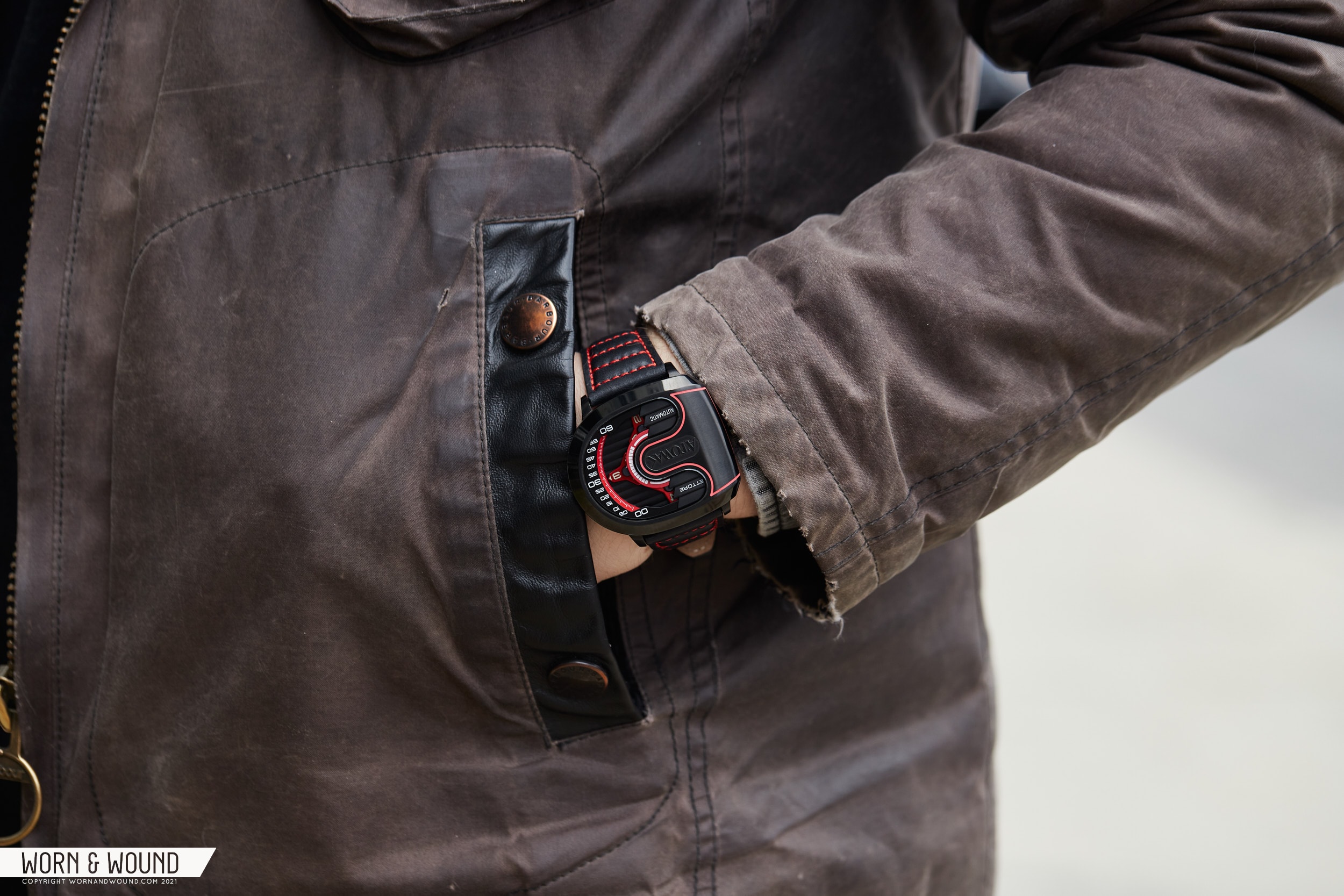
On the wrist, the Ettore Drift has a bold presence and a fit unlike other watches I’ve worn. By being wider than long by a noticeable degree, not including the lugs, it wears well in terms of its wrist placement, as it runs along the wrist rather than across it. The lugs that are there curve down fairly sharply, aiding in keeping the watch in place. The 24mm lug span is wide, but seems necessary given the 47mm width of the watch, both in terms of keeping the watch secure and visual proportions.

In terms of the experience of the watch, well, it’s a weird one. I’m not sure if I ever found it comfortable or particularly appealing to wear, but it might just be a watch that takes some time to get used to as it is so different. It also just feels big, which during a hot and humid NYC August, isn’t ideal, especially on a 24mm leather strap. What I did like, however, was the wandering hour function and their implementation of it.

The right-justification of the time telling feels organic, as the time is read naturally, hour:minute. I also imagine in the colder months, only having this portion of the watch sticking out from under a jacket cuff, conveniently displaying the time in a small arc. That said, if you wear your watch on your right wrist, the opposite would be true, and it would be entirely inconvenient. Sorry, right-wristers. Additionally, as mentioned before, the scale being so small, I tended to read the time to the closest five-minute interval, which isn’t exactly accurate.

Earlier, I mentioned that I would get back to the branding. On the top of the case, the Atowak logo has been prominently displayed at a scale that is far larger than one would typically find on a dial. Between the name being odd (from their site: “The word ATOWAK is Caesar cypher itself for the word UNIQUE when moved 6 letters. The word ATOWAK moved 20 letters to get UNIQUE.”) and the logo not being the most visually appealing, personally speaking, I found this an annoying feature of the watch.

Advertisement

More importantly, the watch itself is called the Ettore Drift. “Ettore” being the first name of Ettore Bugatti, yes, the founder of the automobile manufacturer. While I get they are trying to evoke supercars with the design, specifically the Bugatti Chiron, taking someone else’s name for their product feels a bit presumptuous. Additionally, it’s an odd match, because the wandering hour mechanism results in very little perceivable motion on the watch itself. There is no active seconds hand, just hour satellites making their way around the dial, moving a quarter degree per minute. As such, the watch feels quite the opposite of a machine tuned for speed. It’s slow and deliberate. Had they coined some cosmic branding, I don’t think I would have made a fuss, but here, it just doesn’t match.

But, I don’t want to end on a negative note, as I think Atowak did achieve something pretty cool with the Ettore Drift. If you want to experience a wandering hour complication and, like 99% of us, can’t buy a high-end one any day soon, it’s a solid option. I think with some refinement of their designs and branding, they could come up with something genuinely great, for the price. So, I hope Atowak does well with this watch and continues to work with the wandering hour concept, as there is definitely a need for complications like this that are built off of 3rd party movements and priced for the masses. Atowak

Images from this post:
Related Reviews
Zach is the Co-Founder and Executive Editor of Worn & Wound. Before diving headfirst into the world of watches, he spent his days as a product and graphic designer. Zach views watches as the perfect synergy of 2D and 3D design: the place where form, function, fashion and mechanical wonderment come together.
wornandwound zsw
Categories: