Impressions
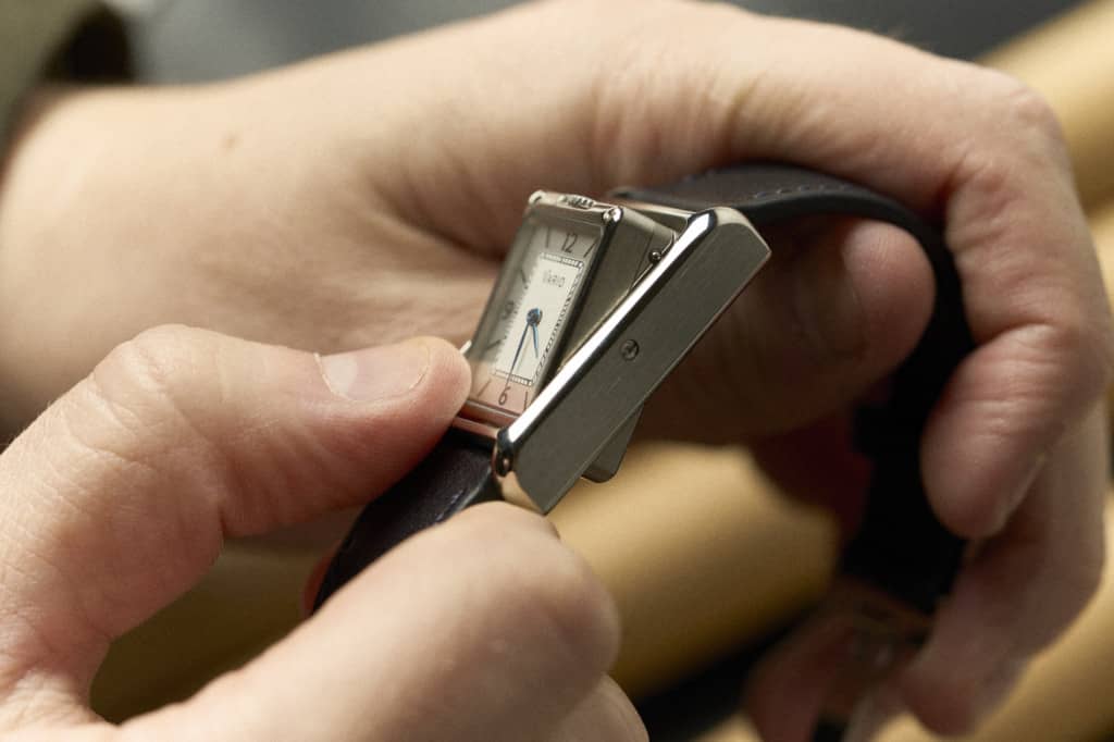
Putting on the Versa for the first time was like stepping out into the first fall day after a hot summer – refreshing. A rectangular watch is a bold step into dress territory by any brand at the moment, so worthy of small applause, but going the distance and creating a reversible, two-sided, two-movement watch gets a standing ovation. Only possible with slim quartz movements, another risk, it’s genuinely exciting to see a micro-brand (or any brand for that matter other than JLC) attempt.
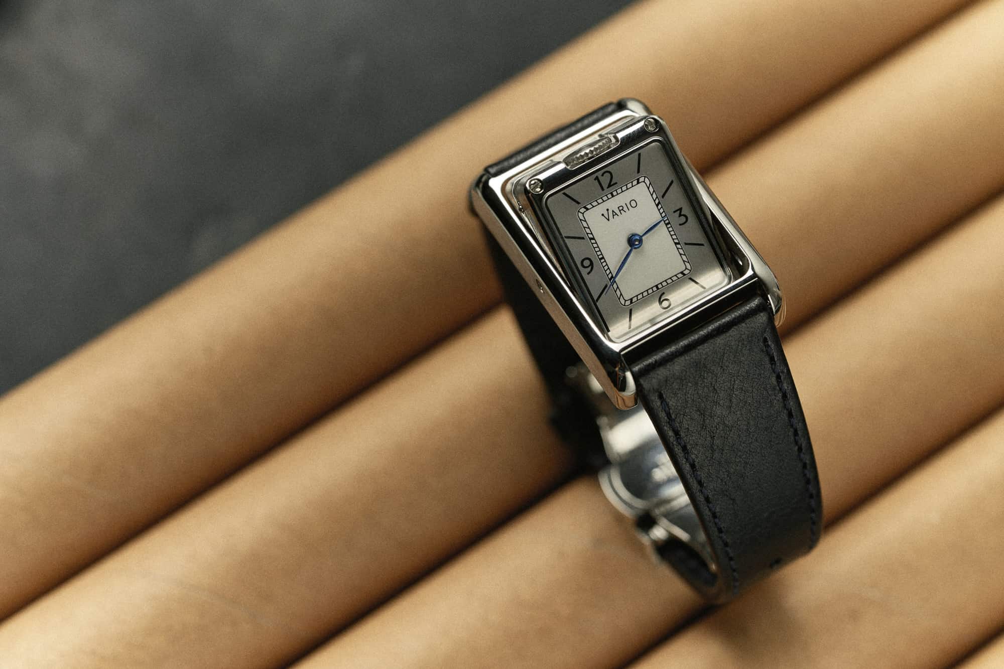
And, more importantly, they pulled it off. The case is nicely finished, functional, and well-sized all things considered. Every time I put on smaller rectangular watches, whether it be Tank, a Reverso, the recent Oris Rectangular, or the Versa, I’m always struck by how much I like them, and how much I want to add one to my collection. The flow from the strap into the case, which is more continuous than on a traditional round watch, creates a pleasing line around the wrist. It has an undeniably elegant effect, lending to their generally dressy inclinations.
![]()
They also wear totally differently than round watches, so the typical sizing logic doesn’t apply. The Vario is a small watch, but I wouldn’t want it any larger. Given the case mechanism, there’s a lot going on in a little space. Gaps, screws, and lots of edges and lines. They give the Versa an unexpectedly industrial look. The 20mm lug width was also a good choice, as the strap itself adds to the visual presence of the watch.
My only semi-criticism is that the dials aren’t the most exciting. Each watch has two dials (pretty obvious at this point). All versions share a silver dial with 3, 6, 9, and 12 numerals alternating with lines encircling a white rectangle with a minute index. This is, I believe, meant as the sportier dial option. It clearly plays off of a Reverso style, but without copying it.
![]()
The other side is rendered in either blue, green, or red depending on the model. Consisting of a simple railroad index with diamonds at the poles on the outer edge of a flat, colored suface, it is meant as a minimal, dress option. Both sides feature small leaf hands, which function better on the sportier side given the inner index as it compensates for the necessarily shorter hands.
Neither side is offensive, but neither really wins me over either, leading me to flip back and forth regularly as I grew tired of them a bit quickly. In theory, I prefer the silver version, but the typeface chosen feels too soft, and almost non-committal. Perhaps a different handset, such as a syringe style with lume, would have added more conceptual contrast to this side as well. Had that been the case, I think the minimal, dress side would have worked better as an occasional side. As is, they feel almost like two concepts for a formal side.




 Featured Videos


