Lundis Bleus 1100-4 Review

The micro-brand boom of the last few years has been exceptional to watch, but one must wonder with all the brands out there, what can a new brand offer? All too often, brands come along, particularly via crowd funding platforms, that frankly don’t offer enough. They don’t put forth anything new, save a contrived story and perhaps a good value for an ultimately forgettable product. This might seem like a negative, but it’s actually a positive. Now, brands need to try harder and do more interesting things to succeed. This has led to a previously insignificant segment of the industry setting tastes globally, and frankly out-doing the traditional watch industry.

Founded by two seasoned watch makers who have worked for the likes of La Joux Perret, Richard Mille and Corum, Lundis Bleus are bringing a different approach to the micro-brand market. Drawing on their years of experience, Lundis Bleus is attempting to be a high-end independent brand, but with accessible prices. This is “independent” not just in the sense of “not owned” by a larger parent, but in the sense of a brand that consists of just a watch maker or two doing as much on their own as possible.

LUNDIS_BLEUS_1100-4_DIAL_11

Their name actually has an interesting story behind it. Meaning “Blue Mondays”, it’s a reference to a practice by watchmakers through the 19th century to take Monday off and, well, imbibe. They had long hours and performed highly skilled work, so it was an earned right. Lundis Bleus is celebrating this little known fact outside of the watch making world as it speaks to their spirit of independence.

Stories and intent are great and all, but what really matters is the product. Lundis Bleus’ first line of watches, the 1100s, have a striking design that will immediately grab you. Sophisticated dials with lots of textures, elegant flowing cases and a general aesthetic that speaks both to classic watch making and something unique, contemporary and high-end. They don’t look like watches from a new brand, having a finesse often seen only after many years.

The 1100’s are also unique in their positioning, coming in at 1350 CHF, which is about the same in USD. Powered by the Miyota 9015, this makes them more expensive than the typical 9015 powered watch, but I dare say one needs to look beyond just the movement when determining the price. Design, finish, execution are all factors. They also do a lot “in-house”. This includes some movement modification such as changing the date disks, pad printing the rotors and regulating, and will soon include kiln-firing enamel dials. At the same time, they are honest that their manufacturing is sourced in Asia. I won’t lie and say this isn’t a bit controversial and might be a non-starter for some, as there are Swiss-made automatics at this price as well, but the watch itself is gorgeous, speaks to its price and beyond, and is very worth a closer look.

Advertisement
$1350

Lundis Bleus 1100-4 Review

Case
Steel
Movement
Miyota 9015 (regulated)
Dial
Silver
Lume
NO
Lens
Box Sapphire
Strap
Leather
Water Resistance
3ATM
Dimensions
40 x 46mm
Thickness
11mm
Lug Width
19mm
Crown
Push-Pull
Warranty
5 Years
Price
$1350

Case

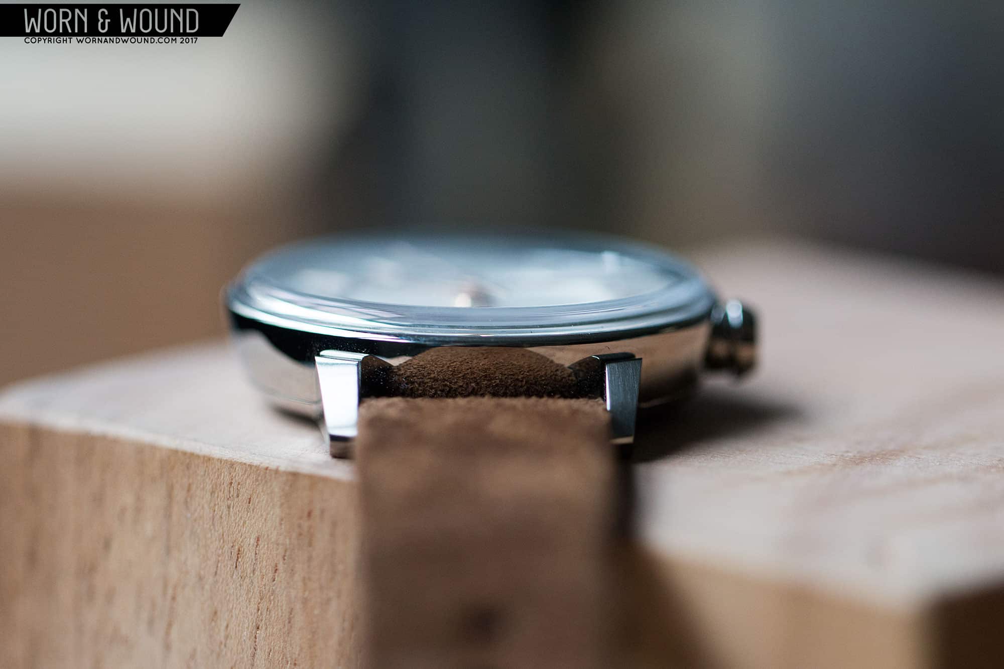
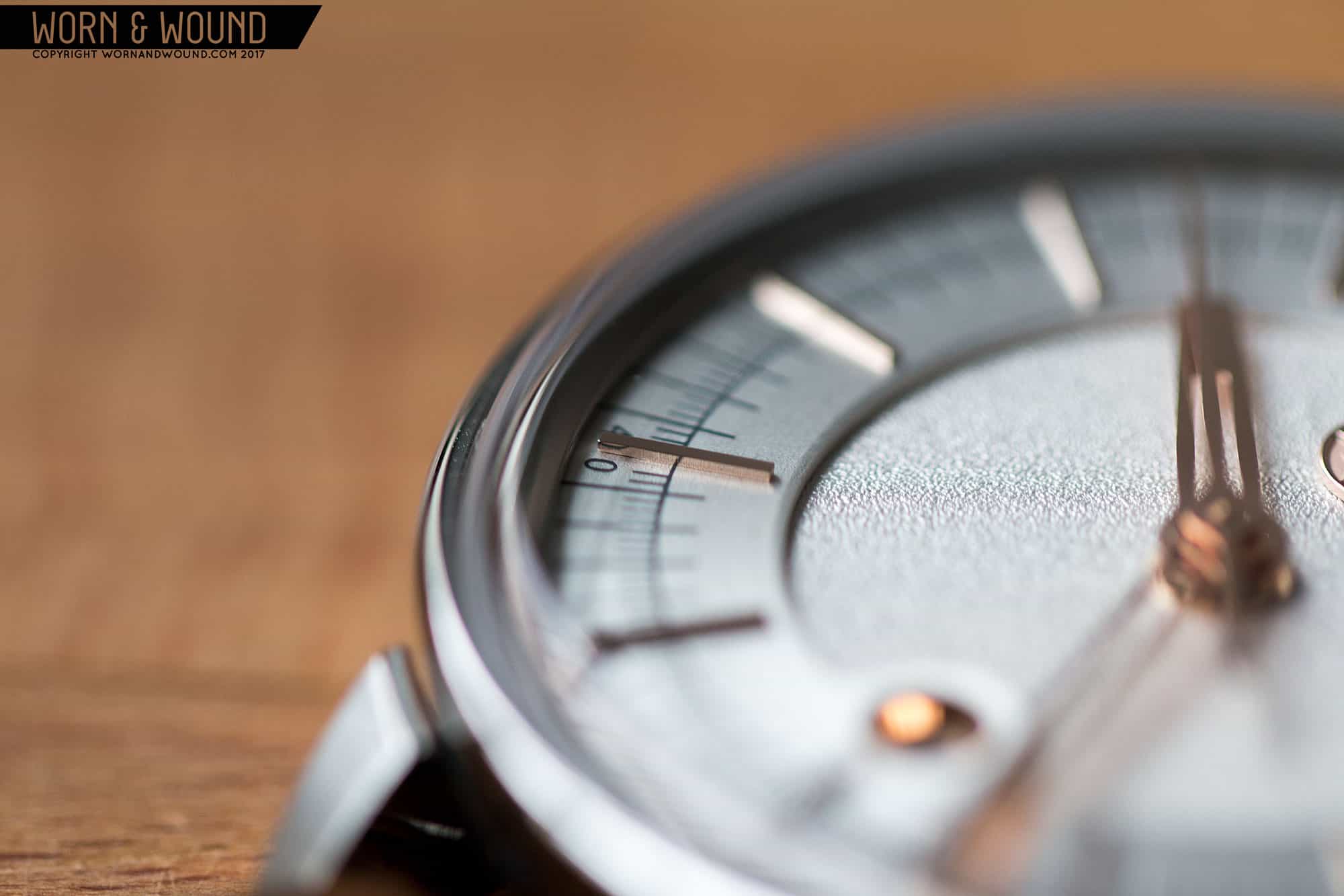
Most watch cases play supporting cast to the dial, but with the 1100, it’s certainly competing for the spotlight. Measuring 40 x 46 x 11mm, to the top of the box-sapphire crystal, it’s a modern medium size. Initially, which is to say before seeing it in the metal, I hoped it would have been smaller, likely 38mm. In person, the size and proportions make total sense. This isn’t a dress watch, nor is it a throwback, rather it’s a modern concept that feels right a bit larger. The box-crystal is worth a note. It’s a gorgeous shape, stepping up at the edge before gently doming over the dial, and has very good AR.

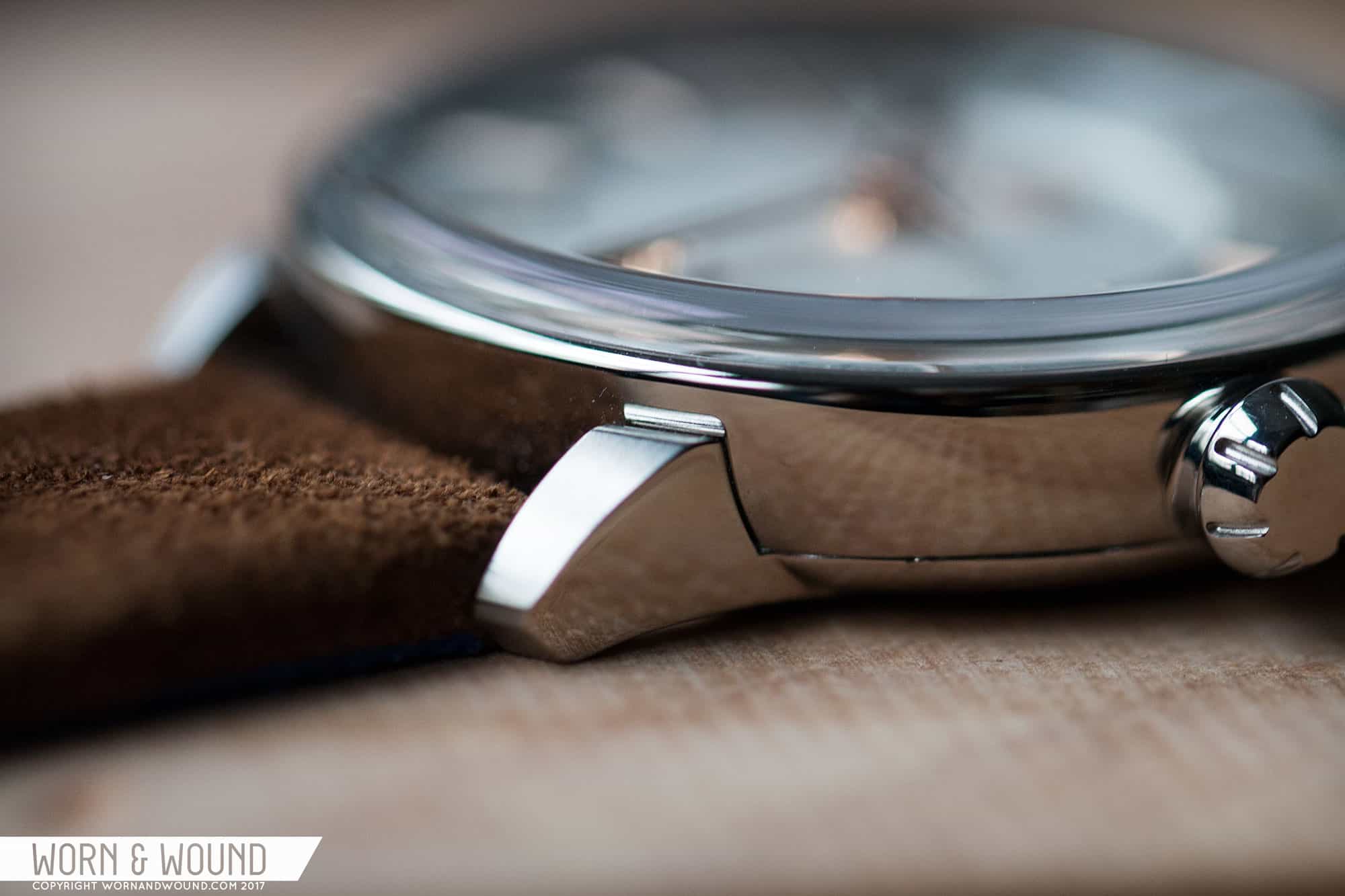
The design itself then has several unique elements. It’s a two-part case (not including the crystal) with a mid-case and screw-on case back. The mid-case is a fully polished bowl-shape that is quite thin where it meets the crystal. The case back and lugs are then a single piece. The lugs come up around, but don’t actually touch the mid-case. The little gap that is created is a unique detail meant to emphasize the flowing form of the mid-case and the dial. From above, there is a little black line created by the shadow in the gap between the lugs and mid-case that make the form really pop. Additionally, the tops of the lugs are brushed adding a bit more contrast.

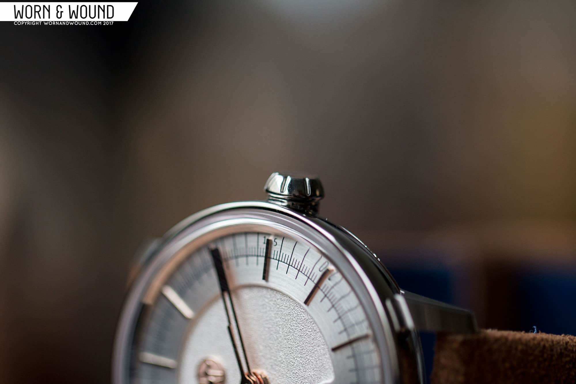
The crown at three has a quirky shape, designed with ergonomics in mind. It’s a tapering mushroom-cap shape that gets narrower away from the case. This creates an angle that helps prevent discomfort when contacting one’s wrist or hand. Along the side of the crown are seven indents which have been blasted, creating a bit of a play of finishing with the otherwise polished surface. It’s a thin crown that is a touch hard to grasp to pull out, though the wide, inside edge does create a lip for one to get a finger nail under.

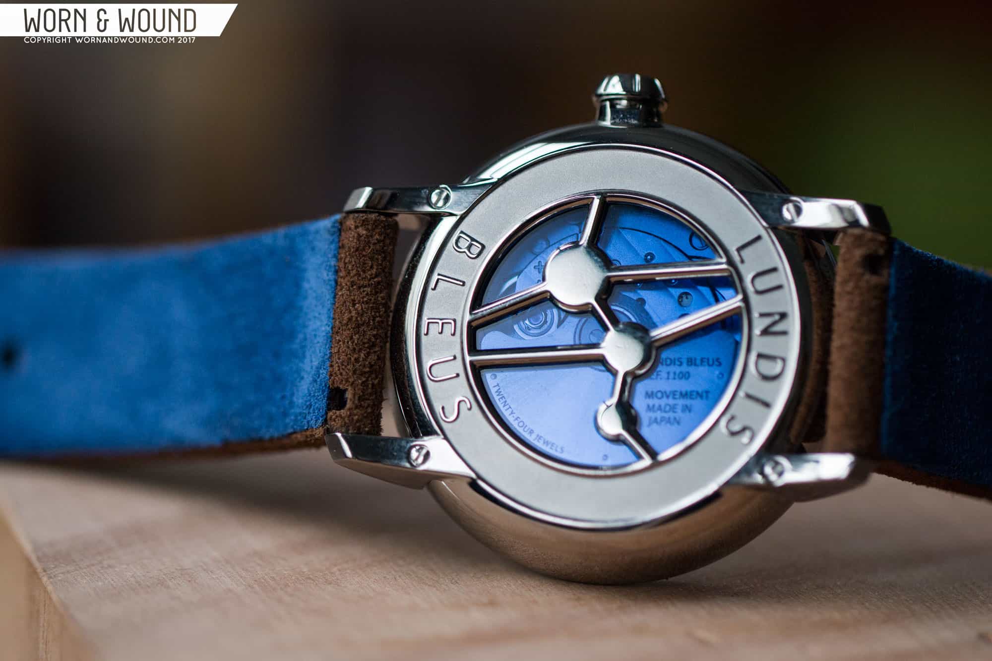
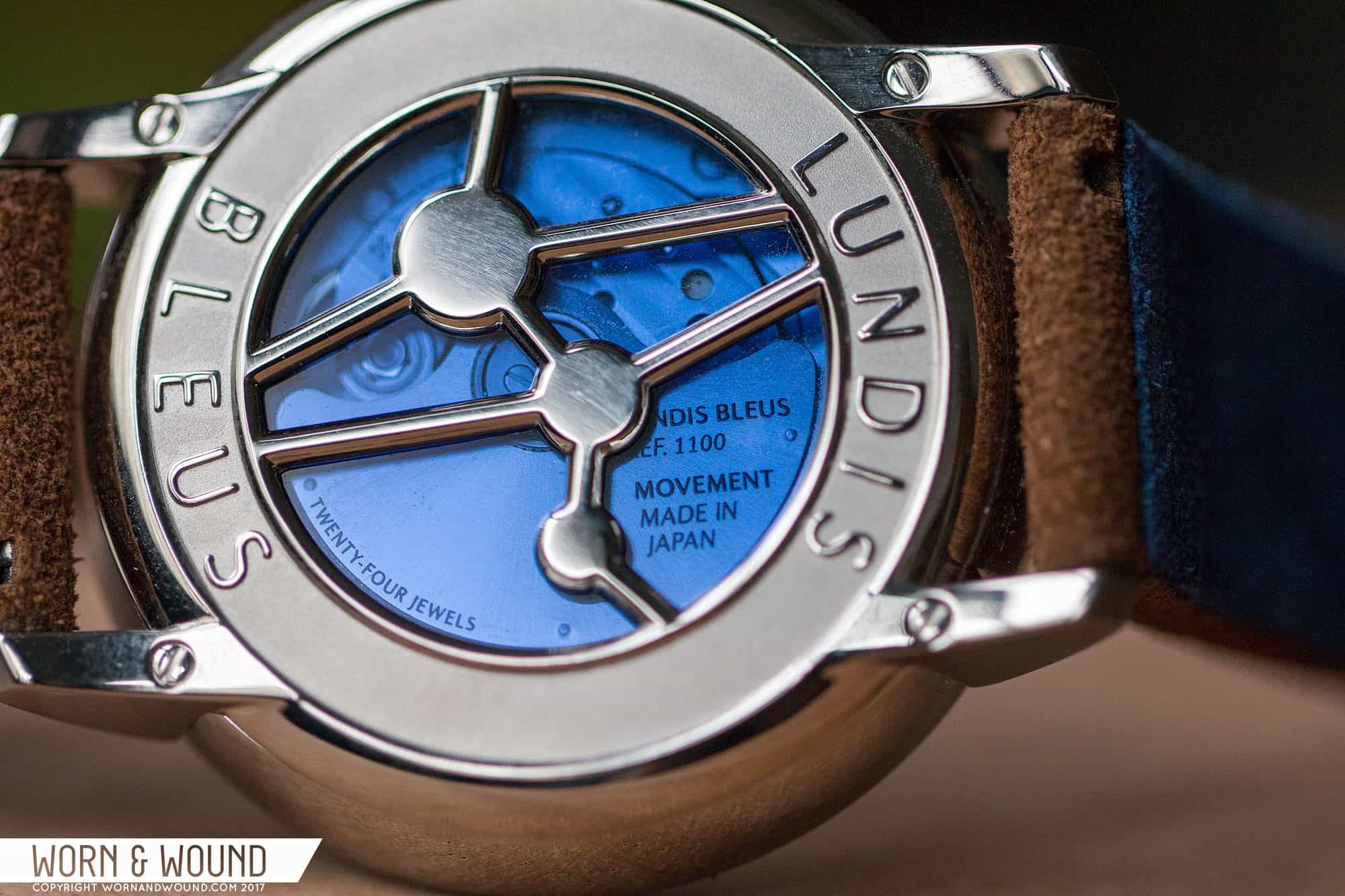
Flipping the watch over, you are treated to a pretty exotic scene. The case back features a wide stamped “Lundis Bleus” area with raised polished letters over a matte surface, while in the center is something altogether bizarre. There is a display window in a dark, sapphire blue underneath a polished, over-sized version of their logo. Which, as I’m sure you’ve noted, is a strange almost molecular looking graphic. In fact, it is a interpretation of an alcohol molecule, playing of the “Blue Monday” naming concept. It’s a cool design all around, at once showing you the movement, while also not fixing your attention on the one aspect of the watch that isn’t their design.

Dial

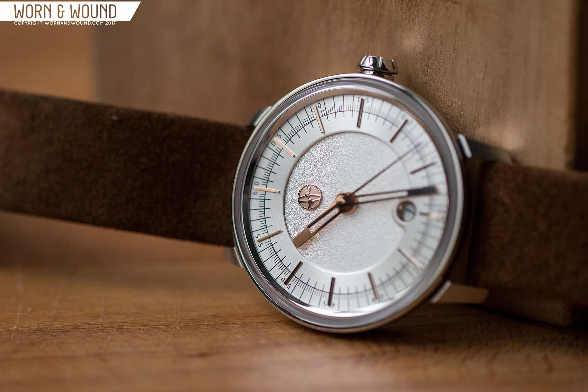
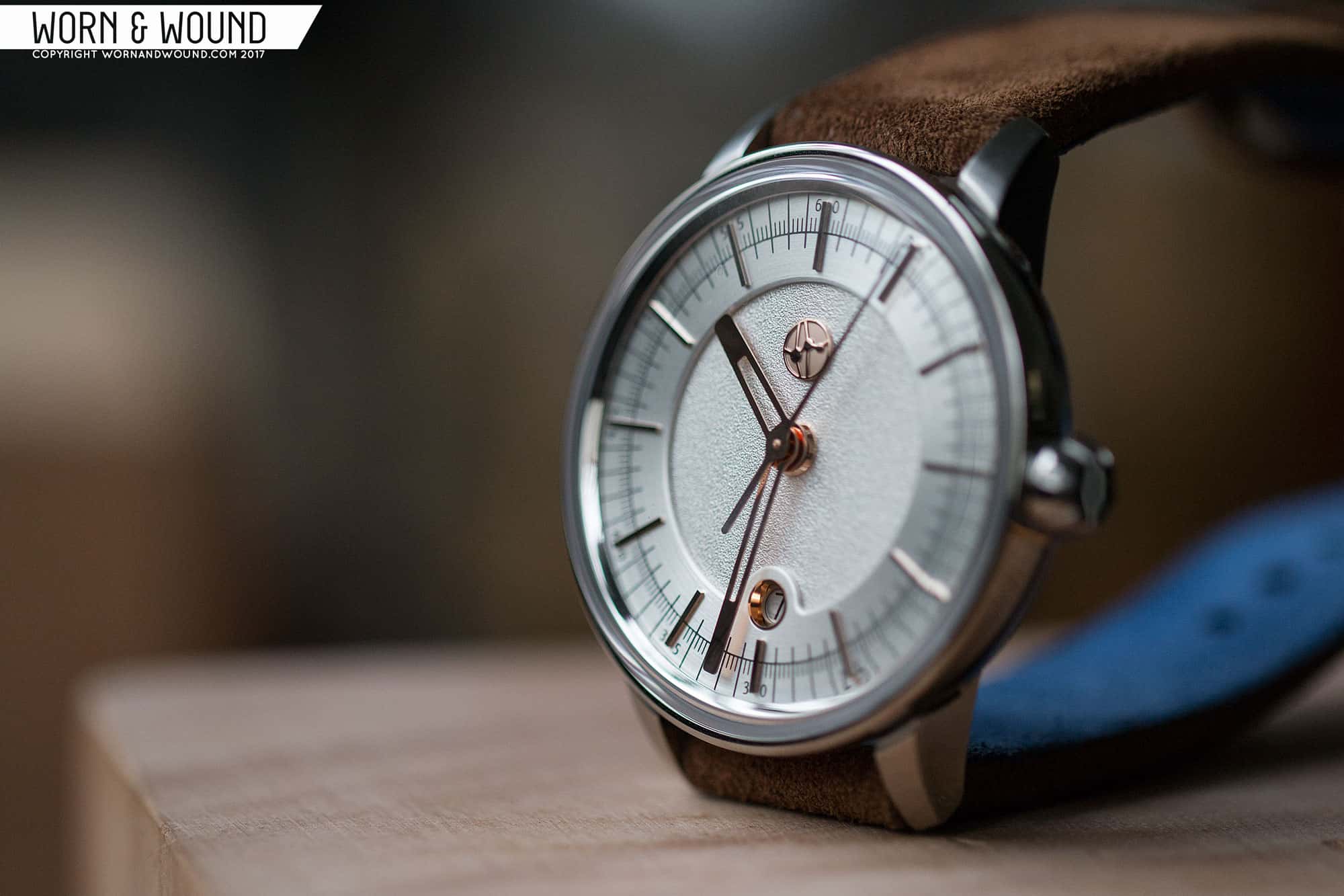
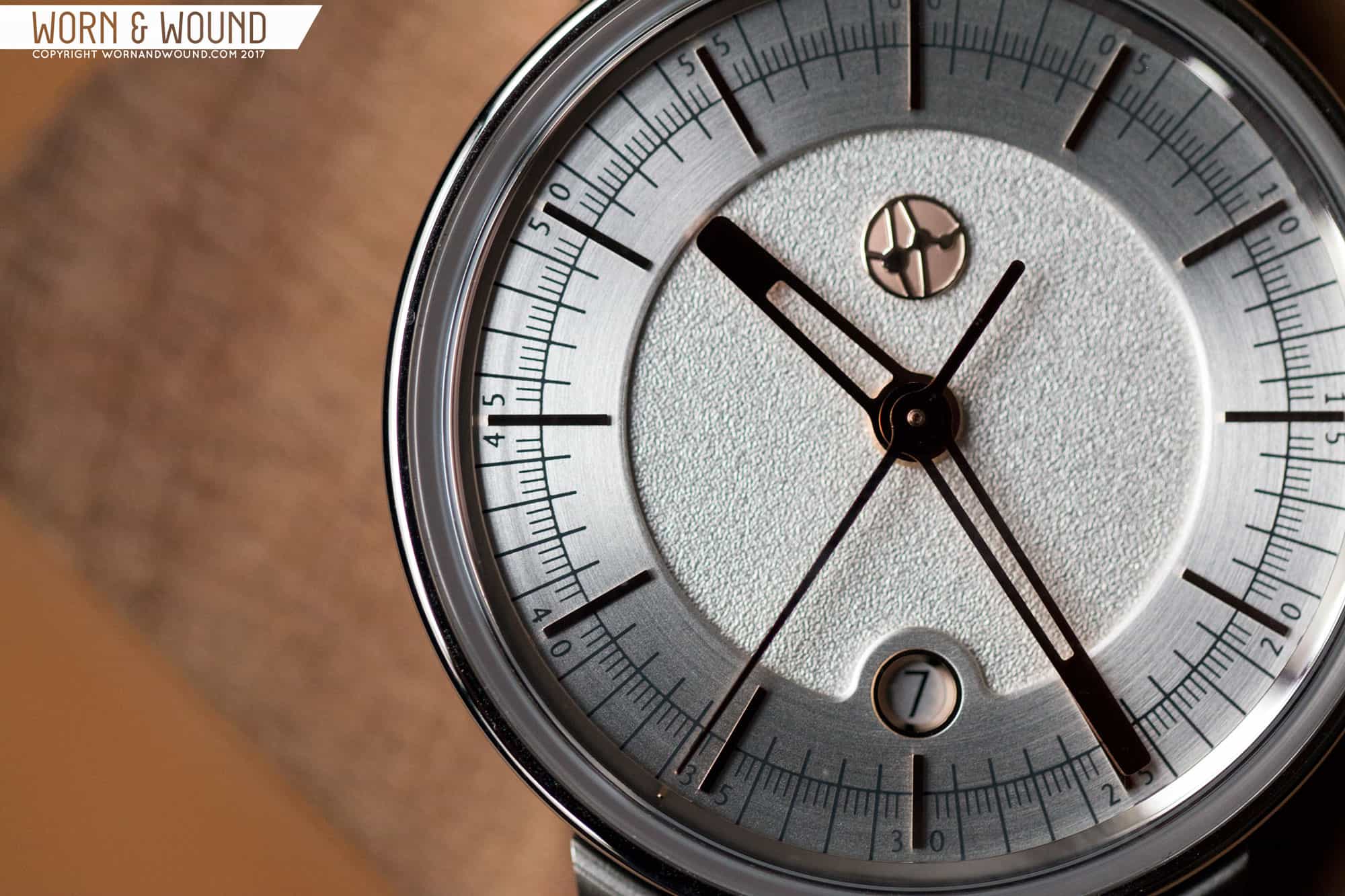
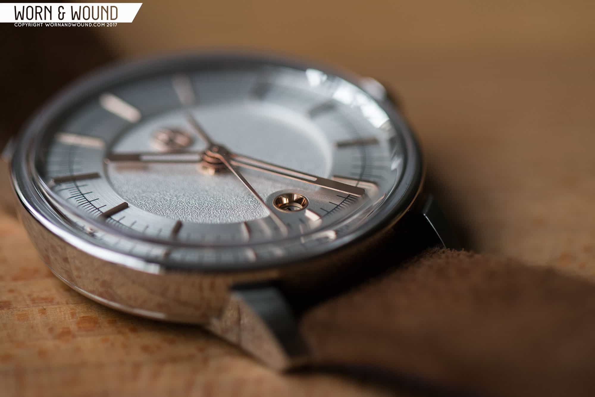
While the case puts forth a good effort, in the end, the dial remains the star. In all ways and shapes, the dial of the 1100 says “high-end”. Using a mix of finishes, layers and graphic elements, Lundis Bleus created something exotic and sophisticated that is rare at the price point. The dial consists of two main layers. The lower area, which is visible in the center of the dial, has a coarse noise texture. It’s simply a beautiful texture one doesn’t see used very often that speaks to high-end watches, such as the A. Lange & Söhne Zeitwerk Handwerkskunst. This area is unadorned, save an applied Lundis Bleus logo at 12. It’s the same “alcohol molecule” logo found on the case back, and while odd and a bit jarring at first, grew on me. The lack of typical text on the dial adds to the contemporary feeling of the design, and the quality execution of the logo (it has both polished and matte surfaces as well as slight rounding) is enjoyable to look at.

LUNDIS_BLEUS_1100-4_DIAL_8

The upper layer then contains various indexes on a radially brushed surface. The finishing here contrasts the noise texture, creating a darker, more metallic surface. The two look great next to each other, creating dynamic breaks in the light that crosses the dial. The hour index is then represented in thin, applied batons. In the case of the 1100-4, which is the version we have, they are polished and rose gold plated. The use of rose gold to contrast the steely backdrop works very well, adding legibility while looking stylish.

Additionally, there is a minute and seconds index that is printed on this surface in dark grey. It’s a dense index with a lot of marks that add a technical and more casual feel to this dial, as well as bringing sector/scientific dials to mind. There are long lines for the individual minute/second and shorter lines for fractions of a second. There are also numerals at intervals of five, straddling the applied markers. Running down the center of the raised surface is then a circle that bisects the index, creating a division that one could interpret as separating minutes and seconds from each other. The density of this index works to play off of the empty center area, creating different regions of intensity on the dial. It ends up balancing out well, with no part feeling too complex or too sparse.

Dates are often points of contention in my reviews, so good ones are worth special attention. Located just above six is a circular date window that sits in an extension to the upper ring. The window itself is fitted with a contrast tube, here in rose gold. I really like this detail as it highlights the date subtly, and is cleaner than a frame of sorts would have been. My only complaint is that the depth and diameter of the window make the date a bit dark, occasionally being hard to read. The date disk is then black on silver, which is customized for each different version of the 1100 series. In this case, one might not notice since the 9015 is always black on silver, though I think the typeface is different. On models like the 1100-6, which has a rose gold dial, the date wheel has a more obvious customization.

Lastly, for the hour and minute hands, Lundis Bleus went with a simple, but effective design. They are both fairly wide and blocky with partially skeletonized shapes, tapering towards their tips with rounded corners all around. What’s particularly nice about them is how they align with dial below. The hour hand rides the edge of the upper level, as does the skeletonized region of the minute hand. The minute hand then cuts across the outer index, ending just before the printed numerals, keeping them visible. The seconds hand is then a tapering stick with a long counter weight. All are in polished rose gold, standing out against the steel below.

Advertisement

Strap and Wearability

The 1100’s come mounted on 19mm suede straps is tobacco brown. They are straight cut, and feature folded in edges, firm padding and suede lining. On the sample model, the lining is a vibrant blue, though on other models its red. It’s a nice strap that looks good with the watch, keeping a general casual feeling and playing a bit off of the texture and materiality of the dial. That said, a tapering strap might have been a bit more elegant. The strap includes custom buckle that has a nice shape as well as a mix of brushed and polished finishing. It’s much more substantial feeling than most stock buckles.

On the wrist, the 1100 has a lot of presence. It’s a bold and handsome watch with a lot of dial to look at, though it doesn’t feel obnoxious our gaudy. The subtle flecks of rose gold from the dial come across as tasteful, while the otherwise monochromatic steel surfaces have a strong, masculine feel. In the end, what really comes across with the 1100 is the feeling of wearing something high-end. It exudes quality and a certain reserved poised that one typically finds at a higher price. At 40 x 46mm, it’s not a dress watch in the classic sense, though it certainly would work in formal environments. As is, it’s a great day-to-day size that I found fit my 7” wrist well. I’m sure it would look good with a blazer, though it also felt at home with my typical oxford, jeans and boots.

Conclusion

Just imagine for a second the Lundis Bleus 1100 had some haute movement in it. Something hand-made in small batches, in small, quiet ateliers in Switzerland. The case might not be steel, but rather white gold, and the price tag would be in the tens of thousands if not more. I’m thinking along the lines of brands like Ochs Und Junior, Speake-Marin, Kari Voutilainen, Moritz Grossman… the haute-independents. I don’t think anyone would bat an eye. The design and provenance of the founders speaks to that world. But instead of that in-house-style of haute watchmaking, the goal was to make it accessible. So, parts were sourced from Asia, the case is steel and they went with a Miyota movement that they regulate in-house.

LUNDIS_BLEUS_1100-4_CASE_7

In the end, many affordable micro-brands have tried to emulate haute watches through adding complexity and trying for sophistication while Lundis Bleus achieved that feeling not through mimicry, but through good design and experience. The 1100 is a unique watch with great detailing and an air of luxury that is earned, not asked for. The 1350 CHF price tag might be hard to swallow if just due to cost comparison, but the watch itself feels worth every cent. The Miyota 9015, over the last few years, has proven itself a very solid engine. It’s unfortunate it has the stigma of being “non-Swiss” as the price of the 1100 would likely not be questioned if it had an ETA, Sellita or Soprod inside. I sincerely hope people look past that to see the watch for what it is, as Lundis Bleus has created something special here.

Advertisement
Images from this post:
Related Reviews
Zach is the Co-Founder and Executive Editor of Worn & Wound. Before diving headfirst into the world of watches, he spent his days as a product and graphic designer. Zach views watches as the perfect synergy of 2D and 3D design: the place where form, function, fashion and mechanical wonderment come together.
wornandwound zsw
Categories: