Melbourne Sorrento Review

Melbourne watches has been quietly pursuing their unique timepieces for a few years now. With the boom of microbrands, they have always managed to stay relevant, producing an elegant line of watches with an eye for day-to-day watches that veer towards dress pieces. We’ve looked at several, such as their first, the Flinders, as well as their particularly well executed Portsea models. Based off of the marine chronometer concept, the Portsea mixed a clever use of materials with classic styling, creating something very appealing.

Melbourne’s newest release, the Sorrento, draws on the success of the Portsea, taking the aesthetic in a different, sportier direction. Billed as a dress diver, the Sorrento utilizes the layered, ceramic dial of the Portsea in a bigger dive case, creating a sort of hybrid of the two concepts. It also features a uniquely textured bezel, sapphire crystal and Miyota 9015 movement, making it well rounded package at an MSRP of $830. *Please note the sample reviewed and photographed is a prototype with some wear and tear

Advertisement
$830

Melbourne Sorrento Review

Case
Stainless Steel
Movement
Miyota 9015
Dial
Blue
Lume
Yes
Lens
Sapphire
Strap
Bracelet
Water Resistance
200m
Dimensions
42 x 49mm
Thickness
14mm
Lug Width
22mm
Crown
6 x 4 screw down
Warranty
yes
Price
$830

Case

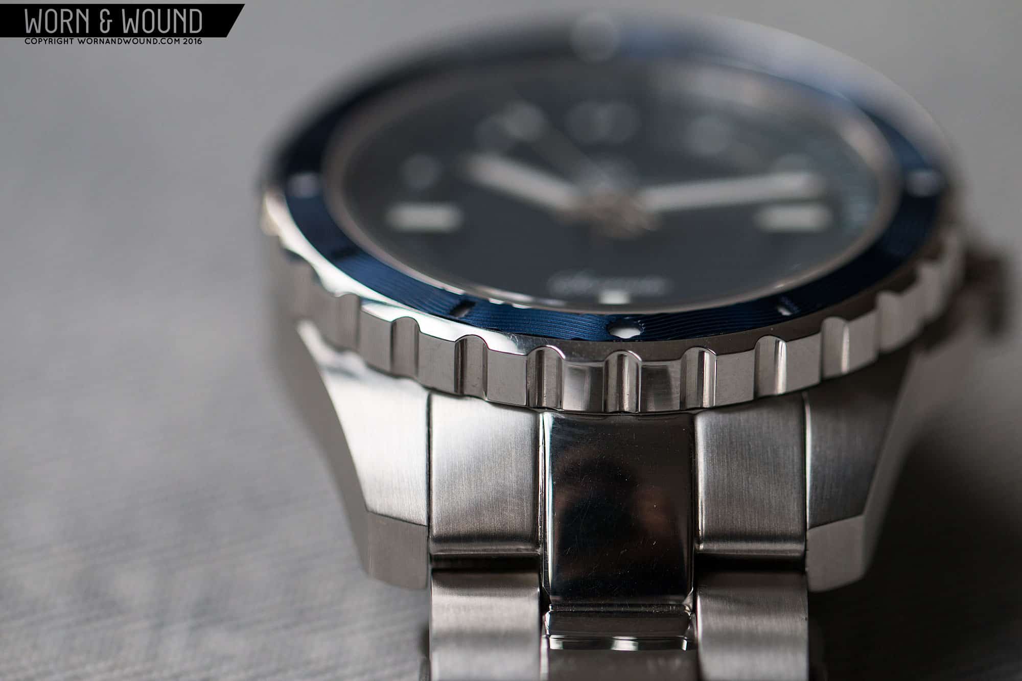
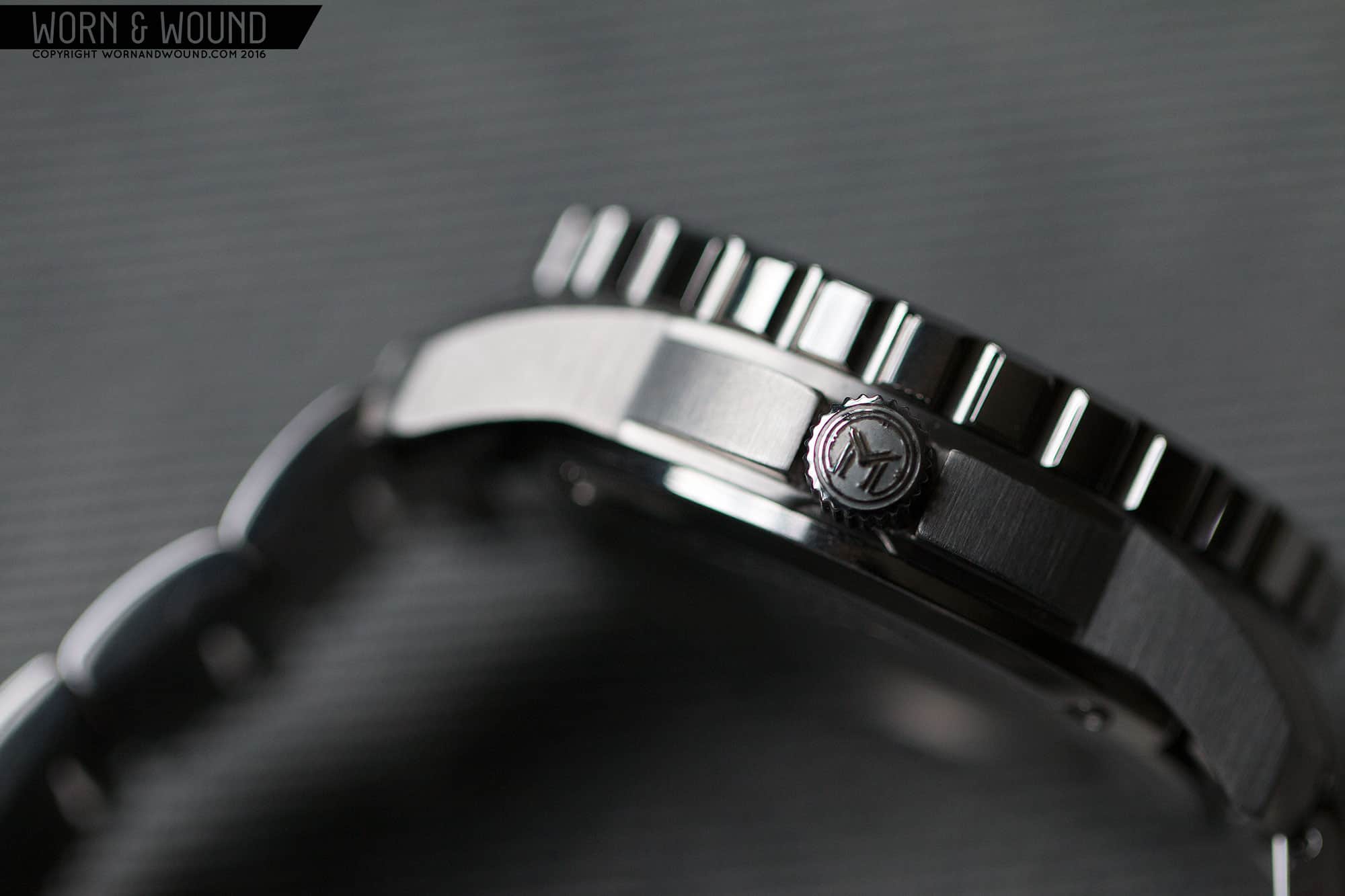
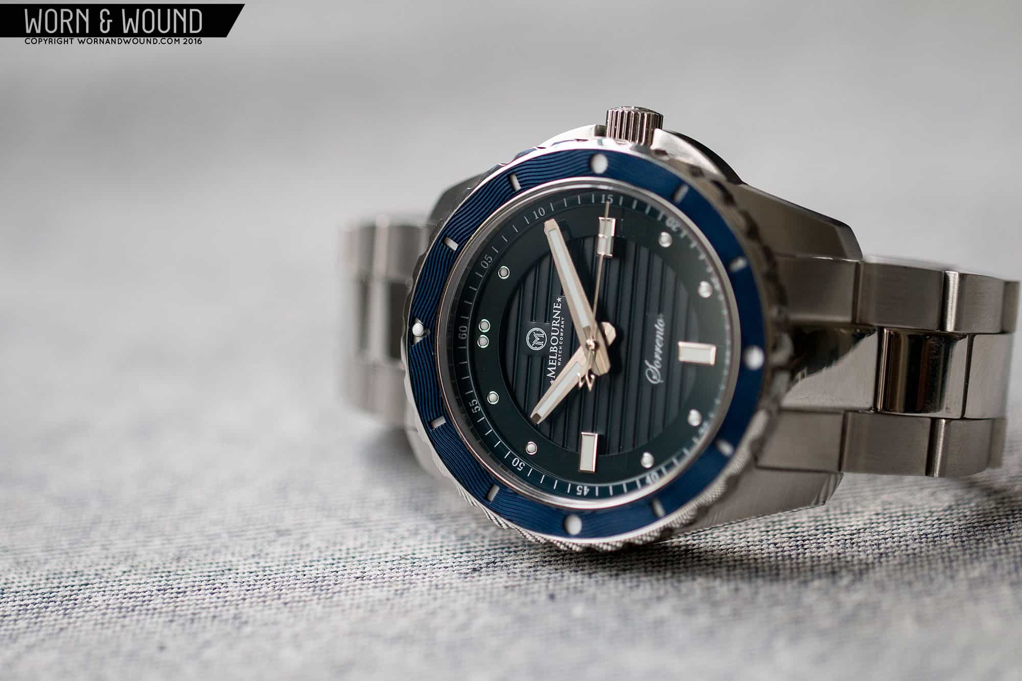
Coming in at 42 x 49 x 14mm, the Sorrento is a chunky dive watch, but with not-crazy dimensions. 42 x 49mm is definitely wearable and doesn’t come across as big for big’s sake. 14mm tall, on the other hand, is definitely thick, giving the watch an unmistakeable tool watch profile. Given the thickness, I would have expected a 500m+ rating, so the 200m, while totally serviceable for use, was a bit surprising. From above, the design is very masculine, with broad lugs that look like they can take a beating. On the right side is a reserved screw-down crown coming in at 6 x 4mm that is flanked by large, arcing crown guards that add some bulk and aggression to the overall package.

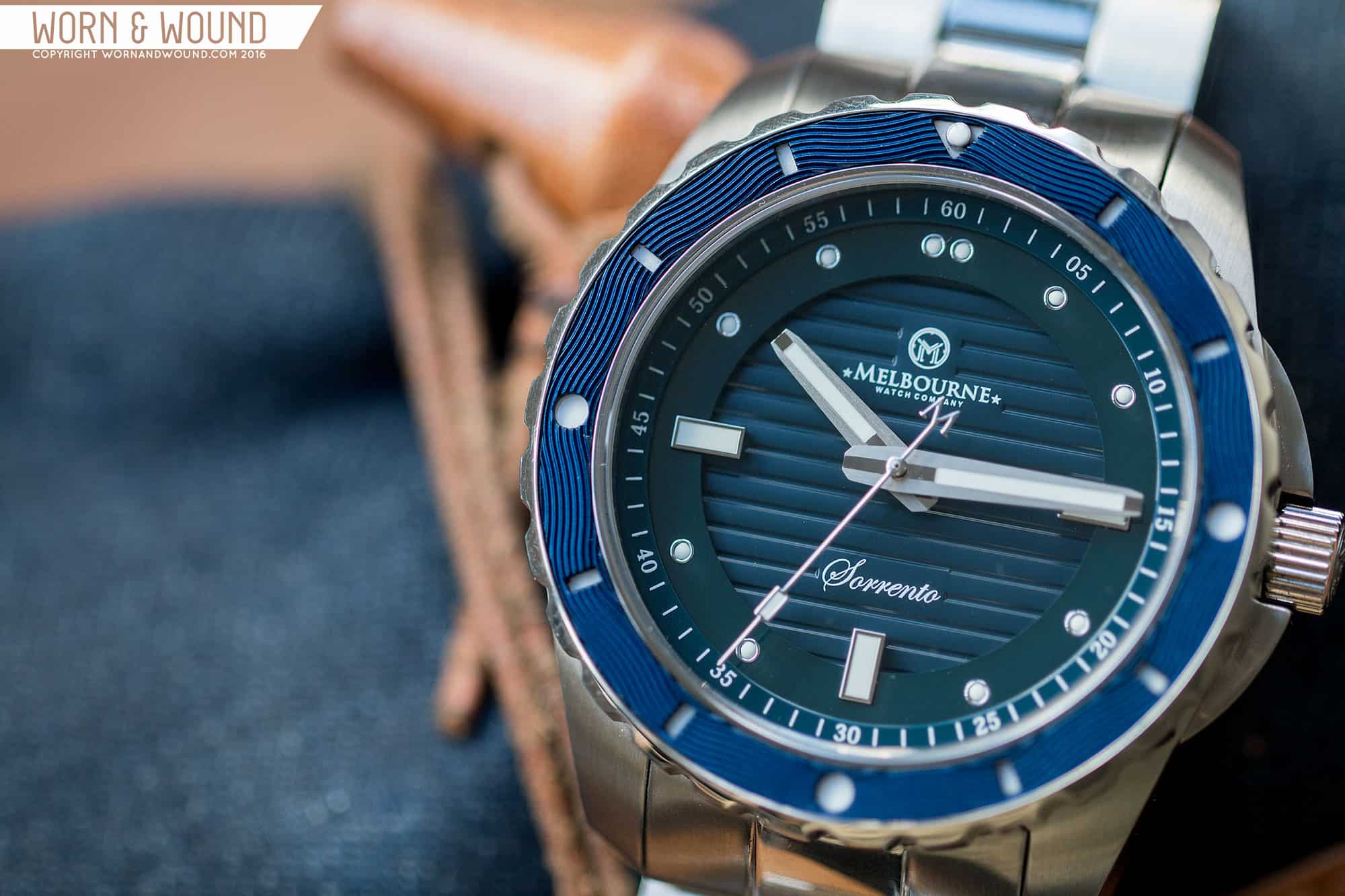
The bezel is a definite highlight of the case and watch overall. The insert is made of engraved aluminum over an enameled surface, giving it a bit of sandwich look. The engraving is particularly cool, adding a flowing texture of waves that you can literally touch and feel. This isn’t something I’ve seen done before on bezel, though it has a certain Omega-ness to it, that said it’s a great detail for a micro-brand watch. The bezel itself is then quite tall at nearly 5mm in height, with big chunky teeth for grip. It has a 120-click uni-directional mechanism with good action and little back-play.

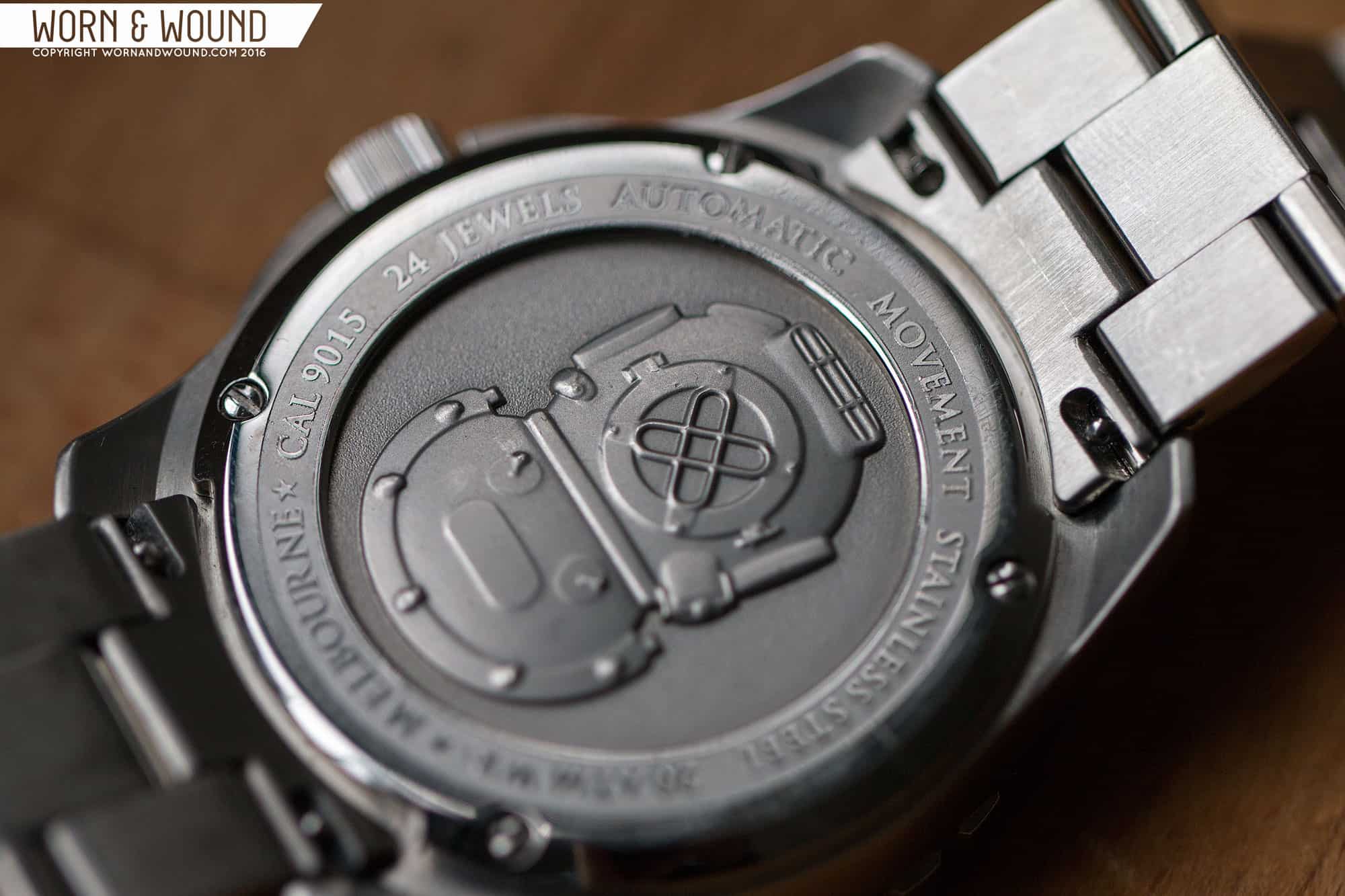
The case features a mix of finishing with the mid-case being entirely brushed and the bezel being polished. The added glint of light from the bezel goes to the “dress diver” concept of the watch. Flipping the watch over, you have a cool, deeply stamped case back. We’ve seen this before on Melbourne’s watches, and it’s alway a welcome addition. On the Sorrento you have a sculptural vintage diver’s helmet with a pebbled background. It looks great and definitely adds value to the overall perception of the watch.

Dial

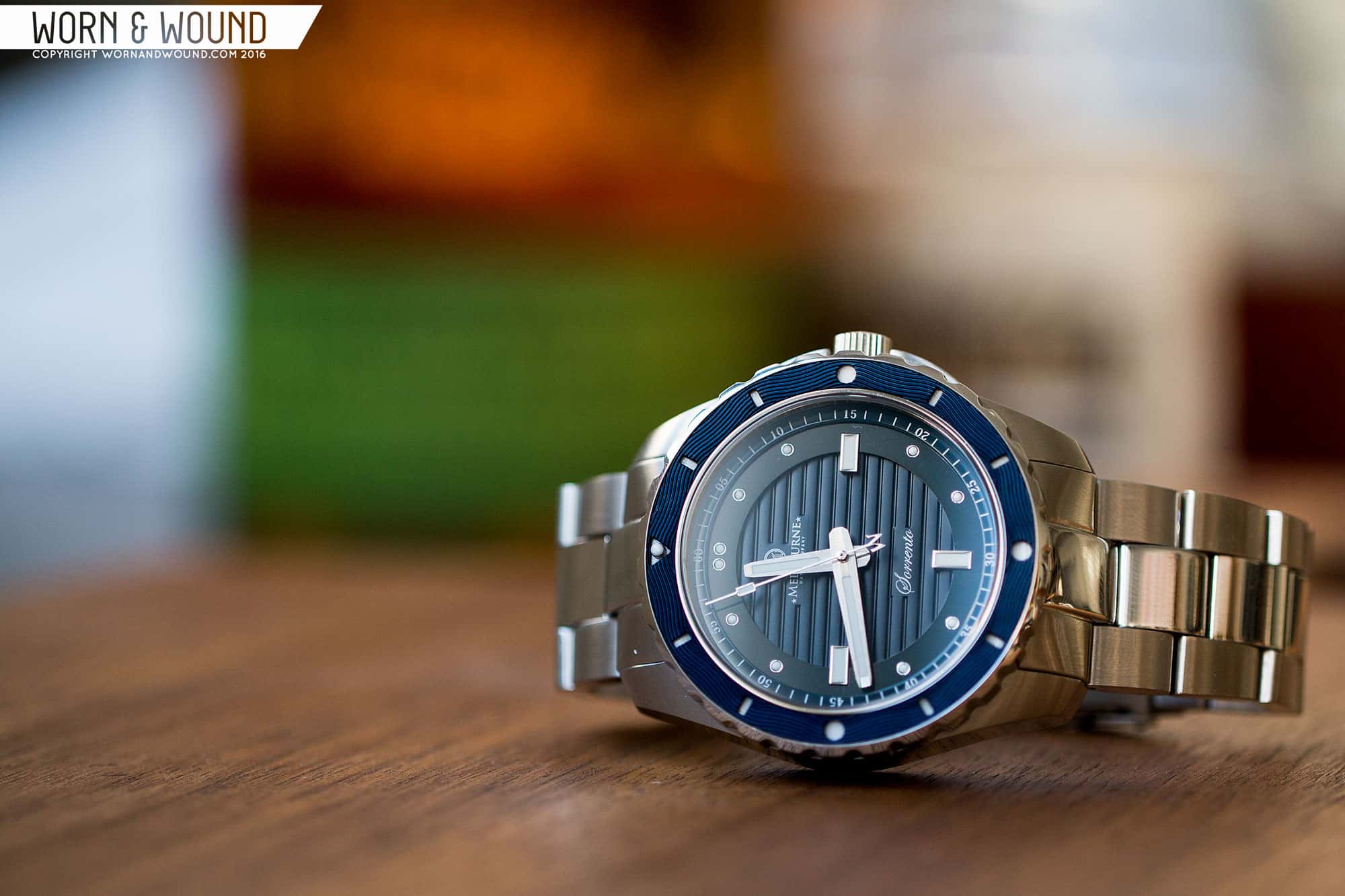
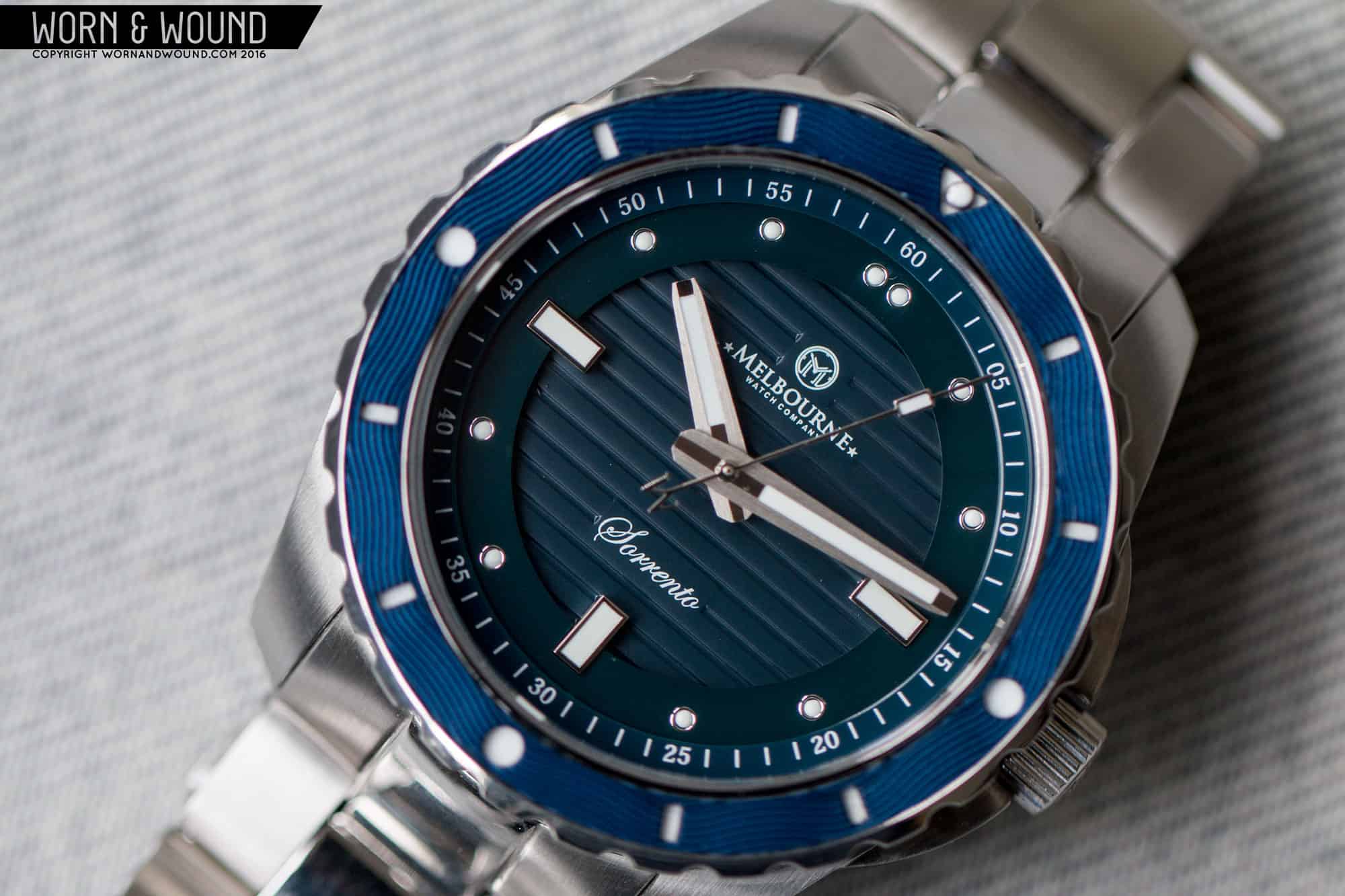
The dial draws from the Portsea collection, creating a more unified aesthetic across the brand, but takes it in a different, sportier direction. The dial consists of three layers, a base layer, a mid layer and a chapter ring. The base layer is dark blue and features a horizontal line pattern that clearly brings to mind some well-known luxury sport watches, but in the context of this watch doesn’t feel like an aped detail. In fact, it works very well, adding a background of texture.

The next layer up is a ceramic ring on which you’ll find the primary index. This consists of three large rectangles at 3, 6 and 9, and small circular markers for the rest of the hours, doubling at twelve. The large rectangles are well executed, with steel surrounds and lume filling. They actually cut through the ring, continuing in towards the center of the dial, which is an attractive detail. The small markers then appear almost like set stones with steel surrounds around white lume interiors. I don’t love how they look, to be blunt. They feel too small compared to the rectangles and lack the boldness associated with the dive genre. Also, the area at 12 feels too empty, aching for something on scale with the rectangles.

The last layer is the chapter ring, which consists of white numerals and marks on a blue surface. This works well and adds some needed sportiness to the dial. The three rings together, plus the markers, create a dial with a nice sense of depth and texture. It has a sculptural sensibility that is a nice change for a dive watch. The sample watch is clearly a dark blue, but I found the layers don’t quite match. The ceramic ring in particular veers towards teal. Admittedly, this is a prototype, so that might be fixed for production.

The hands of the Sorrento are unique and interesting. The hour and minutes are a bold, modern style that are sort of coffin-shaped. They are widest at the central axis, tapering back and forward, and featuring faceted corners. They also have a cool mix of finishes, featuring matte sides with a polished strip down the center. The seconds hand is then a stick with a lumed square and an “M” counterweight.

Straps and Wearability

The Sorrento comes on a 22mm steel bracelet with a typical three-link design and solid endlinks. It’s a robust bracelet with a sturdy feel, a slight taper down to 20mm, and a mix of brushed side and polished center links. Though I don’t love polished links on bracelets, as they can be a bit tacky, they do feed into the polished bezel and add to the dress-diver concept. As such, it makes sense on the Sorrento, riding between rugged and elegant.

melbourne_sorrento_wrist_1

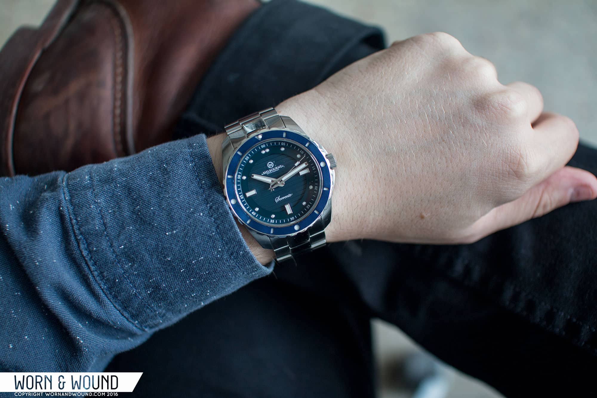
On the wrist, the Sorrento wears better than expected. It sits comfortably on top of the wrist, not looking too big by any means. The 42mm diameter mixed with the broad lugs makes for a very solid, masculine watch. The height is where it feels big. At 14mm, with an exaggerated bezel height and slab sides, it does sit high, towering over your wrist. This is not unheard of for a dive watch or tool chronograph, but given the dress-diver concept, feels too big. As is, it’s not going to fit well under a shirt sleeve. That said, the Sorrento does have an overall appealing look, mixing textures, depth and color. The bezel is particularly captivating, catching light in interesting ways and having a real, tactile quality. It’s not an aesthetic one typically finds in a case this size, so it stands out.

Conclusion

With the Sorrento, Melbourne has created a unique watch that builds on the aesthetic they created with the Portsea. The layered dial, textured bezel, use of interesting materials and techniques gives the Sorrento a distinct look that speaks to the brand. This I really like. The Portsea watches were a very successful play on a marine style that has a signature look Melbourne can own. It makes sense for them to utilize that aesthetic in other lines, creating a cohesive catalog of watches.

That said, the dress-diver concept is a curious one that I think is hard to pull off in general. It has to balance size with aesthetic elements, and stay true to two conflicting concepts. Dress watches want to be small and understated, dive watches want to be larger, and rugged. Finding a middle ground that works for, or as both is tough as it’s a game of compromises. The Sorrento is one approach, which takes a tool-watch sized diver body and adds some elegant elements to make it dressier. Another approach would have been to take a dressier body and add dive elements, like a bezel and bolder markers, and perhaps forego a typical dive water resistance. This might have been more successful aesthetically in the end.

melbourne_sorrento_case_7

As is, what you have is a watch for those who want something bigger and bolder with the aesthetic elements of the Portsea, and as that the Sorrento is successful. Coming in around $830 MSRP, $605 pre-order (prices change depending on strength of USD) the Sorrento is on the high, but still acceptable side for a Miyota 9015 powered automatic. I know people will disagree since there are kickstarted brands with no margins selling them for less, but in reality, that’s a fair price. So, if you’ve been looking for a bigger, sportier Melbourne, the Sorrento has you covered. It’s also available in all black or white with a blue bezel, for more conservative options.
Advertisement
Images from this post:
Related Reviews
Zach is the Co-Founder and Executive Editor of Worn & Wound. Before diving headfirst into the world of watches, he spent his days as a product and graphic designer. Zach views watches as the perfect synergy of 2D and 3D design: the place where form, function, fashion and mechanical wonderment come together.
wornandwound zsw