It’s really exciting to see some of the watches that are funded via kickstarter come to fruition. We’ve looked at the Pebble, the Anstead Oceanis, the Lew & Huey Riccardo and now, the Melbourne Watch Co’s Flinders. As is always the case with these funded projects, the question becomes, was it worth it? Did the horde of philanthropic watch hobbyists help birth a worthwhile product? The answer, in my opinion, is a firm yes.
Named after a central train hub in Melbourne, the Flinders is a modern business-casual watch; a sort of everyday design. It’s versatile in a non-sport setting, which is to say, wear it to work, to the bar, out with friends, to walk your dog, but probably don’t sky-dive into a volcano with it (but if you do, tell us). It’s sized to have presence, but not be obnoxious and styled to be handsome, eye-catching, but not ostentatious. It’s also designed to be a good value, featuring nice detailing and finishing throughout, a sapphire crystal and a Miyota 9015 for about $475. Sujain, the founder of the brand, has kindly offered w&w readers 10% off of the flinders through April 10th with code WORNANDWOUND for an even better deal.
Melbourne Watch Company Flinders Review
 Case: Steel
Movement: Miyota 9015
Dial: Silver
Lume: No
Lens: Sapphire
Strap: Leather
Water Res.: 50m
Dimensions: 40 x 47 mm
Thickness: 10.5 mm
Lug Width: 20 mm
Crown: 5 x 3.2mm
Warranty: 1 year
Price: $475
Case
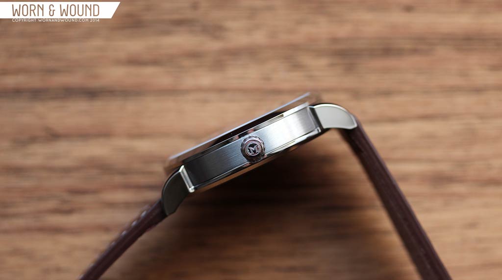
The Flinders immediately impressed me upon removing it from its slightly-nicer-than-average shipping box. It’s clean and well-proportioned; easy on the eyes. The 40 x 47 x 10.5mm case has a multi-part construction with the lugs attached to the case-back. This is a design solution we’ve seen on the Hamilton Khaki Navy and Bravur Watches as well, which allows for greater finishing and detailing options than the standard mid-case lug, at least at this price point. On the Flinders, they used this to create very elegant, slender lugs with a slightly broadening angle, beveled edge, and lip before meeting the case. They speak to more decorative watches from the early twentieth century, but are subtle and don’t over take the watch with ornateness.
The other benefit of the multi-part design is in the finishing. The bezel, lugs are polished, while the mid-case/case sides are lightly brushed. Because of the lugs coming up from below, the case is brushed between the lugs and right up to the polished edge of the lugs. This makes for clean and sharp finishing. The display case-back, which shows off the undecorated 9015, has a circular brushing, some engraved texted and 6-flat head screws for easy access to the movement.
At 3 is a push-pull crown with deep-grooves and Melbourne Watch Co’s “M” logo on the side. It measures 5 x 3.2mm, making it on the small side. This is the one potential misstep on the case to my eyes. It just seems too small, and bit too long for its diameter. I think a lower, wider crown would have suited the watch better, and frankly been easier to grasp. I found this a challenge to pull out to set the time.
Dial
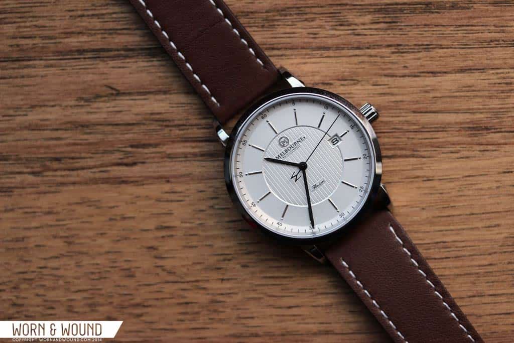
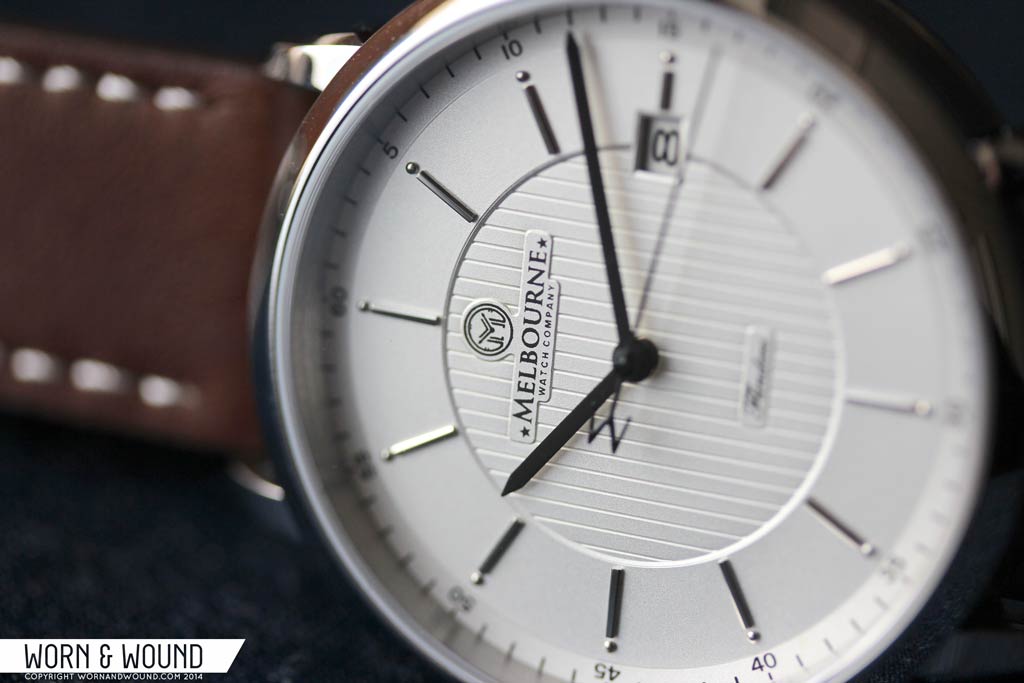
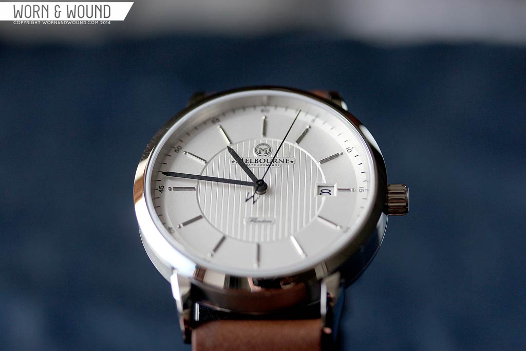
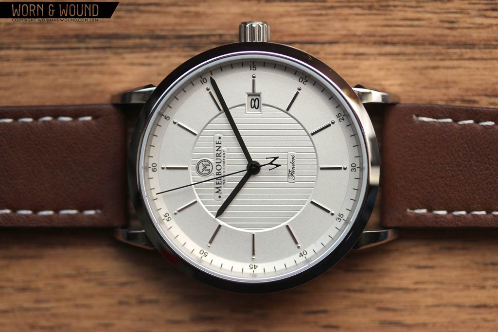
The dial of the Flinders has a restrained class to it that is very appealing. Available in black or silver, the dial utilizes layering, texture and finish to create a look that speaks to a higher price point. The silver dial version, which we had on hand, is a pale, matte silver that can come off as white or light grey, depending on the light. The primary index consist of applied polished silver batons and half spheres. It’s a simple index that is effectively legible and adds a dressy note, each baton glimmering slightly. Balancing this is a printed index on the outer edge of the dial for the minutes/seconds in black, with numerals at intervals of 5. This index is actually on a layer that is slightly below the central area, and a touch lighter in color, which adds depth and texture.
The center of the dial features a wide area with a faux guilloche of parallel lines. This is a really nice detail that activates the dial. It’s decorative, but simple and clean in such a way as to be masculine. Because of the slightly metallic surface, this area is avery dynamic, shifting from lines of highlight to lines of shadow depending on the light. Also in this area is a sizable set of Melbourne logos, both text and icon, below twelve. They are large, but don’t feel to big or noisy. Above 6 is then a small area that reads “Flinders” in script. Breaking through the dial at is the date window, which reveals the black on white date. Though technically it doesn’t match, the white is close enough to the silver to blend in.
The choice of hands for the Flinders is interesting and, I think, quite smart. The hour and minute are gloss black straight-swords that are relatively thin. Though a simple, classic shape, what makes them interesting is that they sort of contrast the style of the dial. I would have expected something a bit more elaborate, such as delphine hands, but this was the right choice. They add a stronger and bolder element to the dial that brings it back to being casual and versatile. The seconds hand is a thin black stick with an “M” shaped counterweight. Not sure if that was necessary as the dial is so heavily branded, but I assume they are trying to create a signature design.
Straps and Wearability
The silver dial Flinders comes mounted on a 20mm brown leather strap with a classic tapering design. It’s a medium/mocha brown with a white contrast stitch and a fairly supple feel, though it’s clearly leather around filler. I’d think of this strap as a fine starter for the watch, but would likely look into something with more character. The medium brown is a bit flat and the white contrast stitching is a bit to clean. A richer color, perhaps with more orange or red and a cream or light grey stitch would suit it a bit better.
That said, it’s totally wearable and works well enough with the watch out of the box. The buckle happens to be very nice though, with a more unique design then one typically finds. The design of the Flinders and the monochromatic color of the dial make it very versatile when it comes to straps as well. Dress it up with a croc, dress it down with a suede. a simple cordovan would look great as well. Try black, brown, tan, maybe even blue if you’re feeling daring.
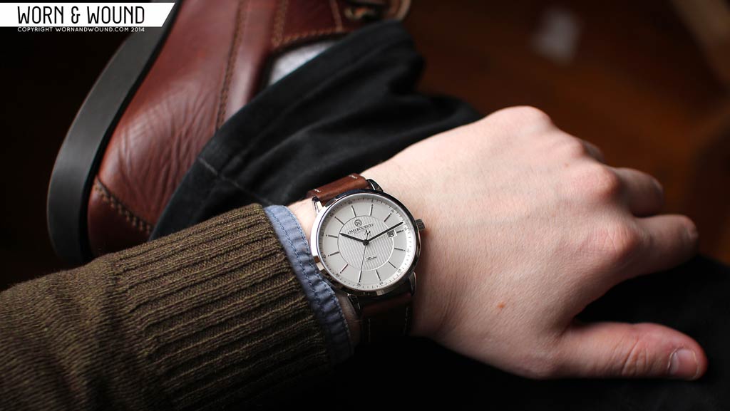
On the wrist, the Flinders is a simply a winner. It’s a very comfortable size, not too wide, not too long and pleasantly thin. Most of the focus is on the dial, as the lugs are quite narrow, which makes it seem a bit smaller than 40mm too. As a versatile, everyday wear, this is just about the perfect size. It’s large enough to have good presence and be masculine while not trying to stand out. It’s also small enough to look a appropriate in a more formal setting.
Style wise, the Flinders also does a great job. Versatility is the key feature that makes it compelling. It has dress elements, sport elements, restrained elegance and touch of boldness, all of which come together for something serene and refined. Im a particularly big fan of silver dialed watches as I think they are even more color neutral than white or black, so this really can go with anything. Put it on with blue jeans a patterned shirt and boat shoes with a distressed brown strap to match and you’re fine. Through on a grey suit, black shoes and a black strap with a slight sheen and it will fit right in.
Conclusion
I was pleasantly surprised by the Melbourne Watch Co’s Flinders watch. Not because I doubted them for some reason, but I didn’t expected to like it quite as much as I did for my own personal taste. The watch just feels right. The various elements come together for a watch that is a pleasure to wear and looks good all the time. I especially like the case design as it’s quite a bit more elegant than what one typically finds under $500.
The only real issues I had were with the crown being too small and the strap being a bit boring, but neither take away from the watch being successful as a whole. The only other potential issue is that the design is a bit derivative of some of the Baume & Mercier Classima line, which feature very similar dials, namely having the same central texture and similar outer indexes. Honestly though, the Flinders is different in many ways, looks better, has a more interesting case design and a far more palatable price tag.
So, if you’re looking for an affordable everyday watch that leans towards dress rather than sport, the Flinders is very worth considering. Melbourne Watch Co has already started progress on their next watch, the Hawthorne, which leans more towards sport. Their kickstarter is currently active, already surpassing their goal of $15,000 AUD. Having now been impressed by the Flinders, I am thoroughly looking forward to what they have coming down the line.
by Zach Weiss




 Featured Videos





Like the look of the dial and the case. However, both their models look exactly the same.. I feel like this watch is a bit overpriced for a new brand using a Miyota movement..
Perhaps you’re thinking of the Miyota 8215 instead of the Miyota 9015?
A $475 watch using the 82xx movement would be overpriced. The 9015 is a superior movement comparable to the ETA 2892’s level up over the 2824. It’s significantly thinner than the 82xx series (3.9mm to 5.67mm) and beats at 28800bph instead of 21600. It is also more accurate than the 8215 (already a pretty accurate workhorse movement).
There are many brands using the 9015 in watches priced higher than $475. There are some priced lower, too, to be fair.
$430, using the W&W coupon code mentioned above, makes this a nicely spec’d watch at a reasonable price.
Is that a ‘W’ on the second hand or is the ‘M’ upside down?
I can’t get excited about this one. The seconds hand is a nice try, but distracting. I’d like to see this with roman numerals. The dial looks too vanilla. Fit and finish look very good. I guess it looks like a design that was played too safe.
Hey Zach. Thanks so much for reviewing this watch. I live in Melbourne and didn’t even know about these guys until I read your review. Personally, I love the watch.