Mido Commander II Review

Mido is a name that has been popping up on worn&wound with more frequency as of late. The Swatch Group owned brand is not new by any means, they just had focused on non-US markets for the majority of their life span. Now, however, they are pushing in to the states following the success of Tissot and Hamilton, who they share a general price category with. As I mentioned when we first introduced their Baroncelli Heritage watch (which we later did a hands-on with post Basel), what’s great about Mido becoming more available is that they have a nice range of well-priced dress and business-casual watches. A genre I feel is often underserved in at the price point we discuss.

Today we’ll be looking at the Mido Commander II, which as the name suggests is the sequel to a classic Mido watch. A bit larger and more contemporary, the Commander II has a retro style without feeling like a remake. It has an interesting character of its own with its circular case, integrated bracelet and textured dial. Since it’s Swatch Group, inside it’s powered by an ETA automatic movement. In this case, the Caliber 80.611, which features an 80-hr power reserve. Coming in at a retail price of $920, it’s a decent value for a Swiss-made automatic, let alone one with an 80-hr reserve, which typically cost over $1,000 these days.

Advertisement
$920

Mido Commander II Review

Case
Stainless Steel
Movement
Caliber 80.611
Dial
Sunburst Gray
Lume
BGW9 SuperLuminova
Lens
Domed Sapphire
Strap
Integrated Bracelet
Water Resistance
50m
Dimensions
40 x 45mm
Thickness
11.4mm
Lug Width
mm
Crown
5.5mm
Warranty
Yes
Price
$920

Case

The Commander II features a modernized take on a vintage design. It’s a bit larger, and has some interesting contours. Before getting into that, it’s worth noting that the Commander II is available with lugs or with an integrated bracelet, as seen here. Typically, I go for lugged watches, as one can change the strap on them, but with the Commander II, I felt that the integrated design offered a more complete and considered aesthetic. Does it come at the cost of convenience? Of course, but it just looks right on the watch, and makes it wear very nicely.

MIDO_COMMANDER_II_CASE_5The diameter of the case measure 40mm. Because of the integrated lugs, you can either measure from link to link, which gives you 45mm, or disregard that measurement entirely, and just say it’s a 40mm lugless design, as in the end, that’s how it looks and feels. From above the case appears to be a cylinder with straight sides, a big dial, a nicely chamfered crystal that the bracelet joins underneath. The form is fairly uninterrupted, even the crown at 3 being semi-hidden in a recessed pocket.

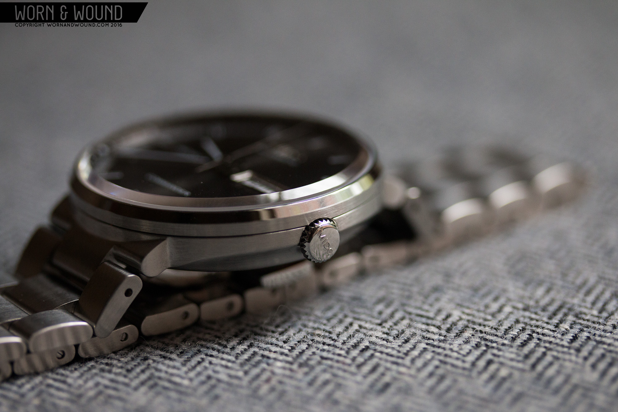
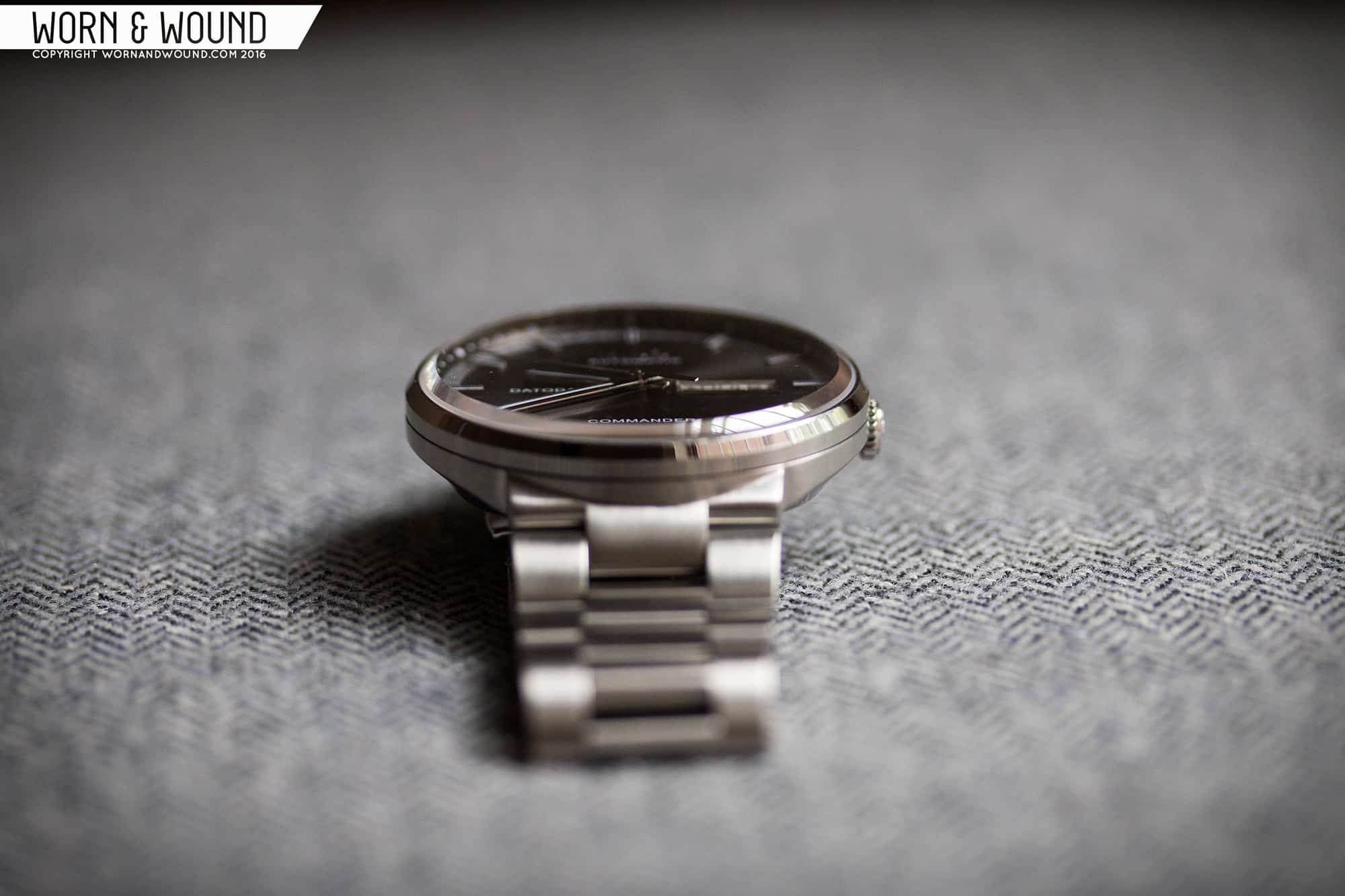
Looking from the side, the case geometry and finishing becomes more apparent. What stands out is that on either side there are large scalloped areas. These do a few things. One, they break up the side of the watch, making it look less tall. It’s 11.4mm to the top of the crystal, which isn’t too big by any means, but with slab sides, that could appear tall. The cutaways give the midcase the sense of being much thinner. Then they also add comfort as there is no bottom edge to dig into the wrist… not really much of a concern on a 40mm watch, but it doesn’t hurt either. Lastly, on the right side, it gives added access to the crown.

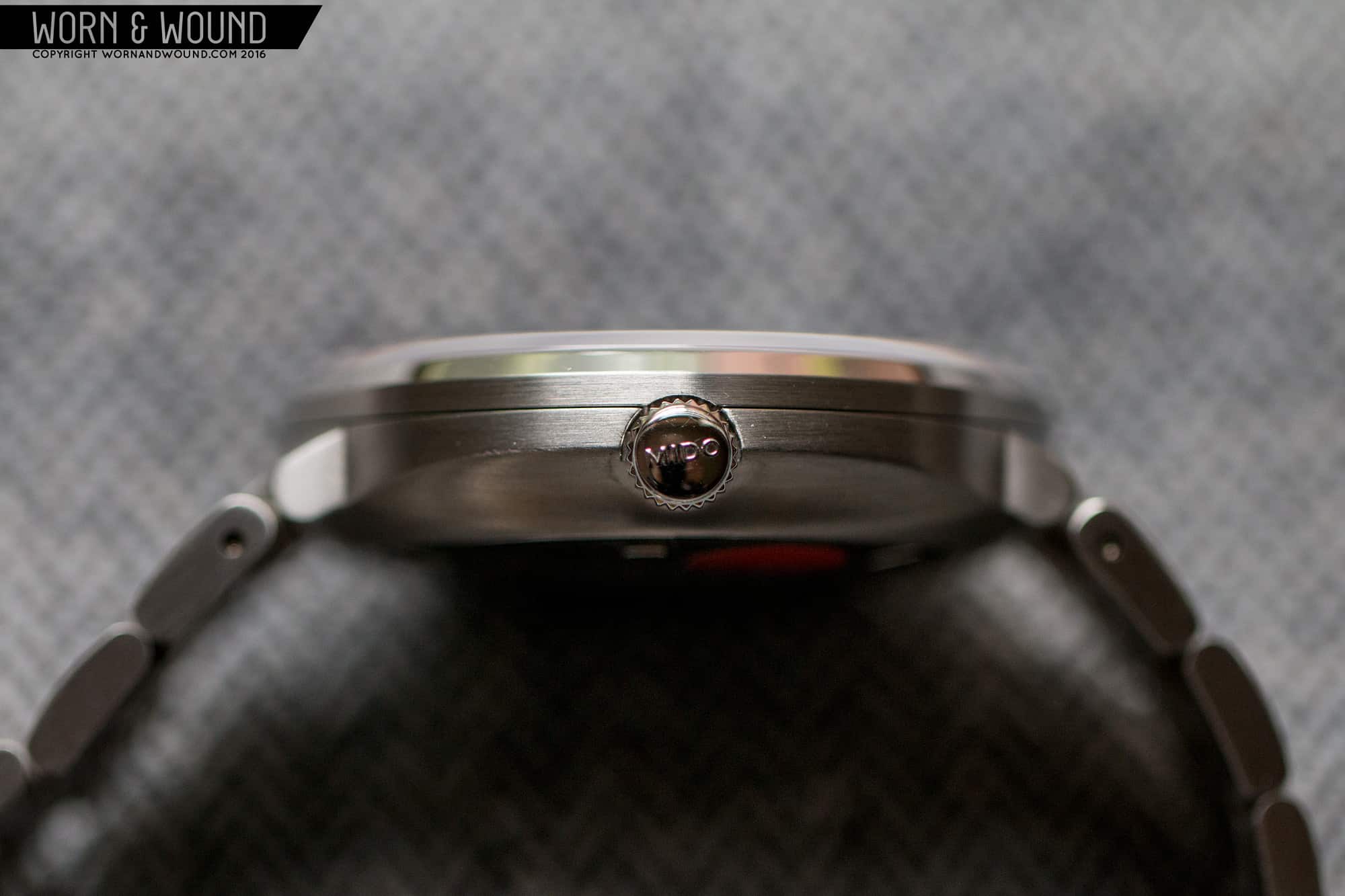
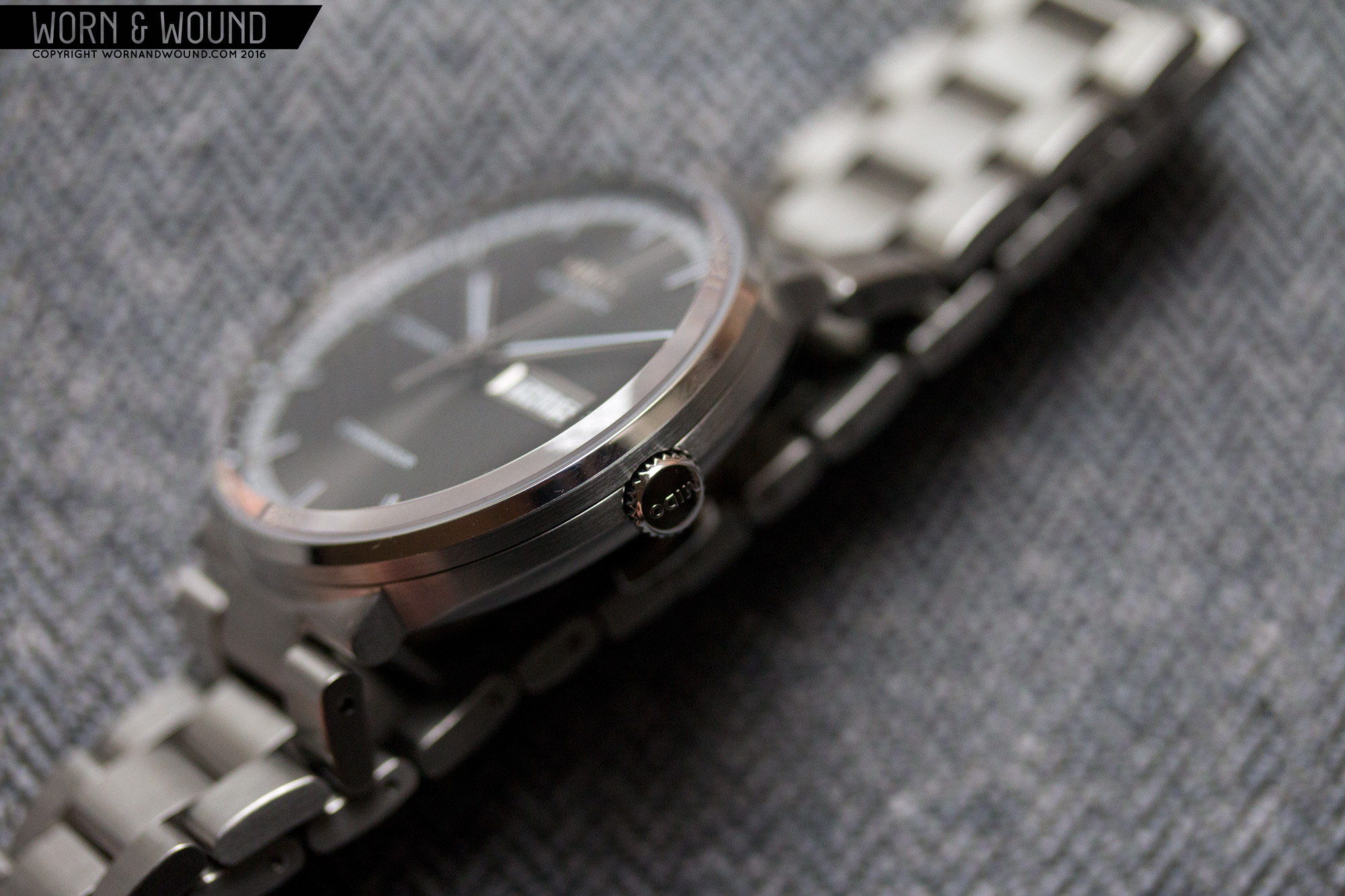
Still looking at the side, you’ll see that the midcase has satin brushing all around and then a mirror polished bezel. I was glad to see that the majority of the case was brushed, as too much polishing would have been tacky, while the limited use adds some texture and variation. The polished angle of the bezel then leads into the chamfer on the tall domed crystal, which is an attractive transition. The big sapphire crystal is another nice touch, referring to the boxed acyclic crystals of vintage watches.

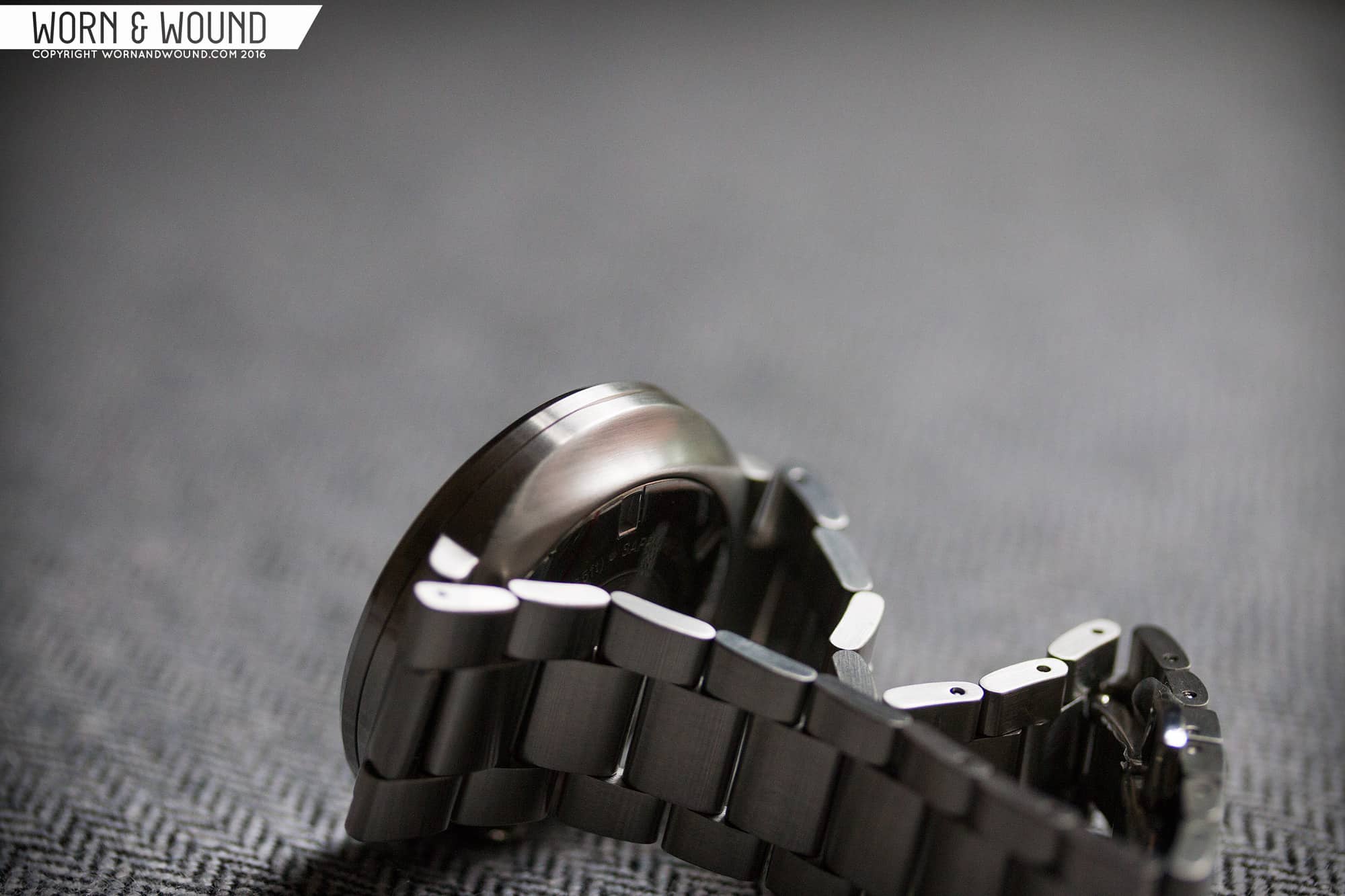
The only slightly odd thing about the case is the crown. It’s a very simple design measuring 5.5mm in diameter, with coining on its edge and a Mido logo on its outer surface. The odd part is that it is full polished, but sits within a brushed area. I assume this was for a bit of contrast, but it almost looks like the crown goes to a different case. Flipping the watch over, you have a solid case back that recessed in the midcase. Because of the integrated bracelet, you rarely get a view of the caseback, so no sense in making it anything but solid.

Dial

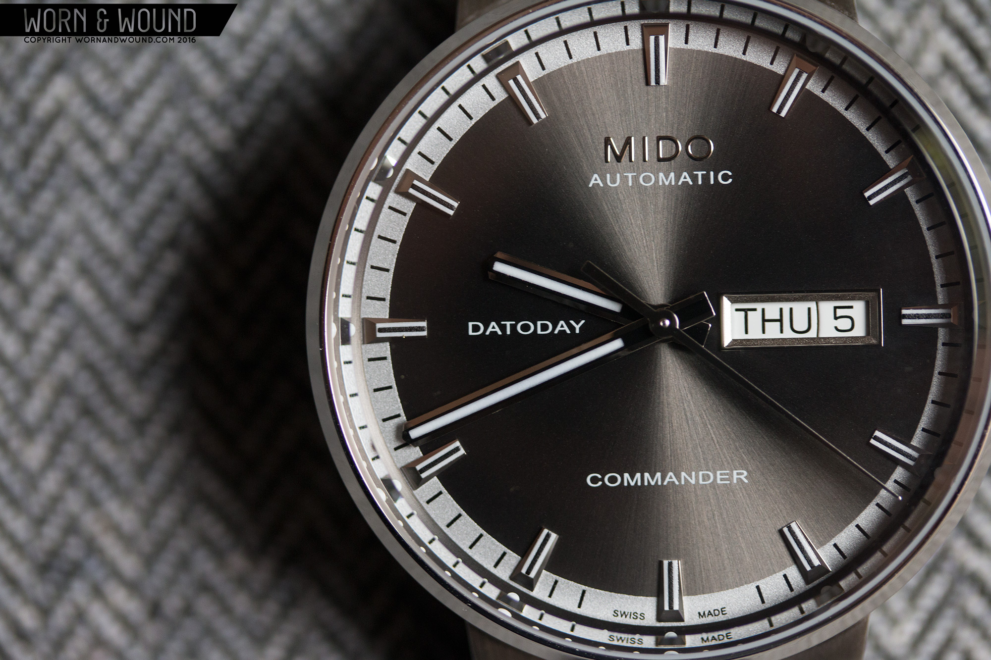
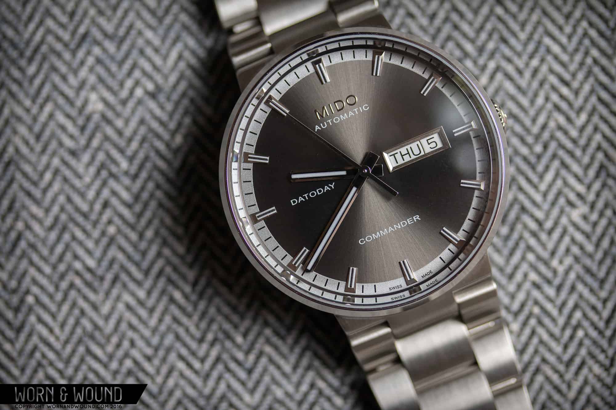
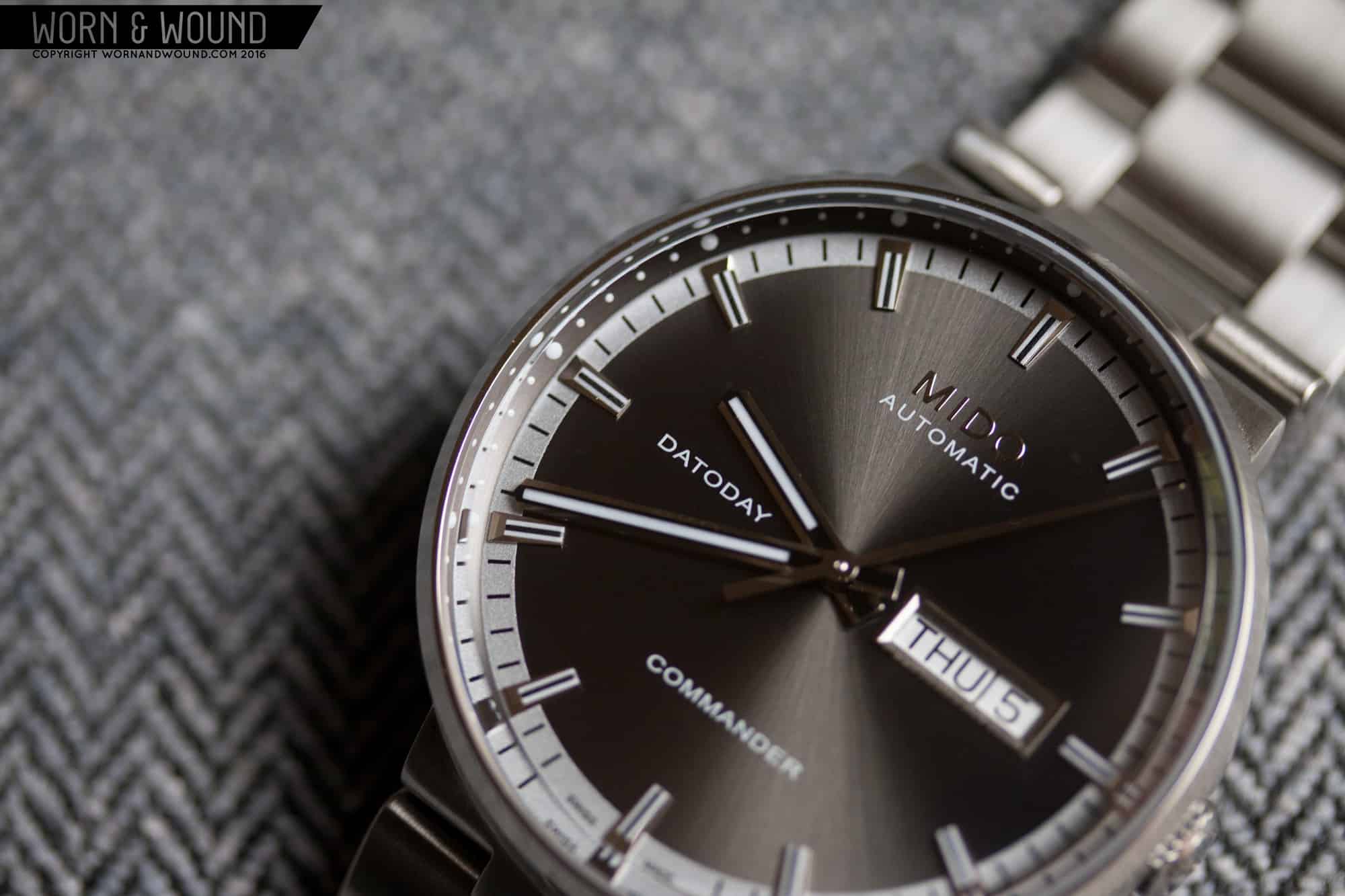
The dial of the Commander II mixes texture and finishing with applied markers for a handsome effect. The inner surface of the model reviewed is a dark gray with a sunburst finish. I’m sometimes on the fence about sunburst as it can be a bit plasticky feeling, but here it looks great. The gray is quite dark, so the beams of reflected light in throws are tempered and add some depth. Around the inner surface is a ring of light, matte silver. This contrasts the inner area, framing it, adding a slightly sporty feel.

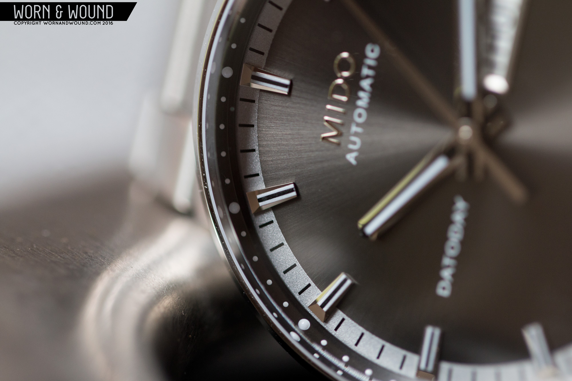
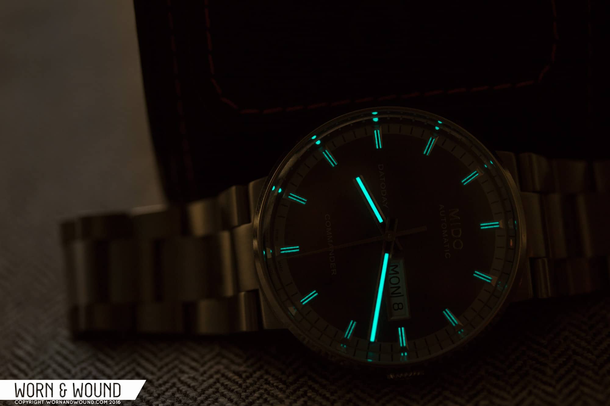
The primary index rests on top of both of these surfaces, consisting of 12 identical applied markers. Each marker is quite complex, with a faceted ramp shape that adds some glints of light as the dial moves around. On top of the markers are three lines, consisting of a black line flanked by thin lines of BGW9 lume. In the light, the stripes add a texture of there own, each creating an area of density. In the dark, the lines of lume have a cool, stylized effect. It’s a very thin area so they don’t glow that bright, but it looks nice. Between each marker are thin black lines per minute/second.

Around the outer edge of the dial is a gun-metal gray chapter ring at a steep angle. When you look at the watch straight on you actually don’t see it because the chamfer of the crystal blocks it, only revealing itself at an angle. On the ring is an additional index consisting of white dots that are larger per hour and lumed. I like the use of dots here as it contrasts the otherwise faceted geometry at play, and has the feel of tritium dots from vintage watches.

On the main surface of the dial you have various pieces of text as well as a large day/date window at 3. The latter might be an issue for some as it does stand out a lot, and is relatively large for the dial. I accept it, as it’s part of the Commander watches and their history, though I do think more could have been done to integrate it with the dial. The most obvious thing just being to make the date disk gray with white text instead of white/black.

MIDO_COMMANDER_II_LUME_1

The handset used on the Commander II is very handsome, with a nice amount of detailing to match the dial below. The hour and minutes are straight swords in polished steel with black lines running down their centers. Within the black lines are then thin strips of lume. Both hands a bit wider than you’d expect on a watch this style, which works surprisingly well, giving them a masculine look. The seconds hand is then a more standard tapering stick in polished steel.

Advertisement

Movement

Beating inside of the Commander II is the Caliber 80.611. Like Tissot and their Powermatic 80, or Hamilton and their H-30, the Caliber 80.611 is a proprietary name for an 80-hr ETA movement, the C07.xxx, based on the 28xx platform. Specifically with the 80.611, it’s based on the 2836/ C07.621, which is the day/date variant. It’s a 25-jewel automatic with hacking, hand winding, day, date, 80-hr power reserve and a frequency of 21,600bph.
Take a moment and watch the video below, which shows a bit of the manufacturing and assembly of the Caliber 80.

Bracelet and Wearability

As mentioned, the version of the Commander II being reviewed has and integrated bracelet, where the end-link of the bracelet is actually part of the case. As such, it’s not interchangeable, so you best like it if you’re interested in the watch. Luckily, it’s nice looking and well-made. It’s a 3-link design with a taper that measures 22mm and the case and 18mm at the clasp. It’s lightly brushed all over, giving it an understated look. The watch is all about the dial, so I was glad that the bracelet wasn’t ornate. It also features a butterfly deployant clasp for clean lines all around.

MIDO_COMMANDER_II_BRACELET_1

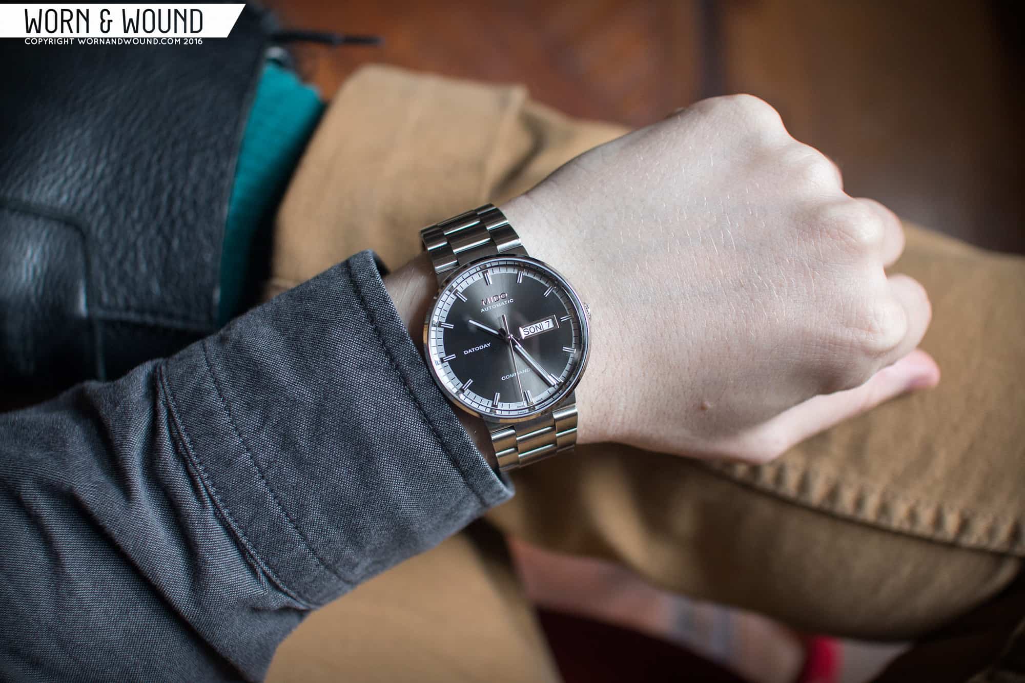
On the wrist, the Commander II wears very well. The 40mm case is a nice size for a business-casual watch. It has enough presence to feel masculine and modern, but isn’t oversized either. Is it larger than a classic dress watch? Sure, but I think of it more as an everyday watch that can work in a formal environment, rather than a special occasion watch. As said before, it also really wears like a lugless watch, but an all dial one, balancing out well. Lugless cases tend to feel smaller, while big dials feel bigger. In the end, I think they nailed it with 40mm.

MIDO_COMMANDER_II_WRIST_1

It’s also very attractive. The case is subtle, but unique, with enough detailing to capture your attention. The dial then is dark and textured, with intriguing features and a overall nice sense of balance. It doesn’t draw too much attention, but it’s not too demure either. Because of the coloring, size, etc… it’s also very versatile. It will compliment pretty much any color and works with clothes ranging from casual to formal. I mean, I wouldn’t necessarily wear it with a tux, but it definitely would look great with a gray suit.

Advertisement

Conclusion

The Mido Commander II watches are a great option for someone looking to add something a bit more formal to their collection, but still want a good everyday watch. Handsome, refined, well made and just different enough from everything else to stand out. The model shown is also only the tip of the iceberg as far as the Commander watches go. There are ones with lugs and straps, lugs and bracelets, dial variations, Chronometer rated models, chronographs, ladies sizes and more. So, if this one intrigued you, but perhaps didn’t win you over, they might very likely haven’t a variant that will.

I however really did enjoy this model. I love grey, so the monochromatic palette did it for me, but I also like the integrated bracelet. Perhaps it is just because I don’t own anything like that or typically am drawn to it, that I found the the experience interesting. From a design perspective, it makes a lot of sense. It’s a complete and coherent vision. From the consumer perspective, it simplifies things. No need to worry about matching the strap to anything, just grab it and go (though I suppose that is true with bracelets in general). Lastly, with an MSRP of $920, it’s very fairly priced. Good build, good finishing, 80-hr power reserve, stylish… speaks for itself.

Images from this post:
Related Reviews
Zach is the Co-Founder and Executive Editor of Worn & Wound. Before diving headfirst into the world of watches, he spent his days as a product and graphic designer. Zach views watches as the perfect synergy of 2D and 3D design: the place where form, function, fashion and mechanical wonderment come together.
wornandwound zsw