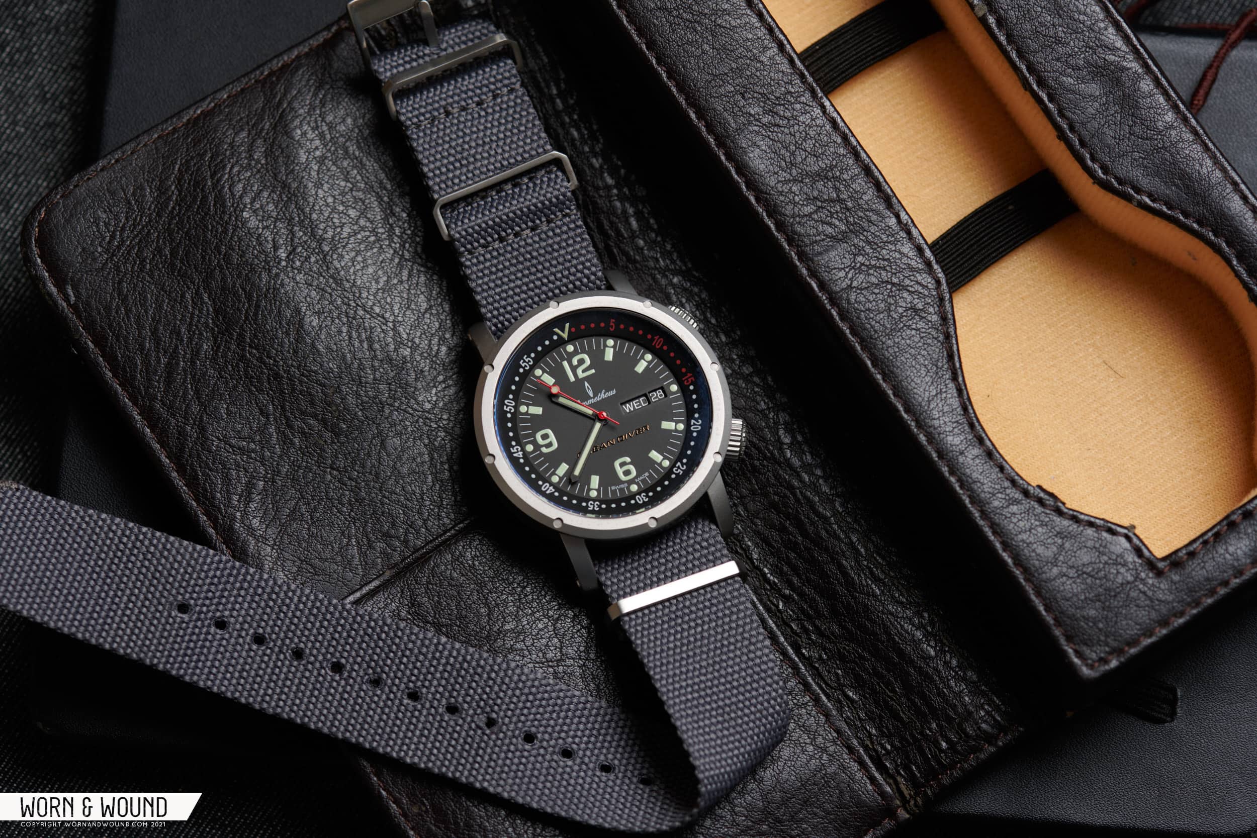
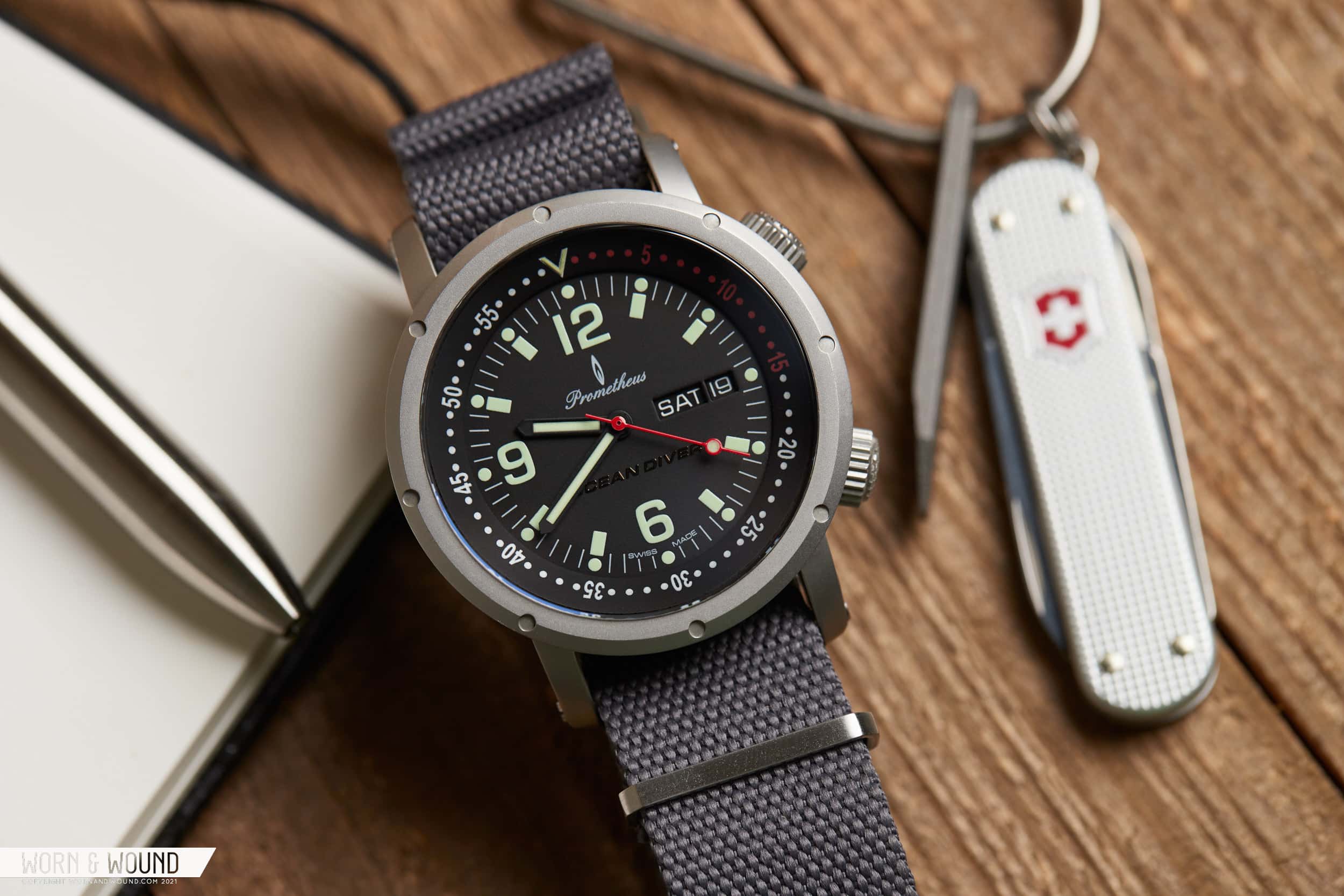
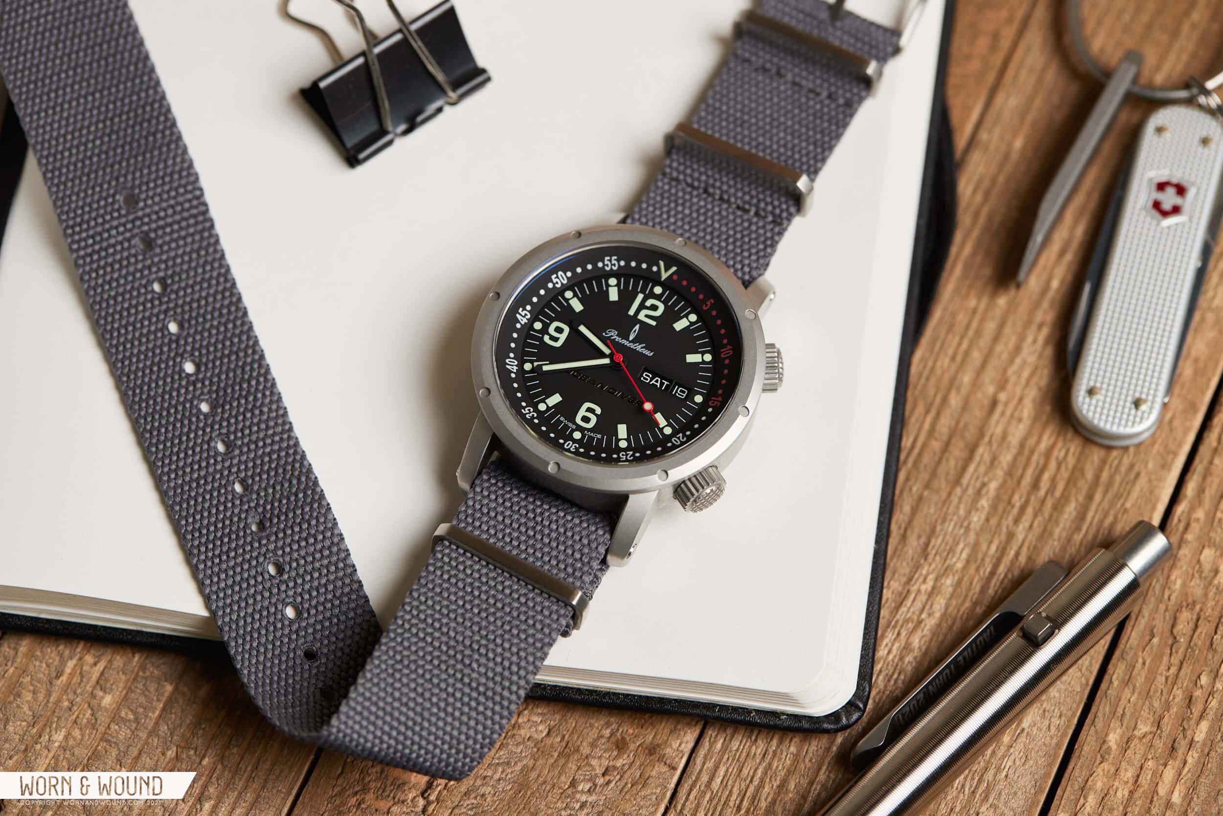
Turn the clock back to 2009, and the watch collecting world looks like a very different place than what we know it as today. Much of the community thrived on forums like TimeZone and WatchUSeek, and a small enclave of independent ‘micro’ brands were beginning to find traction. Instagram wasn’t a thing yet, ‘hype’ watches were readily available at ADs, and eBay held a treasure trove of cool, quirky watches waiting to be discovered. In hindsight, it was a veritable paradise for enthusiasts. Save for the fact that Worn & Wound wasn’t around yet, of course. If we were, there are plenty of watches that would have appeared on these pages that linger in the back of our minds to this day. In Missed Reviews, we’ll be taking a look at some of our favorites, starting with the Prometheus Ocean Diver.
Missed Reviews: The Curious Case Of The Prometheus Ocean Diver
Missed Reviews: The Curious Case Of The Prometheus Ocean Diver
‘Historical’ Context
I first came across the Ocean Diver in late 2009, when it was first offered to customers after a rather dramatic development period that involved a community sourced design, and a change in manufacturer mid-way through. The brand developing the watch, Prometheus Watch Company, was one of a handful of small brands that were active in the community, alongside the likes of MKII, Stowa/Jörg Schauer, Ocean 7, and Doxa; each of whom had their own official forum on WUS (WatchUSeek). The Ocean Diver was a watch design unlike anything else I had seen at the time, and for good reason, it was designed by a fellow forum member by the name of Brian F. Green (his blog about it).

The project began in a contest posted to WUS’s design forum by Prometheus, who asked for submissions by any member of the community. Users voted on a range of designs with Green’s concept eventually coming out on top. The design is a nod to old school super compressor watches, but I wouldn’t classify the end result as a throwback by any stretch. More on that later, but with the design in hand, Prometheus worked with a manufacturer in China to develop a prototype containing a Seagull ST16 automatic movement. Unfortunately, the prototype didn’t quite live up to the expectations, and the decision was made to move manufacturing to Switzerland, and shift to an ETA movement instead of the Seagull unit. The delay was considerable, but the improvements were welcome, even if it did mean a higher price point and later delivery.
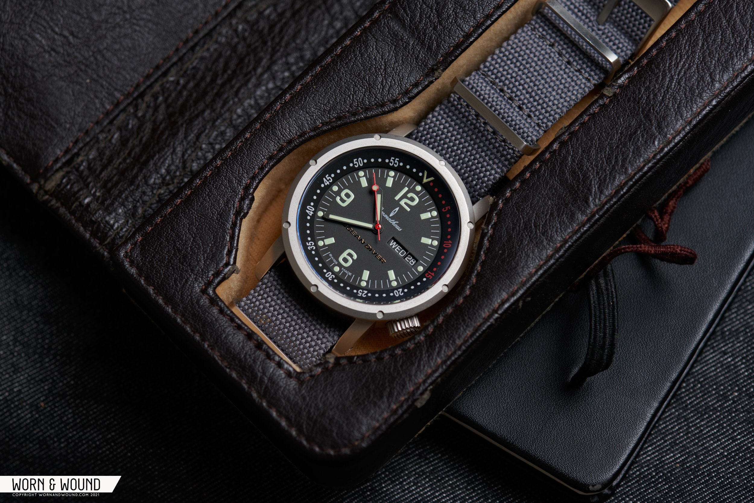
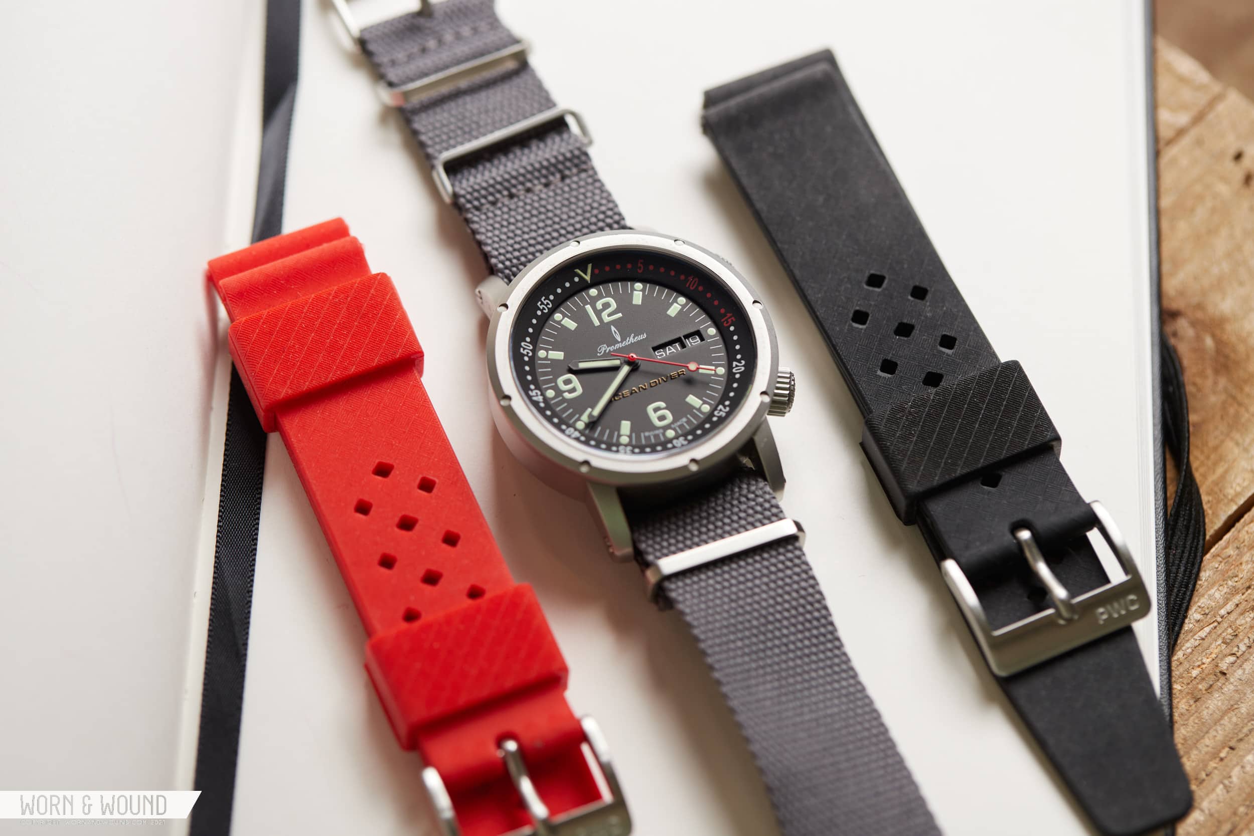
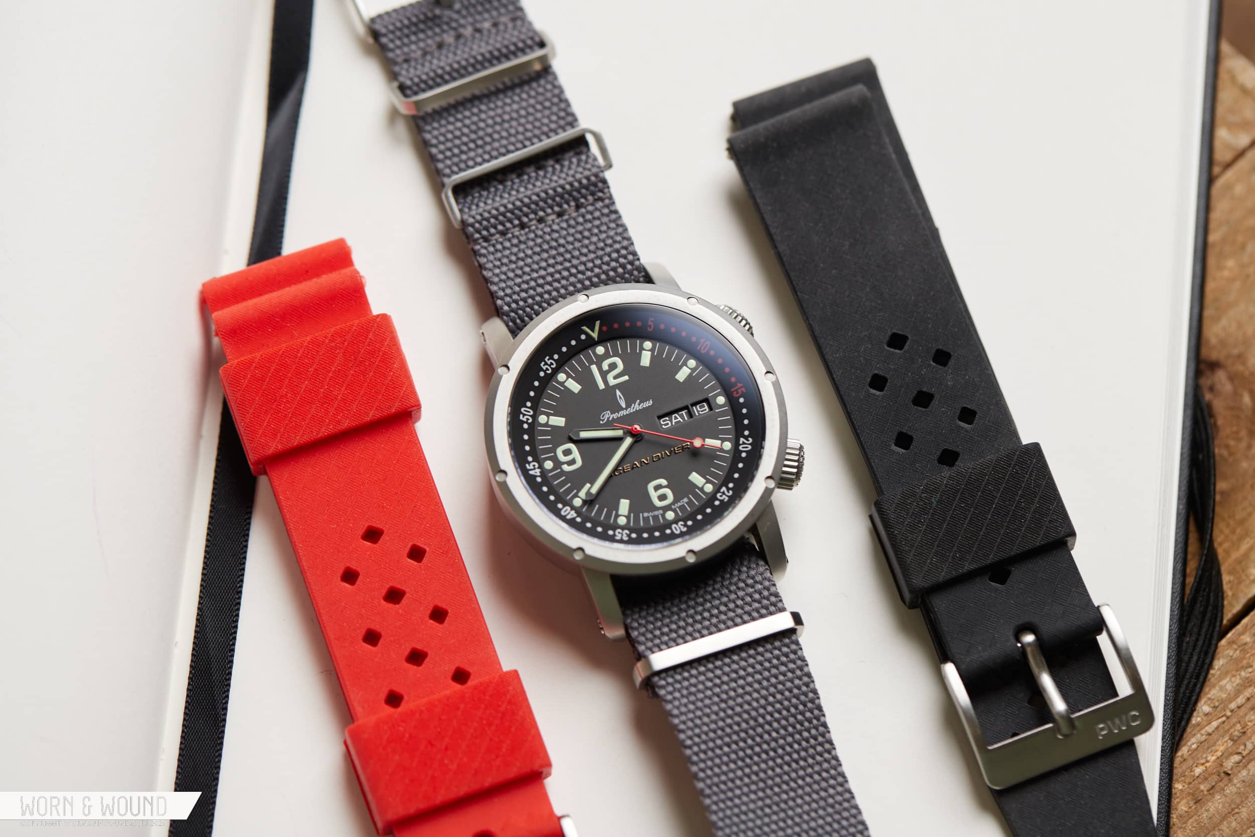
By late 2009, the Ocean Diver was ready for the public, and in 2010 the watch went on sale directly from Prometheus Watch Company. The watch was well received for its original design and top shelf build quality, especially considering the $500 price point. They didn’t skimp on the extras, either, as the watch shipped with two rubber tropic straps, a trick leather carrying case, and a t-shirt depicting the watch (as is customary).
I was among the first wave of commercial buyers and vividly remember receiving the watch and immediately struggling to unscrew the lug bars to swap straps (damn Loctite). Although it was eventually shuffled out of the collection, the watch left an indelible impression on me. And now, more than 10 years later, I’ve managed to track down another example (thanks, Brent!), complete with both straps (and t-shirt) to see just how well it holds up.
The Ocean Diver
Returning to things we carry fond memories of is a risky endeavor. Turns out, not everything we lionize from our past holds up so well today, like the graphics of Goldeneye N64, or the movie Hackers. A few things, however, transcend their era and are worth returning to because their qualities aren’t reliant upon the culture that bore them. I’d place the Ocean Diver in this category, while fully acknowledging the irony that its creation is intrinsically linked to watch collection culture of the late aughts.
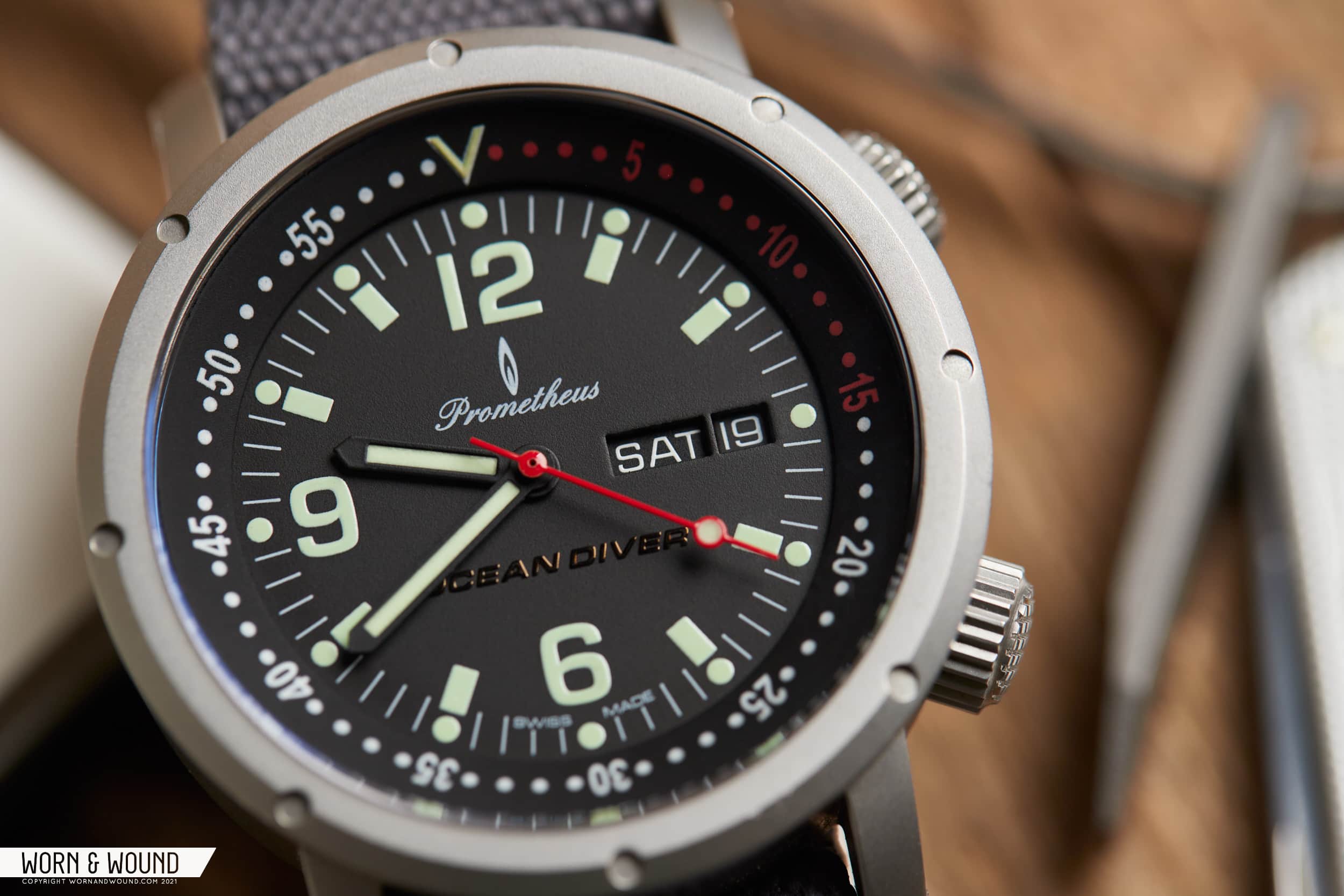
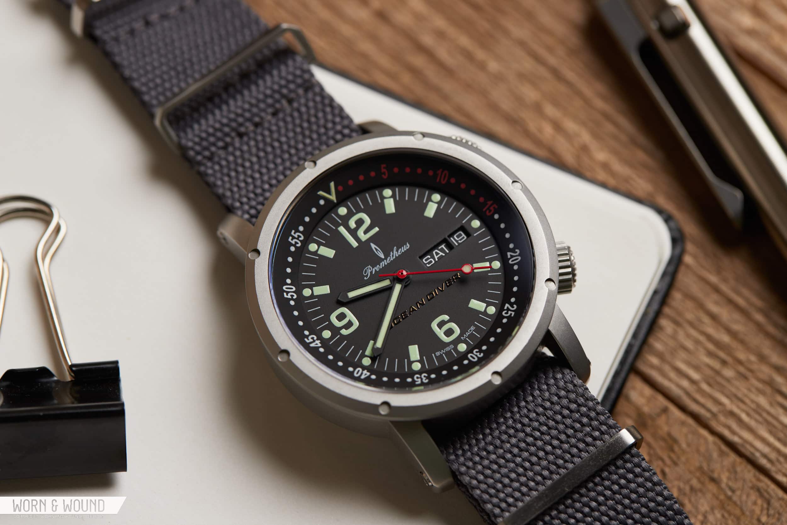
There is an indefinable quality about the Ocean Diver that sets it apart from its contemporaries, such as the Ocean 7 LM-2, early Christopher Ward divers, and Seiko’s SKX watches. The internal bezel, the design of the hour markers, including the oversized numerals at 6, 9 and 12 o’clock, the porthole shaped case design and its bead blasted texture all add up to something of an unusual experience that was wholly original at the time, and remains so today.
The late aughts were a period before the ‘heritage inspired’ and reissue trends we’ve seen dominate the past decade, so while the concept of the Ocean Diver was indeed inspired by old super compressor divers, it doesn’t really look like one. The lume isn’t yellow, the case isn’t cushion shaped, and the typefaces used aren’t retro. Apart from the odd logo and scripted brand name, I’d say the design as a whole stands up pretty well today, precisely because it didn’t follow much in the way of trends. Hat’s off to Brian F. Green there.
The Case
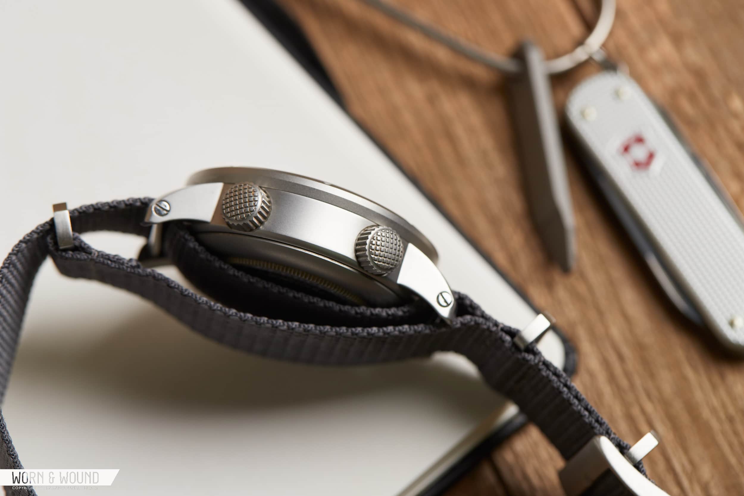
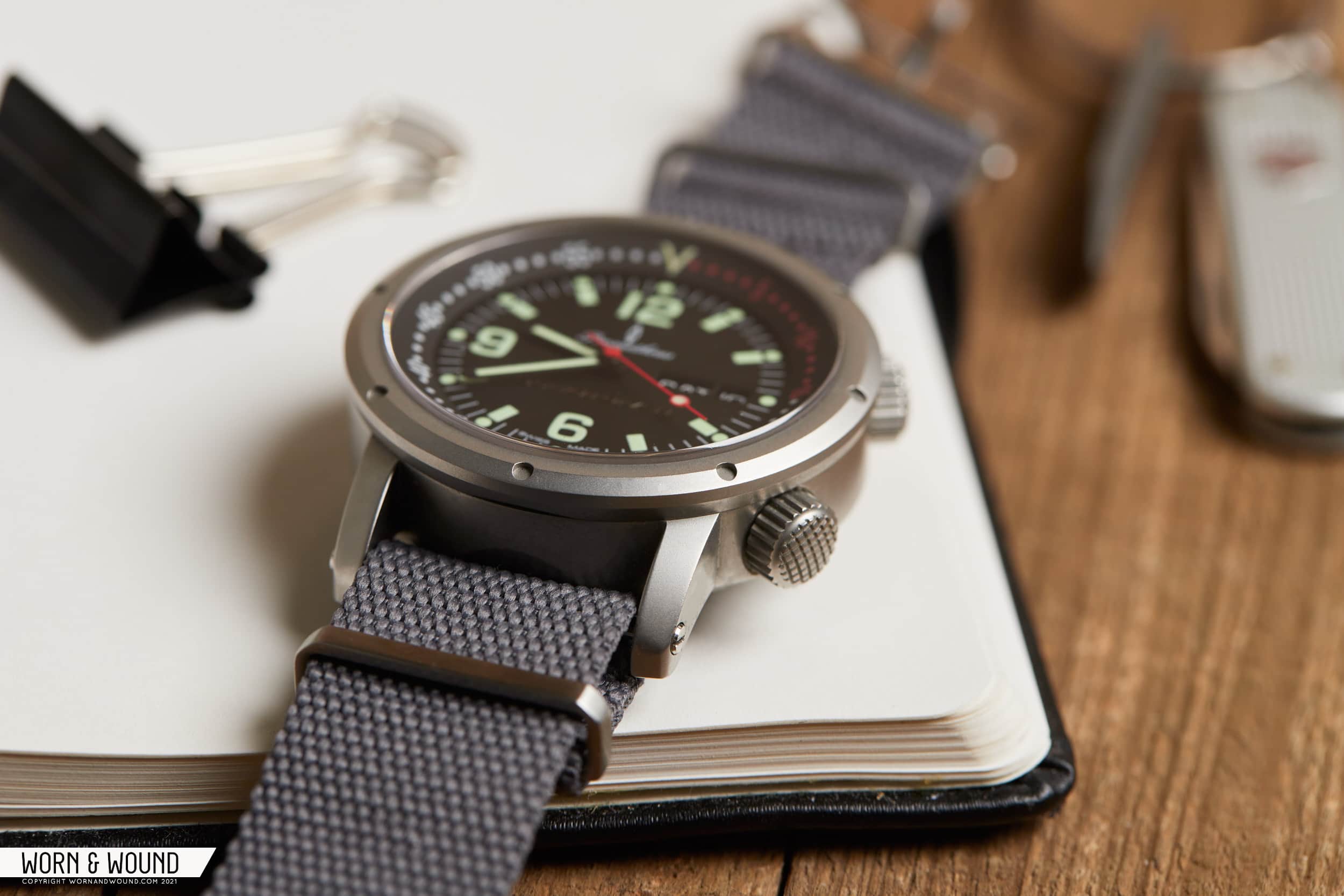
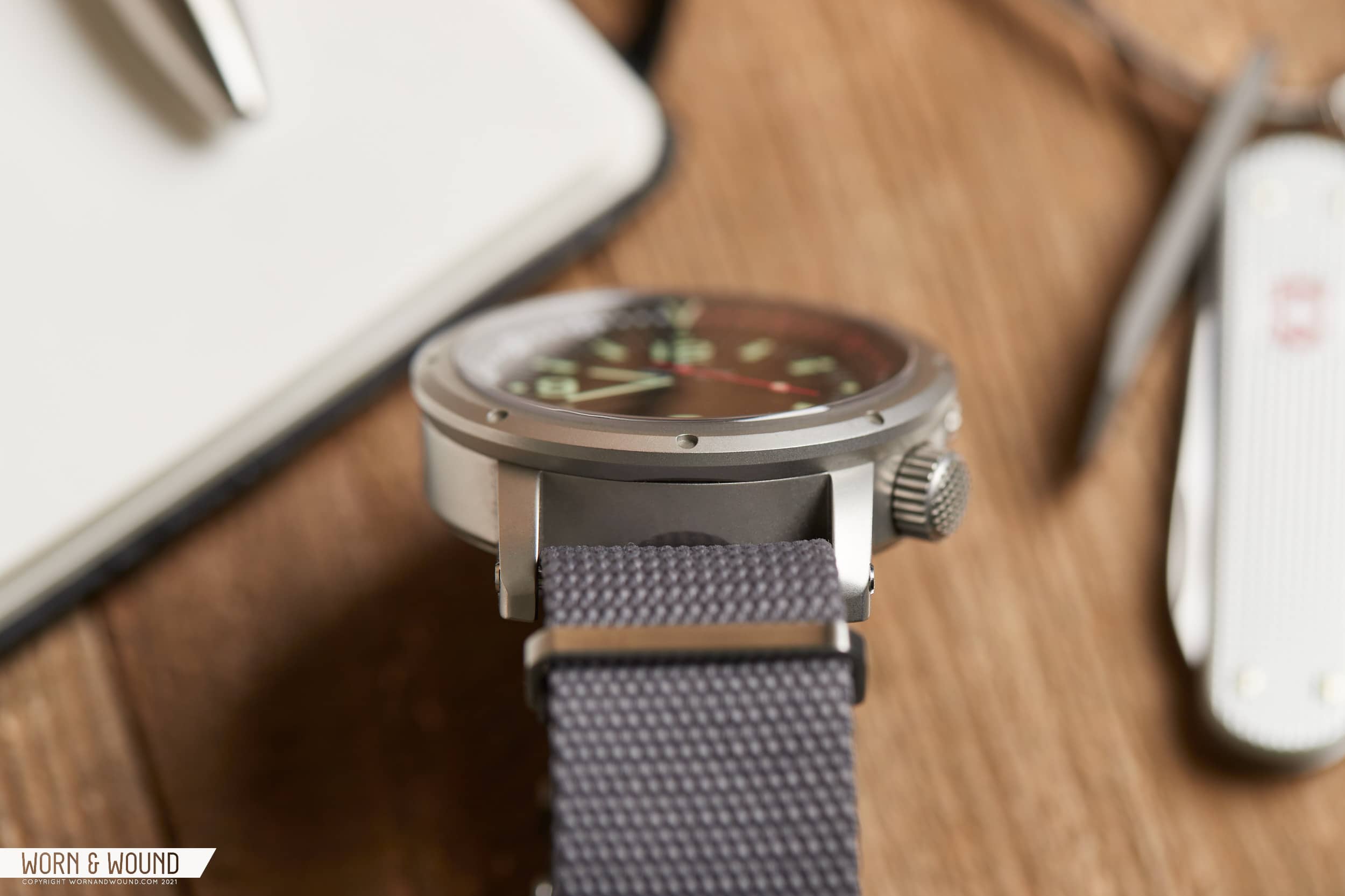
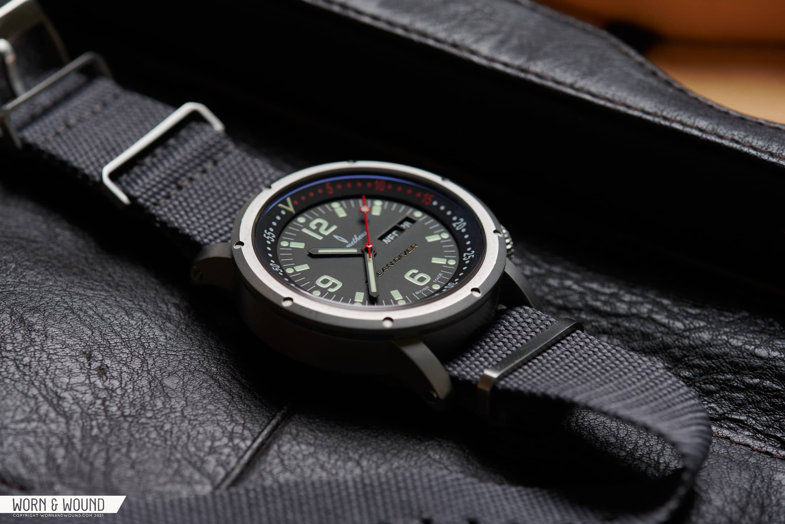
The case design of the Ocean Diver is relatively simple, featuring a cylinder with straight lugs, and a small hump in the caseback for movement clearance. The surface is uniform in texture, having been bead blasted to a fine matte texture. The bezel piece surrounding the dial is split in the center, with an angled edge that features 8 shallow recessions to recall the porthole inspiration. No fake screw heads here, just a visual cue that, in hindsight, probably don’t need to be there, but also don’t detract from the design as a whole.
There are no spring bars here, rather a solid thick bar is screwed in place between the lugs, and yes, there is a screw on both ends, requiring a fair bit of delicacy when changing the straps. It’s also why I keep mine on a grey matte supreme NATO from our friends at Crown & Buckle.
The switch to an ETA movement meant some slight case revisions from what was originally planned, including a move to a 44mm case size and 22mm lug span. According to the calipers, however, the case measures a hair under 43mm at the bezel, with the case itself measuring just under 42mm from 3 to 6. Total length from lug to lug is 51mm thanks to a long lug design, however they curve downward toward the wrist, so while the watch looks big on paper, it’s a pretty easy wear, all things considered.
A pair of crowns are placed at 2 and 4 o’clock that each get a heavy cross hatched texture at their tops making for easy manipulation. The 2 o’clock crown adjusts the internal bezel with very satisfying clicks each half second. This is not a screw-in crown so it can be adjusted easily on the fly. The force required to adjust is enough to prevent accidental movement, in my experience. The crown at 4 o’clock does screw-down, and provides the winding and setting of the ETA 2836-2 inside, meaning a day and date complication appear at 3 o’clock on the dial.
The Dial
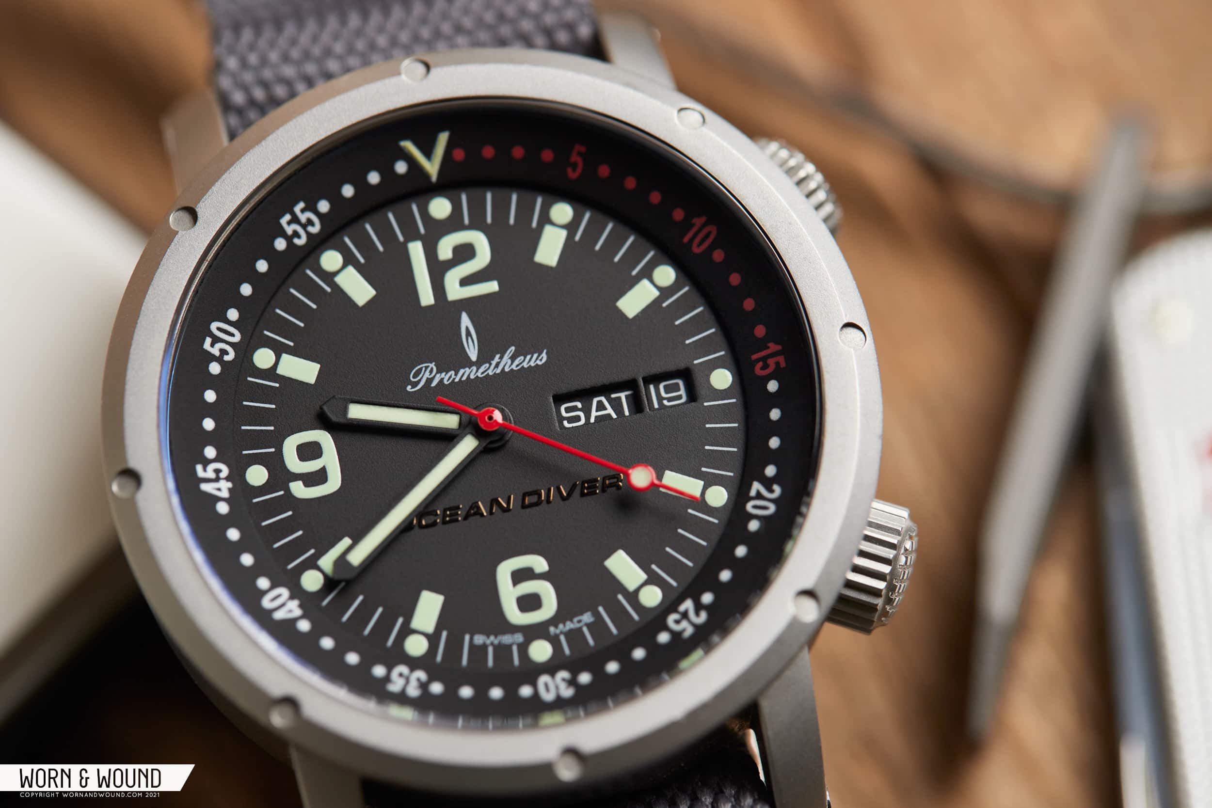
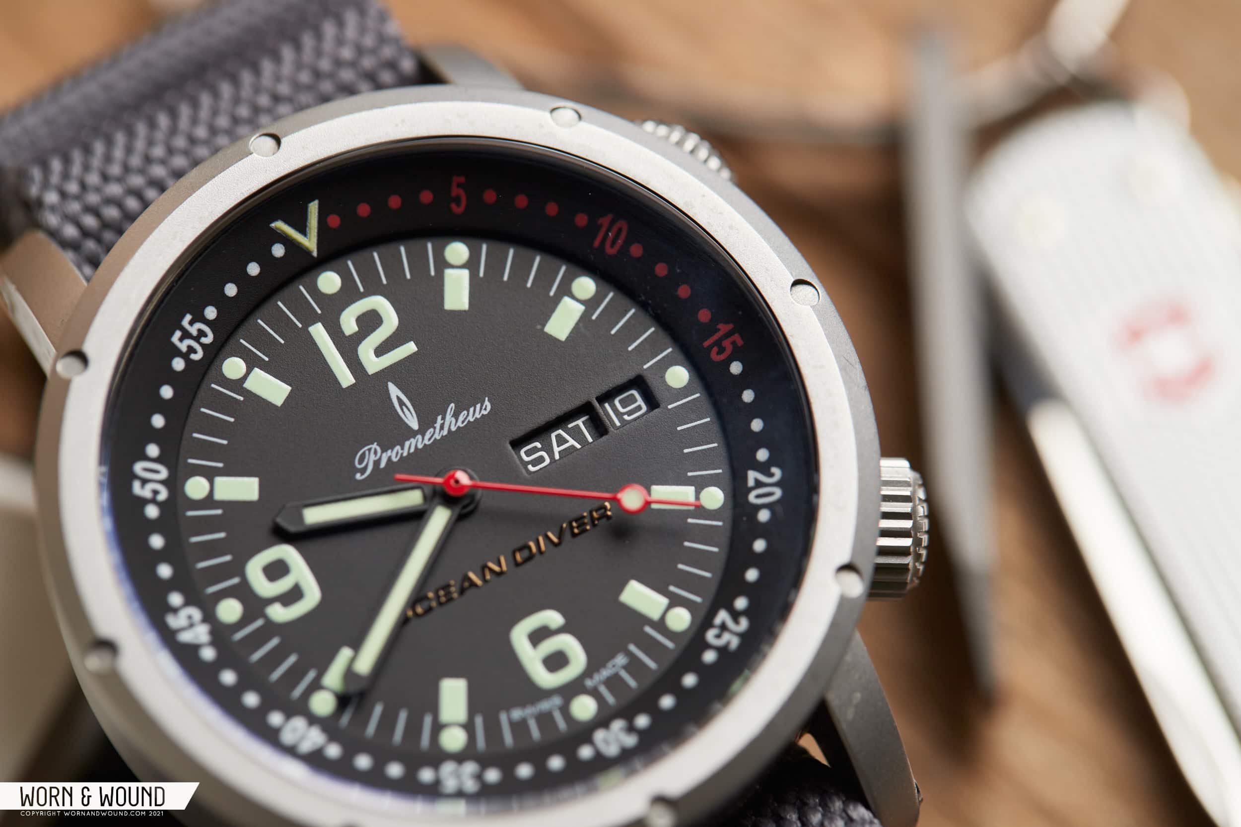
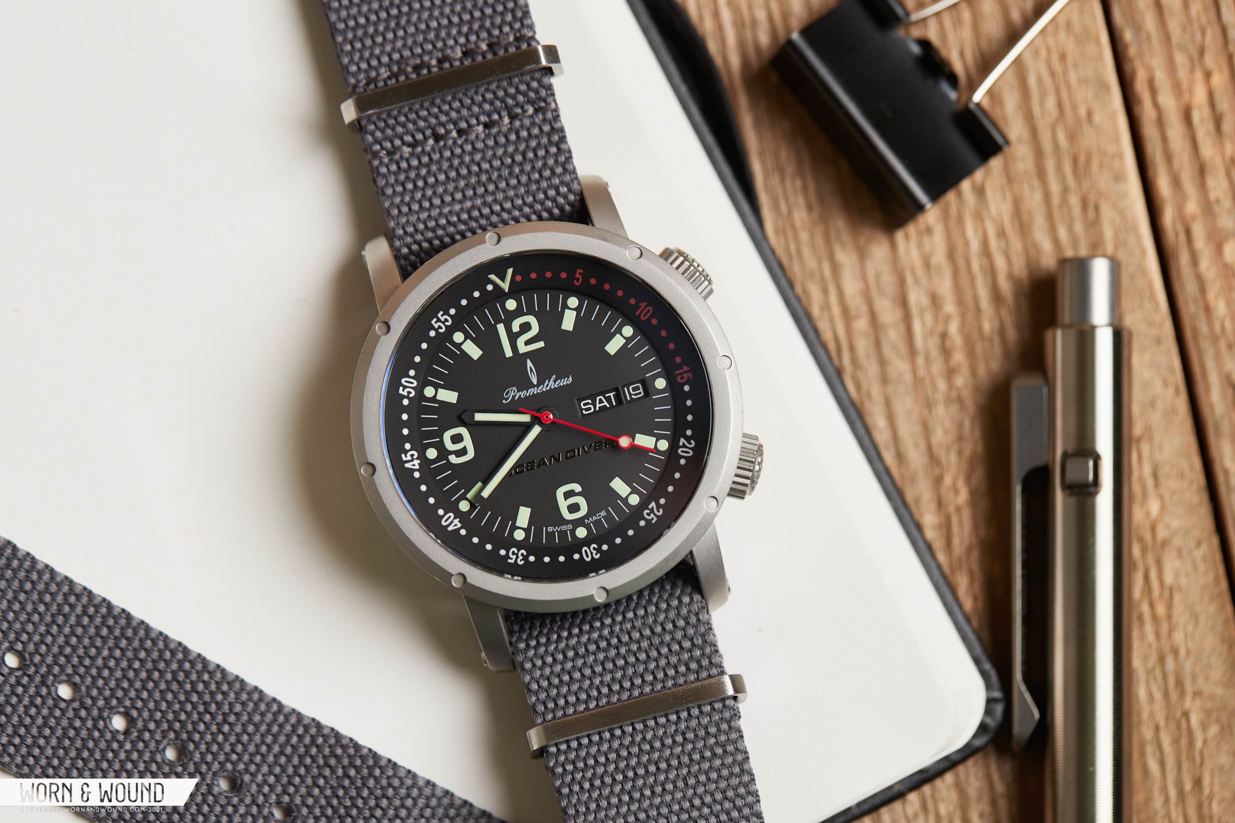
The internal bezel takes up a healthy amount of space around the dial’s perimeter, measuring about as thick as an external unit you’d expect to find on a traditional dive watch. This provides great visibility to the bezel, which marks each minute with a dot, and each five minutes with its Arabic numeral. The first 15 minutes are red, providing a bit of color that matches that seconds hand.
The C3 Super Luminova used here is green tinted in appearance, making for a distinctive palette of red and light green against the matte black dial. I’m not sure the pairing was intentional but it looks great and reminds me a bit of the OG IWC Aquatimer with a hint of red thrown in for good measure.
The hour markers themselves look like the iconography used for the generic ‘person’ symbol, using a long bar with an equally thick circle at its top. It’s an odd mixture but I’d call it a quirk that works more than it should here. They are well proportioned against the large numerals at 6, 9, and 12 o’clock and make for strong legibility, even in low light situations. A pair of thin pencil hands track the time, and present the biggest missed opportunity with this watch: a smaller, thicker hour hand. The existing hour hand is quite long and the exact same thickness as the minute hand, hindering at-a-glance legibility and, maybe more importantly, lacking some of the visual heft that makes a great dive watch dial.
Day and date apertures appear at 3 o’clock, each getting their own window, and each measuring the absolute minimum height required to display the day and date. They aren’t outlined, and the discs are color watched to the dial with white printing. They don’t call any more attention to themselves than is required, while offering a welcome bit of practicality to the watch. The Ocean Diver logo gets a stealth application at 6 o’clock, appearing in glossy black, with the difference in texture creating the only contrast against the dial.
In Use
The Ocean Diver walks a fine line with its wrist presence, teetering between just right and too much. For my 7 inch wrist, at least. Its footprint is perfectly manageable, but the case profile doesn’t really mitigate the 15mm thickness of the watch. Worn on a NATO, it sits a bit high, and this is slightly accentuated by the wide bezel piece fit to the top of the case. As far as dive watches go, I wouldn’t call the OD offensive by any stretch, but it is a little top heavy to be sure. It does get a 300 meter depth rating, so it’s not all just for show.
Prometheus shipped the watch with a pair of rubber tropic straps, one black and one red. They have a basket weave texture and are soft, almost fuzzy to the touch. The straps were criticized at the time for being dust magnets and that still seems to be the case a decade later. The tail section of strap is about as long as Seiko’s rubber dive straps, which is to say, it’s very long. A PWC (Prometheus Watch Company) label on the buckle again evokes a touch of IWC. It’s not a terrible strap, but I’m guessing a different supplier would have been chosen today, along with an easier method of actually changing the strap. If you’re supplying a pair, the expectation seems to be that both would be put to use.
More than anything this is just a fun watch to wear, especially if you connect with the nostalgic vibes it puts off, i.e. were a forum lurker back in the day. The watch does indeed hold up today on its own merits, but the real draw here is how this watch recalls an era of the hobby we may never see again.
The Movement
Prometheus had originally planned to use the Seagull ST16, but with the manufacturing shift made the change to the ETA 2836-2, which allowed for a day display alongside the date. This movement, without the day of the week complication, is the 2824 we’re all familiar with. The movement does hack, but it’s interesting to note that, according to technical documentation of the era, ETA lists this functionality as ‘optional’ pre-2010.
The 2836-2, a part of ETA’s Mecaline collection, is of course not available from ETA these days, and its functionality would be found in the Sellita SW-600a. However, that Sellita movement is about 4mm wider than the ETA, meaning it may not have been possible in these case dimensions. As far as Swiss options go, this is a watch that could not exist today at a $500 price point. There’s certainly nothing wrong with going the Miyota route, however, and indeed would be required with something like the Miyota caliber 2805, which measures the same 26mm in diameter as the ETA movement.
The 2836-2 can be found in use throughout the Swatch group brands, from Longines (Master Collection) to Tissot (Visodate) to Hamilton (Khaki Aviation Pilot) and more. Other brands like Sinn, Domasko, and Fortis have all made use of the movement as well, leaving the Ocean Diver in good company in terms of long-term reliability and serviceability.
Conclusions
The Prometheus Ocean Diver is a watch by a brand that anchored their existence to the enthusiasts that brought it to life. We’ve seen fan votes and competitions before, but none quite like this, with full reign given to the community. This is a watch that could have gone south in a million different ways, but somehow, it didn’t. While it certainly doesn’t look like a typical watch from a typical brand, it still works on a level it has no business working on.
This is a watch that overcame a tumultuous development cycle and pushed through all the better for it. There’s a metaphor in this watch somewhere about ‘pulling through when the going gets tough’ or ‘getting it right takes time’ but the fact that this Ocean Diver, along with its GMT and Chronograph variants (both also very cool) stand well apart from every subsequent release from the brand tells me that what really makes this watch special is the community, and its designer, Brian F. Green.
As a result, the Ocean Diver defies explanation. For WUS members at the time, this watch should be viewed as a personal triumph of sorts. For me personally, this watch represents everything I loved about small independent brands at the time, and comes with a huge amount of nostalgia for a very different period of this hobby. My tastes have changed a lot in the subsequent decade of collecting, but this watch, somehow, appeals to me the same today as it did back then.
The Ocean Diver received three variations in its lifespan, this Day/Date, a GMT, and a Chronograph (which featured very unique pushers), and all three are a rare site in the open market these days. Prometheus produced 500 of these watches, so there are some out there and I suspect a WTB thread and a lot of patience would do the trick if you’re after one. If you have or had one, or even have a memory of this watch, let us know in the comment section below.
In the coming weeks and months, we’ll be publishing more Missed Reviews of watches before our time, and we’d welcome your recommendations on what you’d like to see included. Email the editor at [email protected] or leave a comment below.




 Featured Videos


