When I first held the Pebble watch after it arrived, I was not sure how much I was going to like it. Honestly I prefer mechanical watches these days having grown up wearing nothing but digital and analog quartz watches. But, the Pebble is different. It’s not just a digital watch, it’s a connection to your digital life. That is the premise the makers of the Pebble wanted the watch to be at its core. It lets you un-tether yourself from your smart phone, yet still be able to know when something needs your attention. But, how well does it do all of that and still work as a watch?
(Please note that this review is based upon pairing with an iOS device; I apologize for the shortcoming but I do not have an Android device available for comparison.)
 Dimensions: 30mm
Lug width: 22mm
Lug to Lug width: 50mm
Water Resistance: 5 ATM / 50M
Crystal: Scratch and shatter resistant with anti-glare coating
Weight: 18 grams (head only); 36 grams (with stock strap)
Supports: iOS 5 and up; Android 2.3 and up
Price: $150
Case
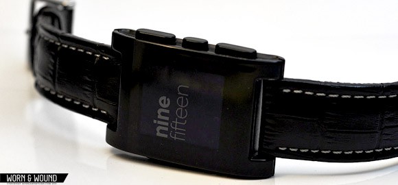
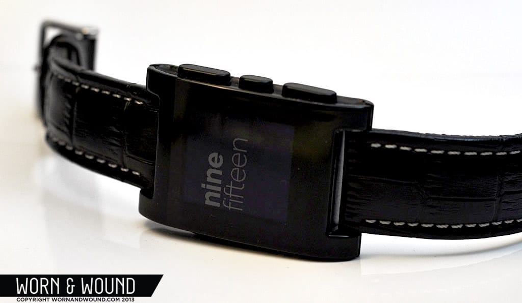
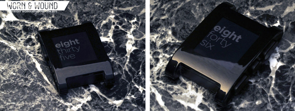
The Pebble uses a rectangular case shape with an oblong screen to display the time and notifications. The case is plastic and very lightweight, coming in at 18 grams for the head only (26 grams with the stock strap). Different finish colors are available: Jet Black, Cherry Red, Arctic White, Orange and Grey. Being more of a traditionalist I chose the black model which is a very glossy, jet black. The finish of the plastic is very clean and in actuality the watch looks better in person than it does on the Pebble website.
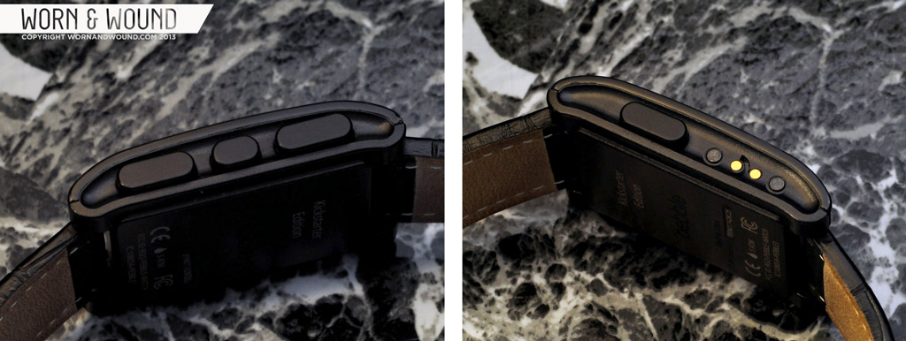
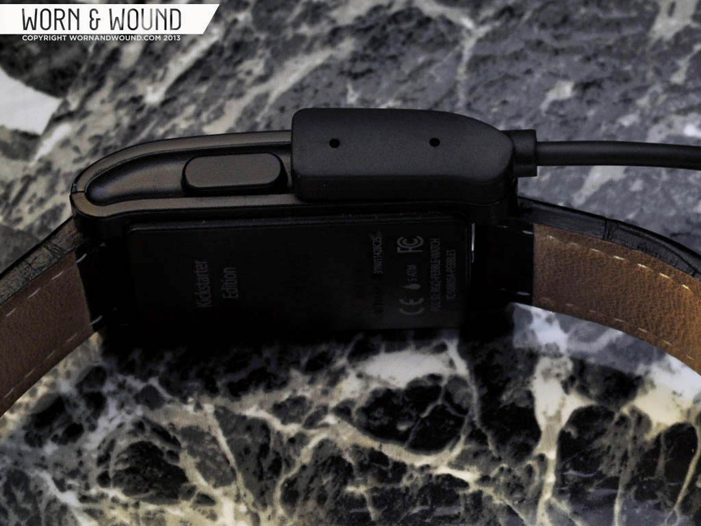
There are four buttons on the Pebble case: 3 on the right side (up, select and down) and a large back button on the left side. Any of the three buttons on the left will activate the backlight feature as well. Below the back button on the left is a series of four small dots, two black and two gold, which are for the propietary magnetic charging cable supplied with the watch. The cable snaps on similar to how a mag safe cable clicks into a MacBook and was how they were able to achieve 50M of water resistance. The case is slightly rounded at the lugs which keeps it from having too blocky of a design and not looking too much like a slab of plastic on the wrist. It measures 30mm across and 50mm from lug to lug. My wrist is 6.5″ and the Pebble still looks fine. It’s not exactly a dress watch design, of course, but it can be dressed up a bit with a nice strap.
Display
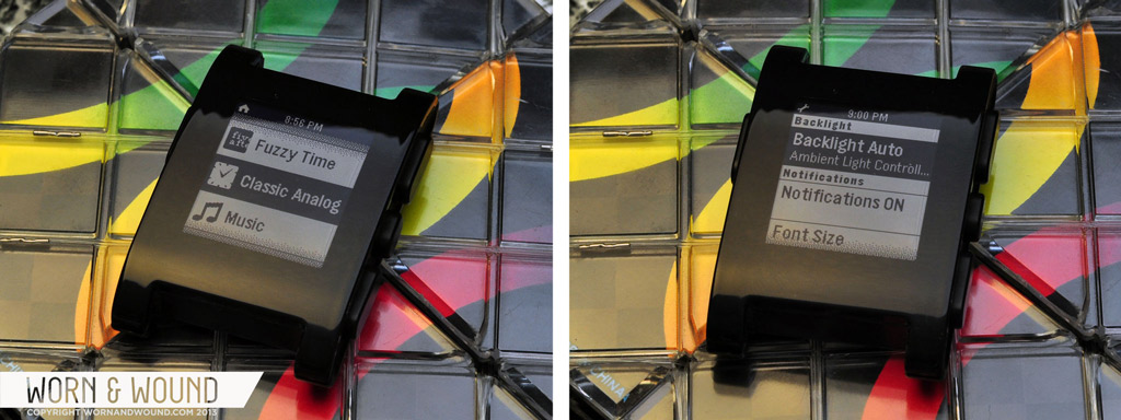
The Pebble’s display is a 144 x 168 pixel black and white e-paper display. It is just large enough to be easily read and display several lines of information. Most of the text looks quite good from a normal reading distance one would use with a watch; some of the clock faces show some pixelation but not enough that it looks cheap. You can set the notifications display at either a small or large text size, depending on your eyesight. All of the available watch faces are easy to read in direct light and a backlight is available for darker settings. The backlight can be always on (which will more quickly drain the battery), off or set on auto, what they call Ambient Light Control. The Ambient Light Control reads the available light in the room and determines if it is dark enough to warrant activating the backlight. With the backlight on this auto setting a flick of the wrist will activate the light. Of course you can also press one of the buttons as well. You should be able to activate the backlight with a touch to the face of the watch, but I have found this to be intermittent at best; it will frequently take a few taps to activate the light. When navigating the menu in darker setting the backlight will timeout very quickly which can make reading a bit of a challenge (the developers are aware of this bug and working on a fix). A future enhancement the Pebble team should consider is adding a menu to set the backlight display time.
The included watch faces are Text Watch, Fuzzy Time and Classic Analog. Each provide a unique way of displaying the time. Unfortnuately only the Classic Analog displays the date and day of the week; there is not a way to access this information via the Text Watch and Fuzzy Time faces. You can install a half-dozen other faces via the Pebble iOS app that provide some other very unique ways of displaying the time, including a tic-tac-toe watch face and one that looks to use binary. My personal favorites are the Fuzzy Time, which displays in text the approximate time to the nearest five minutes (“five after nine” as an example) and the Text Watch, which displays the time as text (“nine fourteen”). The analog face is nice enough and features a seconds hand with the usual quartz tick of once per second. I would like to see a face with a seconds hand that has a smooth sweep which I imagine could be quite possible since the watch faces are all software driven.
Pebble states the watch has a scratch and shatter resistant “lens” with an anti-glare coating to allow for better legibility, although I manage to pick up quite a bit of glare when under the fluorescent lights at work. As far as scratch resistance I’ve already put that one to the test thanks to a gym locker, the two collided pretty well and fortunately the Pebble came out of the bump without a scratch. I imagine over time it will acquire it’s share of battle scars, just like any watch. One glaring omission from any display screen on the Pebble is an indication of your battery life. They claim it will last up to a week on a single charge, but you won’t know exactly where you are until it’s almost too late. A recent update provides a notice when your battery has between 12 – 24 hours of charge remaining. The best habit would be to let it charge overnight at least once a week.
Functions
The draw of the Pebble are the additional features it offers beyond that of a traditional watch, however at launch there are not that many of those available. The first and most obvious function is that of just a watch. As explained above the Pebble does this very well, although again it would be nice to have access to the day and date in more watch faces for forgetful people such as myself. That little nitpick aside, it does display the time well and gives the wearer the option to change how it does so. The Pebble has an alarm feature that when set will buzz the watch on your wrist; there is no audible alarm so you will have to have the watch on for it to work. There is no option to set the alarm via 12 hour or 24 hour mode, it is 24 hour mode only. Once an alarm is set it is on and the only option after that is to delete the alarm: there is no edit option or an on/off toggle. Once it is in there the alarm is either active or deleted. This seems like a bit of a shortcoming as anyone that has owned a digital watch is familiar with being able to set an alarm and then toggle it on or off as needed. You can set multiple alarms, although I did not test how many were available.
Since the Pebble is paired to your smartphone via Bluetooth the two can communicate back and forth, which is what powers the other functions and where you get into the really cool stuff. One of the primary features of the Pebble is to display notifications from your smart phone (iPhone, iPod Touch, Android) to your wrist. This includes SMS messages, phone calls, appointment reminders; essentially anything that you are notified of on your phone will appear on the Pebble. Why is this cool? If you are like me you may often leave your phone somewhere around the house while you are doing other things. Up in the kitchen is a popular spot or downstairs on my desk, for example, while I am off elsewhere. Before if my wife sent me a text message and I was not near my phone I wouldn’t know she needed something until I finally picked up my phone.
With the Pebble the notification is pushed to the watch via Bluetooth and appears on the watch face along with a vibration from the watch. You can see what kind of alert it is, who it is from and several lines of the text; with text messages usually being shorter it is quite common to be able to read the entire message on the watch. Phone calls can be answered or dismissed on the watch; if answered you obviously have to have the phone with you so you can talk to the other party as there is no speaker or microphone on the Pebble (a true Dick Tracy watch this is not). You can also choose which notifications you receive on your Pebble; if you want only calls or SMS that is easy to do. It took me a little while to stop instinctively reaching for my phone to check it when a notification came in. Once I got past that Pavlovian response I developed a new one to check my wrist. In practice it is very useful to know if you need to address what is coming in via the phone or it can be dismissed for later. Notifications time out after three minutes, or you can click the back button to return to the watch. As slick and cool as it is, it is not flawless.
The biggest notification issue I ran into was when the Bluetooth link between the iPhone and Pebble was dropped. In testing I make sure I did not change my normal phone habits. Throughout the day I am frequently away from my phone as it is either on my desk at work or a similar situation. The two would reconnect easily enough, but I found that as often as not the notifications would not push to the watch. I would have to go back into the iOS settings and re-toggle the notifications I wanted to use. This is quite a hassle and makes me less confident that I will see everything on the watch that I should. In an attempt to fix this I dropped the connection between the phone and the watch, rebooted the phone and then reconnected the two via Bluetooth. Unfortunately this fix did not completely work as some notifications were still broken when they re-paired. Hopefully this is something that will be fixed soon via a software update. The other shortfall I found with the notifications is you only see the most recent one. If several come in on top of each other there is no way to scroll back to see previous messages. Hopefully this is something they will implement in the near future as it is a clear gap.
The other built in function at ship time is the ability to control some aspects of your music playback via the Pebble. Fire up your favorite music player and the music app on the Pebble and you are ready to go. The watch will display the currently playing track (as long as it has the proper metadata) and gives you the ability to pause or resume and skip forward or backward. Very handy if you have your phone in a speaker dock or even in your pocket. Real world example: I took the Pebble grocery shopping and was enjoying a podcast while I did so. When it was time to checkout at the register, I left the iPhone in my pocket and paused the music instead with the Pebble. I tested the music app with several music services and it worked with all that I tried. Some of the text is truncated for longer titles, but there is still enough information there – and you are listening to the song – to know what it is.
Presently those are the features the Pebble carries at launch: watch (with alarm), notifications and music control. Some more traditional digital watch features are missing from the Pebble, such as a chronograph, countdown timer, world time, and day-date display. Hopefully these features will be available in the future as add on apps to fill in the additional functionality. Beyond these traditional watch functions, Pebble expects there to be many other types of apps once their SDK (Software Development Kit) is available. Some possibilities include running or biking apps that show speed and distance; weather apps and a golf rangefinder to name a few. Once app development takes off the usefulness of the Pebble will be far extended.
Staying connected to your phone all day and using these functions does have a drawback: the Bluetooth connection will add an additional drain on your smart phone’s battery. I found that on average before the Pebble my iPhone 5 battery at the end of the day was normally between 25-40% by the time I went to bed. This is with no additional charging during the day and usage such as SMS, email, Twitter, reading and browsing. Since being linked to the Pebble all day I have been going to bed with between 10-15%, so clearly an additional expenditure of power. This should come as no surprise to anyone familiar with smart phones and how they work; additional things like GPS, Bluetooth and wi-fi will all require additional juice from the battery.
The Menu
 The Pebble menu is a simple affair where you scroll up or down to navigate the available options. The look and feel of the menu remind me quite a bit of an old school “feature phone” (aka “dumb phone”) where you use the four-way toggle on the keypad to navigate a text menu. Even as old school as it looks it still functions well and I really don’t know what other option they have. The menu items begin with the installed watch faces, then Music, Set Alarm, Settings and finally any apps or watch faces you have installed from the phone. One dislike about navigating the menu is once you are done and want to go back to your watch face the back button only takes you to the main menu; you then have to select again the watch face you want, rather than the back button returning you to the face you were on. Aside from that the menu is very clear and easy to use. Options are limited so there is not that much to learn or mess up if you don’t know what you are doing.
The Strap
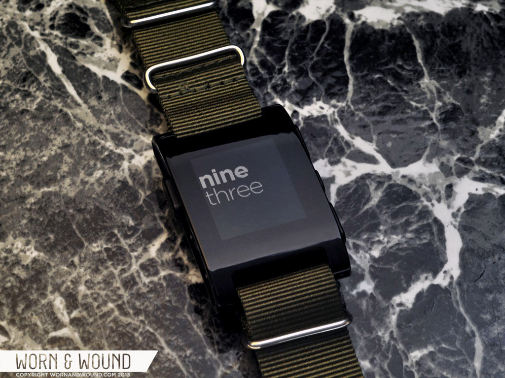
The Pebble has a standard lug size of 22mm which allows for a great variety of strap options. The stock strap that comes with the watch is a simple silicone leather strap that is functional, if nothing else. It feels ok on the wrist and looks ok, but the watch can be dress-up a bit with a leather strap or even given a sporty look with a NATO. Many owners have already opted to remove the strap and put on their own to give the Pebble a different look. The rubber strap would be appropriate for sports activities like running, biking or swimming but in most other scenarios I would opt to swap out the strap.
Conclusion
The smart watch field is very small and still very new. The Pebble is so far the best of these watches to hit the market and has a ton of potential. There are drawbacks at present, that hopefully will be addressed by the developers and the creation of future additional apps for the device. Despite the present shortcomings I am very pleased with the Pebble and look forward to what it will be able to do in the near future. In fact, when the watch was not on my wrist and a notification popped up on the phone I looked to see why I did not feel it on my wrist; after a few days I was already conditioned to look for my notifications on the Pebble first. For the current price of $150 it any tech-nerd should strongly consider picking one up.
Pros:
- Lightweight, comfortable design
- Customizable appearance
- Standard 22mm strap width
- Easy set-up
- Music controls
- Phone notifications on your wrist
Cons:
- Inconsistent backlight performance (developers aware of the bug)
- No battery life indicator
- Constant Bluetooth connection drains phone battery
- Limited watch faces at launch
- No additional apps at launch
- Day and date only on certain watch faces
- Occasional “broken” notifications (developers aware of the bug)
by James Enloe




 Featured Videos



Overall, good review. BUT, you’ve got to have a wrist shot. That’s the most important thing I want to see…
Where did you get the green Nato strap from? Love the color.