Review: Autodromo Taps ’50s/’60s Era Racing With the New Intereuropa Collection

When I think about automotive inspired watches, the brand that immediately comes to mind is Autodromo. Yes, there have been great individual watches and brands tied to the automative world throughout the years, but today, I really cannot think of any brand that distills the essence of cars and car culture quite the way that Autodromo does it. Whether it’s the elegant, Italian-inspired Monoposto and Stradale, or the unabashedly ’80s-inspired Group B, Autodromo’s Bradley Price pulls his inspiration, filters it through his eye, and creates a damn fine watch as the end product. 

The brand’s latest is the Intereuropa, and according to Bradley, the name and inspiration comes from the “Coppa Intereuropa race for sporting coupes held at Monza from 1949-1964 as a support race for the Italian Grand Prix.” These races featured berlinettas from the likes of Ferrari, Maserati, Alfa Romeo, and Lancia. Now, this isn’t unfamiliar territory for Autodromo; the aforementioned Stradale was also inspired by Italian sports cars of the late ’50s and early ‘60s. But this isn’t a retread; the execution here feels fresh, and I would argue it’s several steps above the now sold out Stradale, which I thought and continue to think is an exceptional watch both in terms of its construction and its design. 
Worth noting is that this is Autodromo’s first mainline watch with a Swiss movement. In this case, we have an ETA 7001, a high-end hand cranker that’s long been a staple in the industry. While there is nothing wrong with Miyota or Seiko movements, the inclusion of a Swiss caliber here, and a fine one at that, certainly ups the perceived value of the watch. I’m personally a big fan of the 7001, so it’s a welcome addition for me. 

But I’ll get into all of that in the review below. First, let’s get the specs out of the way. 

Advertisement
$1250

Review: Autodromo Taps ’50s/’60s Era Racing With the New Intereuropa Collection

Case
Stainless Steel
Movement
ETA/Peseux 7001 hand-winding
Dial
Cream, Gray, Blue (multi-layered)
Lume
N/a
Lens
Domed sapphire
Strap
Saffiano rally two-piece
Water Resistance
5 ATM
Dimensions
39mm x 42.9mmmm
Thickness
10.3mm
Lug Width
20mm
Crown
Push/pull
Warranty
Yes
Price
$1250

Case

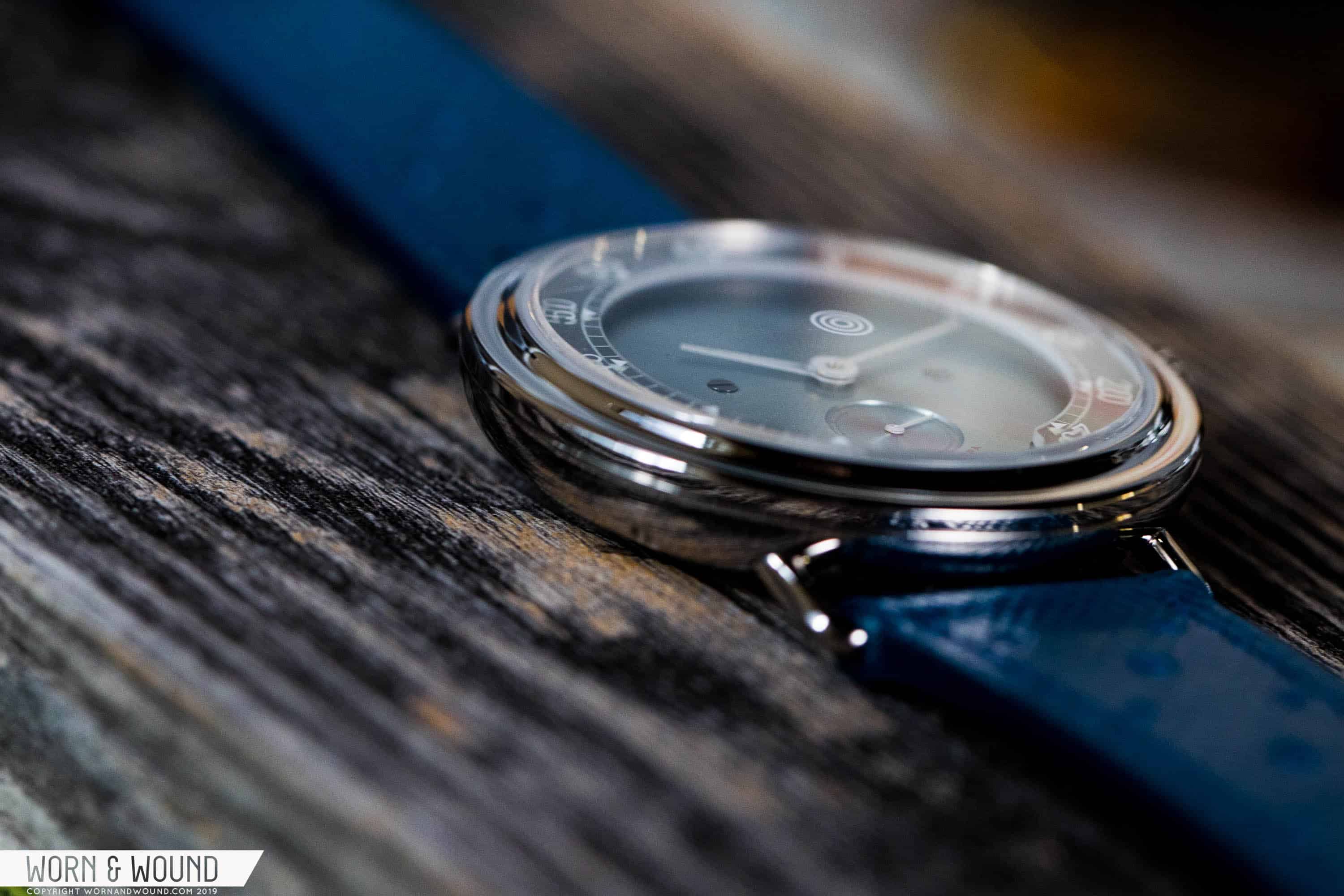
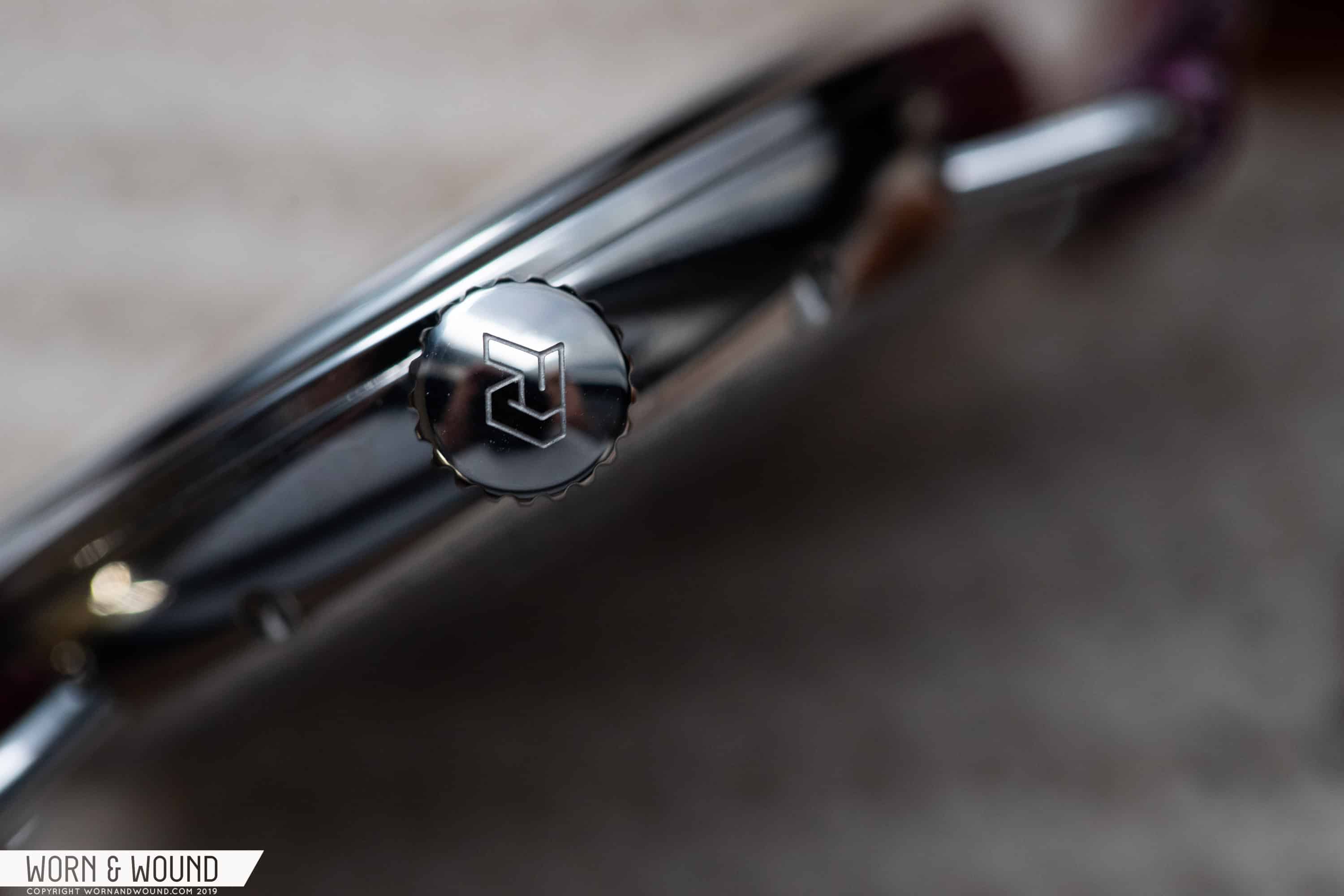
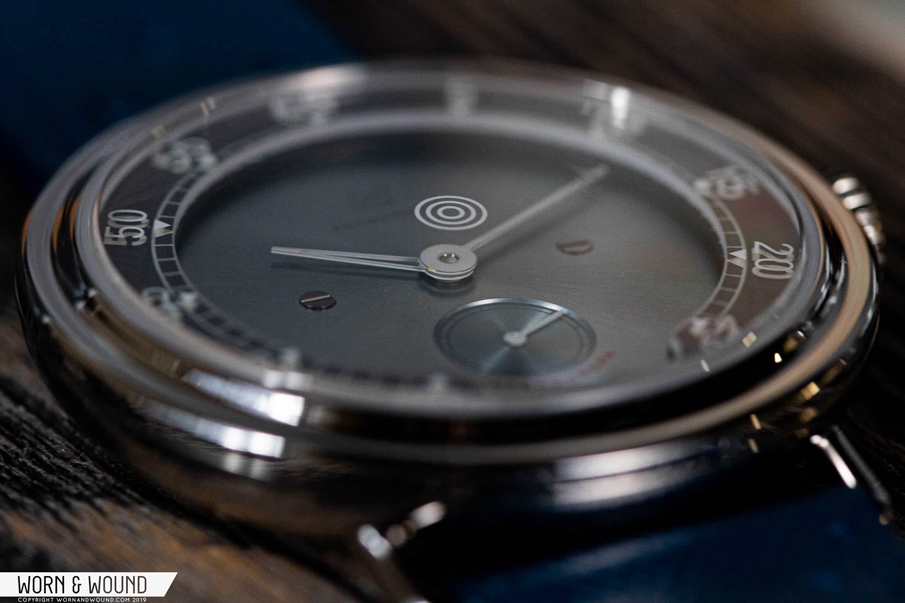
The case measures 39mm in diameter, 10.3mm thick, and 42.9mm lug-to-lug. It’s essentially a bowl, tapering as it moves to the caseback, which also extends out to act as a sort of mid-case. Sitting atop of this mid-case is a stepped bezel with an elegant slope, and inside that is a slightly domed sapphire crystal. Protruding from the case are wire lugs, which were a mainstay of the Stradale line. From the top-down, you cannot see where the lugs meet the case, which in my view is a good thing as it gives the case a much cleaner look on the wrist. The whole thing is rendered in a high-polish finish. That said, it’s not at all blingy. The bezel, with its sloping step, doesn’t bounce light in the way a typical polished surface does, so it tempers the whole thing.The crown at 3:00 is nicely sized relative to the case. It sits close to the case, but its fairly large diameter makes it a joy for winding the movement. The crown also sits below the caseback, which allows for a very easy grip. This is a small detail that goes a long way in making this watch much more manageable as a daily timepiece, and I’ve sold off hand-crankers in the past because they’ve lacked this feature.

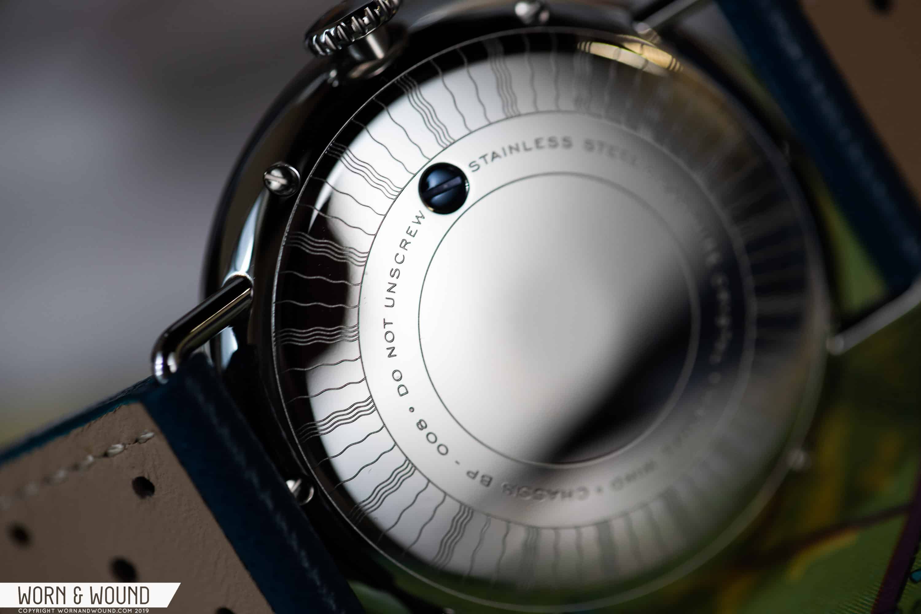
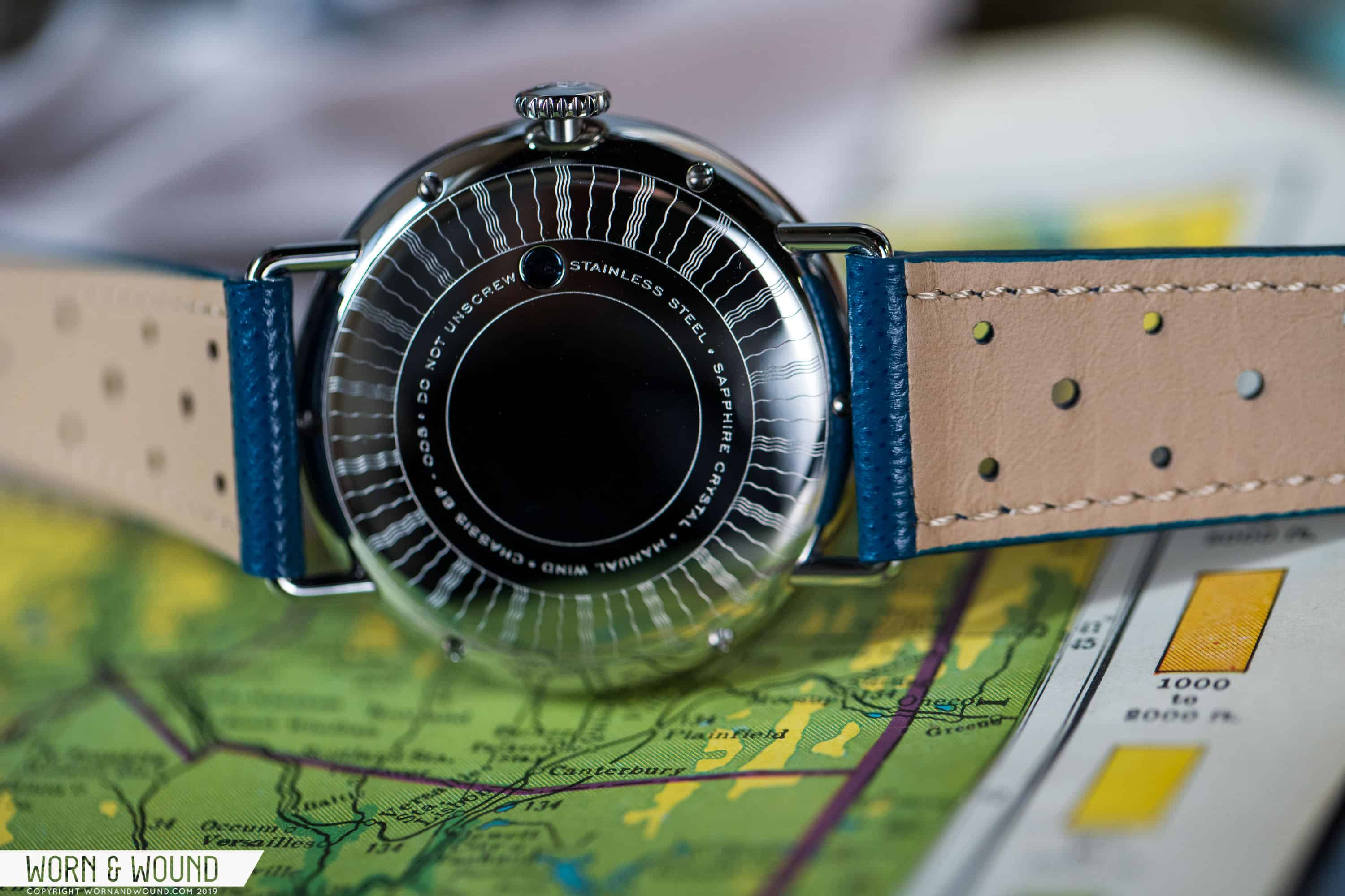
Around back, you have a closed caseback with an etched motif that’s inspired by the horn button on a Cunningham, which was built by Vignale in Torino. If you’re a vintage car buff, this is the sort of detail that’s just for you. No one else will see it (unless, of course, you show them), but you’ll know it’s there.

The screw in the caseback, which comes with the warning “DO NOT UNSCREW” is likely helping hold the internals in place. My suggestion: follow those instructions and leave the screw alone.

Dial

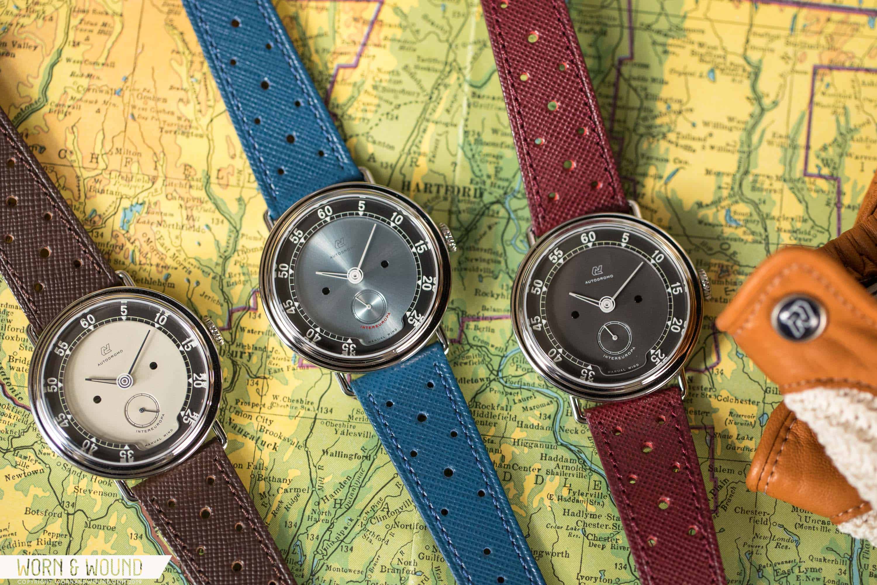
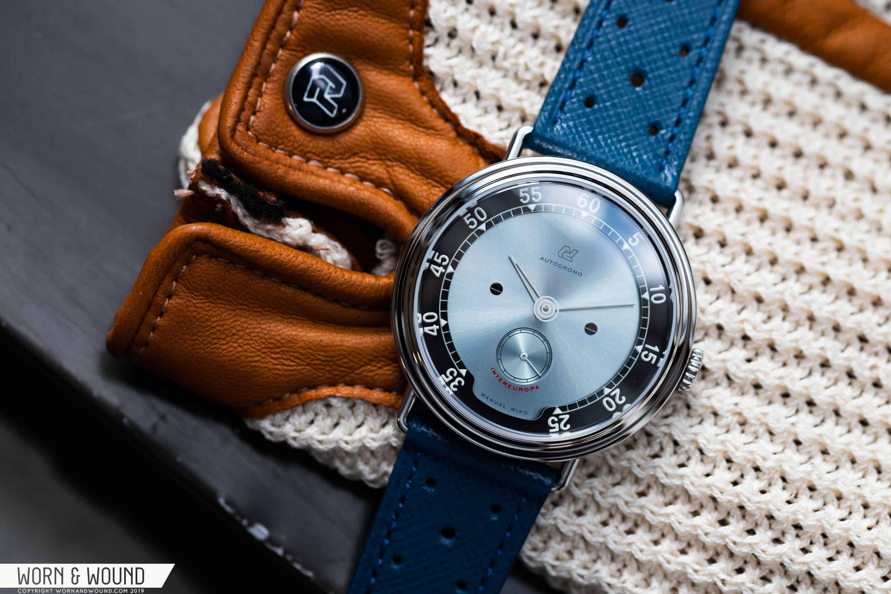
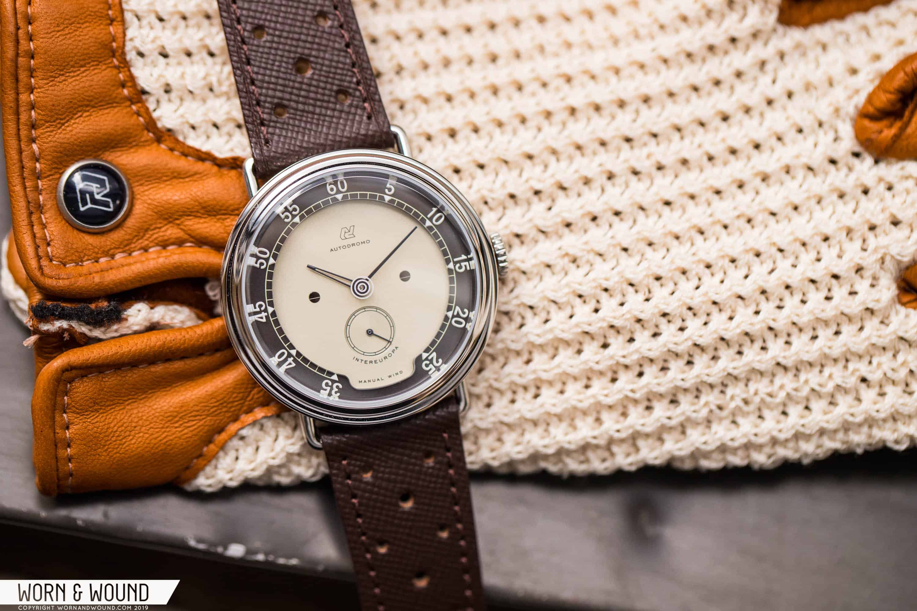
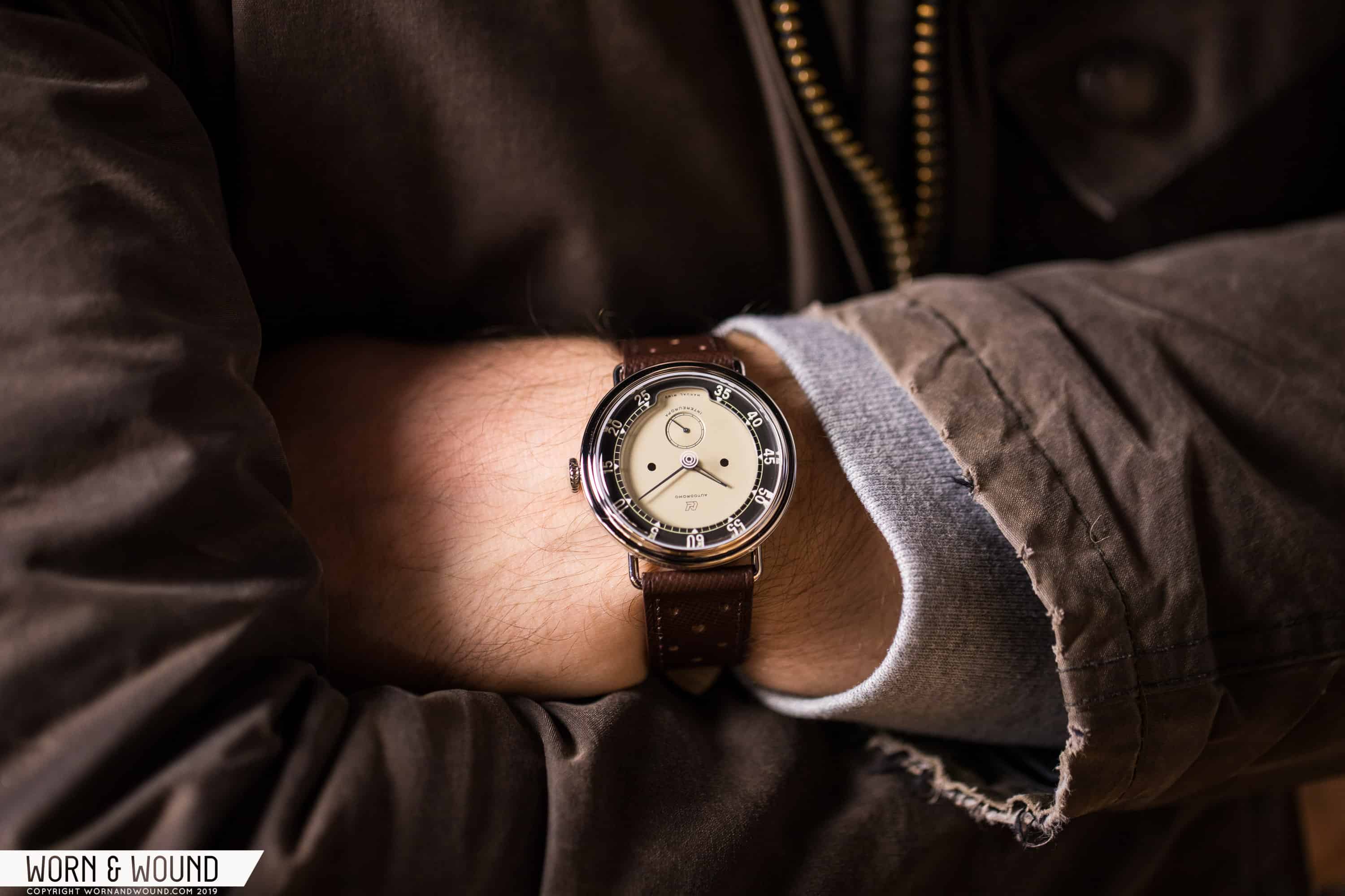
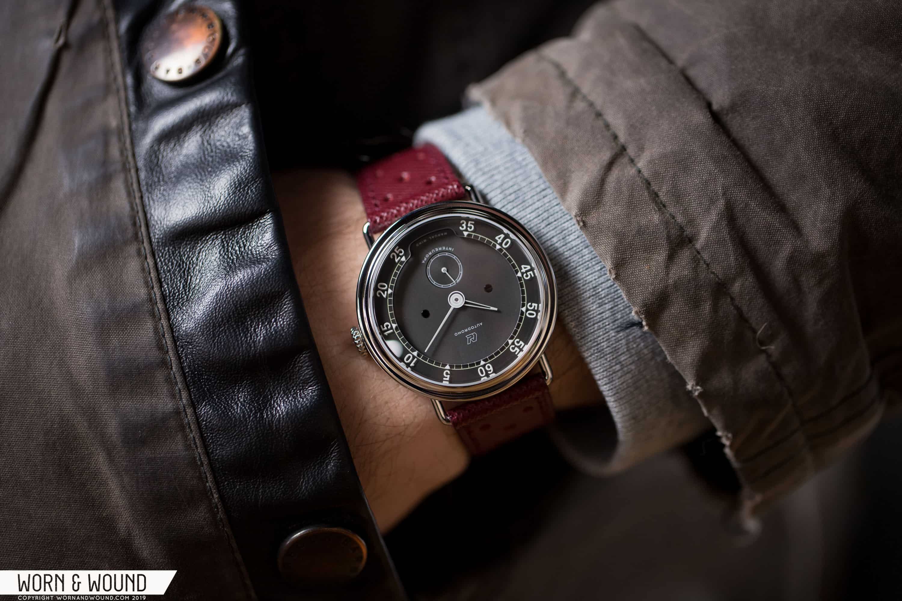
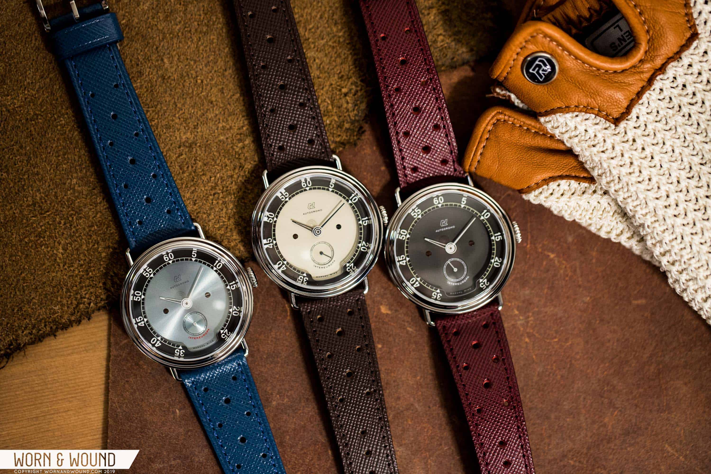
Moving to the layered dial, there’s a lot to discuss. There are three base colors: Blue, Gray, and Cream. Here you’ll finding the branding below 12:00, a sub-seconds register above 6:00, and the staple Autodromo screws along the horizontal axis at 3:00 and 9:00.

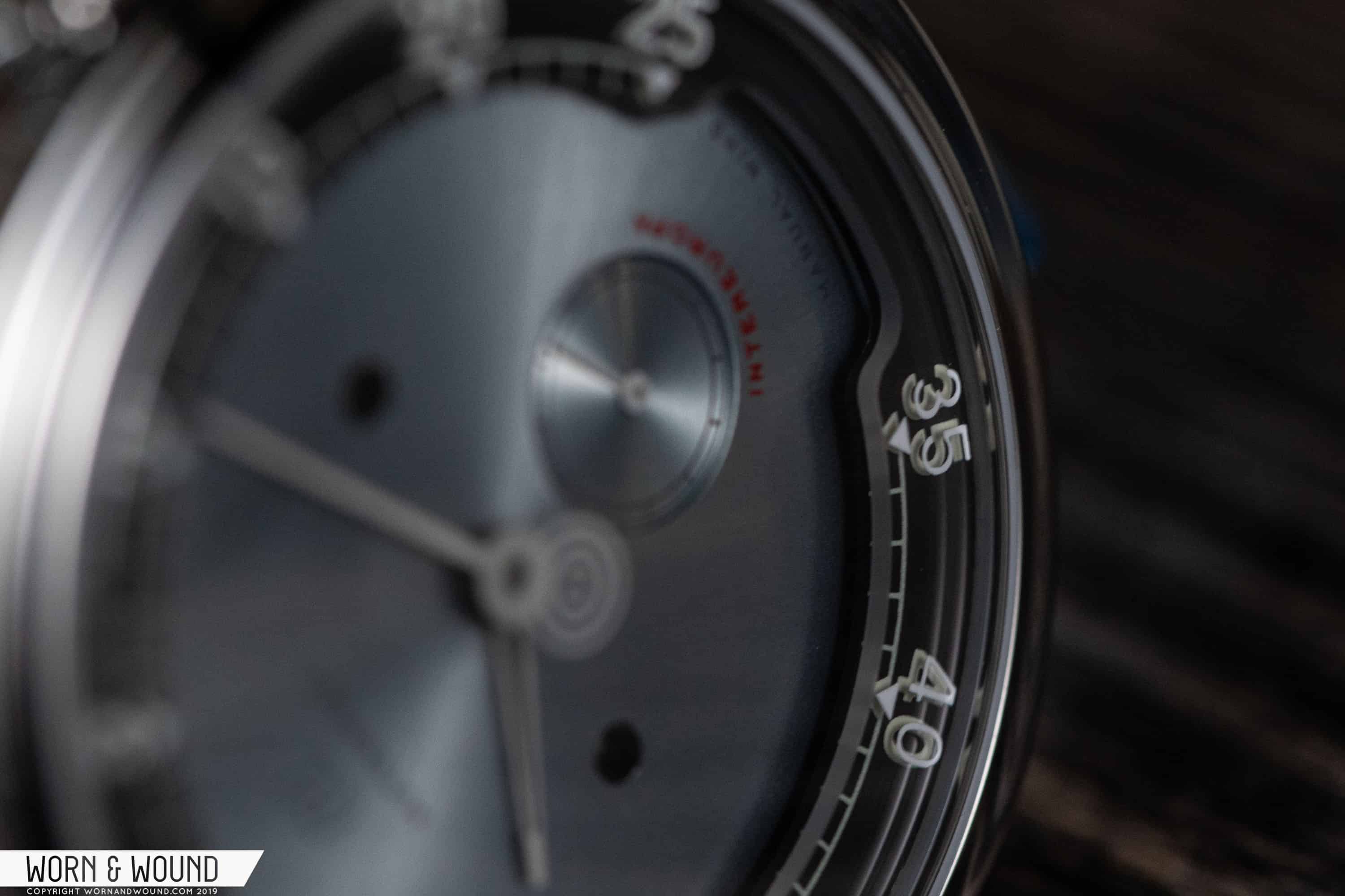
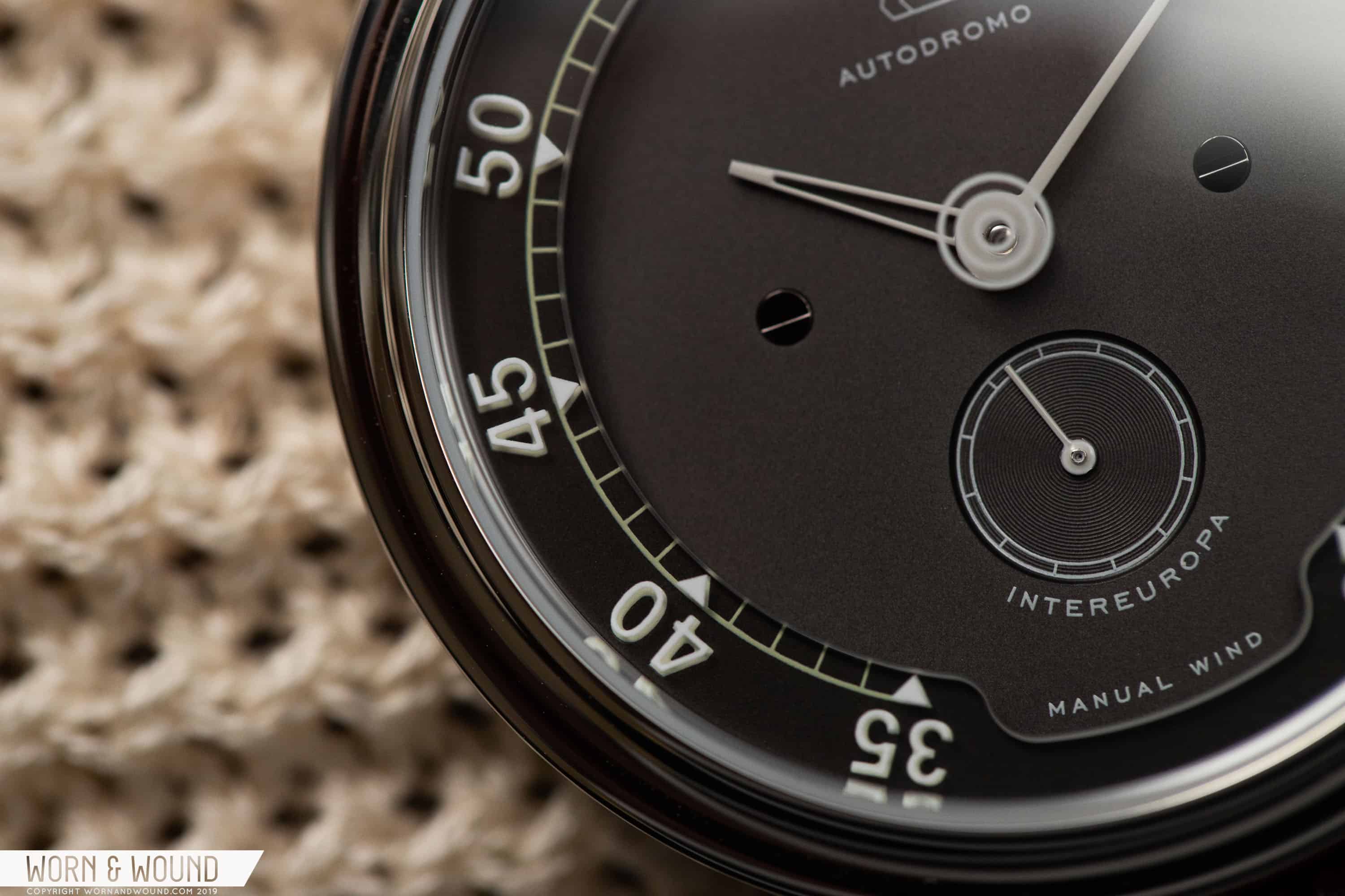
Bradley explained that he wanted the dial to remain faithful to the methods used to create gauges in the 1950s, so that’s what you get here. There’s a top-layer K1 glass cutout that frames the base of the dial, and this is where you’ll find the minutes markers. The numbers and corresponding triangles are printed on both sides of the glass, and the result is a floating drop-shadow effect. Look at the watch top-down, and you’ll see it; look at from an angle, and the effect becomes even more pronounced.

Between the K1 cutout and the base dial is another layer: a gray ring that houses the railroad track. This layer with the class cutout over it together create some awesome dimensionality on the dial. But that’s not all — the crystal plays a role here too. Printed on the underside of the crystal is a bullseye detail, one that was a feature of gauges from that era. So altogether, four layers are used to build out the dial, and I think the end result was well worth the effort. The downside, however, is that this is really the sort of thing that is best appreciated in the metal. It’s hard to capture how cool the effect truly is, and it’s on the wrist that the interplay of all of these elements comes to life.

One criticism that I’ve heard of this watch has to do with the cutout between 25 and 35 minutes. This is, of course, another nod to the gauges that inspire the design. The criticism is that this cutout, which does away with a portion of the minutes track, impacts legibility, but for me this has been entirely unfounded. At no point in my experience with this watch on my wrist have I struggled to tell the time. We all have a general idea of where markers should be, and what the time is based on the relative position of the hands (I’d argue that it’s an almost instinctive ability, and I imagine brands like Movado would make a similar argument). Now, it’s certainly fair to point out a dislike for such a detail — we all have our preferences — but to say it effects one’s ability to read the time is, in my estimation, a stretch.

Advertisement

The handset is relatively straightforward; for the hours, there’s a sketelonized and tapering sword of sorts, and the minute hand is a blunt stick. Both are a nod to instrumentation gauges, and work well with the overall design.

Of the three dials, my favorite is the Cream version. Cream and gray work so well together, and the cream-dialed variant of the Stradale was also my favorite out of that set. The Blue is a touch different from the Cream and Gray, in that it features a shiny sunburst finish. It’s an attractive look, though I can’t help but wonder what the dial might have looked like had it been done in the same manner as the other two. As it stands, it’s still good looking, but, once again, that Cream dial leaves me drooling.

Movement

In the past, Autodromo has relied primarily on Japanese quartz and mechanical movements, but, as I wrote above, for the Intereuropa they’ve gone Swiss. The 7001 is a banger of a caliber, and it has found home in a number of quality watches — from likes of Blancpain and Nomos to Stowa and Meistersinger — over the many years of its existence. It’s a slim 10.5 ligne movement, with 17 jewels, an Incabloc shock system, and 42 hours of power reserve. It’s also a great platform for higher-end finishing. Now, we can’t see the movement here, which is a bit of a double-edged sword since the caseback is nicely finished. I could have gone either way, so I’m personally more than okay with the closed back.

My two favorite things about the movement is how thin it is, which means the watches that it powers will be thin, and that it has a sub-seconds complication at 6:00. This often lends itself to great design, and the Intereuropa is no exception. The sub-dial at above 6:00 helps to balance the branding under 12:00.

For a deeper dive into the 7001, check out this great writeup from our own Mark McArthur-Christie.

Straps and Wearability

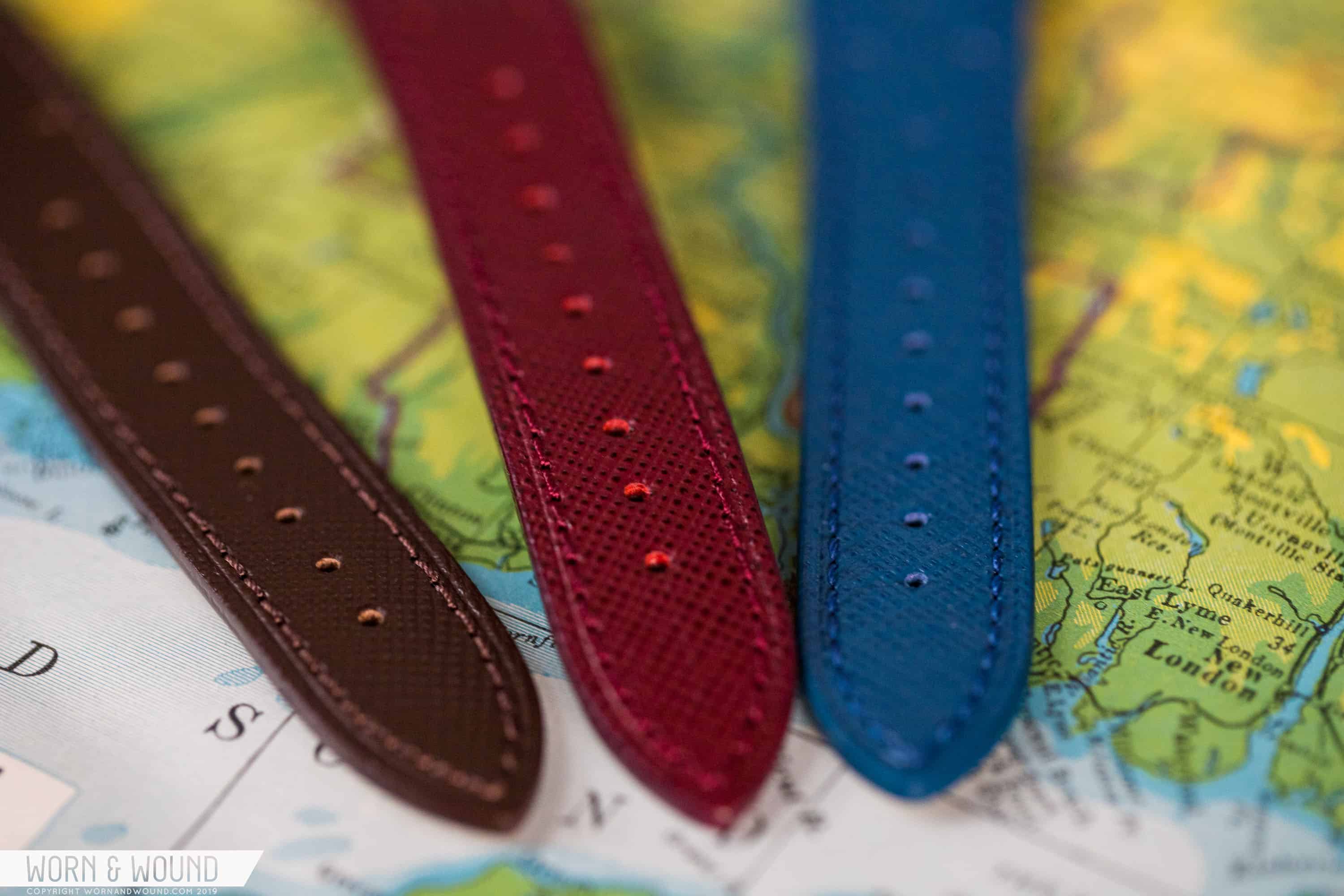
The Intereuropa comes on a Saffiano leather rally strap. Saffiano leather was patented by Prada in 1913, and it was made to be used as scratch-resistant leather for luggage. Today, it’s still a relatively lux material, and you often see it used on Italian handbags. In recent years, it’s also become a popular type of leather for use in watch straps, and we’ve seen all sorts of Saffiano bands at a variety of price points.

Autdromo source their straps from a manufacturer in Rome, Italy. The Blue dial comes with a blue strap, the Cream dial with a brown one, and the Gray dial with burgundy. Overall, I think they’re paired well with the watch. They definitely look and feel luxurious, even a touch dressy, but the rally pattern gives them a sporty edge that jives with the automotive vibe of the Intereuropa . Each band is fitted with a branded buckle and tang.

On the wrist, the watch is an absolute joy. I find that it wears a touch smaller than its diameter, and thinner than its thickness. The latter is true because of the bowl-shaped case, which has a tendency to dip into the wrist. It’s also very light, which is something I noticed in my time with the watch, and that lightness is a nice change of pace from my usual rotation, which right now is dominated by the Black Bay Fifty-Eight. Due to that lightness, the watch sort of disappears, which never happens with a heavier watch.

Packaging

Bradley often outdoes himself with his packaging. But his approach isn’t luxury for luxury’s sake. No, he instead tries to evoke a feeling with his packaging, a hint at the watch inside and the era from which he draws inspiration. And that’s exactly what he does here.

There’s an attractive outer cardboard box with the appropriate branding. Inside, you’ll find an instructional sheet, and a fold out poster designed by Autodromo for the 1957 Coppa Intereuropa. It’s a nice bit of swag, and again it speaks to the tone that Autodromo is trying to build.

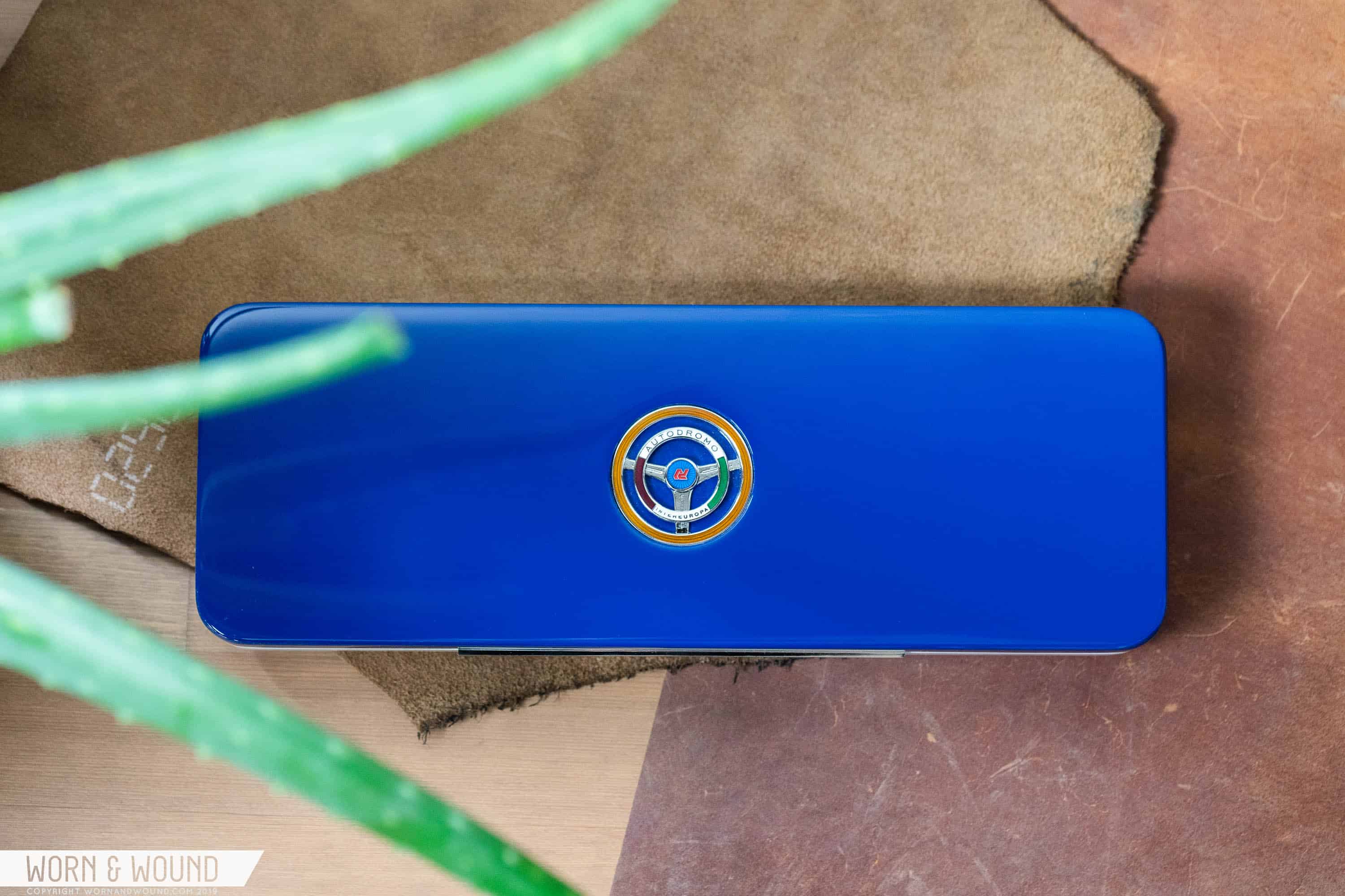
The real prize, however, is the inner presentation box. It’s lacquered wood, so it’s got some major heft to it, and the whole thing is polished to a sleek shine. In the center is a cloisonné badge featuring a steering wheel-shaped design inspired by badges made in the 1950s by various racing clubs that were in Italy in the post-war years. This is a really elegant piece of kit, and it’s the sort of ephemera one would actually want to hold on to and not simply discard.

Conclusion

If you’ve made it all the way to the end of this review, then it should come as no surprise that I am a huge fan of the Intereuropa. First and foremost, I’m drawn to the design, and in-hand the watch feels like a high-quality piece. I also really appreciate the intricacy of said design. Often, too many watches play it safe, and too few brands push the envelope. Autodromo isn’t one of those brands, and Bradley’s willingness to do something outside of the norm in terms of design and manufacturing is something I really appreciate. The watch retails for $1,250, which is inline with past releases and feels appropriate given the complexity of the design and the Swiss movement. Autodromo

Images from this post:
Related Reviews
Ilya is Worn & Wound's Managing Editor and Video Producer. He believes that when it comes to watches, quality, simplicity and functionality are king. This may very well explain his love for German and military-inspired watches. In addition to watches, Ilya brings an encyclopedic knowledge of leather, denim and all things related to menswear.
ryvini
Categories: