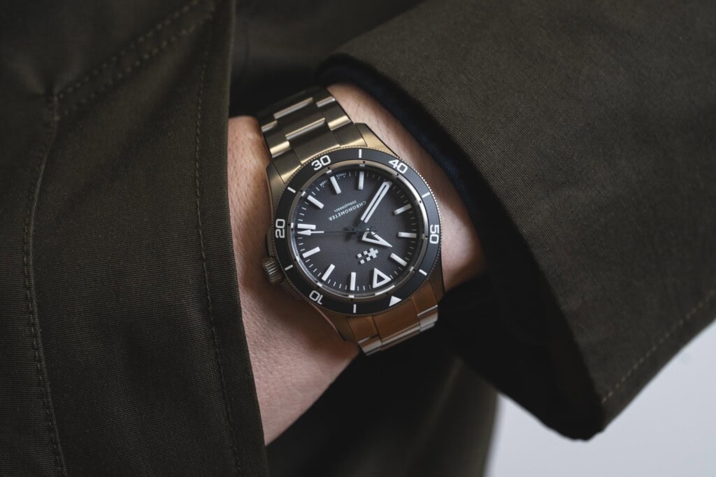
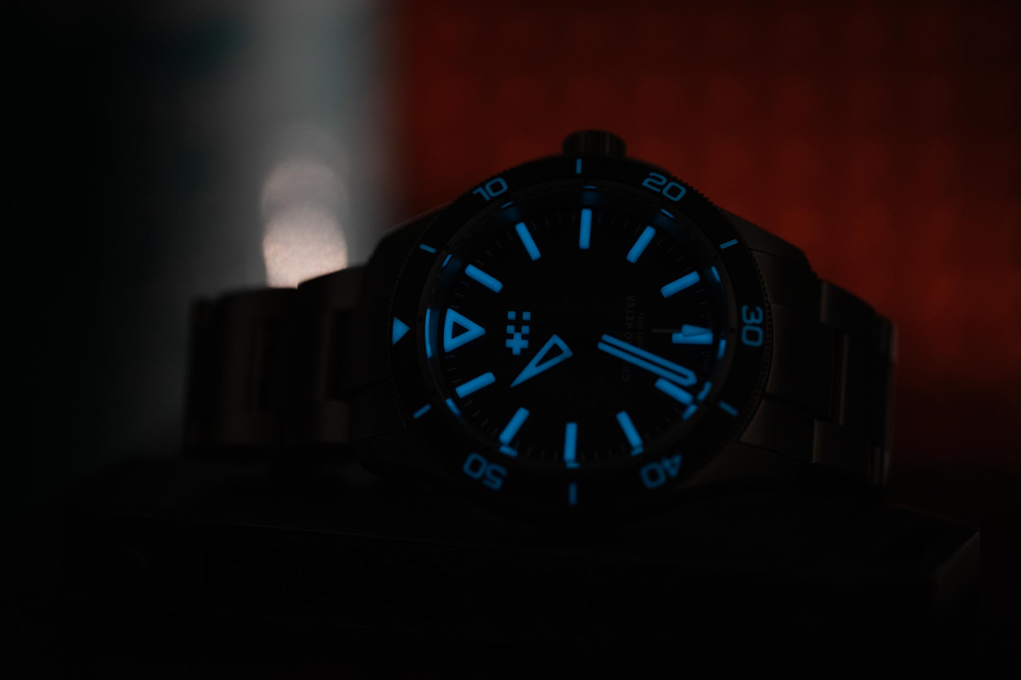
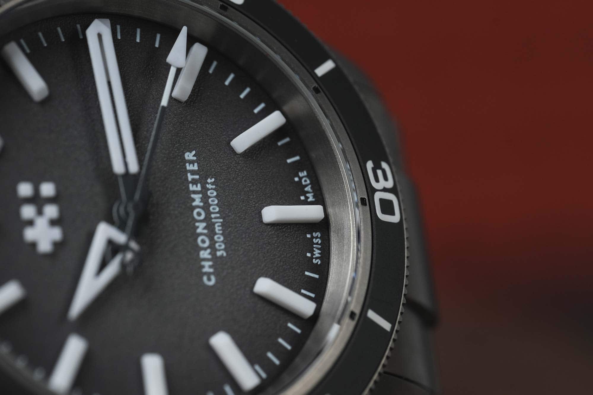
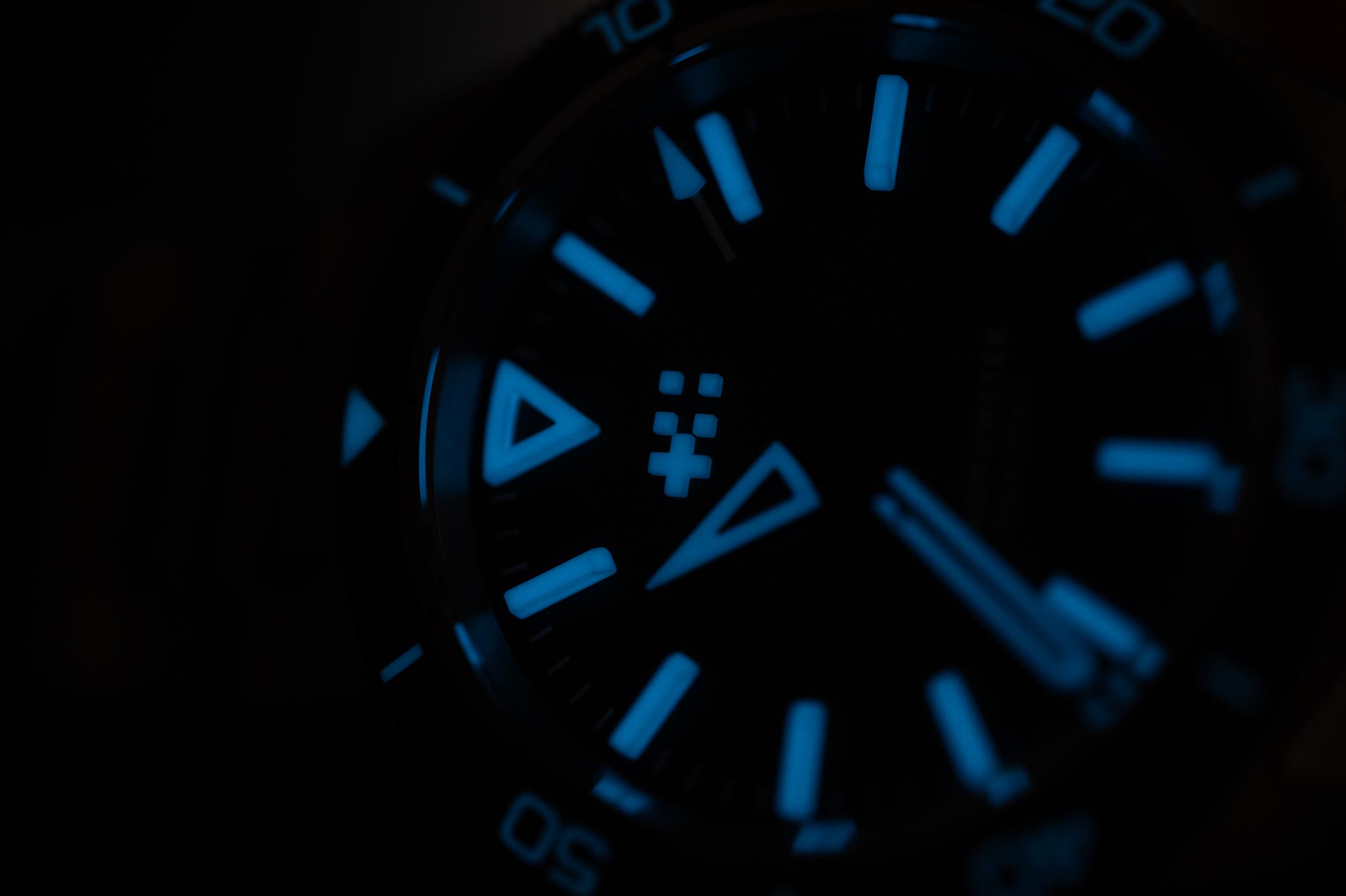
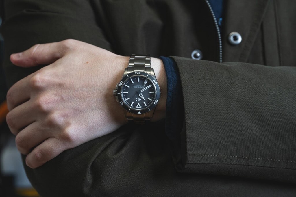
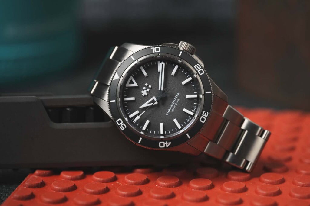
However, one of the best features of the markers is not related to their lume. Because they are so tall, and such a crisp white, they are highly visible from all angles. The Lumière is a watch that is nearly as functional when seen from a very low angle as directly from above. The fact that that stays true while glowing makes it even better. While viewing angle is not a requisite for a dive watch, as far as I know, it seems advantageous.
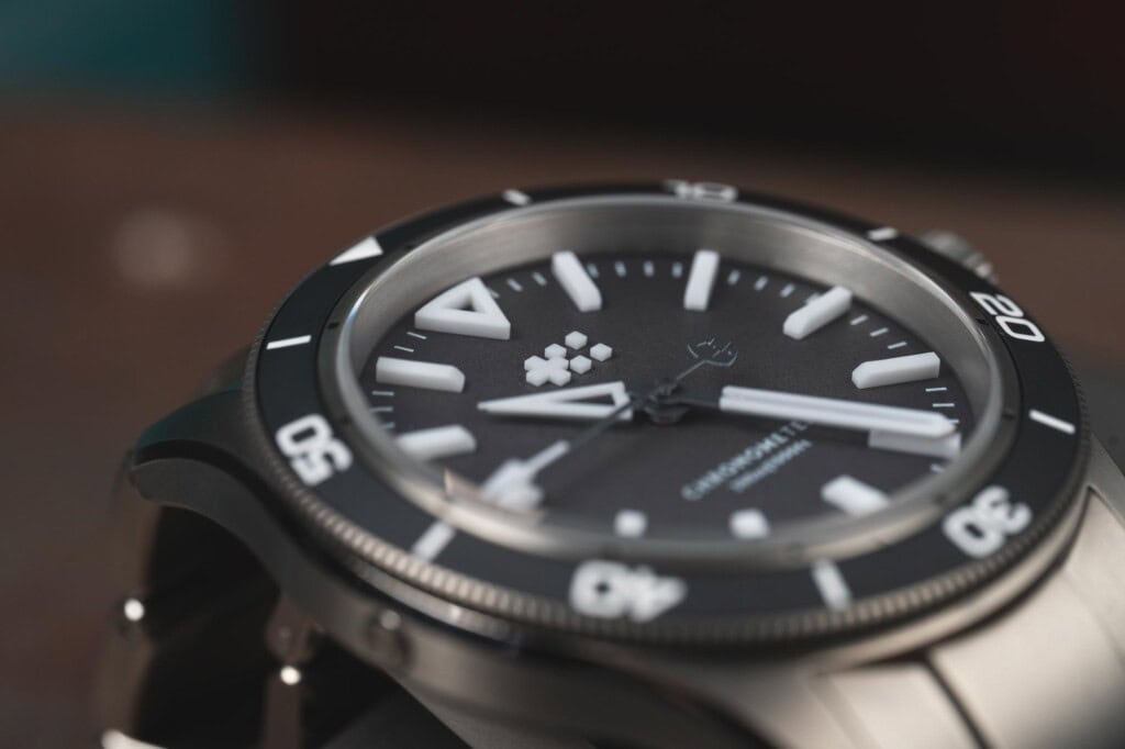
The dial surface is a dark gray gradient with a stippled texture. The gray-to-black fade is effective, emphasizing the markers and adding some stylization. The stamped textured surface was perhaps chosen to appear extra matte, once again emphasizing the crisp white markers. I find this type of texture a mixed bag. Sometimes, it works better than others, as it can come off a bit cheap. Here, I think it’s inoffensive and has intention, but because of the stamping, the white overprint, particularly on the dial text, has slightly messy edges. Admittedly, this is only noticeable with a macro lens.
![]()
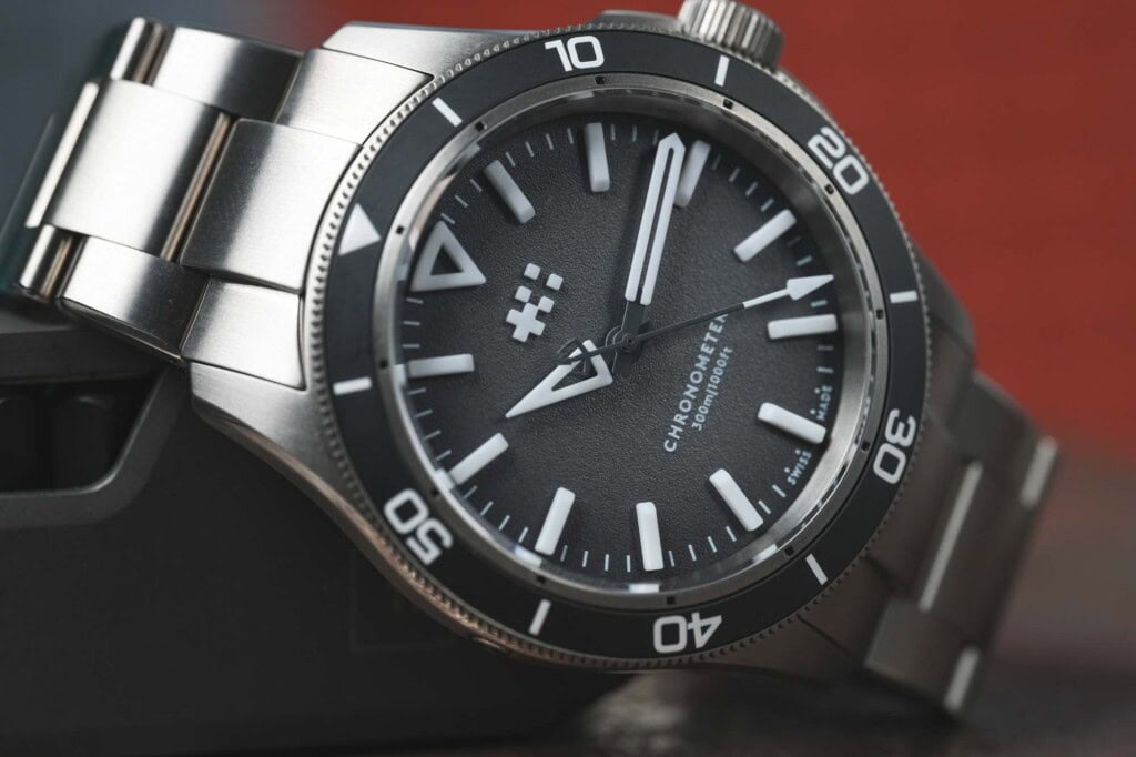
The grey extends to the matte ceramic bezel insert, which looks fantastic. Sure, an all-black dial and bezel would have looked good, too, but the use of gray here plays off of the titanium nicely, giving the Lumière a touch more of an aesthetized look. The markings on the bezel are all lumed, as they should be on a modern diver, matching the color of the dial markers but not quite their intensity.
A functional detail I was glad to see was that the ring on the inside of the bezel, which features small black marks every five minutes, was stationary. This allows you to align the bezel with these marks rather than the dial, which is easier as they are on the same level. I recall previous C60s featuring split bezel designs that were cool looking but were part of the same surface, so they didn’t have this added function.
![]()
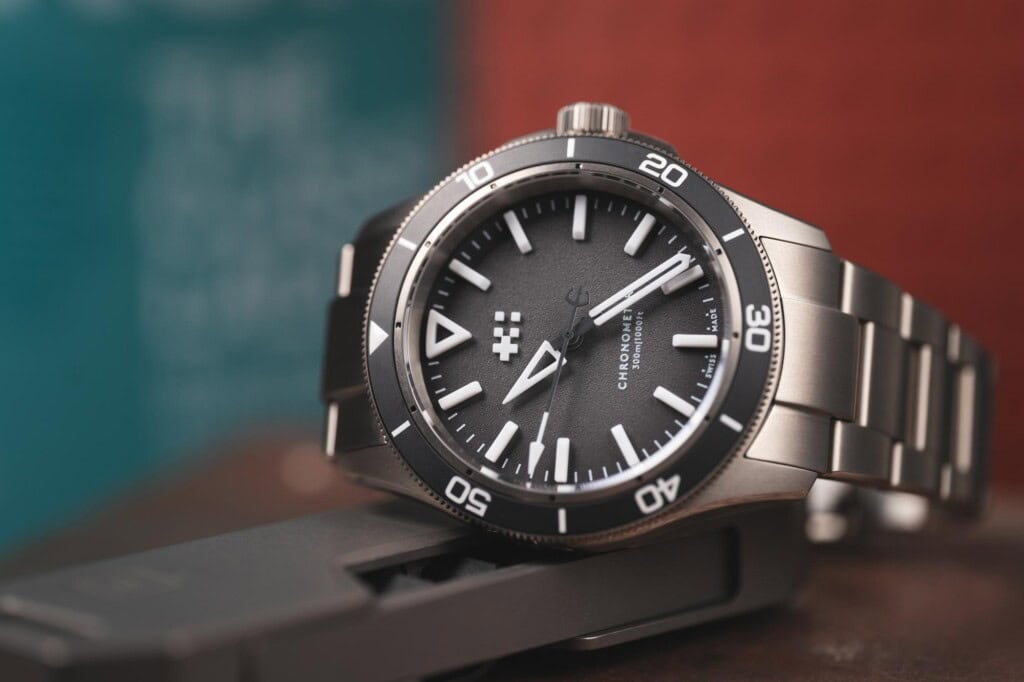
The dial of the Lumière comes together well, and I’d go so far as to say I prefer it to the standard C60s, which are similar but feature applied metal markers. To me, the C60 line has always been about satisfying the itch for a clean, simple, modern diver. They aren’t overly stylized, which in turn means they can seem a bit plain– but intentionally so. And that’s not a problem; they are more about purpose and versatility.
The Lumière has a technical and aggressive style, making it feel more modern. But, despite having a touch of an edge, it’s still easy to digest. There are neither design elements that blow my mind nor disappoint. It’s balanced, it’s clean, it’s legible. The Globolight certainly pulls it all together, but as I said, most of the time, it isn’t doing anything that tall, white plastic markers might not have achieved on their own. Overall, the dial is straightforward and lacks any fussiness, which I appreciate.





 Featured Videos


