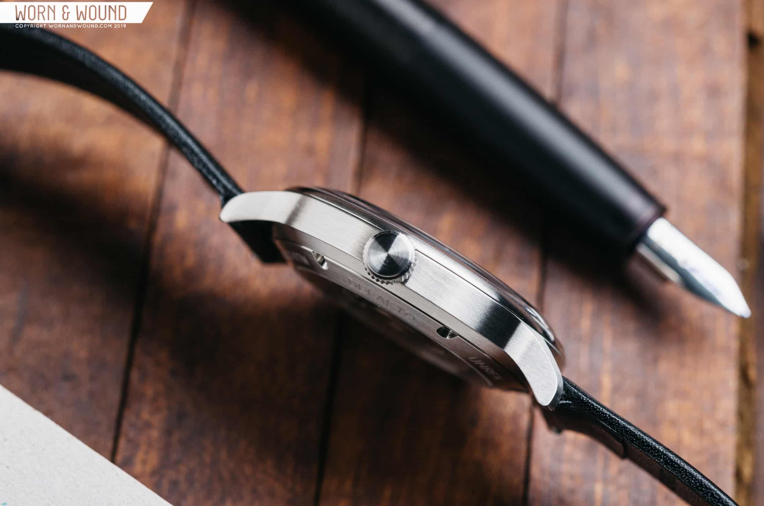
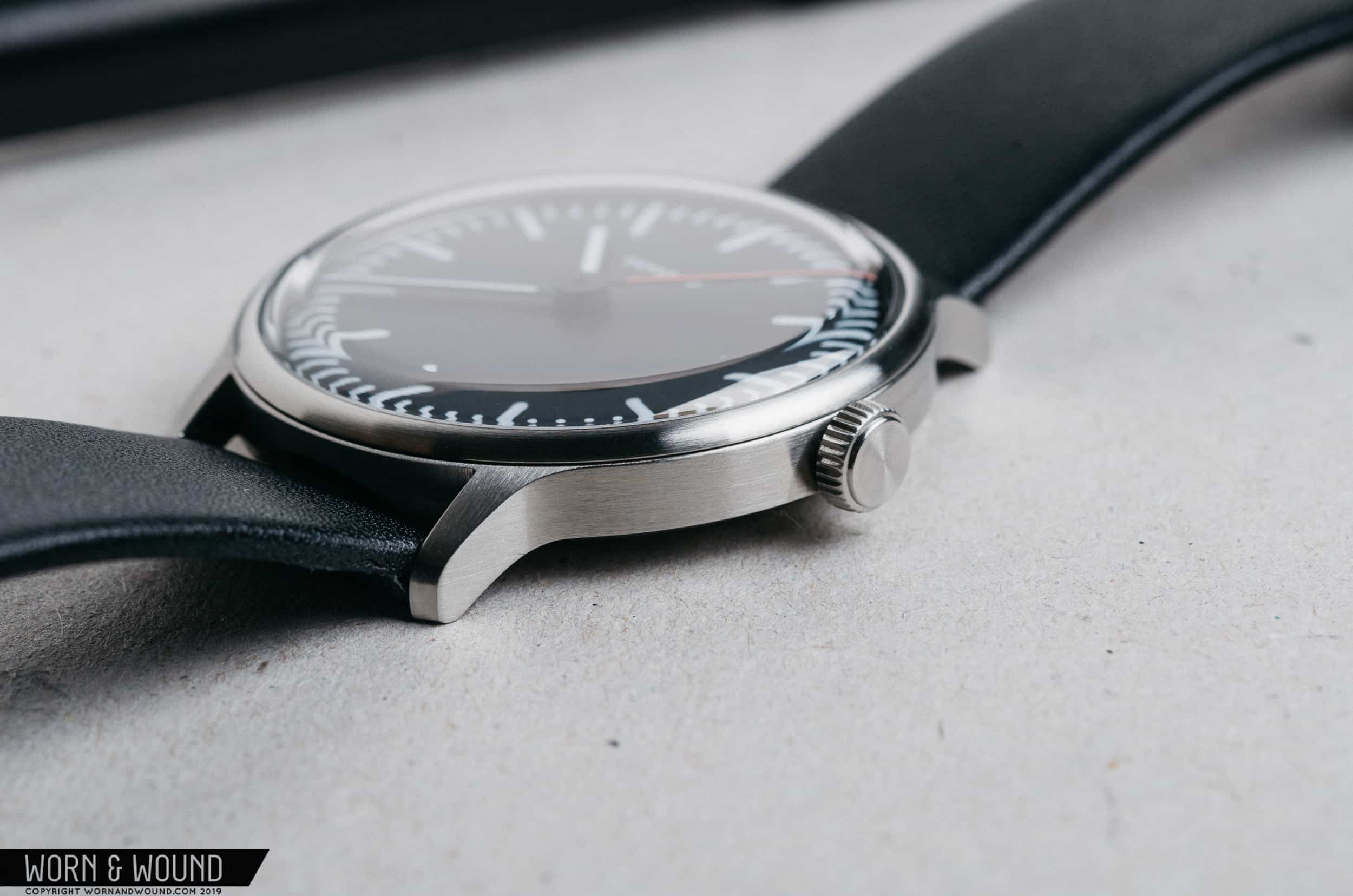
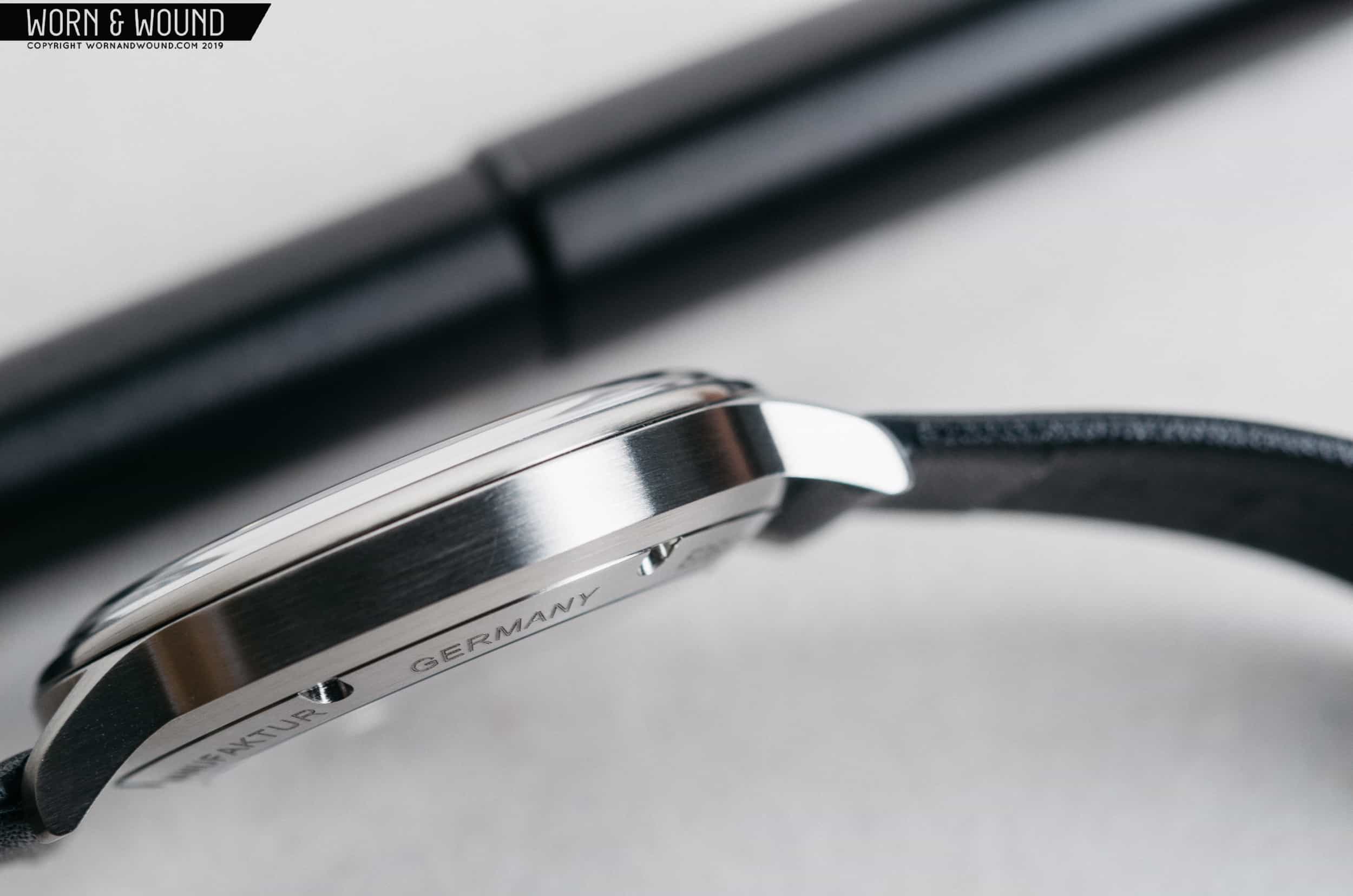
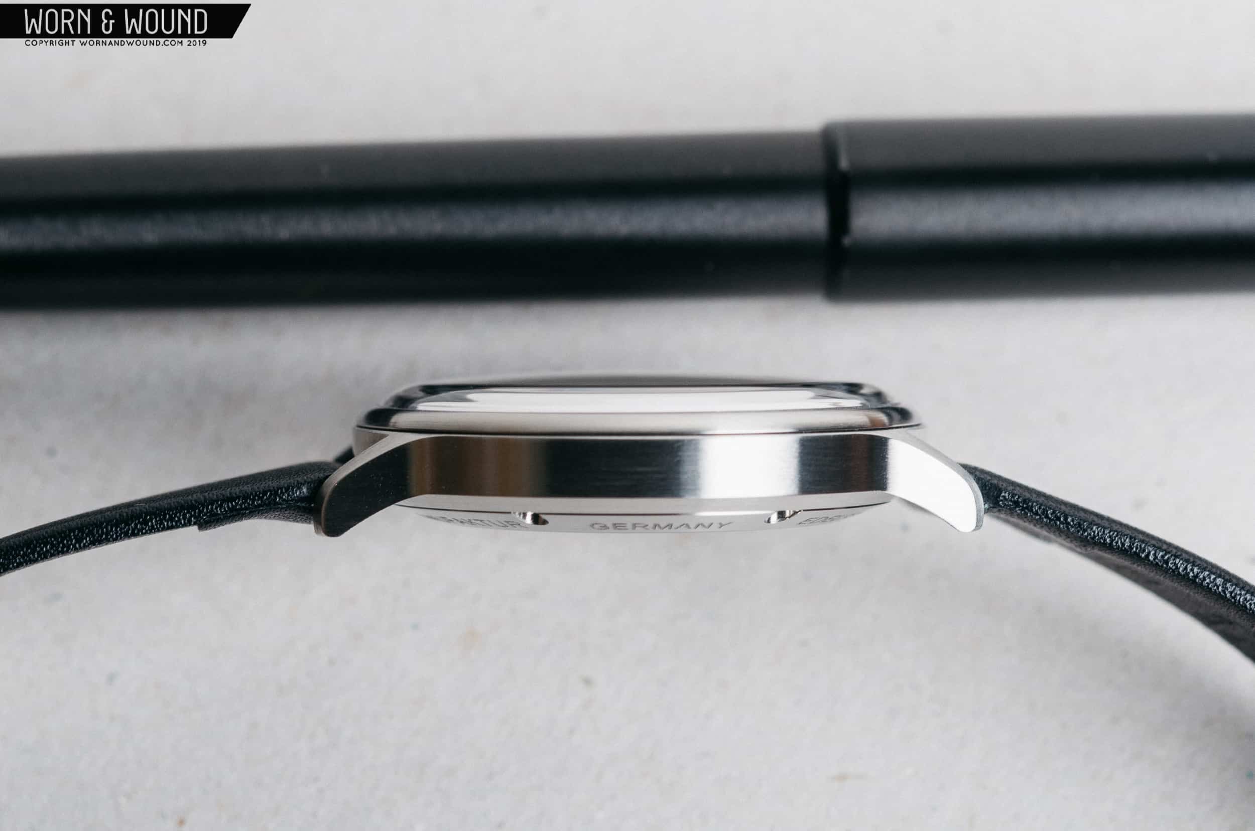
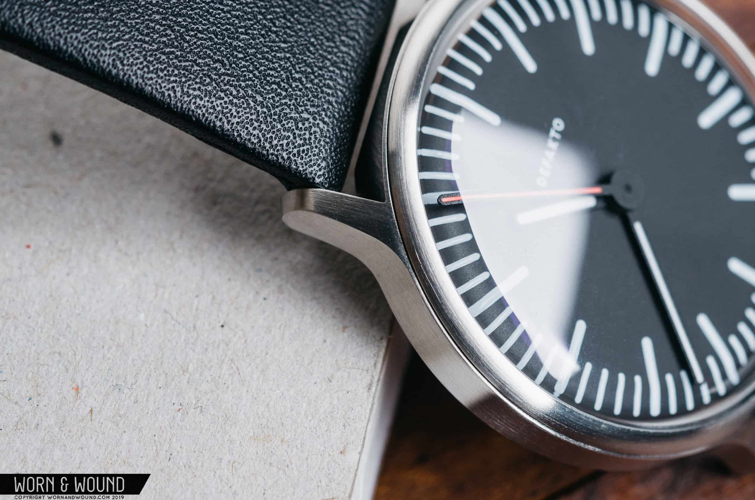
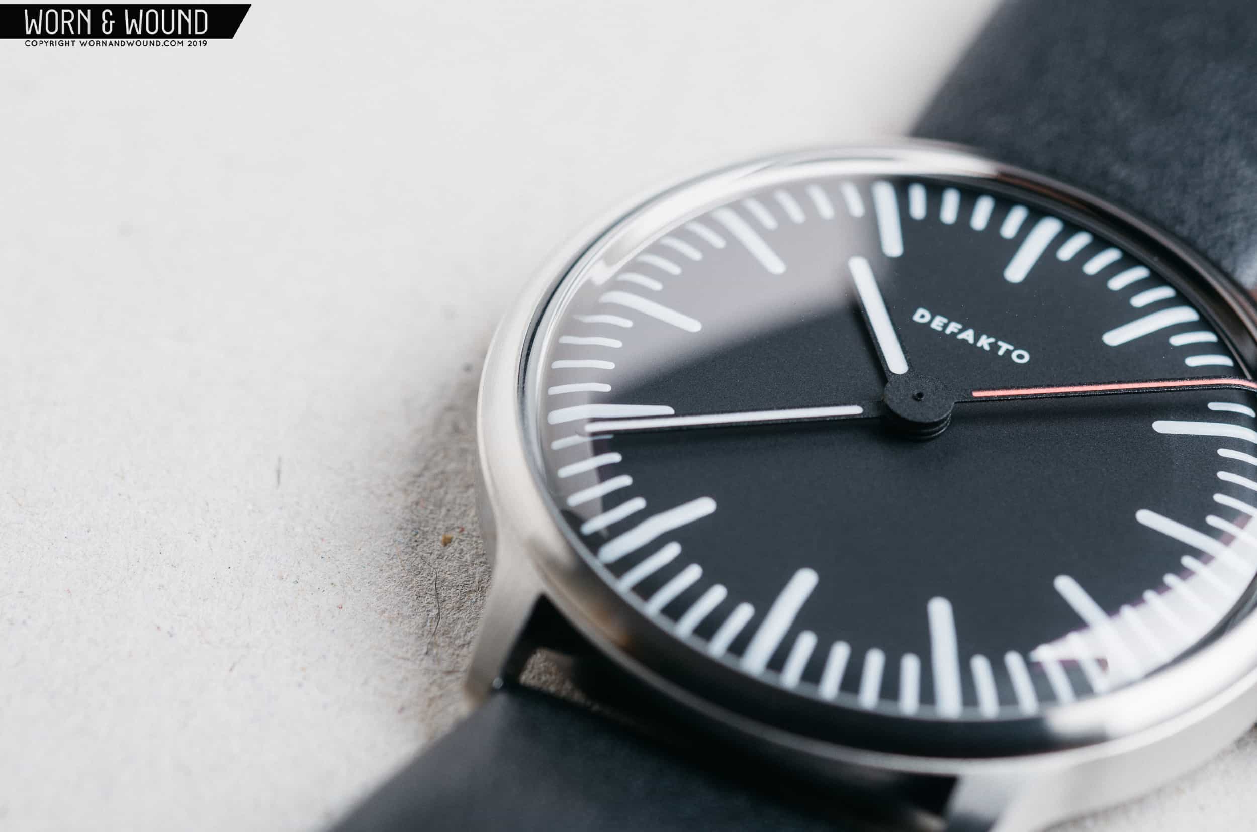
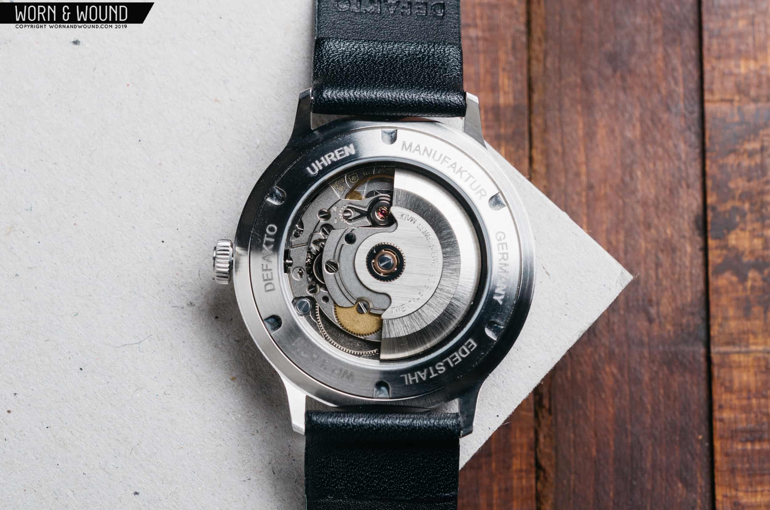
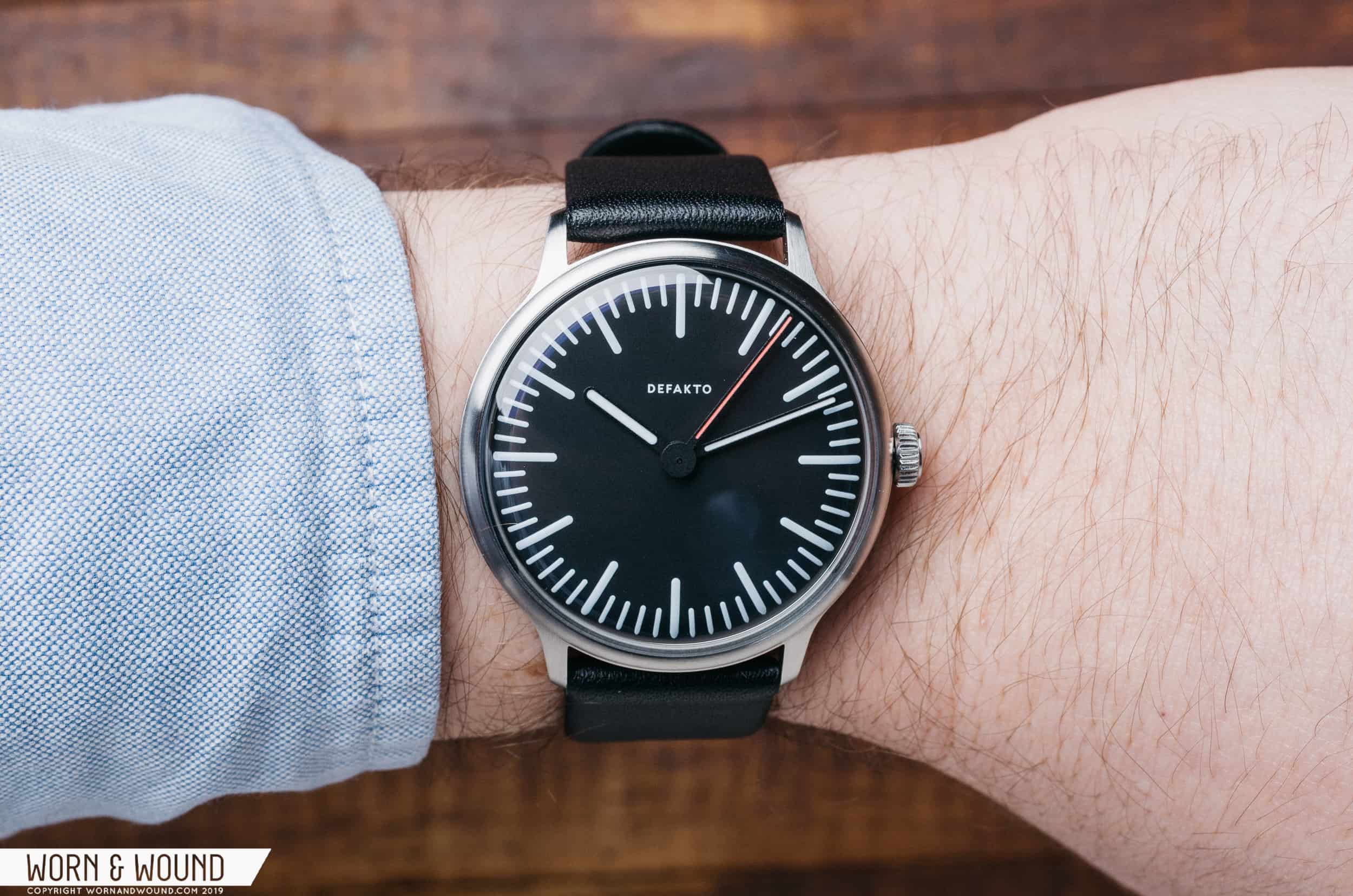
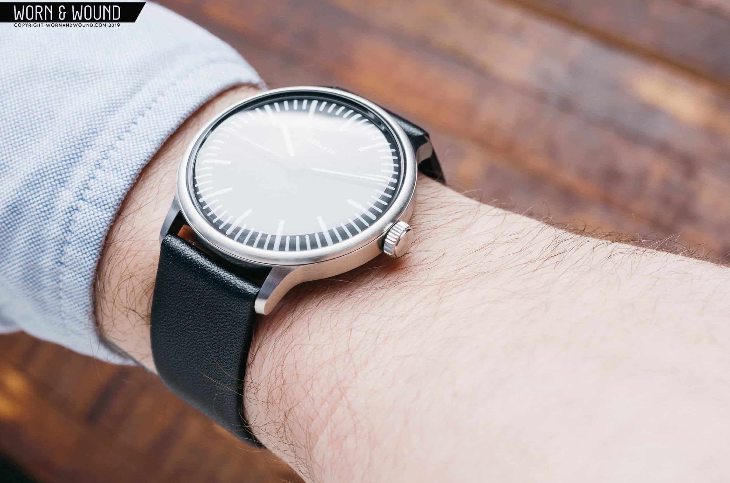
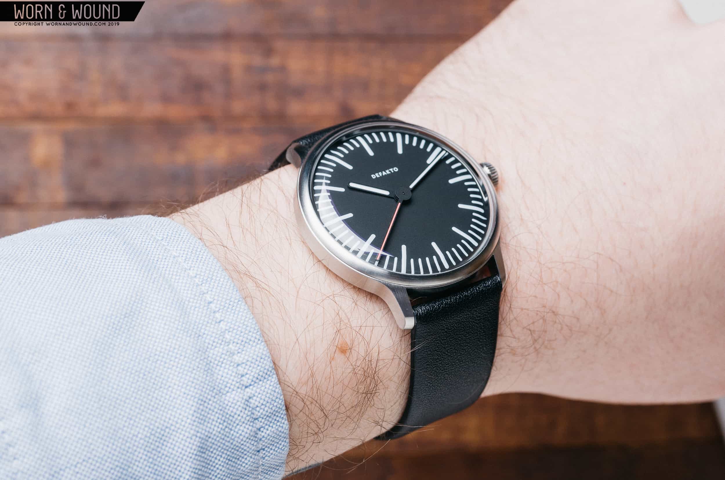
Given the Ickler family’s 100 years of case making experience, it comes as little surprise that the case on the Transit is clean and sharp throughout. The design is simple, but executed well and I really like the finishing technique. While it’s probably easy to just call it a brushed case and walk away, there’s a bit more going on here when you look closer. There are at least five different brushed surfaces, all at different angles. ![]() On the bezel, the brushing pattern follows the circular shape of the bezel itself. The sides of the case both feature horizontal brushing, while the space in between the lugs is brushed vertically. On top of each lug, the brushing is vertical, and finally the flat surface of the crown features radial brushing. Each transitional surface is nice and sharp. As you rotate your wrist, you’ll notice the light playing off each surface in a different direction adding a subtle, yet interesting visual effect.
On the bezel, the brushing pattern follows the circular shape of the bezel itself. The sides of the case both feature horizontal brushing, while the space in between the lugs is brushed vertically. On top of each lug, the brushing is vertical, and finally the flat surface of the crown features radial brushing. Each transitional surface is nice and sharp. As you rotate your wrist, you’ll notice the light playing off each surface in a different direction adding a subtle, yet interesting visual effect.
Dial and Hands
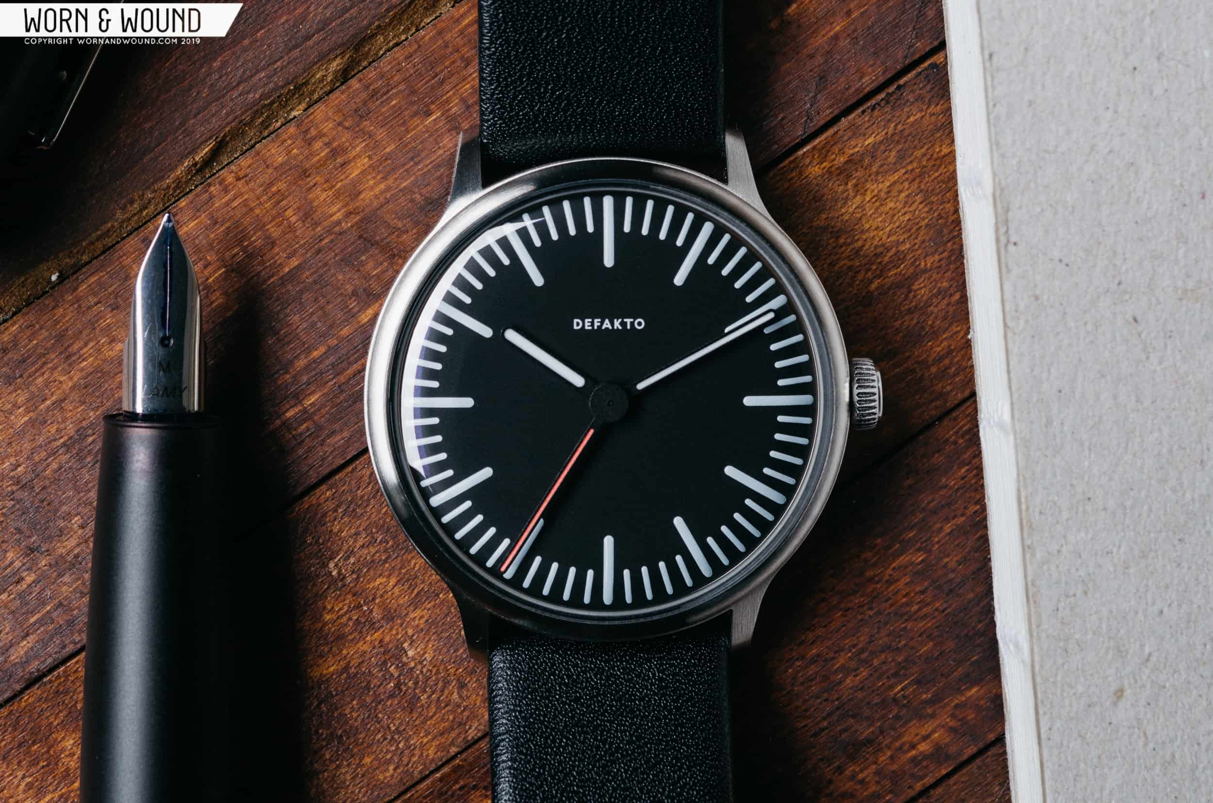
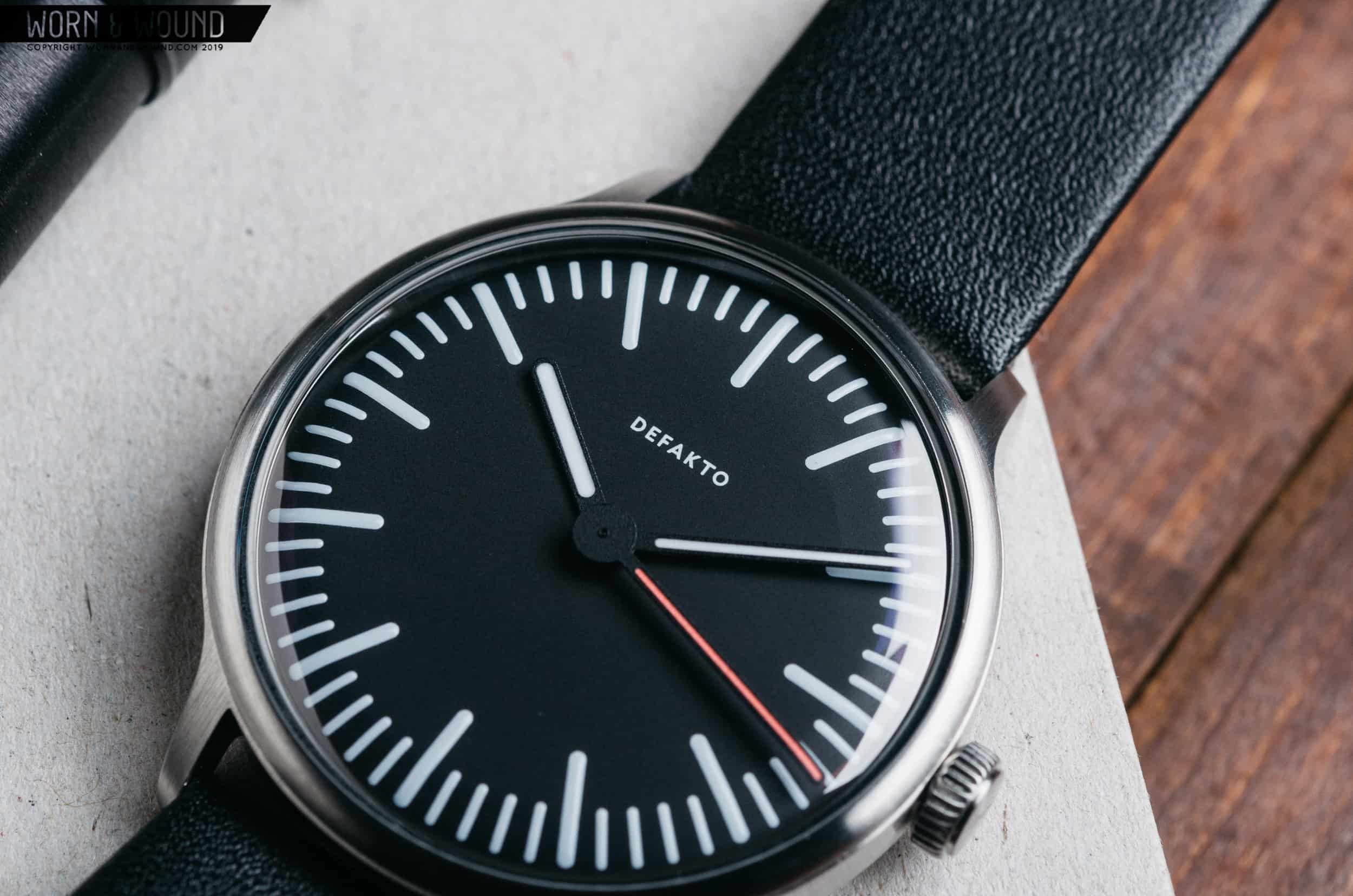
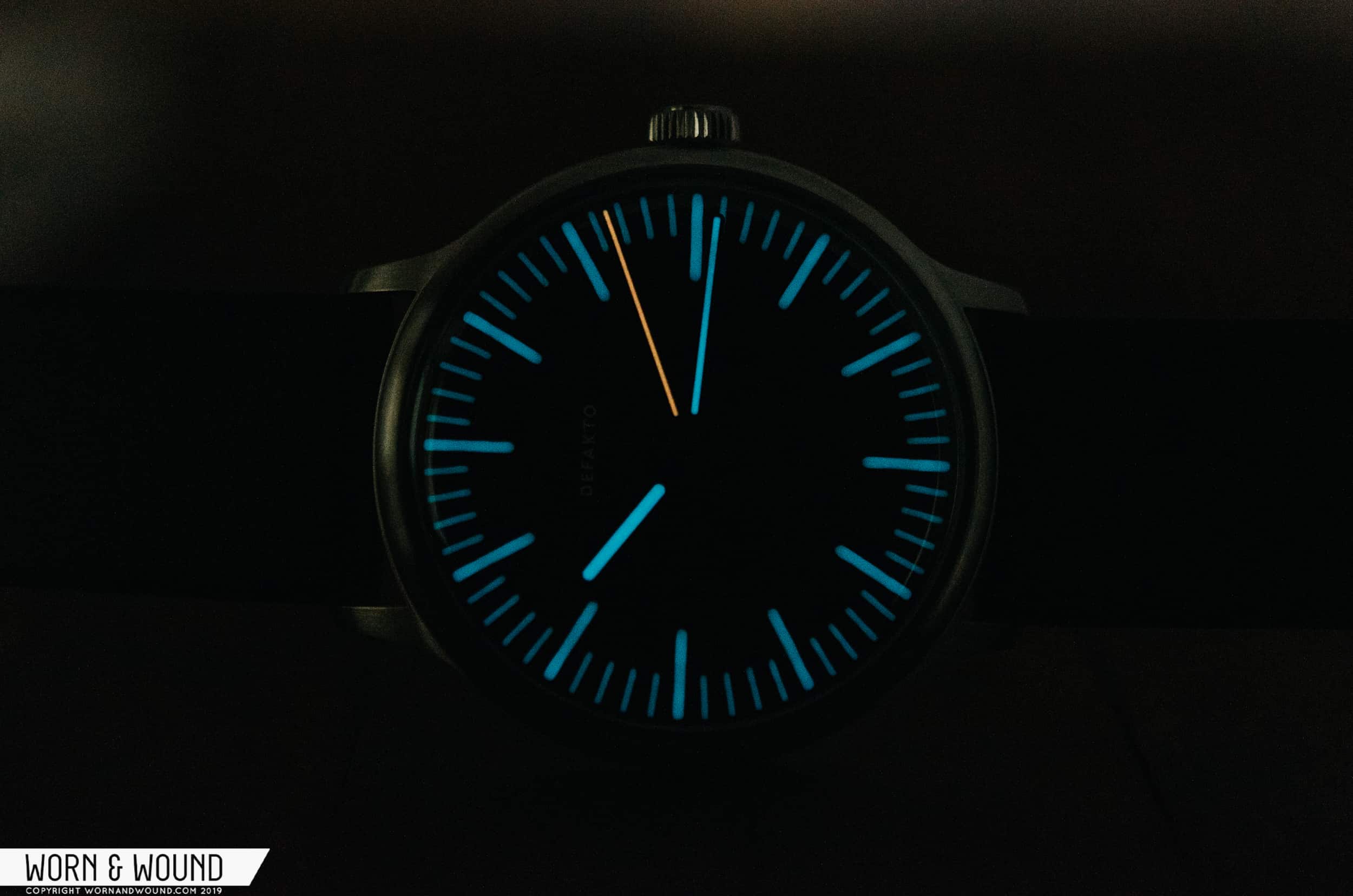
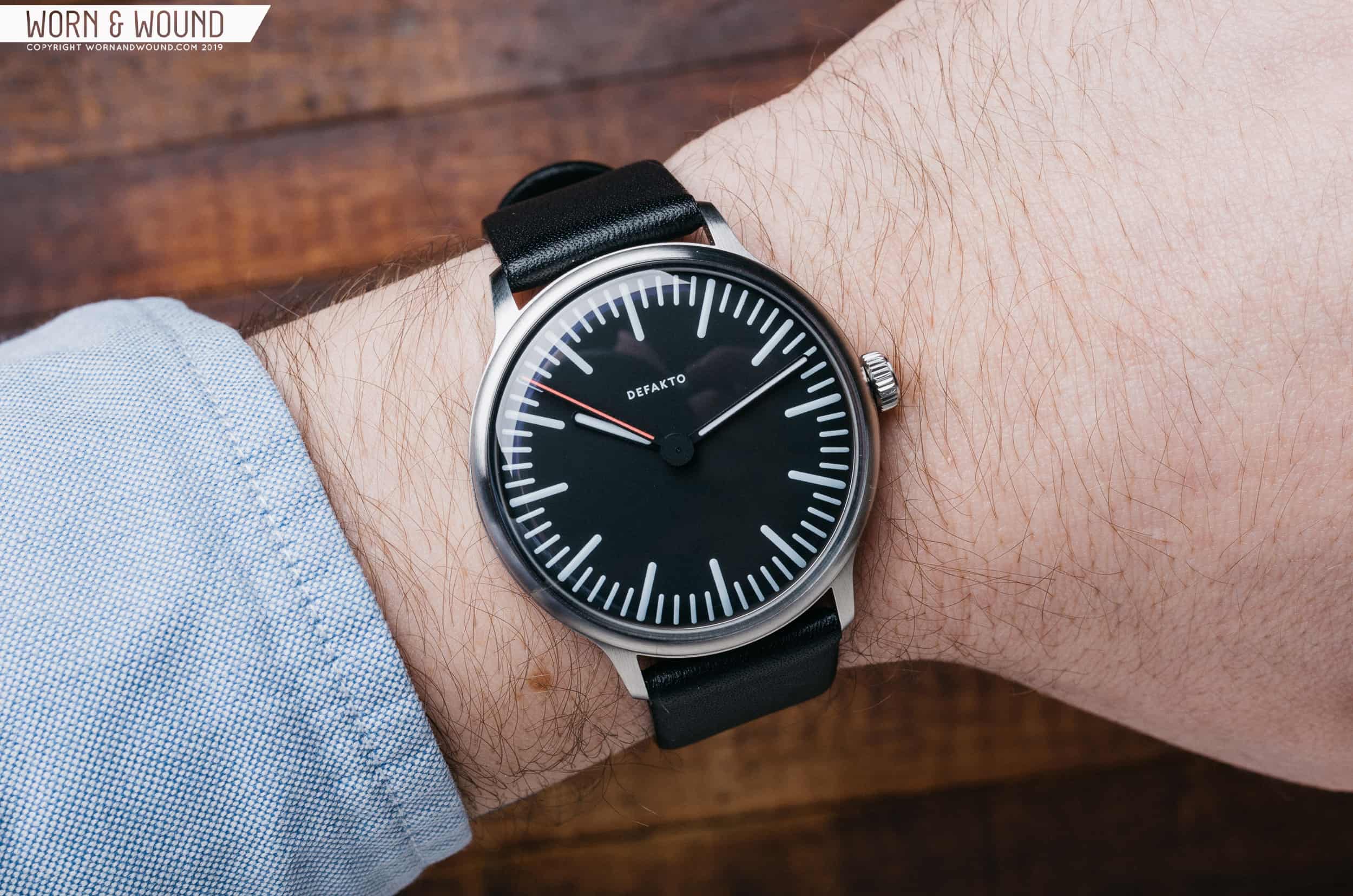
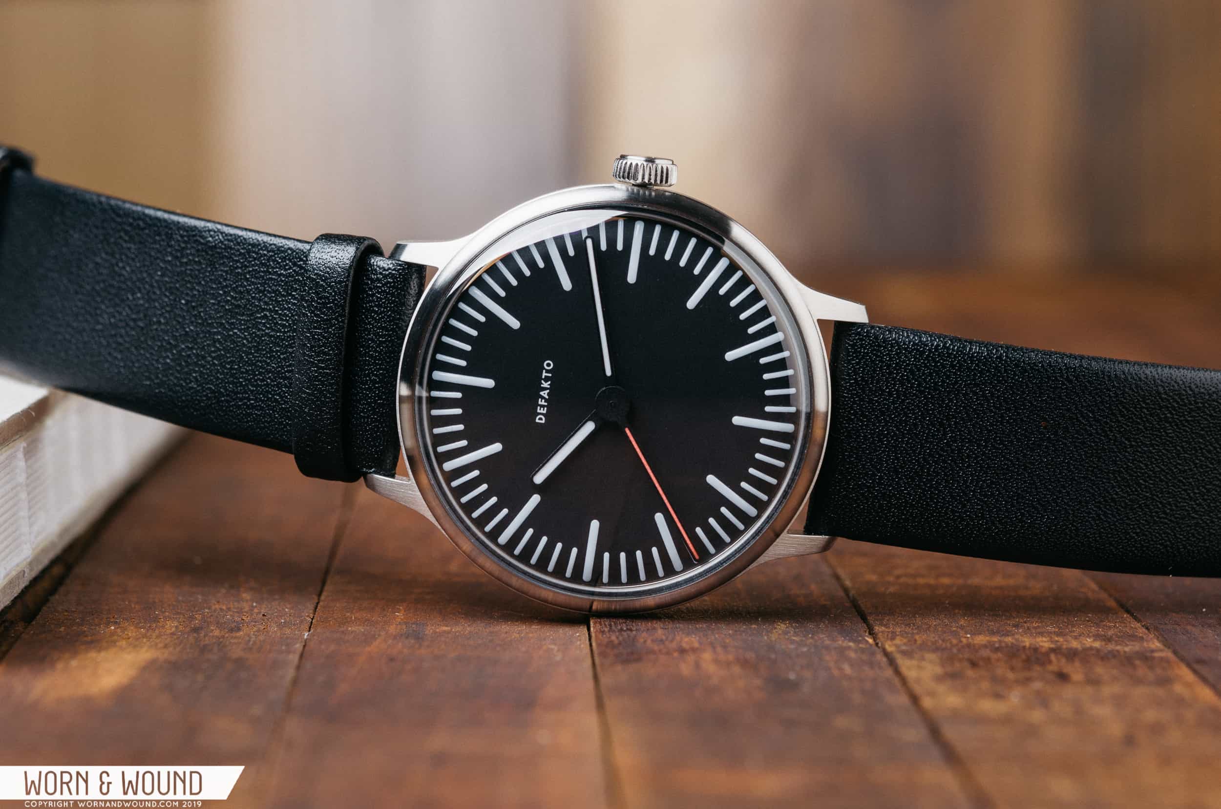
A matte black, curved dial adorns the face of the Transit. The curve is gentle and hard to notice at first, especially under the curved sapphire. Upon closer inspection, you’ll notice that the long minutes hand features a curve at the edge as well. From the top-down, the hands and dial appear to be flat which go well with the minimalist design of the watch. The indices are made up of a series of Super-LumiNova-treated lines that feature a gently rounded edge. They’re actually more like long, flat ovals. There’s a longer oval at five-minute intervals with shorter ones in between. The rounded markers play well with the overall design of the watch. If they were squared off, the Transit’s dial would leave a different impression entirely. The rounded accents throughout counterbalance the sharp edges of the case and lugs with something softer, and I like the resulting effect. ![]()
Pointing to the time, there are three hands: white hands for the minutes and hours, and a contrasting red hand for the seconds. Mirroring the shape of the indices, each hand is a long thin rectangle with a rounded end. The minutes hand extends fairly far towards the edge of the dial, hitting about halfway through the minute marker scale. The hours hand is a fair bit shorter, falling just short of the inside of the longer hour markers. Finally, the red seconds hand is the longest of the bunch, reaching all the way to the outer edge of the dial. On a minimalist style watch, these small differences in details go a long way. The hand set on the Transit is balanced and easy to read — just how it should be. Another thing that jumped out at me is the base of the seconds hand. It sits at the top of the hand stack and is wide enough to cover the origination points of the hours and minutes hands. It’s another cool little detail that makes the Transit look that much cleaner.





 Featured Videos


