Review: the Seiko Presage SARX071 / SPB129J1

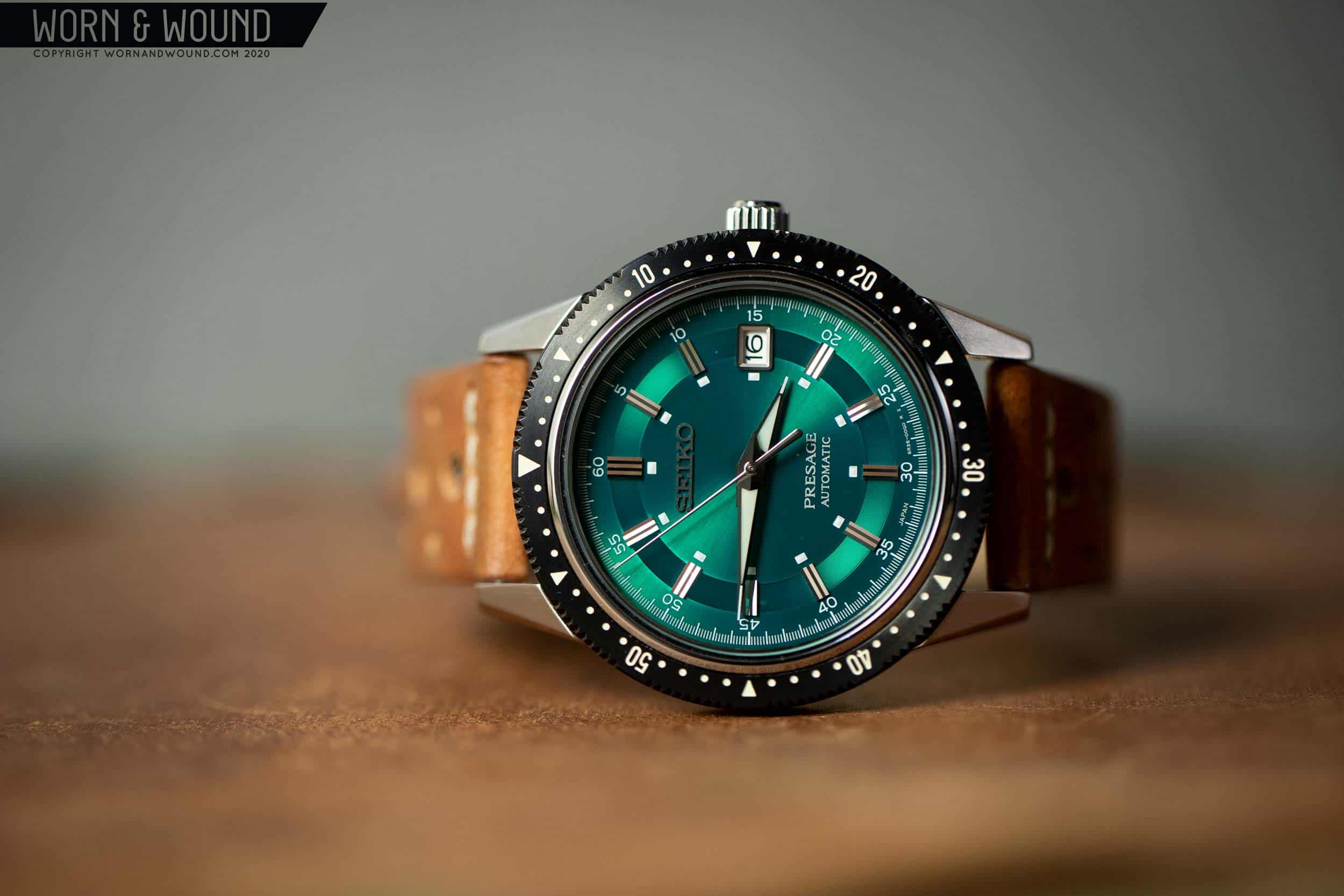
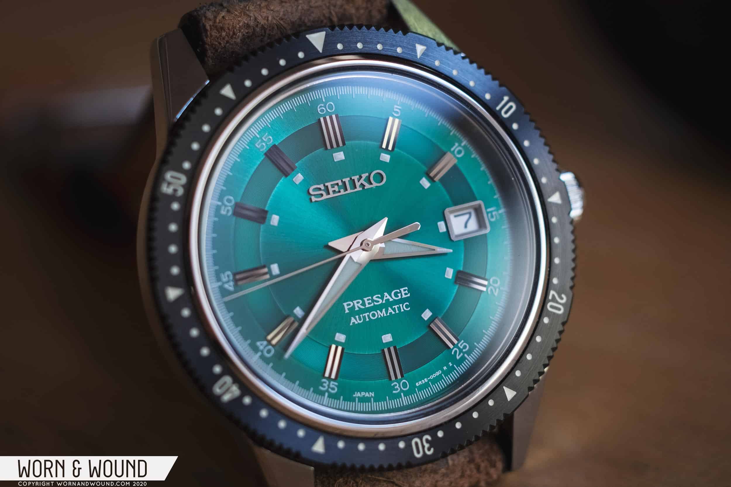
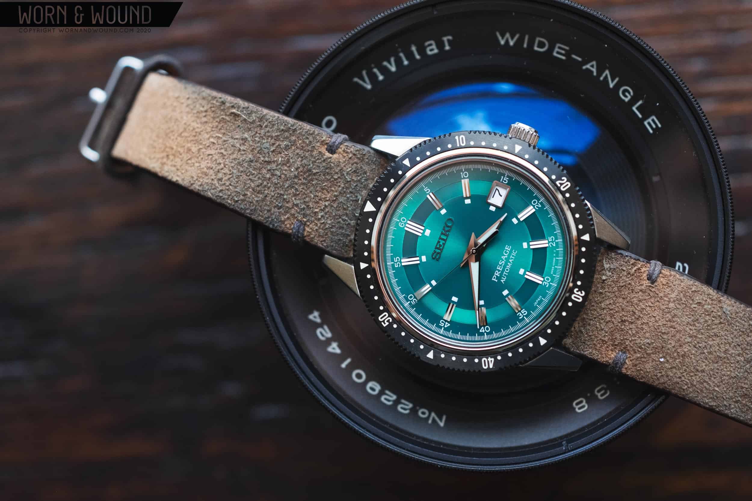
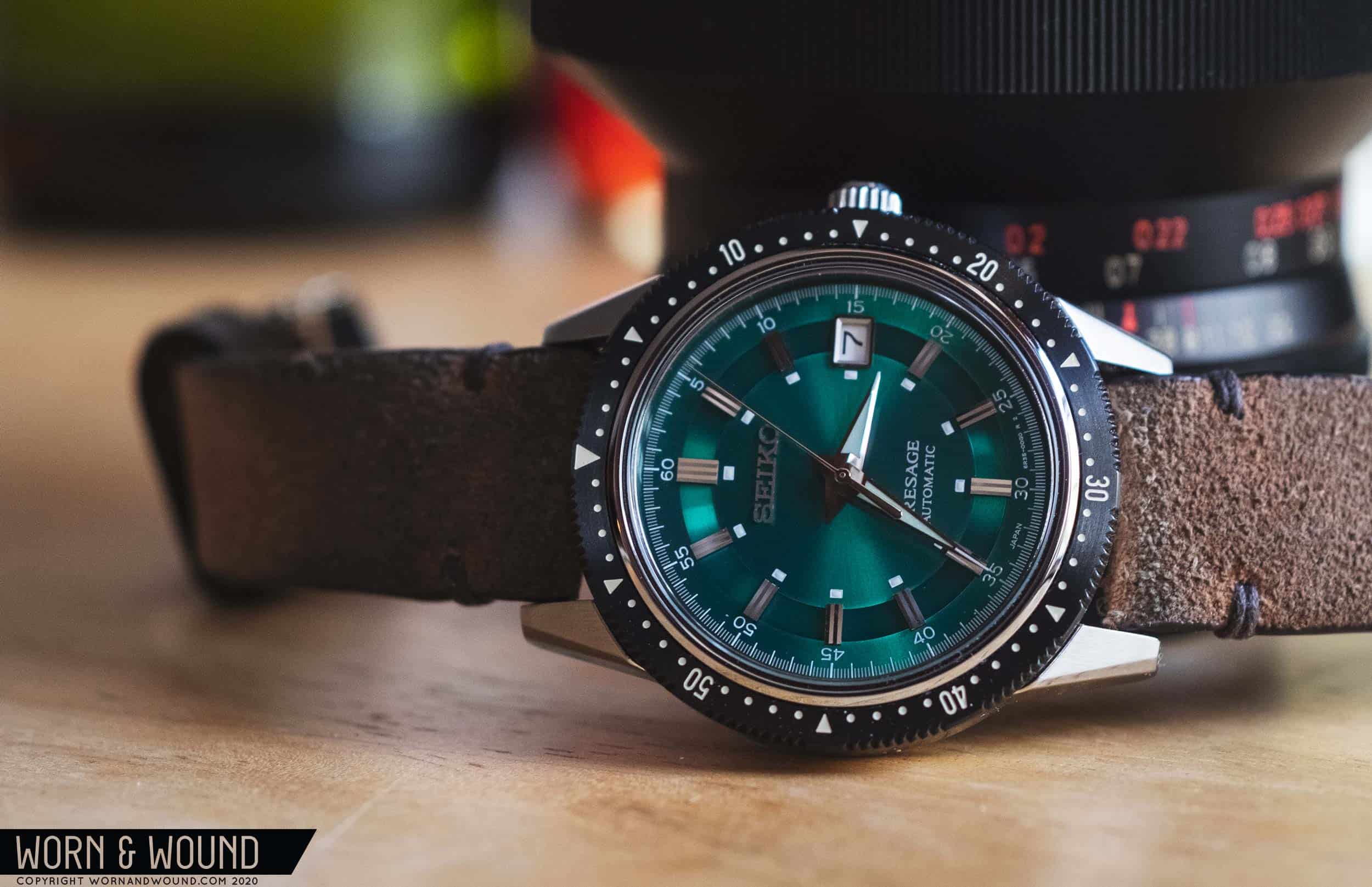
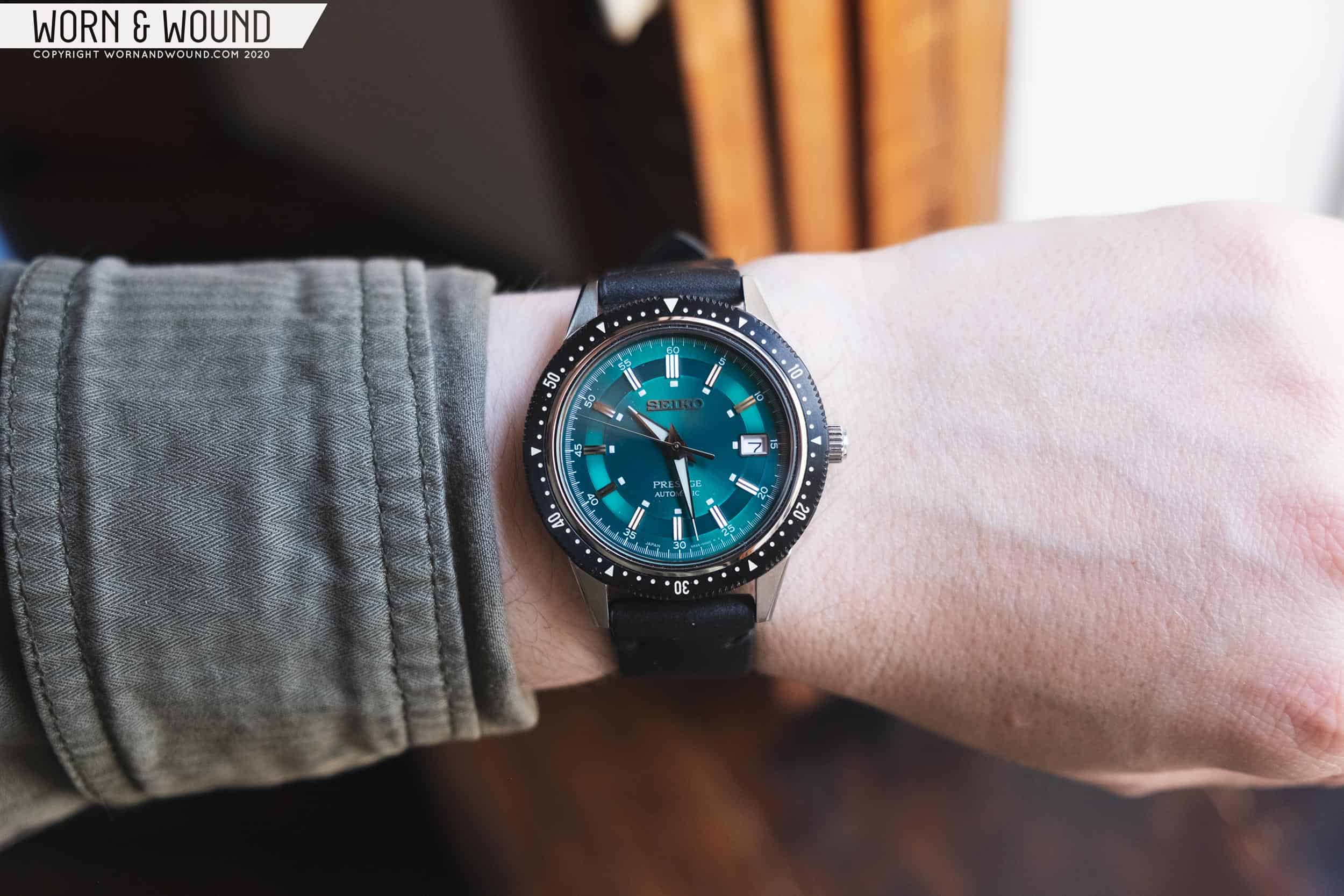
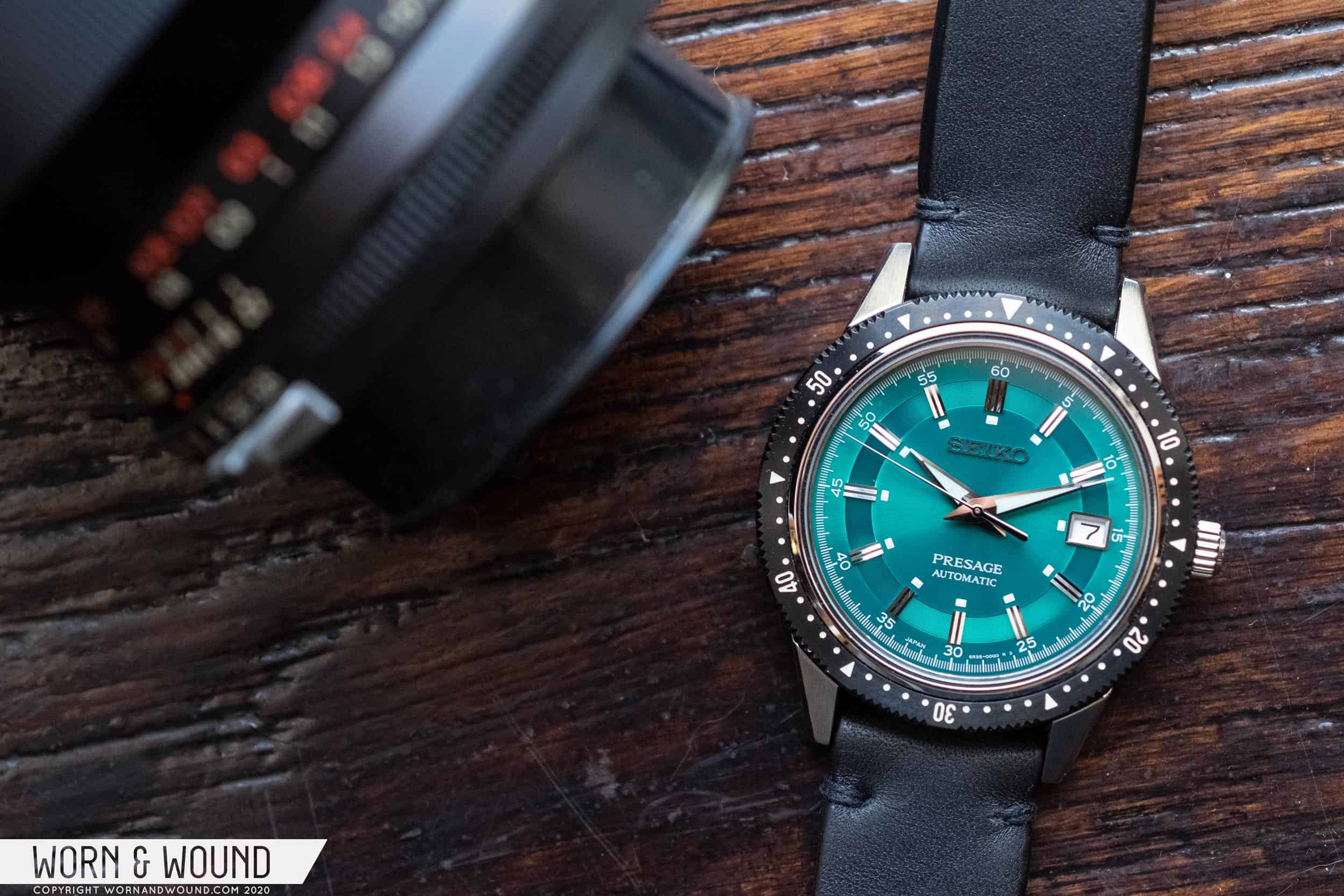
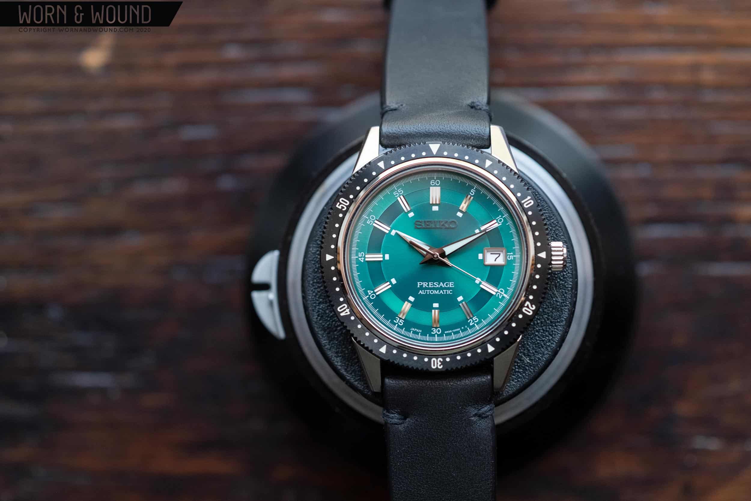
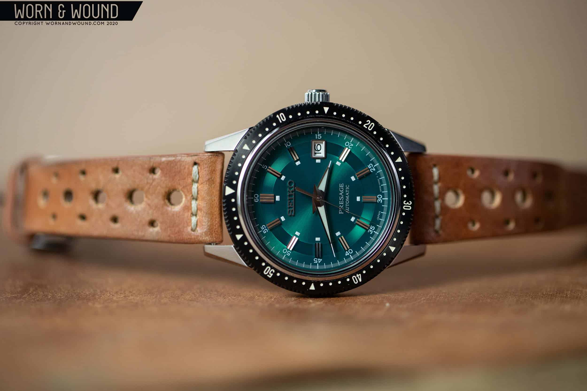
Every now and then, a watch pops up that just strikes a chord, and you know you HAVE to have it. Not want it – need it. For me, several factors have to come in to play for this to occur, so luckily it only happens every now and then. I can’t just like it, it has to be priced right, potentially rare or likely to sell out, and aesthetically different in some way. That latter point is the most amorphous as I really only know it when I see. Sure, I have my tastes, but there’s an undefined X-factor that pushes me over the edge. So, long story short, these factors came together recently which drove me to impulsively and, perhaps compulsively, pick up the new Seiko Presage SARX071 Crown Chronograph tribute watch.

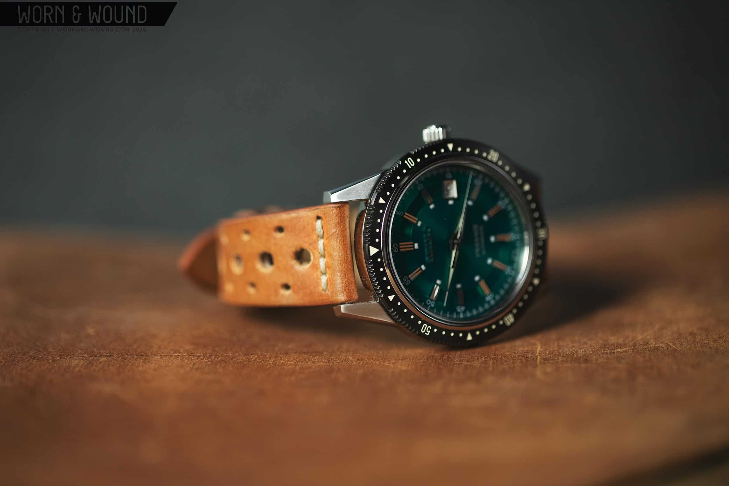
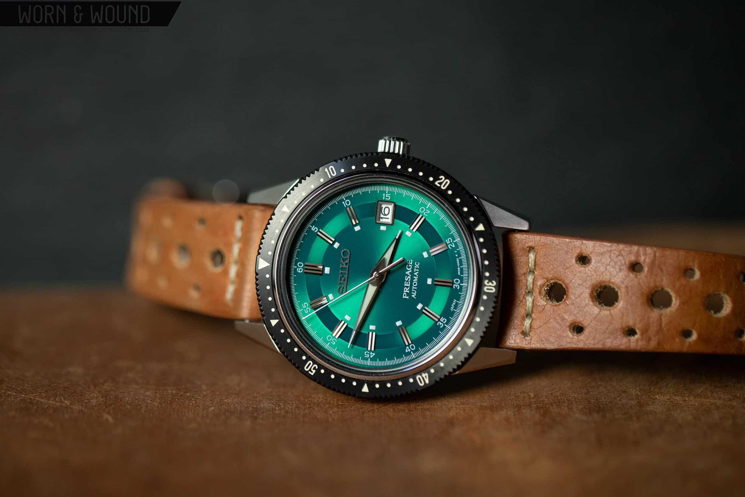
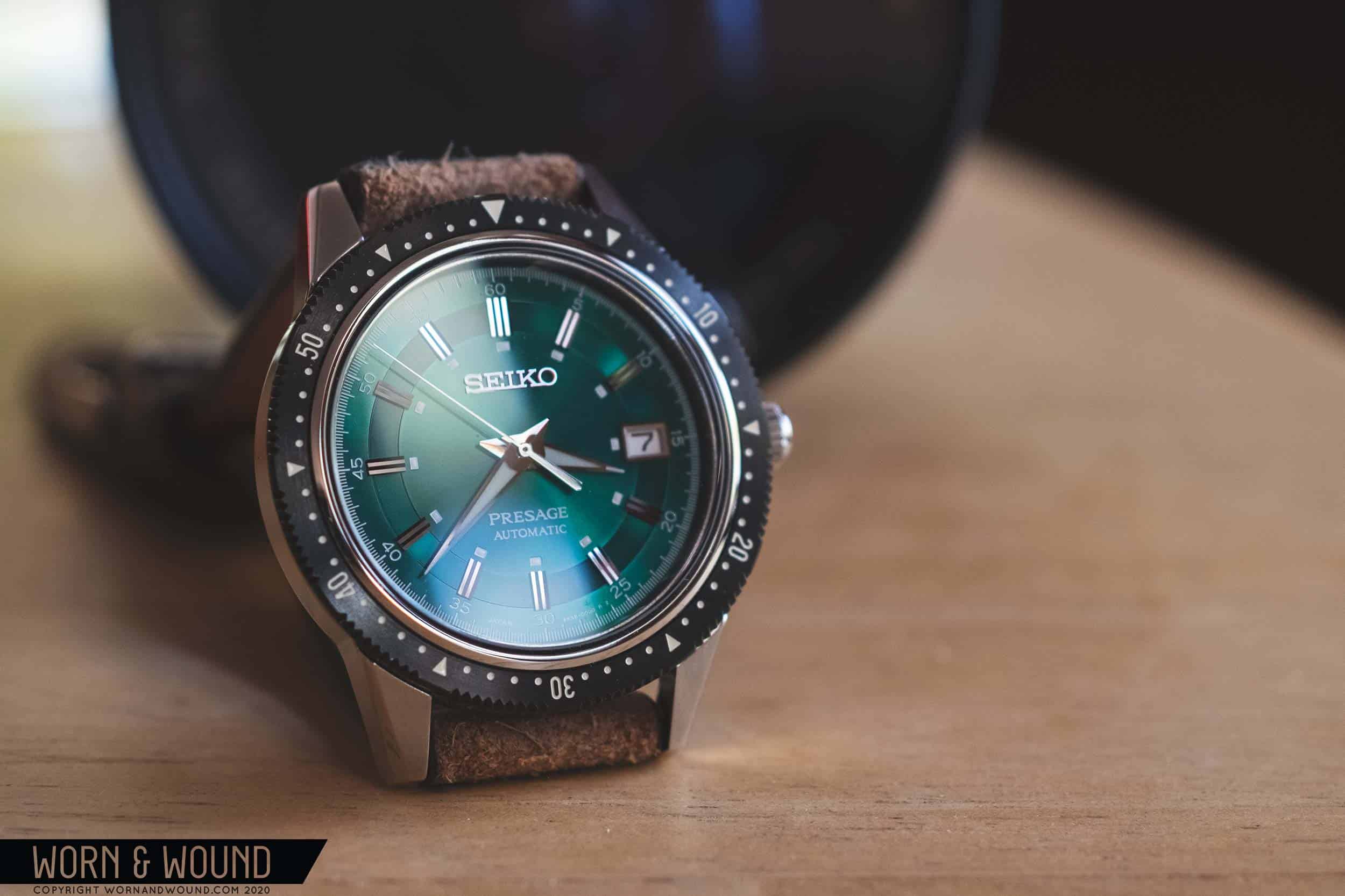
Not a type of watch that was specifically on my radar, in that it’s a 40.5mm non-dive, three-hander with a bezel and a metallic dial, when I first saw some Instagram posts and then read Zach Kazan’s intro, I was surprised by how much I liked it. It’s not really like any watch I own or have owned, and the mix of dressy and decorative dial elements with an aggressive bezel and sport case was just uniquely stylish. The fact that it drew on a very cool and somewhat obscure watch from Seiko’s past made it all the more intriguing. Like I said, some watches just click for reasons unknown. But, what really drove home that I needed the SARX071 (nickname TBD – the Green Crown?) was that they started to sell out in front of my eyes.

I guess I was lucky in that I saw an email from an Asia-based Seiko retailer that fateful morning saying the watches were in, because they didn’t last long. In fact, I was first considering the champagne-dial option, and in my, at least initial, indecisiveness, stalled a bit too long only to find it gone when I finally tried to add to my cart. Aghast, I began to scramble, which took me to the green dial version, but that too was gone. Only black remained, and while sleek and stealthy, it just seemed the most normal. Then the hunt began, which took me to a handful of sites I’d trust to buy from. Champagne seemed gone all over, but I found the green and didn’t hesitate. In retrospect, I might have overreacted as there was no telling if the watch was really sold out for good or just for the time being, but here I am now, with the bright green SARX071 on my wrist.

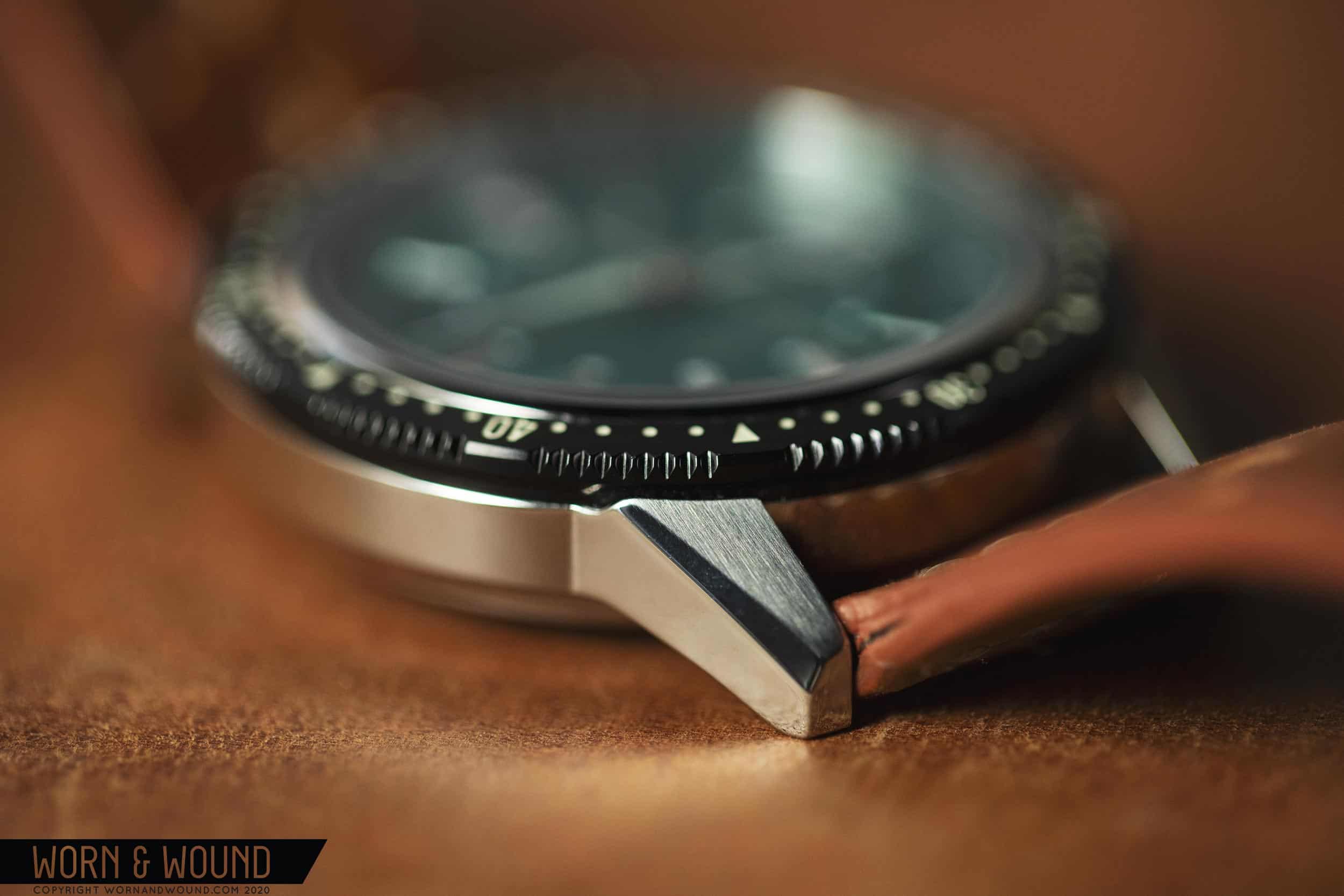
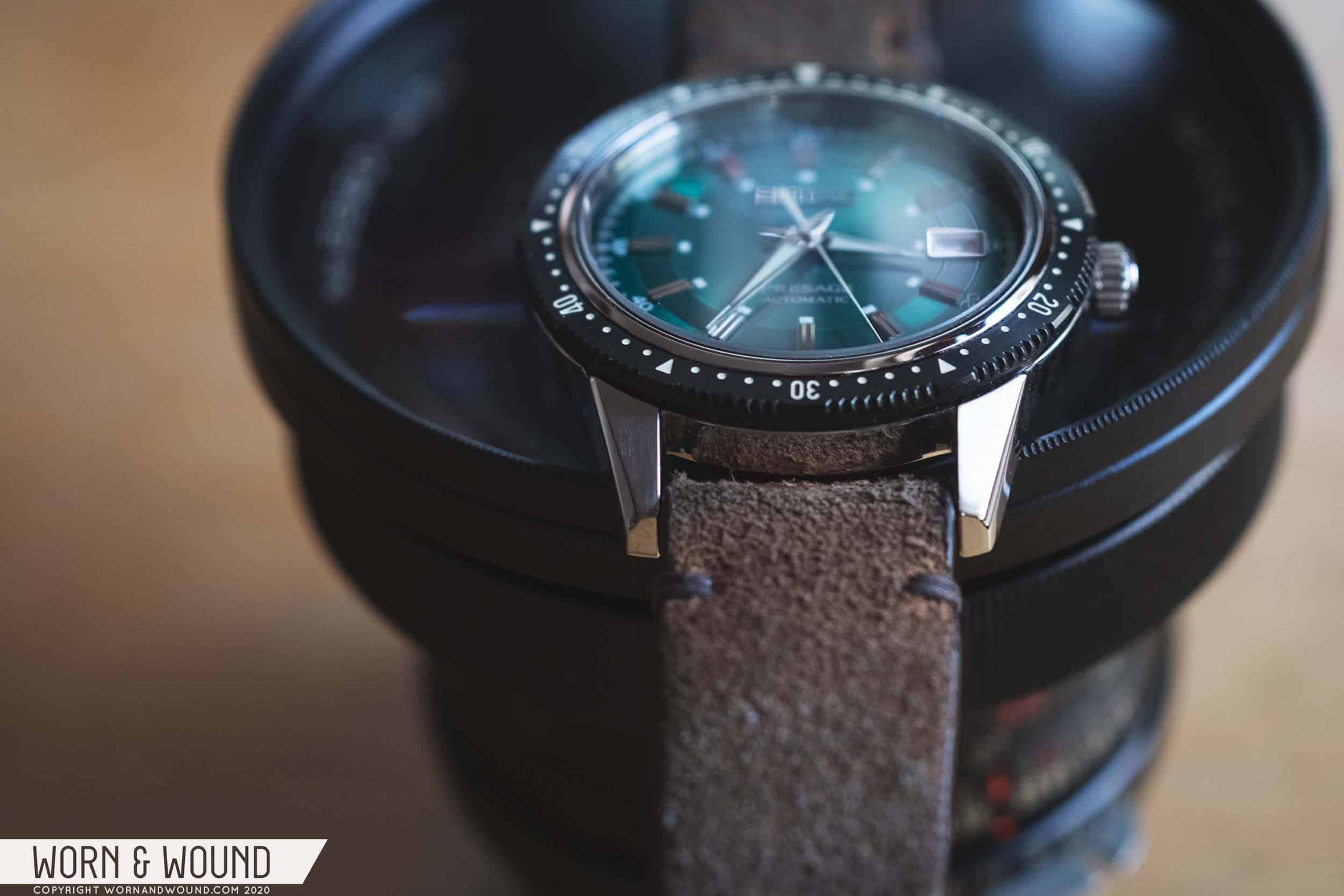
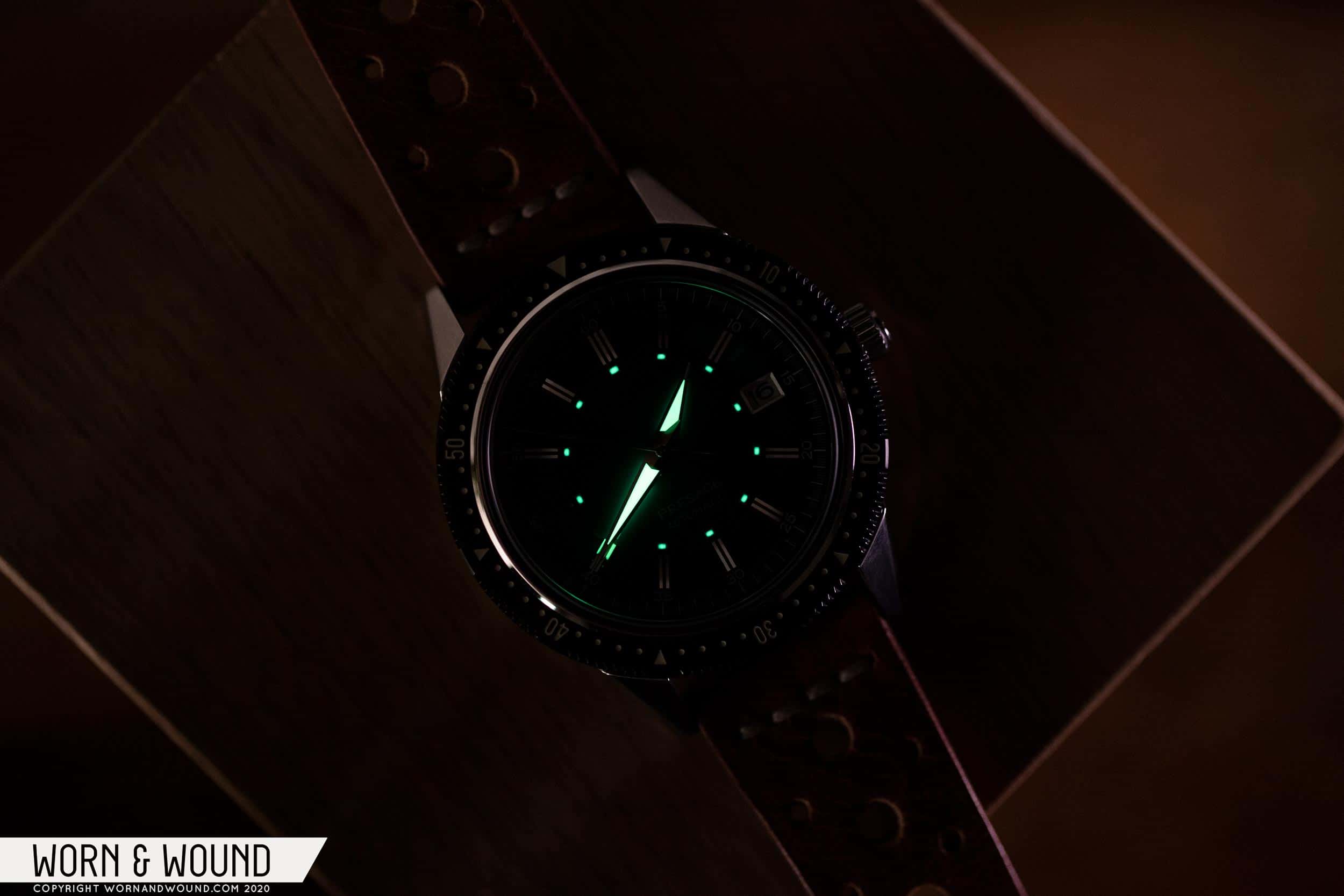
And with that long-winded and likely all-too-familiar story out of the way, with the watch in hand, I think it’s worth taking a closer look. The watch is, after all, pretty different than any other Seiko I’ve reviewed. First off, it’s not a diver, which most of the Seikos that have crossed my desk have been. Second, it’s got a friction bezel, which I literally have never seen on a Seiko before. And lastly, it’s got the new-ish 6R35 movement in it, which boasts a 70-hr power reserve. With a price tag in the neighborhood of $800, which certainly isn’t inexpensive, the SARX071 (071 from here out) is a unique and curious new offering from Seiko.

Advertisement
$825

Review: the Seiko Presage SARX071 / SPB129J1

Case
Stainless Steel
Movement
Seiko 6R35
Dial
Metallic Green
Lume
Yes
Lens
Sapphire
Strap
Steel Bracelet
Water Resistance
100m
Dimensions
40.5 x 48.5mm
Thickness
11.5mm
Lug Width
20mm
Crown
Push-pull
Warranty
yes
Price
$825

Case

Part of the initial draw of the 071 was that the case design was different from what I expect from modern Seiko Presage. The lines were sharper, harder and the use of the black-edge bezel was altogether different. Of course, these were all cues taken from the 1964 Crown Chronograph, but upscaled to a modern size. Now, I imagine this was a point of contention for some, as it often is, but with this design, it didn’t really trigger any concern for me. First off, the original is atypical for a vintage watch to begin with, not quite fitting any mold. It’s also so rare, you’re unlikely to have had much experience with it (I’ve seen one, ever). And the reality is that this isn’t trying to be a recreation like the SLA017 is to the 62MAS, it’s just a modern watch inspired by a vintage design. And not to jump ahead, but the case works really well as they made it.

So, with that out of the way, the case of the 071 measures 40.5mm (41.25mm to the edge of the bezel) x 48.5mm x 11.5mm. That makes it a happy medium with an appealingly flat profile, which while not the thinnest, wears thin. From above, the lugs appear sharp and geometric, featuring light brushing on top, with polished bevels alongside. The full black bezel steals the show for me, however.

There is something about a seamless black bezel that just looks so good. To be clear, this isn’t a black insert with a black edge, it’s a single piece of black metal with milled, paint-filled markers. It’s a bit more aggressive looking than a traditional bezel and brings to mind vintage pilot chronographs and tool-watch favorites like the Sinn 103. This is reinforced by the fact that it’s a friction bezel, which I personally love (and avoids any pesky misalignment issues). Seiko did a great job with it too, as it has just the right amount of resistance. As per the Crown Chrono, the 071 features a mix of dots, numerals, and triangles for the bezel’s index.

From the side, the case is pretty typical in design, though it features a cool detail where the lugs come up above the bottom of the bezel, cradling it. The lugs flow directly into the mid-case, which then features a concave undercut that visually splits the case, making it look substantially thinner. This is a nice design trick. Flipping the watch over, you’ll find a fairly plain solid case-back that features lightly etched details, including the watch’s number of 1964. This could have been more exciting.

Overall, it’s not the fanciest case by Seiko by a long shot, but what it does, it does well. It’s nicely proportioned and sized, and the bezel is a winner. The finishing is ok, but nothing special either. The brushing on the top of the lugs was a good choice visually, as polished lugs would have been too flashy, but the quality of the edges is a bit soft.

Dial

The dial of the 071 is definitely on the elaborate side. It features a green metallic, sunburst surface that’s bisected by a ring of tight circular graining, which somehow looks even more metallic than the surrounding area. The green color is very intense. It’s a true, verdant, bright, decadent green. This isn’t a dial for people who are unsure of their love of green.

On top of the graining are applied markers with a triangular-wave design. Each has two ridges and four reflective surfaces, save the marker at twelve which is doubled. This creates a lot of little mirrors on the dial, each reflecting a bit differently, creating a ton of tiny sparkles as the watch catches the light. So far, everything is quite ornate, and in another context could come off as opulent.

For contrast, on the outer edge of the dial is a printed index of white markers and numerals, adding some sportiness back in. The inner ring of the dial then features white lumed blocks per hour. A detail typically found along the outer edge of the dial, the internal track changes the balance I’m used to, giving the dial a unique personality. It also lines up well with the hands.

At three is a date window with a polished frame and a white date disk. Though the original Crown Chronograph was date free, I don’t hate it here. Its location suits the dial, replacing one of the applied markers, so it doesn’t feel like an add on. I’ve also come to accept that dates are pretty unavoidable on Seikos. That said, I feel like the disk could have been black to match the bezel, which would have given the watch a more aggressive appearance.

The hour and minute hands are polished metal dauphine shapes with lume fill. Extending from the tip of the lume to the tip of the metal portion of the hands are small white lines. This is a great detail that adds legibility, as the hands point more clearly at their respective markers. It also takes some of the dressiness out of the design. The seconds hand is then a thin polished stick.

The combination of all of these elements with the bright green surface almost doesn’t work, but Seiko pulls it off. It’s remarkably balanced considering the amount of detail and texture, and while undeniably ornate, doesn’t feel like a dress-watch-dial shoved in a sport watch case. It’s unique, and a bit odd for sure, but appealing. The green is really the most questionable element in the end as it is very intense, at times overwhelming the rest of the design. Ultimately, the champagne or black probably would have been the better choice as the green is a bit too hard to look past.

Advertisement

Movement

The Seiko 6R35 at the heart of the 071 is essentially, from what we can tell, an upgraded version of the 6R15 with 70 hours of power reserve. Same beat rate of 21,600 bph, it still hand-winds, etc… That said, the 70 hour reserve is a nice upgrade, and something I’ve really enjoyed on the watch. Though I’ve reviewed watches with 80 hour reserves by Swatch before, and even 120 hours by Christopher Ward, this is the first time I’ve had one in my personal collection, which has forced me to notice the difference in more practical ways. Simply put, it’s great to come back to the watch in a couple of days and find it still running. Sometimes, just looking at my collection in the morning and seeing that it’s the only watch I don’t need to set (other than the watch I was wearing the day before) makes it an easy choice.

Wearability

The 071 comes mounted to a steel bracelet with a three-link design and a slight taper. It’s perfectly decent as far as Seiko bracelets go, but I honestly had no interest in it, so I removed it immediately upon receiving the watch. Due to my WFH status, the bracelet is currently MIA, hence why it’s not featured in any of the photos. That said, to me, this is a watch for leather. The faceted geometry of the lugs and the aggressiveness of the black bezel are accentuated by a leather strap. But more importantly, the green of the dial can either be played up or down depending on the color of leather you choose. On the Sienna rally strap shown, the green is complemented, creating a harmony that makes it work better with my typical outfits. On black, the green pops even more, making it a real accent piece. The suede then makes the metallic aspect of it more prominent.

New releases over 40mm get the side-eye, especially when it’s based on something vintage that was small to begin with. But the reality is what matters are the proportions and how the watch wears. In this instance at 41.25mm with the bezel, the 071 fits very nicely. It’s neither large, nor small, and the size suits the watch’s attitude. Though based on an old design, it doesn’t really check a lot of “vintage” cues. If anything, the harsh lines of the lugs and aggressive bezel feel almost modern.

What you get is a watch that I found looks great on my 7” wrist, and has a lot of presence. It’s bold, it’s sporty, it’s a bit crazy looking too with that striking green sparkling in the light. It’s definitely not discreet. The size works for me, especially the thickness of 11.5mm, which while not really “thin” does make the watch wear pretty flat and close to the wrist. Aesthetically, the 071 is unlike other watches I’ve tried. The only thing I can liken it to is the Sinn 104, but the personalities are totally different. One is traditional, while the other is wild. If the two watches were leather jackets, the Sinn is a classic bomber while the Seiko is a motorcycle jacket with spikes and patches.

Conclusion

Though the Seiko Presage SARX071 was a total impulse purchase, it’s one I’m glad I made. It’s not just unlike any other Seiko I’ve owned, it’s unlike really any watch I’ve owned. It doesn’t neatly fit into any typical category, though given its lineage would most likely be an automotive watch. It’s based on a vintage reference but looks and feels fairly modern. It’s sporty, and aggressive, but has lots of ornate and dressy details as well. It really shouldn’t work, but somehow it does, and it’s this oddness that also justifies its existence. With so many watches competing for the same position in one’s collection, something that doesn’t really fit is strangely welcome. Seiko

Advertisement
Images from this post:
Related Reviews
Zach is the Co-Founder and Executive Editor of Worn & Wound. Before diving headfirst into the world of watches, he spent his days as a product and graphic designer. Zach views watches as the perfect synergy of 2D and 3D design: the place where form, function, fashion and mechanical wonderment come together.
wornandwound zsw
Categories:
Tags: