Review: Visitor Watch Co. Duneshore Shallows

Visitor Watch Co. is a brand that is unafraid to just be itself, totally unapologetically. Borrowing elements from calligraphy and pen design, as well as, with the new Duneshore Shallows, elements of fantasy, science-fiction, and heavy metal, the brand truly lives up to their “Offbeat Timekeepers” branding. It’s rare to come across a watch that is so clearly designed by someone with a lot of other interests. As a watch enthusiast who himself has many other interests well outside the realm of watches, it’s gratifying to see someone incorporating all of the other “stuff” that they’re into in a watch. A Visitor watch is, almost by definition, not going to be for everyone, but if the charm works on you, it’ll really work on you. 

I should point out, I really have no idea exactly what the specific design inspirations are behind the Duneshore Shallows, besides the calligraphy angle, which is well documented and something we’ll get to. But I kind of like that this watch invites the wearer to bring their own interpretation to it. Even though writing about watches and giving them a lot of thought is what we do here at Worn & Wound, it strikes me that we don’t often think of watches in this interpretive way – you’d never ask someone about the artistic statement of a Tudor Pelagos, for example. But there’s a quirkiness and a veiled mystery to the Duneshore Shallows that invites this kind of thinking. It’s a physical object that seems open to interpretation in the same way as a Charlie Kaufman film, or a King Crimson record, or Moby Dick

And look, I’m not saying this watch carries with it the importance of one of the greatest and most complex of American novels, but if you’ve read Moby Dick, and spend a good chunk of time wearing this watch, I defy you not to imagine yourself as some kind of modern day Captain Ahab on a maniacal, mythic quest. It doesn’t hurt that the autumn of 2020, when I had a chance to spend some time with the Duneshore Shallows, is one of the strangest periods of American life any of us have been through, and has me in an especially contemplative mood. The fact that the name of this watch could double as a Game of Thrones episode title is also probably playing a role. 

So, with that, let’s get into the Duneshore Shallows in a little more depth, beginning with its most obvious differentiating feature, an incredibly strange and geometrically complex case. 

Advertisement
$775

Review: Visitor Watch Co. Duneshore Shallows

Case
Stainless Steel
Movement
Miyota 9039
Dial
“Sharkside” Gray
Lume
Yes, hands and hour/minute markers
Lens
Sapphire
Strap
Stainless steel bracelet, rubber
Water Resistance
200 meters
Dimensions
44 x 51mm
Thickness
15.6mm
Lug Width
22mm
Crown
Screw down
Warranty
Yes
Price
$775

Case 

As we always do in these reviews, I’m going to give you some measurements that describe the dimensions of the case of the Duneshore Shallows. But that’s not really going to give you a good impression of this case’s construction, or even how it wears. That is going to be more difficult, and I’d oblige readers to study the photographs contained here carefully, and to seek one of these out to try on and see in person if you can, because it’s hard to contextualize it with other watches. But, here at Worn & Wound, we press on, and attempt to do the difficult things, so I’ll do my level best to give you the most accurate impression of this case as possible. 

The case geometry of the Duneshore Shallows is extremely complex

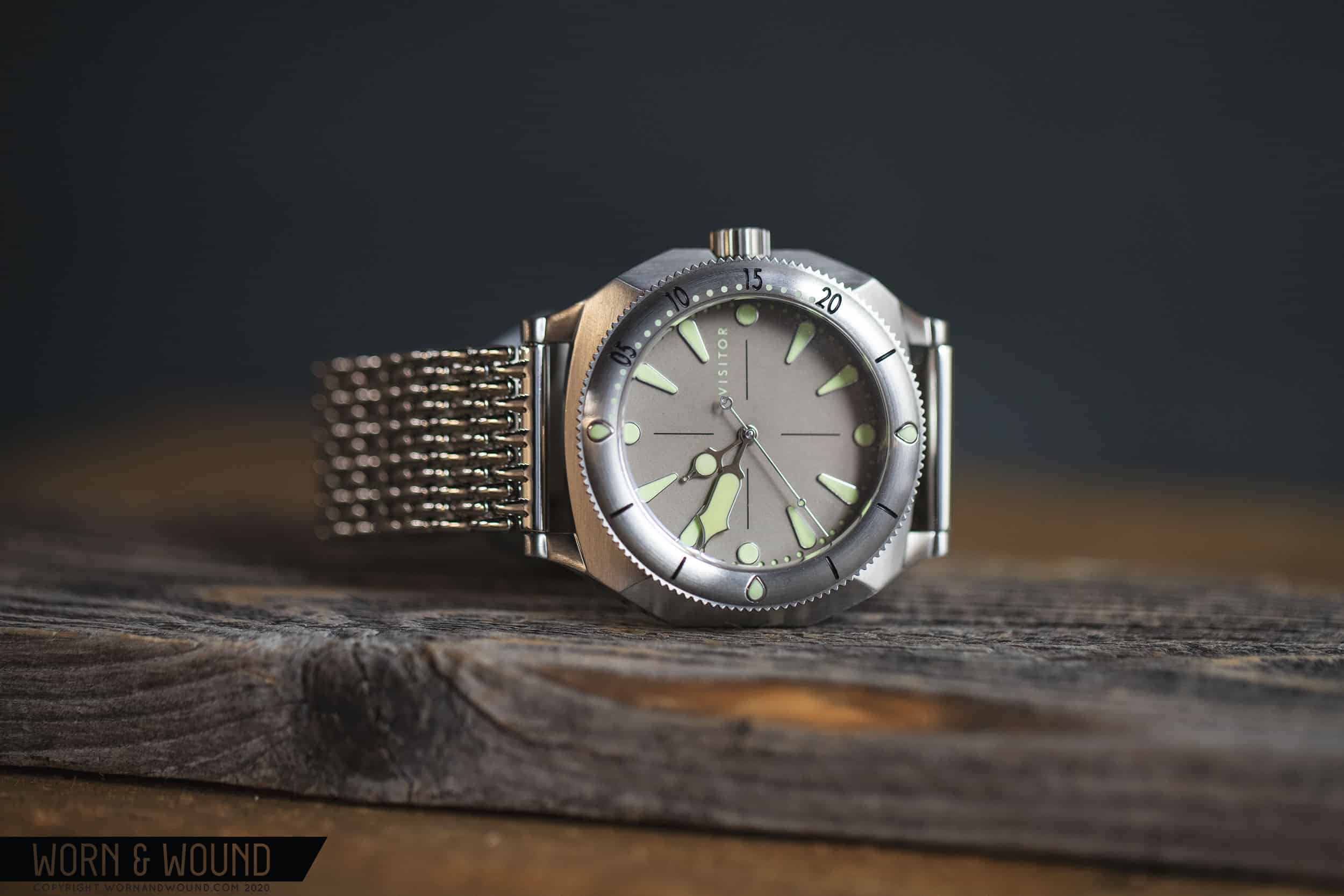
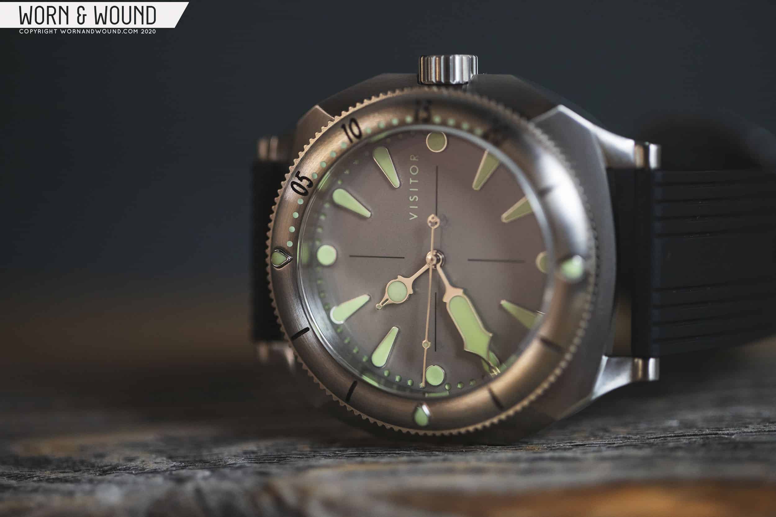
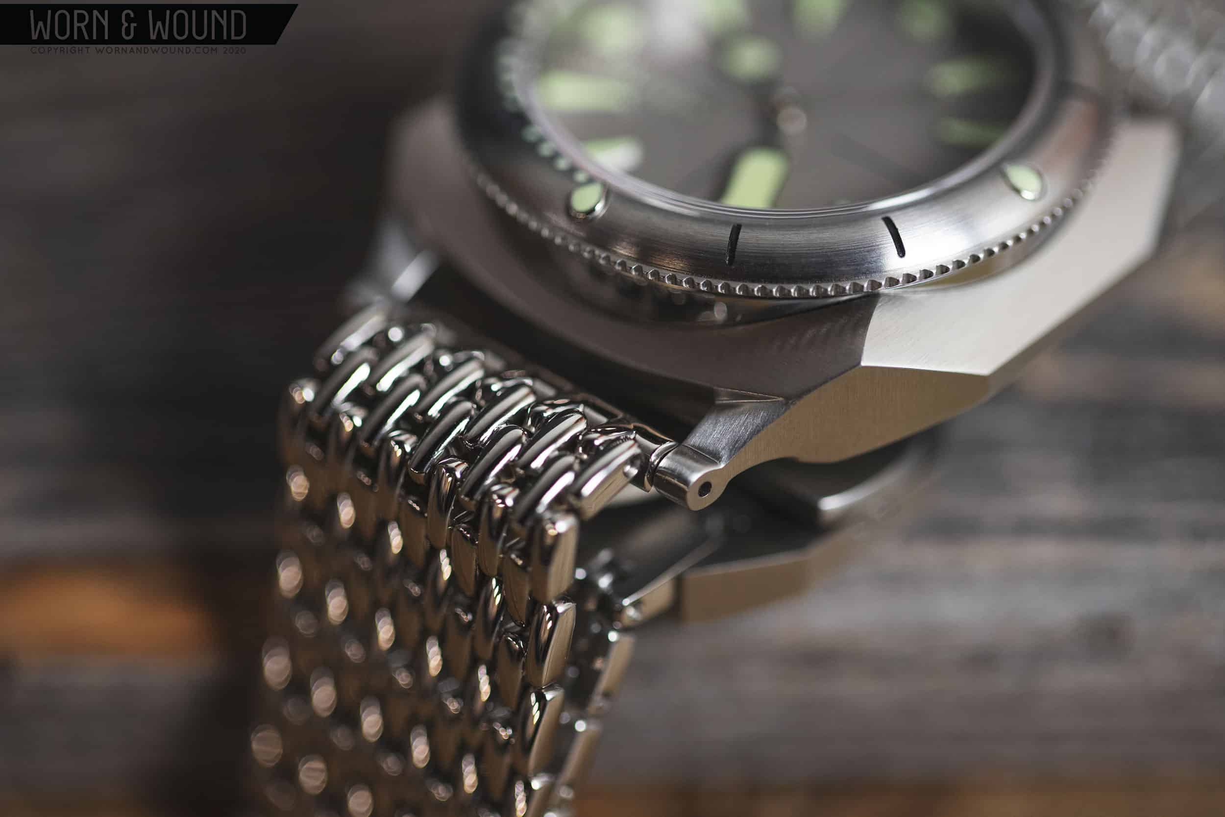
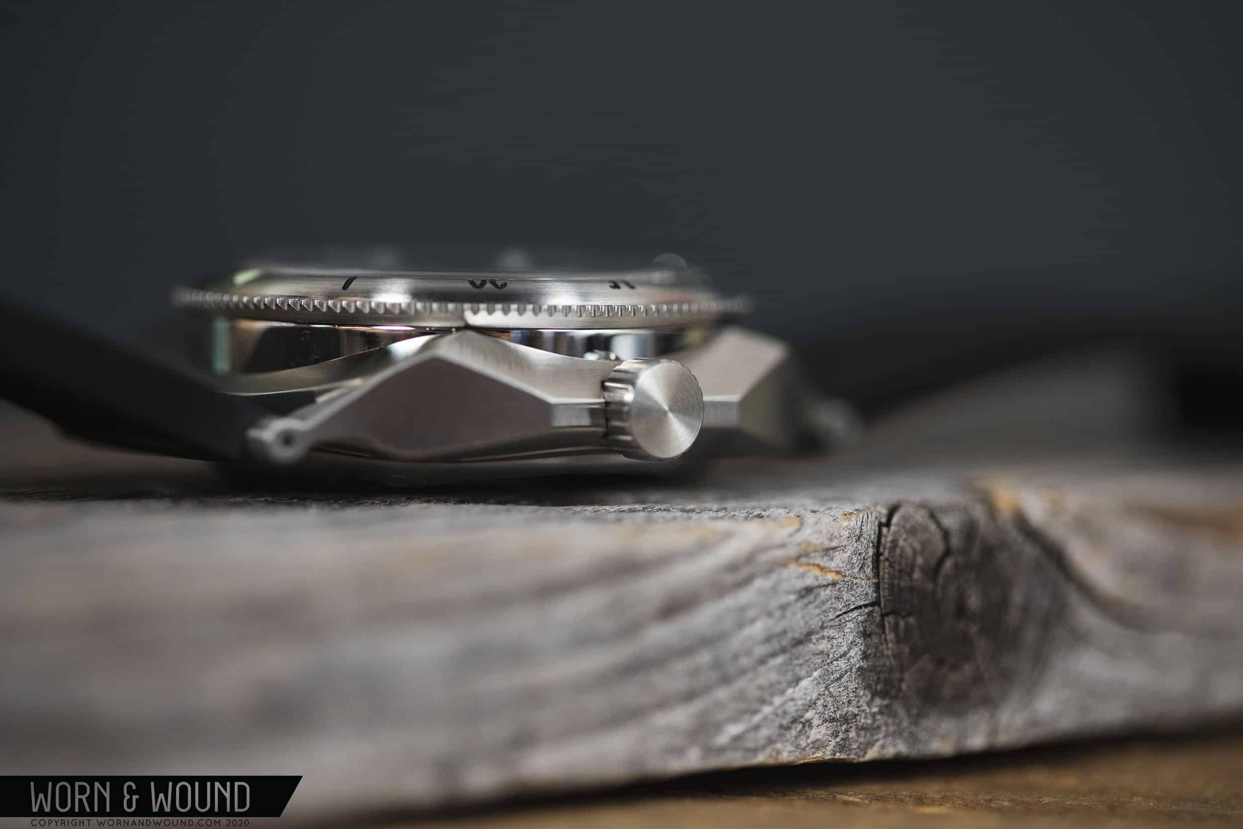
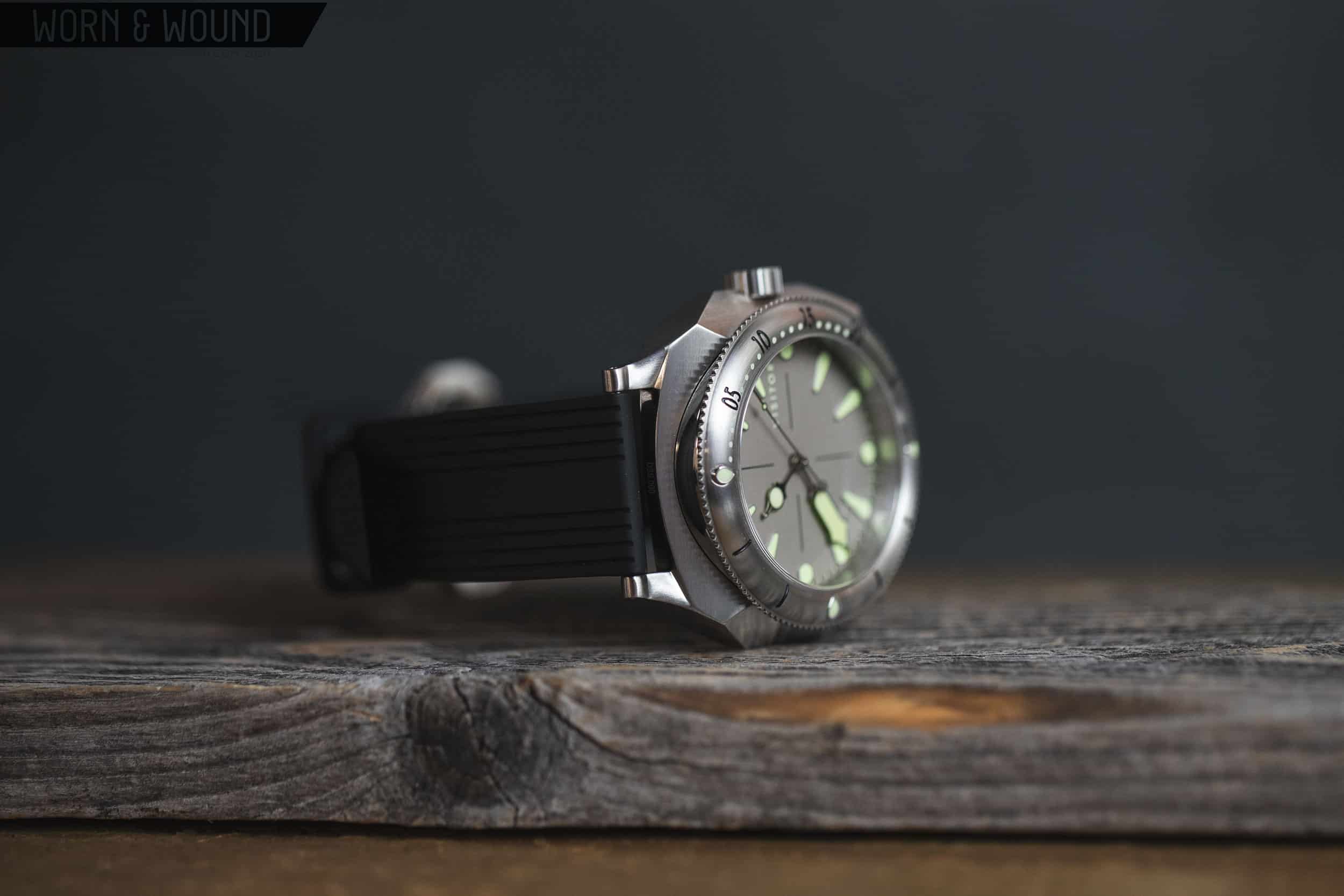
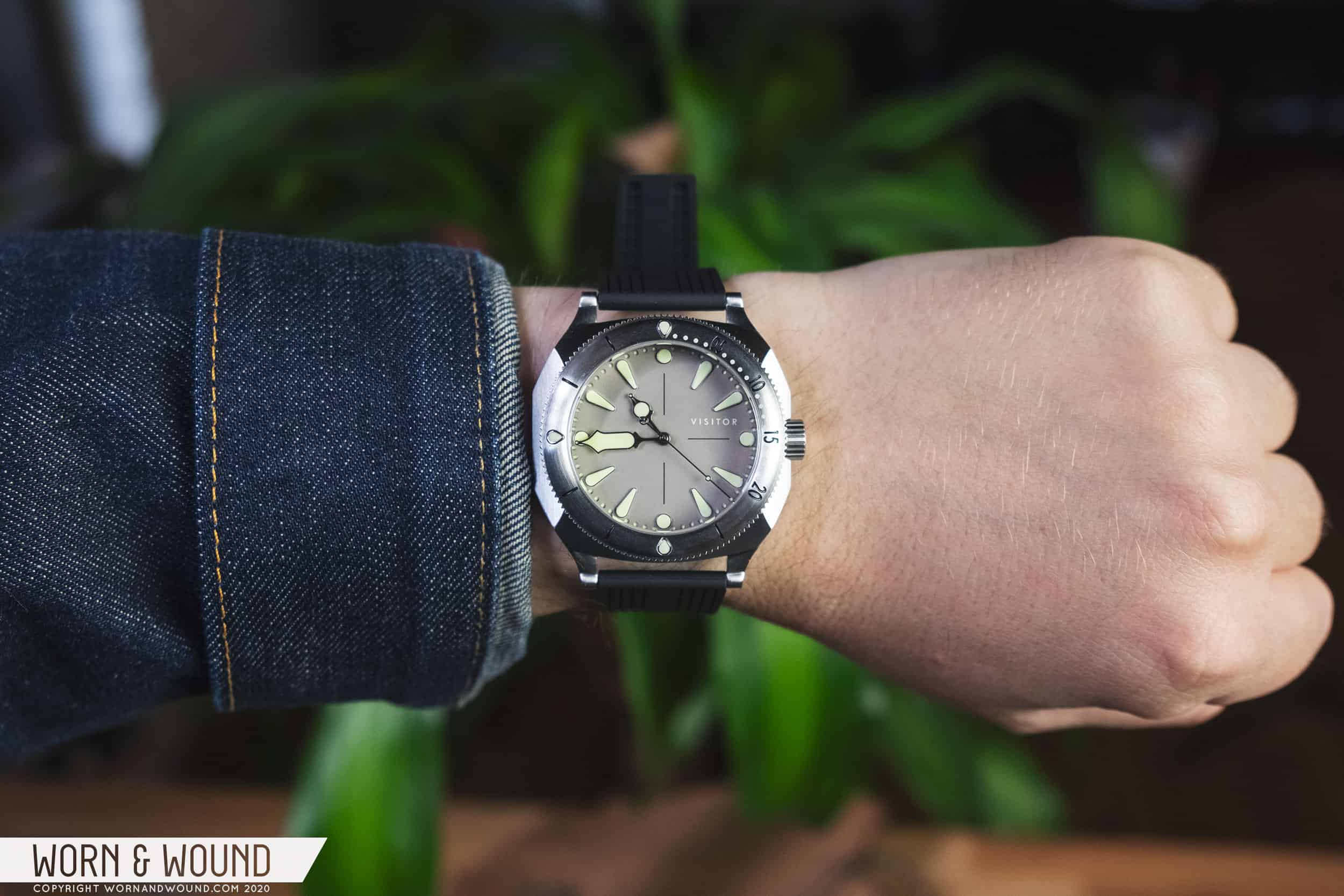
In terms of size, it’s big in a very obvious way. The Duneshore Shallows measures 42mm across, from the 9:00 side to the 3:00 side, excluding the crown, and 44mm from 12:00 to 6:00. As those dimensions would suggest, the case can’t really be described as circular – it definitely has a squared off appearance, but because of the complex construction and mixing of harsh angles with softer lines, it retains an almost organic, natural feeling. Of particular note is the curved groove cut on each side of the dial, which transitions into the dramatic, diamond shaped facets of the case band. The area between these facets and the rotating dive bezel is given a high polish, which provides the most dramatic finishing effect on a watch you can easily characterize as primarily brushed.

At 15.6mm thick, you wouldn’t describe the Duneshore Shallows as slender in any way, but there are some neat design tricks to make it feel thinner than the numbers would suggest. My favorite trick, and indeed my single favorite design element of this watch, is the thin band of stainless steel that runs along the sides of the case, connecting those diamond-like sections at each quadrant. This piece of the mid-case seems to extend outward from a large sloping bevel, giving you the illusion that the watch is thinning out at what should be its chunkiest point. It’s the opposite of the dreaded “slab sided” effect that makes so many watches appear to be thick clunkers when viewed from the side. Here we have a watch that is, in terms of its measurements and heft, an actual thick clunker, but it feels and looks like something far more aerodynamic and aesthetically interesting. 

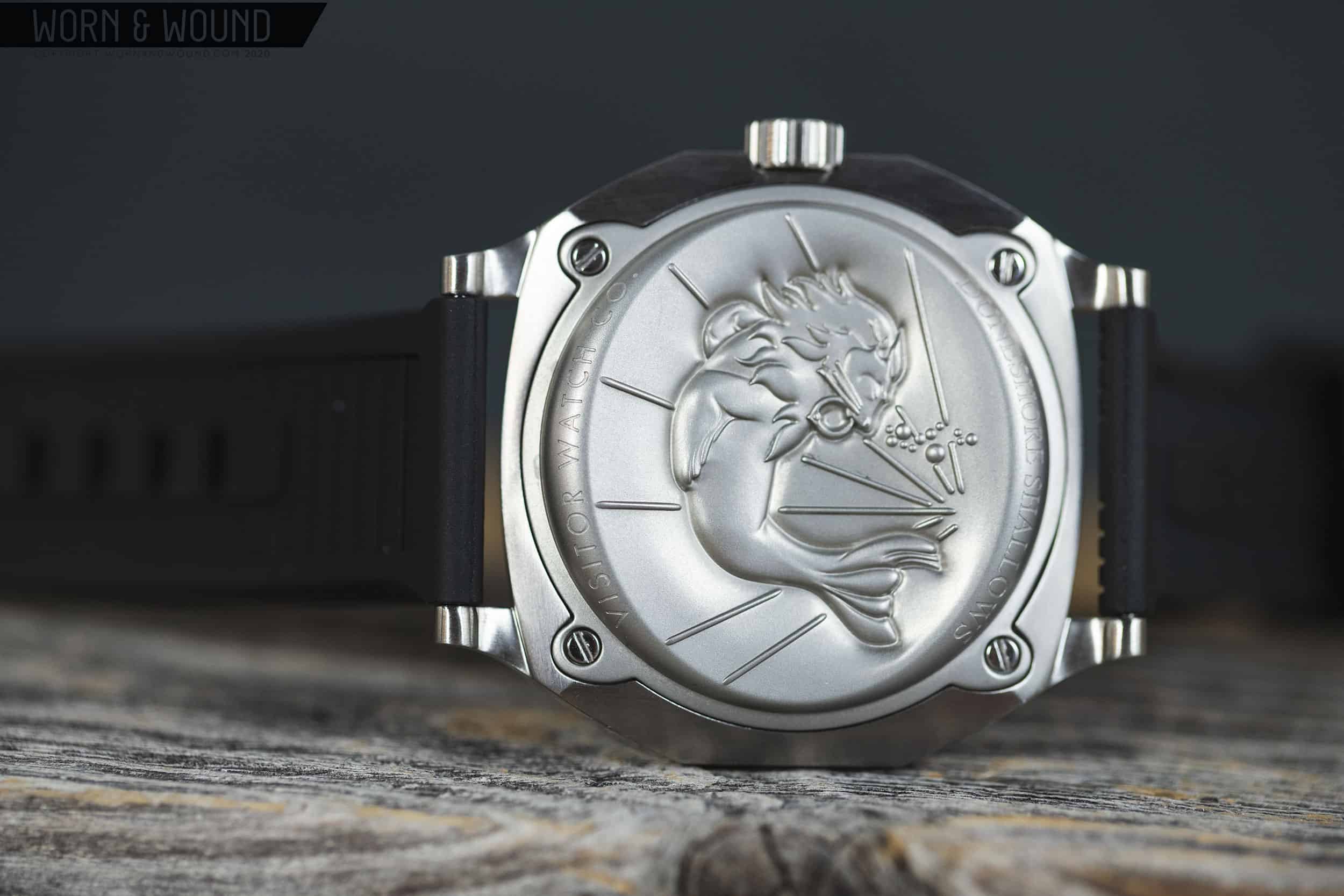
Also worth mentioning, as long as we’re talking about things that make the watch appear thinner, is the case back. I won’t be coy about it: this watch has an engraving of a mythical sea creature on its backside. It’s a sea lion (the head and mane of a lion, the body of a sea mammal), and it’s fantastically imaginative, fun, and all the things that are missing from far more serious watches at many times the price, Omega’s hippocampus excluded. 

But no, the watch doesn’t appear thinner simply because there’s a sea monster of some kind engraved on the case back. The case back itself is actually curved toward the dial side, which has a small but immediately perceptible impact on the wearing experience, and allows the watch to sit low on the wrist without being unduly propped up by a thick piece of steel. The total thickness of the watch at the thinnest point, near its center, is about 13mm, so it gains roughly 2.5mm as you move to the outside of the case.

We should note here that in spite of this unusual case back, the Duneshore Shallows maintains a water resistance rating of 200 meters. This is 100 meters more water resistant than Visitor’s previous Duneshore watch, but comes up short of what many consider to be a new standard of 300 meters.

Let me be the first to say, if it even needs to be said: it absolutely does not matter that this watch is “only” 200 meters water resistant. If that extra 100 meters was the trade off for this wild caseback, Visitor made the right choice, and I’d tell them to do it again, and again, whenever they come up against a decision to over engineer something for a purpose that virtually none of their clients will ever encounter, or do something genuinely creative. We have enough watches out there that are either legitimate professional instruments or market themselves as such to appeal to normal people like me, and probably you. I’m relieved and refreshed to encounter a dive watch that isn’t trying to be a tool, and embraces a tone that’s more casual, even whimsical. The sea creature on the case back is pure gravy. 

Dial

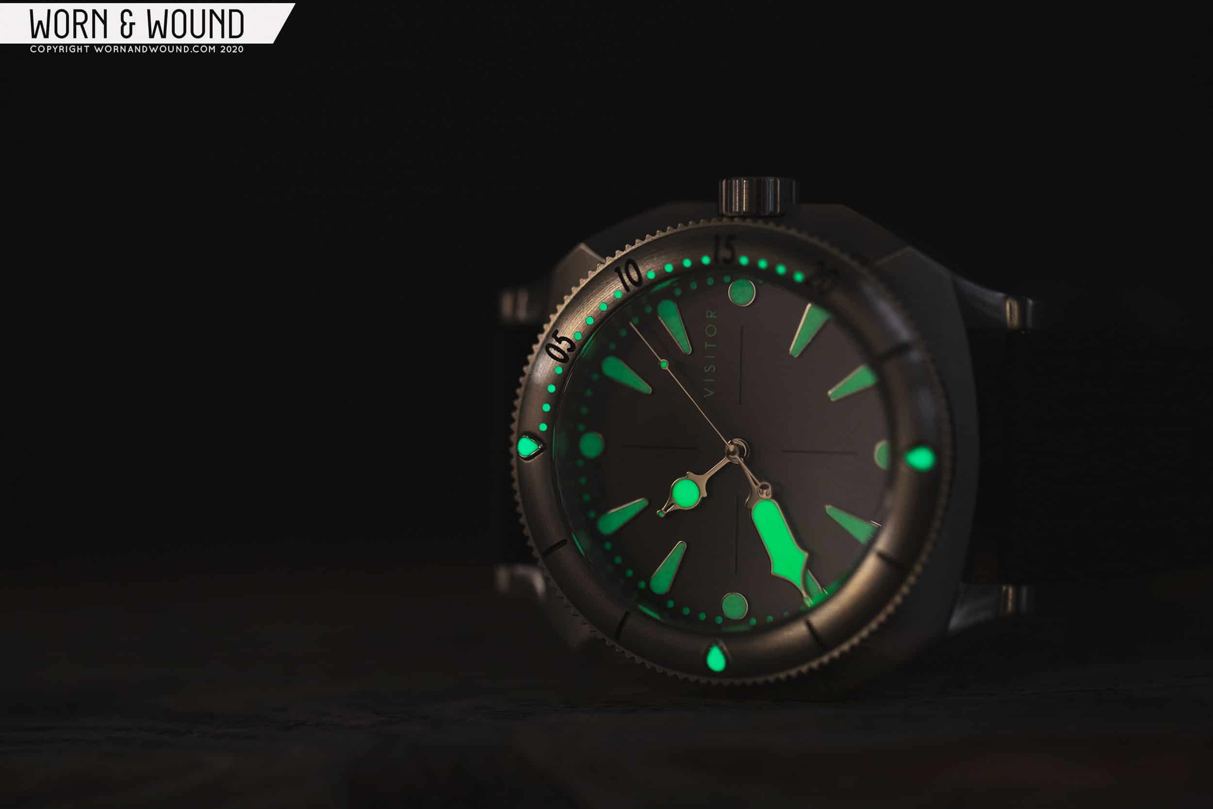
The Duneshore Shallows is available in four dial variants: “Seal Teal,” “Tangerine Fission,” “Iron Jade,” and “Sharkside.” My review unit is the “Sharkside” variant, which is a flat gray color that is relentlessly neutral and hard to find major fault with. In photographs, all of the dial colors appear to be well executed and have different charms about them. Gray is a tough dial color to pull off, but here I think Visitor has mostly gotten the tone right. My only potential quibble is that the green lume material, which reminds me vaguely of pea soup, doesn’t provide the most pleasing contrast. I’d have preferred a stark white here, but it’s not an offensive design decision in my opinion, just not entirely to my taste. 

Here’s where we start to see some of Visitor’s well known design inspiration come to fruition, as the hands have been custom designed to mimic the nib of a fountain pen. Now, I’m not a fountain pen expert by any means, but what this means in a practical way is that each hand has an extremely small circular “ball” appendage at its tip, which has been lumed separately. Aesthetically, I really like this – it’s a detail for the sake of having a detail, and there’s nothing wrong with that. It gives the hands an old-fashioned ornate feel that’s appealing as well, especially as a contrast to the somewhat more brutish flavor of the case. This is an area where Visitor’s influences mix in a fun and exciting way to create a look that’s somehow still cohesive. There’s an acute steampunk sensibility here, mixing the traditional, with the modern, with the fanciful.  

A feature of the dial that’s a bit undersold is the fact that it’s actually a sandwich construction, with lume material sitting under the surface and impossibly small holes at each minute letting it shine through. This is done in such a subtle way that you’d be forgiven for not noticing on a first or second pass, but along with the thick applied hour markers, it adds just enough depth to an otherwise flat dial. A crosshair pattern in a thin black outline divides the dial into quadrants, and the “Visitor” signature, the only text present on the dial, sits between the 2:00 and 3:00 hour markers.

Straps and Wearability

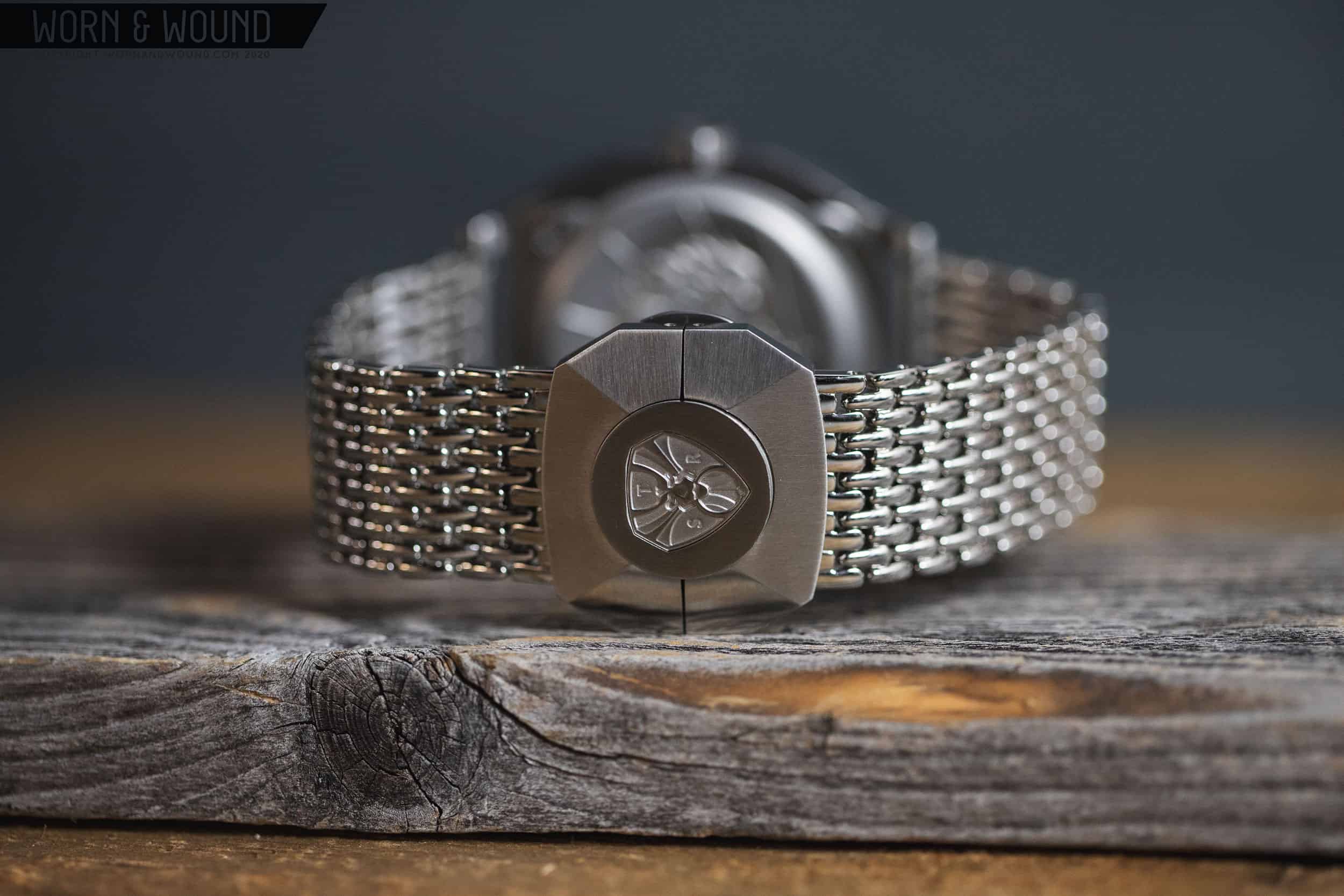
The Duneshore Shallows is available in a few different configurations. The best option, in my opinion, is the bracelet, which is kind of a cross between mesh and a beads-of-rice style. It uses straight end links for easy strap switching, and is very comfortable on the wrist, but the reason this bracelet wins the day is actually the completely insane, custom designed clasp. 

The impressive Duneshore Shallows clasp

This is a dual trigger, butterfly clasp with a large representation of the Visitor logo. The clasp has a medallion like shape that mimics the outline of the watch itself, and it’s enormous and exceedingly well machined. I measured it about 34mm in diameter. Readers, I have vintage watches in my collection that are not significantly larger than this clasp. It’s really a piece of jewelry unto itself, and it lends the whole package something of an ornamental quality. Again, this is about as far removed from a tool watch as you’re likely to get in a value oriented diver, and a sign that Visitor left nothing on the table in terms of meeting their artistic vision for this piece. 

My review unit arrived with two additional rubber straps that I found to be quite comfortable. They are very long – I think they might be sized for the sea creature on the case back. But they’re soft and supple, and the black strap in particular is pretty versatile and a nice match for the gray dial. I’m less of a fan of white rubber straps these days, but I could see it being a fun look on the beach or during other summertime activities. Neither compares to the bracelet, however, in terms of really setting the watch apart. 

In general, I tend to shy away from large watches like this. For a bunch of reasons, I prefer smaller, lighter watches on a day to day basis, but comfort wins out in the end more often than not. As far as wearability goes, this watch is far more comfortable than you’d likely suspect given its measurements and severe geometry. A big reason for this, besides the curved caseback that we’ve already addressed, is the lug design. Here once again is the fountain pen influence, as the lugs have a nib-like appearance that matches the tips of the hands. But there’s a functional benefit here as well as an aesthetic one. These lugs just don’t take up much space, and their size doesn’t add any heft to the watch. In a way, it’s a very minimal way to implement lugs – they exist solely to keep a strap or bracelet affixed to the watch while taking up as little real estate as possible. 

Advertisement

The Visitor Calligraph that Ed Jelley wrote about recently has lugs of a similar design, and it’s worth observing how they leave a completely different impression on the bigger, sportier, Duneshore Shallows. The Calligraph, at 39mm, is obviously quite a bit smaller, but it’s also more conventional as a watch, so the lugs feel decorative, at least to my eye. The proportion of lug to case is so different on the Duneshore that it has almost the opposite effect. On the Duneshore Shallows, the lugs force you to focus on the case, easily framing it and drawing your eye to its distinctive bevels. I’d argue that on the Calligraph, it’s the lugs themselves that are the focal point of the design. 

Movement

The Duneshore Shallows is powered by the Miyota 9039, a dateless automatic caliber that is part of Miyota’s upper tier of 9000 series movements. It’s a perfectly acceptable movement choice, and while it’s not likely to win any accuracy contests, it shouldn’t give users much of a problem either in terms of reliability. For a brand like Visitor, it’s smart to make investments in design, as opposed to the movement. While I don’t think anyone would argue that a Sellita or ETA movement might be technically superior to the Miyota found here, choosing to go Swiss might result in compromises needing to be made to the final product. For example, I’d much rather have a Duneshore Shallows with that bonkers clasp and a Miyota movement, than the same watch on more generic, off the shelf clasp, powered by a Sellita of some kind. The movement used in watches made by an independent brand represents a significant decision point on the part of that brand, and I think Visitor has made the right call here, as it allows the Duneshore Shallows to come in at under $1,000 with some very distinctive design features that will please fans of the brand, and hopefully make some new ones as well. 

Conclusion

I’m a pretty big fan of this watch. It’s visually interesting, well thought out, and fun to wear. More than just the watch, though, I’m a fan of what Visitor does as a brand. The fountain pen stuff is certainly a nice connection for folks who immediately get the references, but beyond that there’s just a ton of imaginative design work being done here that’s hard to find at any price point in the current watch landscape. The Duneshore Shallows feels like something from another dimension, or part of a costume. It has a wild creative streak within it at a time when so many watches are retreads of the past. 

You’ve heard me say that before – I say it a lot. So it’s probably not a surprise that this watch spoke to me. But I was surprised by the creativity behind it, and the brand’s bold and adventurous approach. At $775, the value proposition here is completely dependent on your tolerances for the strange. If you don’t merely tolerate it, but in fact embrace it, I think you’re likely to enjoy the Duneshore Shallows quite a bit. Visitor Watch Co.

Images from this post:
Related Reviews
Zach is a native of New Hampshire, and he has been interested in watches since the age of 13, when he walked into Macy’s and bought a gaudy, quartz, two-tone Citizen chronograph with his hard earned Bar Mitzvah money. It was lost in a move years ago, but he continues to hunt for a similar piece on eBay. Zach loves a wide variety of watches, but leans toward classic designs and proportions that have stood the test of time. He is currently obsessed with Grand Seiko.
zkazan
Categories: