Review: Visitor Watch Co. Linden Calligraph Larkspur

The phrase “You have a visitor” is a bit mysterious. If it were referring to someone familiar, you’d probably just say “Oh, by the way, Zach is here”. While the term “visitor” isn’t necessarily ominous, to me it hints at the unknown. When an unexpected visitor arrives, your mind immediately runs through the  “who, from where, and why” cycle until their identity is ultimately revealed. Hopefully your visitors are as much of a pleasure to spend some time with as the Linden Calligraph from Visitor Watch Co. Phil, the founder of Visitor Watch Co., shares in this sentiment. When speaking with Phil about the inspiration behind the name of his brand, he said “Locals often see “visitors” as interesting and unexpected. Those are two adjectives I strive for in watch design. Also, being a “visitor” often implies leaving your comfort zone and doing something memorable.” When looking at the Linden Calligraph in Larkspur Blue, all of these questions and feelings do indeed come to the forefront of your mind. 

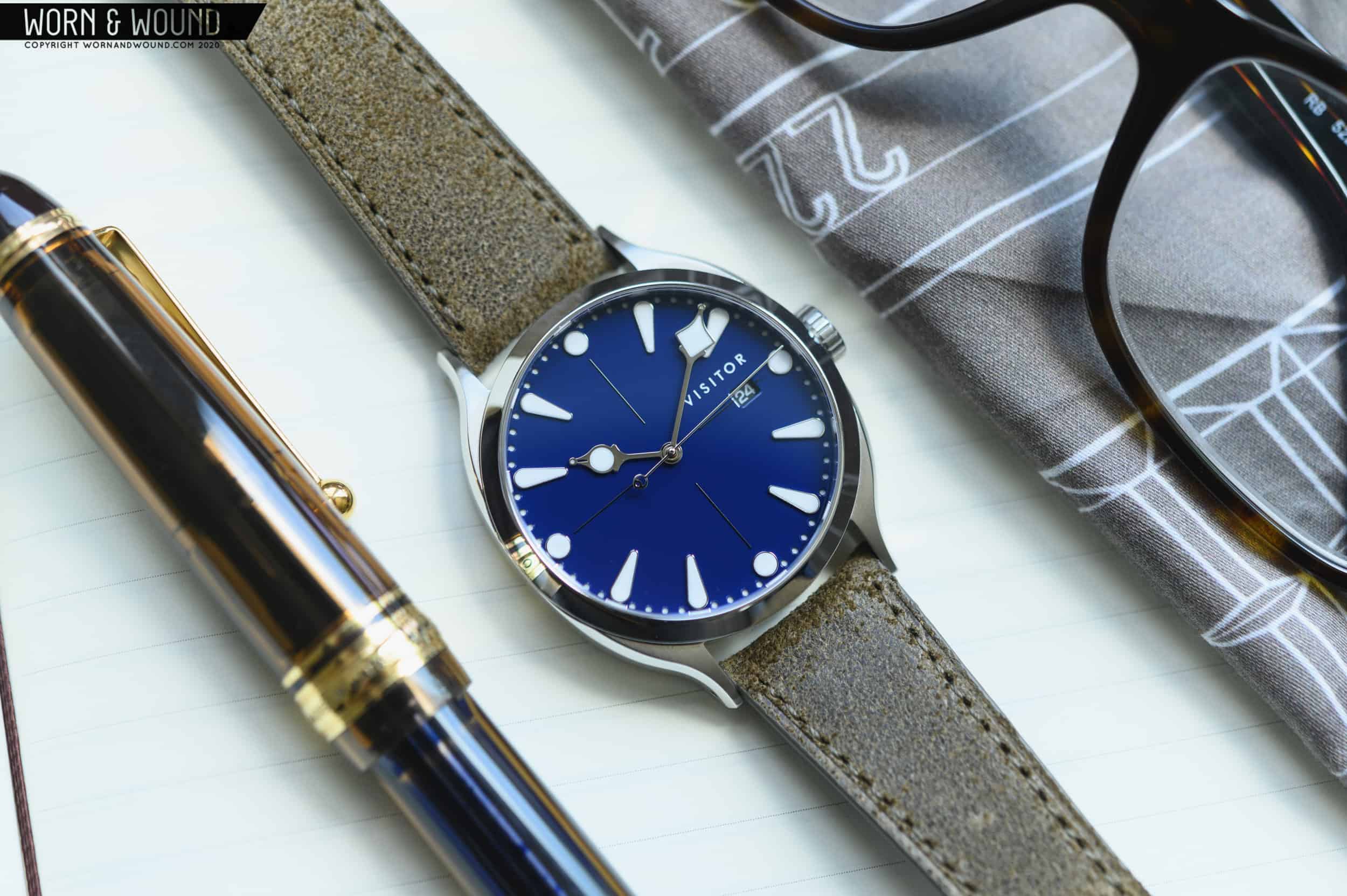
The watch itself is familiar, yet different. A quick run down of the spec sheet doesn’t turn up anything too out of the ordinary. The Linden Calligraph is a 39mm watch housed in a 316L stainless steel case with a thickness of 10.5mm. Up top, there’s a sapphire crystal with some AR coating, and a Miyota 9015 beating away inside. We’ve all seen plenty of watches with similar specs, but I’ve honestly never seen an affordable watch with such a unique approach to design and details. The main design cues are inspired by fountain pens (something I happen to be very familiar with) and the art of writing. The nib-inspired hand set and case are very unique — almost like something from an alternate past. They’re a bit steampunk, but not so over-the-top as you’d feel uncomfortable wearing it without a pair of matching goggles and a unicycle. The dial is reminiscent of wet ink, as highlighted by the glassy smooth finish. There’s a lot to take in from this interesting piece from Visitor Watch Co., so let’s dig in.

Advertisement
$580

Review: Visitor Watch Co. Linden Calligraph Larkspur

Case
316L Stainless Steel
Movement
Miyota 9015
Dial
Blue, Sandwich style with applied markers
Lume
BGW9 on hours, minutes, and date
Lens
Sapphire with AR on the underside
Strap
Leather with custom buckle
Water Resistance
50m
Dimensions
39 x 48.5mm
Thickness
10.5mm
Lug Width
20mm
Crown
Push down
Warranty
Price
$580

Case

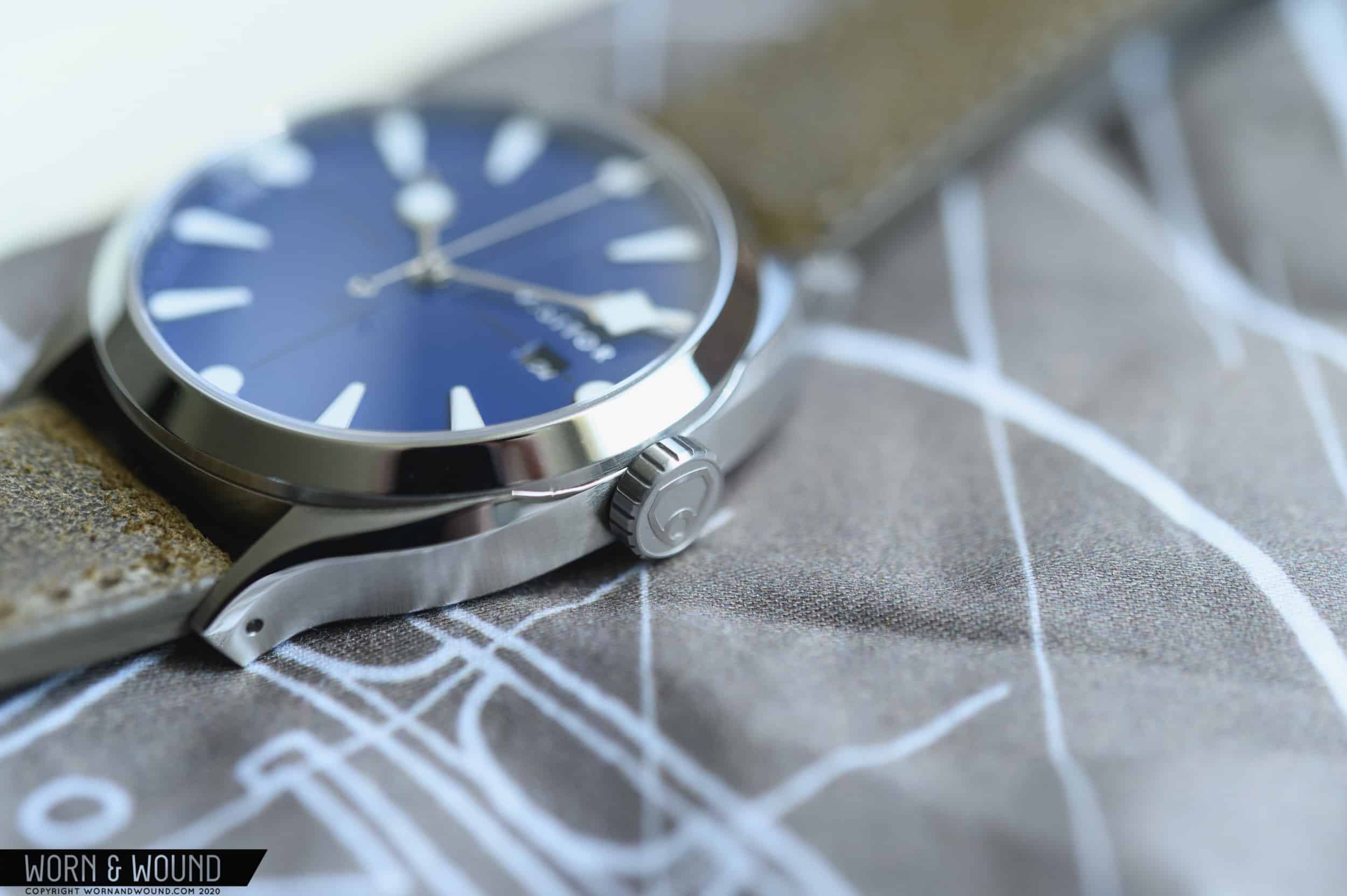
As I mentioned earlier, the Calligraph is built on a 39mm 316L stainless steel case. It measures 48.5mm from lug-to-lug, while coming in at 10.5mm thick. I would say this watch sits firmly in the “medium” case size category. Plenty of watches share similar dimensions, but the case design of the Calligraph stands out from the pack. Looking at the watch from the top down, you’ll notice a unique set of lugs with broad shoulders. The design is based on the nib of a fountain pen. For those not in the know, the nib is the metal (typically gold) piece from where ink is transferred to the page. There’s a slit down the middle of the nib separating both halves (while putting the capillary action that draws ink from the feed to work) and on either side, you have what’s called a “tine”. If the lug width were 1mm instead of 20mm, you’d have the shape of a fountain pen nib, clear as day. The tine-inspired lugs give a squared-off appearance to the case. It’s an interesting look that helps to balance out the large, open, circular dial. It’s a subtle effect, but it makes a big difference in how the watch appears. Surrounding that wide open dial, there’s a polished bezel that’s pretty standard fare. At 3 o’clock, there’s a push down crown that’s finished with a matte treatment on the surface, and embossed with Visitor’s logo on the flat surface. 


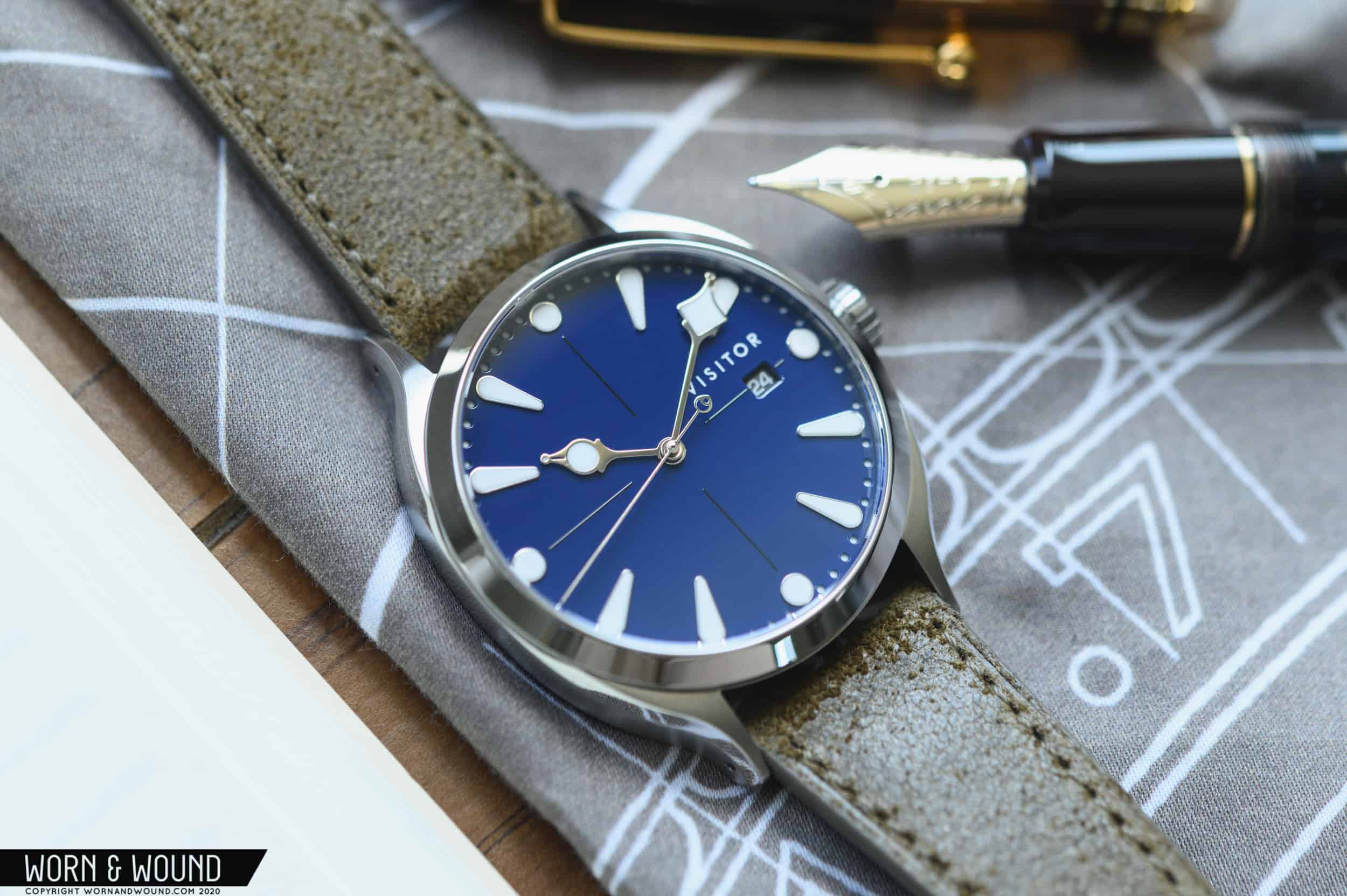
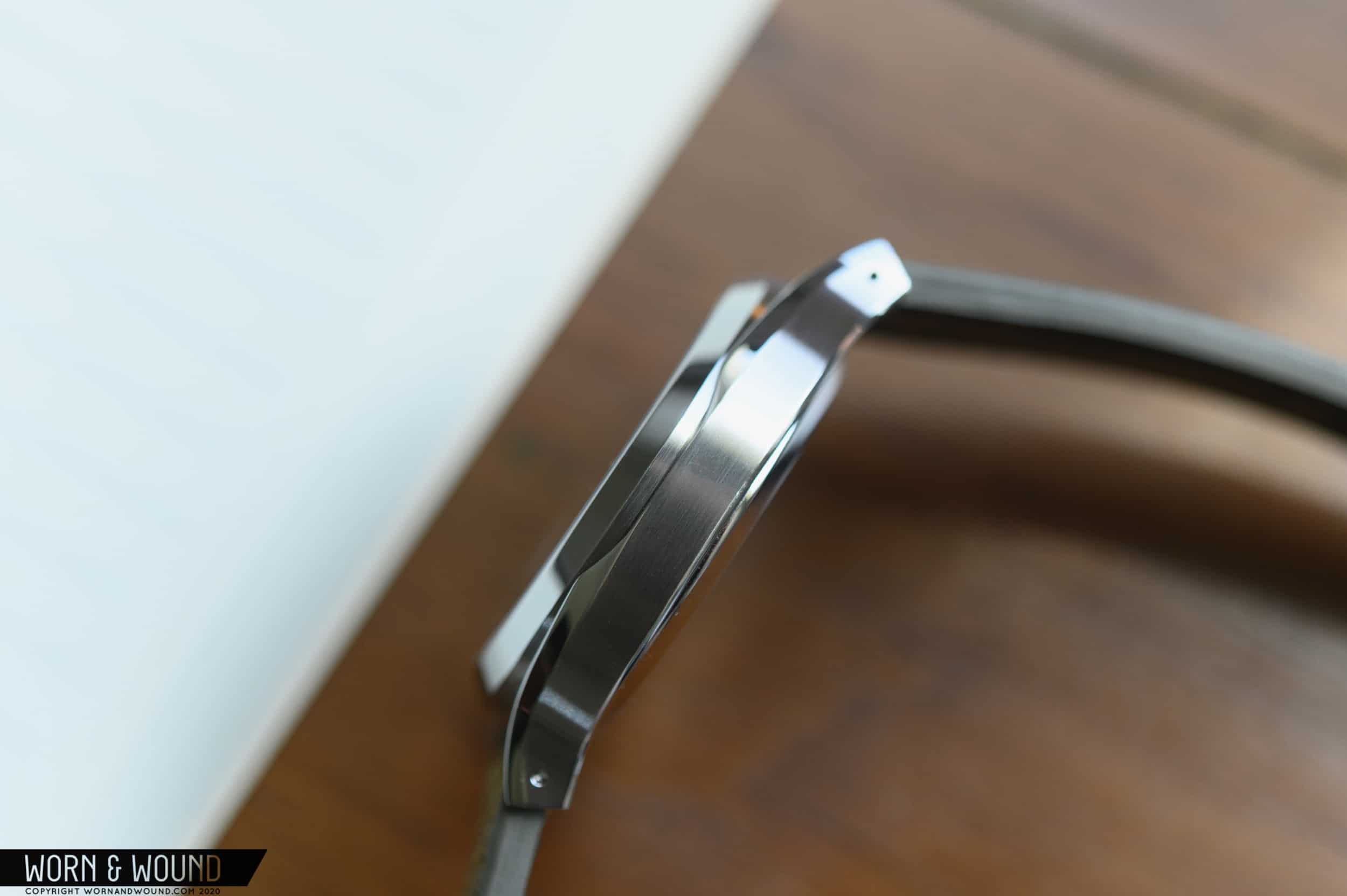
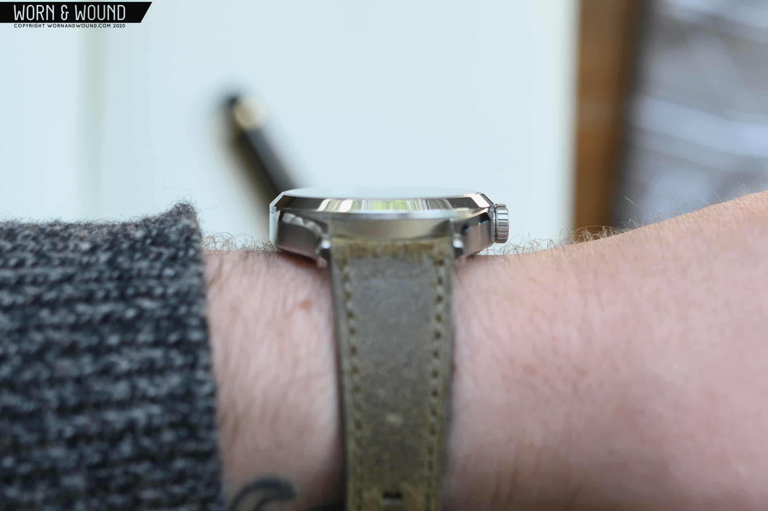
In profile, the first thing that stood out to me is how the polished bezel marries with the case. There’s a chamfer between the top of the case and the mid section, and the bezel cuts right through it. A small portion where they overlap is cut away, which does an excellent job of breaking up the mid case. Take a look at the photos, and you’ll see what I’m talking about. It’s hard to describe, but the resulting visual effect is something I haven’t seen before on a watch, and I’m a fan. The rest of the mid case is pretty straightforward. There’s a gentle curve across the entire surface from lug to lug. A millimeter or so of case back hangs down below, but not enough to add anything to the appearance or feel of the case. The traditional aspects of the watch case help to keep the more “out there” design of the lugs, hand set, and dial in check. This balance keeps the watch wearable, never hitting that over-the-top level of design. It’s just interesting enough to get your attention, but never too garish or wild for everyday wear.

The surfaces of the Calligraph feature a mix of brushing and mirror polish. The top of the lugs and mid case are very lightly brushed, while the chamfer between the top/middle and bezel are polished to a mirror-like shine. Light brushing makes for a shinier watch, and it works well with the rest of the design.  Something too dull would make the brilliant shine of the dial seem out of place. Transitions between finishes are crisp and clean, as are all edges of the case. I’d say the level of finishing meets or exceeds what should be present on a $580 watch.

Dial & Hands

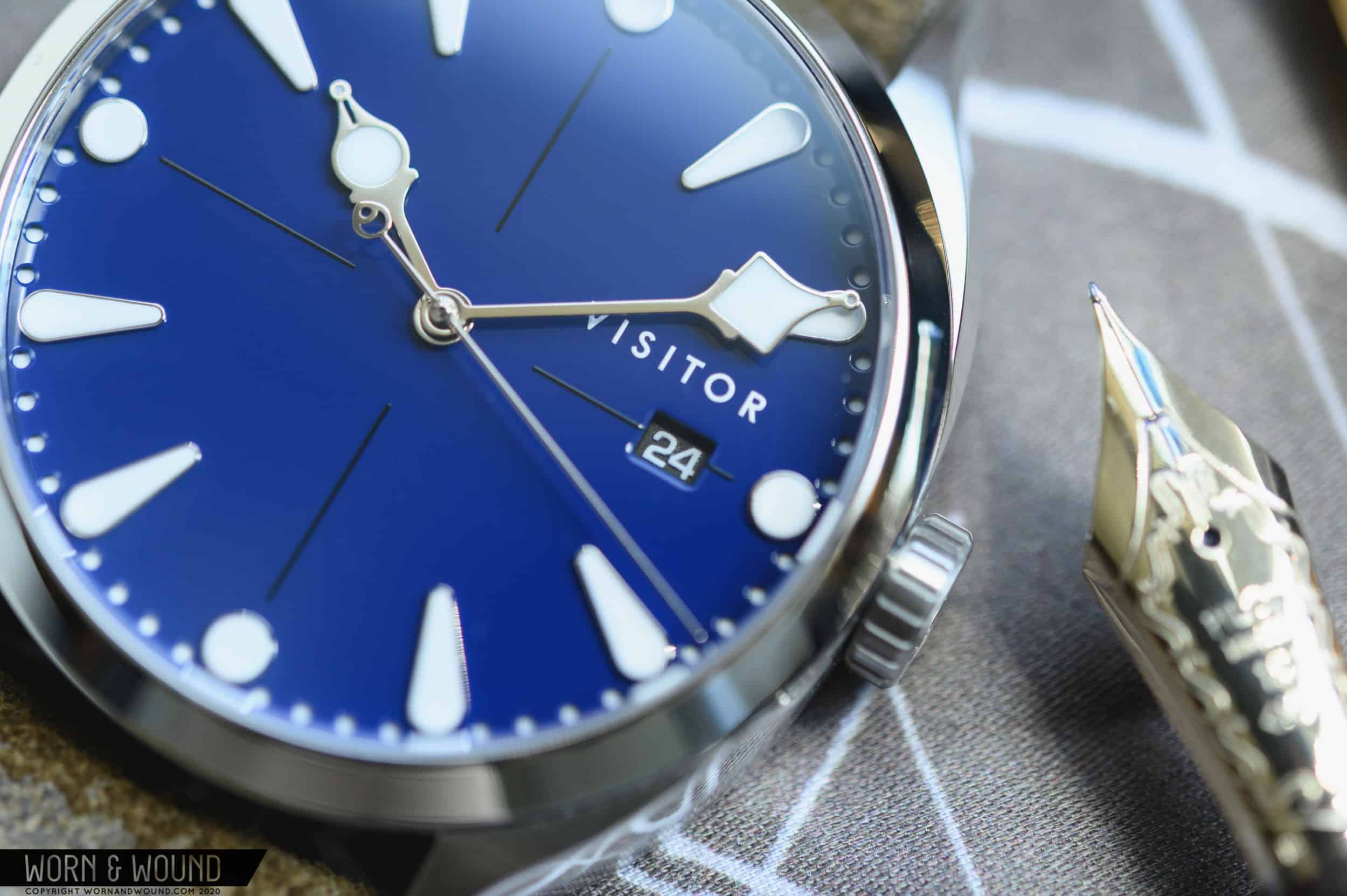
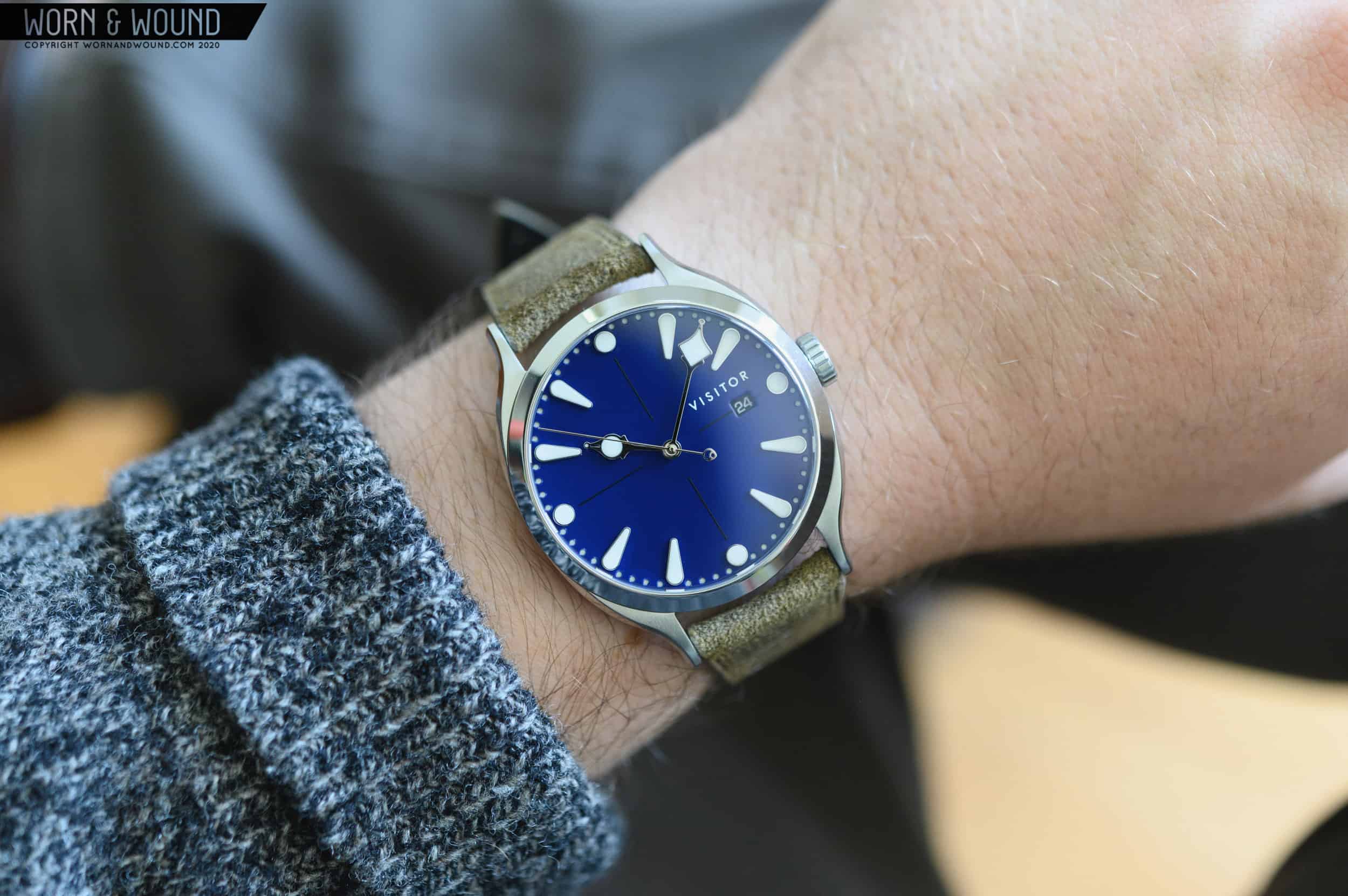
Inspired by freshly-inked words on a page, the dial is reminiscent of wet ink. In any other context I’m sure we’d just call that a shiny dial, but with the pen-heavy details throughout the watch, the ink comparison is a logical one. The Calligraph Linden is not just a one-trick pony, as the dial makes use of a mix of techniques that give it a very luxurious look. The dial is constructed in two layers, ie. a sandwich style. It’s hard to notice at first, but the white minute markers are actually holes in the top layer that show off the lumed base layer below. While subtle, this sandwich construction adds some much-welcomed depth to the wide open blue dial. In the middle, you’ll notice the barely-there crosshair printed into the blue surface, which also helps to break up the wide open space. To mark the hours, there are a unique set of applied indices. The cardinal numerals are marked with small circular plots, while the hours in between are elongated like a droplet of ink. They feature silver surrounds that reflect off the blue base of the dial ever so slightly. Each index is filled with SuperLuminova BGW9 that gives off a pleasant teal-green glow when the lights go out. Just to the left of the 3 o’clock index, you’ll find a white on black date window that is visible through a rounded rectangular window. While a date wheel matching the dial would have been ideal, the date is small in comparison with the rest of the features on the dial and doesn’t really get in the way. The white printing on the dial is rendered in lumed ink, which is a cool little touch. 

There’s no name for the style of hands used on the Visitor, as they are completely unique. In all my years of watch and pen enthusiasm, I’ve never seen the two worlds combined together as much as they are in the Calligraph. The set of polished hands are long and thin in from the stem to the edge, terminating in large, ornamental, nib-shaped tips. The hour hand features rounded edges, while the minute hand is a bit more angular. Since the minute track is so close to the edge of the watch, the minute and seconds hands are very long. The seconds hand is a sliver-thin stick hand with a counter balance on the end. It’s very tough to put it in writing, taking a closer look at the photos should back me up on that. As I mentioned earlier, the watch has just enough unique design elements, but they’re balanced out well by more conservative touches throughout. While the hand set is pretty out there, it fits in with the theme of the watch and they’re executed to a high degree of detail. It makes the whole watch look unique, and I’m impressed with how they’ve maintained legibility while being so ornate.

Movement

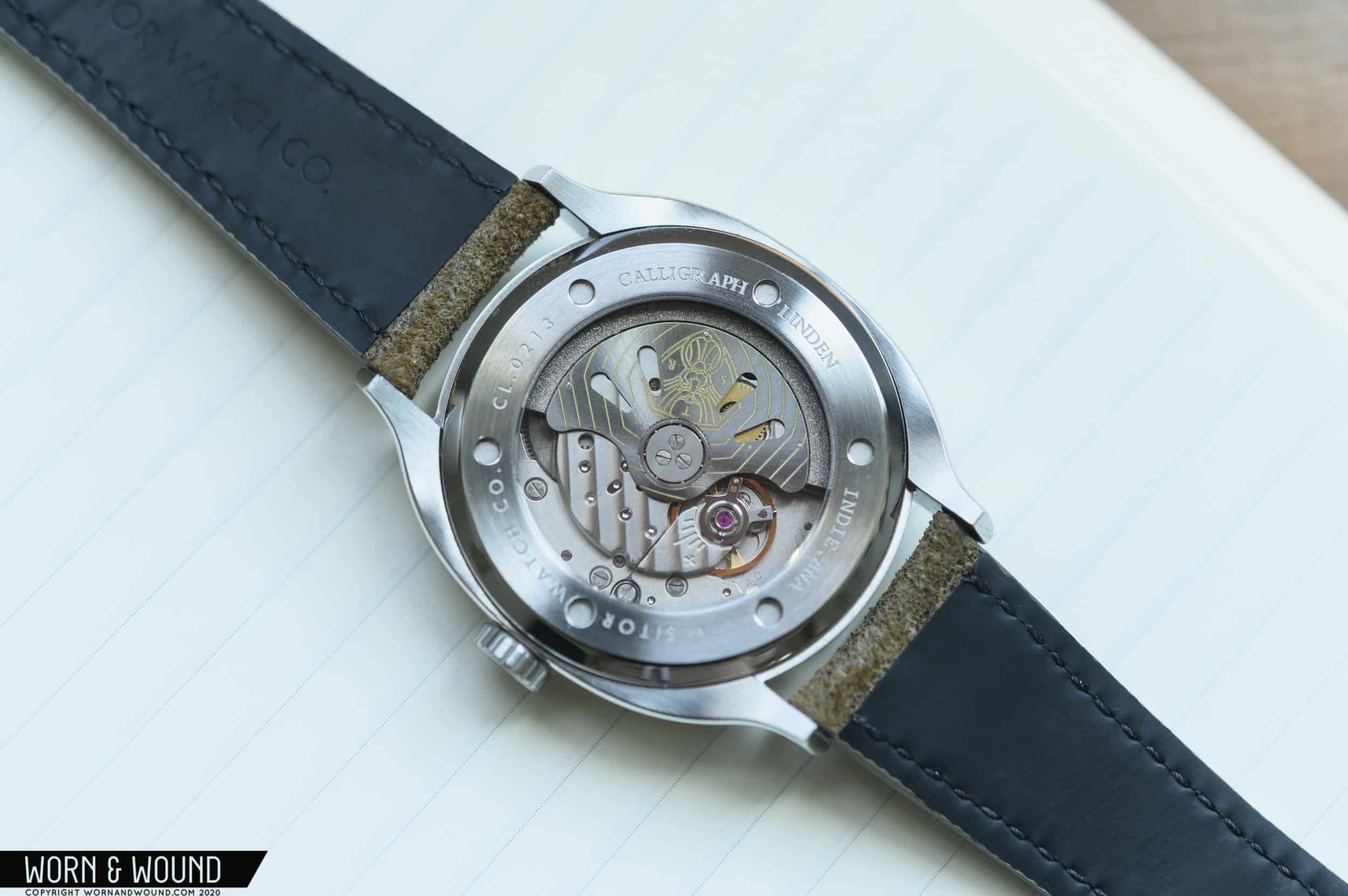
Inside the Calligraph, you’ll find the workhorse automatic Miyota 9015 with date complication. It’s visible through the display case back and features a decorated rotor with the Visitor logo. Beating at 28,800bph, the movement sends the razor-thin seconds hand around the inky dial with a smooth sweep. It’s rated to be accurate to -10/+30 seconds per day, and features a 42 hour power reserve. You’ll appreciate the convenience features like the ability to hand wind the movement and a hacking seconds hand for precise time setting. A quick-set date feature is also a nice touch. In a sub-$600 watch, the movement is right at home. There aren’t a ton of options in the affordable movement world, and Miyota’s 9015 is cropping up more and more. The choice in movement allows the Calligraph to remain firmly at its attractive price point, making it more available to the masses.

Strap & Wearability

For me, this watch is best worn on leather. It ships with a textured calf leather strap with a custom milled buckle. The leather strap is nice and sturdy with a backing and sealed edges. It tapers down a few millimeters from lug to buckle, keeping it comfortable on the wrist. The blue dial ships with a medium neutral gray strap that works well with the color of the dial. It’s worth mentioning the quality of the buckle and how well it flows with the rest of the watch design. The sides of the buckle mirror the shape of the lugs, giving off a very cohesive feel from case to strap. It’s easy to ignore the clasp and just throw on a stock one, so it’s nice to see Visitor going the extra mile. The pseudo-dressy, old-school look of the Calligraph doesn’t really lend itself to being a strap monster. While it would probably look okay on a nato, the vibe would just be kind of off for me.

For a 39mm watch, the Calligraph wears a bit large. The dial is a prominent part of the overall appearance of the watch, and the details are all anchored towards the outside of the dial. With the wide open space in the middle, it looks a bit big for my 6.75” wrist. I’m glad that Visitor opted for a 39mm case size, as anything larger than that would have looked way bigger than the measurements imply. While evaluating the watch for review, I found it to be comfortable on wrist. I appreciate the 10.5mm thickness, which keeps it out of the way and easy to slip under a cuff. For my lifestyle, the Calligraph is a bit of an odd duck. While I work in an office setting, I do enjoy a good fishing trip, and having a young son means splashes, spills, and bath time mishaps are a regular occurrence. While I’m sure the 50m of water resistance would be good for most of that, I like a bit more for my daily watch. The polished surfaces and glossy dial do lean a bit dressy, but the fun design quirks make it a bit more casual. I can’t really nail down the exact scenario in which you’d be wearing the Calligraph, but I think that’s a good thing. It’s more of a watch that has to fit your personality rather than your use-case, which is part of what makes the watch so interesting. 

Advertisement

Conclusion

Most smaller brands tend to dip into the past, homage-style or lean towards modern and futuristic, but the Calligraph Linden stands out from the pack. It’s almost like something from an alternative past. Sure, the watch is a little bit quirky, but it remains restrained enough for daily wear. I really appreciate the out of the box thinking that went into the design, as it’s one that truly stands on its own. The watch is a bit classic, a bit modern, and all unique. Like the name of the brand implies, it is a bit mysterious too. I’m really glad that I got to spend some time with the Calligraph, as it was a refreshing departure from most watches seen today, and I got a kick out of the coincidental crossover between watches and pens. It’s clear that Phil at Visitor has a vision, and I’m excited to see what he conjures up next.

Images from this post:
Related Reviews
Ed is a Long Island-based writer and photographer with an affinity for watches, fountain pens, EDC gear, and a great cup of coffee. He’s always looking for the best gear for the job—whether it be new watch, pen, flashlight, knife, or wallet. Ed enjoys writing because it’s an awesome (and fulfilling) way to interact with those who share the same interests.
Categories: