It’s pretty rare that a household name brand surprises you with a product, but in the case of the watch we’re looking at today, that’s exactly what happened. Victorinox, known of course for their Swiss Army knives as well as their watches, brings to mind a certain design vocabulary. One that speaks most clearly to a military aesthetic, particularly infantry field watches. Though they have made models that diverge, they tend to be in the way of modern sport aesthetics. So, when a clearly vintage inspired design showed up on their site, a watch that I don’t even recall seeing in Basel, I was surprised and intrigued.
The Alliance Mechanical has design elements that speak directly to watches from the early 50’s and late 40’s. Elements that, to my knowledge, hadn’t been used by Victorinox in other watches. The Alliance Mechanical stands out for being a bit lighter, perhaps dressier, than their other watches, but at the same time having details of their modern and military designs. Powered by an ETA 2824-2 and featuring a sapphire crystal, this Swiss-made watch comes in at a fair $750, making it all the more compelling.
Victorinox Alliance Mechanical Review
 Case: Steel
Movement: ETA 2824-2
Dial: Off-white
Lume: Yes
Lens: Sapphire
Strap: Leather
Water Res.: 100M
Dimensions: 40 x 50mm
Thickness: 10.5 mm
Lug Width: 20 mm
Crown: 6 x 3 mm
Warranty: 3 Years
Price: $750
Case
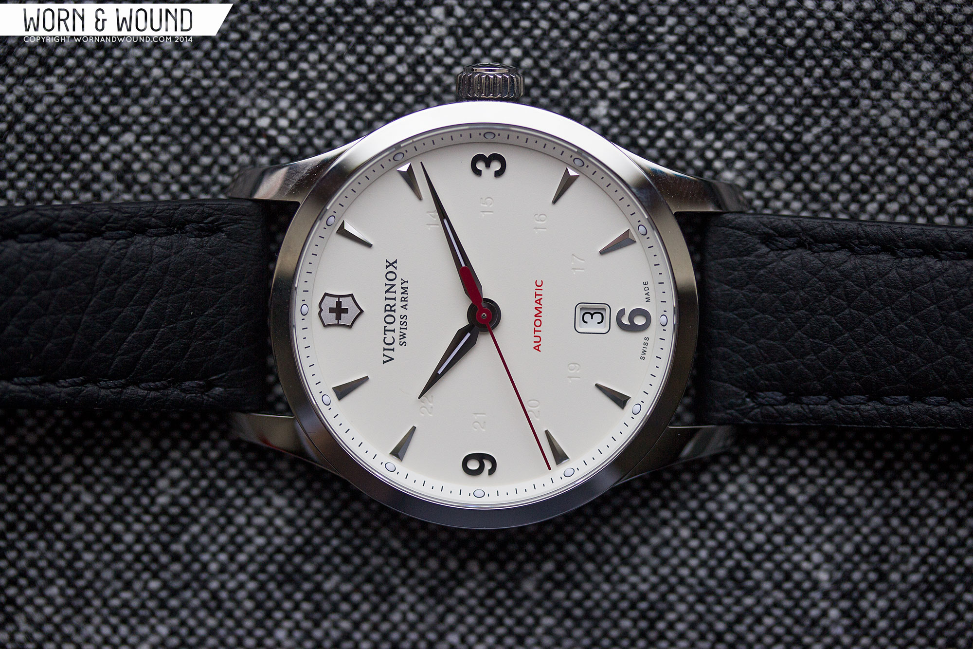
The case of the Alliance Mechanical is simple and understated. It’s entirely polished, with slab sides and no bevels or decoration to speak of. Just elegant flowing lines for a clean and classic, albeit a touch boring, shape. Measuring 40 x 50 x 10.5mm, the Alliance is a medium/small sport watch, but seems plenty large for a watch with clearly vintage details. From above, the case is well proportioned, with thick lugs that add some bulk to the design. From the side, the watch is surprisingly flat, with even the lugs barely curving down. Capping off the case is a flat sapphire crystal with triple anti-reflective coating, that is very effective.
Off the right side is a 6 x 3mm push/pull crown. Once again, nothing out of the ordinary here. The crown is nicely sized and textured, making it easy to grasp. On the outer face is a Victorinox shield logo. Since this watch is an automatic and sporty in its own way, I would have liked the crown to have been screw-down. Perhaps they could have gotten a higher than 100m water resistance that way.
Flipping the watch over reveals the display case-back, which shows off the ETA 2824-2 automatic powering the watch. Though the movement is relatively undecorated, it’s still fun to see, and likely makes the watch more sexy at retail. That said, I wouldn’t have minded a solid case-back in this instance, perhaps with an etching or other decoration.
Dial
The dial of the Alliance is where things get a bit more surprising. Rather than having the more standard infantry/field designs, I at least, associate with the brand, they went for a very clearly vintage dress/sport style, circa late 40’s early 50’s. The design immediately brings to mind early Omega Seamasters (like the first, from 1948) as well as early 50’s Rolex Bubbleback pre-Explorers, with its 3-6-9 layout and applied logo at twelve. When mixed with the more modern case size, it’s definitely an unexpected combo, especially from this brand.
There are two dial variations available, black and the off-white we have here. The light cream tone is very interesting and a nice change from stark white. It’s a bit warmer and deeper, allowing the applied steel markers to contrast nicely. The primary index, as noted, is an “Explorer” style 3-6-9 index with applied polished markers. The markers between the numerals are all faceted, triangular shapes that reflect light nicely, throwing flashes this way and that. At 12 is an applied Vitctorinox shield with a mix of polished and matte finishing that looks great as well.
The typeface chosen for the numerals is a clean sans-serif that looks like it’s straight off of one of the old Omegas. Since they are totally flat, they tend to reflect solid colors, standing out from the faceted markers. Since the watch is a 40mm, it’s much larger than the vintage watches it refers to, but in the scaling, they’ve kept the markers all quite small. As such, there is quite a bit of empty space on the dial that at times feels too open.
To alleviate this a bit, there is a a bit of text on the dial, including the standard logo at 12, and the “automatic” above 6. Automatic is printed in red, which adds a sudden and welcome bit of color. Just above the 6 numeral is a date window with a black on white date disk. While I like that it’s at 6, thus keeping symmetry and the vintage feel, it’s also crowding the 6 numeral. One very cool detail that works towards eating the space as well, is a 24-hour index around the center that is blind debossed. The “ghost” numerals add some texture, and when visible, some added legibility. That said, they are as subtle as a dial element can get, so more often than not, you wont notice them at all.
On the outer edge of the dial is an angled chapter ring with black marks for the minute/second and half-minute. At intervals of 5 are embedded lume dots with black outlines. This is very similar in style to the chapter ring on the Officer’s Day-Date we reviewed a few months, and is a detail I like about both. On the Alliance, it adds a more modern and sporty element that keeps the watch from feeling too vintage. The dots also add a subtle, but not ineffective, amount of lume.
Sticking to the theme, the hands of the Alliance are a vintage alpha style with slim lume strips. They look great, tying the dial together and maintaining good legibility. The seconds hand is a bit more modern feeling. It’s a dark, Swiss Army, red stick with a counter weight that is shaped like one their knife handles.
Movement
Inside of the Alliance is the venerable ETA 2824-2. One of, if not the, most common Swiss Made autos out there. Of course, in the last few years, we’ve been seeing more an more alternatives in use as ETA pulls back on selling to outside brands. We’ve also seen prices on them going up, so finding a sub $1,000 2824-2 is becoming more and more uncommon, making a watch like the Alliance all the more tempting.
The movement is a 25-jewel automatic with manual winding, hacking seconds, date, a power reserve around 40 hrs and a frequency of 28,800 bph. The one featured in the Alliance appears to be a base level model with no plating or decoration, save the Victorinox shield logo on the rotor.
Straps and Wearability
The Alliance comes mounted on a 20mm black leather strap with black stitching that tapers slightly. The leather is a nice medium thickness, making it sturdy, but soft. It’s a very sporty strap that utilizes a type of deployant clasp that makes the strap feel upside down. Rather than the tail going away from you, it goes towards, you, ending up on the inside of the wrist. It makes for a very easy strap to get on and off, though I did find the strap catching on things, like my headphone cord, a bit more than I would have liked.
Aesthetically it’s a bit modern and bland, but a safe and easy option. Since the watch is stylized in its own way, I feel like a strap with some more character would have been nice. Perhaps a brown leather or even a brown faux-croc would have been interesting, especially on the cream dial, as the warmth in the strap would resonate with the dial color. There is a bracelet version of the watch as well for $795. So if you’re approaching this as a more formal watch, that might be a good option for you.
The Alliance fits very well. 40 x 50 x 10.5mm is a great size for a versatile sport watch. It’s big enough to have presence and some robustness, but small enough lug-to-lug to be comfortable and thin enough to slip under a shirt. Having said that, given the 50’s styling of the dial, the watch seems a bit too large. I would love to have seen this at 38, so the dial and case would have just been more compact.
Aside from that, it’s a nice looking watch, with an interesting mix of elements. It’s almost hard to pin down if it feels more like a sport watch or a business-casual watch. The polished case and the applied markers are formal details adding some ornamentation, but the red seconds hand, ghost 24-hr index, chapter ring and backwards strap are more sport or military feeling. Ultimately though, it all comes together for a unique look and one that can be dressed up or down to suit the occasion.
Conclusion
It’s always nice to see a brand you know and trust try something different, and with the Alliance Mechanical, Victorinox did just that. They took a mix of elements, some more standard to the brand’s design language, and others more stylized, and created something intriguing. The final product doesn’t quite seem like anything else in their line, but somehow fits right in. And, overall, I think it’s a success. For an everyday watch with some sporty leanings, the use of the vintage dial design adds some personality and style. My biggest problem with the watch isn’t a real problem at all, I just wish they had pushed things a little farther to create an even more stylized piece. The case could have a bit more to it, the size could have come down a bit to make the dial feel more full, the strap could have been more daring, the date dropped, etc…
The other side of things is the very decent price of $750. For a Swiss-made watch with a Swiss-made ETA 2824-2 that is available at retail (as in subject to those markups) the price is quite compelling. The bracelet option for an additional $45 seems like a good bet too. That said, the Officer’s Day/Date comes in a few bucks cheaper for a bit more of a watch. So, if you’re looking for a watch with vintage flair, but modern build and sizing, the Alliance is worth checking out.


 Featured Videos


Even though I’m becoming a vintage watch nut, I’m having a hard time warming up to this one, especially given the pricing. It just seems to be missing that ‘something’ that draws you in. Maybe some dial texture and/or a warmer off white color, a domed crystal or a little less dead space on the dial? The debossed numerals are also a bit superfluous. Perhaps it’s a bit too sterile for its own good.
Maybe this is one you have to hold and wear to appreciate, but comparing this to the SS/white Bambino does the Victorinox no favors. Maybe the Bambino’s version of vintage is a bit over the top, but then the Alliance is too subtle.
It also appears that there’s some gnarly, poorly finished edges in the movement, especially toward the upper portion – what’s going on there?
This watch loses hands down against the Bambino because it fails the first litmus test – every watch must be beautiful.
While I typically like this style of watch, this feels not quite there. I’m not sure what it is, perhaps the size of the watch is too big for the dial. It could be a touch smaller to bring everything closer together, but then the date window would encroach or even fully replace the 6 index.
Not a bad watch, per say, but certainly nothing special. Hopefully, though, they won’t stop trying out different designs. I like seeing watch companies deviate from their typical path.
They do make a black dial version which in my opinion, looks much better. http://www.victorinox.com/ca/product/Timepieces/Category/Collections/Alliance-Mechanical/241668
I agree. Way better.
The white dial makes all that blank space on the seem even more expansive and empty, creating that ‘dinner plate on the wrist’ effect. Black dial visulally shrinks it somewhat. And the white date wheel adds a nice splash of color (and aids legibility)
Disagree. White is more dressier. The black has a white date wheel !
Wow, have I been pronouncing Victorinox incorrectly all my life? Nice looking watch and a decent price, though it is just a tiny bit too large and should include a screw down crown at that price.
ha ha…not necessarily. I just say it the way I’ve always said it.. Victory+nox… some people say vicTOR-in-ox.
Can’t you just put the strap on the other way if you want the tail facing out?
The styling alone makes it impossible to justify paying more than $300, no matter what the internals or build quality are like.
Yeah, why don’t you call up JLC and let them know how terrible you think their styling of the Master Control is? I’m sure they will be crushed.
I just bought this VSA brand-new for $399, and I’m not having any trouble justifying that incredible deal.
Thanks, your reviews tempt me so much. It is a beautiful watch, I am getting one soon.
Kind of looks like a poor man’s JLC Geophysic with the arabic numerals and the lume pips on the dial flange. Obviously, the JLC is miles ahead though…
At the retail list, it’s not a “poor man’s” anything. But it’s more of an homage to the JLC Master Control than the Geophysic (and at 1/10th the price)…
Case is 50mm long? That’s GINORMOUS.
Zach: Could you just take the band off and put it back on the other way? To solve the awkward close direction? Just got this online and am not familiar with deployant clasp.