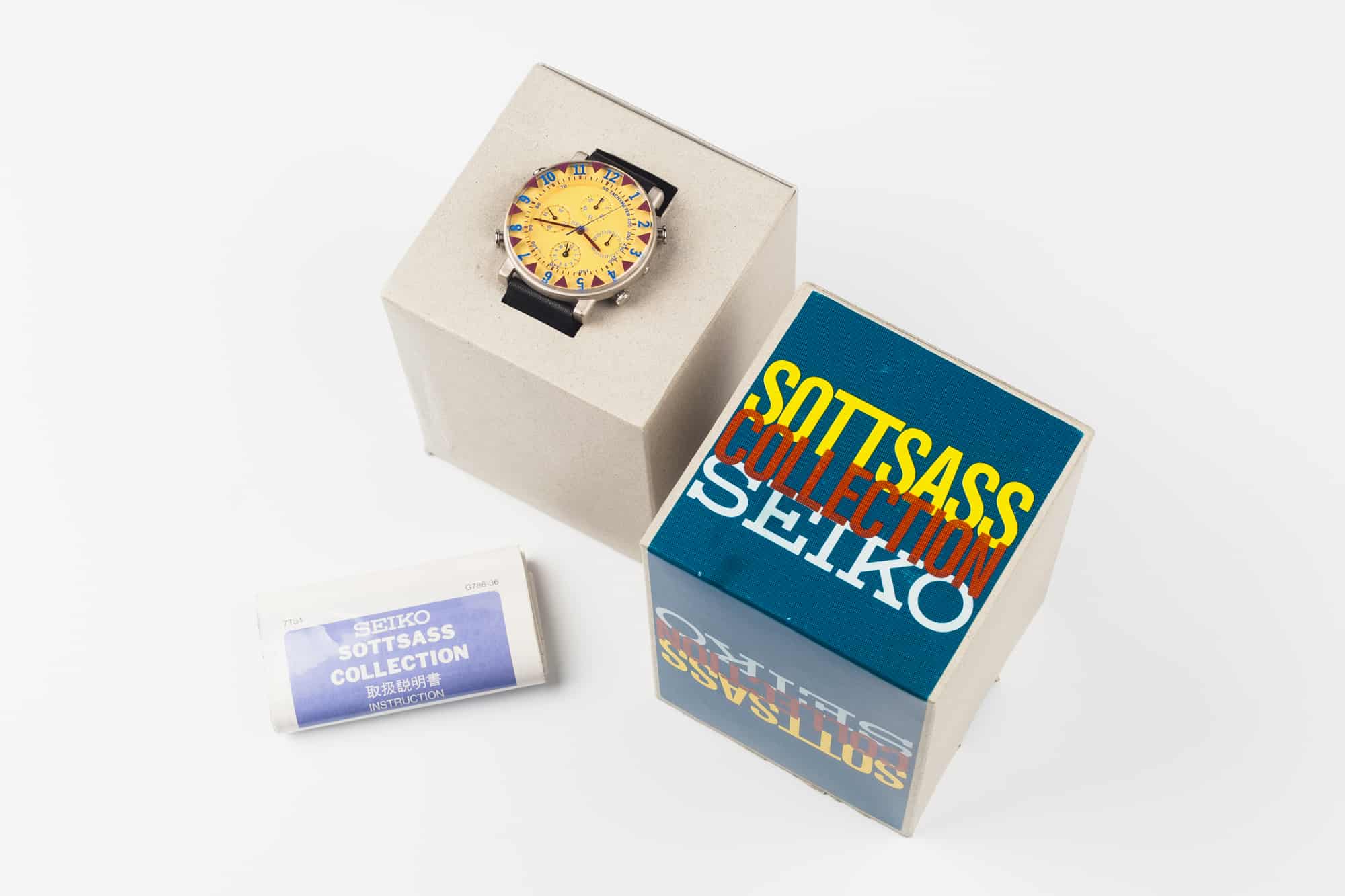
Up for Auction, Ultra-Rare Seikos by Italian Designer Ettore Sottsass

Back in the ancient past, when I first worked as a copywriter, we wrote on Mac Classics. If you were senior enough, you got a color screen. If not — and we were doing words after all — black and white was good enough for you, sonny. My Classic had a carrying handle tucked away on its top, so you could pick it up and take it with you. In my case, to the pub.

At the time, I thought this was cool beyond words, but I had no idea it was a feature if not borrowed, then certainly influenced by, designer, architect and creative Ettore Sottsass. His 1969 landmark Olivetti Valentine portable typewriter — co-designed with Englishman Perry King — featured a fold-out handle that also encouraged you to take your words with you.

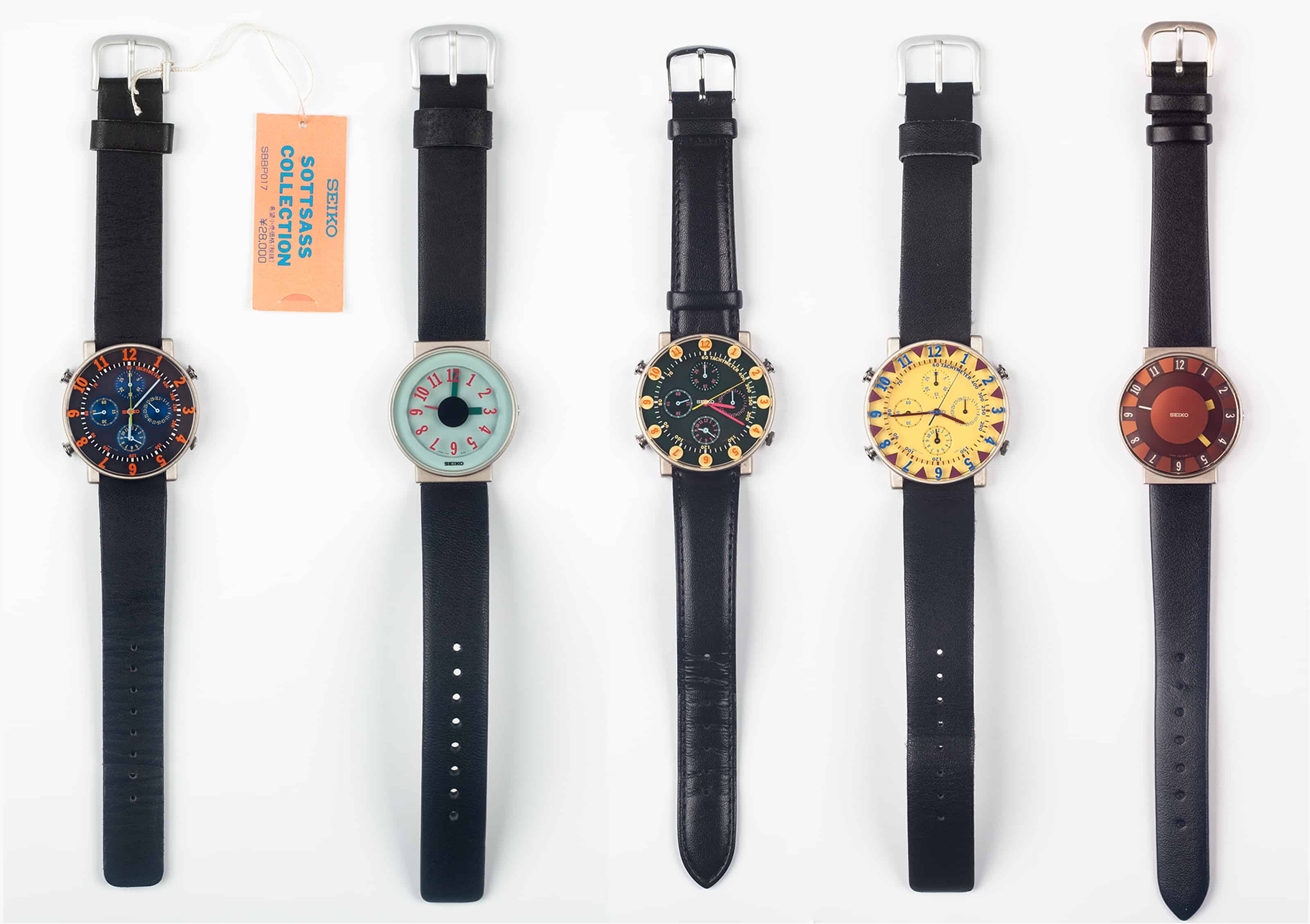
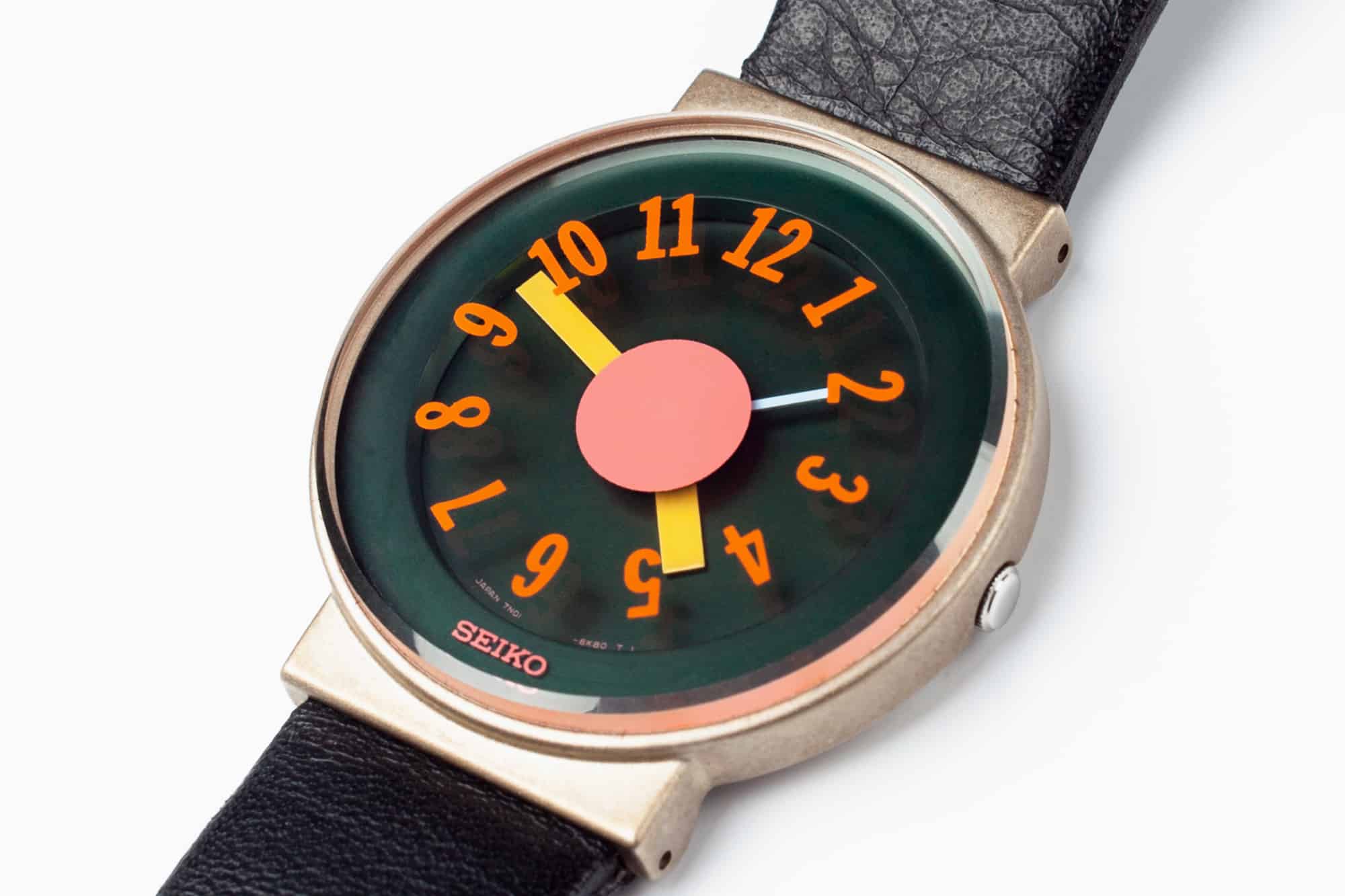
As well as typewriters, Sottsass (a member of the Memphis Group of designers) worked on architectural designs, industrial designs, and, in the early ’90s, turned his attention to watches. In 1992, he collaborated with Seiko on the logically, if unimaginatively-named Sottsass Collection.

Today, Sottsass’ watch designs aren’t perhaps as well-known as they should be, so it’s hats off to Chicago-based online design shop Philolux (see what they did there?) running the Postmodern Times exhibition of some of the Memphis Group’s watch and clock designs — including Sottsass’.
It’s worth talking a little about rarity at this point. For example, the new Rolex Daytona ceramic is rare. People are putting their newborn children’s names down in the hope they’ll get a watch before they get a pension. But these Sottsass watches are in a different league of rarity. You’re more likely to see a unicorn driving down Park Avenue in a pink 4.5 litre Birkin Bentley than see a collection like this in one place.  Heck, one of these eleven (yes, eleven!) original first editions on its own would be rare enough, but the team at Philolux has been in close contact with a Japanese collector for the last couple of years, and he’s finally decided to sell his entire collection. Oh, and they come with their original boxes and instruction leaflets.

Advertisement

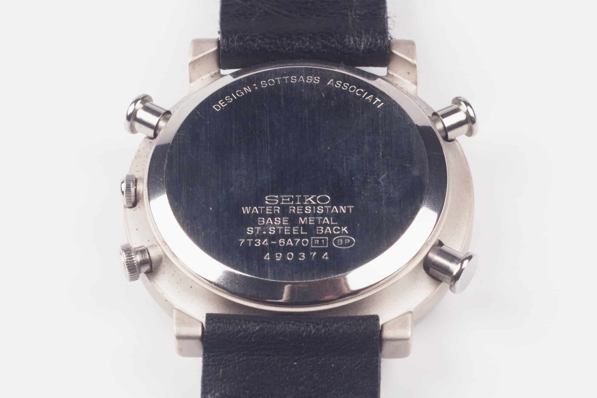
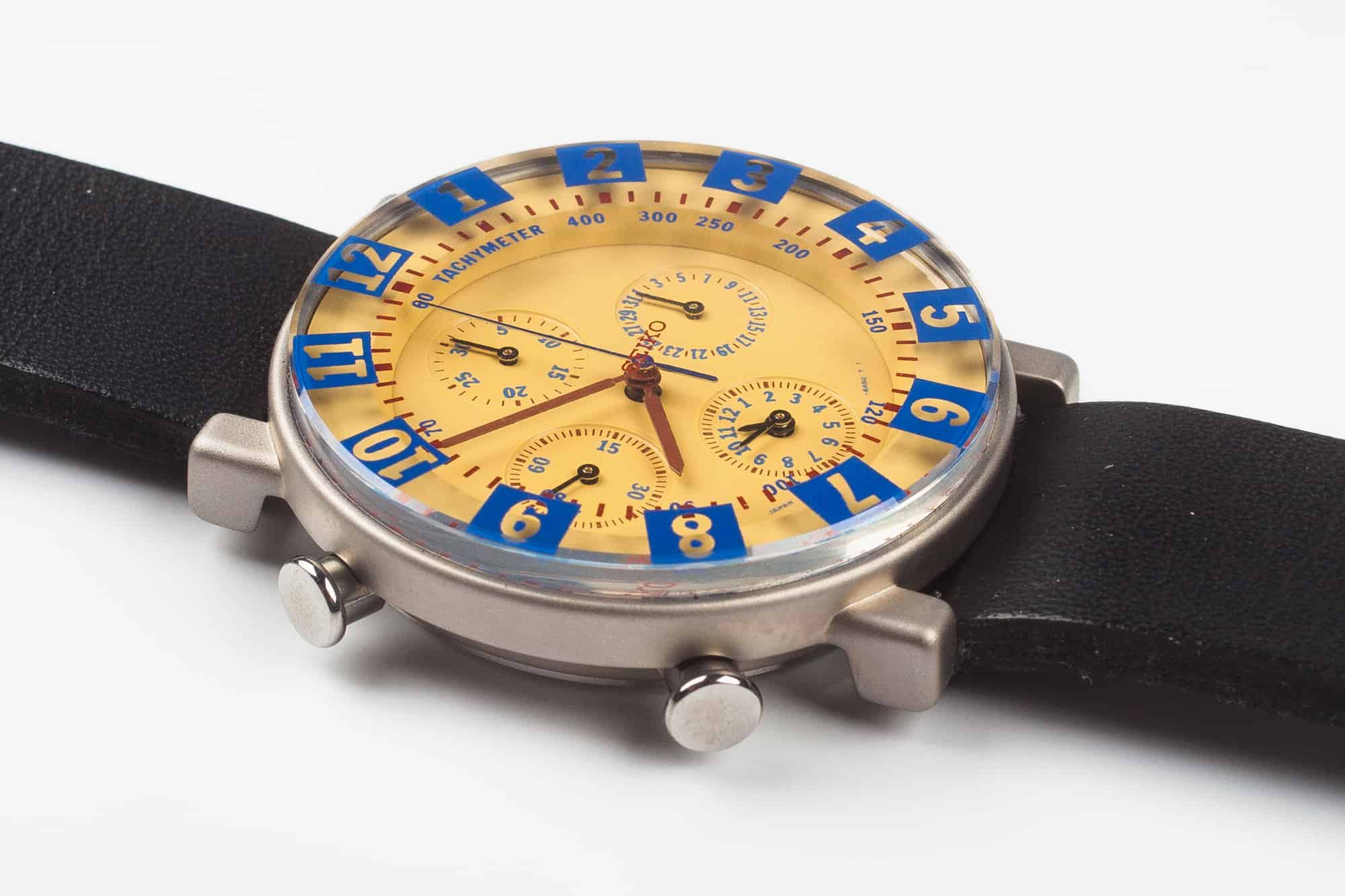
When one looks at where the watches started — their movements — Sottsass’s achievement looks even more remarkable. Each of the Sottsass chronograph watches was powered by the relatively humble Seiko 7T34 quartz movement, hence the 7T34-6A40 case-back designation. Like most Seiko movements, it’s far from pretty, but it makes up for the functional looks by being solid, reliable, and accurate. It’s a bog-standard, unjewelled, base metal movement running a minutes and 1/5 sec split-time chronograph, an alarm, and a quick-set date. The three-handers got the even more basic, but time-tested, Seiko 7N01 movement.

The cases were stainless steel, with short, squared lugs (or for the three-handers, hooded lugs) and a classic 37 millimeters in diameter.

So far, so dull.  Ettore Sottsass wasn’t able to influence the movements or the cases of the watches he was given to work with, but he took full advantage of the advice given by David Ogilvy, patron saint of copywriters, to “give me the freedom of a tight brief.” And Sottsass focused that brief on the dials, crystals, and hands.

As Carly and Joachim from Philolux point out, “He didn’t just vaguely modify an already existing watch, he completely rethought the design of the face with the layered floating effect.”

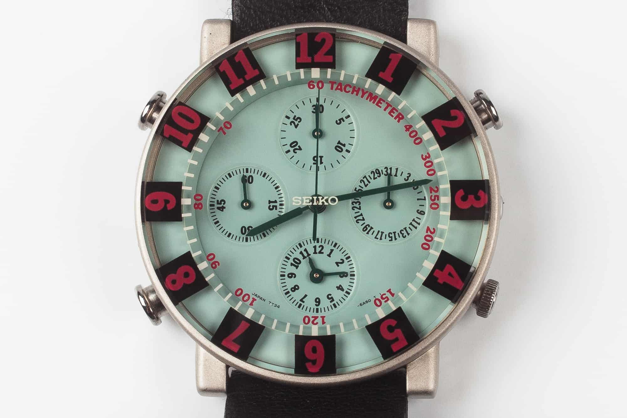
Working with the idea that creativity is about changing the familiar to be unfamiliar, he didn’t simply use the crystal to protect the dial and give an uninterrupted view of it, he integrated the two. On the Sottsass watches, the crystal is as much part of the dial as the dial itself.

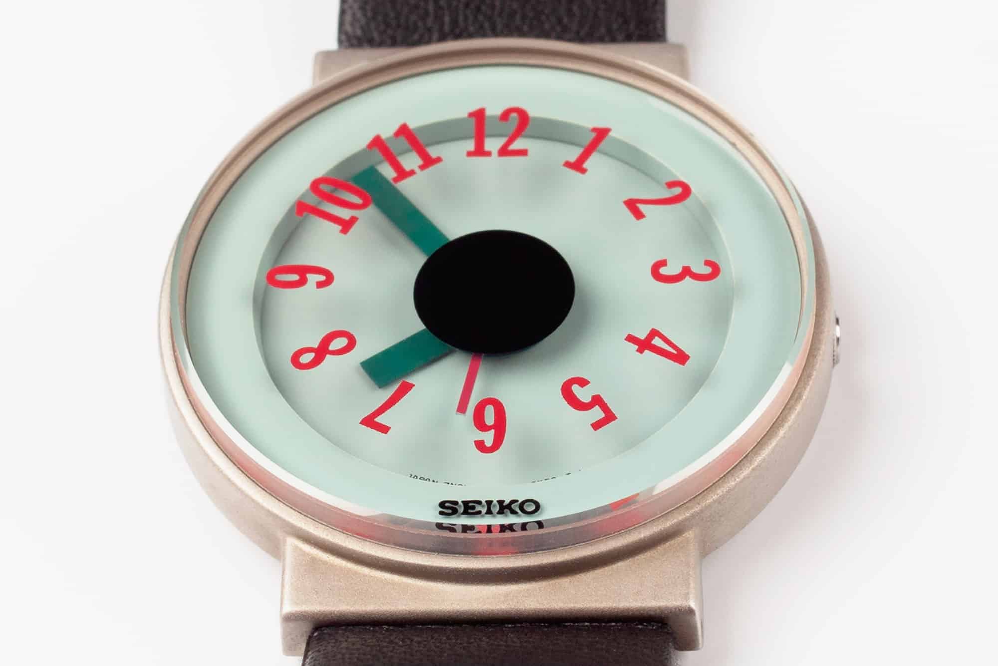
The crystals cover the whole case front — no bezel — and, on the three-handers at least, carry the screen-printed hour markers, leaving the dial clean. By choosing a thick, mineral glass and printing the numerals or markers on its underside, Sottsass gave the faces of the watches a real depth. In fact, he used a multi-layering effect to his crystal printing to add even more depth and visual interest — the hour and tachymeter markings seem to hover in mid-crystal. There’s a practical note, too — the crystals all have bevelled edges. A clean, 90-degree edge would be far too easy to chip.

Sottsass designs make a point of color. Why should a typewriter be office grey when it can be bright red? Pity his office designs never caught on or we’d have seen the last of liver-colored carpet tiles. He brought the same thinking to his collaboration with Seiko, using yellows, reds, electric blues, and greens for the crystal printing. The crystals carry the Seiko logo, too, centrally and in a contrasting color to the dial underneath.

You get a choice of dial, depending on whether you go for the three-hander or the chronograph. The three-handers have plain dials, with only the Seiko model designation picked out in the usual tiny font between seven and five o’clock. All the action with these is on the crystal. The chrono dials restrict themselves to the same model designations and the information on each of the four sub-dials. You get a 30-minute counter at twelve, a date dial at three, alarm setting time at six, and running seconds at nine. Stopwatch seconds are at the center of the dial. And each sub-dial has a subtle background tint to lift it. They’re busy dials, with four sub-registers and that central chono hand, but the high contrast colors make them easy to read at a glance. Each dial has a tall, stepped rehaut that adds still more depth.

There’s a real difference in the way Sottsass differentiates the hands between three handers and the chronographs. Where the chronos get thin, elegant paddle-pointers, the three-handers use chunky, stubby hands with squared-off ends — all hidden behind a central spot on the crystal.  They should feel cumbersome and clunky but — and this is a testament to Sottsass’ ability — they actually feel right for the dials.

The production costs for these original watches must have been pretty stiff, and, sadly, they were only very briefly available. Seiko resurrected the concept behind them with modified designs in 2016 with the 7T62 movement (they kept the 7N01 for the three-handers), but with simpler dials in the Sottsass Spirit range. They’re not exactly falling off the shelves at dealers though — the 2016 limited edition run of 1,000 of the SCEB037 are still around, but there were just 300 SCEB027 and SCEB029 models made, and the SCEB031 was only made in a run of 200 watches.

A diligent bit of googling will track down a few of these later editions and they’ll pop up on auction sites from time to time, but you’ll need a crowbar, lottery-winning luck, and real persistence to track down an original. To find one that hasn’t been bashed about is an even bigger challenge. But wouldn’t it be worth it just to own one of the leading members of the Memphis Group’s most remarkable designs?

So here’s your opportunity (don’t say we don’t look after you at W&W). There’s an auction in late March, run by Wright Auctions.  Alongside some pretty impressive design pieces, each of these eleven first edition Sottsass wrist watches and chronographs will be on auction on March 21st at Wright’s The Design auction.

There’s an estimate of $2,000 to $3,000 per watch (the last one on the market went for $2,500 last year), but it’s the hammer on the day that decides the price. You might just be able to pick up a piece of watch design history.

Related Posts
Mark developed a passion for watches at a young age. At 9, he was gifted an Omega Time Computer manual from a local watch maker and he finagled Rolex brochures from a local dealer. Today, residing in the Oxfordshire village of Bampton, Mark brings his technical expertise and robust watch knowledge to worn&wound.
markchristie mark_mcarthur_christie
Categories: