Sean Lorentzen
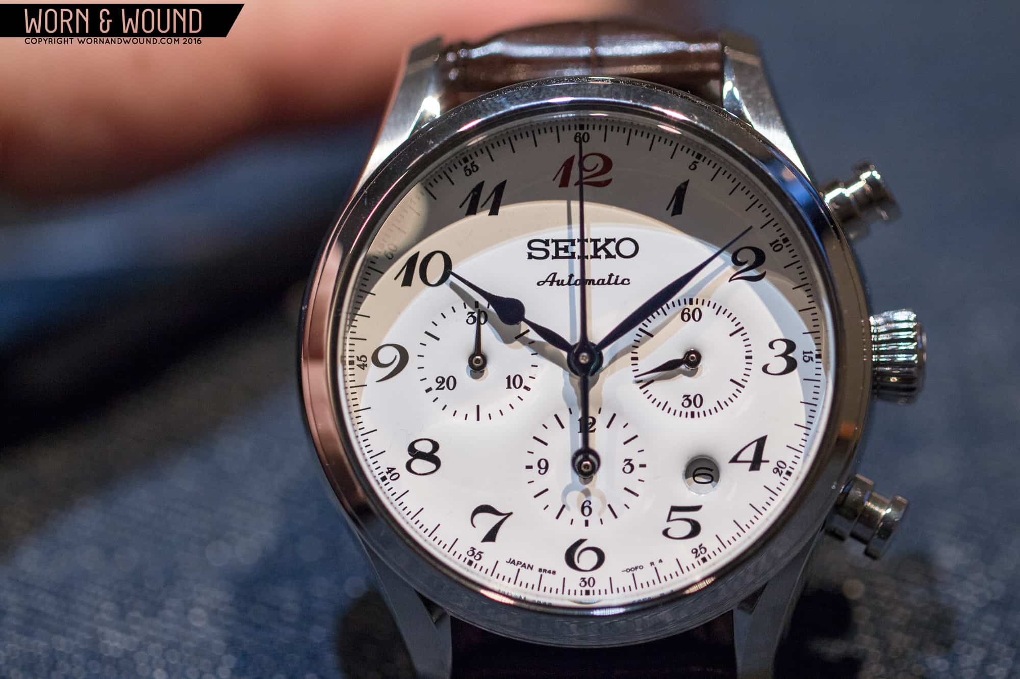
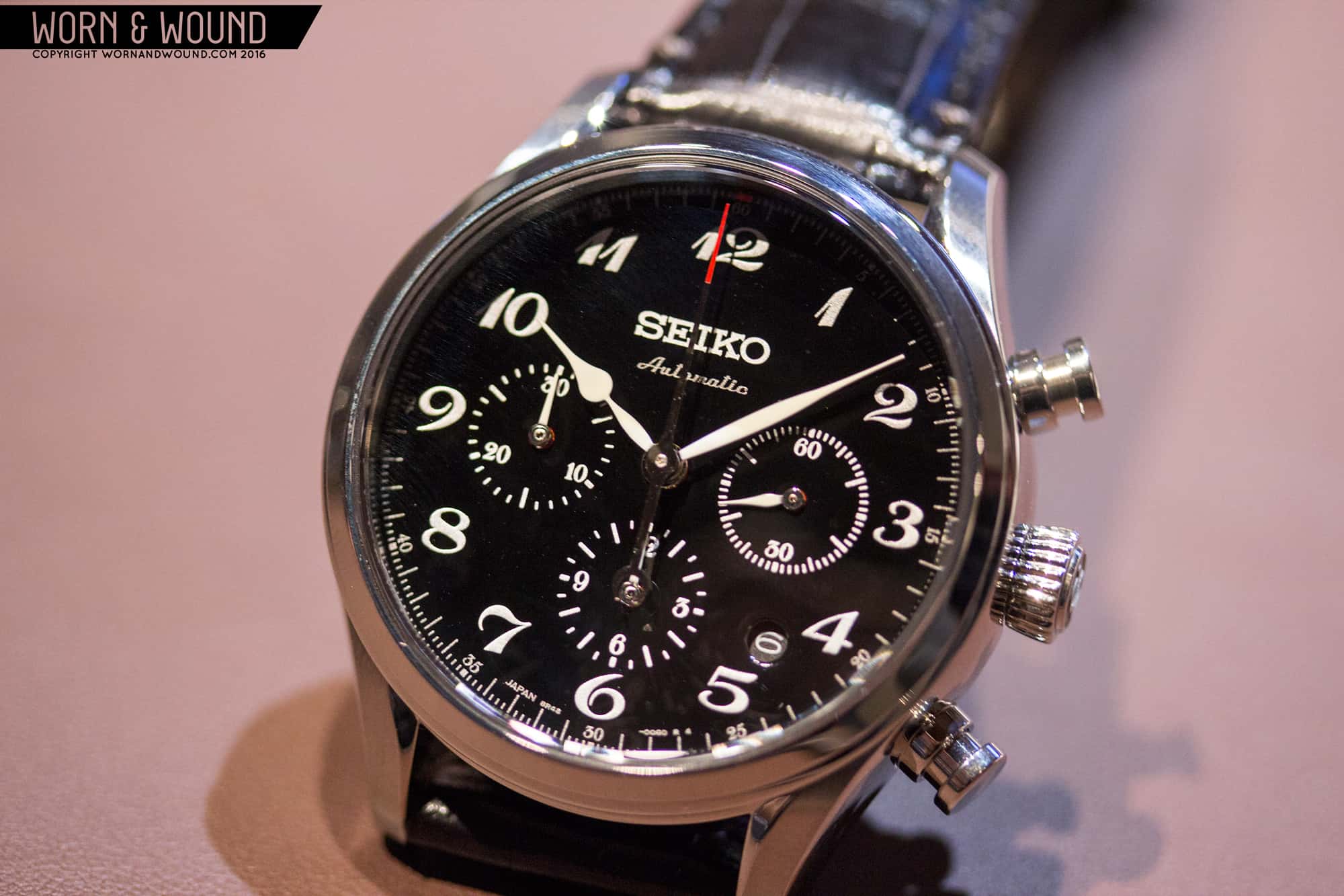
Man, this is a tough one. I could list a half dozen or more watches from this year’s Basel that deserve the prize. The Omega Globemaster, Bulova Moon Watch, the bronze Zodiac Seawolf and the stunning Oris Carl Brashear were all worthy, but in the end there could be only one- the Seiko Presage Limited Edition Chronograph. What a way to introduce a new line! Absolutely beautiful fit and finish, an extremely competent movement, and that dial… I’m not usually the turn-of-the-century design type, but here it just works. If it were a no-date I’d call it a perfect 10. As it sits, and at this price, I’d have to settle for a 9.7.
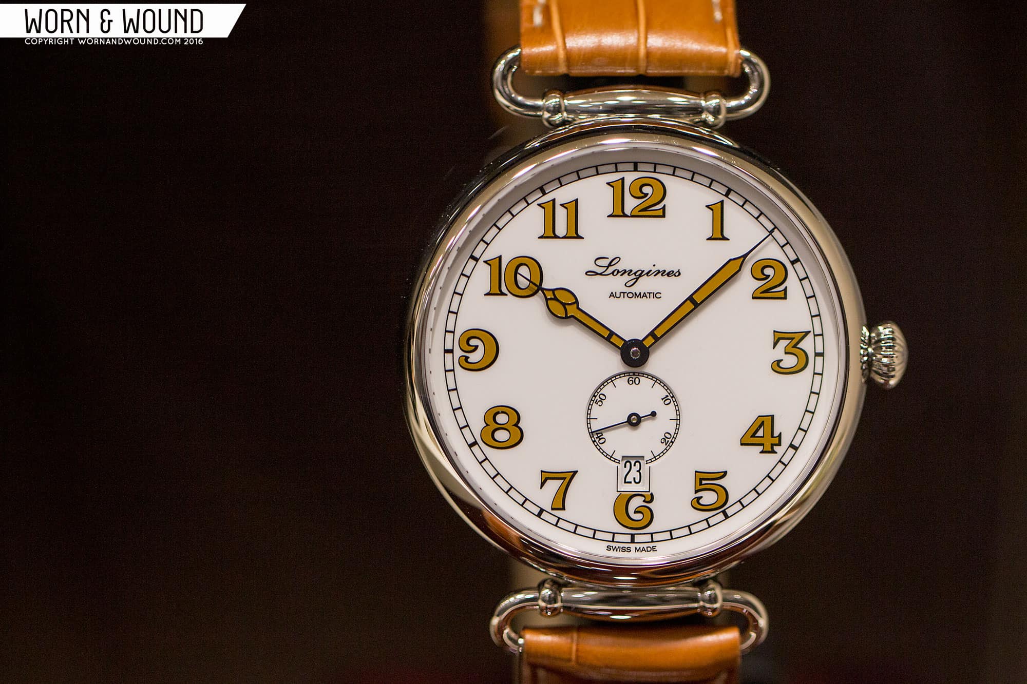
![SEIKO_PRESAGE_LE_CHRONO_8]() On the other side of the coin, it’s pretty easy to pick my least favorite. If you could describe the Longines Heritage 1918 in one word, it’d be “almost”. There’s so much that almost works about this piece, but falls flat right at the line. With a hand-wind movement and a no-date dial, this could really be something special. As it sits, it’s too thick, and the sub seconds dial is so undersized and visually off-balance it looks like a knockoff. Those lovely golden Art Nouveau numerals are broken, nay, butchered by that wide-set standard-ETA-movement date window! If one watch in the world shouldn’t have one, it’s this. That’s what really bothers me about this. It’s easy to pick on the truly awful, but when something so clearly shows promise and fails? That’s tragic. Please, Longines. It wouldn’t take much to make this one a winner.
On the other side of the coin, it’s pretty easy to pick my least favorite. If you could describe the Longines Heritage 1918 in one word, it’d be “almost”. There’s so much that almost works about this piece, but falls flat right at the line. With a hand-wind movement and a no-date dial, this could really be something special. As it sits, it’s too thick, and the sub seconds dial is so undersized and visually off-balance it looks like a knockoff. Those lovely golden Art Nouveau numerals are broken, nay, butchered by that wide-set standard-ETA-movement date window! If one watch in the world shouldn’t have one, it’s this. That’s what really bothers me about this. It’s easy to pick on the truly awful, but when something so clearly shows promise and fails? That’s tragic. Please, Longines. It wouldn’t take much to make this one a winner.
![LONGINES_HERITAGE_1918]() Li Wang
Li Wang
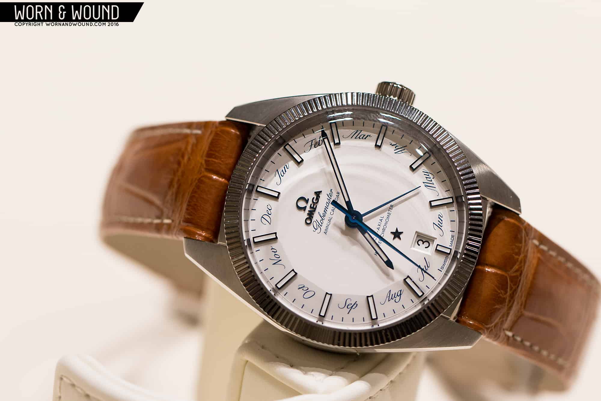
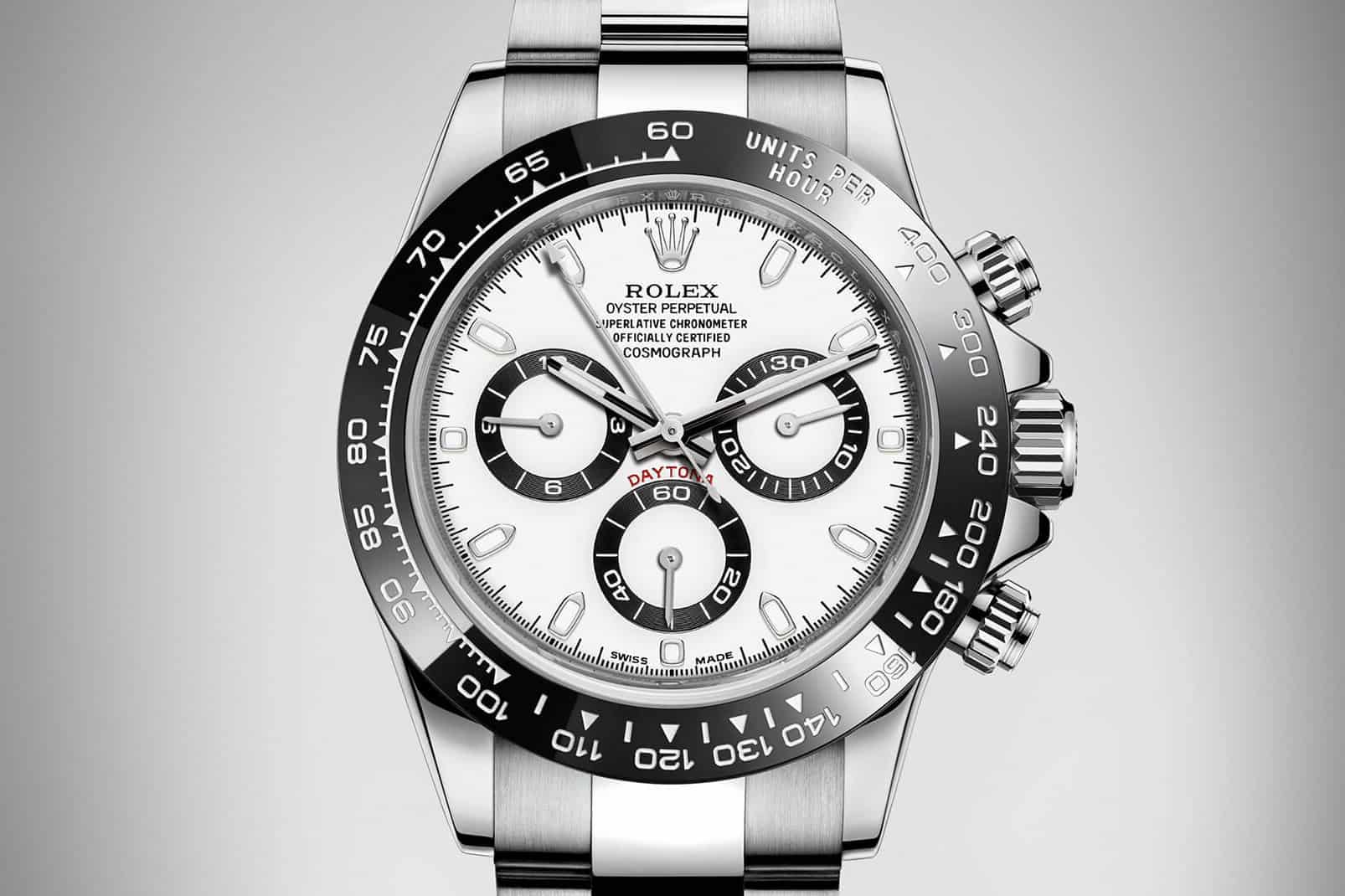
My favorite watch this year is not one I even desire (because I’d choose a Speedmaster Pro if I wanted chronograph), it’s one I’m choosing as fine example on how to modernize and update a without with losing the esthetic feel of its previous incarnations. The Rolex Cosmograph Daytona reference 116500LN in 904L steel works on every level as a modern chronograph. The ceramic bezel brightens up its looks and is a very tough material. The movement specs have been moved to tighter +2/-2 seconds a day standards and the case size is still around 40mm. Triple lock crowns and lacquer dial (black or white) are all subtle and sensible upgrades to a model that has not been updated in over a decade. Modern Rolex oyster bracelets are a pleasure to use and wear, so the entire package here is spot-on for its intended audience. I just like that there’s no odd case size jumps or drastic dial element changes or wacky colors. Other watch companies should look towards this 2016 Daytona as a model on how to modernize with restraint.
![ROLEX_COSMOGRAPH_DAYTONA_STEEL]() The watch I really didn’t like is the critically acclaimed 36mm version of the Tudor Black Bay. But why would you make a dive watch without a rotating bezel? It’s the watch equivalent of walking out the door without your pants on.
The watch I really didn’t like is the critically acclaimed 36mm version of the Tudor Black Bay. But why would you make a dive watch without a rotating bezel? It’s the watch equivalent of walking out the door without your pants on.
Mark McArthur-Christie
It’s that time of year again – the high (and low) lights of Baselworld. Always tough, since one man’s Horrorshow is another’s Haute Horlogerie. But here’s what I’d put on my wrist and what would go in the bin.
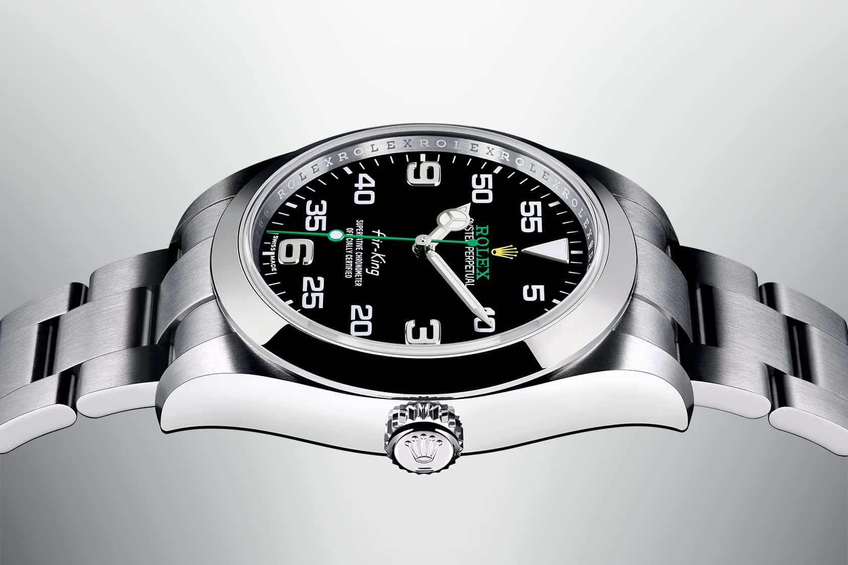
Loser: The new Rolex Air King
![Rolex-Air-King]() If you’ve ever woken in a cold sweat at 3am wondering what the illegitimate lovechild of a Rolex Explorer I and a tree frog would look like, you now have your answer. Technically, the Air King is an utterly beautiful watch – 904L stainless case, 3131 movement, protective Faraday cage. But the dial is carrying more fonts and colours than the lost library of Alexandria. That said, I’d buy one as an investment in a heartbeat – it’s the next 6541 Milgauss.
If you’ve ever woken in a cold sweat at 3am wondering what the illegitimate lovechild of a Rolex Explorer I and a tree frog would look like, you now have your answer. Technically, the Air King is an utterly beautiful watch – 904L stainless case, 3131 movement, protective Faraday cage. But the dial is carrying more fonts and colours than the lost library of Alexandria. That said, I’d buy one as an investment in a heartbeat – it’s the next 6541 Milgauss.
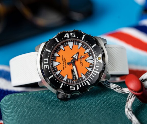
Winner: Seiko’s Presage SRQ019
I don’t know why I’m telling you this as there are only going to be 1,000 of these. And they won’t hang around when they go on sale in September for a daftly cheap €2,500 – €2,800.
![SEIKO_PRESAGE_LE_CHRONO_2]() What do you get? A watch that’s so gorgeous that you keep looking but can’t remember what the time was. Properly blued hands. A white vitreous grand feu enamel dial or a swimmably-deep Urushi lacquer one. Inside, Seiko’s own column wheel 8R48 movement with a 48 hour power reserve and running and 28,800bph.
What do you get? A watch that’s so gorgeous that you keep looking but can’t remember what the time was. Properly blued hands. A white vitreous grand feu enamel dial or a swimmably-deep Urushi lacquer one. Inside, Seiko’s own column wheel 8R48 movement with a 48 hour power reserve and running and 28,800bph.
September, remember? Race you.
Ilya Ryvin
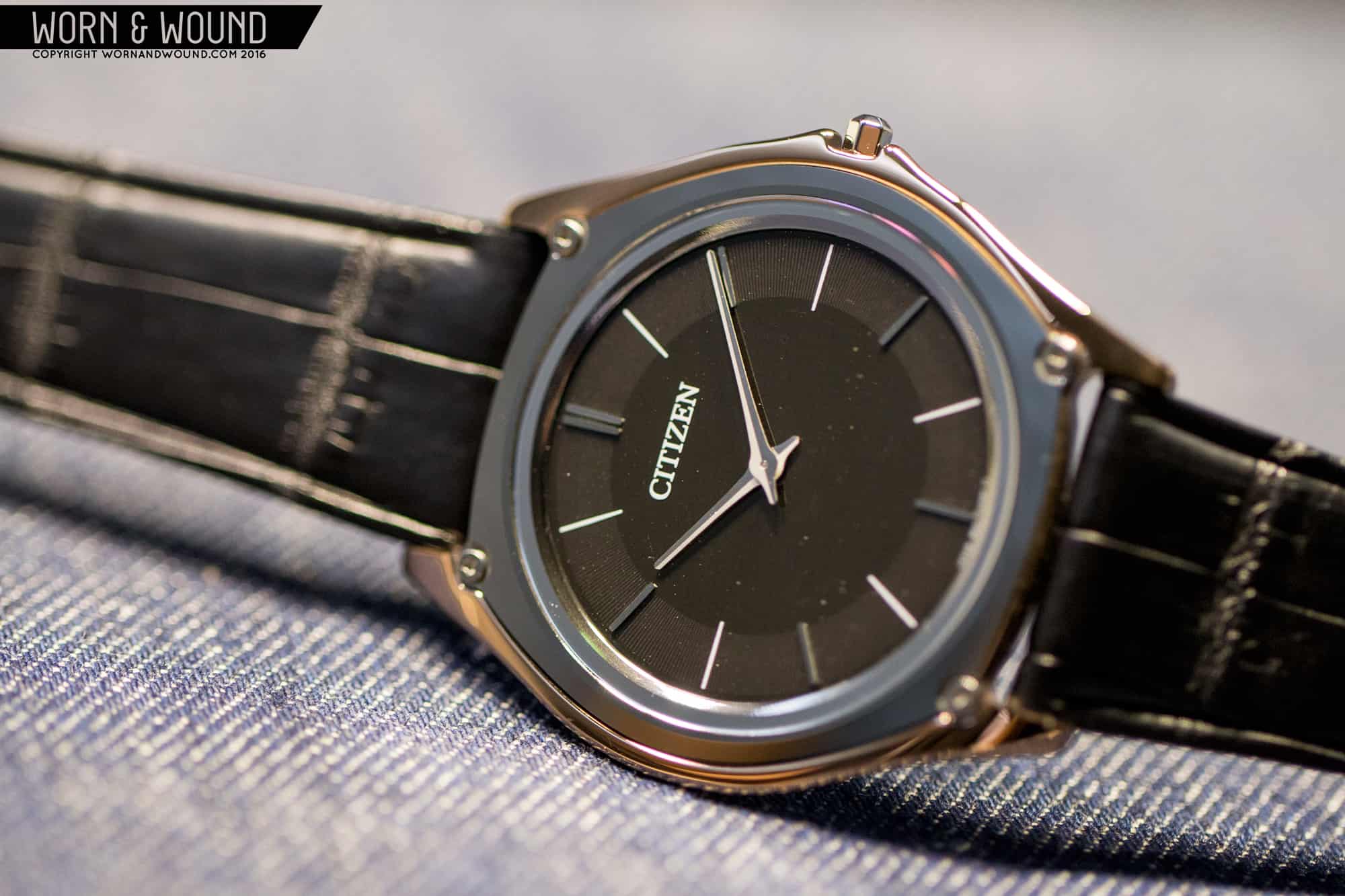
I am going to have to go with a watch that really surprised me this year: Citizen’s Eco-Drive One. Let me just get this out of the way—yes, it’s an expensive quartz watch, and at $6,000 (for the limited edition, $2,600 for the general release) it might be a pill that’s just too hard to swallow for most of the buying public. But of all the releases this year, this one really stayed with me, and it’s great to see a brand doing innovative things with quartz, and doing them unapologetically. At just a hair under 3mm thick, the Eco-Drive One is impossibly thin. But millimeters (or lack thereof) aside, it’s just a great looking watch. The LE is especially nice with the beautifully finished cermet case and tungsten carbide bezel, and I love the apparent Genta influence on the overall design.
![CITIZEN_ECO-DRIVE_ONE_3]() On the wrist, it really impressed. As much as I love the intricacy and inherent beauty of a mechanical movement, there is something fantastic about the “set it and forget it” approach of a light-powered quartz watch. Now, I can’t afford to drop that kind of coin anytime soon, and even if I had the cash I don’t know if I’d put my money where my mouth is. That said, Citizen will eventually democratize the tech and with it the price, so I am really excited to see what Citizen has in store.
On the wrist, it really impressed. As much as I love the intricacy and inherent beauty of a mechanical movement, there is something fantastic about the “set it and forget it” approach of a light-powered quartz watch. Now, I can’t afford to drop that kind of coin anytime soon, and even if I had the cash I don’t know if I’d put my money where my mouth is. That said, Citizen will eventually democratize the tech and with it the price, so I am really excited to see what Citizen has in store.
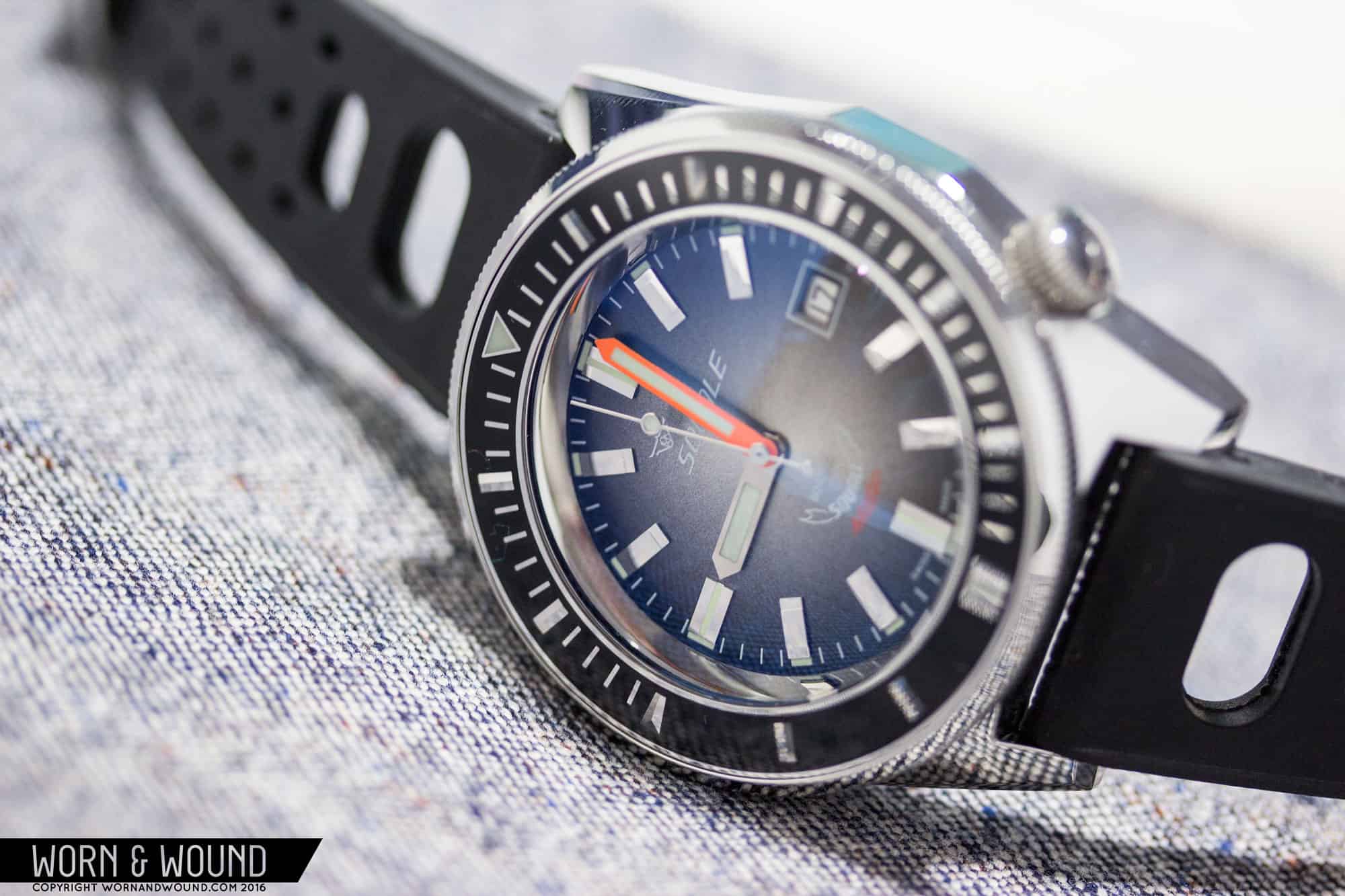
When I got wind that Tudor was releasing a 36mm sports watch, I thought, “Finally, they’re going to do right by the Ranger.” And then I saw the Black Bay 36. Boy, was I disappointed. Before I continue, I should confess that the Black Bays have always been hit or miss for me; some I like, some I don’t, but I nevertheless understand their appeal amongst the vast majority of watch lovers. The 36, however, feels almost uninspired by comparison. Tudor took one of their best sellers, scaled it down and removed the bezel, so unsurprisingly it looks like a tiny Black Bay with a missing bezel. I applaud Tudor having the guts to go small, but I really think they did it with the wrong watch. At 36mm, they could have released an appropriately sized Ranger and it would have absolutely killed.
![TUDOR_BLACKBAY_36]() It also nags me that the 36 is now the only Black Bay with an ETA movement. There is nothing wrong with using ETA movements, but Tudor has made a big deal of their measured transition to in-house. Does Tudor plan on releasing a new in-house Black Bay 36 next year like they did with the Pelagos and other Black Bay models? I know I wouldn’t take kindly to buying a watch, only to have an in-house version of it hit the market a year later.
It also nags me that the 36 is now the only Black Bay with an ETA movement. There is nothing wrong with using ETA movements, but Tudor has made a big deal of their measured transition to in-house. Does Tudor plan on releasing a new in-house Black Bay 36 next year like they did with the Pelagos and other Black Bay models? I know I wouldn’t take kindly to buying a watch, only to have an in-house version of it hit the market a year later.
Jon Gaffney
Picking my favorite watch from Basel World 2016 came down to two choices for me, the Tudor Heritage Black Bay 36mm and the Doxa Sub Anniversary Limited Edition. Both were spot on beautifully executed “heritage” models, but with very different looks and historical pedigree. In the end I have to choose the Tudor Heritage Black Bay 36mm as my favorite though. While it didn’t inherit the in-house movement that the rest of the Black Bay line did at Basel this year, I think the 36mm still outshined them all. The whole package is pretty perfect. While some might say that 36mm is too small, I think with the lack of rotating bezel and maxi indices that it will wear larger that its dimensions. For many people this could fulfill that mythical “one watch” role with 150m water resistance and looks to pair easily with a suit or hiking equipment. It’s refreshing to see a brand taking risks in restraint versus a splash.
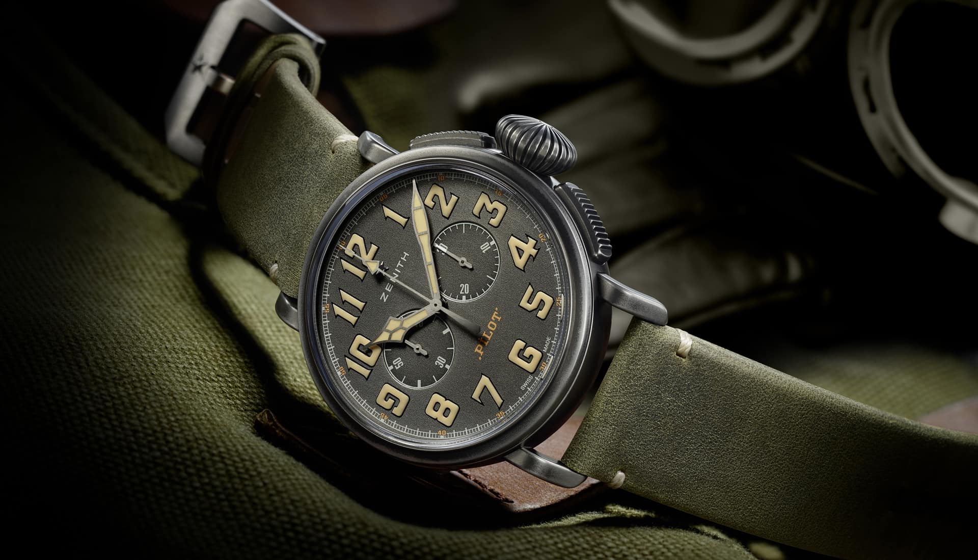
![ZENITH_PILOT_CAFE-RACER]() For my least favorite watch, the Zenith Pilot Café Racer is an easy pick. I really didn’t find it to work on any level to my eye. It seems like a watch confused as to what it wants to do. While large, big crowned pilot’s watches have storied history, mashed up with the steampunk aesthetic is seems overly busy and kitschy. Functionally at 45mm and with a massive crown, I think it would be unwieldy to wear while riding the café racers that inspired it. Zenith has had plenty of wins in their history, but you can never win them all and the Pilot Café Racer is a clear loss in my book.
For my least favorite watch, the Zenith Pilot Café Racer is an easy pick. I really didn’t find it to work on any level to my eye. It seems like a watch confused as to what it wants to do. While large, big crowned pilot’s watches have storied history, mashed up with the steampunk aesthetic is seems overly busy and kitschy. Functionally at 45mm and with a massive crown, I think it would be unwieldy to wear while riding the café racers that inspired it. Zenith has had plenty of wins in their history, but you can never win them all and the Pilot Café Racer is a clear loss in my book.


 Featured Videos