That’s right, it’s time for Panda Dials, PT 2, (PT 1 was last week) so let’s get right to it.
Seiko 6138-8020
No watch collection should be without at least one Seiko 6138 and/or 6139. I don’t care if your daily wear is a Richard Mille or a Rolex Mil-Sub, the 6138’s and 9’s are just so enjoyable to wear that one is missing out by not having one. They also are so varied in their styling that everyone should be able to find a design that suits them; a 6139-6002 “Pogue” for those who want something colorful, or a 6138-0030 “Kakume” for those who want something very 70’s, or a 6138-8039 “John Player Special” for those with an interest in racing, or a… the list can go on.
And for those who seek a Panda dial, the 6138-8020 is the way to go. The only “vertical” Panda in the group, the 6138’s sub-dials are at 12 and 6 for the hour and minute registers, respectively. That does throw the Panda-ness a bit, but we’ll excuse that as it’s such a gorgeous watch. Much like the Hamilton Chrono-matic, the 8020 features a light dial surface, black sub-dials and is encircled by a black tachymeter chapter ring. There are no numerals on the main dial, just applied markers with black strips and lume dots, skipping 12, 3, 6 and 9. Everything lines up perfectly for a very balanced feel with the sub-dials just touching the seconds index, and the date and logos canceling each other out.
One interesting thing to note is that the dial isn’t quite white. Instead, it’s a very pale silver with vertical brushing. This gives it a bit more depth and texture than a matte white would have, and adds to the sleek sportiness of the watch. My favorite feature, however, are the hands. The hour and minute are black syringe shapes, with thin slots of lume. They’re not particularly wild or unique, they just work very well with the watch’s design. The seconds hand is then a tapering stick in black with a red tip. The only color on the dial, the small dash of red adds just a little excitement.
With a 41mm case, the 8020 is a great size for sporty chronograph, coming in actually a bit smaller than many of the other, chunkier 6138s. Additionally, the case design is a bit more classic than some of the other 6138s but still reads thoroughly as a Seiko. These are a great option for a vintage Panda that wont cost too much (should be under $500), as well as one that will wear a bit more modern.
For more on 6138s check out this great reference guide by WUS user freemind1
Omega Speedmaster 3569.31 / Mitsukoshi
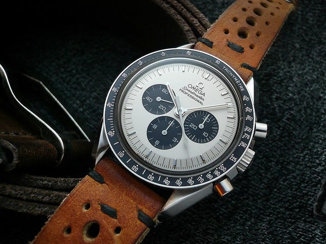
What happens when you take one of the most iconic watches, let alone chronographs, ever and give it a Panda makeover? You get an instant cult classic. Such was the case with the Omega Speedmaster Mitsukoshi, a Japanese market limited edition from 2003. Made for the Mitsukoshi department stores, the edition of 300 was gone fast and has become an incredibly rare and collectible watch…it’s also become a highly “faked” watch, with people modding existing standard Speedmasters with new Panda dials. While I’m totally for modding your watch, it just means that one must be very careful of “Mitsukoshis” for sale (image featured is from a modded Speedy by Heuerville).
With that said, a year following the success of the Mitsukoshi, Omega smartly released a more obtainable Panda with the Speedmaster 3569.31 Apollo 11 35th Anniversary edition. Still limited to 3,500 pieces, the 3569.31 had a nearly identical dial, and is still something you can find today.
Looking at the dial, it’s all white/silver with black sub-dials at 3, 6 and 9, as to be expected. In a slightly odd move, Omega used polished applied batons as hour markers instead of the more classic printed lume rectangles. Obviously the lume would have been lost against the white here, but a black or a black-outlined rectangle would have been the expected design. As is, they put small lume dots at the outside edge of each marker. Additionally they used an applied Omega logo, throwing back to the 60’s models. The clearest difference between the Mitsukoshi and the 3569.31 is the addition of red text reading “July 20, 1969” just below the logo.
While the iconic Speedy design is all matte black, the Panda dial options were a interesting twist on the look. Sure, if you were to only get one Speedy Pro (lol), a classic or vintage model would be the correct choice, but for those who crave a Speedy and the high contrast beauty of a Panda, the 3569.31 is a reasonable option. Unlike some of the other watches listed, the Panda design here gives the watch an almost dressier feel. It brings out the pie pan shape of the slightly metallic surface, which in addition to the polished markers, gives everything a glossy sheen. Definitely less a tool watch than the original, but appealing nevertheless.
Heuer Autavia ref 1163T “Jo Siffert”
If the Rolex Paul Newman Daytona is the King of the Pandas, the Jo Siffert Autavia is the crown prince. Released in 1969 the Caliber 11/12 third-generation Autavias took the rotating bezels and aggressive demeanor of the early Autavias, and put them into a now iconic 42mm barrel case. While the Carreras of the 60’s were elegant and reserved gentlemen’s sport watches, the Autavia was an all out beast; an accessory to the race cars its owner’s were meant to drive.
Thus, it’s only natural that drivers took a shine to it, and in the case of the 1163T, was adopted by F1 star Jo Siffert. The 1163T is easily identified by its mix of white and black Panda dial, with highlights of beautiful, royal blue. As was the trend in the day, the dial featured applied faceted markers with lume on their outer edges for the hours, circled by an index of thin black lines for the minutes and chrono-seconds. At intervals of 5, there are thicker blue lines that extend from the hour markers to the case edge.
The two large sub-dials at 3 and 9 tell the elapsed minutes and hours, respectively, and once again contain the only numerals on the dial. At 6 is a date window with a beveled, applied border showing a black date on a white disk. Heuer’s hands have always struck me as some of the nicest ever used on sport watches. They had a tendency to use them as a pop of color, adding contrast to their dials. The fence post hands found on the Siffert are thick, with a bisecting line that starts as blue, then becomes a thin strip of lume, ending in a triangle of blue as well. The chrono-seconds is then a tapering needle in solid blue. The vein of blue that runs through the hands brings out the blue in the dial and ties everything together. While a Panda dial at heart, the blue definitely gives it a more energetic feel.
Heuer Autavia 1163T Sifferts are very rare and go for quite a bit of money, so like the Daytona, these are put on the grail shelf. Luckily other Autavias of the same era go for far less, though they lack the Panda coloring.
Photos by our friends at analog/shift
Longines Heritage 1973
One of the few Panda dials currently available on the market also happens to be one of my favorite watches I’ve reviewed in the last couple of years: the Longines Heritage 1973. Now, perhaps I loved it because it was a Panda, or perhaps it’s because it simply looked like a watch from the 60’s/70’s made anew (as you might have sensed from this guide, I have a thing for that era), but no matter what, the 1973 is a hell of a chronograph, and one you can actually obtain.
The dial of the 1973 is very similar to the original watch, with black sub-dials at 3 and 9, applied markers for the hours, an minutes/seconds index with an alternating “racing” design, all circled by a blue tachymeter. The one big change from the original is the inclusion of an hour register at 6, which has been cleverly downplayed. Instead of being black, indented and textured like the other sub-dials, it’s simply the index printed on the white surface of the dial. Thus, at a glance or from a distance, the watch has the classic two-register look. The subtle use of blue on the dial is a great touch (on the original as well) as it helps distinguish the tachymeter from the other index, and adds just enough color to make things more interesting. That said, it’s not nearly so blue as to feel like a Siffert wannabe.
While the dial is the star of the show, the case of the 1973 really sets it apart from modern offerings. The cushion case takes cues from their Conquest watch, which shared a case with the Heuer Camaro. It’s a very distinct design that mixes dress and sport beautifully. On the 1973 the case has been upped from the original 37 to a more modern, but still tame 40mm. This is partially due to the larger automatic chronograph inside, but also simply Longines making it more accessible to a modern market. While increasing a case size often backfires, here it works very well. The short, stout case wears perfectly at 40mm, and has ample room for finishing, which has been very well executed.
With a street price of around $2,500, the Longines Heritage 1973 is a great watch for those looking for a modern mechanical chronograph with a distinctly vintage look and feel. While the price isn’t cheap, the watch is powered by an automatic column-wheel chronograph you wont find offered by other brands.
Universal Geneve Compax “Nina Rindt”
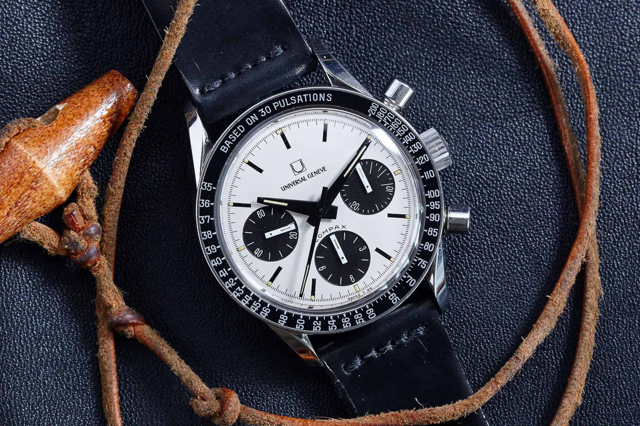
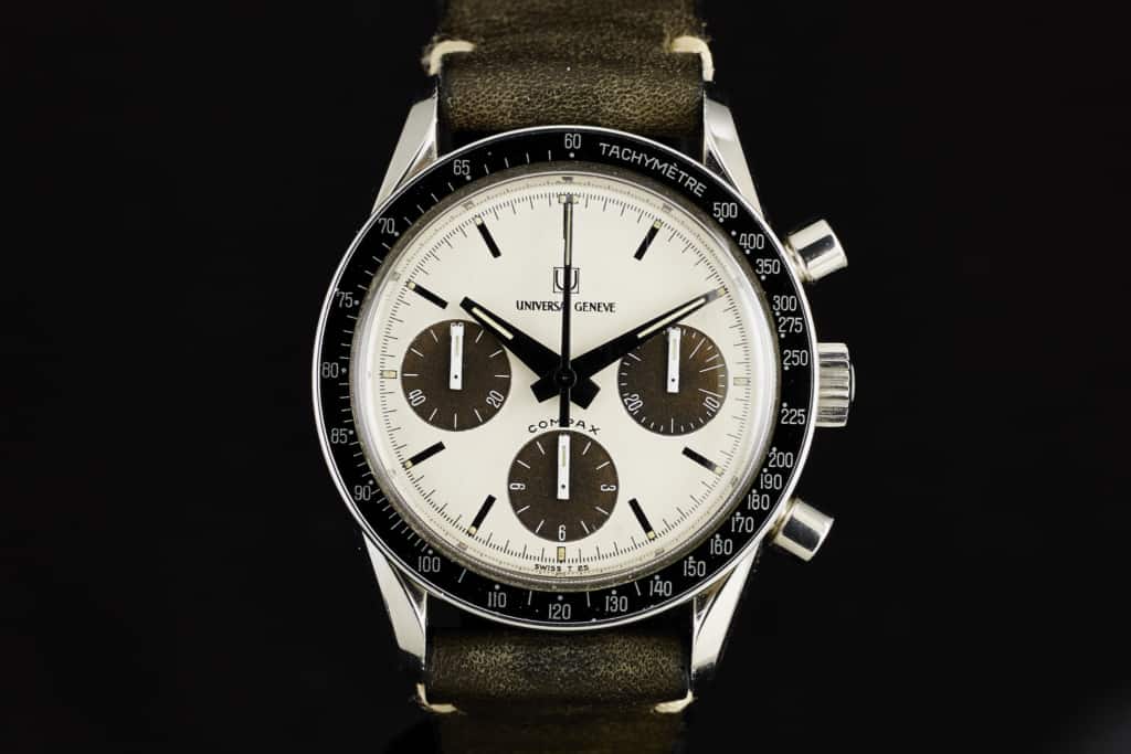
If you took many of the watches mentioned in the parts 1 and 2 of this guide and mixed them together into a perfect hybrid of sorts, you’d have the Universal Geneve Compax “Nina Rindt”. Named after the wife of racing legend (and Autavia wearer) Jochen Rindt, who was seen wearing the watch, the Panda UG Compax is a watch of near indescribable perfection. A fact collectors are all too aware of, as these went from rare, fairly unknown and trading for a few thousand to highly desirable hen’s teeth that can break the $20k point.
I’ve had the immeasurable luck to have seen a few in person, as well as some of the other dial varieties in the series, and it leaves a lasting impression. As said, it has elements that speak to a lot of different watches but was an all original concept with some great design details that were utterly unique. The bombé lugs and bezel speak to the Speedmaster, but UG had those lugs on their Polerouters, which date to the 50’s, and the bezel was a pretty generic style as well, and suggests that they had the same supplier. Also, the UG is much smaller at 36mm.
The movement is the Valjoux 72, a widely used manual chronograph that one would also find in Paul Newman Daytonas as well as Heuer Carreras. The “Compax” over the hour register also brings the Daytona to mind, but a quick look at UG’s tri-compax and aero-compax chronos from the 40’s and 50’s will show this is something they had done for some time. The dial then also features long black rectangles of a similar width and length as those found on the Hamilton Chrono-Matic, which could indicate they were made by the same dial house.
Regardless of similarities, the UG Compax has a personality all its own. Looking at the sub-dials, the index design is particularly striking, and in my book, the best use of typography on a watch in this guide. The numbers are in a gorgeous, thin, Germanic typeface, and rotate about the index with the markers. The numbers are perfectly integrated with the index, particularly on the hour register, where the beautiful, compact 3, 6, 9 and 12 effortlessly fit between the long white lines they alternate with. In person, this is all very small, but noticeably gives the watch a more cohesive design.
The hand set is really intense for such a small watch, and simply just awesome. The hour and minute are wide and blocky shapes that taper towards the edge of the dial. They are gloss lacquer black with small slits of lume. The seconds hand matches the set, but is much thinner. This appears to be the same handset that is on the UG Space Compax as well, which is basically a mix of this watch and the Polerouter Sub. Unlike nearly every other watch mentioned in both parts of this guide, the sub-dial hands are not simple stick hands! Nope, they are chunky rectangular blocks. They are so cool. Simple, bold, they play off of the thin typeface of the sub-dials through contrast, and as the saying goes, tie the room together. It’s these little details that finesse the Nina Rindt over the top. Dare I say, this is the Queen of the Pandas?
Universal Geneve Compax “Nina Rindt” photos by analog/shift
—
…and that’s that for our PT 2 of our guide to Panda Dials. With the classic black on white version taken care of, it’s time to take a look at their mirror image, the inverse Panda in PT 3.




 Featured Videos


