It seems like it was just yesterday that I first saw a Farer in person. Stylish, beautifully finished, and a touch playful, the Barnato GMT (quartz) left an impression. In particular, the well-proportioned case and deft use of color spoke to a design sensibility that was beyond the brand’s years. In reality, it has been a little under two years since that time, but in those two years the brand has gone from one that piqued our interest, to one of the most dynamic that we regularly cover on Worn & Wound.
37mm with style to spare
Since then they’ve released three lines of mechanical watches, starting with a family of three-handers, then jumping over to GMTs, and finally dipping into the water with a line of true compressor-cased dive watches. Today, I’m excited to show you Farer’s fourth mechanical release in two years and their first series of hand wound watches.
Featuring 37-millimeter cushion cases and ETA (Peseux) 7001 movements, these new watches are thin, sophisticated, and feature the brand’s most ambitious dials to date. As per usual for Farer, there are three models within the line, though they are essentially three totally different watches. There’s the Lansdell, with its green and steel sandwich dial of sorts; the Hudson, with a metallic blue/green dial and large indexes; and the Stanhope, which we’ll be taking a look at today. They are quite distinct from one another, though a certain mid-century automotive flair is present in each. Still designed in Britain and manufactured in Switzerland, the Farer 37-millimeter Hand Wound series will come with a price tag of $1,175.
Advertisement
$1175
Farer Stanhope: Exclusive First Review
Case
Steel
Movement
ETA/Peseux 7001
Dial
Black/White
Lume
Yes
Lens
Sapphire
Strap
Leather
Water Resistance
5ATM
Dimensions
37 x 38.5mm
Thickness
8.5mm
Lug Width
20mm
Crown
Push/Pull
Warranty
Yes
Price
$1175
Case and Movement
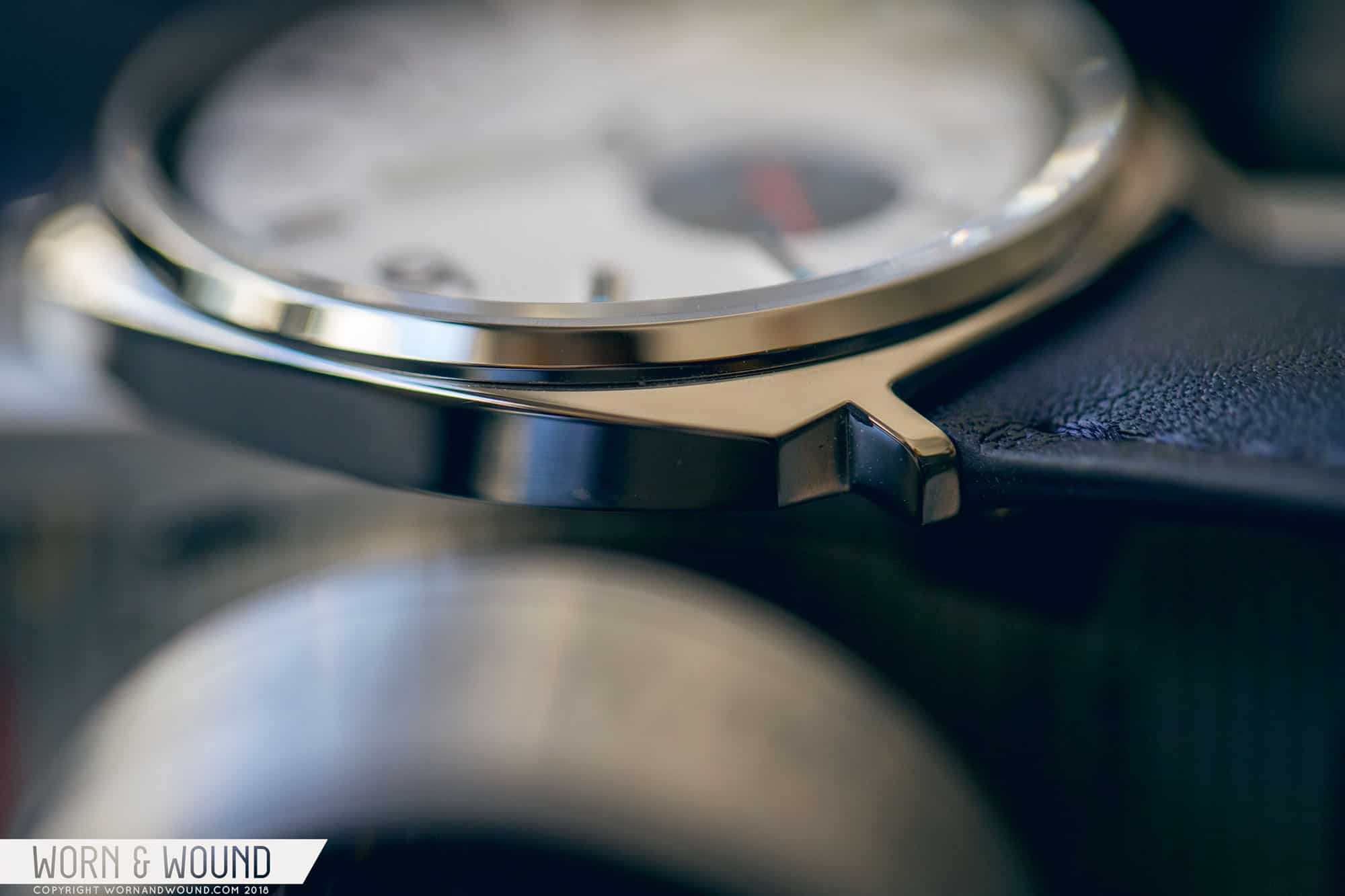
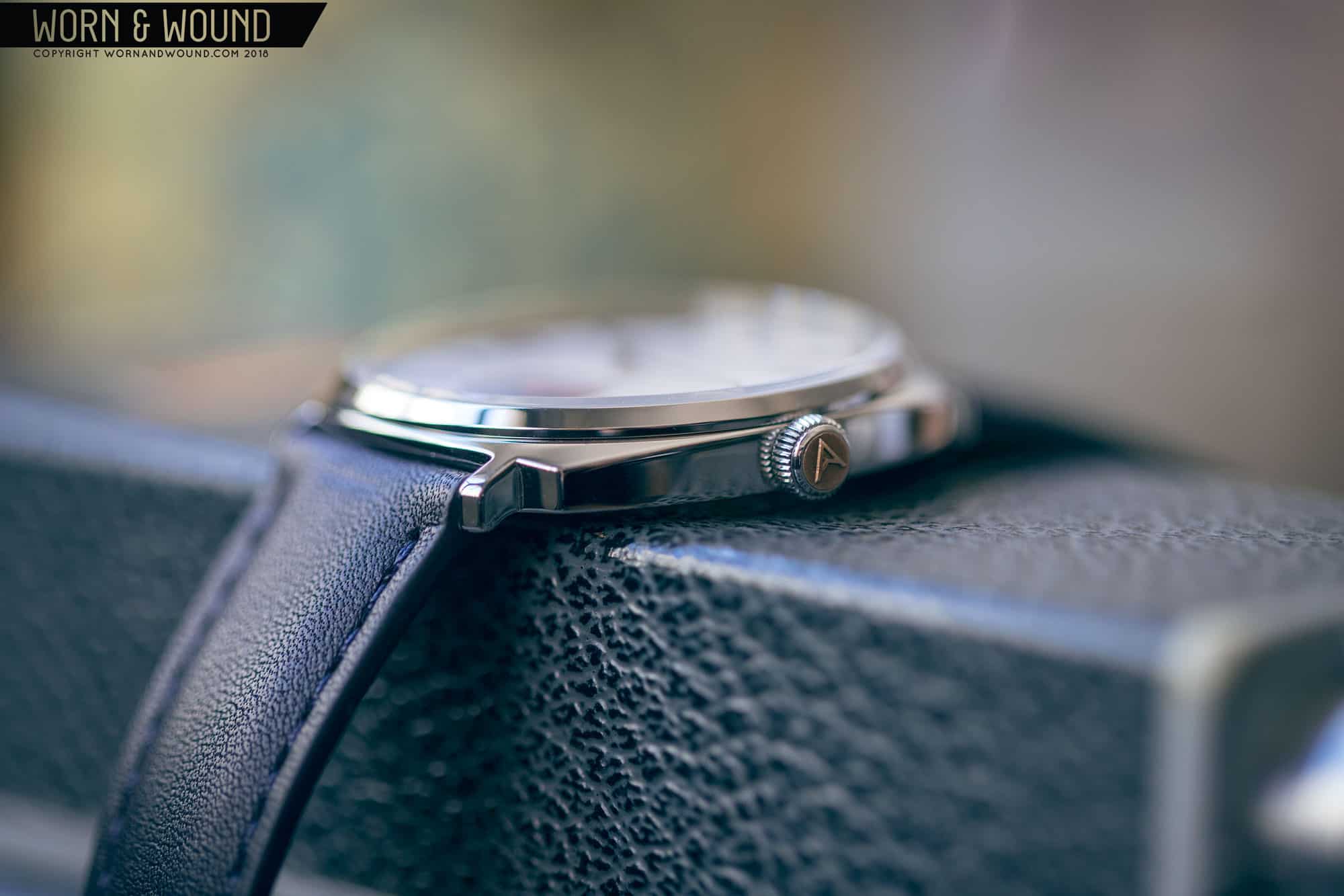
The common elements between the three watches are the case and the hand wound movement within. Starting with the former, Farer outdid themselves with this new cushion design. Measuring 37 millimeters by 38.5 millimeters, the watch sounds small, but it actually has a large visual impact. The cushion shape extends the metal out, giving it more substance to the eye and therefore it reads larger. Simultaneously, the bezel is super thin and allows for a 34-millimeter dial opening, which gives it that “all dial” look on the wrist.
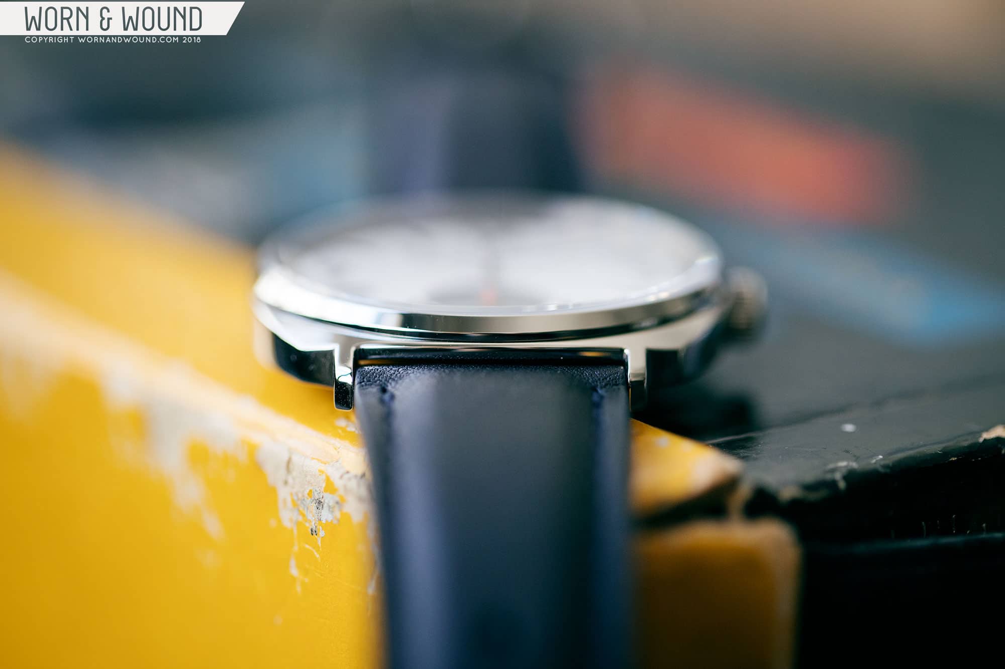
Thanks to the hand wound movement inside, the watch is also super thin at just 8.5 millimeters to the top of a domed sapphire crystal. That’s thin to begin with, but the watch actually looks and feels a bit thinner as the mid-case only measures about 5 millimeters, and the case back is almost completely flat and flush. The result is a very svelte watch that rides low.
slim as can be
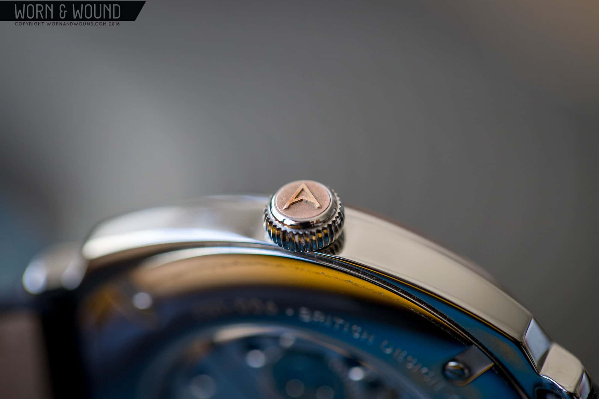
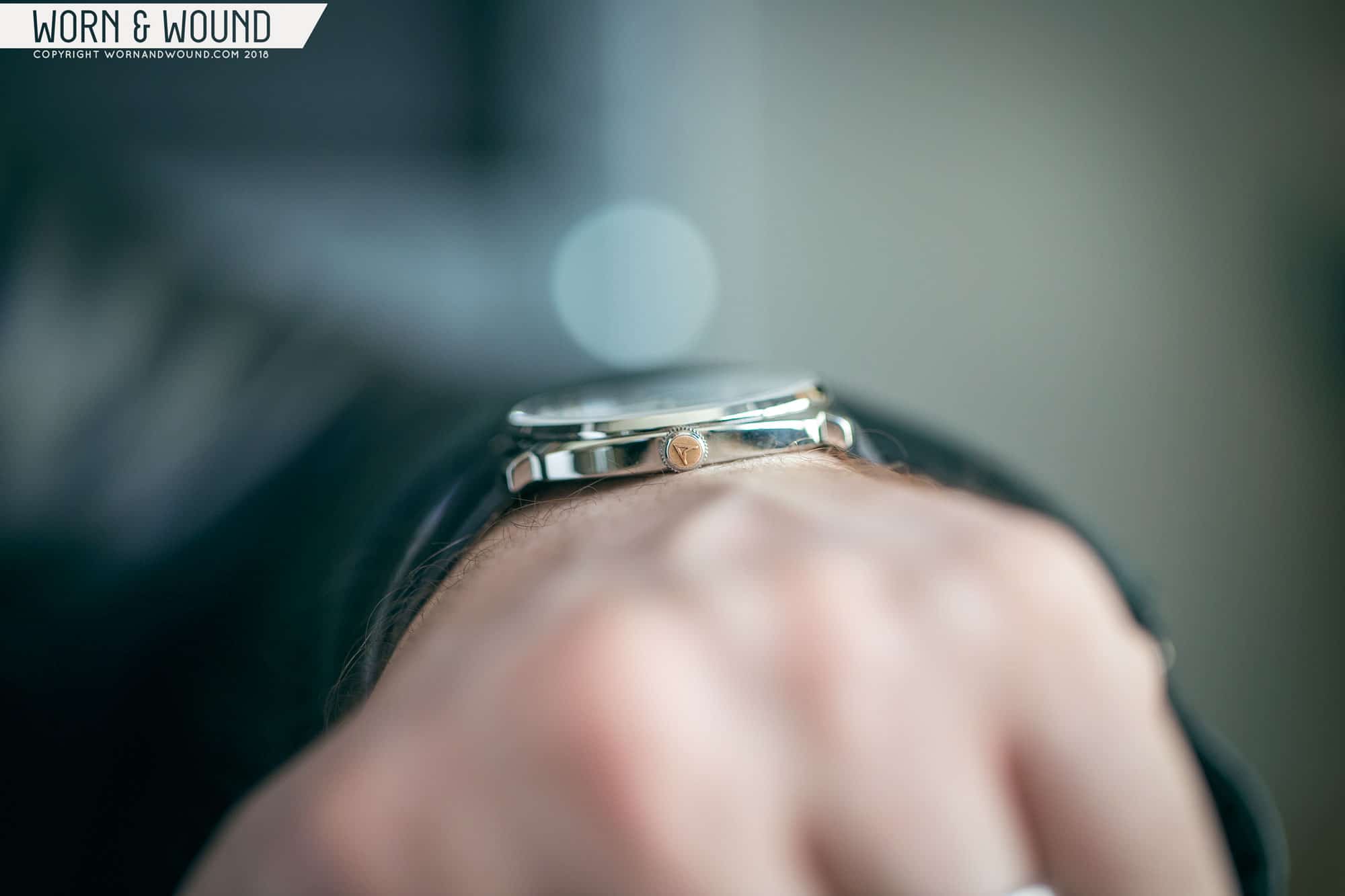
One point of contention with previous Farers was the contrast bronze crown. I’ve always been in favor of them, as I felt they added some easily identifiable branding to the design, as well as some unique visual contrast. For the 37-millimeter Hand Wounds, Farer found a cool compromise that I think will be a crowd pelaser. The crown is a steel onion with a bronze plug in the end featuring Farer’s “A” logo. This way the crown appears steel, yet it still has a touch of one of Farer’s signature concepts. It will also patina, which is a cool detail. Visual impact aside, Farer has explained that because this is a hand wound watch, they felt steel would be a better choice for regular skin contact.
Bronze capped crown
The ETA/Peseux 7001
Thin mid-case
Not too shabby
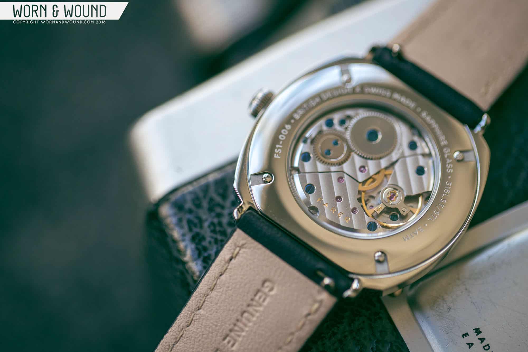
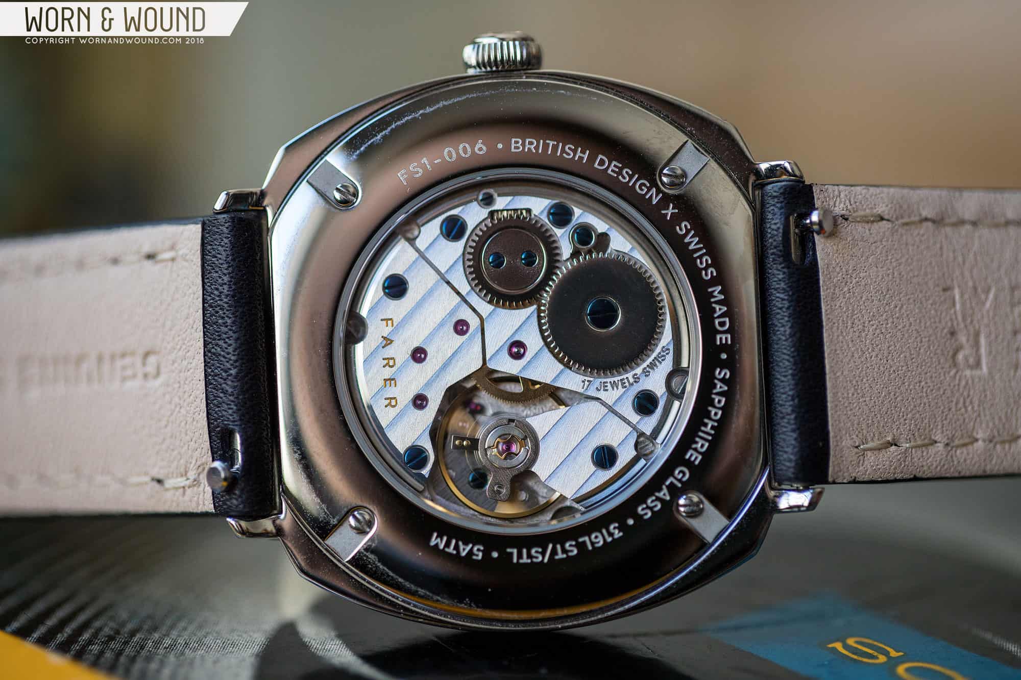
Flipping the watch over you’ll find a display case back held on by four screws. Here you’ll find sparse details on the watch—just the basics—and a window through which you can enjoy the ETA 7001 movement. This small, slim caliber is featured in many manual wound watches of a smaller stature, and it’s a pleasure to look at. Decorated with Geneva Stripes and blued screws, this 17-jewel movement has a power reserve of 42 hours and frequency of 21,600 bph, which translates to a smooth sweep on the small seconds hand at six. For an in-depth history of this movement, head here: Caliber Spec: Peseux/ETA 7001.
All in all, it’s a beautiful case and a refreshing design. Sure, cushion cases are nothing new, but they are uncommon, and the usage here in a small time-only hand wound watch is unique. The proportions are spot on, the machining is beyond reproach, and it’s just so wonderfully thin. Given the similarities on paper, I can’t help but think a bit of Nomos when I put this watch on. Our reverence for the German brand is well established, and I find this design from Farer to be right up there with them.
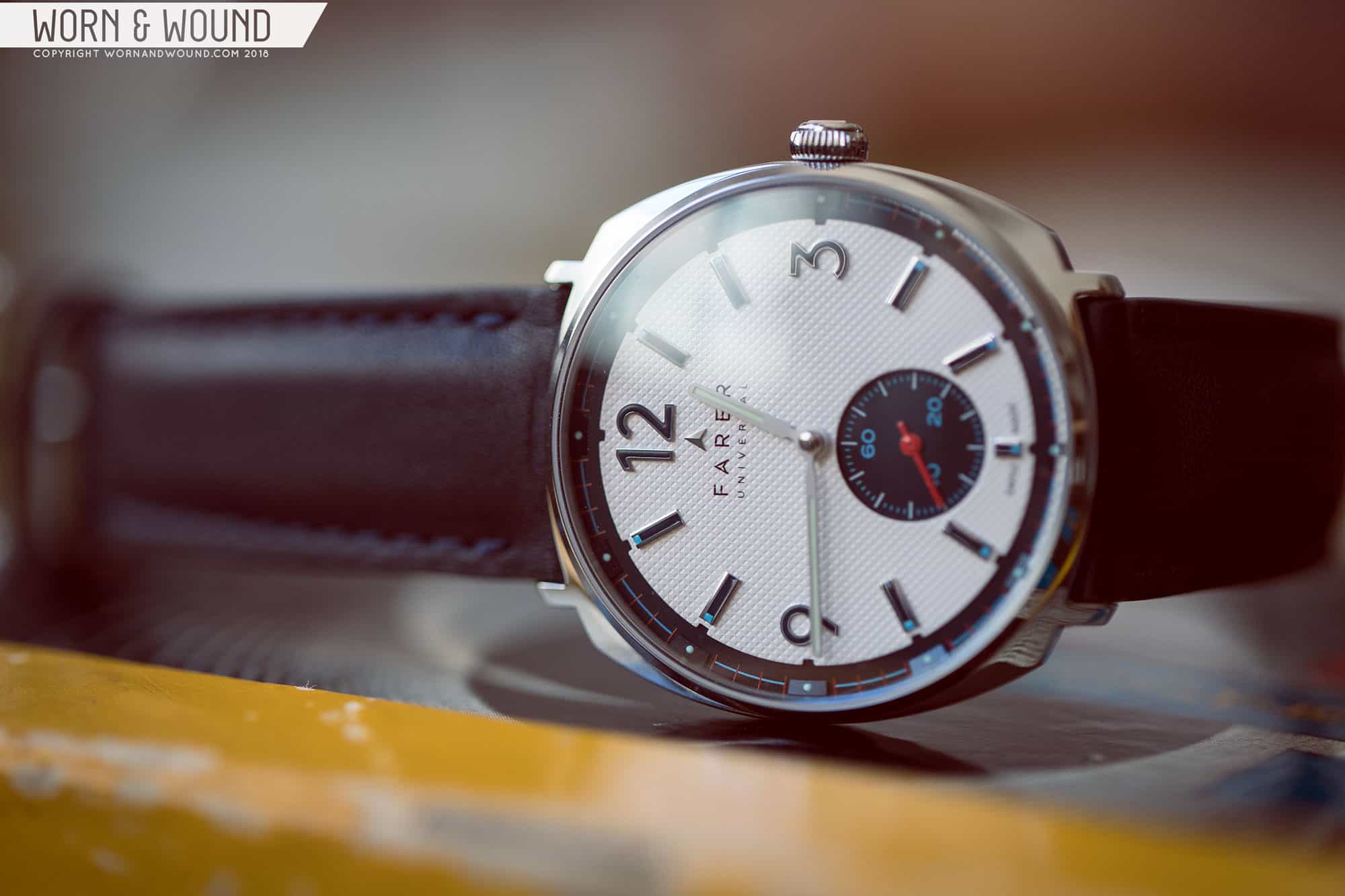
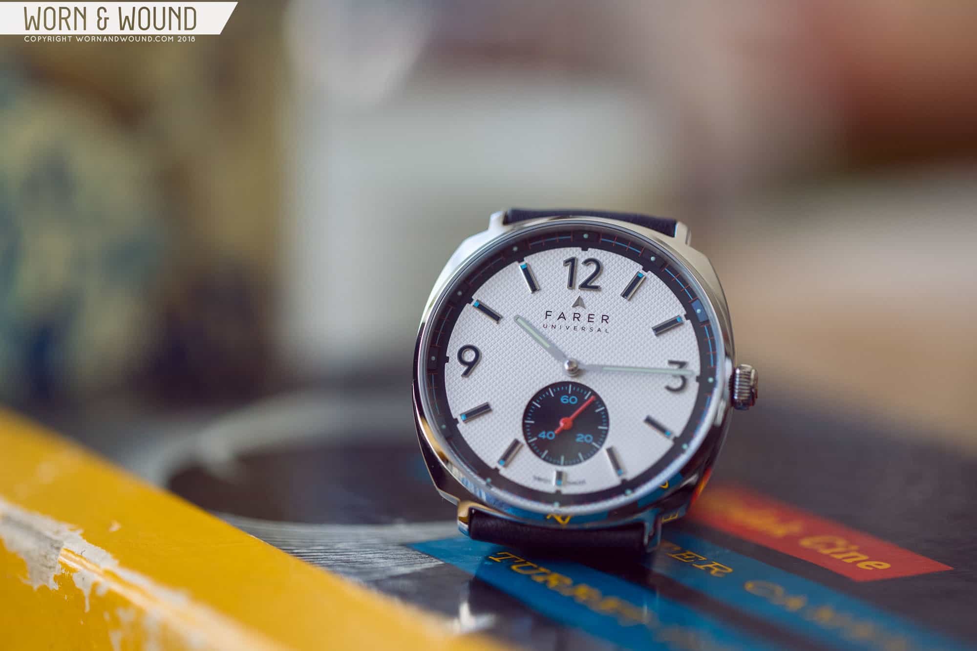
Dial
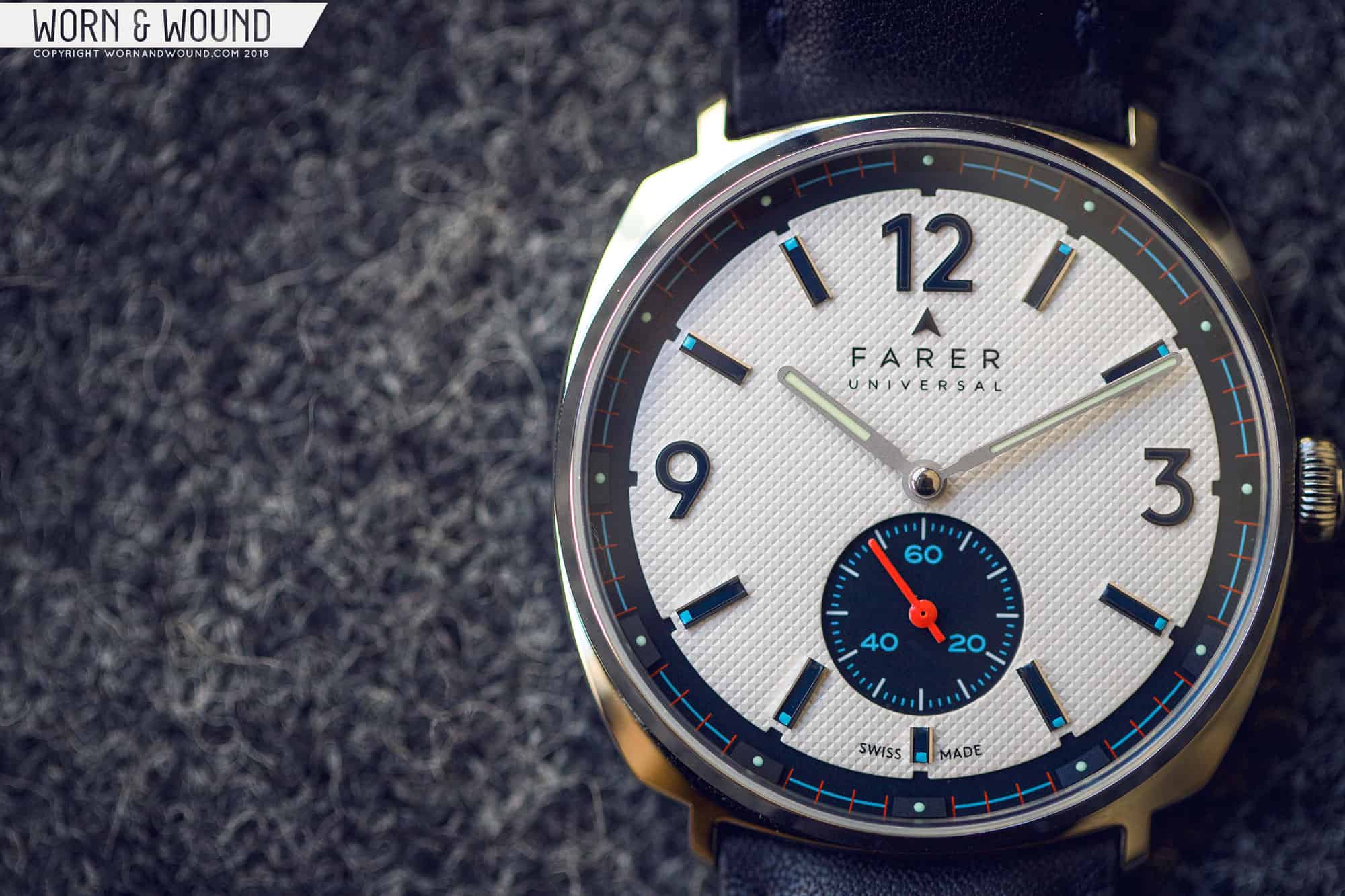
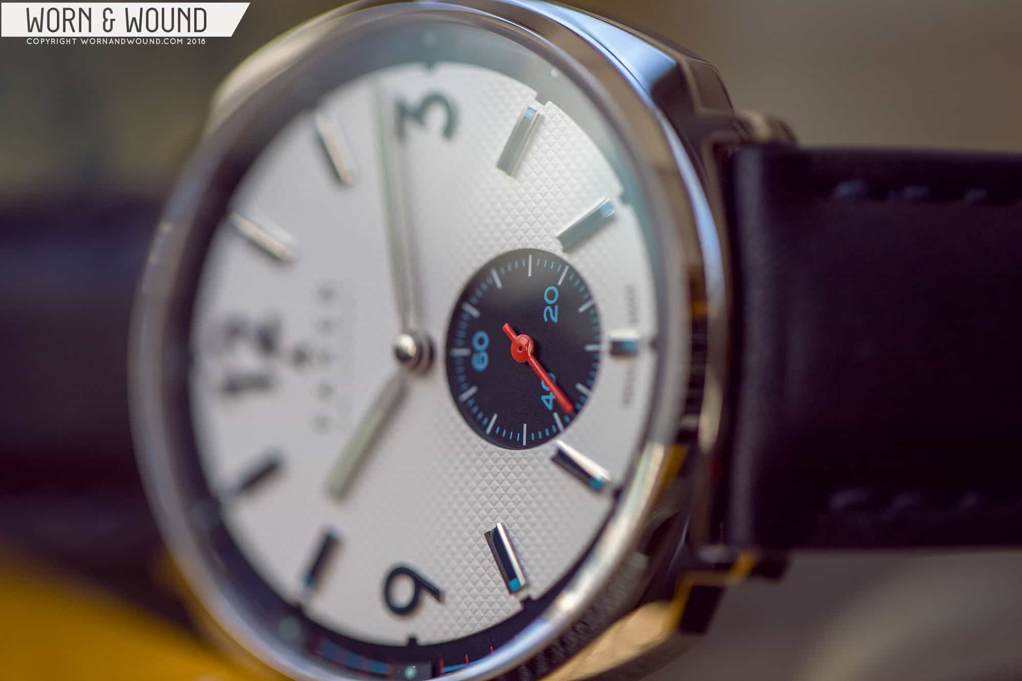
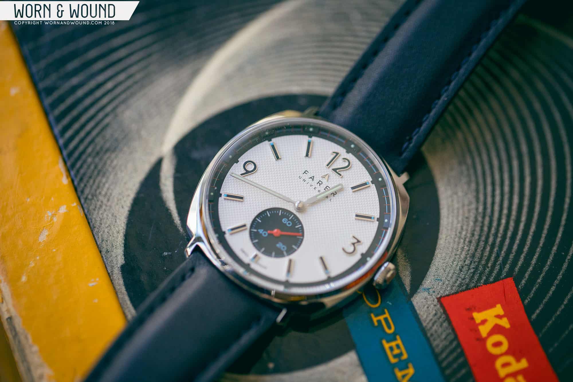
The clean elegance of the case gives way to tamed complexity for the dial. Dials are definitely where Farer is making their mark (I still can’t shake the Lander from my mind), and with the Stanhope (as well as the watches in the series) they have pushed themselves (and their vendors) much further. The Stanhope features, by my count, at least two layers, 24 applied markers, one striking texture, and multiple over prints. It sounds like a lot, and the dial isn’t lacking in activity, but it works out well.
The dial consists of two main layers, a lower area of black that serves as the base of the dial and canvas for the chapter ring and sub-seconds dial, and the upper area of white that holds the primary hours index. Starting at the top, the star of the show is the Clous de Paris texture (which is a fancy way of saying “waffle dial”) that covers the entire surface. Why textured surfaces like this and linen went out of style is beyond me, but I’m glad to see them making a comeback.
Layers, textures and colors come together
On top of this surface are applied markers for the hours, numerals at three, nine and twelve, and rectangles for the rest. Not ones to miss an opportunity, Farer made sure to make the applied markers remarkably complex. The three Arabic hour markers have polished surrounds and black fill; they are clean and handsome. The rectangles are more ornate with polished steel edges, black centers with blue dots on their ends. Additionally, per hour, there is a little notch taken out of the white surface adding some play in depth and texture.
At six is a large cutout to the surface below, which creates the dial for the small-seconds. The seconds index is then composed of long dashes at intervals of five in white, and small dashes for the individual seconds and numerals at 20, 40 and 60 in powder blue. It’s a sporty sub-dial that plays well off of the more elaborate applied markers. Also on the white surface at twelve you’ll find the brand name printed in black and an applied arrow logo in polished metal.
Around the white layer, the lower area emerges to create an outer chapter ring. I quite like that it is a touch below rather than above the center, which is uncommon. In this area are applied markers with a wide ramp shape in black, matching the surface below. On each of these is a small lume dot. This is perhaps the most curious detail on the watch. The ramps are only noticeable from an angle, or when the light hits them just right. They add dimensionality and some texture to the dial in a surprising way. Are they necessary? I’m not sure, but I do like them.
Arcing between the applied ramps are segments of a minute index with red lines per minute and a bisecting blue track that sort of outlines the dial. The blue is a consistent color throughout the dial, but the red is only featured here. It’s a dark red, so it doesn’t really standout, but it does add an interesting and subtle contrast. That said, I think white lines over blue would have worked just as well.
Waffle for days
For the hour and minute hands Farer went with thin rounded batons featuring lume fill inside matte metal. Functional and non-offensive, they work, but they do feel a bit under-dressed when compared to the rest of the dial. They are also a bit low-contrast for the dial, with the soft gray of the metal getting a bit lost on the white surface. Farer typically goes with bright contrast colors, though that would have been too much here; instead, simple black might have done the trick. The sub-seconds hand takes a turn back to form; it’s a bright red stick. This adds a nice pop of color to the dial and plays well off of the predominantly white, black, and blue palette.
I have one more slight gripe with the hands; the minute hand feels a bit short. It rides along the edge of the white surface rather than protruding beyond, thus not feeling like it’s really pointing at the index along the black area. It’s still totally legible and readable, but it just feels like it misses the mark—literally.
Straps and Wearability
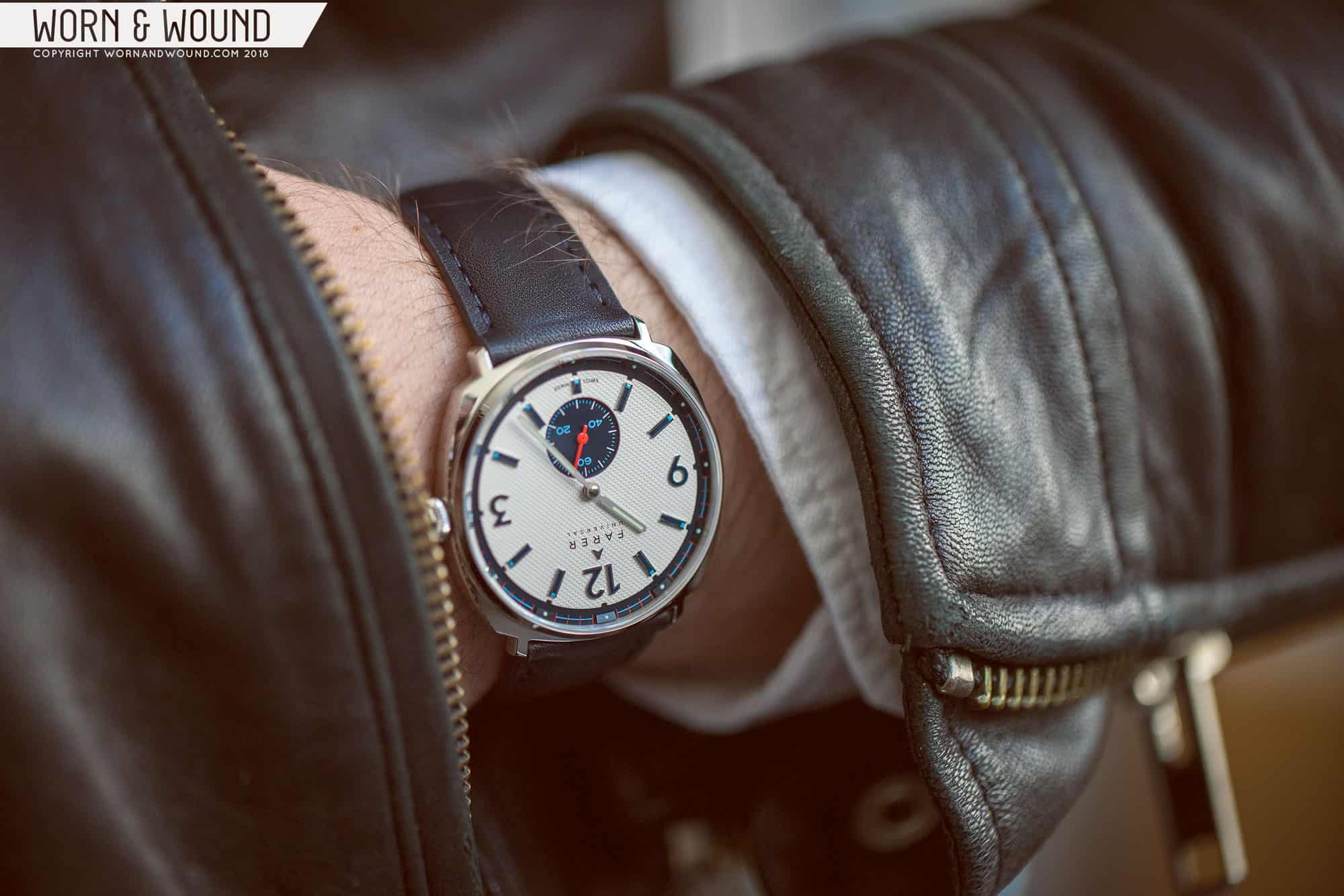
The Stanhope sent to us came on one of Farer’s 20-millimeter black straps, though when you order the watch you can choose your color strap from their menu. One of the interesting things about this watch is that Farer stuck with a 20-millimeter lug width, which I think works surprisingly well considering it’s a small watch. It actually helps the case feel and look a bit larger. That said, I don’t think all 20-millimeter straps make sense with the design.
The strap provided was a very nice, well-made strap, but it was a bit too thick/padded and heavy for the watch. Given how skinny the watch is, something thin—like 2.5 millimeters at the most—and without padding would be ideal, as well as something with a larger taper. Honestly, I think this watch is begging for a nice piece of shell cordovan. This way you’d still get the broad shouldered look, but with more contrast and a lighter feel on the wrist.
small watch, big impact
so thin
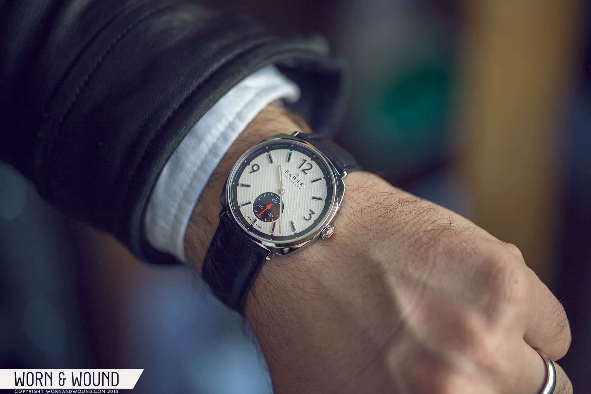
With that said, this watch wears amazingly well. It’s the biggest “small watch” I’ve ever worn. Sure, it’s 37 millimeters with a short lug-to-lug, so it’s literally a small watch, but it’s all dial, so it has the presence of a watch that is much larger. Plus the cushion shape has more visual mass. People with small wrists will rejoice in how wearable it is, while people with larger wrists will be surprised by how large it actually looks. It also goes without saying, but it’s an incredibly comfortable all-day watch.
And then there’s the looks. The Stanhope mixes together an astonishing array of details to create something sporty and fun, but also still office appropriate. The aesthetic hints at mid-century vintage, as do most of Farer’s watches, but it doesn’t feel like it refers to any watch in particular. The palette is also striking, despite being simple. The mix of large black and white elements has a lot of contrast and pop, granting the watch a masculinity and boldness that is surprising at its scale. And the most amazing thing is that, despite seemingly every brand under the sun doing the vintage-inspired thing, this watch feels totally new and unique.
Conclusion
It’s pretty clear that I’m impressed by this watch and what Farer is doing in general. With the Stanhope, Farer continues to show that they are a brand to be reckoned with. They might be young, but their knowledge of watches and watchmaking doesn’t show it. This was already clear with their previous releases, but the Stanhope, and likely the other 37-millimeter Hand Wounds, pushes this notion even further. The case is astonishingly well-proportioned, giving it the feel of a small, classic watch, but with the presence of something new and bold. The dial then balances an incredible amount of complexity, assembling a cohesive graphic concept through applied parts and textures. It comes together to be exceedingly wearable and undeniably stylish.
Coming in with a price tag of $1,175, the Stanhope isn’t cheap, but it’s fair and is in line with Farer’s other mechanical timepieces. The watch exudes quality, features a great movement, and has one of the more intricately constructed dials I’ve seen in some time from any brand, let alone a relatively affordable one. More over, Farer isn’t a brand that wants to position themselves as “cheap,” rather one of approachable luxury, which I believe they achieve.
Needless to say, Farer’s trajectory is pretty impressive as these last two years have shown. I’ve gotten a peek at what’s to come and though I’ve been sworn to secrecy, I can say that it’s not letting up anytime soon. As for the Stanhope and the other 37s—well, I haven’t wanted to take the damn thing off, so that should tell you something. Farer
Zach is the Co-Founder and Executive Editor of Worn & Wound. Before diving headfirst into the world of watches, he spent his days as a product and graphic designer. Zach views watches as the perfect synergy of 2D and 3D design: the place where form, function, fashion and mechanical wonderment come together.
This website uses cookies to improve your experience while you navigate through the website. Out of these cookies, the cookies that are categorized as necessary are stored on your browser as they are essential for the working of basic functionalities of the website. We also use third-party cookies that help us analyze and understand how you use this website. These cookies will be stored in your browser only with your consent. You also have the option to opt-out of these cookies. But opting out of some of these cookies may have an effect on your browsing experience.
Necessary cookies are absolutely essential for the website to function properly. These cookies ensure basic functionalities and security features of the website, anonymously.
Cookie
Duration
Description
cookielawinfo-checkbox-analytics
11 months
This cookie is set by GDPR Cookie Consent plugin. The cookie is used to store the user consent for the cookies in the category "Analytics".
cookielawinfo-checkbox-functional
11 months
The cookie is set by GDPR cookie consent to record the user consent for the cookies in the category "Functional".
cookielawinfo-checkbox-necessary
11 months
This cookie is set by GDPR Cookie Consent plugin. The cookies is used to store the user consent for the cookies in the category "Necessary".
cookielawinfo-checkbox-others
11 months
This cookie is set by GDPR Cookie Consent plugin. The cookie is used to store the user consent for the cookies in the category "Other.
cookielawinfo-checkbox-performance
11 months
This cookie is set by GDPR Cookie Consent plugin. The cookie is used to store the user consent for the cookies in the category "Performance".
viewed_cookie_policy
11 months
The cookie is set by the GDPR Cookie Consent plugin and is used to store whether or not user has consented to the use of cookies. It does not store any personal data.
Functional cookies help to perform certain functionalities like sharing the content of the website on social media platforms, collect feedbacks, and other third-party features.
Performance cookies are used to understand and analyze the key performance indexes of the website which helps in delivering a better user experience for the visitors.
Analytical cookies are used to understand how visitors interact with the website. These cookies help provide information on metrics the number of visitors, bounce rate, traffic source, etc.
Advertisement cookies are used to provide visitors with relevant ads and marketing campaigns. These cookies track visitors across websites and collect information to provide customized ads.


 Featured Videos


