


 Featured Videos


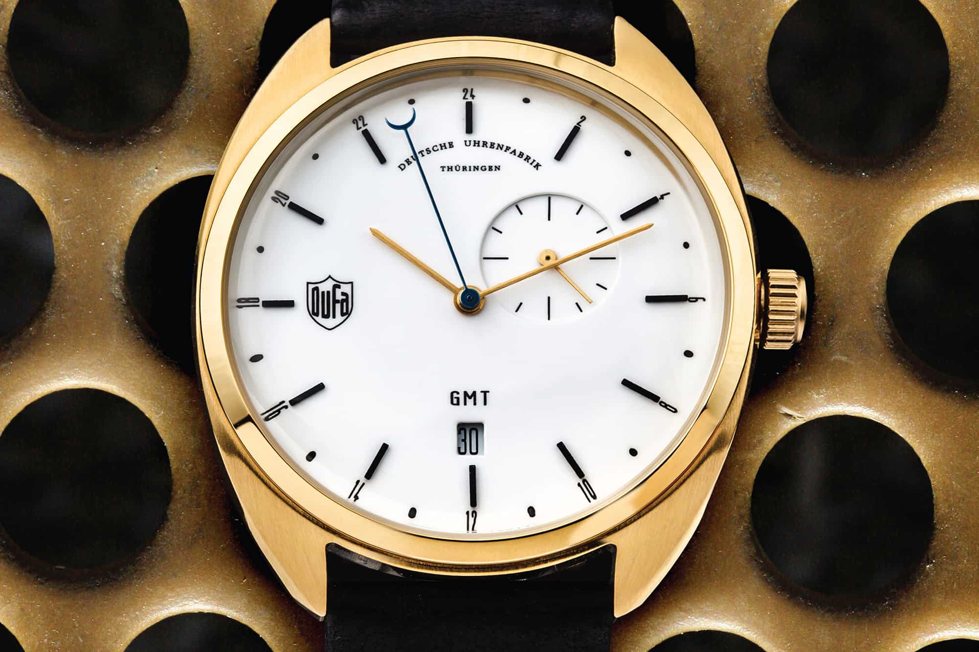
In a watch market where the dress/formal watches under $500 are few, and often unoriginal, something clean and different is like a breath of fresh air. When I first laid my eyes on Deutsche Uhrenfabrik watches (DuFa), I was immediately interested in what I saw. Gone was the faux-vintage Rollie, see Daniel Wellington, styling that seems to be overrunning kickstarter and fashion sites. Instead, as the name would clearly indicate, there was something Germanic with a line that touched on classic design and the Bauhaus, with the occasional playful quirk. In particular, there was a nice use of asymmetry in the dials, utilizing movements with off center sub-dials. A perfect example is their Gotha GMT, which features a sub-seconds dial at 2.5, applied bar markers and a barrel case. It’s odd, yet very appealing.
So who/what is DuFa? Well, it’s an old brand name, one that seems to have been a clock maker at the least, that has been brought back by new owners. The new brand is focused on the $300 – $400 price range, currently producing only quartz watches. As said, their design philosophy draws on the aesthetics of the Bauhaus, with watch names to that effect, such as the Walter Gropius and the Weimar. I got the chance to spend time with watches from the latter series, the Weimar and Weimar Chrono, so let’s take a quick look.
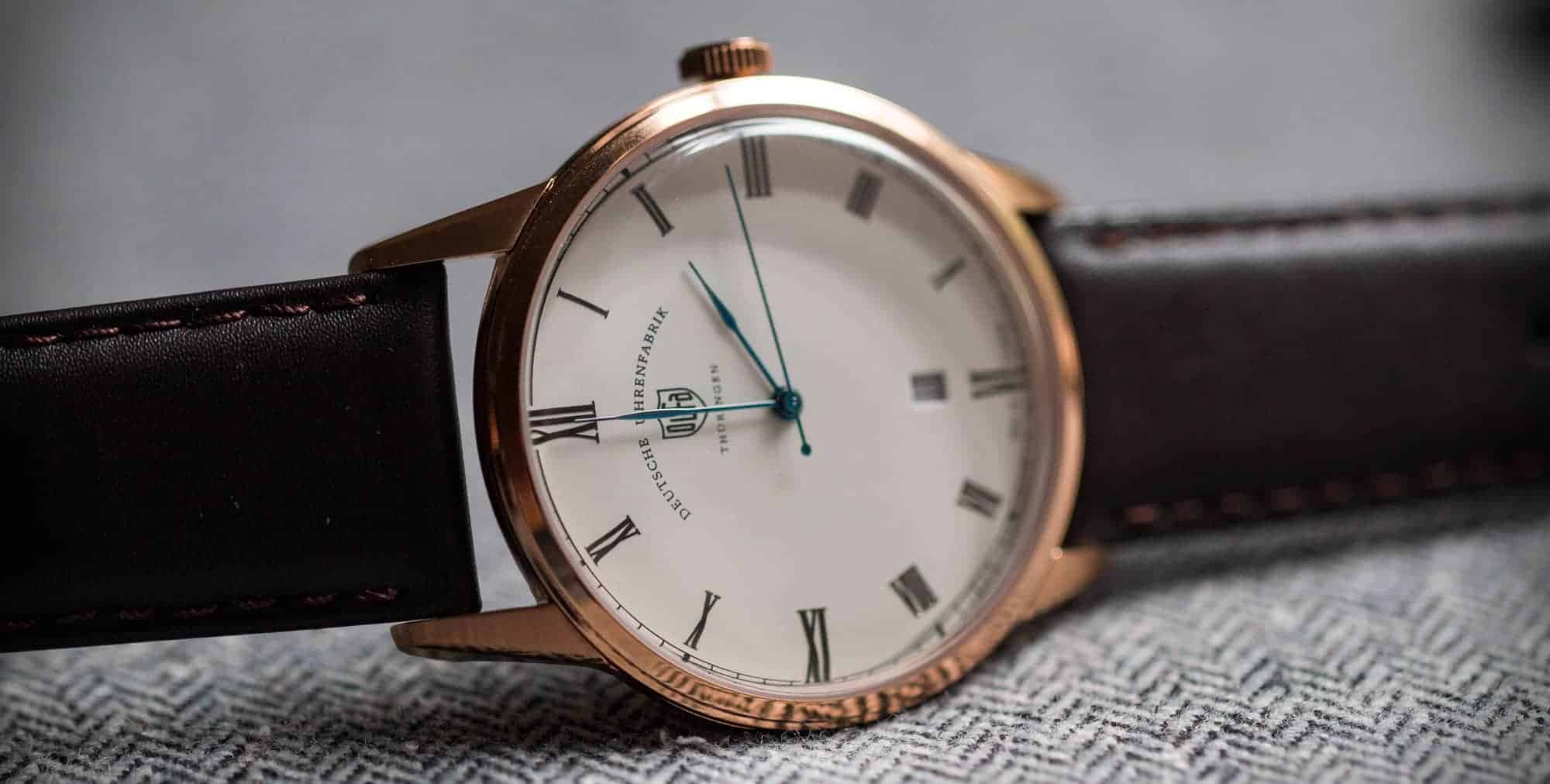
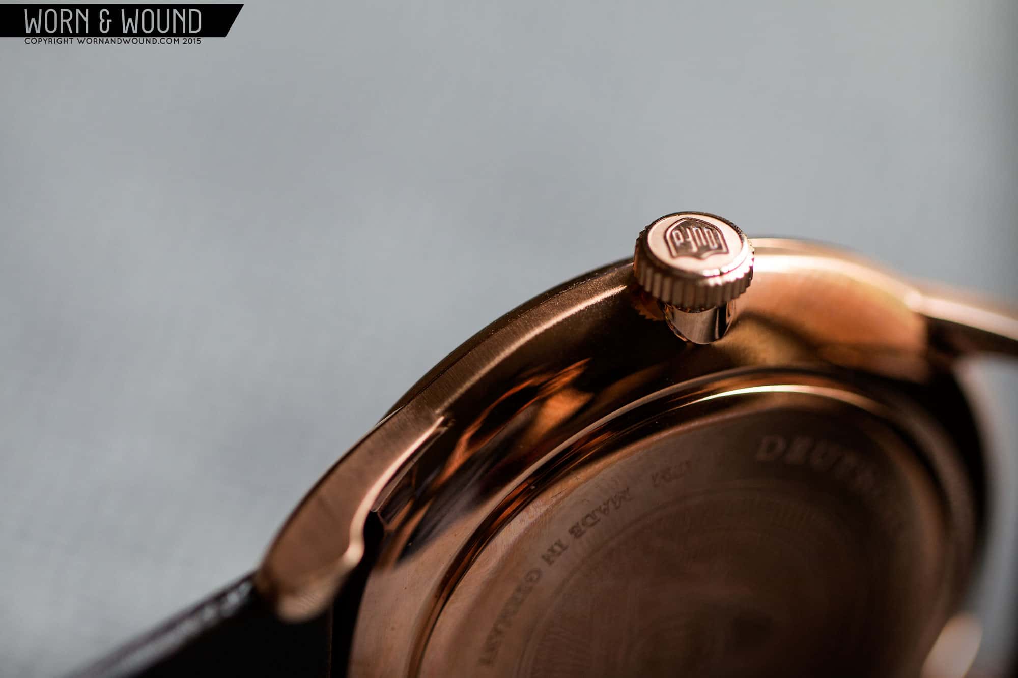
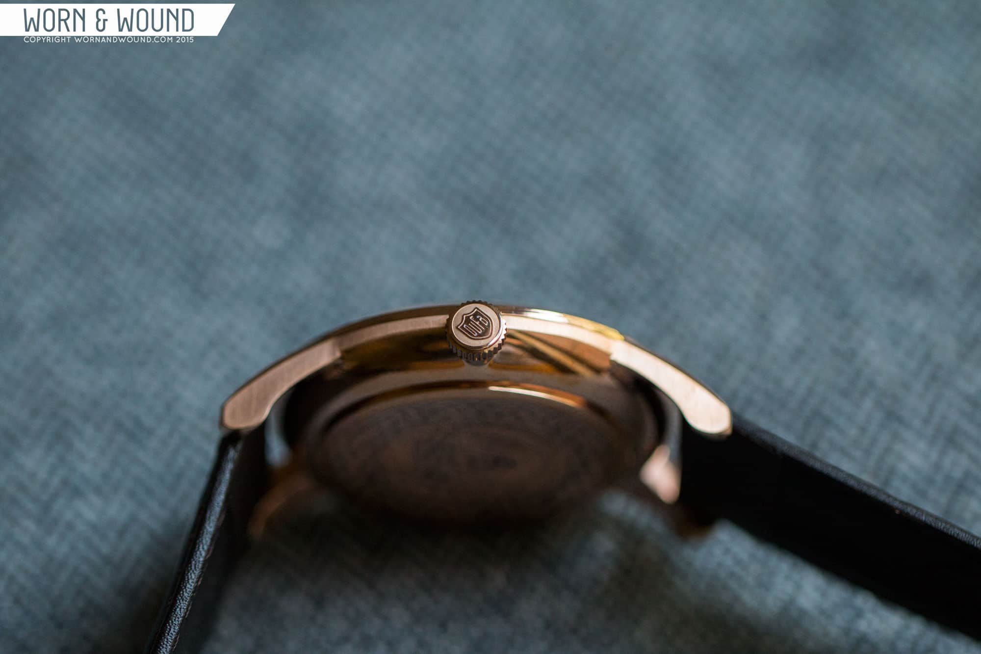
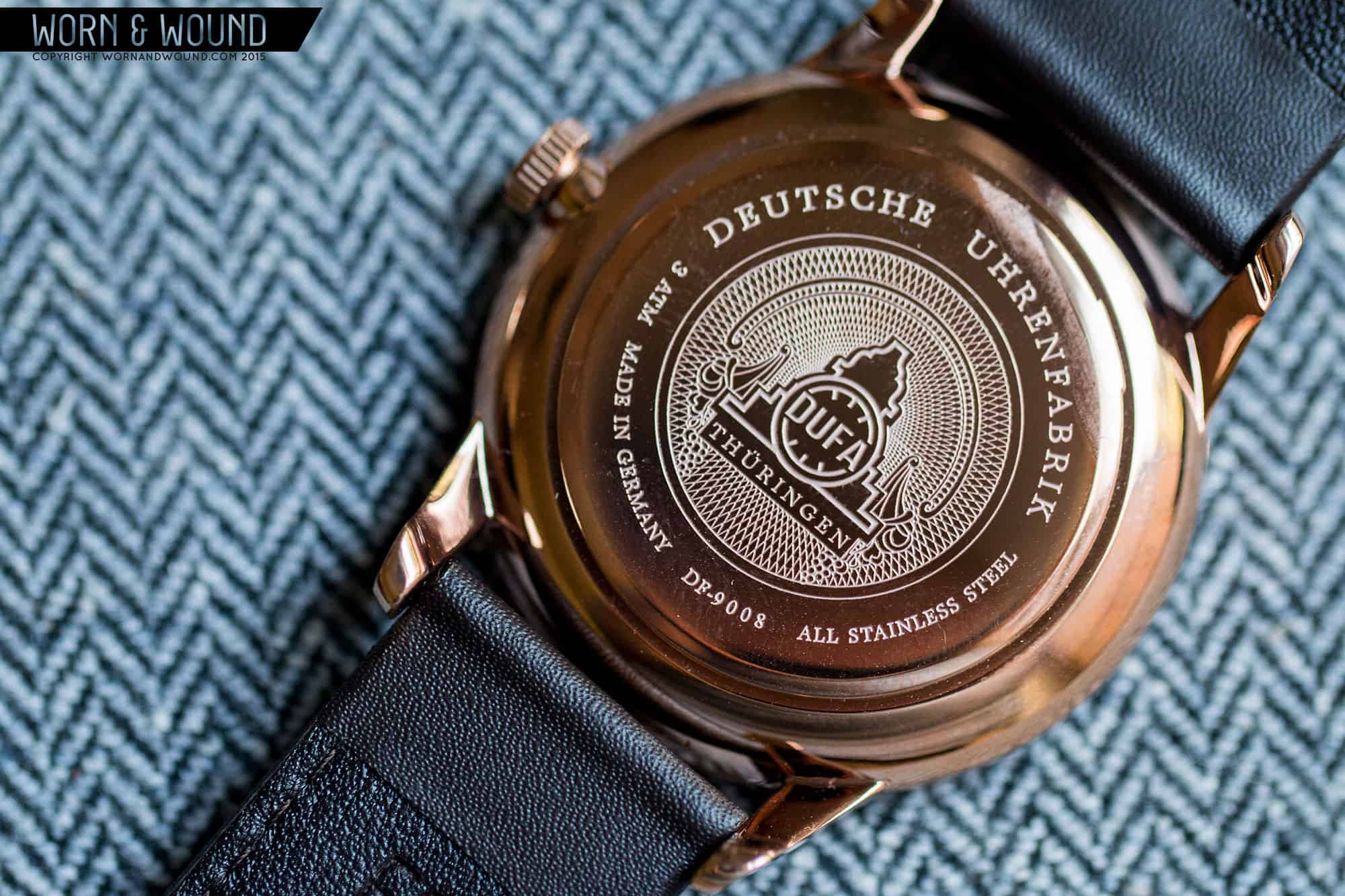
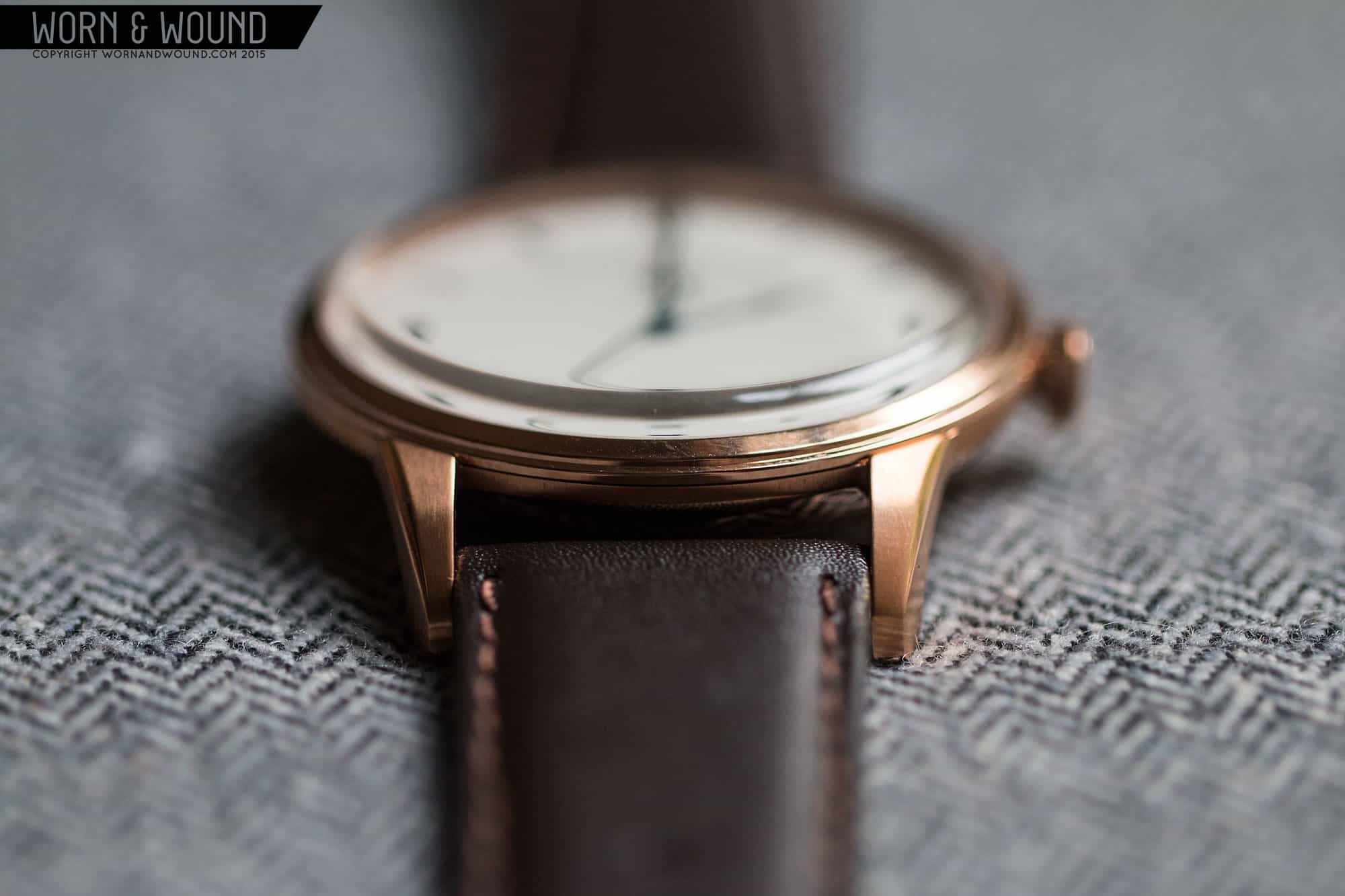
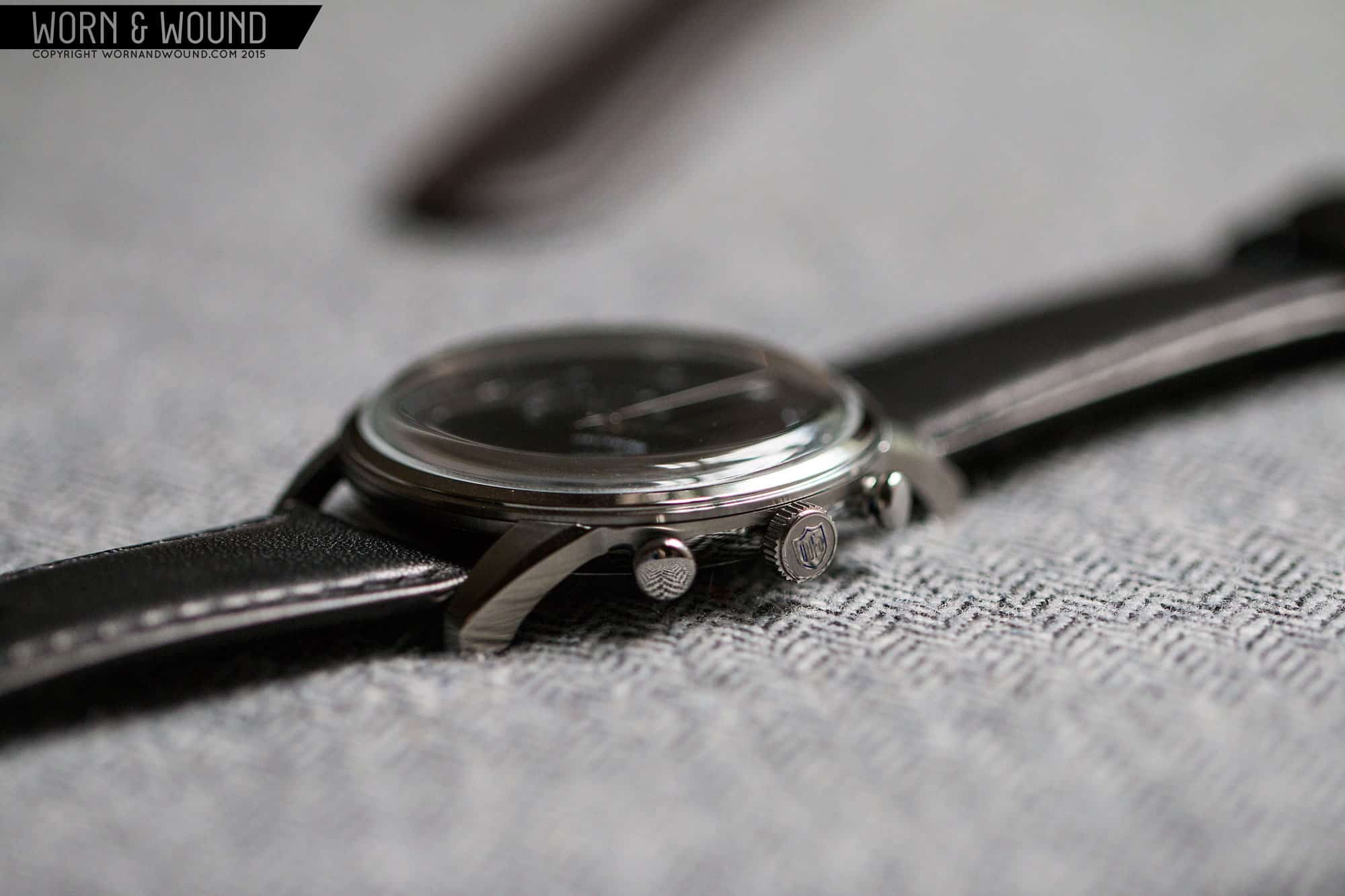
What first struck me about these watches was the case design and finishing. A riff on something classical, the case have a dramatic bowl shape, with long tapering lugs. There is a nice play in finishing as a vertically brushed edge rung from the side of lug and across the rim of the central case, transitioning to polished below. The Tops of the lugs are brushed too, and there is a polished bevel on their outer edges. The relatively thin bezel, which angles upward and has a slight step, leads to a domed crystal (likely mineral, their site is missing this info) that has the look of an acrylic box. Off the right side is a wide, but thin crown that makes you ache for a hand wound movement. The flat end has a DuFa shield logo in relief against a matte surface. The execution of the crown is honestly nicer than what you typically find on watches far more expensive. Flip the watch over and you have a beautiful etched design on a snap in case-back.
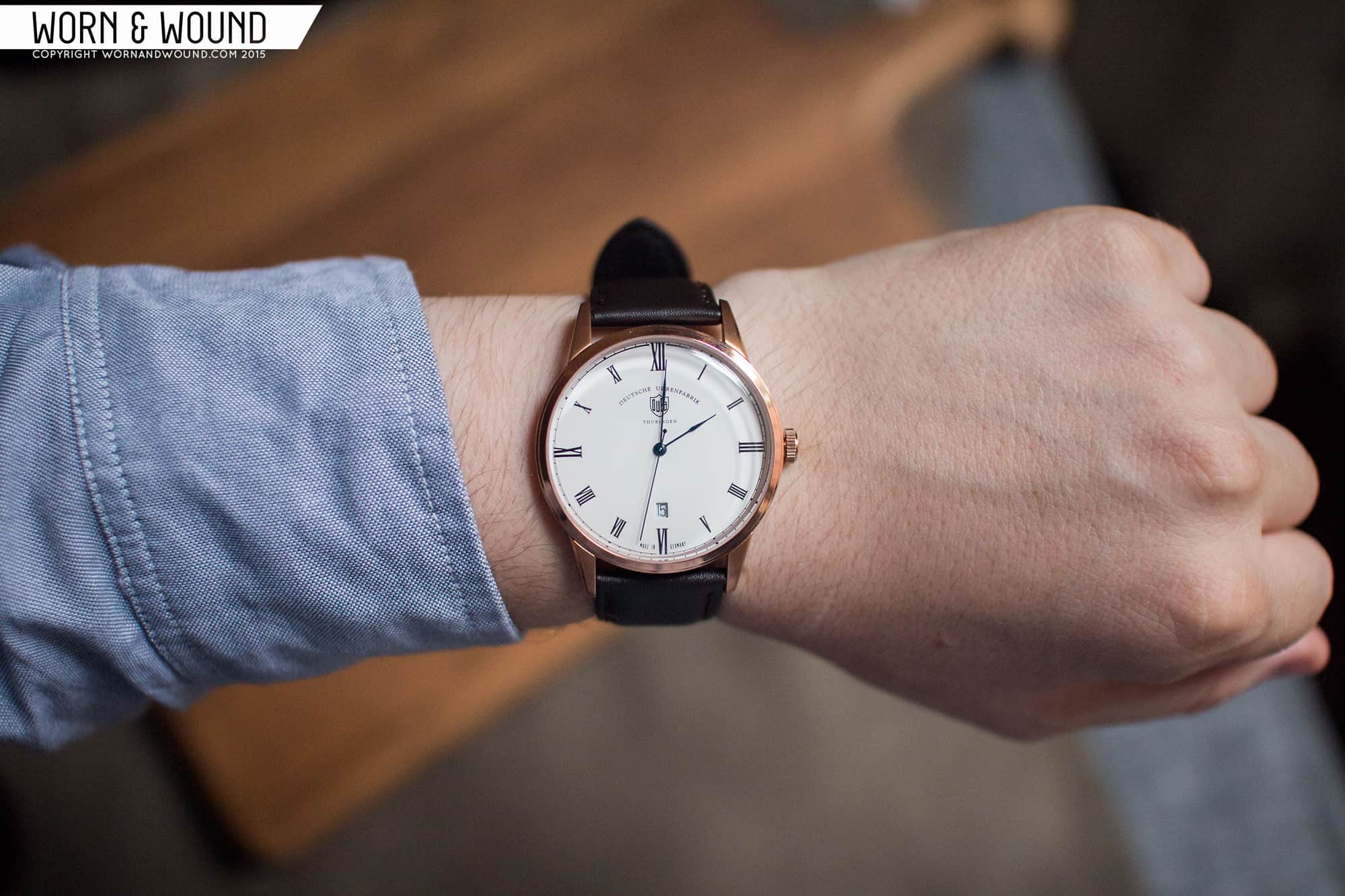
The only surprise was their size. Coming in at 42 x 50 x 11mm with 22mm lugs, they are large for the aesthetic and certainly for a dress watch. They are well proportioned, not looking as large as they are, but once on the wrist, the size is apparent. These would have been ideal at 38mm, especially the time-only model, given their overall conservative feel.
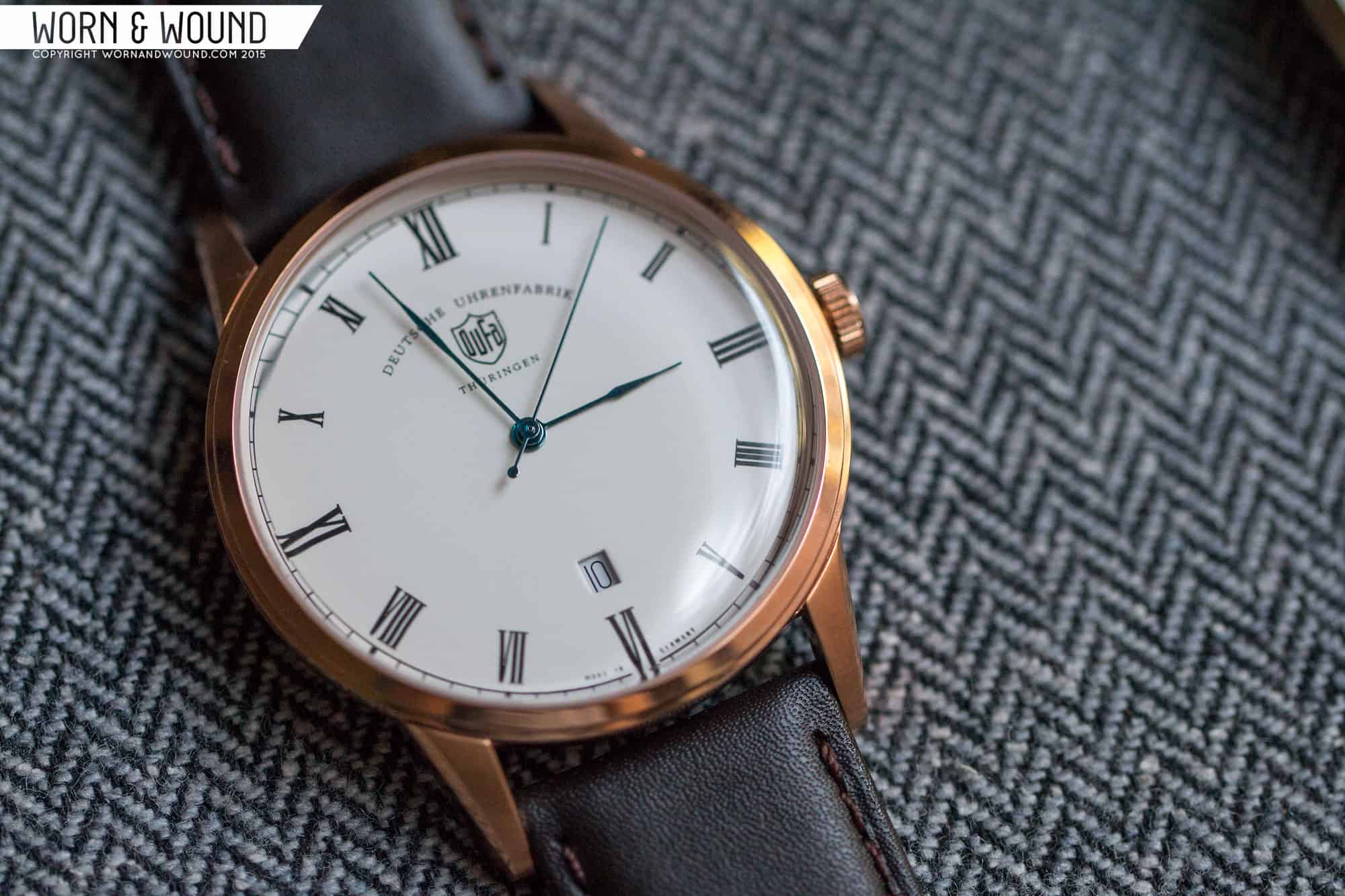
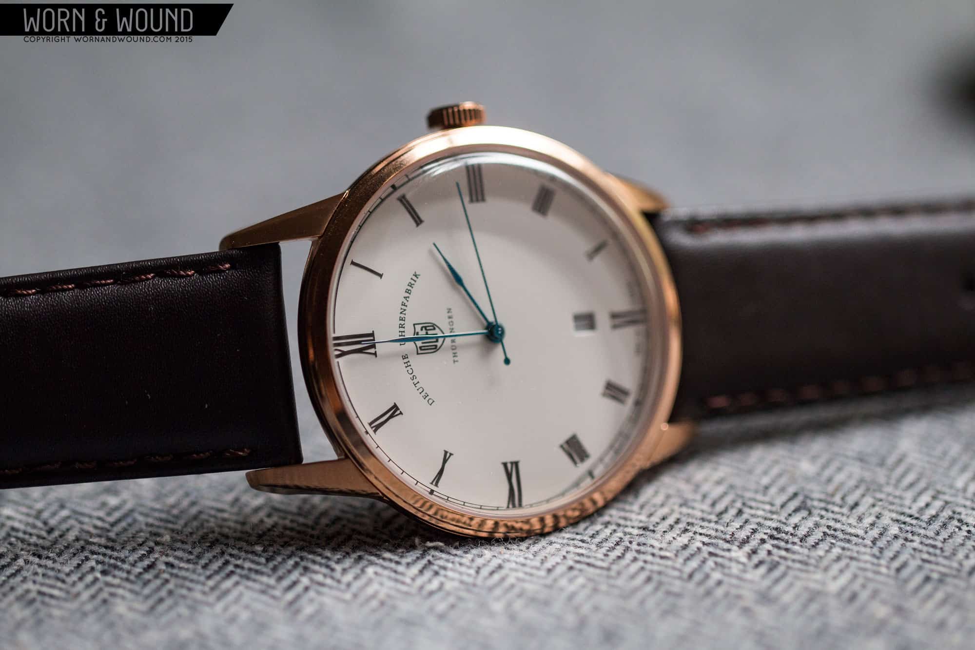
The dial design of the Weimar’s are a bit more classical German than Bauhaus, but are nevertheless attractive. On the time only model, the primary index consists of roman numerals for each hour, large at 12, 3, 6 and 9. I particularly like that the 3 and 9 numerals are at 90 degrees, giving the dial a nice balance. On the outer edge of the dial is a railroad index that just sort of completes the look. Below 12 is DuFa’s shield logo with “Deutsche Uhrenfabrik” in arching text above it and Thüringen below. It’s a lot of text, but the look actually works, coming across almost as some sort of seal. Just above 6 is a small date window showing the black on white date. It’s discreet and keeps the dial balanced. The hands, which on the cream dial model are blued steel (likely chemical) are thin and elegant, organically widening every so slightly towards their tips. Overall, the dial is very attractive. If only the hand was gently sweeping, rather the ticking away.
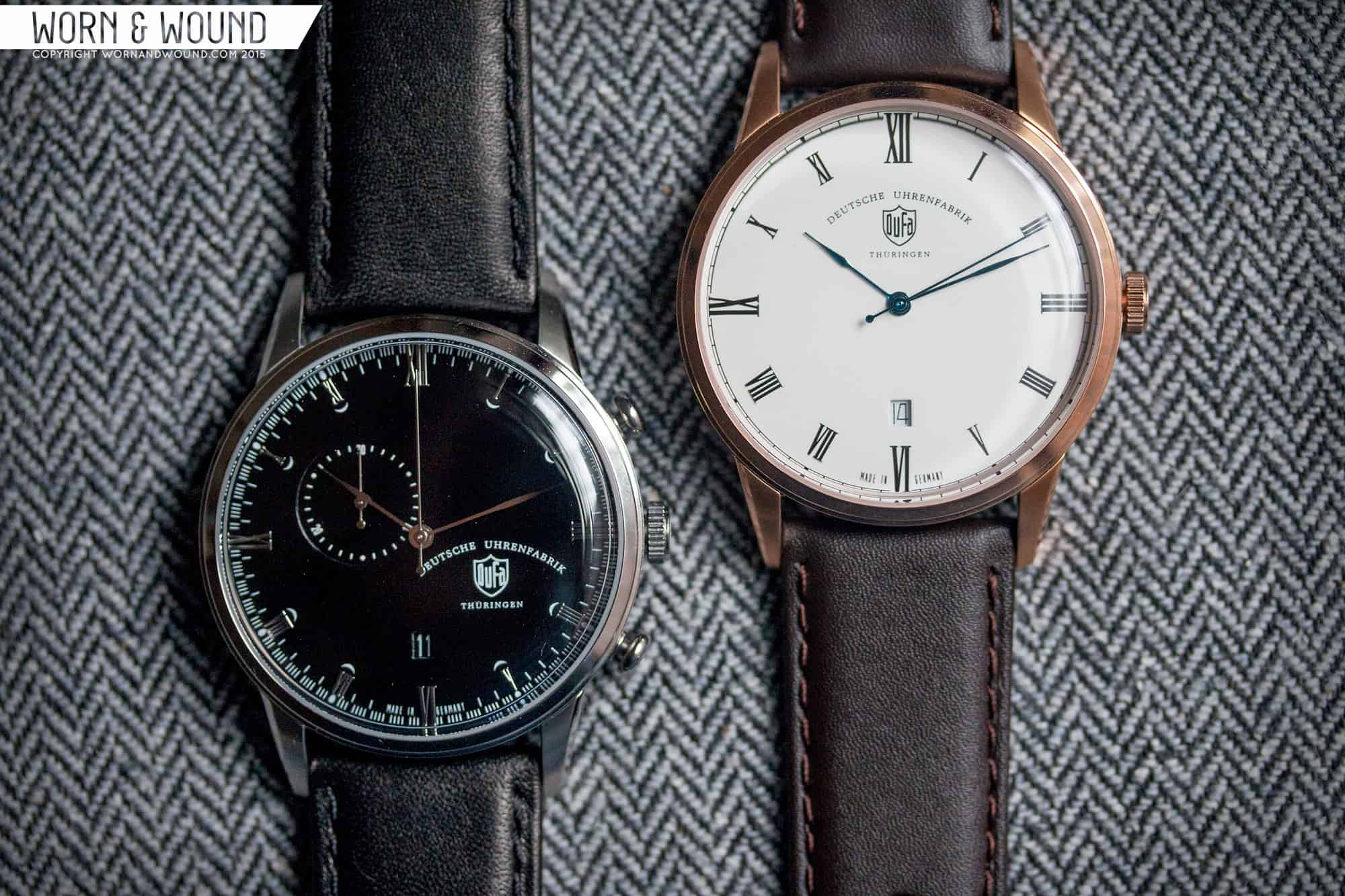
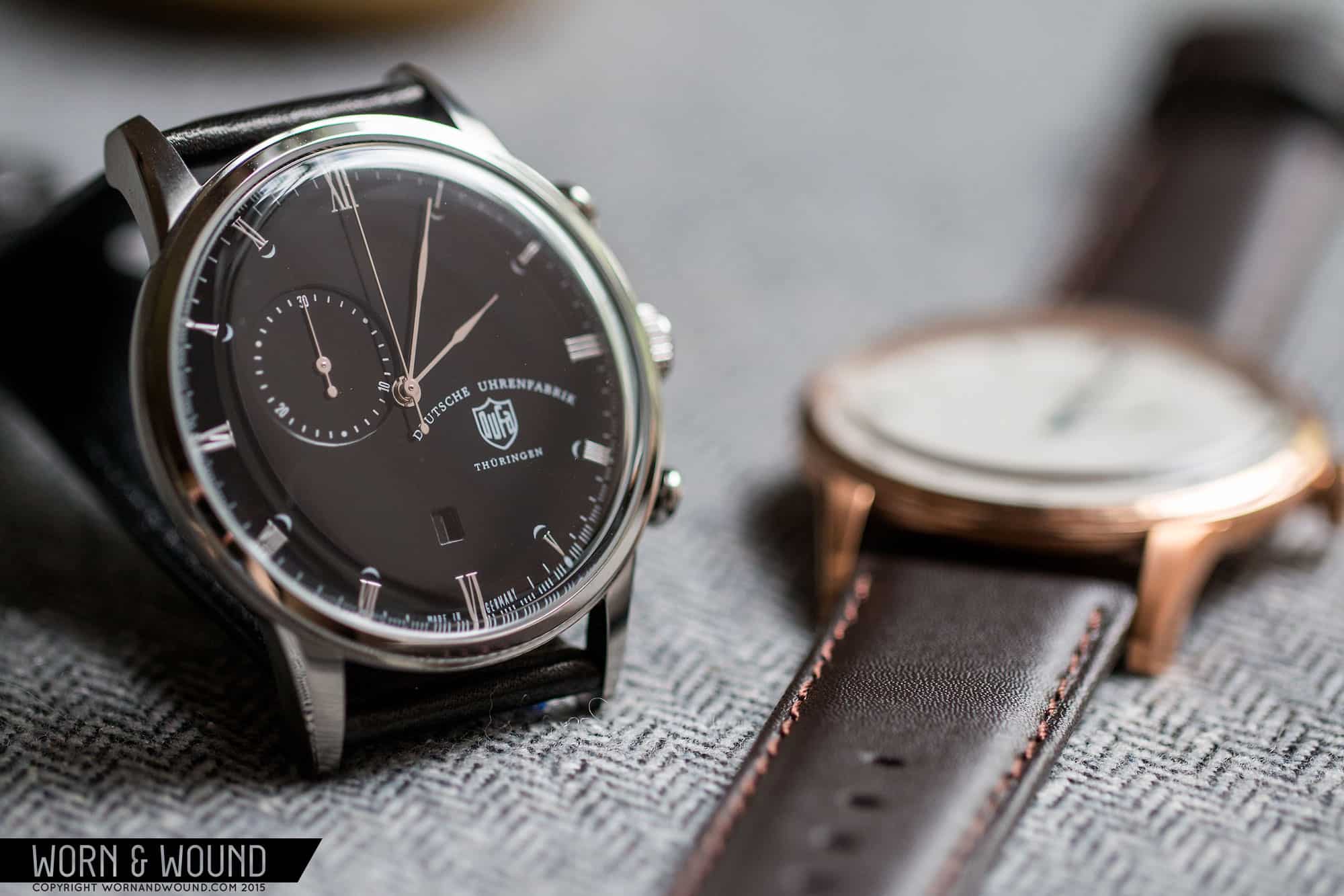
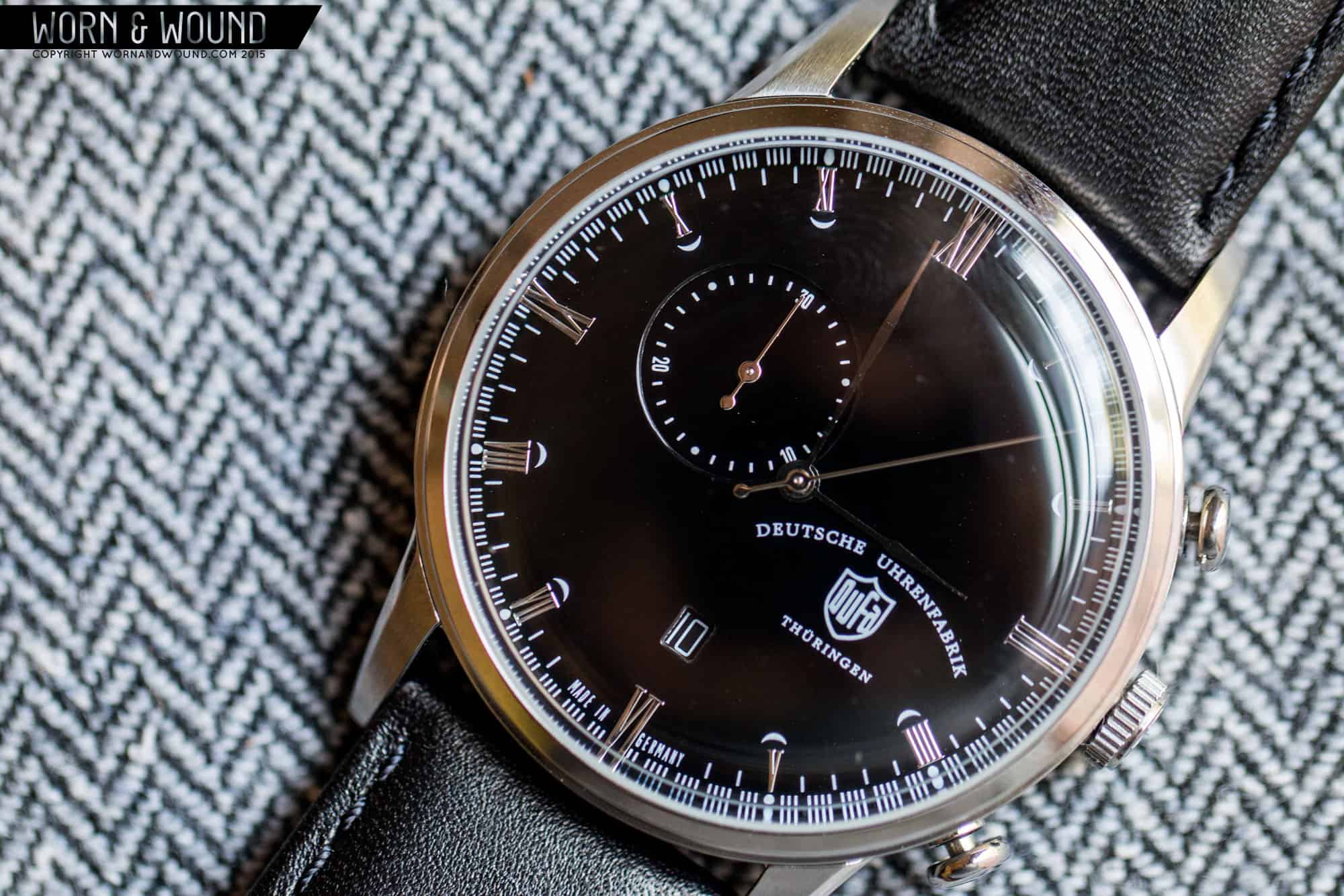
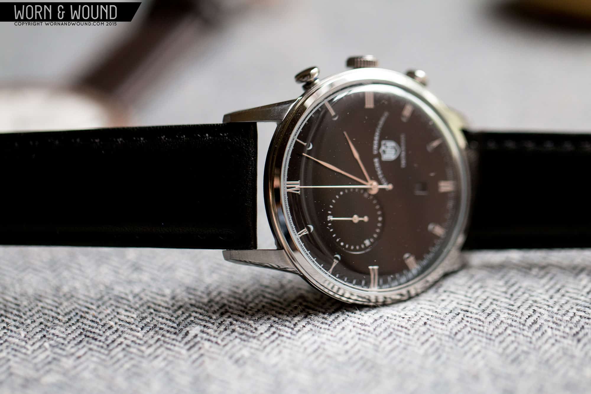
The Chrono has a similar dial, but with a few differences. The main index is still made of Roman numerals, this time applied, but the 12, 3, 6 and 9 are smaller in comparison. On the inside of 1,2, 4, 5, 7, 8, 10 and 11 are small crescent shapes, printed on the dial. Their purpose is likely just aesthetic. Another large difference is the removal of the railroad index, and the inclusion of one that is almost like a racing index, with seconds set in and 1/4th seconds staggered out. You might be thinking, why does this quartz chorine need 1/4th seconds? Well, the movement, which I believe to be made by ISA Swiss, actually has a sweeping chronograph seconds hand that ticks 4 times/second. This gives the watch the illusion of being mechanical. The watch then features a lone chronograph minute counter, set off of 10, and no active seconds. The use of just one sub-dial is very interesting, giving the watch a unique look. To balance it out, they put the logo and logo text off of 4. The result in odd, but works and gives the watch unexpected character.
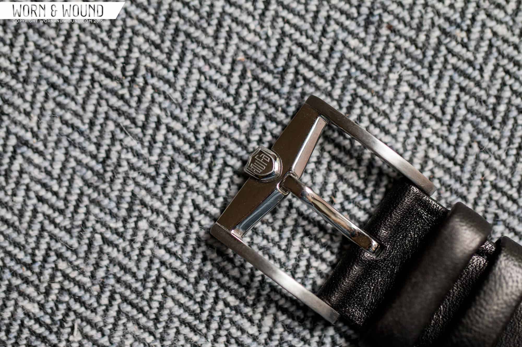
On the wrist, the watches look good, I just wish they were a bit smaller. The 50mm lug-to-lug is a bit long and the 22mm wide lugs just seem a bit too broad for the overall elegant design. With that said, at 42mm they wear fine for something casual. The big domed crystals and bowl shaped cases play with the light, making them quite dynamic. And the edge-to-edge dials appear very large, giving the watches a lot of presence. Aesthetically, I really quite liked them. The time-only model is clean and handsome, with very well though out proportions. The chronograph is then a bit more strange and playful. I didn’t love the loo of silver markers on the black surface, but it’s available in a variety of options, so that’s not a concern. The straps they come on are nothing to write home about, but they feature custom buckles with shield logos mounted to them, which have a nice vintage look, reminding me Heuer buckles.
All-in-all, the Weimars left a good impression. The cases were well made and designed, and the dials either succeeded by being balanced or interesting. At the $300 – $350 price range, they are in a bit of an odd spot, especially as quartz watches. They are a bit more expensive than they perhaps should be, especially if the crystals are mineral, making them unlikely to compete with the growing sub-$100 quartz fashion watch. If these had Miyota mechanicals in them… well, that would be a different conversation. Unfortunately, that cool chronograph layout will not be found elsewhere, but at least that gives the model a reason to stay quartz. Regardless, this is definitely a brand worth keeping an eye, especially if they stay true to their Bauhaus core.
