Simplicity is the hardest thing to pull off well. So as a driving philosophy for a brand, it’s pretty risky. Yet, Defakto, who we’ve followed since we started worn&wound, pursues it with every new design. A feat made more impressive when one considers that their vocabulary of forms consists of rectangles and lines in black or white. Yet, despite these self-imposed restrictions, Defakto has 5 unique watch lines, creating many different watches when taking finishing and dial color into account, and has one a German Design award for their efforts. Not too shabby.
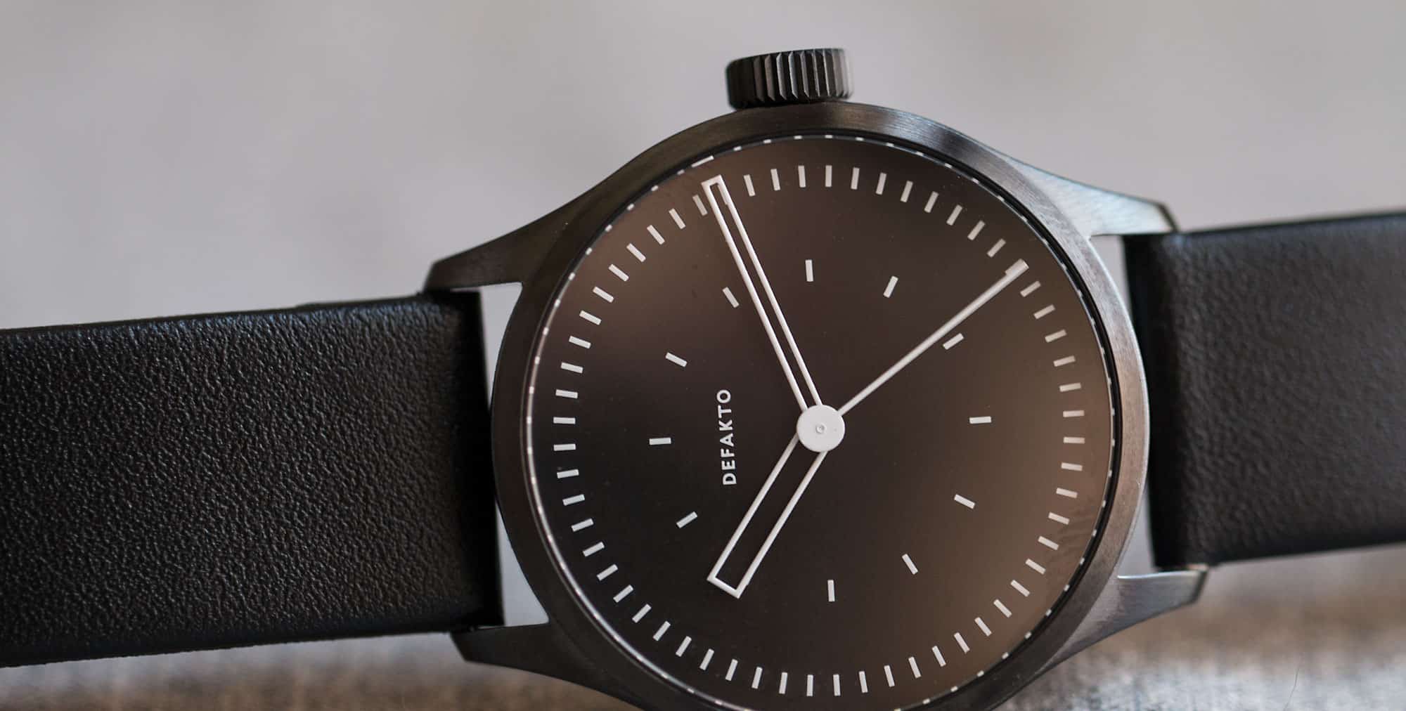
Last October, Dekafto announced their newest line, a 39mm 3-hand mechanical (their first to fit that description) named the Kinetik. The name clearly being inspired by the addition of an active seconds, giving the watch motion. Additionally, the design focuses on how things overlap and the shapes they create, but with their signature highly reduced vocabulary. Starting at $565 and going to just over $600, these German made minimalist watches feature ETA 2824-2’s making them a great value on top of something very unique.





 Featured Videos






Size, movement and price is on point if you’re in to minimalistic style. Great watch, keep up the good work Defakto!
I have one and I’m very pleased with it.
It took me a while to work out what sort of strap I preferred it on though, and I tried a lot of options. In the end I discovered I prefer it on an all black nato (with PVD hardware).
Something about the combination just works and it gives the watch a little bit more of a “utalitarian” feel (I guess that’s the straps military overtones). I’m not a big nato fan in general and don’t have one on any other watch, but here I love it.
I love minimalism (in general, not just watches), but I find Defakto boring and derivative. Might have something to do with the fact that I’m from Europe, I grew up with this style of design everywhere around me.
It baffles me that they won a design award, because this is such a cliched interpretation of a minimalist clock face that it would get you laughed at in an industrial design academy.
Design academies and the design industry are very different things. It’s comparing theory to practice, most of the time of which they don’t cross over because of one thing. Money.
One cross over, is that design academies are big business’s that make a lot of money from hopeful students. No wonder they’re laughing at students, they don’t need to care if ideas are good or bad, either way they get paid.
I really admire nearly everything about this watch. The design is perfect: not too much of this or too little of that. It’s a glancer’s dream that doesn’t scream, “Hey, I’m wearing a cool watch!” Love the fact that there’s no date. Ideal size. Works with any situation – from black tie to black t-shirt. What’s got me scratching my head is the price. How did they manage to get it so low and include that “will work perfectly for the rest of your life” movement? What it actually means is that Defacto is not out to rape the watch-loving public! I only have two gripes. They shouldn’t have used an exhibition case back. That violates the design sense. And……..when I first saw the Kinetik name, I thought it was a Quartz watch ala Seiko.
Do not like this watch. The hour hand seems completely out of proportion and the hour markers on the dial are just odd. Love all their other watches, though.
I also think the hour hand seems out of proportion but I like the hands when they overlap.
I agree, but so much more effective in their Akkord where the minute hand was solid/narrower. Same effect.
Yup. More proportional
I believe the hour hand is fatter so that when the hour, minutes and seconds hands all line up, they outline each other. Without the hour hand being larger, the minutes hand wouldn’t be able to contain the seconds hand. See this photo: http://wornandwound.com/library/uploads/2015/10/KINETIK_5.jpg
That said, I understand your point about the hour hand size.