We are very excited to announce that James Helms, founder of REALWatchReview will be joining the worn&wound team. James is a veteran of the watch review game, and brings a wealth of knowledge of affordable watches to the site. With James on board you can expect even more reviews, feature articles and a whole lot more. James is going to start things off with a review of the Mutewatch this Friday, and you can find his initial impressions of the watch below. We’ll also be adding some of James’ reviews from REALWatchReview to our archive, so there will be even more great content available on worn&wound.
So keep coming back to worn&wound to check out more from James, Zach and Blake. In the meantime, enjoy James’ initial impressions of the Mutewatch and get ready for his full review next week*.
*We have been informed by the folks at Mutewatch that our review unit is exhibiting defective behavior! So, we are going to postpone the final review until we receive a new unit in order to give a correct account of the watch. Stay tuned!
When I first heard about the Mutewatch, I saw that it was amazingly straightforward in its purpose as well as its design. Developed in Stockholm, Sweden, you can see the Scandinavian design in the look and feel of the product. Using LEDs for timing and vibrations for alerts, it’s an exercise in blending what a lot of people are starting to use as a watch (their smartphones) and a timing device. This watch review is going to be a bit different, not focusing on movements or what is inside, rather what the watch does for design and function.
Design
The watch is one piece design of soft rubber, which seems to be silicone although they don’t mention the material. The screen is separated from the back by tilting slightly forward. Its held together by a simple button that can be adjusted by sliding the receiving button up or down the band on notches. Overall the design is a near seamless flow from front to back.
The screen is invisible unless you touch the screen or flick your wrist to activate. White LEDs show the time as well as the functions. The color of the light slightly differs on different models depending on the color you choose which is just the tinting of the material it is shining through.
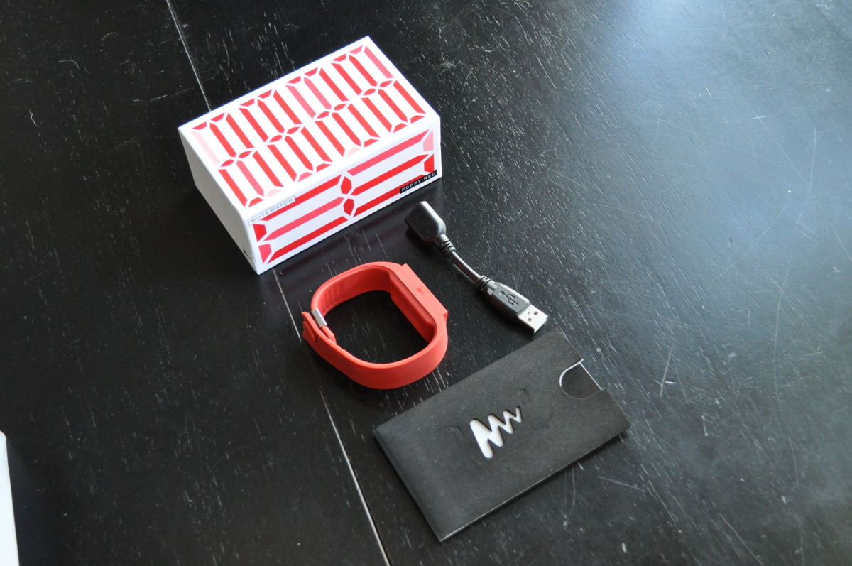
This watch is a bit different in its approach to power. Unlike a digital watch that has a very low power draw the Mutewatch needs to be charged. Charging is achieved via a USB connector that is hidden on the inside of the band.
Functions
The watch is quite basic with timing, an alarm and a countdown timer. Instead of using noises to signify the end of a timer, the watch uses vibration. This is a great idea considering most people really don’t set alarms on digital watches anymore for the shear fact that they make noise.
 To navigate the different functions the screen is swiped and tapped in eight different areas to turn on and off functions. The watch is said to intensify its vibrations depending on movements received from the internal motion sensor. This motion sensor also can activate the time when you flick your wrist instead of having to touch the screen.
Although they haven’t released any yet, I am pleased that Mutewatch has left the architecture of the watch open to firmware changes. Using the USB cable, the manual mentions that they can be downloaded on their website.
Overall
The Mutewatch is an immensely interesting design in not only its look but its usage functions as well. When the Final Review is posted we’ll get into some of the functions deeper and daily use. Feel free to post below if you have any questions of comments. Make sure to check out Tic Watches to find out more about how to get a Mutewatch.
Thanks to www.TicWatches.co.uk for supplying the review watch.


 Featured Videos


