It’s not too often we come across a watch that is really unlike anything we’ve seen before. Most designs play by at least some set of rules, and really wild things tend to be either very cheap or very expensive. Well, a few months ago I got the chance to meet Emmanuel Dietrich, founder of Dietrich Watches, and check out his designs, which were profoundly different. The watch had an odd shape, with crazy curves and geometry that spoke to a different idea about how watches should look and feel. The case alone really drew me in, with parts that veered greatly from the standard, and require very good manufacturing to pull off. The dial then had some wild things going on that simply pulled me in further.
The concept behind the watches correspond to Dietrich’s idea of organic design. Rather than drawing more from watches themselves or more man-made things (think automobiles and architecture) the design draws from nature. This isn’t a new concept to design with people like Ross Lovegrove practicing similar concepts in products and Zaha Hadid pursuing them in architecture, but it is one that is rarely implemented in watches.
Today, we’re going to look at the first in their series of watches, the OT-1, OT for “Organic Time”. Before getting too into it, it’s worth noting these are weird watches. They aren’t going to be liked by everyone. I myself am on the fence as to whether I find them attractive or not, but I know I find them fascinating, especially from a manufacturing standpoint. The OT-1 features a mix of steel and PVD finishing with green highlights, a sapphire crystal (a crazy one at that), a Miyota 82S7 automatic movement and a price tag of $1,215.
Dietrich OT-1 Review
 Case: Steel, Mixed Finishes
Movement: Miyota 82S7
Dial: Mixed Materials
Lume: Yes
Lens: Domed Sapphire Crystal
Strap: Leather
Water Resistance: 50m
Dimensions: 46mm X 47mm
Thickness: 14.5 mm
Lug Width: Passthrough
Crown: Pull Out
Warranty: 2 Year
Price: $1,215
Case
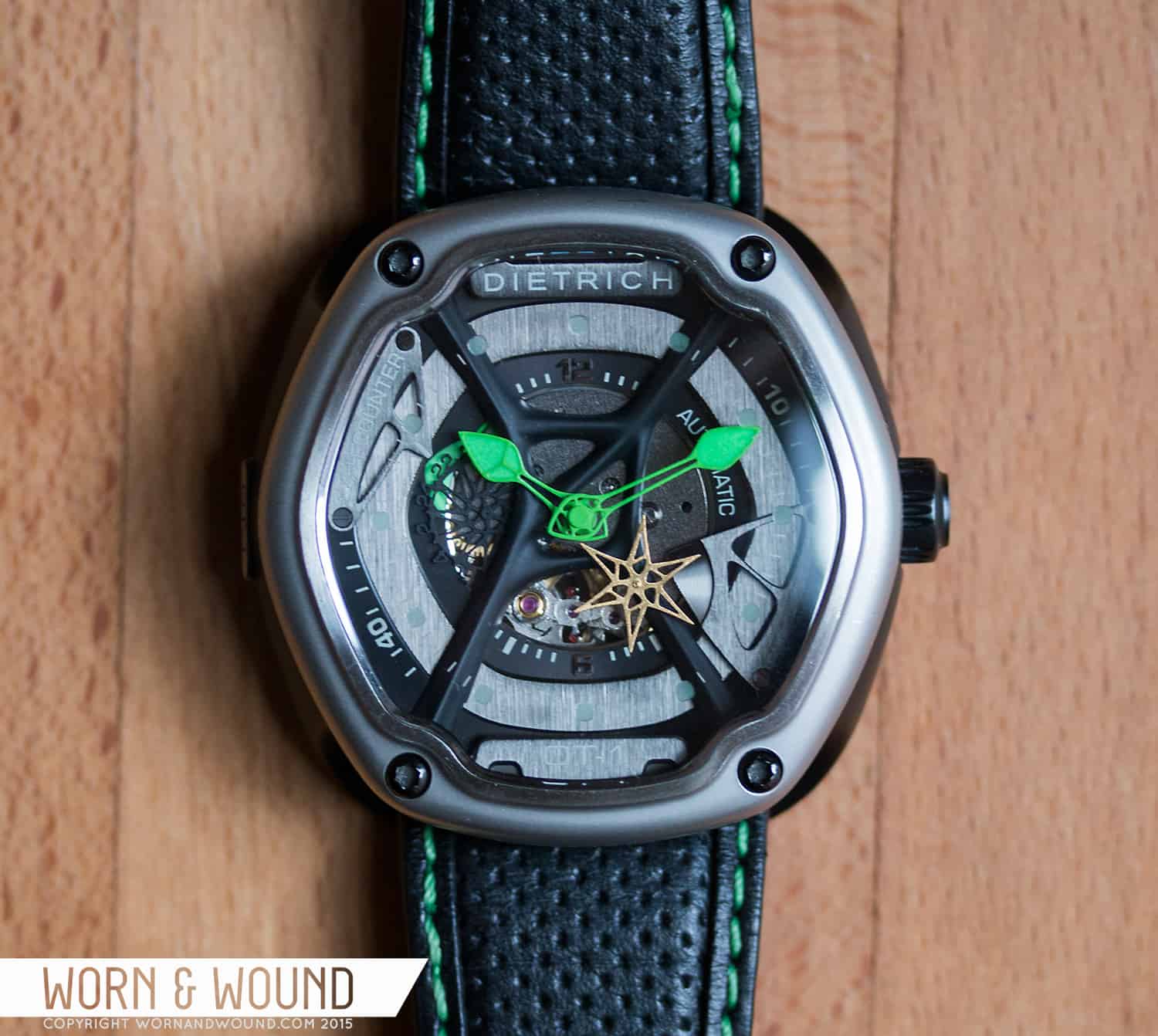
To say the case of the Dietrich OT-1 is different is an understatement. It’s one of the most unique case designs I’ve come across featuring odd shapes, multiple parts and remarkably complex geometry that only work thanks to skilled manufacturing. To me, the case is really the star of the show. It’s a bit tricky to get an exact measurement of its dimensions, given it’s undulating shapes and odd structure, but it’s in the neighborhood of 46mm wide by about 48mm long at it’s longest point and about 14.5mm tall from the case back to the top of the domed crystal. While not a small watch, the fluid shapes and ergonomics of the design make it wear shockingly well.
The shape is somewhere between a hexagon that is melting and a barrel. When you look at it straight on, you seen that geometry, but with something almost shadow-like underneath. The bezel holds the 6-sides, though their corners are softened to a point of formlessness, while the lug-chassis flows completely freely. The construction of the case is different than the typical 3-piece. Here you have a bezel, central case, lug-chassis as well as crystal and case back.
The lug-chassis is the outlier and perhaps the most exceptional item on the watch. It’s a screw on component that has no flat moments. It flows and undulates in these beautiful and complex ways, holding the watch up, mounting to the wrist, and giving the watch a profile of something that wants to speed away. It also provides a flat surface for a strap to passthrough, as this watch does not feature springbars. They even mill a flat portion on the side with an OT-1 badge, which seems like a detail that simply complicates things, but for the sake of looking cool. From a manufacturing standpoint, it’s a complex piece that had to be machined from all sides, creating completely smooth forms and tight tolerances where it mounts.
The bezel is worthy of closer inspection too. On this model, it’s presented in matte steel, for a sating sheen all around. The surfaces are all super smooth, rounding on every edge. As the bezel approaches the crystal, it comes up a step, creating border for the crystal, which has a brushed finish for some contrast. There are also 4 large black screws going through the bezel, presumably holding it in place.
That brings us to the domed sapphire crystal. Sapphire in general are more pricy than other options, but odd shaped, super domed, boxed, etc designs are more and more costly. The one here is perhaps the weirdest I’ve seen. Mimicking the shape of the bezel, it’s sort of six sided, but where the screws are set in the bezel, the crystal cuts in. So, the perimeter of the bezel is this constantly changing line. If the tolerances here had been off, they would be immediately noticeable, so there is no margin for error. On top of that, it’s not like there is a standard gasket that would fit such a shape, yet the watch has a 50m water resistance. Lastly, the dial is etched on the internal side with markings that play into the dial. While it might get overlooked, make no mistake that this piece posed them a manufacturing challenge.
On the right side is a fairly traditional push-pull crown in black PVD. It’s 7.5 x 4mm, making it large and easy to grasp when needed. On the flat side of the crown is the number “69”, which seems a bit out of place. It’s in fact the birth year of designer Emmanuel Dietrich… but without knowing that one might just find it…er… odd. Anyway, it’s suitable crown, though I feel like it’s the one piece that doesn’t stick with the vocabulary of forms. Simply put, it looks too much like a watch part.
Dial
The dial trades the complex geometry of the case for layering, texturing and simply strange shapes. According to their description, it’s a 4 layer dial, but to the eye, it actually seems like a lot more, building up and out from the movement, all the way to the crystal. The very bottom is actually the Miyota 82S7 movement. Here you can see the ticking of the escapement within. I’m not sure if I love this detail. The rest of the dial, which we’ll get to, is abundantly finished, with no portion left un-detailed. The movement, however, is as it is out of the factory. So the steel is bright and undecorated. Meanwhile, you have the visible escapement which to me distracts a bit from other parts in motion.
From here, layers of matte black and brushed black PVD surfaces ascend up out and in alternating concentric circles. Or rather, concentric melting hexagons. Through out are then various moments of greater detail. On the bottom most tier is a partial index with applied 12 and 6 numerals, as well as the word automatic. From 9 – 10 is a slab of bright green lume which serves to back light the 24-hr disk. Instead of a typical dial and hand, they converted the hand into a disk of wispy organic lines, with numerals studding the outer edge. It’s matte black, so as it passes over the green area, they become visible. To mark which hour it is, there is a bridge of brushed PVD with a flowing form that is bolted on two tiers up, extending over and point to the hour. This bridge is then labeled with “24 H COUNTER”.
The next tier is then just brushed PVD metal. It might seem plain, but it actually serves as a back drop to the etched markers on the backside of the crystal. Since these are relatively light, the dark surface helps provide contrast. The following tier is then in matte black again, and features a few marks for minutes. In fact, most are gone, just 7-14 and 38-44 are showing, feeling sort of meaningless. Also on this layer is the already mentioned 24 hr counter/bridge and a “small second” bridge. Like the 24 hr counter, it bolts on, cantilevering over the dial. What they did here is interesting, the end of the bridge has a part of a sub-seconds dial, just a 10-second arc, with little markers and concentric graining. The seconds “hand” is then a golden star-shaped-thing with similar wispy, organic line detailing. Each tendril, if you will, then acts as a second hand as it passes over the partial dial. It’s a cool idea that is certainly unique looking.
Crossing the entire dial is a black web-like structure, with a strange molded form, that runs from the four big screws going through the bezel. Its shape is somewhere between twigs and something soft and stringy. It’s odd, to say the least, and likely entirely aesthetic. To me, it looks like an organism got into the watch and began to grow, rather than a part of the watch itself. Lastly, on a level just below the crystal at 12 and 6 are two platforms reading “Dietrich” and “OT-1” respectively.
The hour and minute hands continue the bizarre under current of organic forms. These two leaf-esque hands consist of more stringy, near impossibly thin lines, coming to larger paddle forms that are filled with lume. On this model they are extremely bright green with matching lume, really jumping off and out of the dial. While I appreciate their design, as well as that of the second hand and 24-hr disk, there seems to be a bit of discord in the dial as a whole. There are plenty of cool textures and elements to enjoy, and they are all well executed, but the very organic portions clash with the more blunt and literal portions.
For example, all of the words feel like they are trying to be technical, presented in fonts that are cold and modern. The organic shapes then don’t belong amongst them. It ends-up being almost sci-fi, like a prop from a film about an alien infestation. That said, I like both ideas separately and see how they would work, one sending the watch more towards a traditional sport watch the other towards an entirely organic, material based design.
Straps and Wearability
The Dietrich’s lug-chassis is designed for use with pass-through straps. While this limits your third party options, the brand did a good job designing unique straps to work with their system. The strap that came with the sample in fact looks like a two piece. Each side tapers from 26mm to 22mm, connecting under the watch. The goal of this design, was to create something very ergonomic. Because of how the lugs work, the fit around your wrist like a glove, the part of the strap that is under the watch then doesn’t push it up really, and the strap flows over the ends easily, dropping around your wrist. It also makes for very simple swapping of straps.
The strap that came on the sample is black leather with green stitching and a perforated texture. Aesthetically, it’s not really my cup of tea, the green being too on the nose with the green in the dial, and the perforated leather just being too sporty. But, it’s very nicely made and comfortable. It’s soft and pliable, making wearing the watch for long periods of time quite easy. They do make additional straps themselves, which range in price from $90 for nylon to $195 for custom rubber, with leather options teetering around $135, making them all fairly pricey.
As mentioned above, the watch wears very well thanks to the ergonomic design. It’s like it attaches to you, fitting so snuggly and comfortably. This makes the large size very bearable, as does the fairly short length. because the longest part, the lugs, are under the strap, they don’t have a visual significance in how it wears. Rather, the bezel really sets the size, while its soft curves and forms belie its actual width.
Aesthetically, it’s a very striking watch, clearly. It’s not for everyone, that is obvious, but for those with a more modern aesthetic, it could certainly work. It wears and feels like a sport watch, though some of the design elements don’t really fit into any classification. For me, it’s like a watch as sculpture. Looking into the dial while out is like stopping and looking into another world, a world of odd shapes, metal and moving parts.
Conclusion
The Dietrich OT-1 is really unlike any other watch I’ve tried. It’s not easy to classify, it’s not made of easy to respond to forms. The “organic” elements are challenging aesthetically as the don’t correspond either to what I expect to see on a watch, nor typically with items I wear. But, that’s kind of exciting. It’s not often a watch comes along that presents something different. My favorite thing about it though is that it’s really the case design that the watch lives on. It’s not just a standard watch with some weird widgets ticking away on the dial, rather the whole watch has been considered, and apart from those elements, the case is a big success. It’s beautifully made and constructed, with components that are visually complex as well as complex to manufacture. The space under the crystal could actually have been treated completely differently, and the case would stay as great.
The price tag of $1,215 is definitely going to present a challenge for some people, but I think it’s a justifiable price. Yes, the watch uses an 8xxx series Miyota and is made in Asia, but there is a lot more going on than just the movement. In fact, the movement might be one of the least expensive components in this piece, but was the right choice given its functionality. The price is really due to the unique design, complex manufacturing and tolerances. The build quality is exceptional, and would rival that of watches even costlier. And of course, given how unique it is, it’s only going to appeal to certain people, and if those people see this and think “I can’t live without that” then whatever price might make sense.


 Featured Videos


Although I’m a bit on the fence about how much I like the design, I love this watch for what it represents: something really *unusual* and *different*, especially at this more realistically affordable price (versus something like an Urwerk). I think that’s great to see.
The uniqueness of the watch is going to be highly polarizing. I like it, though it’s not something I would necessarily wear. They are much more interesting in the metal than in photos, which may seem surprising, since they are clearly an interesting design, but you can see and feel the difference in a Dietrich watch when you’re holding it.
And please bring back the single page review, or at least an option for one. I am less likely to read an entire review if I have to click through pages. (For example, I read only the first page of this one.)
Wow, what an awesome design. I don’t think I’ve ever been so struck by a watch.
Hmm. This one is.. somewhat divisive. On the one hand, it looks amazing – all those layers and design elements and surface finishes. On the other hand, it somewhat reminds me of a toy you’d take out of a cereal box.
One thing’s certain, in the video you guys posted it looks far, far, far better than in the pictures.
Great review!
BTW – I REALLY like this watch. Were I to get one, I fear I would likely stare at it all day…
I am much more of a watch traditionalist, but I can appreciate where they were going with this. The lugs are unique, and the overall feeling of this piece is that it is “fun”. It’s way too large for me to ever wear, and the price point is a bit steep for something that’s.. How should I put it.. “Chancy”, but it would be fun to look at for sure.
great review as always, I’ve seen images of this around for a while. From a design point of view I think it’s fantastic! So many unique details and the case design is brilliant. I would not personally wear one, but love what they have done.