Not every watch that strikes our fancy is a rugged tool watch or a minimalist German dress watch. No, sometimes curious, quirky watches grab our fancy. Watches that aren’t necessarily part of the larger watch tradition. Watches one might find in a museum shop or boutique fashion store. While these watches might not satisfy the horological cravings of the diehard WIS, they do grant insight into other concepts of what a watch can be. Often, if one is willing to loosen their own boundaries of what a watch should look like, or how a watch can be read, these unique, art/design watches can be very enjoyable to wear and own, if only on occasion.
Void is a brand that fits into this category. Founded by Swedish designer David Ericcson, for several years they have been producing watches with a distinct aesthetic that draws as much from modern product design as from watch design. Clean, at times minimal and at times energetic, their watches range from fun, plastic, inexpensive digital watches, to more classically inspired automatics. Lying in the middle is a series that has always caught my eye, the V01 and the V02. Both based on a rectangular case with a display that only half covers the face, leaving a wide block of brushed metal to be appreciated, these designs, one of which is digital, the other analog, always struck me as clever, unique and stylish.
Thanks to our friends over at Watch Co. I’ve gotten the opportunity to spend some time with the V02 in brushed copper. This immediately eye-catching watch is powered by a Japanese quartz movement (manufacturer not specified) and features a unique time readout I’ll get into later. It comes in at $205 and is not quite like any other watch I’ve worn.
Void V02
 Case: Copper PVD Steel
Movement: Japanese Quartz
Dial: Black
Lume: No
Lens: Mineral
Strap: Leather
Water Res.: 30M
Dimensions: 36 x 42mm
Thickness: 9 mm
Lug Width: 24 mm
Crown: 6 x 3 mm
Warranty: 1 Year
Price: $205
Case
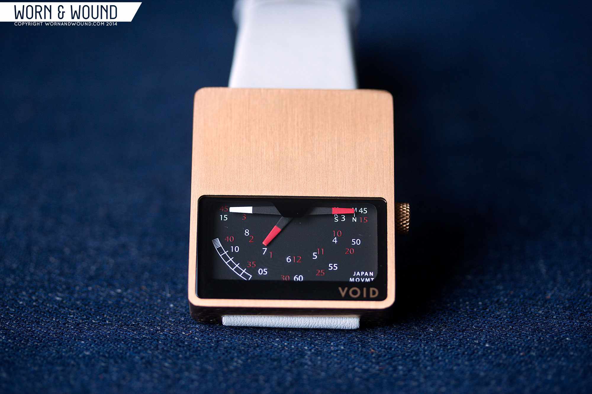
The V02 is bluntly a rectangle. Flat sides, flat top and bottom surface… only the corners have been rounded to make it safe to wear. It’s also a lugless design, so the straps appear to almost magically pass through it. It looks large, but actually measures a comfortable 36 x 42 x 9mm. As simple as it is, it’s striking, standing out against your arm by being so non-human, like a sculpture strapped to your wrist.
On this particular model, the brushed copper finish adds a gorgeous, warm tone to the package. Like rose gold, but darker and less precious, the copper is at once decorative and industrial. It doesn’t look precious, but it doesn’t look mundane either. The partial dial aperture, which covers about half of the top surface, gives the metal plenty of space to be viewed. In fact, it’s such a prominent part of the dial, that viewing the metal seems like an intentional, and enjoyable, side effect of the design.
Off the right side, just below center, is a knurled crown also in copper. The design suits the watch, bringing in an industrial detail. Flipping the watch over, you have a steel caseback held in by 4 small screws. On the polished surface are a few details and and the designer’s signature.
Dial
The dial is particularly interesting, as the hands descend from above, rather than being in their classic, centered position. What you have is a pseudo-retrograde dial, where time is told on nested indexes. Essentially, the dial actually runs the full length of the case, but only a small portion is revealed. Thus the hands tell time in arcs, running from what would be 3 – 9.
The matte black surface has 2 (or 4, depending on how you see things) indexes, one for minutes, the other for hours. Both consist of small numerals in either red or white, which you read separately, each comprising half of a typical dial. Whether you look at the red or white index is then determined by the color of the tip of the hand, each hand being double sided. As one side passes under the covered portion of the dial, the other emerges. Thus giving the “retrograde” effect, without hands that snap back. It takes a minute to get used to, but is actually pretty simple.
Aesthetically, the dial feels like a gauge from the 80’s. It’s not particularly stylized, the typeface is pretty generic and there are some strange markings and words around that feel almost haphazard. Though that description sounds very negative, somehow the dial comes together to be cool looking. Around the dial, above it, is a black space that separates the case from the main dial. This area has a slight bulge that covers the central axis of the hands. That shape reminds me of the back window of a car, which when mixed with the blocky case and awkward dial brings the Delorean and Back to the Future to mind. That might just be me, but it’s an association that gives this was a strange nostalgic quality.
Straps and Wearability
The V02 comes mounted on a 24mm stitch-less leather strap that is a light grey with a slighty minty green tint. It’s not what I expected, nor a color I am particularly drawn to, but I see how it works with the copper. The warm and cool tones play off of each for more contrast. My issue with it is that it’s very light and a bit hard to match up with clothing. Though more predictable, a reddish brown strap would have been nice, playing off of the earthiness of the copper. I was glad to see that the buckle was also copper coated, matching the case.
On the wrist, the V02 wears as well as one might hope for a rectangular slab. It’s not ergonomic, but it’s not uncomfortable either. The size makes it sit properly on top of the wrist, so it doesn’t look oddly large. Though minimal in its own way, it’s got a lot of presence and is a watch people will notice. The dial is secondary to the brushed copper case, so the aesthetic really is that of a piece of metal strapped to your wrist. Designs like this don’t really fit into typical dress/casual/sport considerations, so pairing wise, I think it’s open. Naturally, I don’t see this as a dress watch, but in the right context, for the right person, it could probably be pulled off. Most likely, it’s good with casual, modern clothing.
Conclusion
Obviously the Void V02 isn’t a watch for everyone, so let’s just get that out of the way. But, I have to say, I liked it. Perhaps my favorite things is simply the case finish. The copper color is different and very attractive. Combined with the sharp case and unique dial, and you have a watch that is, overall, simply enjoyable. It’s not an everyday watch, it’s not about to replace my mechanical staples, but as an eye-catching conversation piece, a watch to wear to non-watch events, it could definitely serve a purpose. Though most of us hate to admit it, when we wear our personal favorites, non-watch people rarely notice them. This is the kind of watch that will get anyone’s attention, and likely praise for its unique looks.




 Featured Videos





I have this watch in my collection and I had to seach hard to find it as it was sold out at a few places.
It only takes a minute to figure out what time it is and then is very intuitive. I am very happy with this off-the-beaten-path timepiece and recommend it.
I like the design and its cheap, but not cheap looking. I’ve even figured out how to tell the time on the watch. I like it. I may have to add this to my collection. Thanks for bringing this to my attention.