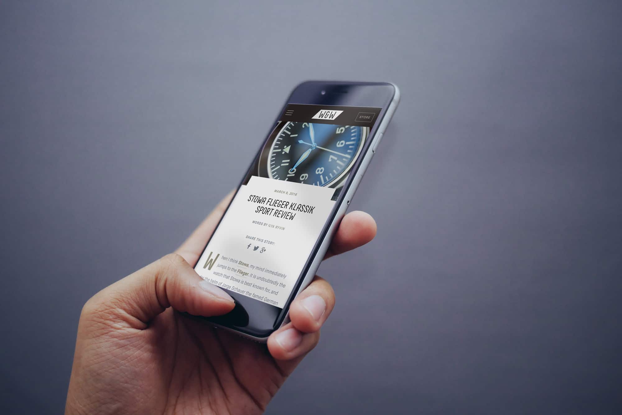
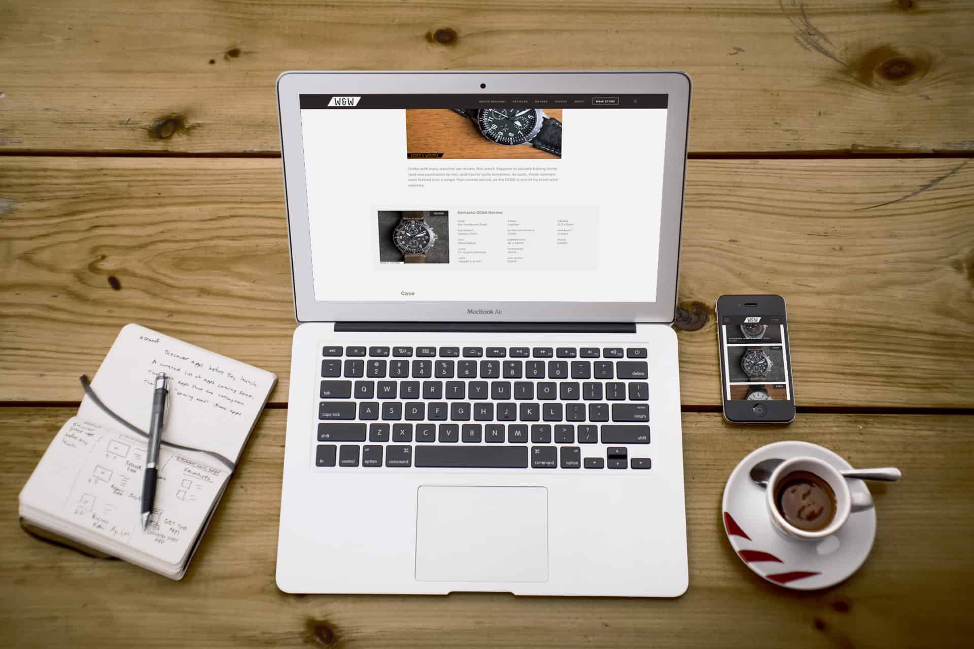
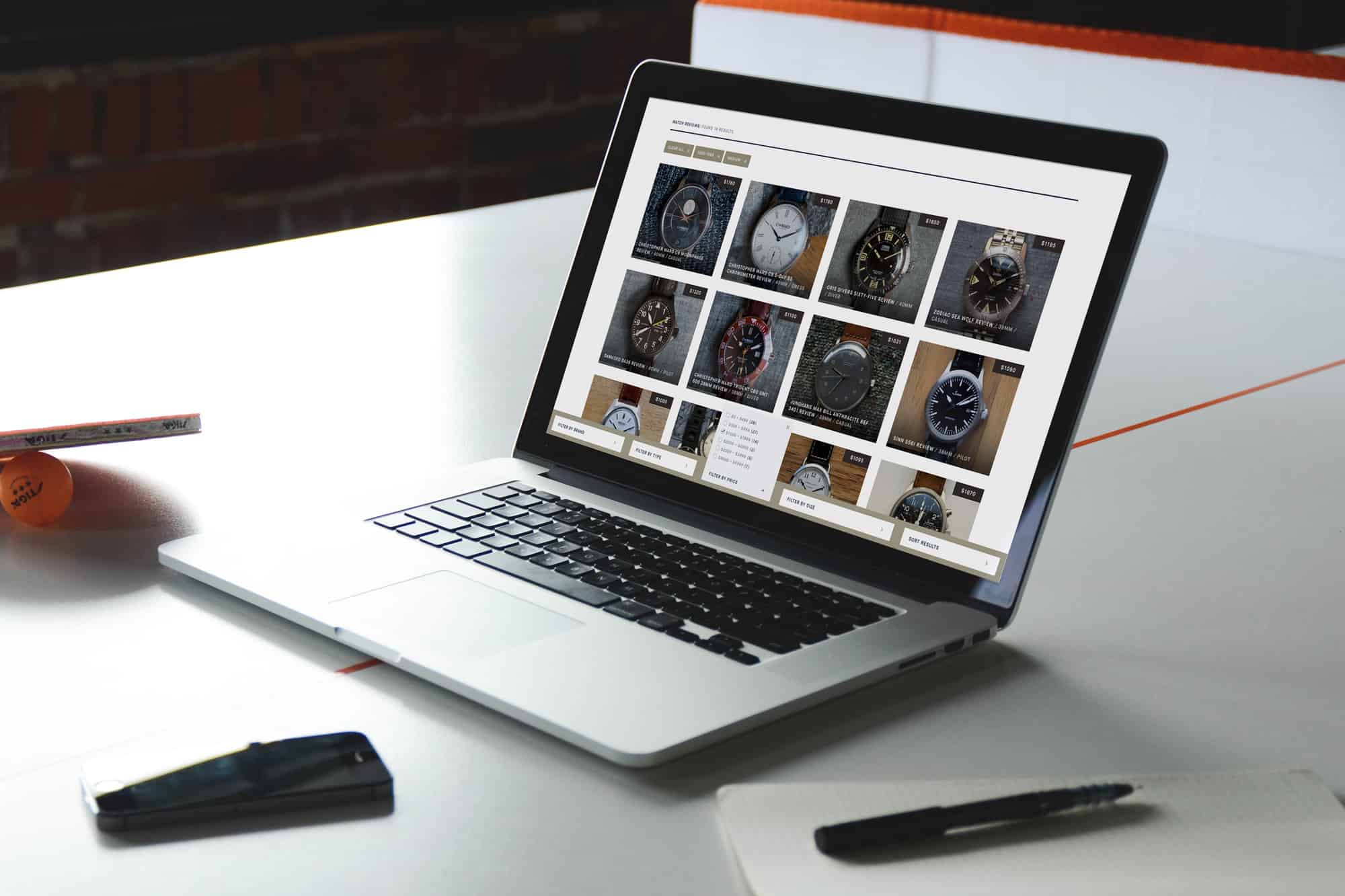
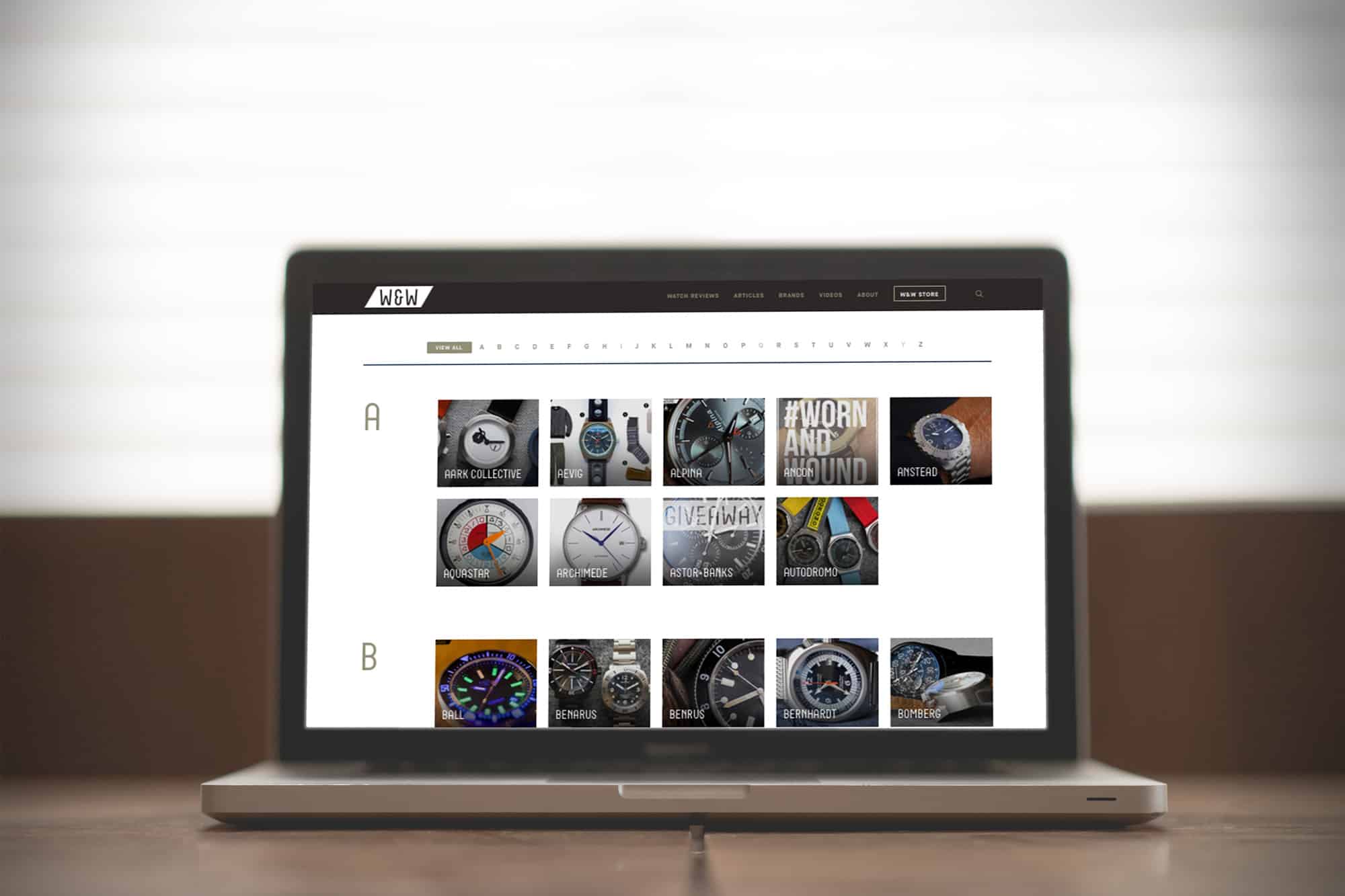
Ladies and gentlemen, we’re beyond excited to announce the newest version of worn&wound! As you probably immediately noticed when pulling up the site today, things look a bit different. Well, they are actually very different. For our fourth version of w&w, we worked with a very talented duo, Jesse Rosenfield and Kyle Mac, to rebuild the whole site from the ground up. This isn’t a re-skin, it’s a whole new build, one that has been designed and coded to work better and be faster. We also put an emphasis on making sure the mobile experience is top notch for you readers-on-the-go.
For the aesthetic, we stayed true to what we think is most important. It’s minimal, with a focus on clean lines and imagery. As with our previous sites, we’ve wanted to make sure the w&w is a unique experience. So, expect the new site to have some cool features and design elements you wont find elsewhere. But more over, the design is meant to celebrate and elevate the content and the watches we talk about.
Homepage + Content
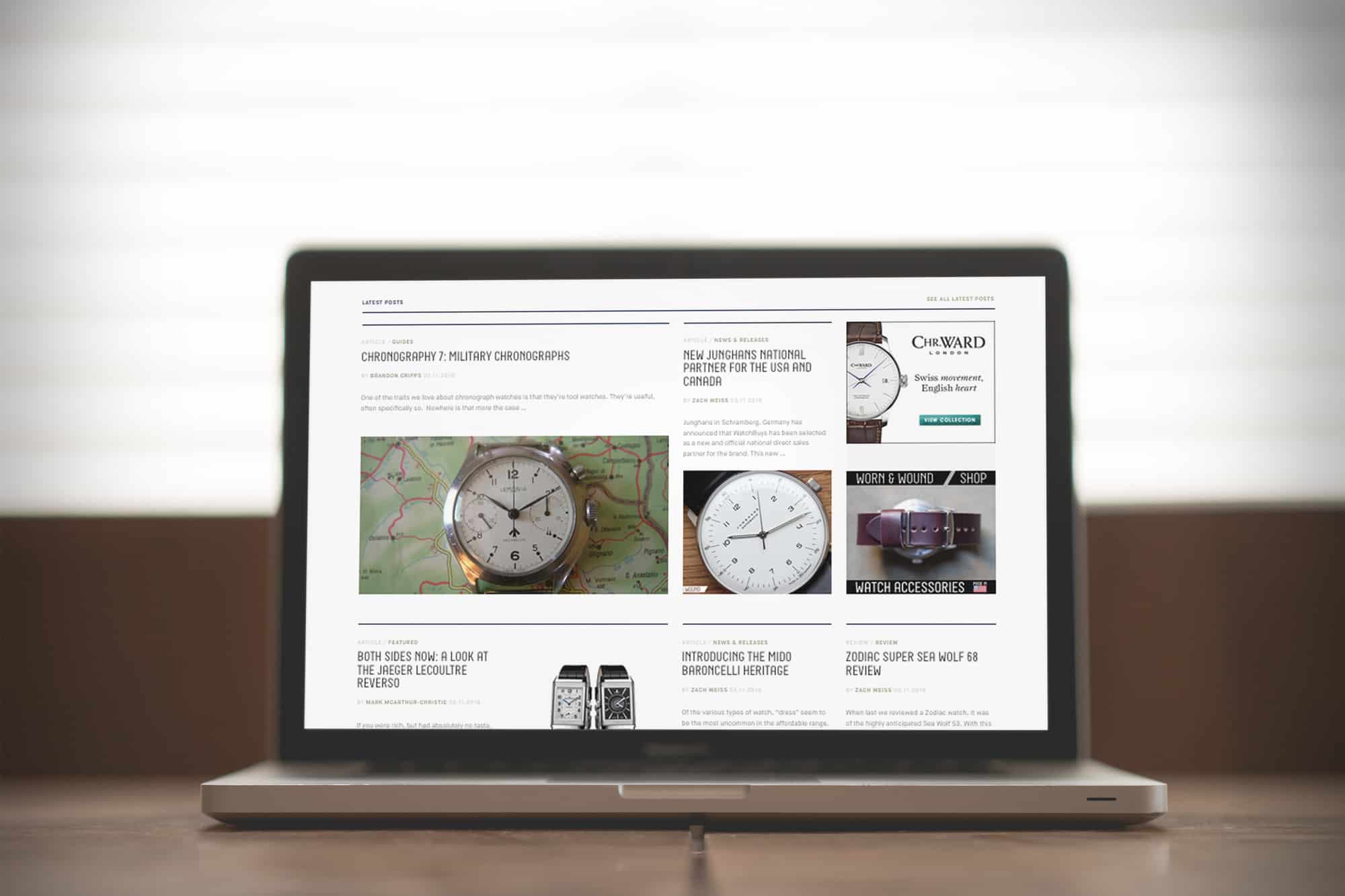
Diving right in, the homepage opens with our cover story section, presenting the day’s lead story and following 3 stories with bold images. That might be all you need, but if you wish to dig deeper, below you’ll find our dynamic news feed, presenting recent articles in an attractive layout.
Moving further down, you’ll now find multiple curated content sections. Over the last 5+ years, we’ve created a lot of content. But unlike in many other industries, much of that old content is still totally relevant. Of course, you can access it all through the archives, but here we plan on presenting you with interesting packages of posts, perhaps highlighting a topic, brand or series. Check it out now, and you’ll find some w&w classics in one section and the first three parts of Chronography series in the other.




 Featured Videos


