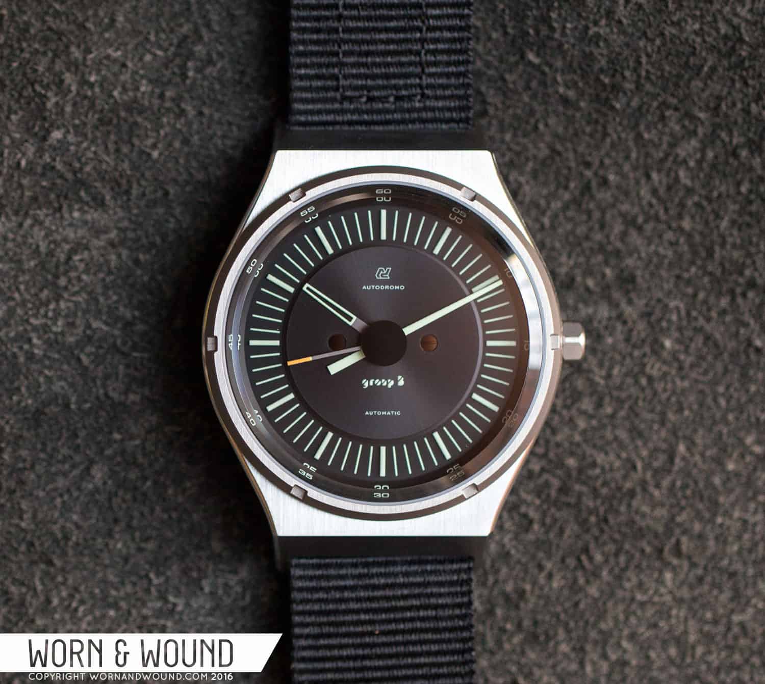
Autodromo Group B Review

When people discuss the great eras of watch making, the 80’s don’t often come up. It was a time when quartz had leveled the industry, inexpensive pieces flooded in and digital was emerging. Nor do the 80’s come up when people speak of great style and fashion, plagued by fluorescent colors, padded shoulders and oddly baggy shirts. But when people discuss Rally car racing, it’s a different story altogether.

With Autodromo’s new line of watches they drew upon the distinctly 80’s era of rally car racing known as Group B. As Sean pointed out when we first announced the watches, Group B was a notoriously brutal and dangerous. Cars were light and had monstrous amounts of power. It was an era that fostered a lot of technological innovation in the sport, but resulted in too many accidents as well as a few deaths, ending after 4 years. Many consider it the “golden age” of rally car racing.

As with previous lines of Autodromo watches, the design found its inspiration in those beastly machines, drawing on their blunt, faceted chassis and neon, high-contrast dashes, but also on their spirit of innovation, pursuing a lighter build, mix of materials (steel and titanium) and springbar-free concept. But the watch design itself is obviously not a literal translation of a rally car, instead speaking to sport watches of the surrounding period, as well as the aesthetics of 80’s… but, done with a careful eye, avoiding the tackiness that pervaded the era.

AUTODROMO_GROUP_B_DIAL_19

What they ended up with is their boldest design to date. A watch that hints at Genta, has shocks of color, is exceptionally light and balanced and is truly unique in the current market. The Autodromo Group B comes in at $925, is powered by a Miyota 9015 automatic, features two custom nylon pass-through straps and a handmade aluminum box.

Advertisement
$925

Autodromo Group B Review

Case
Steel and Titanium
Movement
Miyota 9015
Dial
Black w/ various colors
Lume
Yes
Lens
Sapphire
Strap
2 x Nylon
Water Resistance
50M
Dimensions
39 x 50mm
Thickness
10mm
Lug Width
20mm
Crown
4.75 x 3
Warranty
2 Years
Price
$925

Case

Autodromo is a brand that puts a lot of attention on case design and finishing. It’s a theme through all of their watches that, to my eyes, has made their watches truly excel. The Group B is no different, and is perhaps their strongest offering in this regard to date, though perhaps the most divisive. The two most standout design features are the mix of steel and titanium elements and the pass-through lug design. The first grants the watch a light weight of 52g, some interesting, subtle shifts of color and speaks to the ingenuity of the Group B rally cars. Autodromo used the light weight metal to create a sort of capsule including the bezel, case back as well as the movement holder. It’s the latter detail that is perhaps the coolest as it’s functional rather than aesthetic.

AUTODROMO_GROUP_B_CASE_1

The second creates an even simpler method of strap swapping, removes a potential breaking point (spring bars can pop out or snap under extreme circumstances) and continues the visual language of the design through out all case elements. The down side is that normal two-piece straps are not usable. It’s certainly a bold design decision that while potentially turning away some customers speaks to the concept and visually ties the watch together.

The case measures 39 x 50 (edge to edge) x 10.2mm (to the top of the sapphire), making it a thin and modestly sized watch. If you were to remove the crystal, the watch would be under 10mm, which is very thin. This was achieved through clever design, where the movement partially sits within the domed case back. The result is something light and lithe. The edge to edge length is on the long side for a 39mm diameter, but thanks to the faceted design, it wears smaller in that dimension. Overall, it’s a great compact size, which unto itself is a nice change of pace from a lot of what’s out there.

The design is striking, mixing a barrel shape with sharp facets and excellent finishing. From above, you have that classic barrel silhouette, with a flat top surface and a bezel mounted directly onto it, which cuts away with a steep angle to descend down the wrist, and create the slot for the straps. The finishing quality of the case is immediately apparent here. The top surface breaks into the angled side with a perfectly clean and sharp line. Both have continuous brushing running vertically (12 – 6). The titanium bezel is then brushed on its top surface as well, perfectly matching the mid-case below. The bezel is matte on the sides, creating a nice contrast of textures as well as bringing out some of that darker titanium gray color. On the bezel, there are tool grip marks, like what you’d typically find on a case-back, bringing another dimension of texture in and creating a technical aesthetic detail.

Continuing to look at the steel mid-case, the sides are brushed as well, and along all side edges, including on the underside, there is a polished bevel. This detail is particularly gorgeous, adding some classic elegance in the mix. In the light, that little glint from the edge highlights the form. The fact that the finishing runs on the underside speaks to the brand’s commitment to detailing. Even the flat portion on the underside of the strap-slots is brushed. You rarely see that kind of attention to detail.

AUTODROMO_GROUP_B_CASE_7

On the right side is a small crown measuring about 4.75 x 3mm with a hexagonal design. It’s actually the same design that is found on the Prototipo, but shrunken down for the Group B case. It’s a nice design that definitely speaks to the Autodromo concept and aesthetic. It’s also nicely finished with rounded edges all around.

Flipping the watch over, the case back is made of matte titanium and is held down with 6 screws. As mentioned, the case back is a bowl shape and actually the tallest part of the case. Since it’s underneath, domed and partially obscured by the strap, you don’t realize that, which is a clever trick to further make the case look and feel thinner. The back is relatively plain, once again as it is largely obscured, but does contain various details about the watch in an elegant and small typeface around its perimeter and an Autodromo logo in its center.

AUTODROMO_GROUP_B_CRYSTAL_1

The crystal on the Group B is worth note too. It’s a tall sapphire crystal, coming out above the bezel, with a wide chamfered edge and a flat top surface. The big chamfer is a cool detail that gives the crystal a greater sense of form than one typically sees on a crystal. First, it corresponds to the vocabulary of shapes found across the case, with facets and flat planes alternating with each other, creating a nice rhythm throughout the entire design. Second, by being thick but solid, the chamfer creates distortion. So when viewed from the side, you get this real sense of the glass being there (whereas typically crystals are meant to be more invisible) which works with the focus on materials at play in the design.

Dial

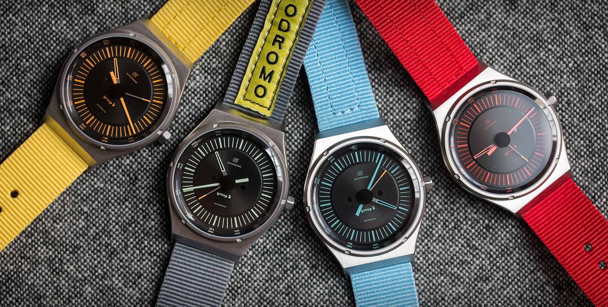
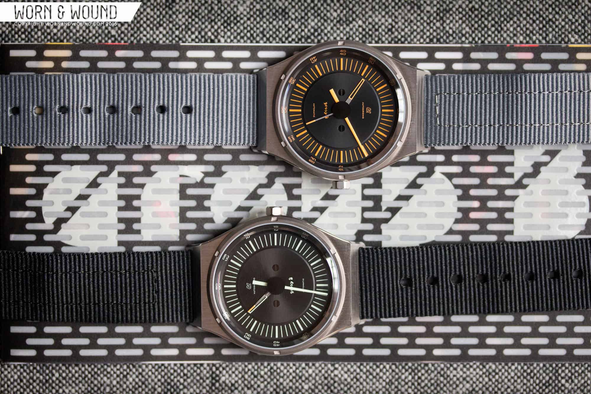
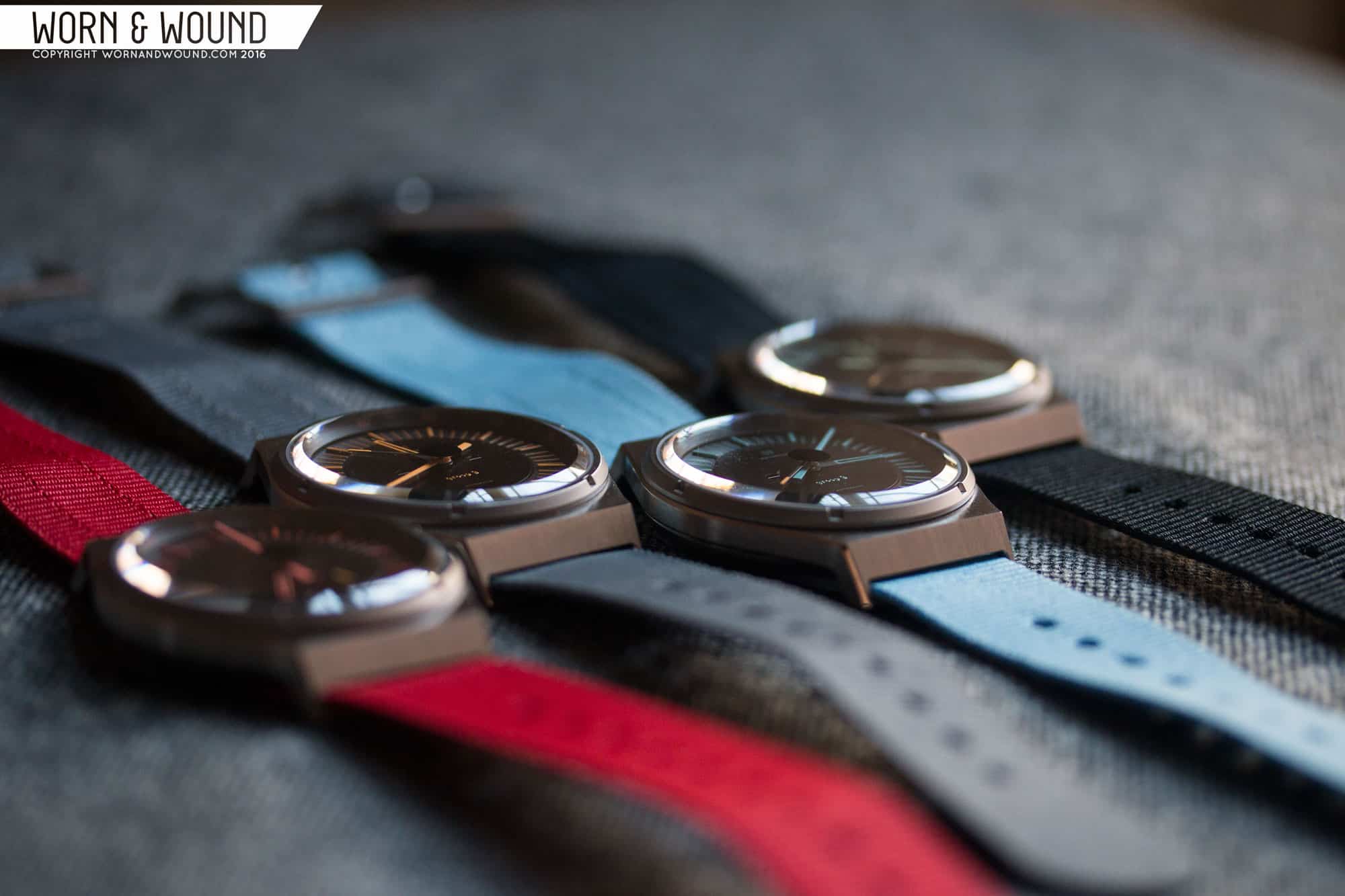
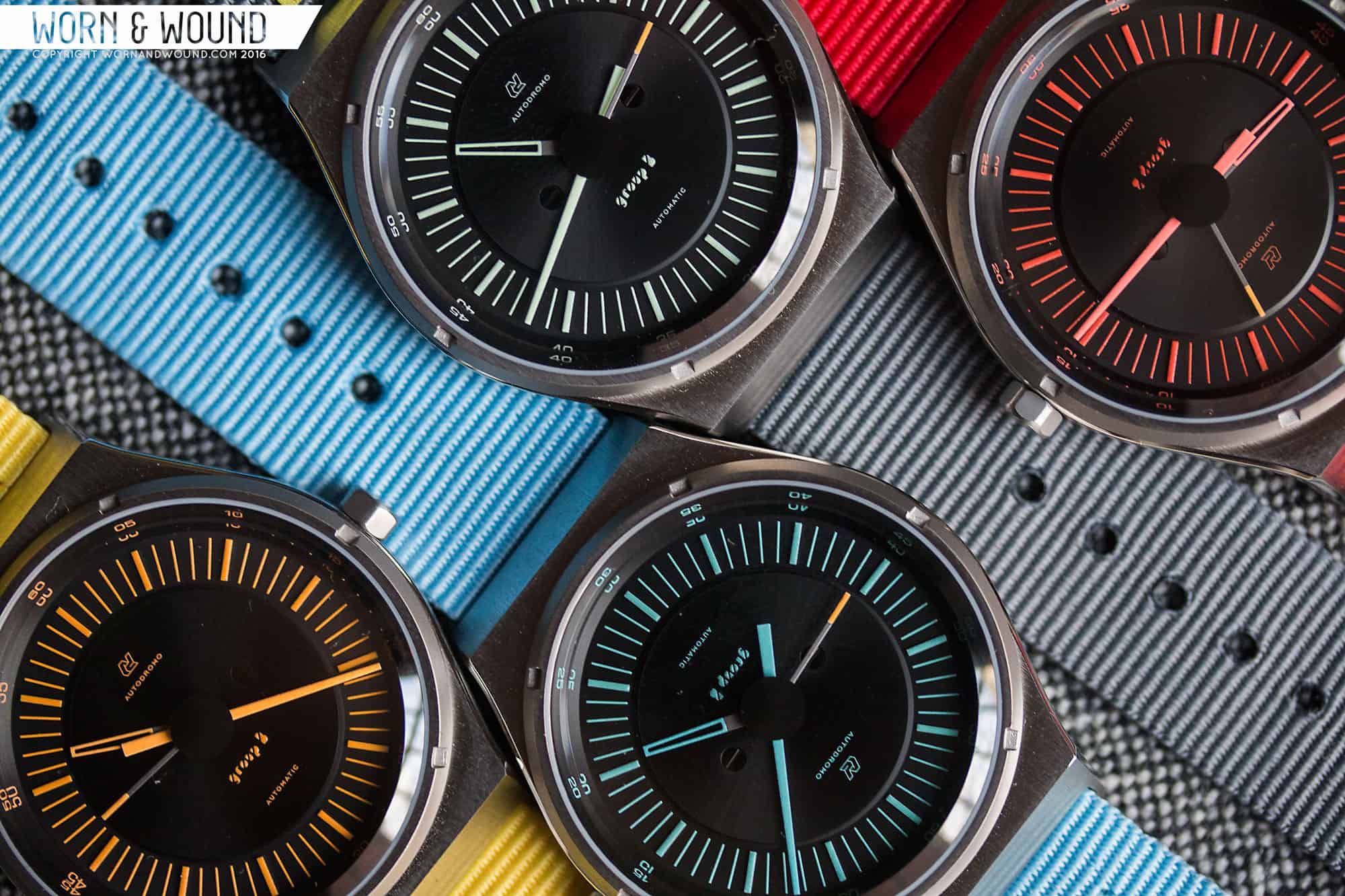
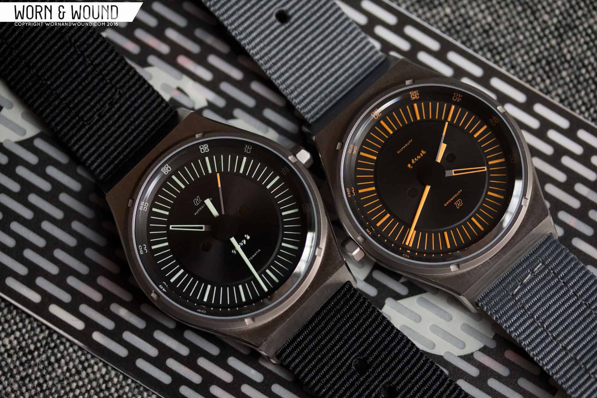
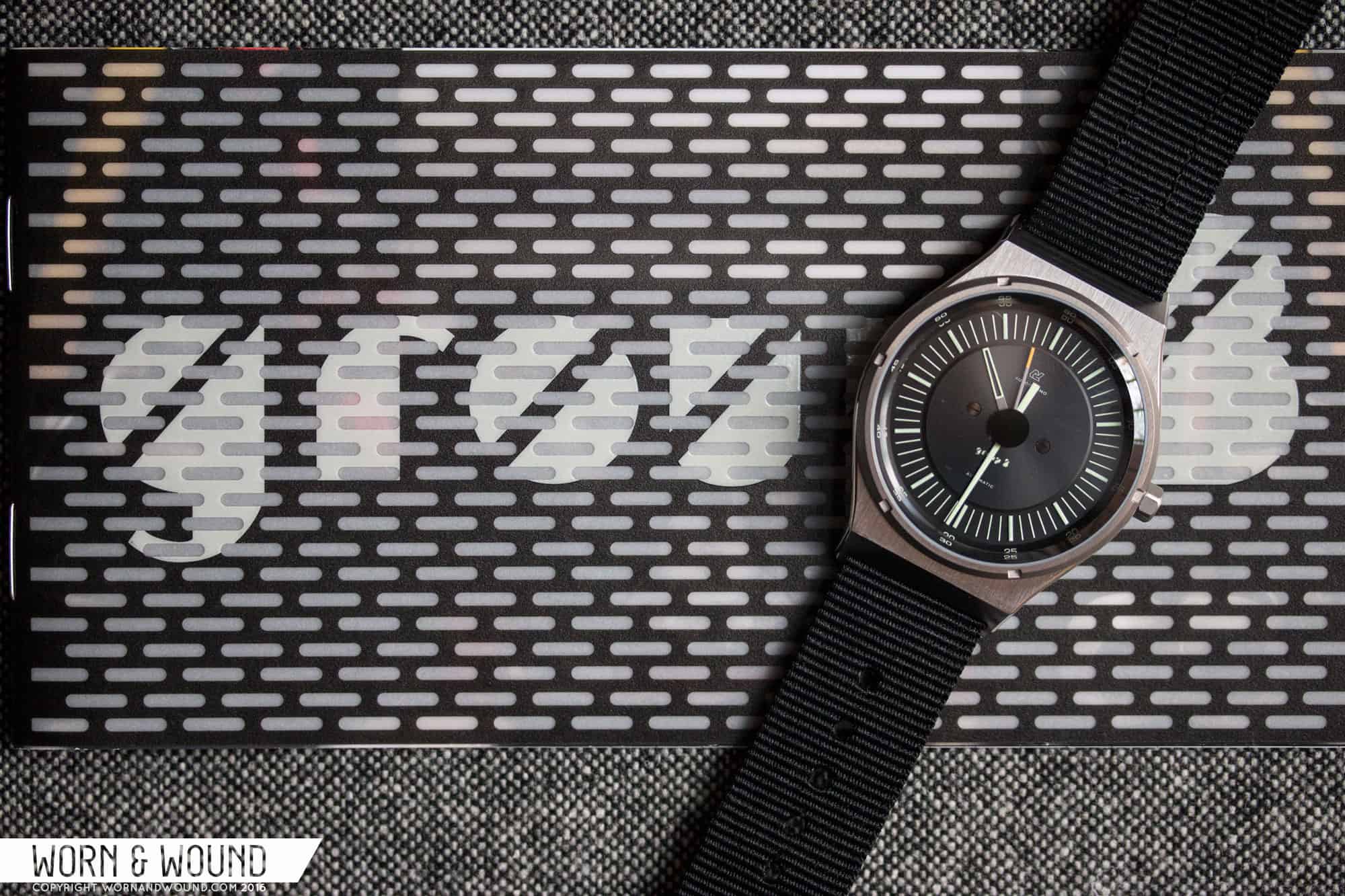
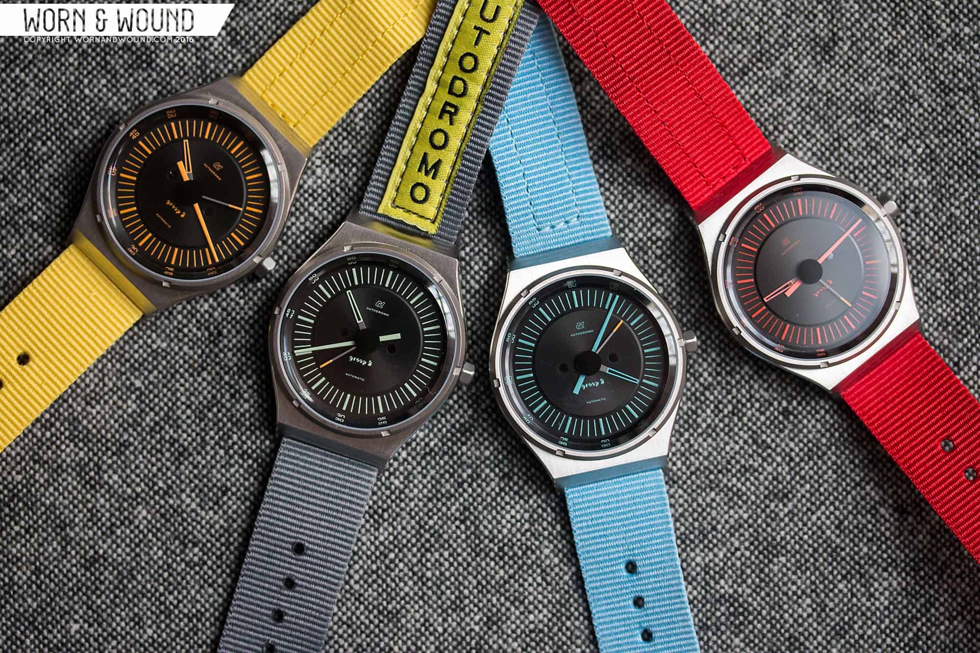
The dial of the Group B is clean but bold, utilizing high contrast and sometimes surprising colors. As with some of the other Autodromo watches, the dial draws from dash gauges, this time specifically from tachometer of the Lancia 037 Group B rally car (which is the car pictured on their site). Though drawing from that source, it’s not very literal, so it doesn’t immediately read as automotive. At a glance, the dial might appear flat, but in person it’s anything but. There is actually a surprising amount of detail considering what seems like a simple design. Currently, it’s available in 4 colors: white, blue, yellow and red. I’ll get into each, but first I’ll look at the general design.

AUTODROMO_GROUP_B_GROUP_2

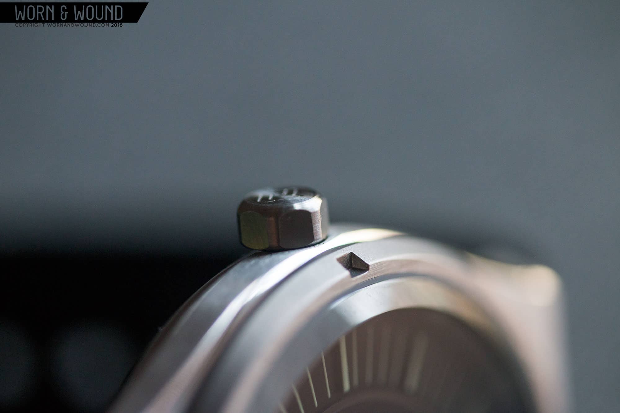
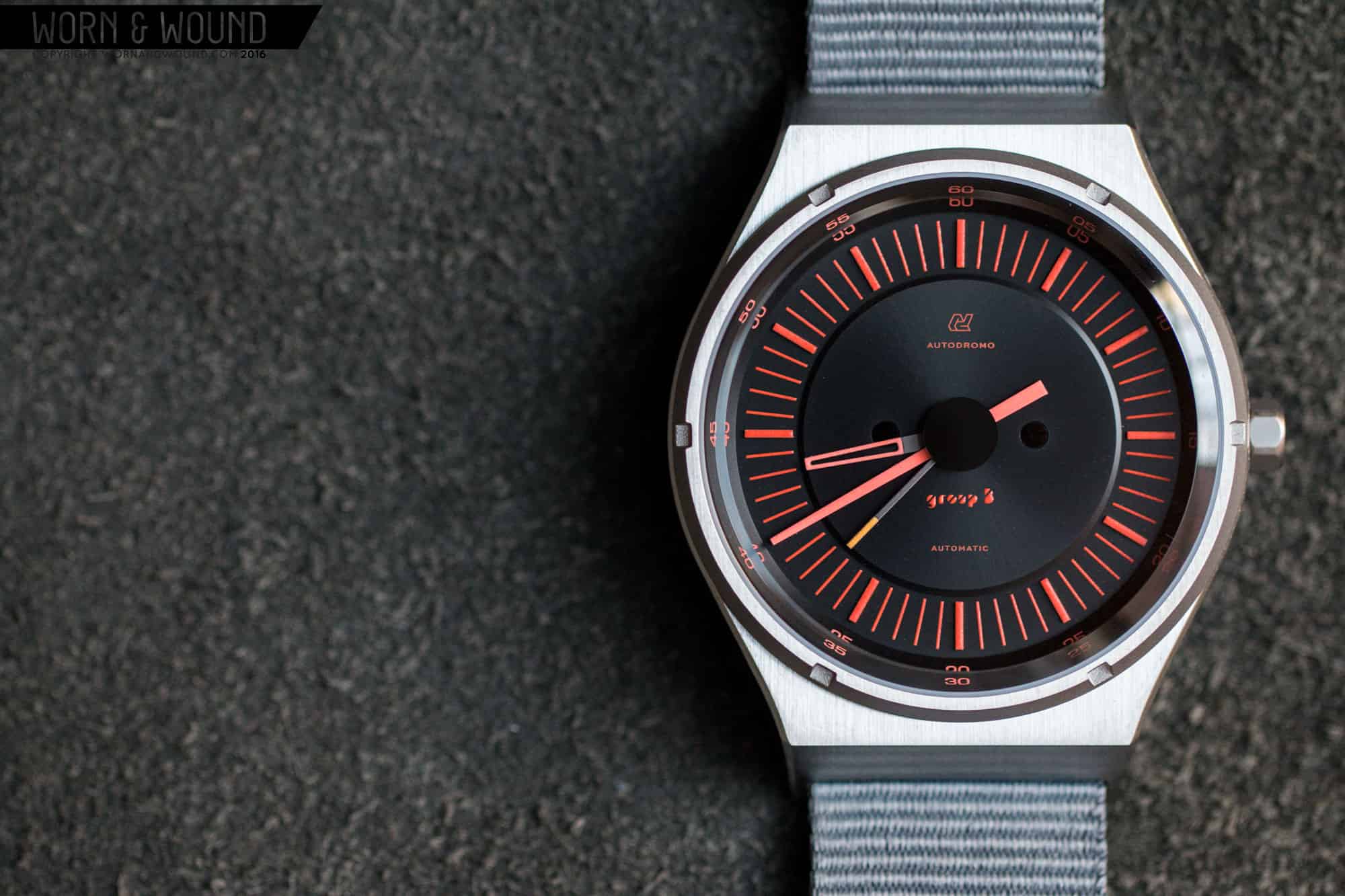
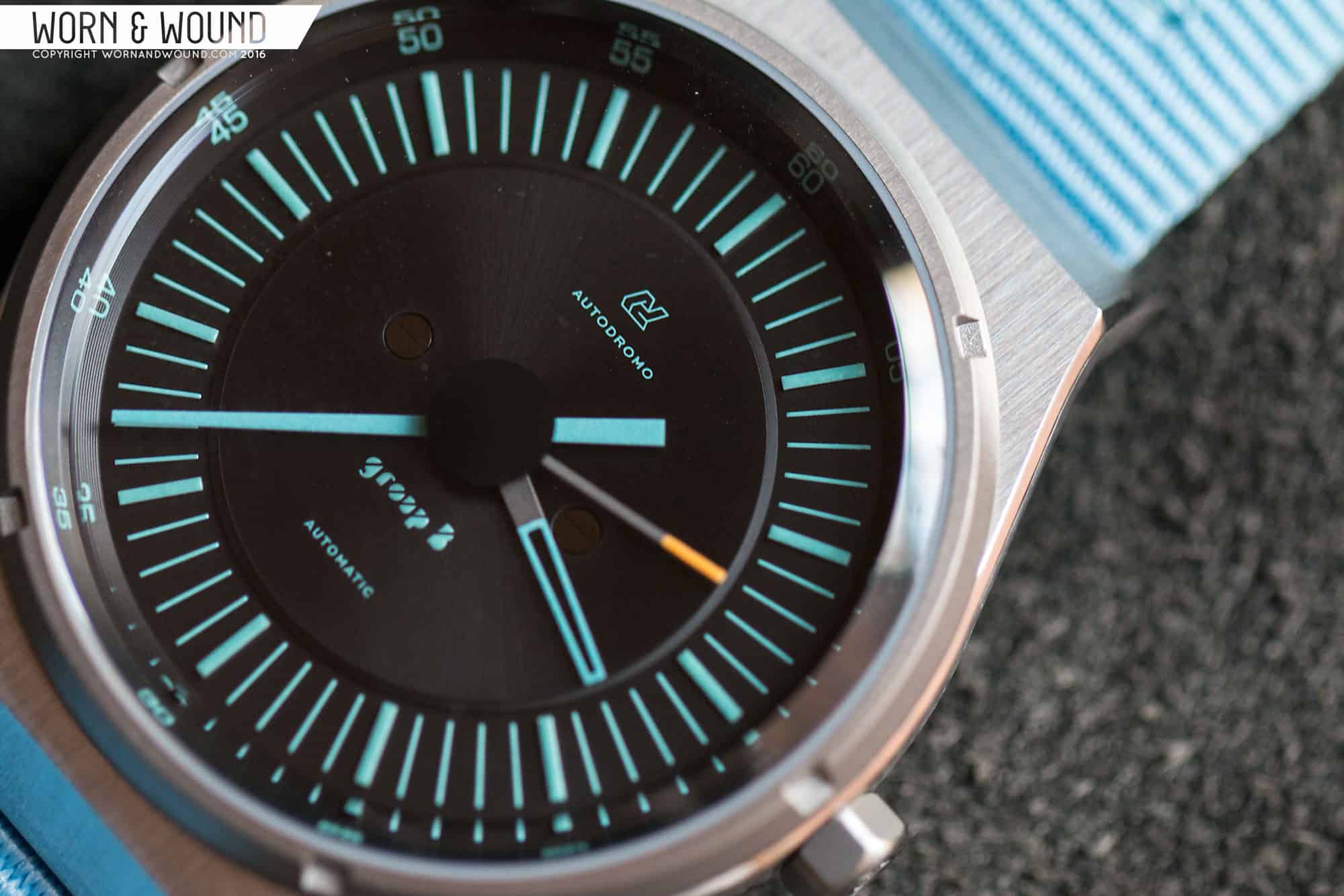
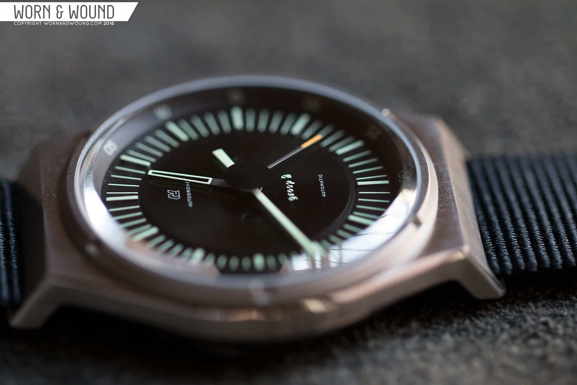
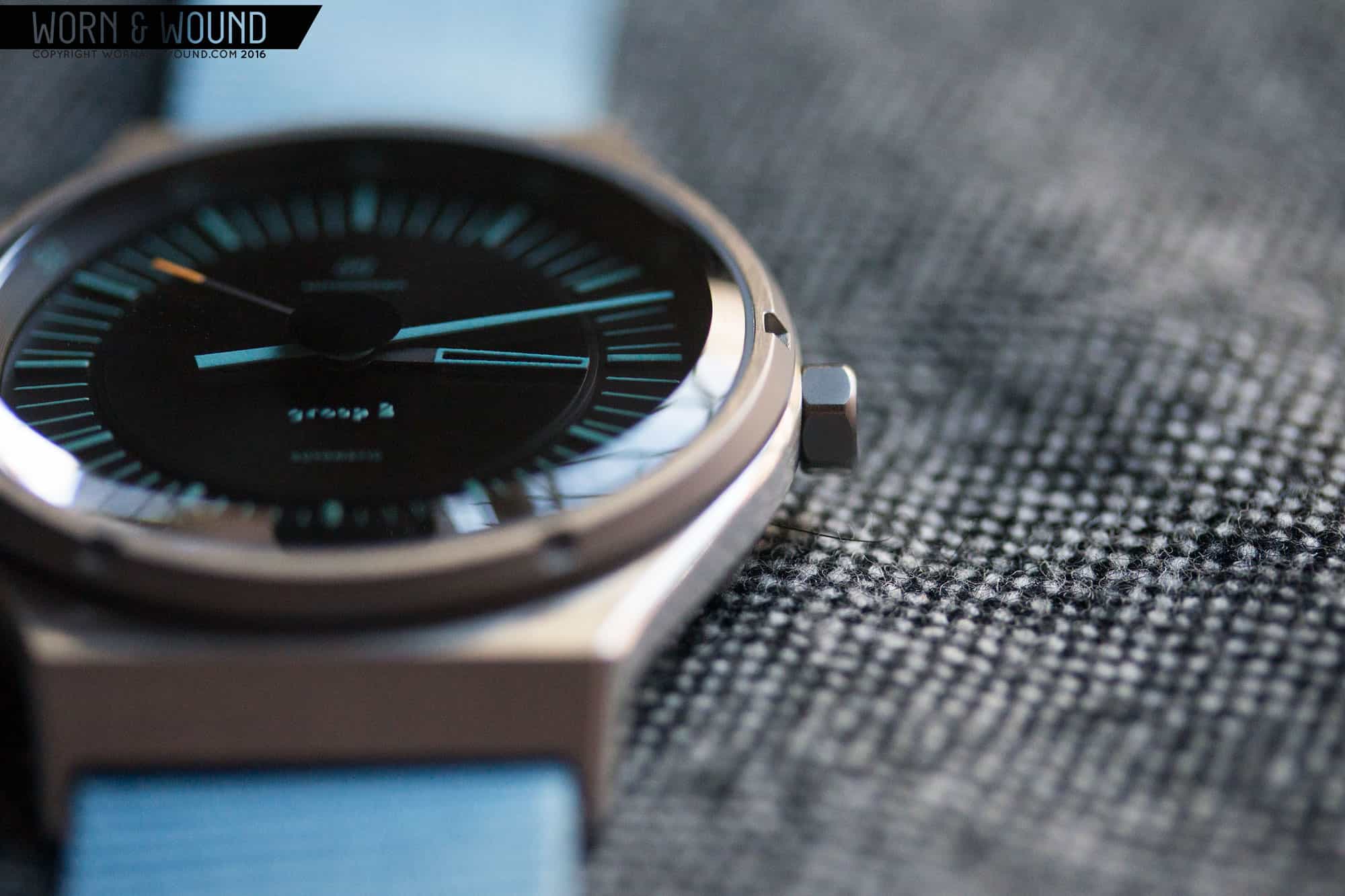
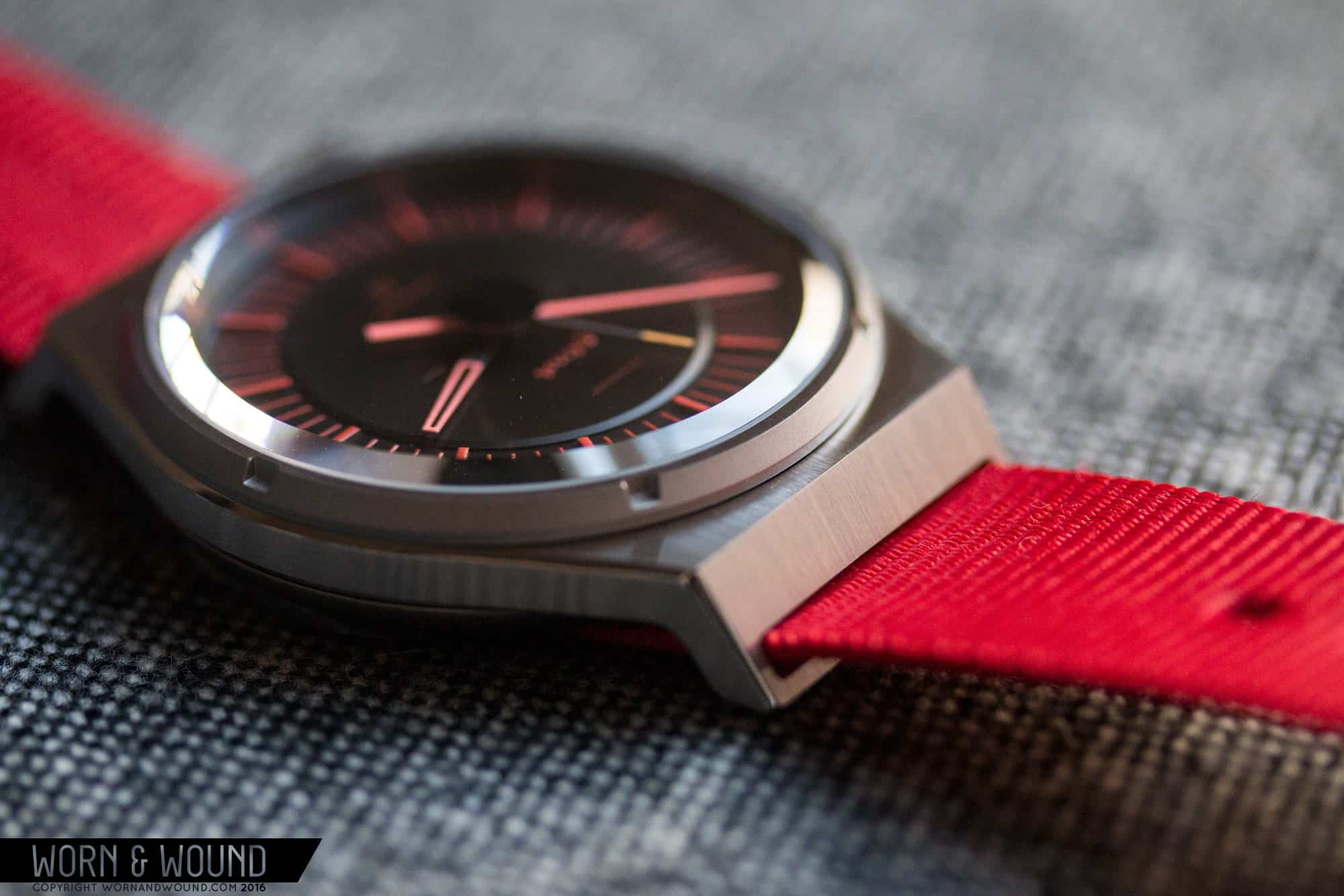
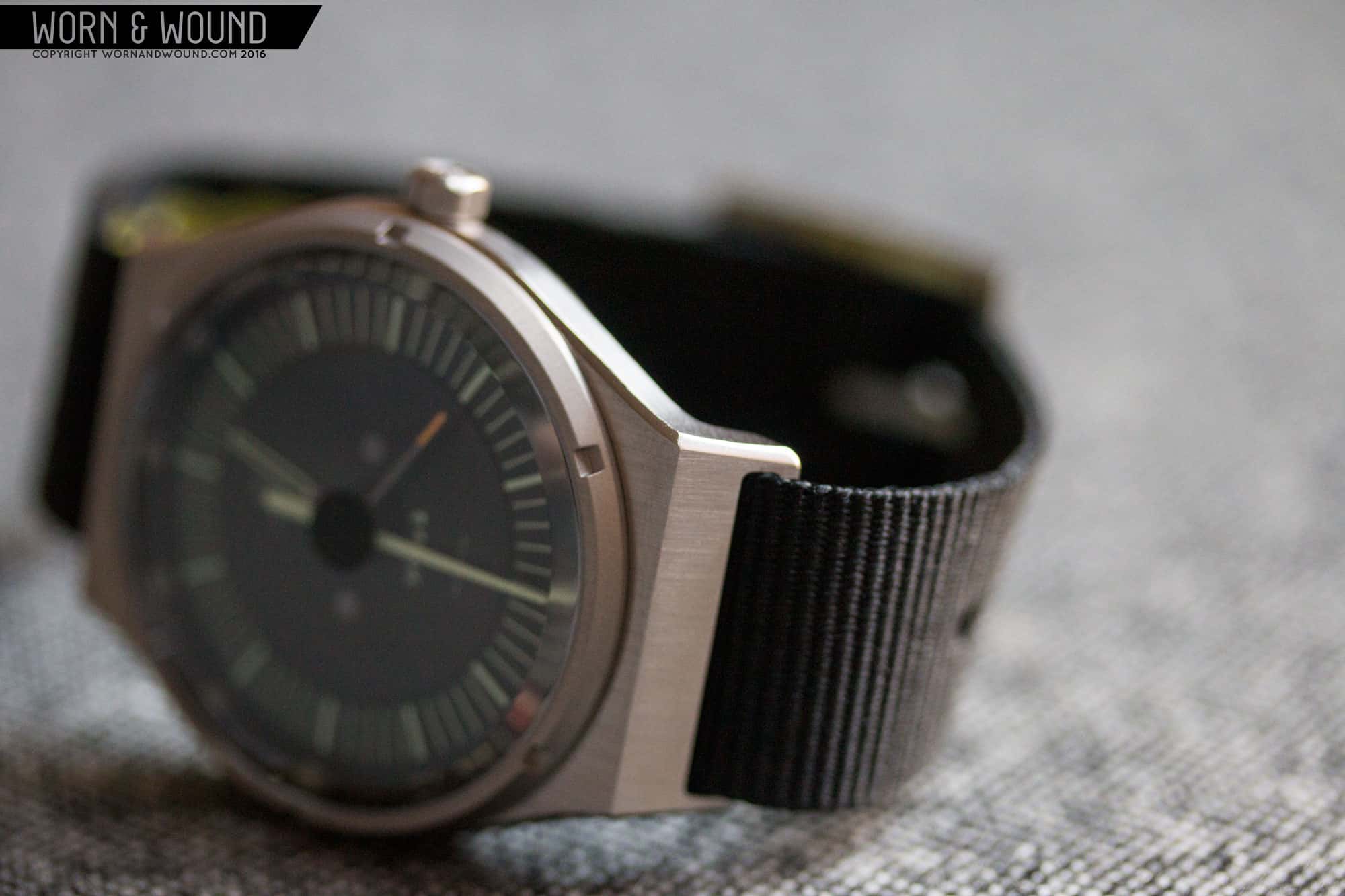
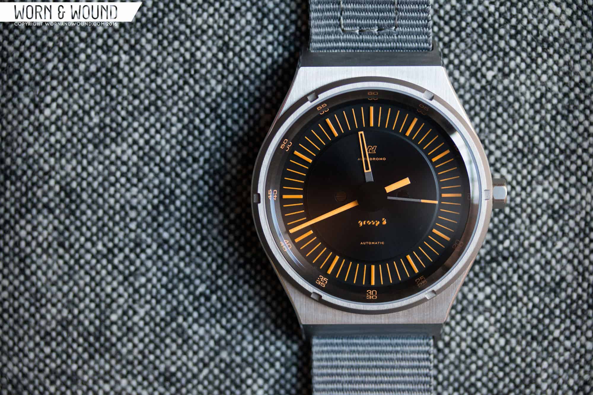
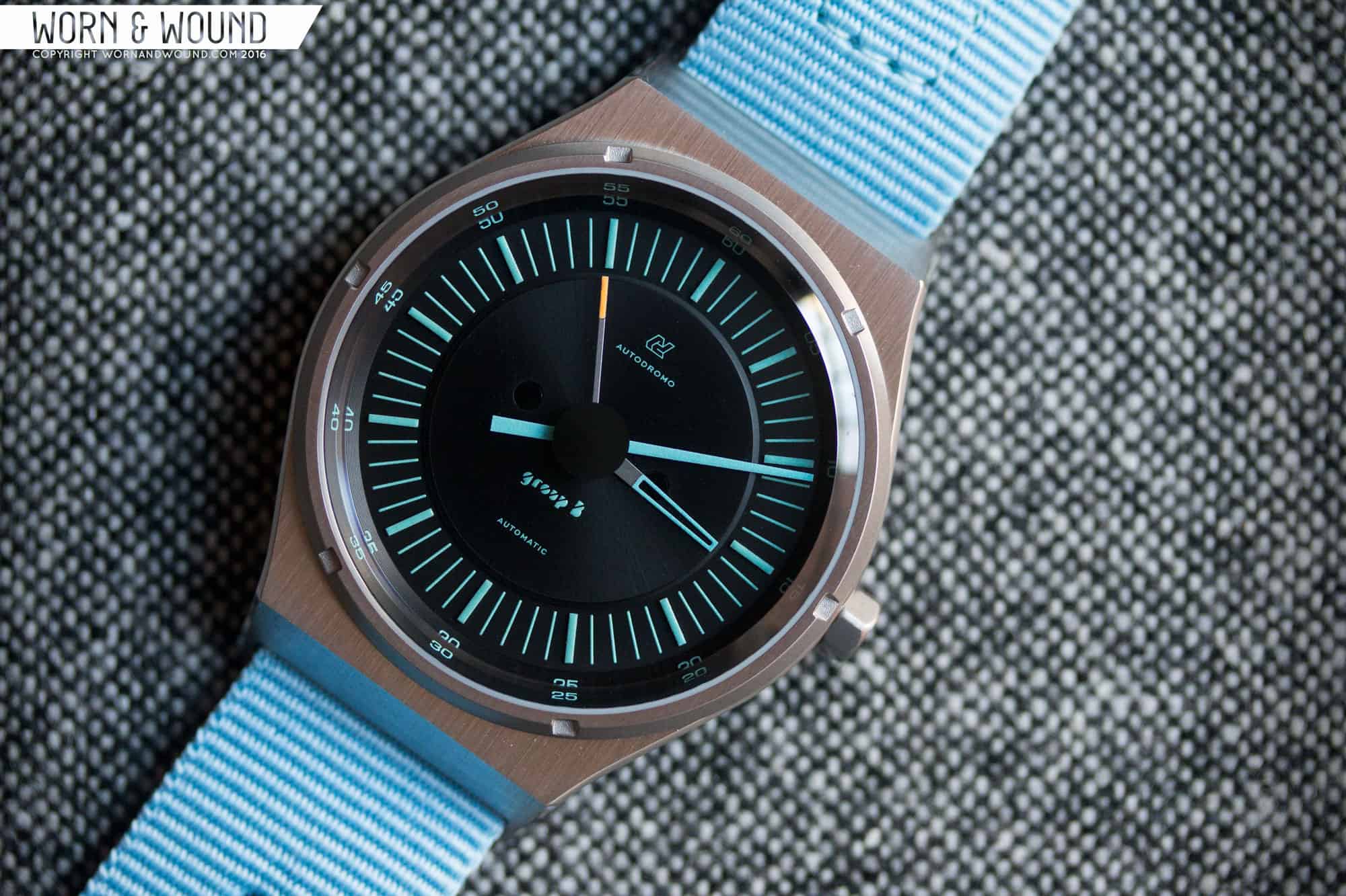
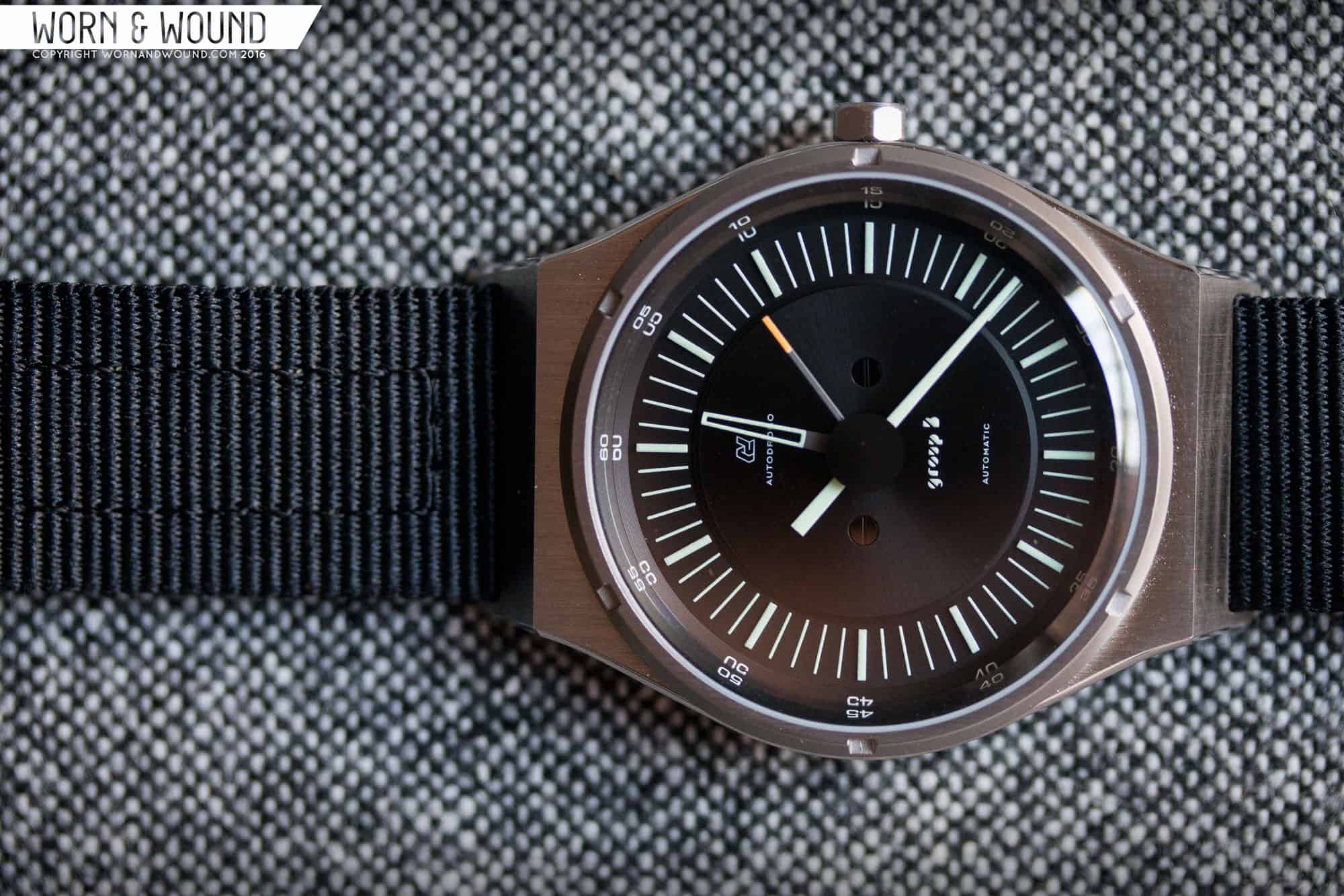
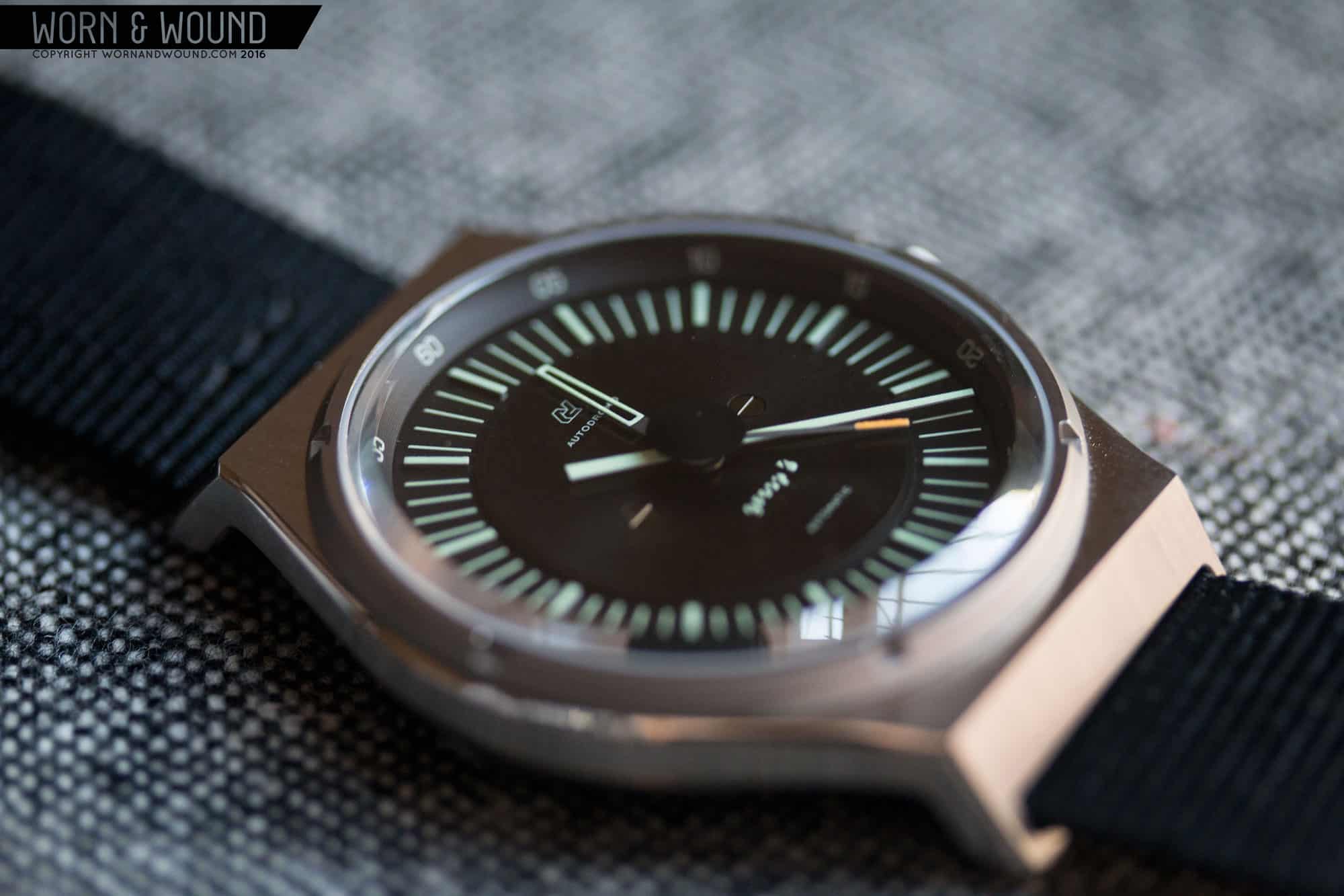
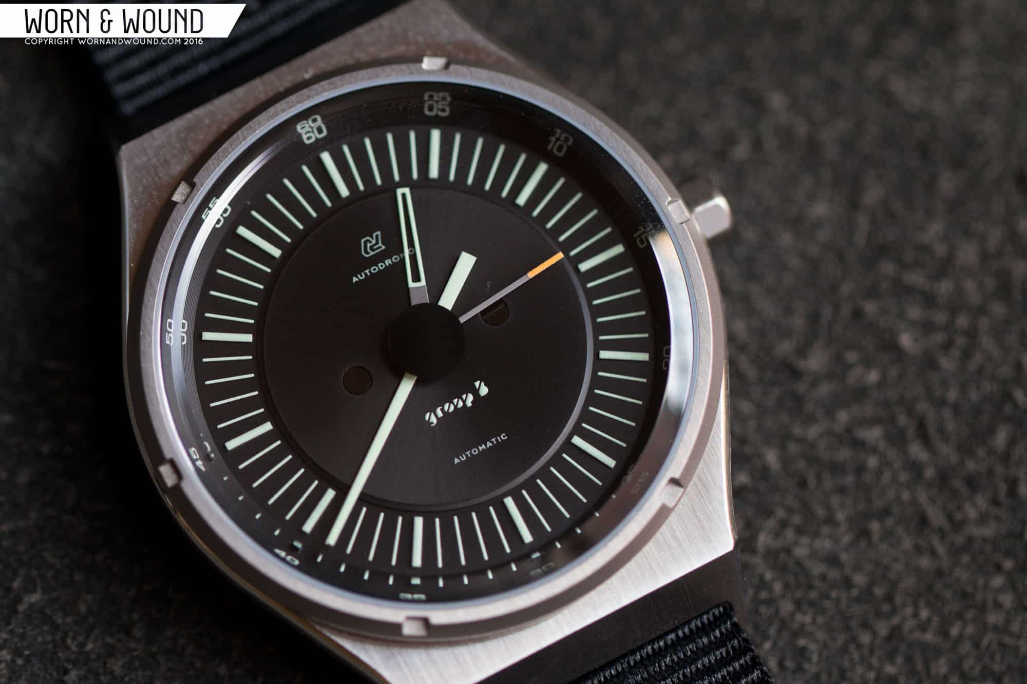
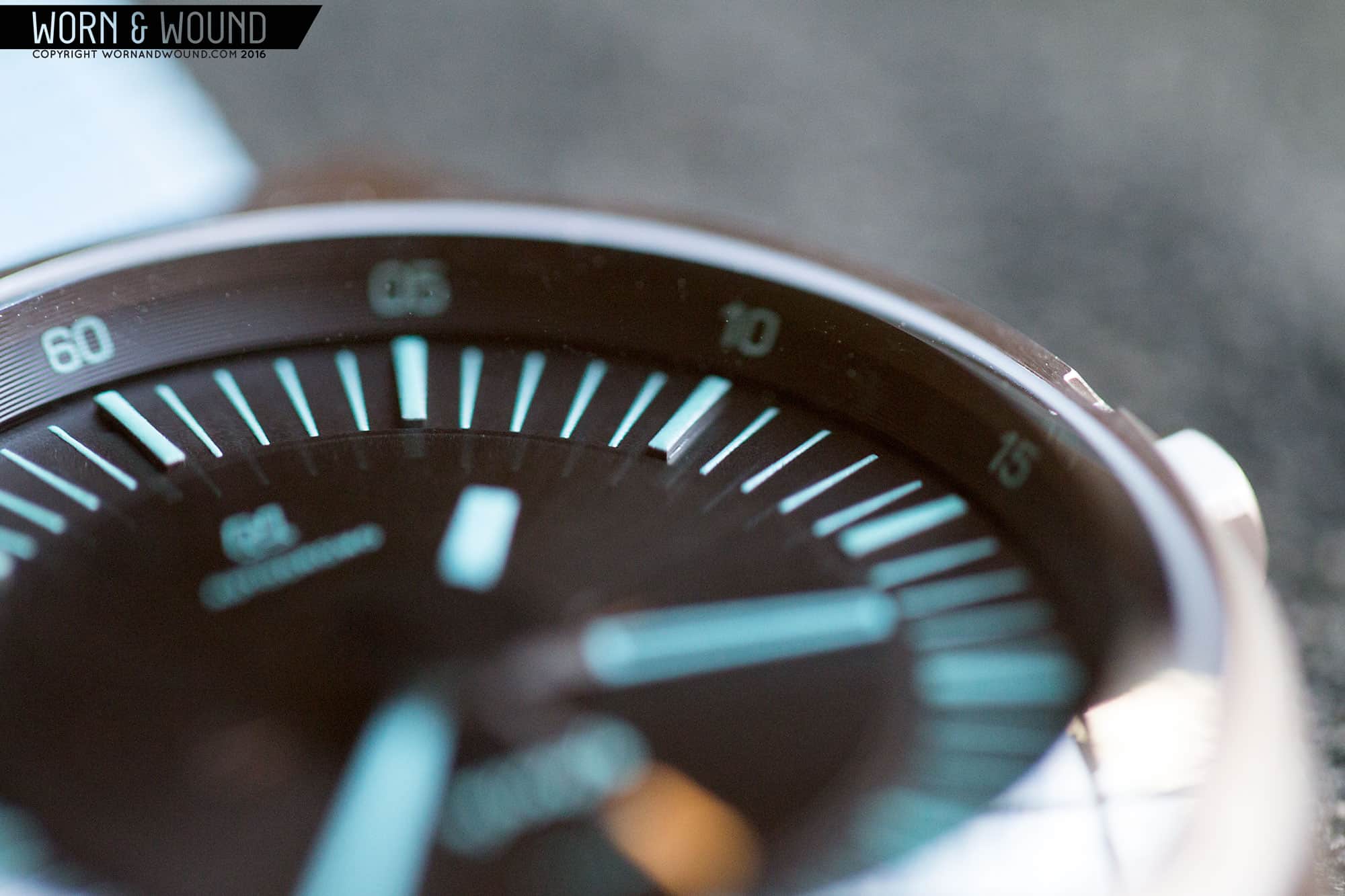
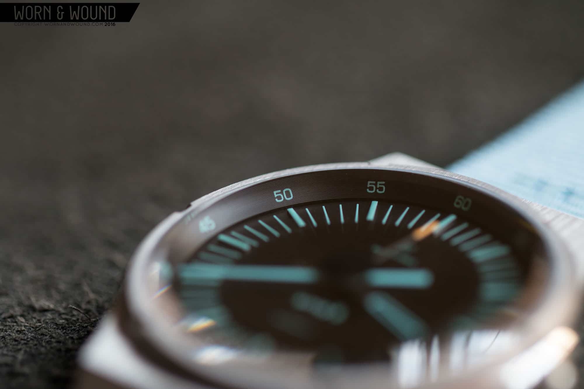
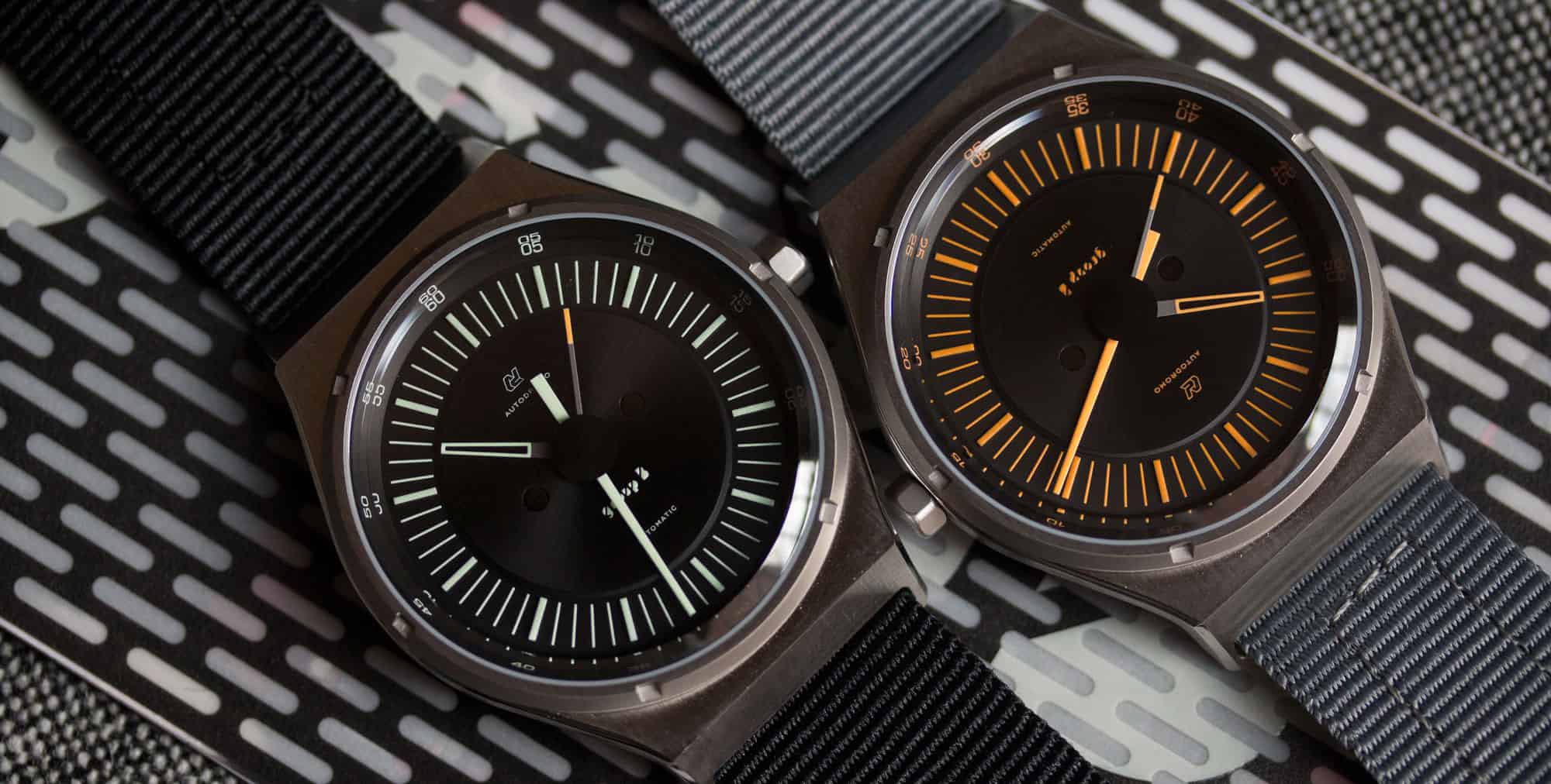
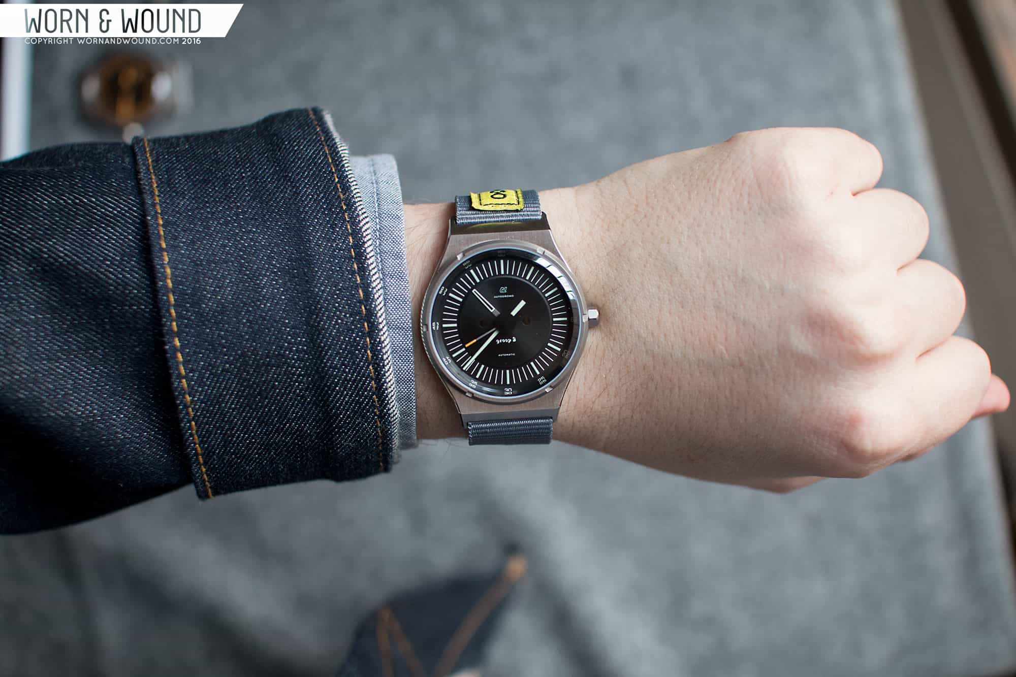
The dial features a stark black surface with a raised central area, creating a lower elevation between that and the chapter ring. The primary index sits in here, and consists of bold lines in one’s color of choice, getting wider at the hour. The hour markers are actually raised as well, perhaps applied, creating some depth and texture and further making them stand out. The chapter ring, which is steeply angled, has color matching numerals at intervals of 5, adding a needed reference for legibility. A cool detail I didn’t even notice until looking at the chapter ring with a loupe is that it’s textured with circular graining. This gives the ring a slightly different and more metallic sheen.

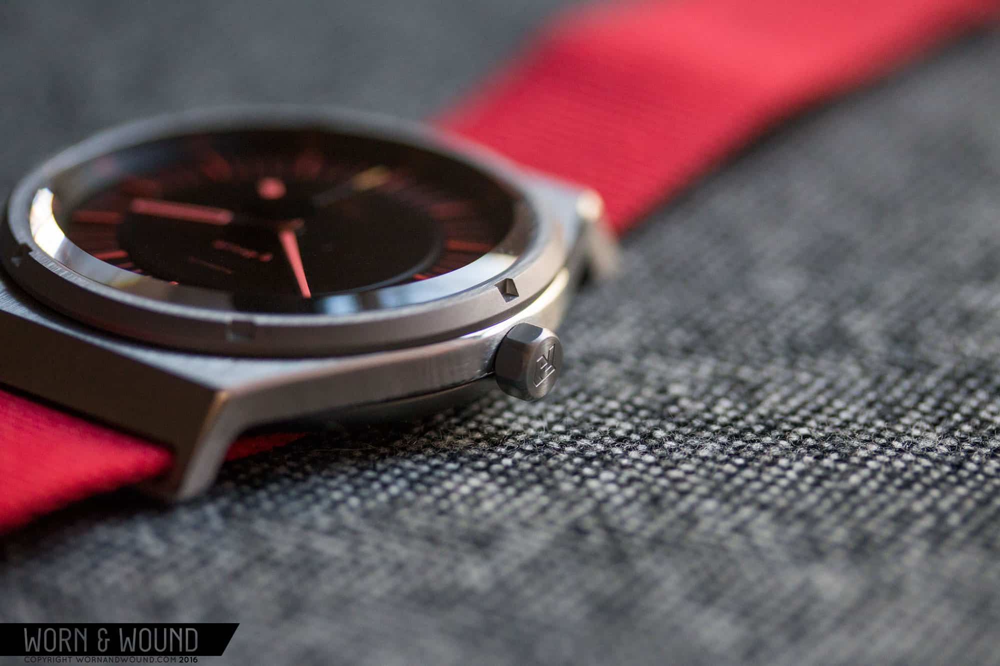
Looking at the center area now, as mentioned it raised up and features a beveled edge. This area too has a slightly different sheen, more of a satin with a slight sun-ray, giving it increased materiality. On this surface you have the Autodromo logo below twelve, automatic and the Group B logo above six. These elements are kept very restrained, including the fairly bold and dramatic Group B logo. On either side, left or right, about the center of the dial are Autodromo’s signature screw heads. Here they are recessed and in gloss black, only noticeable when the light hits them just right.

AUTODROMO_GROUP_B_DIAL_12

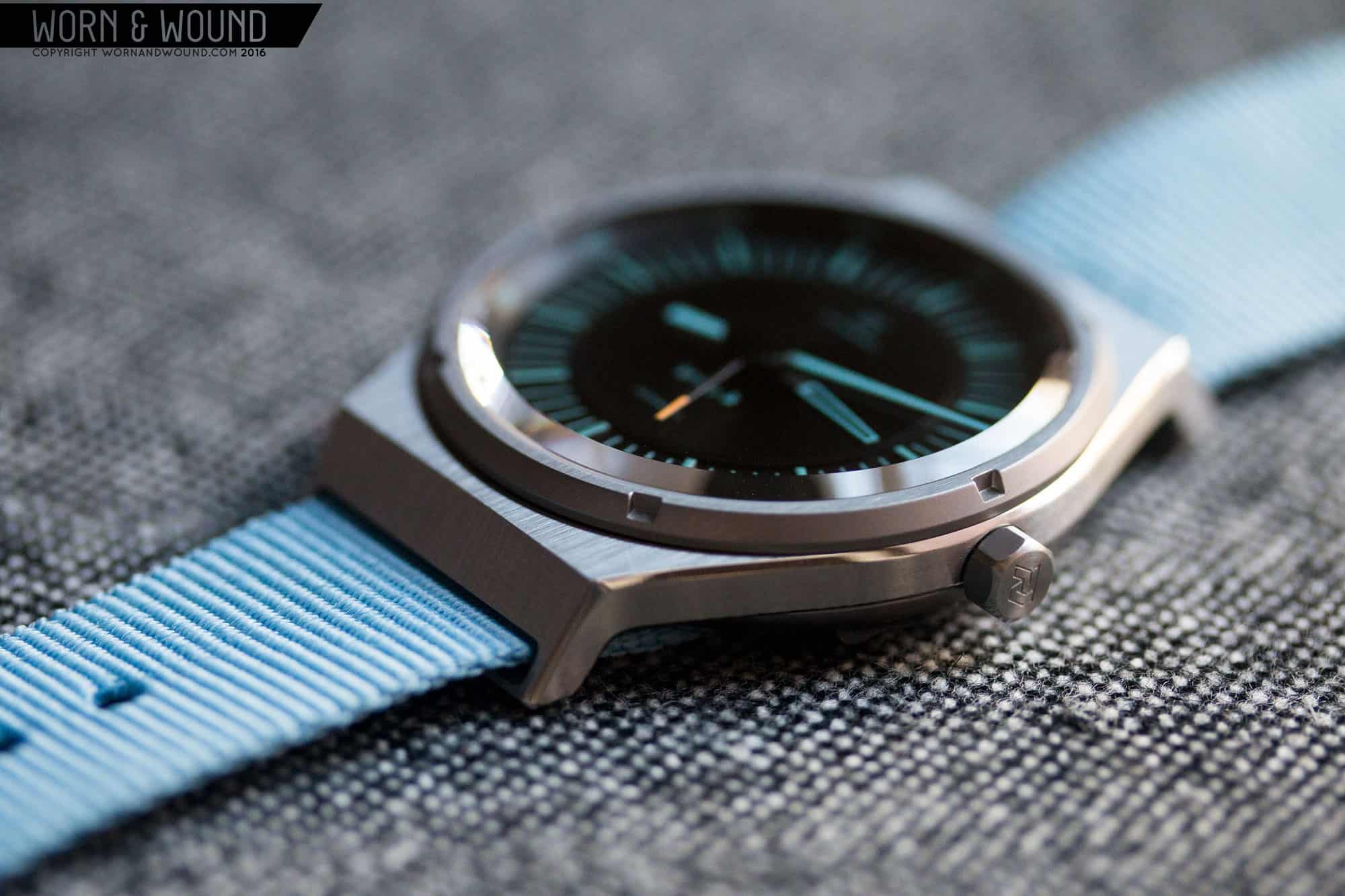
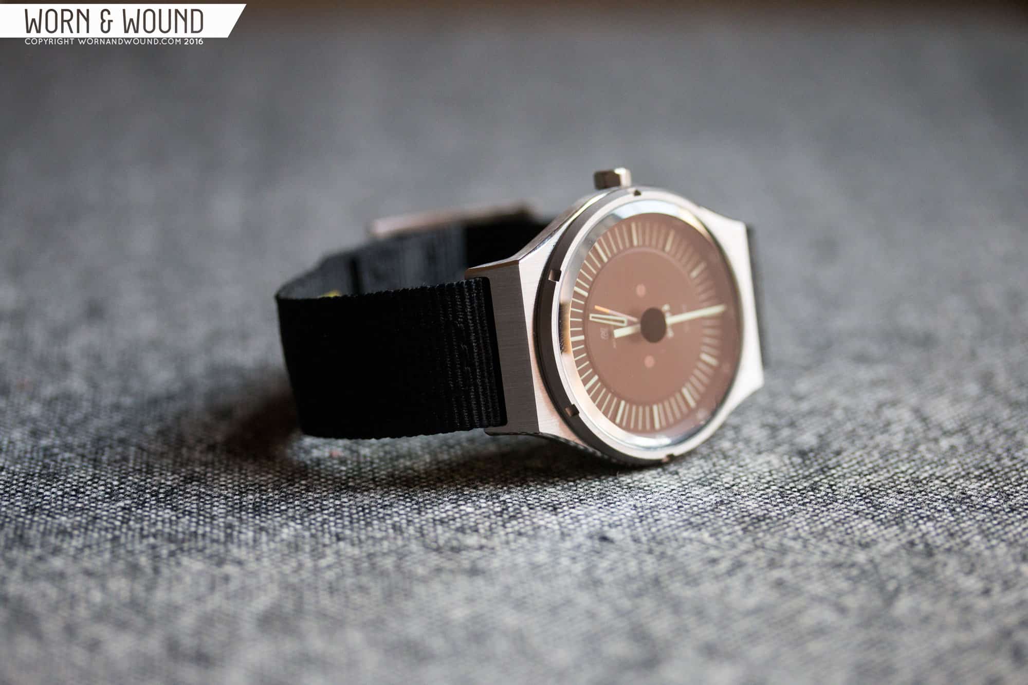
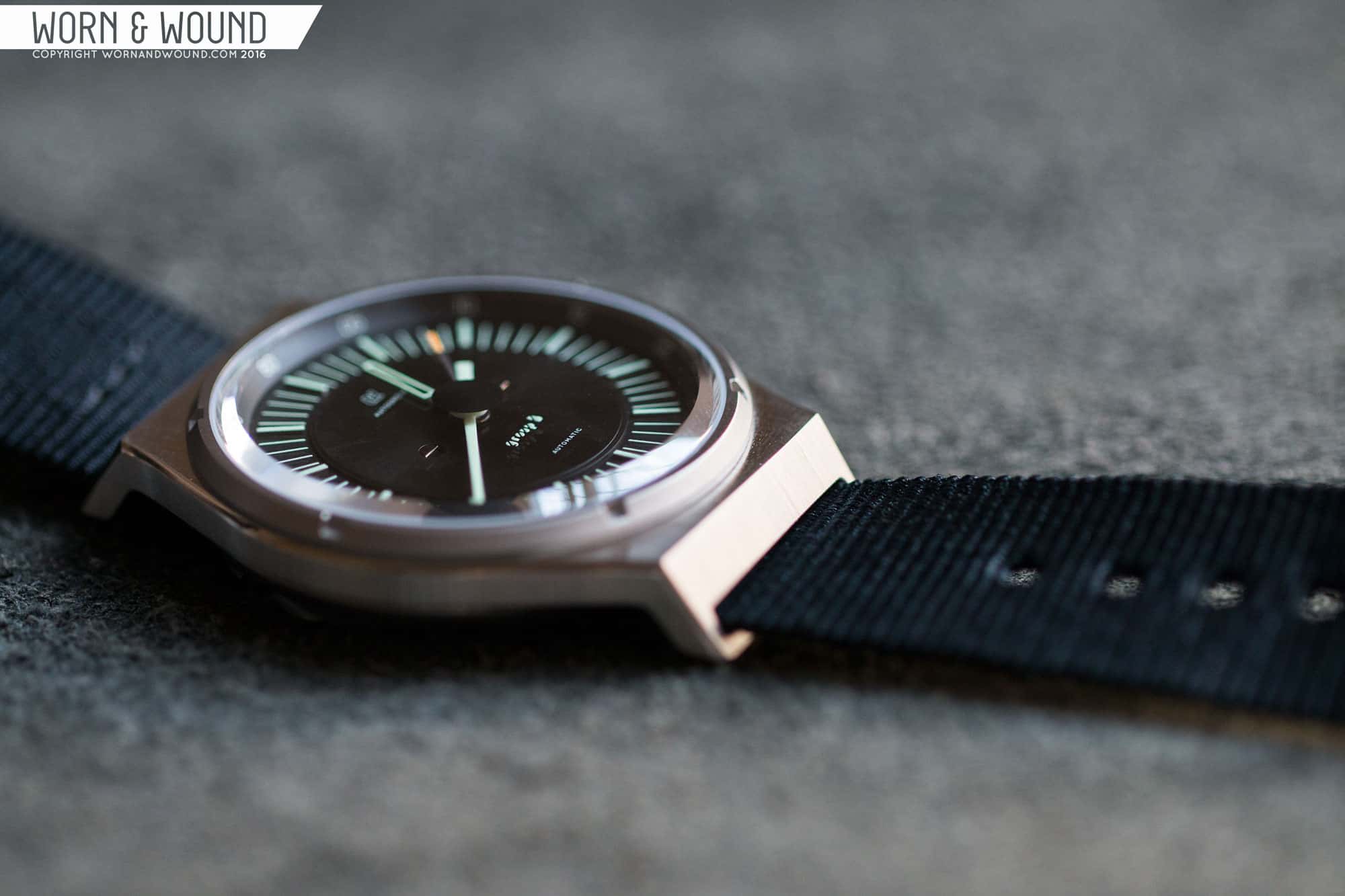
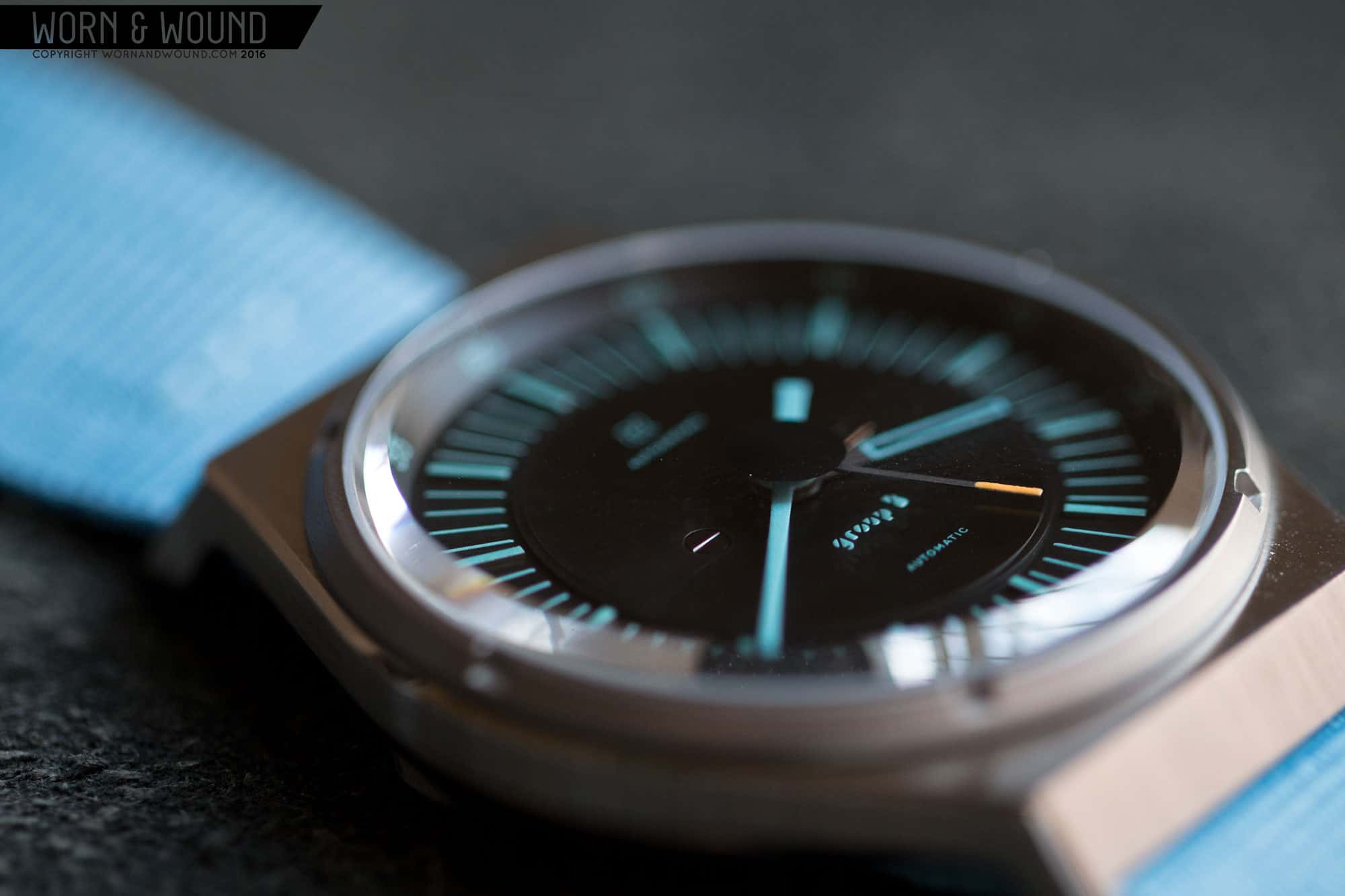
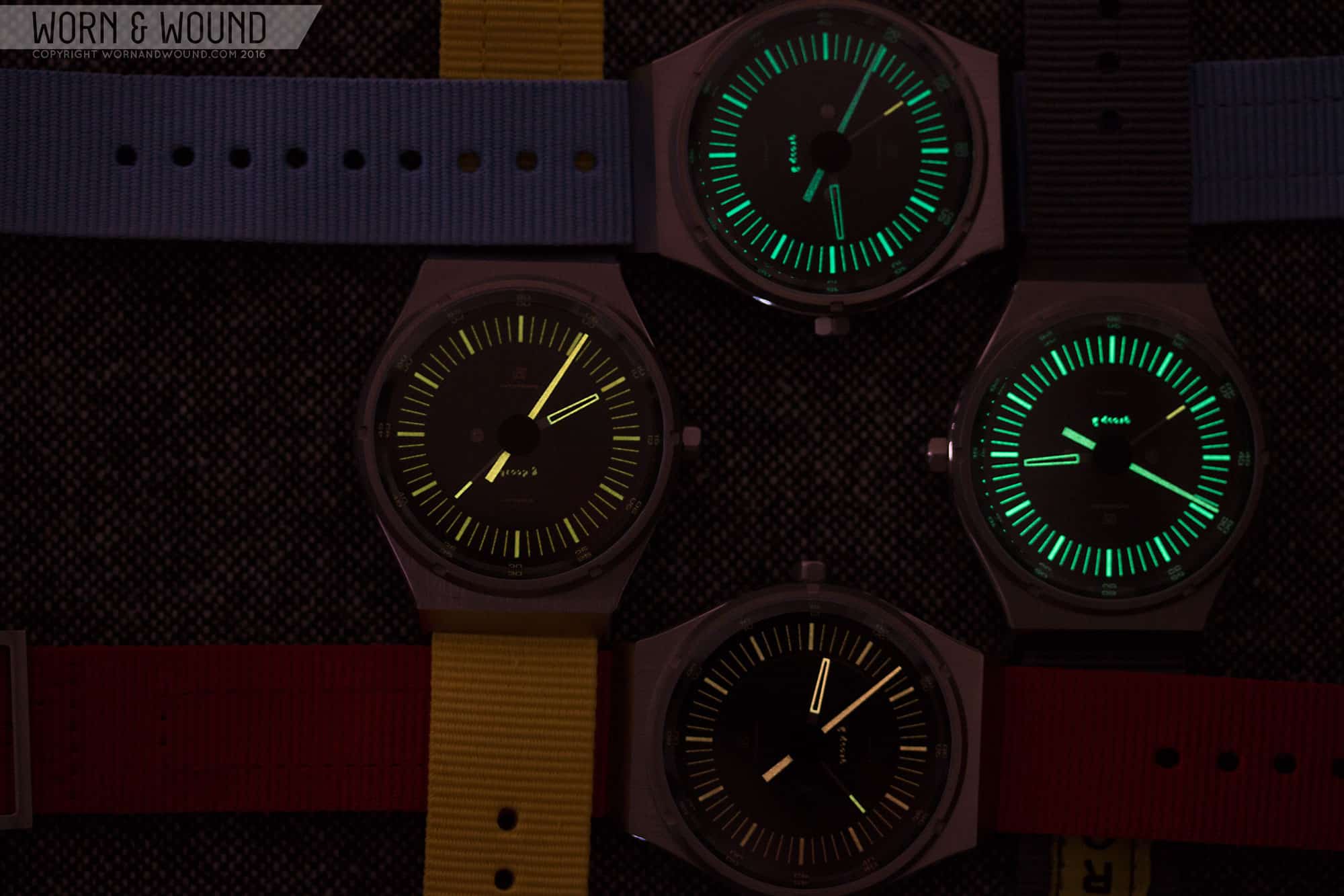
The last dial detail is in the center and is actually floating above the dial itself. On the back of the crystal there is a screened black circle. This covers the central axis of the hands, speaking to the gauge influences, while also adding some interesting depth to the dial. The hands of the Group B fit the watch’s theme well and are fairly unique. The minute hand is a long tapering stick that passes straight through the center of the dial. The black disc on the glass hides where it connects to the center, giving it a sense of a continuous taper. The hour hand is then a smaller skeletonized shape with a similar tapering design. It doesn’t pass through the center, and is overall a much more subdued design, letting the minute hand take center stage. The seconds hand is then a straight stick with and orange tip, which is the only dial detail that does not change per colorway. I found the hands very easy to read at a glance as the size and weighting of the hour and minute are distinctly different, and they both end at logical places on the dial.

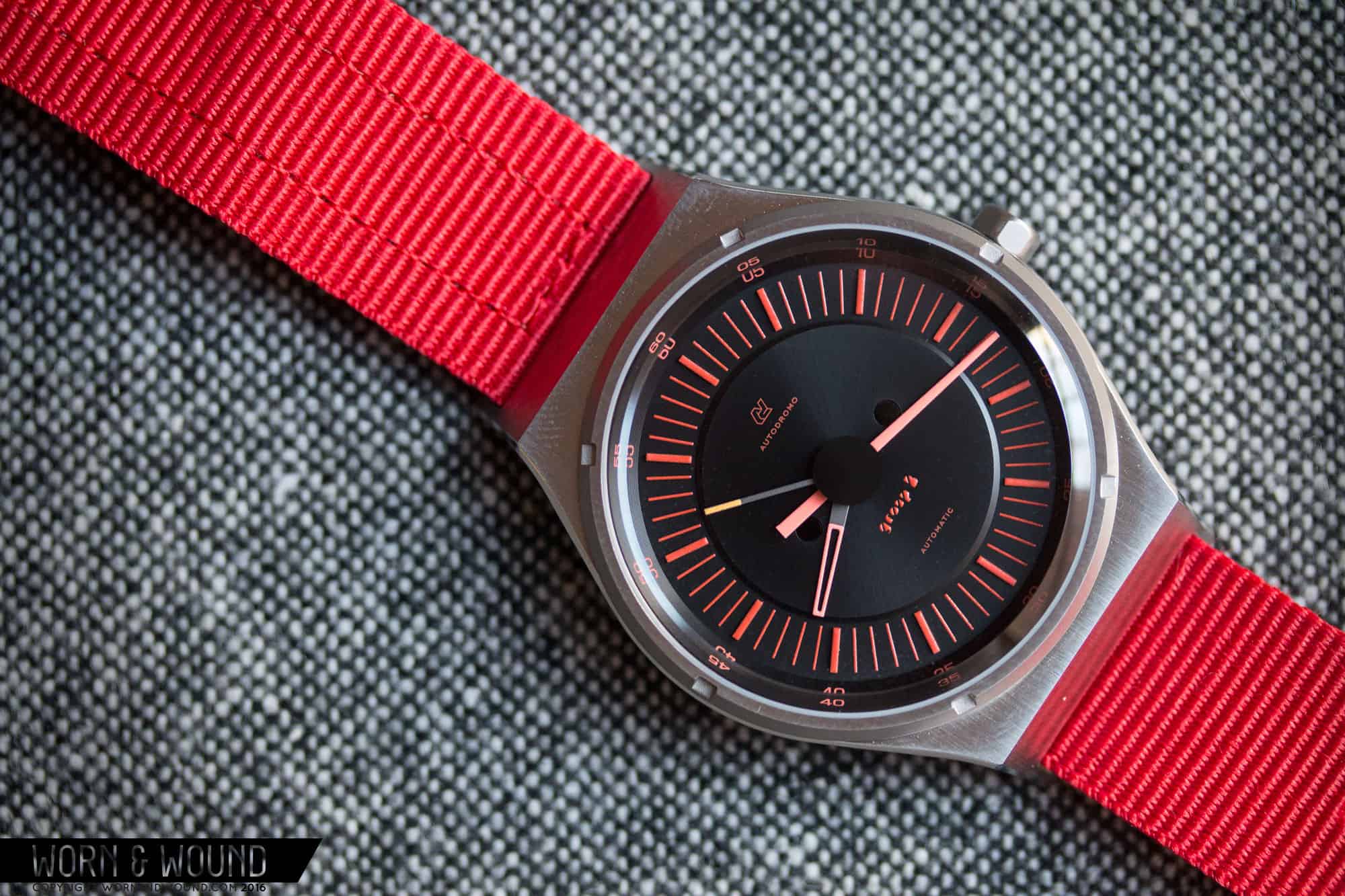
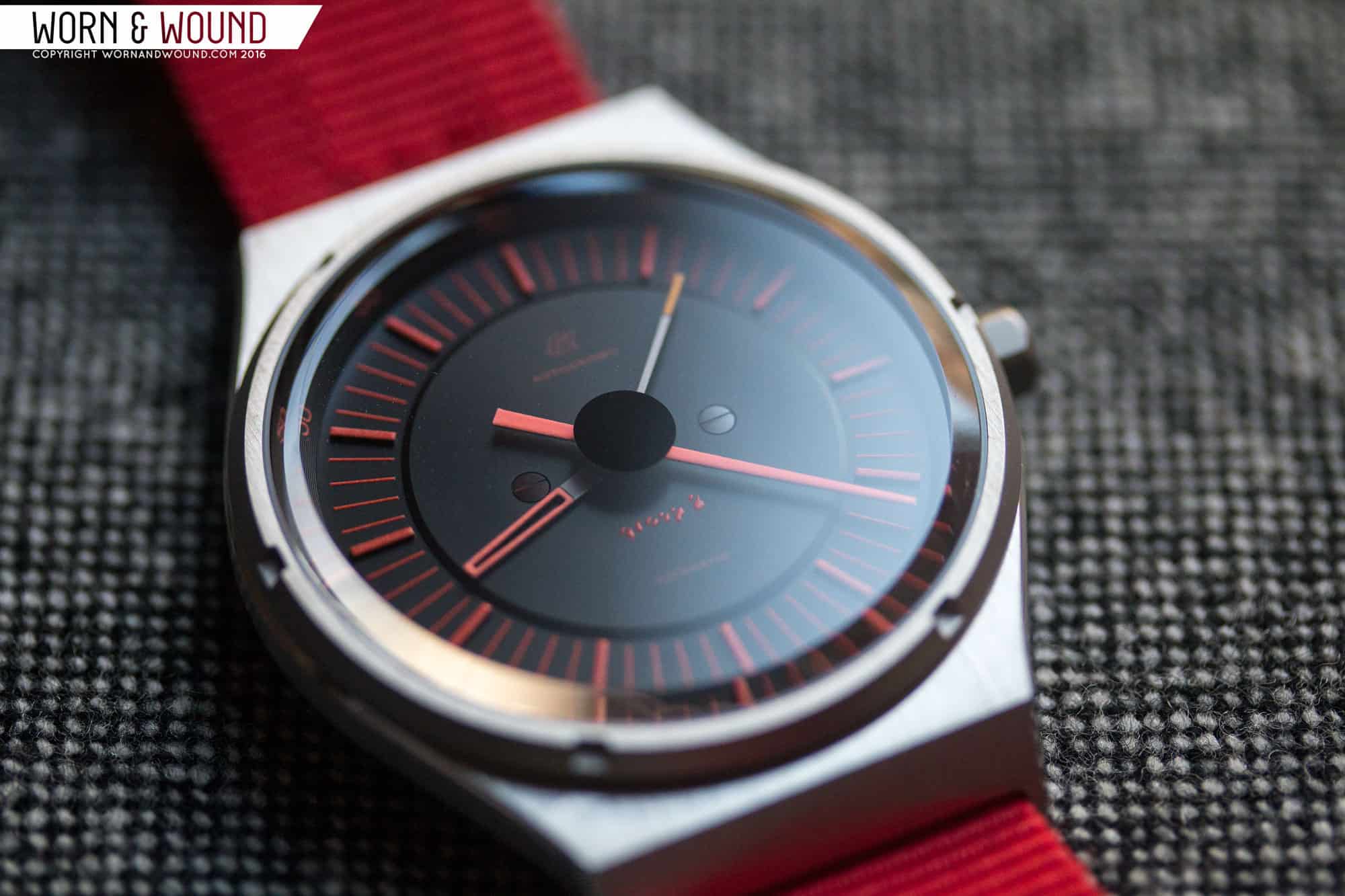
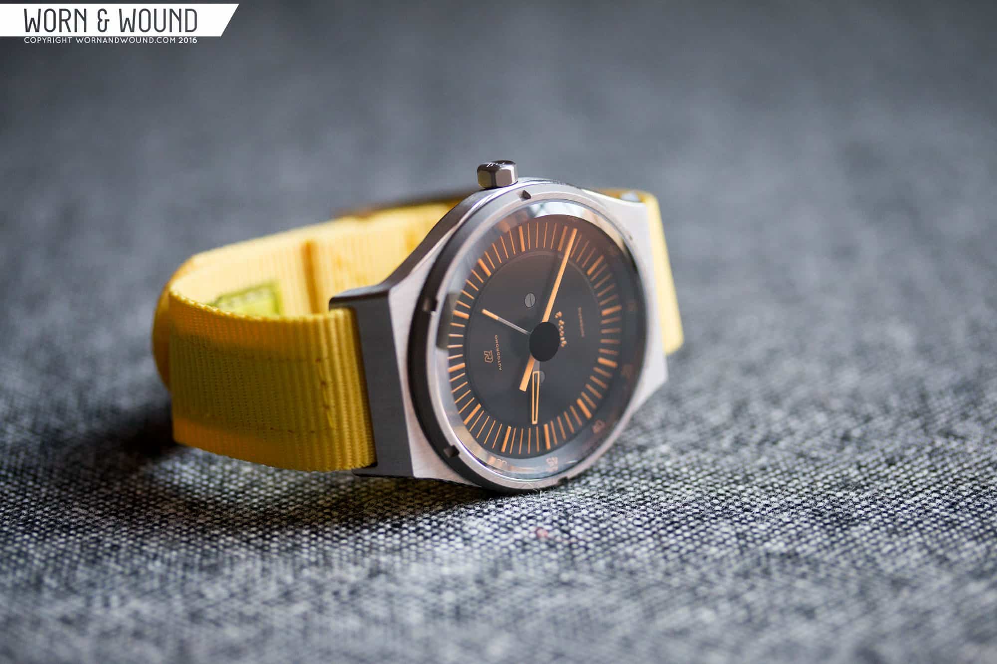
As noted, the Group B comes in white, blue, yellow and red, giving four distinct options. The white is clearly the most neutral and subtle. It’s high contrast and easy to read, but the lack of a bold color makes it more calm. The white itself is actually a touch green to my eyes vis-a-vis the lume that is present. The slight cool tone is enjoyable. The blue dial is then a more bold option, but still a bit tame. Blue naturally recedes a bit, so this doesn’t jump out quite as much as the red and yellow options. It’s a good choice for those who want color, but nothing loud… or people who simply like blue.

The red option is more daring as the color is more aggressive. Against the black, the red is intense and while striking, a bit mysterious. One thing to note is that I found the red to be a different color than what is shown on their website, which is more of a cherry red. This is a bit lighter and more fluorescent. Similarly, the yellow is less of a lemon yellow and more of an orange. Of the dials, this one took me most by surprise and really grew on me. The yellow/orange is bright, really jumping off of the dial and grabbing your attention. There is something about the color and that it’s almost harsh in a sense that really gels with the aggressive case lines.

The lume on Group B’s is surprisingly good. It’s featured on all of the lines in the main index, all of the hands and in the Group B logo, which is a surprising but cool touch. The white dial glows best, followed by the blue and then the red and yellow. This makes sense as the human eye actually sees green waves the brightest, hence the use in various lumes. At night, the watch is extremely cool looking, coming across like a futuristic neon-powered prop from an 80’s sci-fi film.

Advertisement

Straps and Wearability

The Group B watches are all accompanied by two nylon passthrough straps. One that matches the dial accent color (except white, which comes with black instead) and a neutral gray. The nylon passthrough is a custom design with a big Autodromo patch mounted to one side, giving it the look of a harness or seatbelt. The coolest detail is the buckle, however. Another totally unique design, the buckle is a thin rectangular frame with a slight curvature. Since it’s double sided, one side acts as the keeper as well. Naturally, it’s nicely finished with brushing along its surfaces, and the word “Autodromo” engraved on the front side. It also has a solid tang, rather than folded sheet metal. Once again, just an awesome level of detail from the brand. By adding the buckle, they took something fairly innocuous, like a nylon passthrough, and made it a lot more interesting and attractive. A cool thing you can also do is pop off the buckle and reverse it, so you can wear the “Autodromo” patch side out. This really increases the racing look and feel of the watch.

AUTODROMO_GROUP_B_BUCKLE_4

On the wrist, the Group B wears exceptionally well. It’s a great size, fitting my 7″ wrist ideally. The 50mm edge to edge sounds long, but the watch feels more like it ends wear the case angles down, thus being much smaller. 39mm is then a great size for a sport watch. It’s big enough to have presence, small enough to be sensible. Throw in the 10mm height and 52g weight, and you have a very comfortable watch that you almost forget is on your wrist.

Of course, it looks amazing too. It’s unique and it’s stylish, and more over, has a look and feel that no other watch I’ve tried really approaches. The dials jump out at you first, with their bright and high contrast colors. Seeing them emerge from under my shirt sleeve was always exciting as the sudden shock of color was in huge contrast to my otherwise low-key wardrobe. Then the geometry and finishing of the case hits you. The way that polished bevel glints in the light and the brushed faceted mid-case create high contrast areas of light and shadow. It’s a truly beautiful and luxurious design.

Given that it is a sports watch with some pretty aggressive and bold elements and is paired with nylon straps, it’s a fairly casual watch by nature. That said, the case itself has some elegant components, which tempers that a bit. Nevertheless, this watch seems like it would be at home with a leather jacket, black jeans and black boots or sneakers… oh and black Wayfarers, definitely.

Packaging

Autodromo gives special attention to their packaging, creating great presentations and something you’ll actually want to keep. The box for the Group B comes in a graphic sleeve with black and white graphics that are very 80’s. The box itself is handmade of aluminum, which likely means the aluminum sheet is cut, and then formed and riveted by hand. You can see the rivets all around, giving it a great industrial feel. On the top is a little plate with various details about the watch.


Flip the lid open, and you’ll find some padding underneath, and the Group B booklet, which, once again, has a very bold graphic cover. Under that, you’ll find the watch head and two straps separated from each other and embedded in dense foam. I really like that they did this, rather than put the watch on one strap and have the other just aside. Seeing it like this forces you to pick it up an appreciate the case first with out a strap, seeing the details. Then you get to pick your strap color, simply slide it through the watch’s slots and put it on.

Conclusion

It’s rare for a watch brand to continue to out do itself, but that seems to be the case with Autodromo. The Group B is a stunning watch with a genuinely unique aesthetic, clever design details, excellent build and exceptional finishing. What more could you want? Sure, the design literally is not going to be for everyone. It’s too idiosyncratic for that, too stylized, but for those who find it appealing, of which I am obviously one, it’s a real winner. The biggest potential deal breaker will be the passthrough only lugs, which admittedly are limiting if you have mostly 2-piece straps. That said, there are around ten million varieties of 20mm nylon straps out there, so I’m certain one could find what suits them.

AUTODROMO_GROUP_B_STRAP_3

With a price tag of $925, the Group B is on the high side of what we’ve come to expect from the brand as well as a watch with a 9015, but from my experience, in both design and execution it far exceeds watches that cost much more. And I have to say this… the movement is not the only consideration for a watch’s price, and in this instance is frankly the lesser consideration to the case execution and the design. There’s a reason some watches cost half of this and if you put the two side-by-side you’d see why. I luckily get to see and handle a lot of watches, so it might be more obvious for me, but I stand by that statement.

AUTODROMO_GROUP_B_STRAP_2

One other thing I really enjoyed about this watch, getting back to the 80’s, is that it isn’t just a car person’s watch. The aesthetic actually brings to my mind, as I briefly mentioned before, 80’s  sci-fi films, in a good way. I think of the future as it was depicted in Blade Runner (1982) with world of neon lights, and harsh geometric forms (a dystopia I actually find appealing) and this watch seems like it could fit in that world. It also brings to mind the watches that Giorgetto Giugaro designed for Seiko that were famously used in the film Aliens. Watches that too were geometric with strong lines and bold use of color. What is very interesting is that Giugaro is really known for his automotive designs, having worked on countless cars including the DeLorean, and various Lancia’s, Maseratis, Alfa Romeos and other Italian classics. Seems like it all relates.

Images from this post:
Related Reviews
Zach is the Co-Founder and Executive Editor of Worn & Wound. Before diving headfirst into the world of watches, he spent his days as a product and graphic designer. Zach views watches as the perfect synergy of 2D and 3D design: the place where form, function, fashion and mechanical wonderment come together.
wornandwound zsw

12 responses to “Autodromo Group B Review”

  1. chenpofu says:

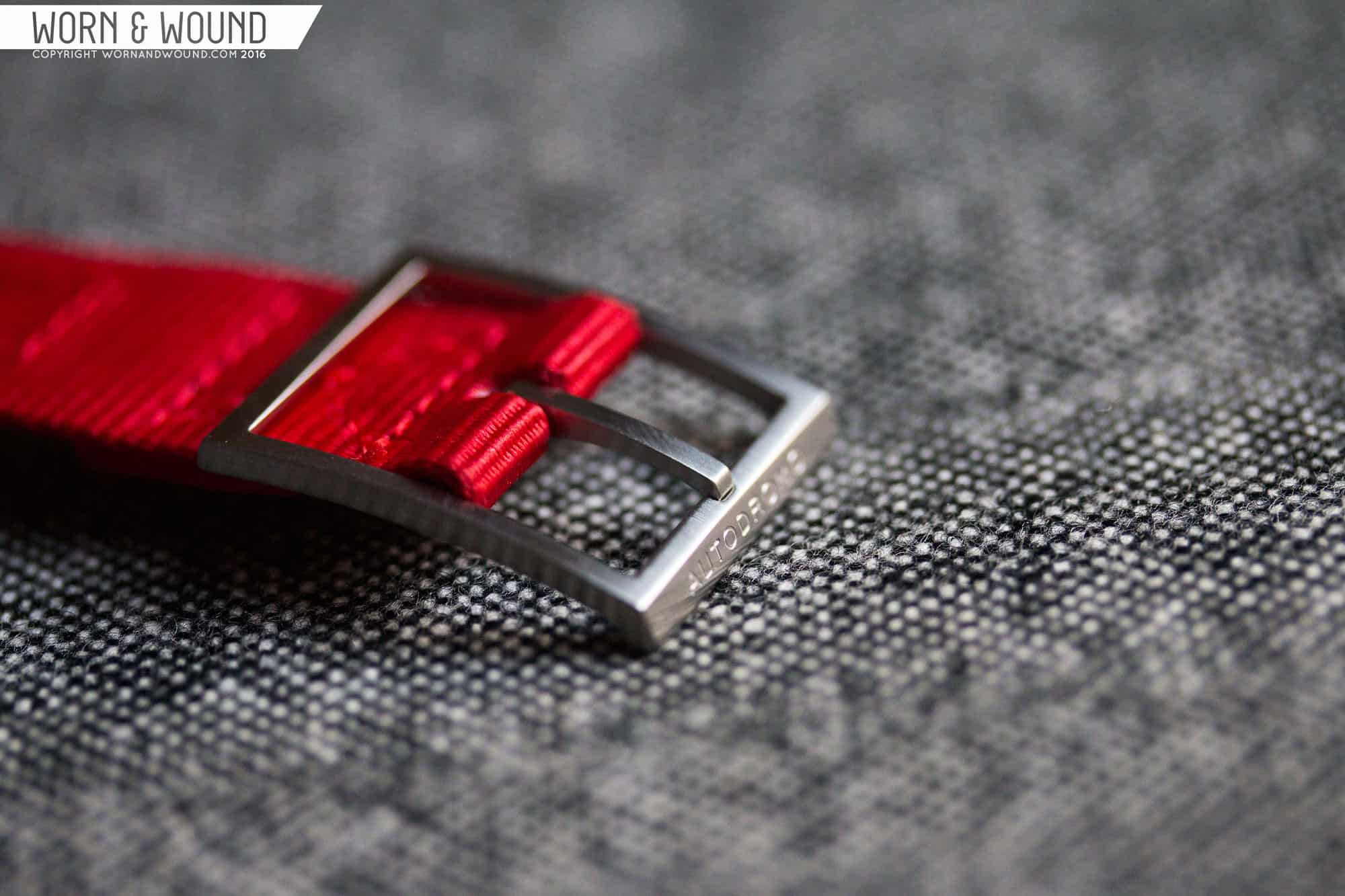
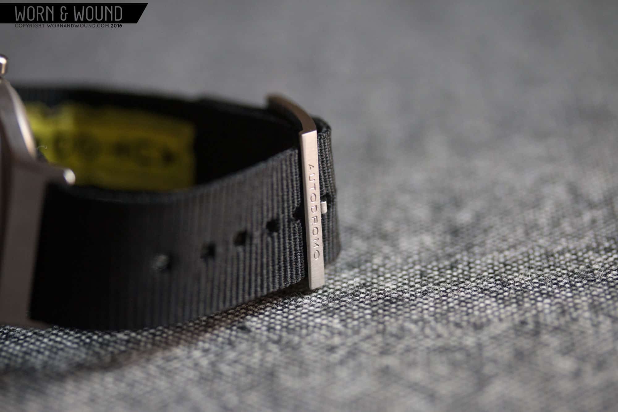
    Nice review. I don’t think the buckle on these straps is really a unique design, it looks pretty similar to the buckle on my Nomos Ahoi strap (rectangle, double side, curved).

    One detail I don’t like is that the 3 hands are all different, I prefer to have the hour and minute hand to have the same design. Maybe one can get use to it (and maybe I am a bit slow), but the short second hand and the long minute hand seem confusing also.

  2. jfstudios says:

    Nice watch but 2 deal breakers for me:
    – water resistance should have been 100m with screw down crown to make it a great daily beater
    – they are trying to push the price enveloppe too far. I’d rather have a Sinn or other swiss / German brand at this price

  3. Svetoslav Popov says:

    I’ve bought Smiths Nato PRS-40,, which is far better for me. It is 100m water proof and also has much more brutal appearance.

  4. Watchlords Forum says:

    Interesting article. This is one of the better designed automotive themed watches I have seen. Far too many of them are over done with features that are not needed by the average watch buyer. The movement is reliable although not on par with an ETA but for the price point not a bad buy.

  5. Pom says:

    One thing that has worried me is when I compare the lume on my blue group b it’s practically non-existant but on these photos it’s so striking. Guess I’ll see what Autodromo and the retailer say… as something on my watch can’t be right.

  6. Michael says:

    This really is a stunner of a watch, in any color. While the price seems high to some, keep in mind that lower production volume means the development costs are amortized over a smaller quantity. Also machining titanium is costly, the crystal is bespoke(expensive), etc. The price is totally justified, however that also means competition from brands that offer perhaps more watch, but less design. I do wish for more water resistance (10bar) and would trade a couple of mm in case thickness to get that, which characteristic of the durability of those racing cars.

  7. Nelson says:

    I don’t like the hands. They seem confusing.

  8. smoothsweeper says:

    Can’t decide between the colors!

  9. smoothsweeper says:

    On the yellow model, it looks like the second hand tip is the same color as the indices. Is this what it looks like in person?

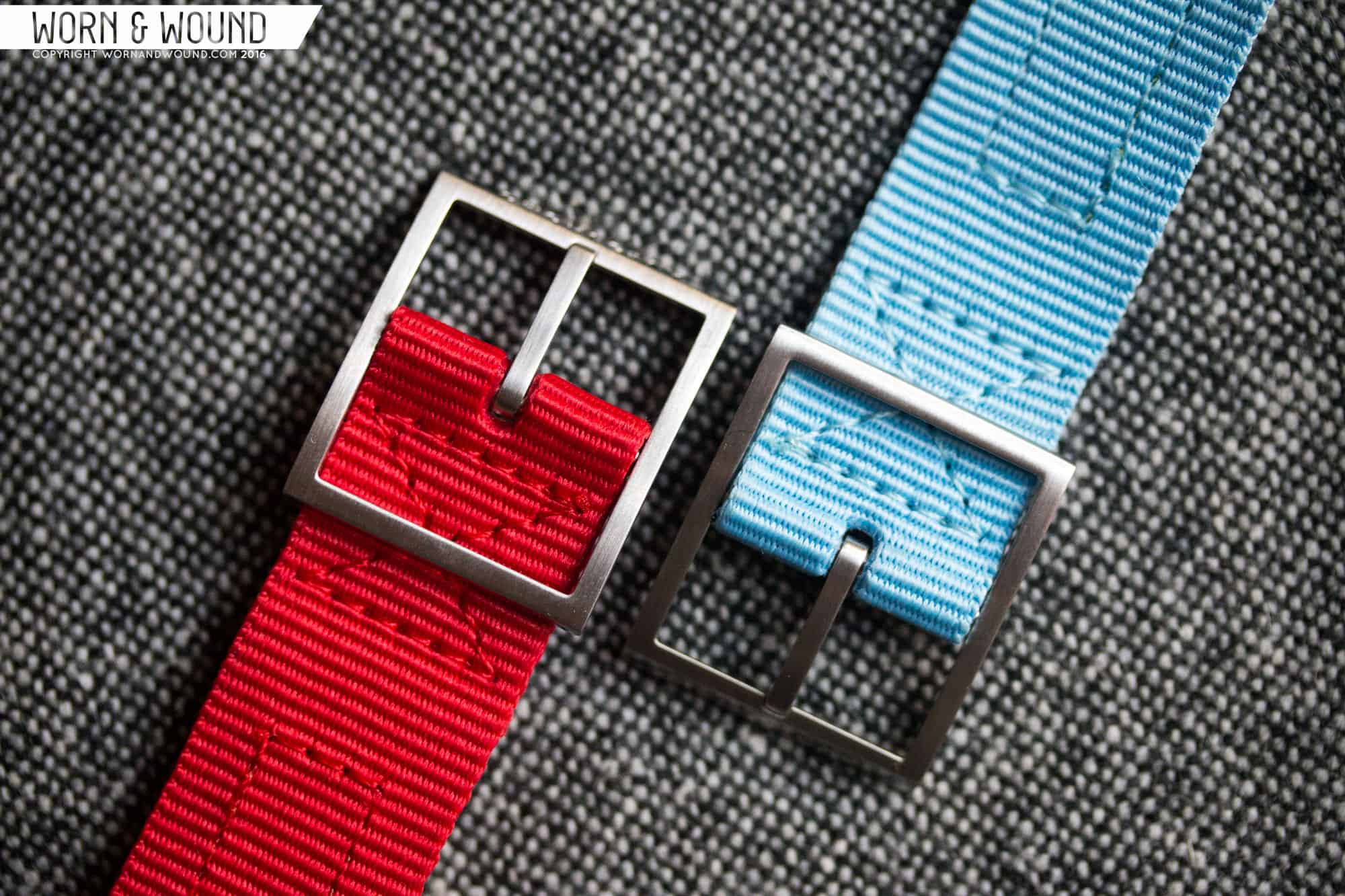
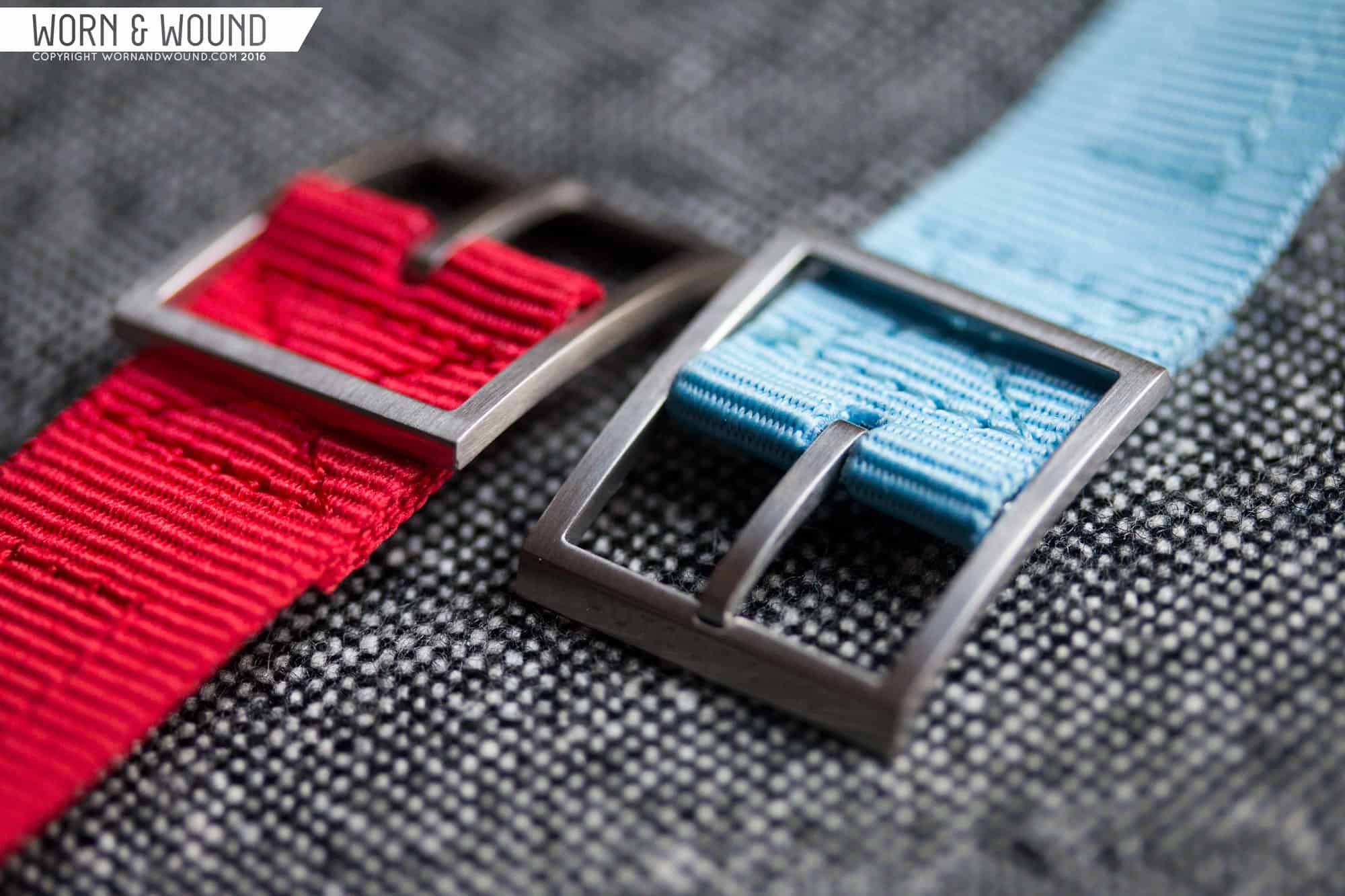
  10. Wow, with the different styles available, it’s nice to get an up close view of the Group B. They look really great on a nato strap, especially with their lightweight design, you can see this fitting well together.

  11. Justin Yates says:

    Love the design of the watch a lot.. That being said I’ve never seen a watch miss so far off the mark when it came to the price. This is like Macallan 18 going from $110 a bottle to $230 overnight for no reason. I wouldn’t mind picking up one secondhand but it might be difficult because I don’t see that many picking it up firsthand.