Christopher Ward is a British watch brand that started back in 2005 with just two models. Over the past 14 years, Christopher Ward has worked to expand and refine their offerings of Swiss-made mechanical timepieces. They now offer dress, dive, flieger, and motorsport style watches with several models in each range. Today, we’re taking a look at one of their more recent offerings —the C65 Trident Automatic, a dive-style watch that’s inspired by the sport watches of the 1960s. A blend of modern and vintage aesthetics, a sleek 41mm case, and Swiss construction make up only a few of the features seen in the C65 Trident Automatic. Let’s take a closer look!
Review: Christopher Ward C65 Trident Automatic in Blue
Review: Christopher Ward C65 Trident Automatic in Blue
Case
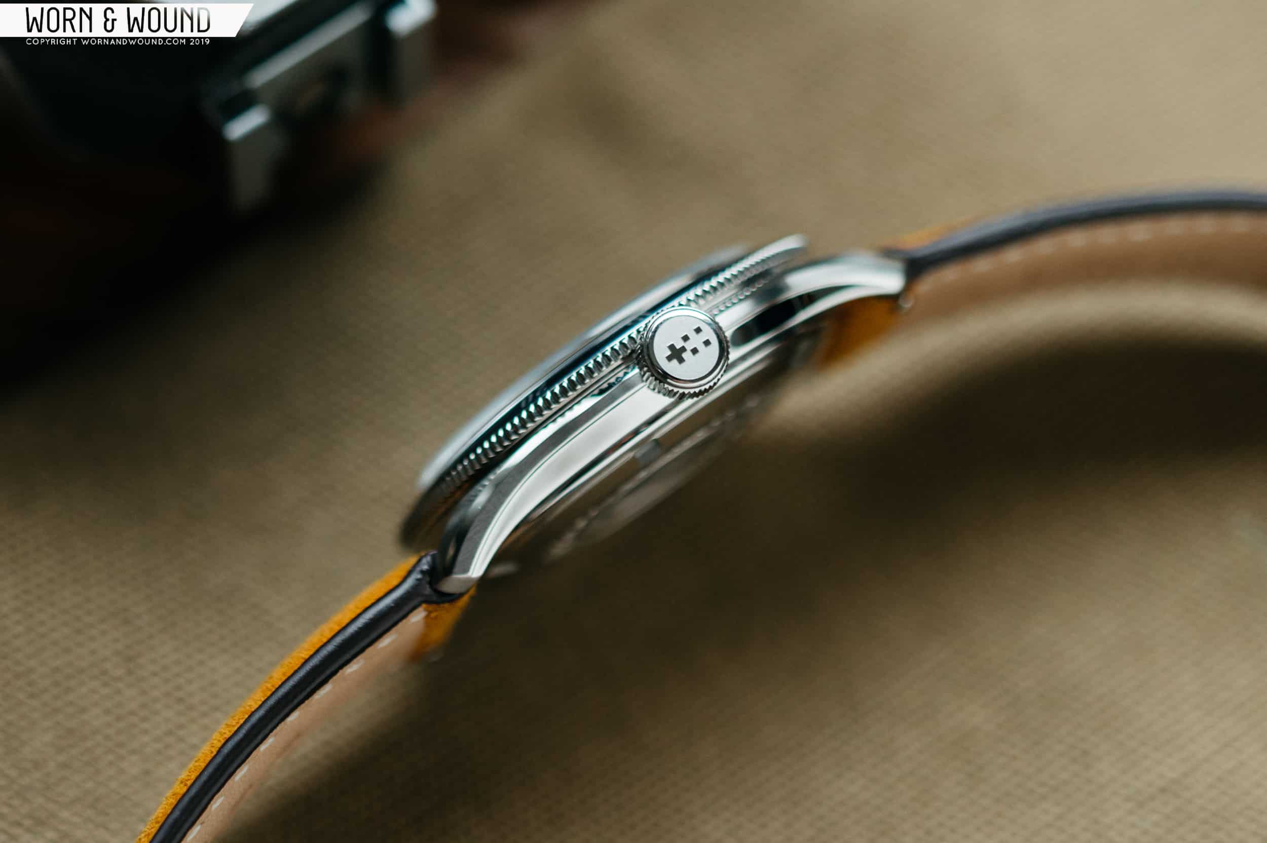
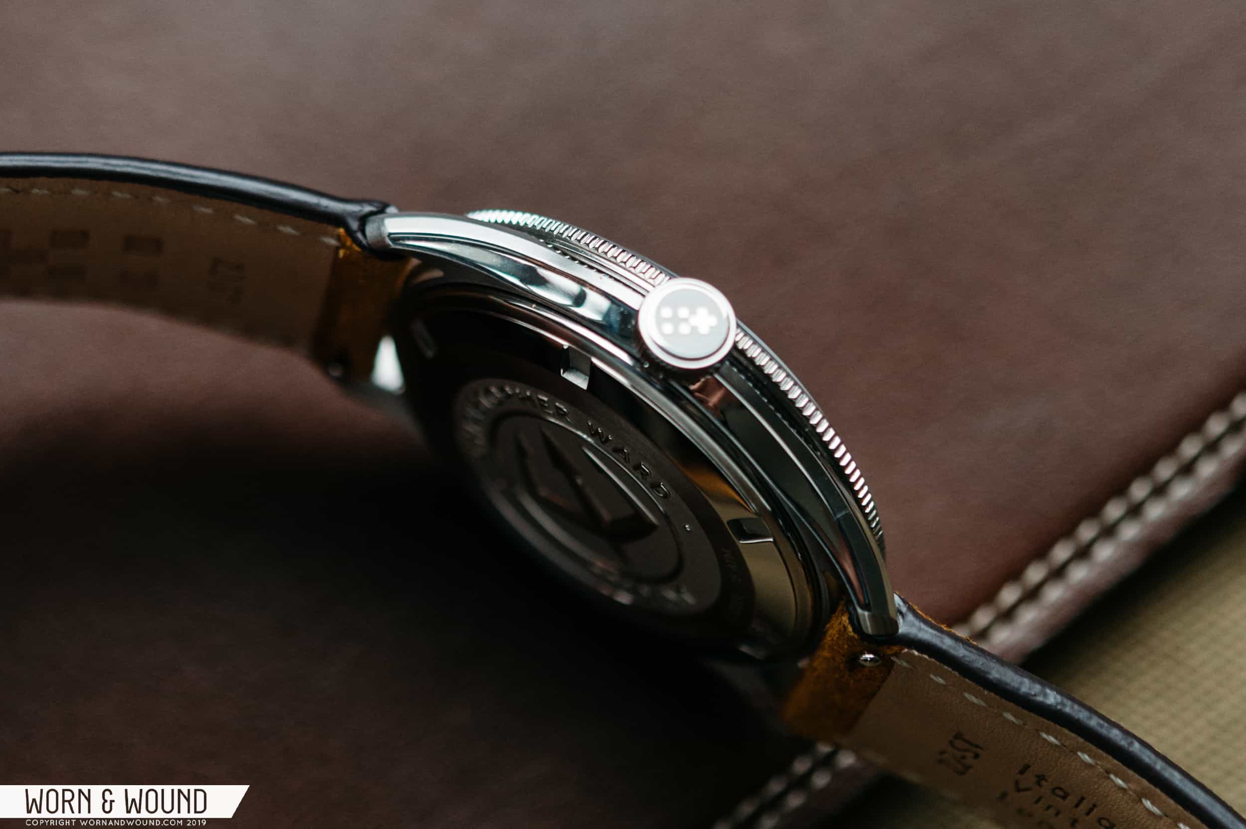
Christopher Ward’s C65 Trident has one of the more interesting case designs I’ve come across on a dive watch. It’s 41mm wide by 47.1mm lug-to-lug, which is pretty spot-on for a modern diver. The design of the watch is decidedly vintage, and with the new return towards smaller cased watches, I wouldn’t have minded if it came in at 39mm. Personal preferences aside, the watch wears remarkably well, and I believe it’s due to the design of the case. When you look at it from the side, no single element of the case is significantly taller than the other. The result is a balanced and comfortable case that looks as great as it feels on the wrist.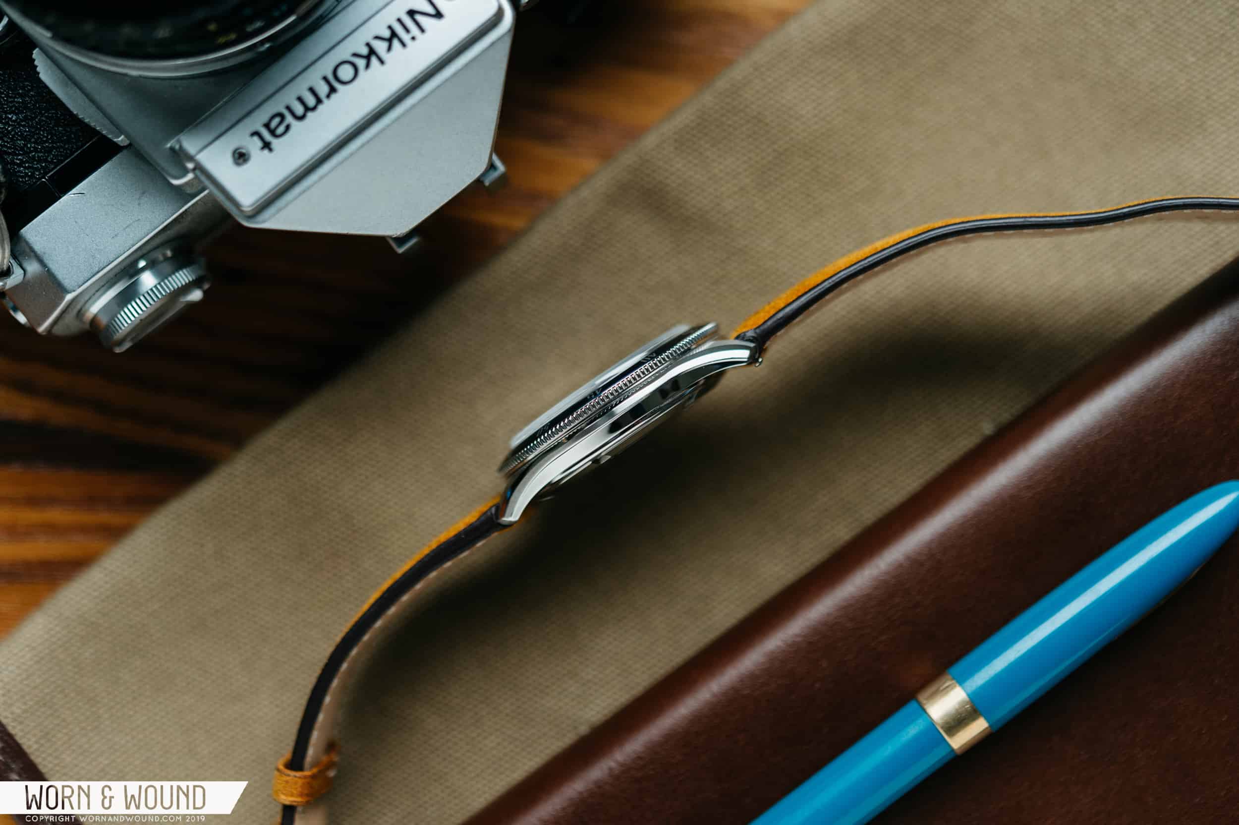
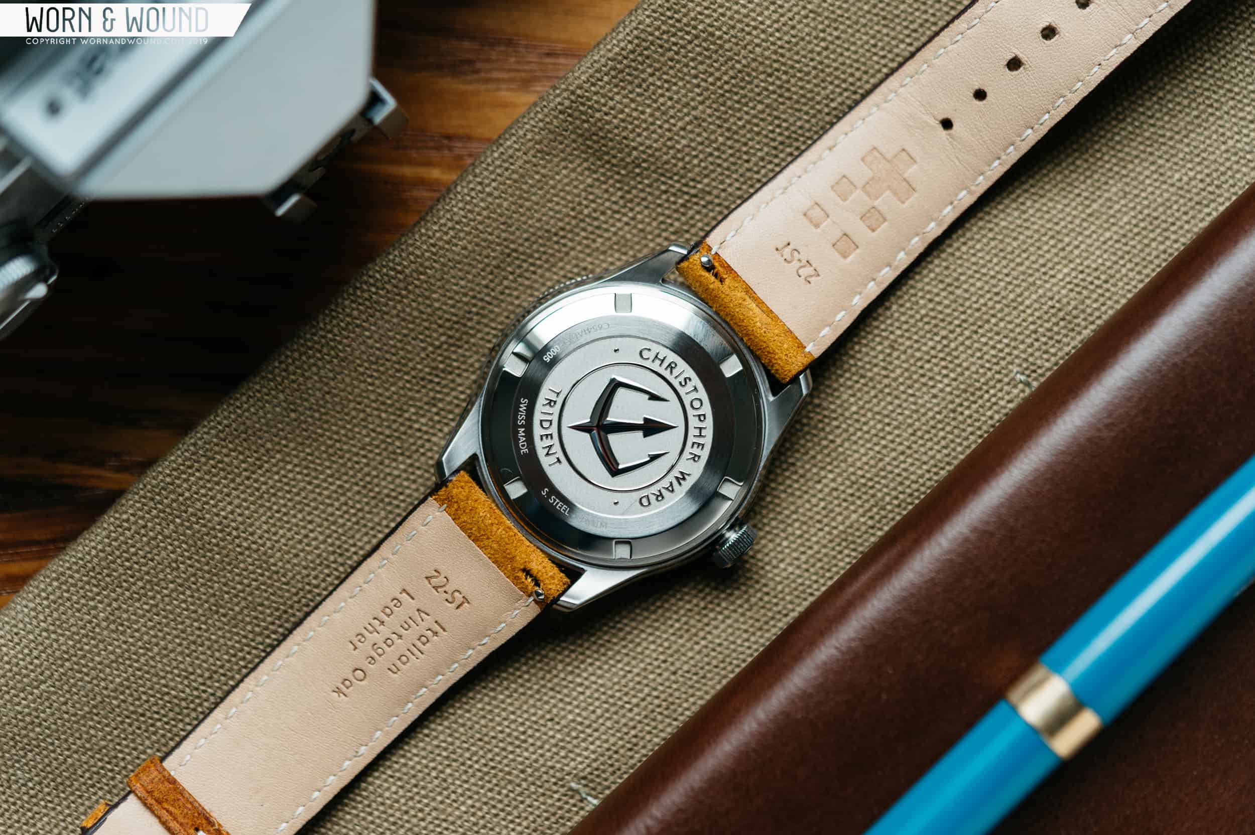
You can see the caseback that hangs slightly under the case, then a hard angle towards the curved midcase, another hard angle back in to meet the bezel, the gentle angle of the bezel itself, then finally the box-style sapphire crystal on top. Each of these design elements stack up to a reasonable 11.55mm height. The curve of the lungs and under hanging caseback nestle the watch into your wrist, allowing the C65 to slip under a cuff with ease. Speaking of the caseback, the finishing seen on it is incredible. It’s stamped deeply with the trident logo and features a multitude of different finishing techniques that add depth. It’s one of the nicer caseback designs I’ve seen, and it’s a shame that it’s hidden away on the underside of the watch.
Throughout the case, you’ll find a mix of brushed and polished finishes. The sides are largely polished while the lugs feature some straight brushing on the top surface. I find myself looking over the watch and appreciating new little details nearly every time I look at it. One such example is the bevel between the brushed top of the lug and the polished side that integrates into one of the angles of the midcase. The swooping lines add some interesting visual appeal to the case, playing with light depending on the angle.
Sitting on the right side of the case is a large standalone crown. The lack of crown guards adds to the vintage aesthetic while retaining the sleekness of the case, especially when viewed from the side. The fact that the crown pushes in instead of screws in threw me off a bit; I’ve grown accustomed to the security of screw in crowns on sport watches, and especially dive watches. That said, I’ll concede that the vintage-inspired C65 Automatic is more of a diver “style” watch than a true dive watch, and the fact that it ships on a leather strap hints at that too. Nevertheless, the case here is rated to 150 meters, which is less than the 600m of water resistance found on Christopher Ward’s Trident 3 line of watches, but it’s still more than sufficient for most water-based activities.
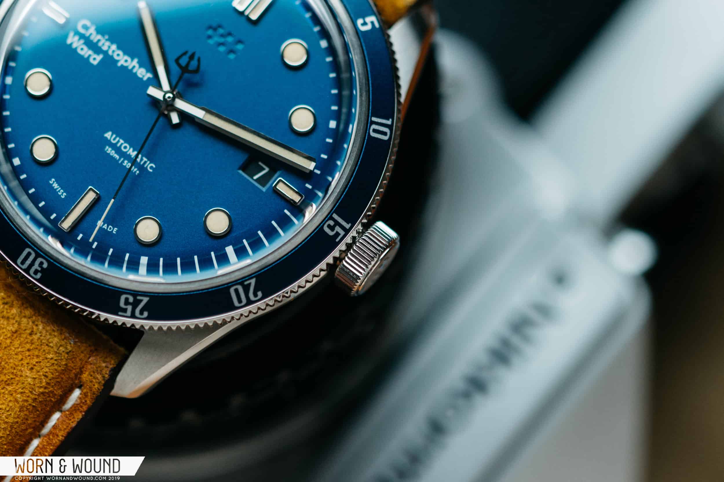
Sitting atop the case is a unidirectional 120-click bezel that’s decorated with a metallic blue insert. There are numerals placed every five minutes to count elapsed time. The typeface chosen for the minute marks on the bezel reads pretty modern, which is a departure from the rest of the mid-century inspired design. I like how the bezel is slim, especially when compared to other dive watch offerings. It’s unimposing on the design and helps the watch maintain its sleek appearance and feel. The action on the bezel is nice and snappy, with a light, yet precise click. Around the edge, there are very fine teeth that makes the bezel easy to grip and turn.
Dial and Hands
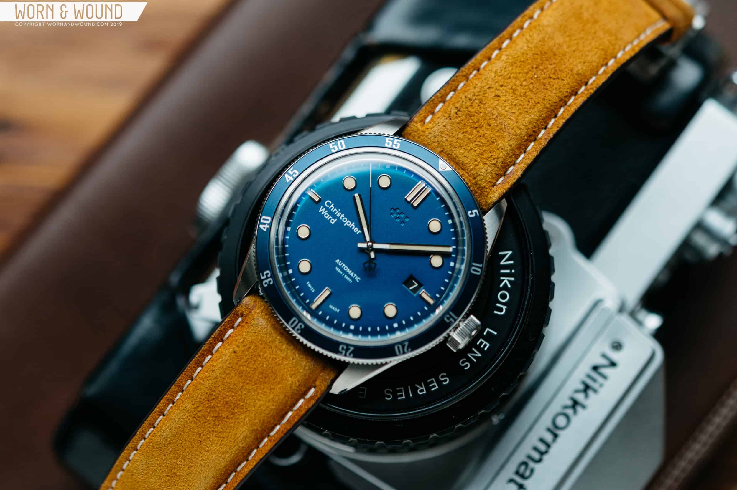
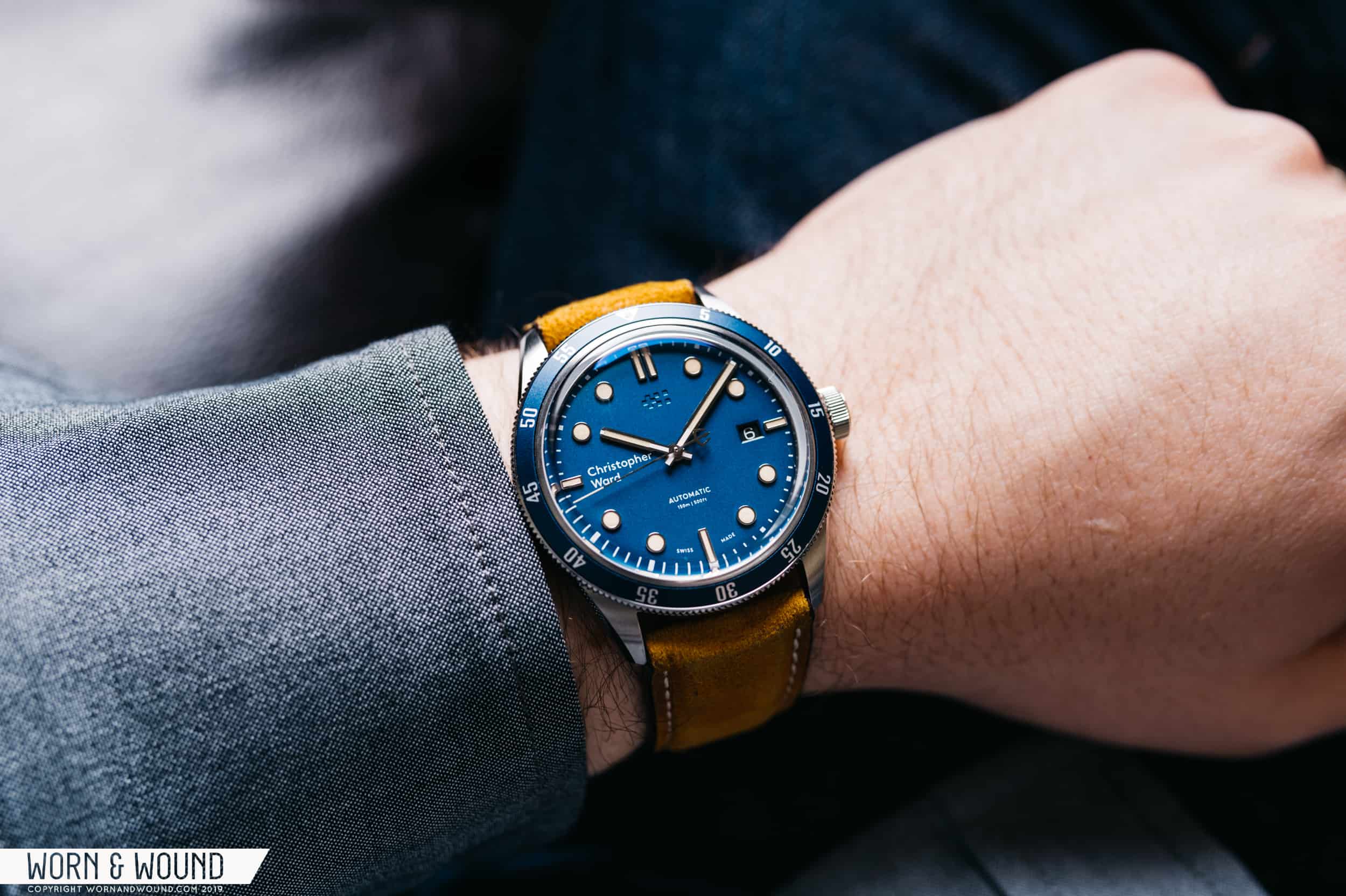
If you’re on the hunt for a vibrant blue dial, look no further. The blue dial on the C65 is a metallic shade of turquoise that really pops. To me, it screams summer on the beach. On the dial, you’ll find raised applied indices that are filled with Old Radium SuperLuminova paint and highly polished on the sides. I wouldn’t accuse the C65 of “fauxtina” (fake aging and wear). Here, it seems like a more logical color choice than the standard pale green lume. The orange-tinged tan tone of the lume pairs great with the vibrant blue of the dial. Performance-wise, it glows a medium-green tone, despite appearing completely different in the light. While the luminous paint isn’t the brightest or longest lasting, both the hands and indices glow evenly — a small detail that not every manufacturer pulls off well.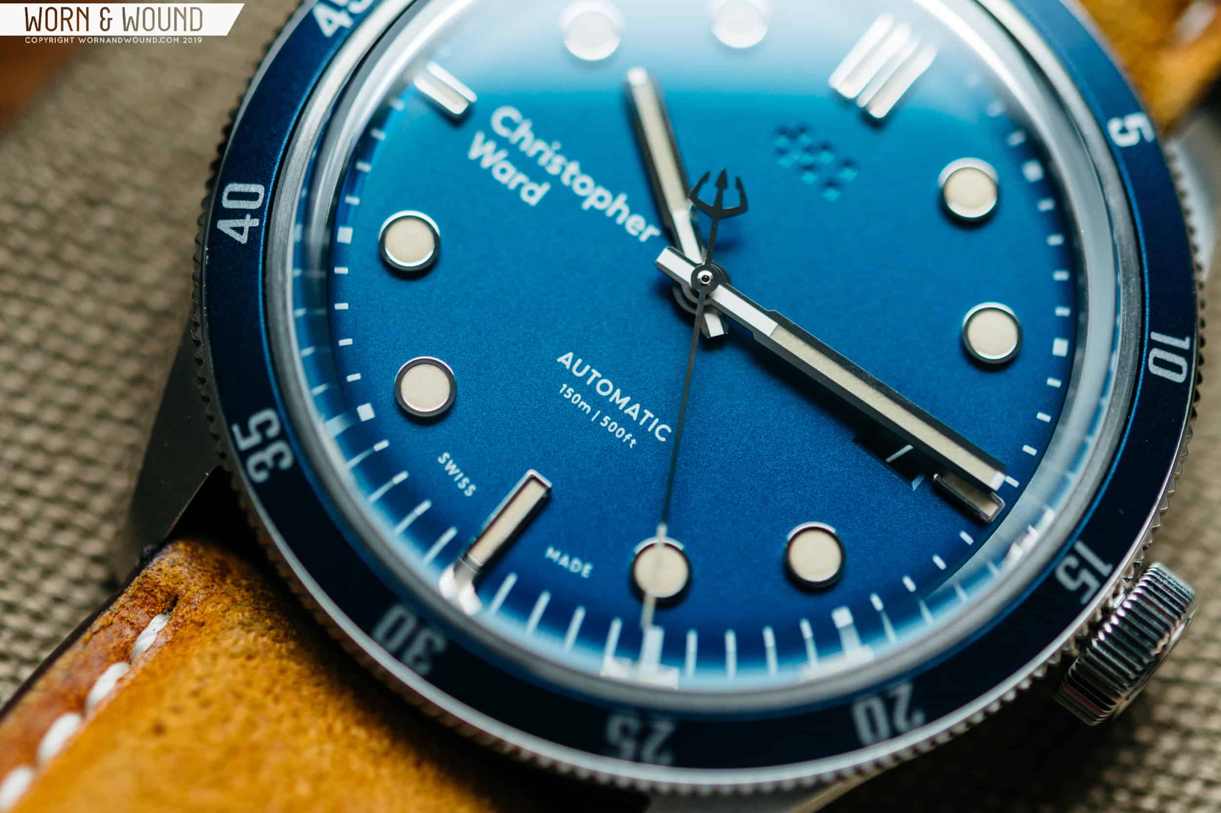
The stick-style hands are polished chrome with a single stripe of lume down the middle. The lumed center section of the hour and minute hands are flat, while the polished sides gently angle down towards the dial. The finishing on the hands is a little rough, with a few slightly ragged edges visible when looking up close. One of the signature features of the Trident line is the design of the seconds hand. Opposing the long, thin end of the seconds hand is a trident shaped counterbalance. It’s a neat little signature feature that solidifies the C65 as part of the Trident series of watches from Christopher Ward.
Let’s take a closer look at some of the design features of the dial. There are three hands (hours, minutes, seconds) pointing to applied indices and a precise printed chapter ring. At the 12 o’clock position, there’s a double rectangular bar, followed by a single bar at 3, 6, and 9 o’clock. All of the other hour markers are denoted by a circular index. Let’s go around the dial again for a look at the text/logos. Just under the 12 o’clock index is a debossed twin flag logo. Move around to 3 o’clock and there’s a beveled date window with a black background and white text. The 6 o’clock position has the words “AUTOMATIC,” the depth rating, and “SWISS MADE” flanking the index bar. Finally, at 9, there’s the printed “Christopher Ward” logo in their stylized typeface.
The debossed logo at 12 is tastefully done and adds some more depth to the dial. Even though there aren’t any other black features on the dial, the black date wheel resting inside a beveled window looks good too. Some of the text on the dial feels just a little off. The text at 6 o’clock feels too small and too spaced out. This is due to the fact that the dial has a lot of breathing room. I think the narrow bezel results in more room on the dial (for better or worse). The small white text looks a little like it’s lost at sea — especially on the blue background. Christopher Ward’s new logo at 9 o’clock is polarizing in the watch world. It’s rendered in a modern typeface which feels a little out of place on a vintage-inspired watch. It does, however, help to balance out the date display at 3 o’clock. Some like it, and some don’t — it’s up to you to decide. Don’t get me wrong, I don’t dislike the dial, but I do believe that playing with the spacing and sizing of the elements could result in a layout that works more to my tastes.
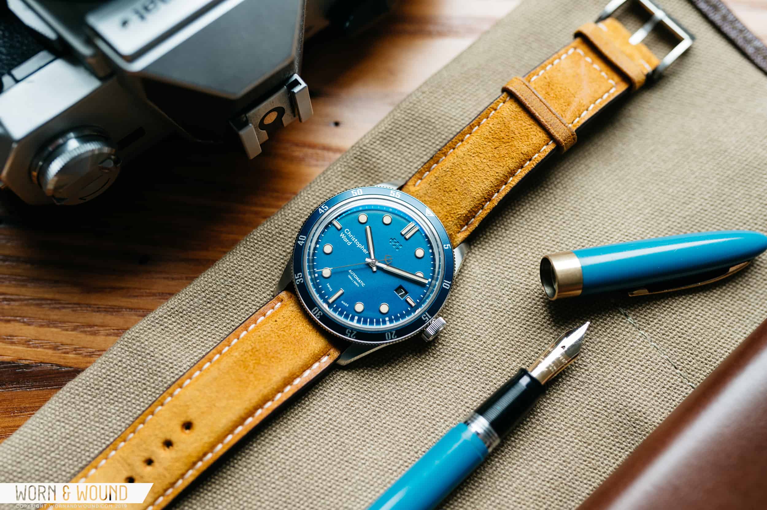
Individually, it’s easy to pick apart small features of the watch. When you back up a little bit, the design choices that I took (minor) issue with do work together well. It’s important to look at the overall watch when making a purchase decision (or writing a review). At wrist length, the whole is greater than the sum of its parts.
Movement
The word “Automatic” is prominently featured in the model name of the watch. This is the first of the C65 Trident series to include an automatic movement. Beating away inside is a Sellita SW200-1. The movement is proven, reliable, and has a solid set of base features that will please most watch enthusiasts looking for something in this price range. You’ll appreciate the 38-hour power reserve, hacking seconds hand for precision time setting, smooth 28,800 bph rate, and built-in shock mounting to resist the occasional bump. Chris Ward also went the extra mile and decorated the rotor with their twin flag pattern, even though it’s being blocked by the solid steel caseback. The Sellita is a logical choice for a watch in this price point.
Straps and Wearability
Blue dials can be a bit tricky to match. Especially when that’s not the only color featured on the watch (the Old Radium indices are tan). The Vintage Oak Leather strap included with the C65 Trident Automatic is a bright shade of tan suede that leans almost yellow. You’ll find some nice nappy texture on the suede that adds some depth to the strap. White stitching runs down the sides of strap, and the edges are sealed for a clean finish. Changing the strap is lightning fast, thanks to the integrated quick release pins. The included strap strikes a nice balance between raw and refined, and it looks great on the blue C65.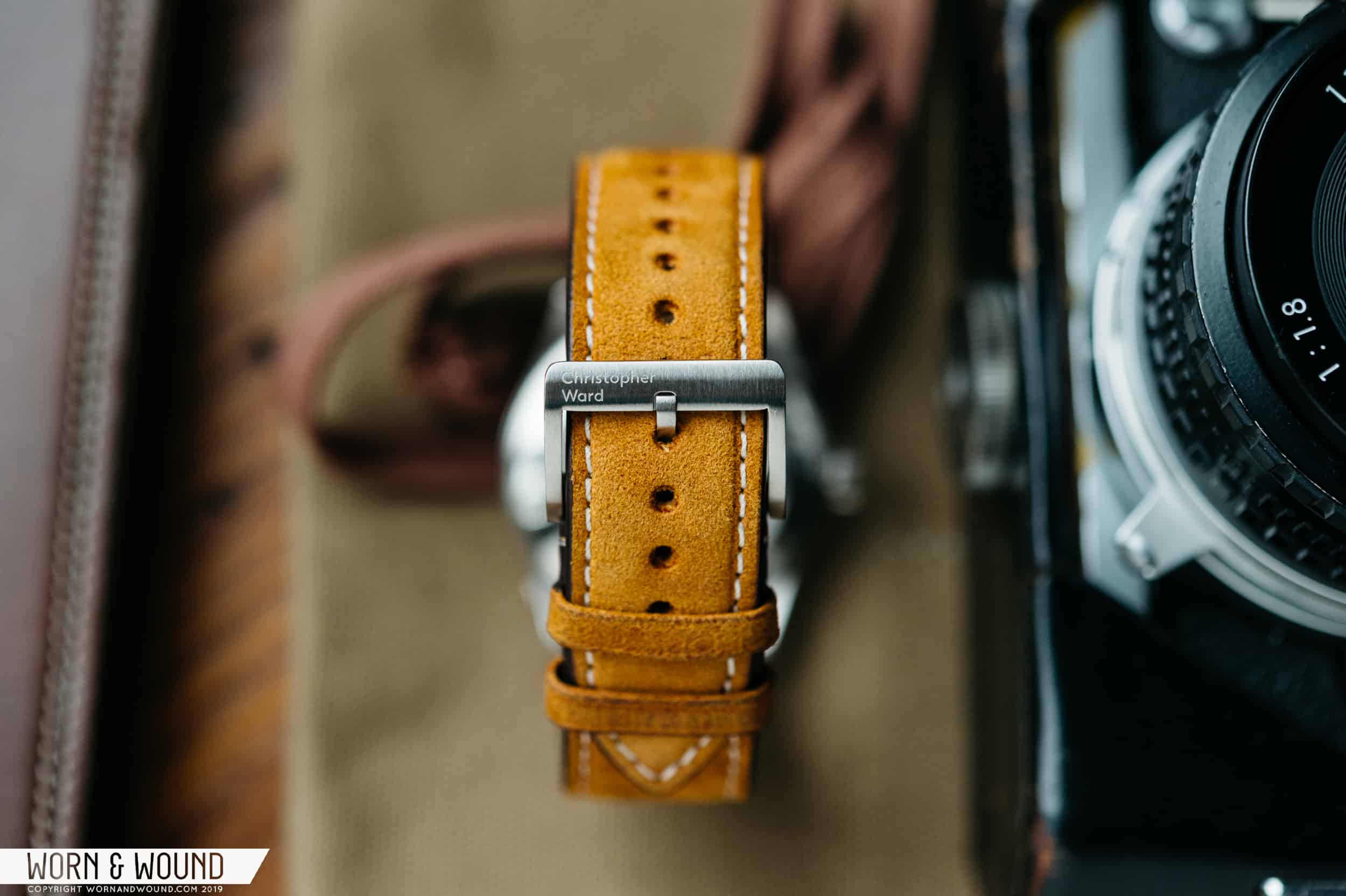
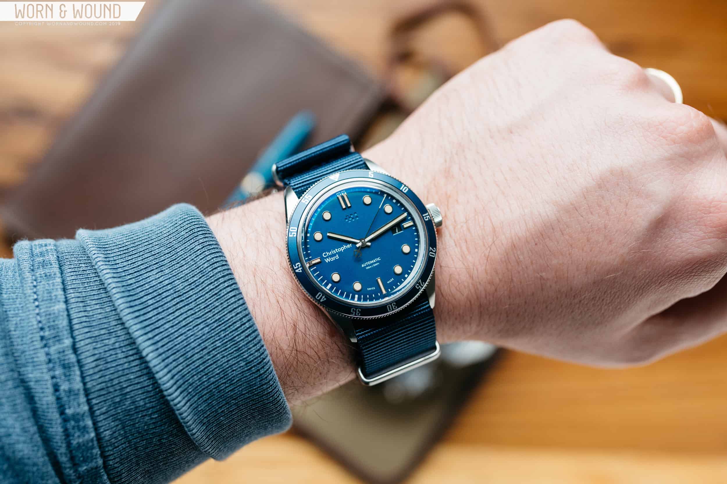
If you’re the type to frequently change straps, you may have a little bit of difficulty finding your own to match the blue C65. While it is awesome, the shade of blue on the dial is certainly unique. It would look best on a vintage style tropic rubber strap or a seatbelt weave grey mil-strap. I did throw the C65 on a navy blue nato while assessing the watch. While it was a lot of blue, I did dig the look. If you opt for the black version of the watch, you shouldn’t have any problems throwing it on whatever 22mm strap you happen to have around.
A stainless steel bracelet is also available, although not included with the specimen that I evaluated for review. The bracelet looks like an enticing option, as it only adds an additional $70 over the leather strap. You’ll find a micro-adjusting clasp on the bracelet which is ideal for accommodating small changes in your wrist size throughout the day.
Conclusion
Christopher Ward’s new C65 Automatic is an excellent option for those who like the style of vintage dive watches, and for those who don’t need the 600 meters of water resistance available from the Trident 3 collection. The case design is truly something special, especially when viewed from the side. For a 41mm watch with an 11.55mm height, it wears much thinner than the specs imply and most contemporary divers, and that’s largely due to the impressive case design.
As a fan of blue dials, this one kicks it up to the next level with the grainy metallic blue adorning the dial and bezel. Altogether, the C65 Trident Automatic is an excellent option for your next daily diver. I believe the design, finishing, and features more than justify the $795 starting price, and I’m excited to see more vintage-inspired designs from Christopher Ward in the future and how the C65 line progresses. Christopher Ward




 Featured Videos


