Affordable Vintage: Head-to-Head With the Omega Seamaster ref. 166.0240 and King Seiko ref. 5621-7030

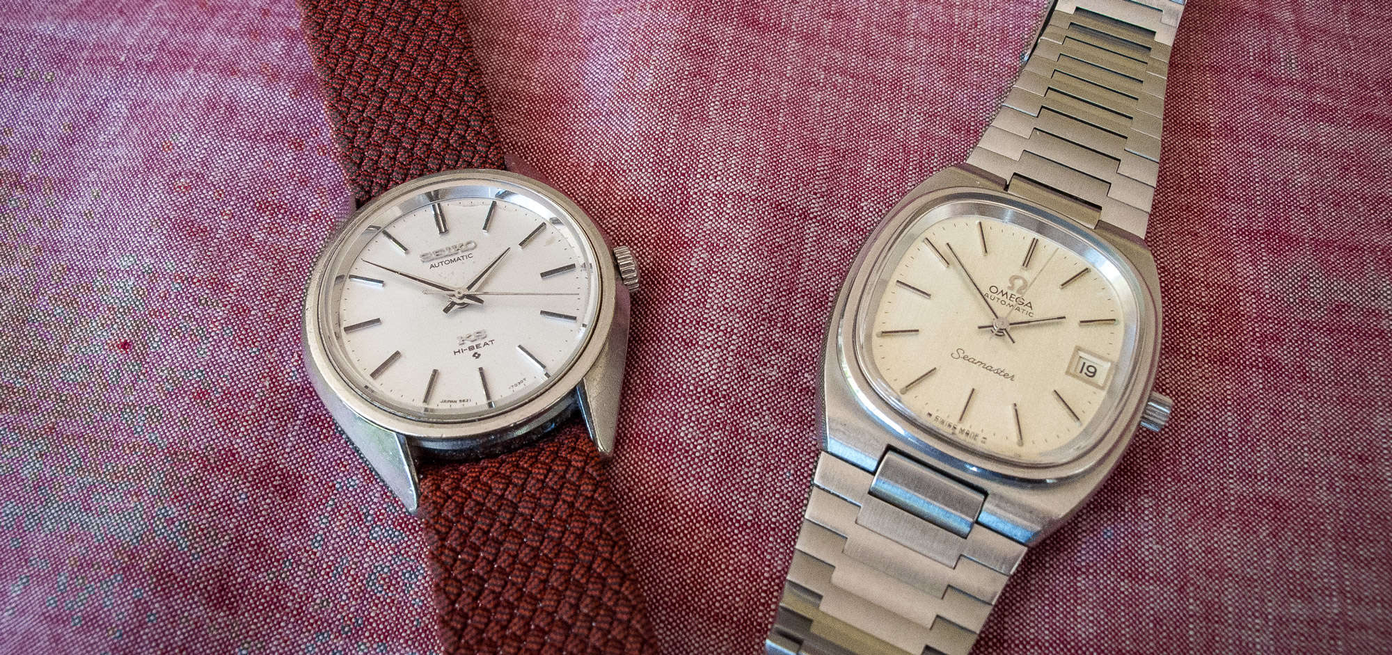
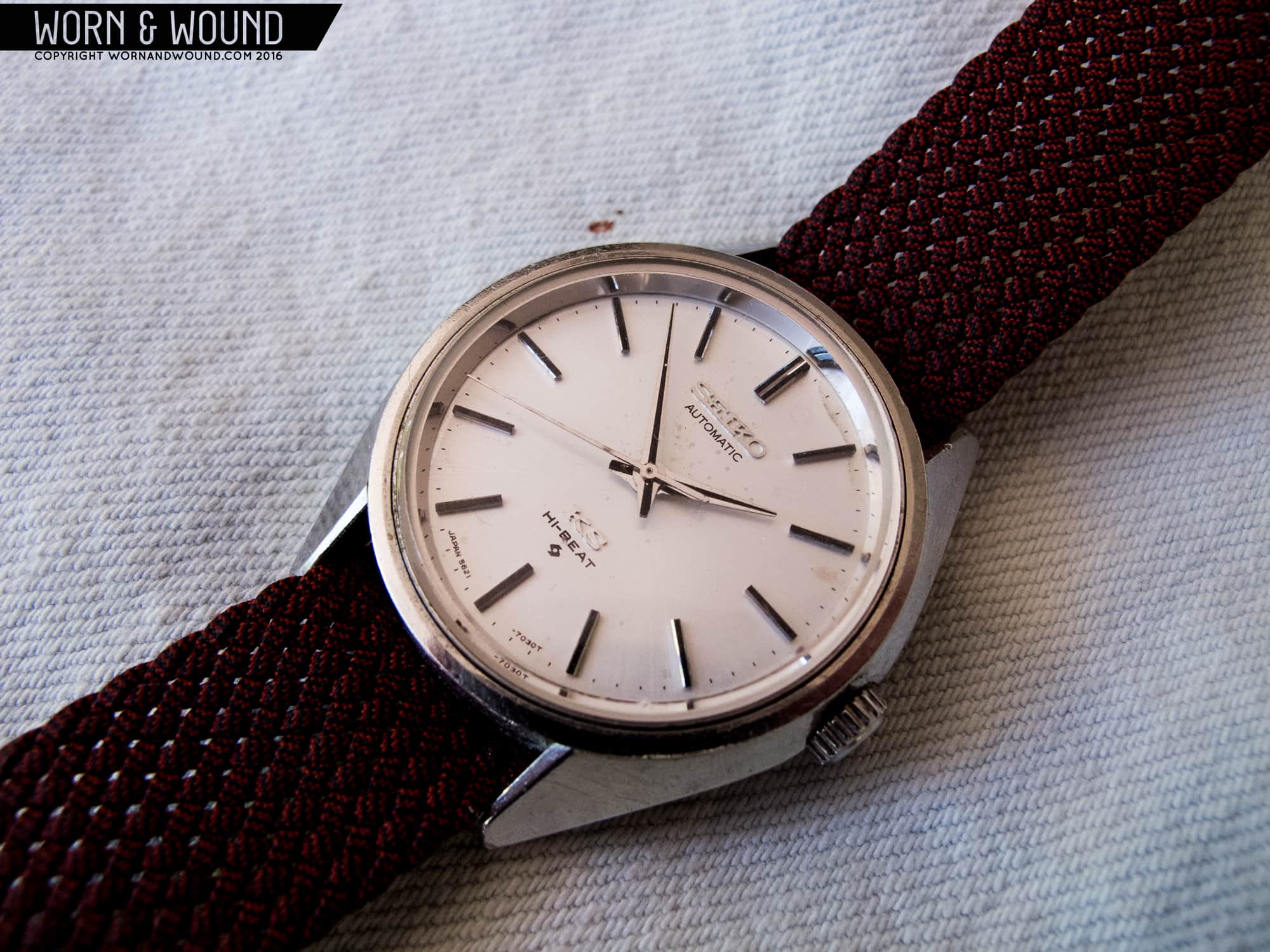
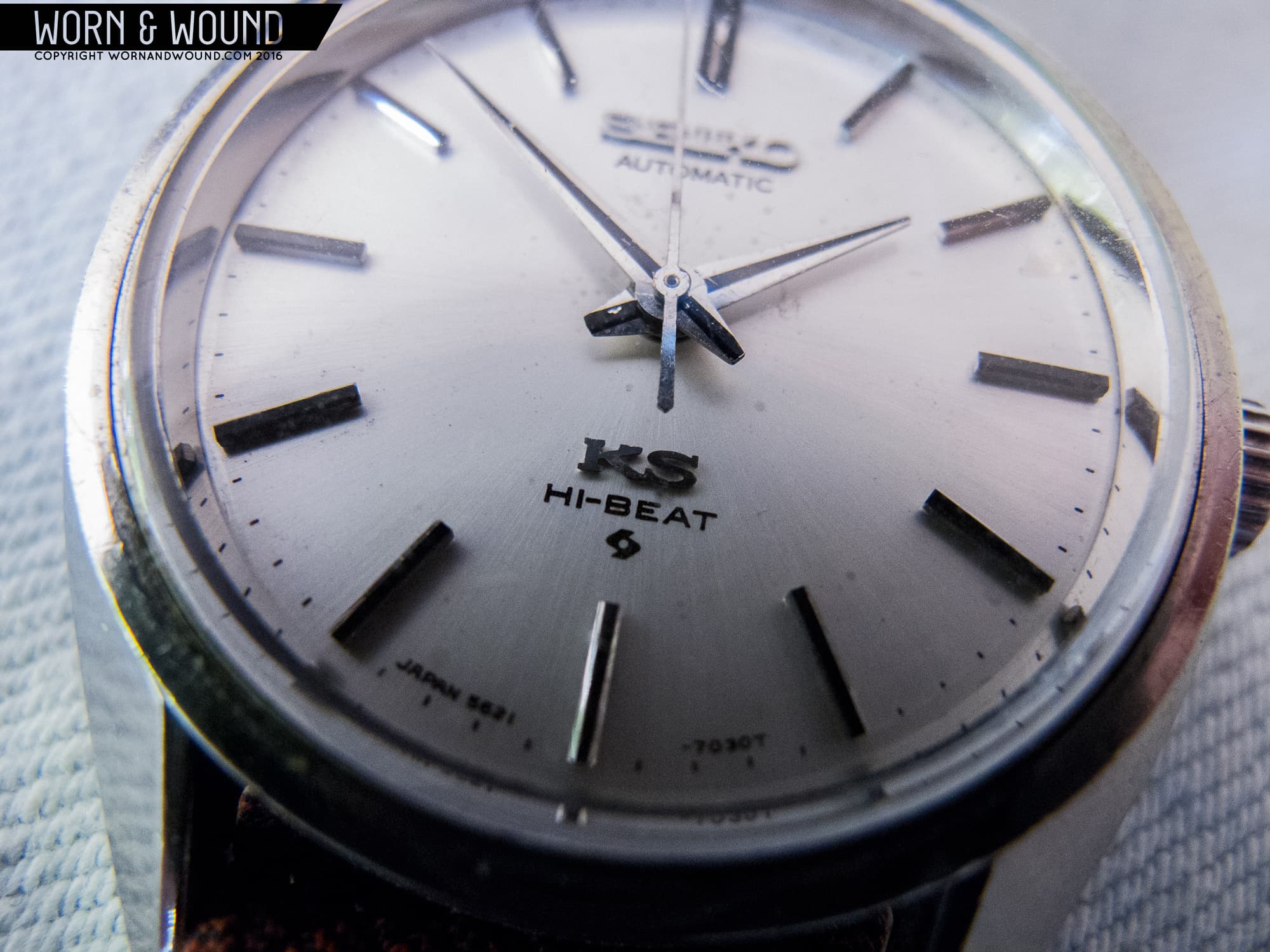
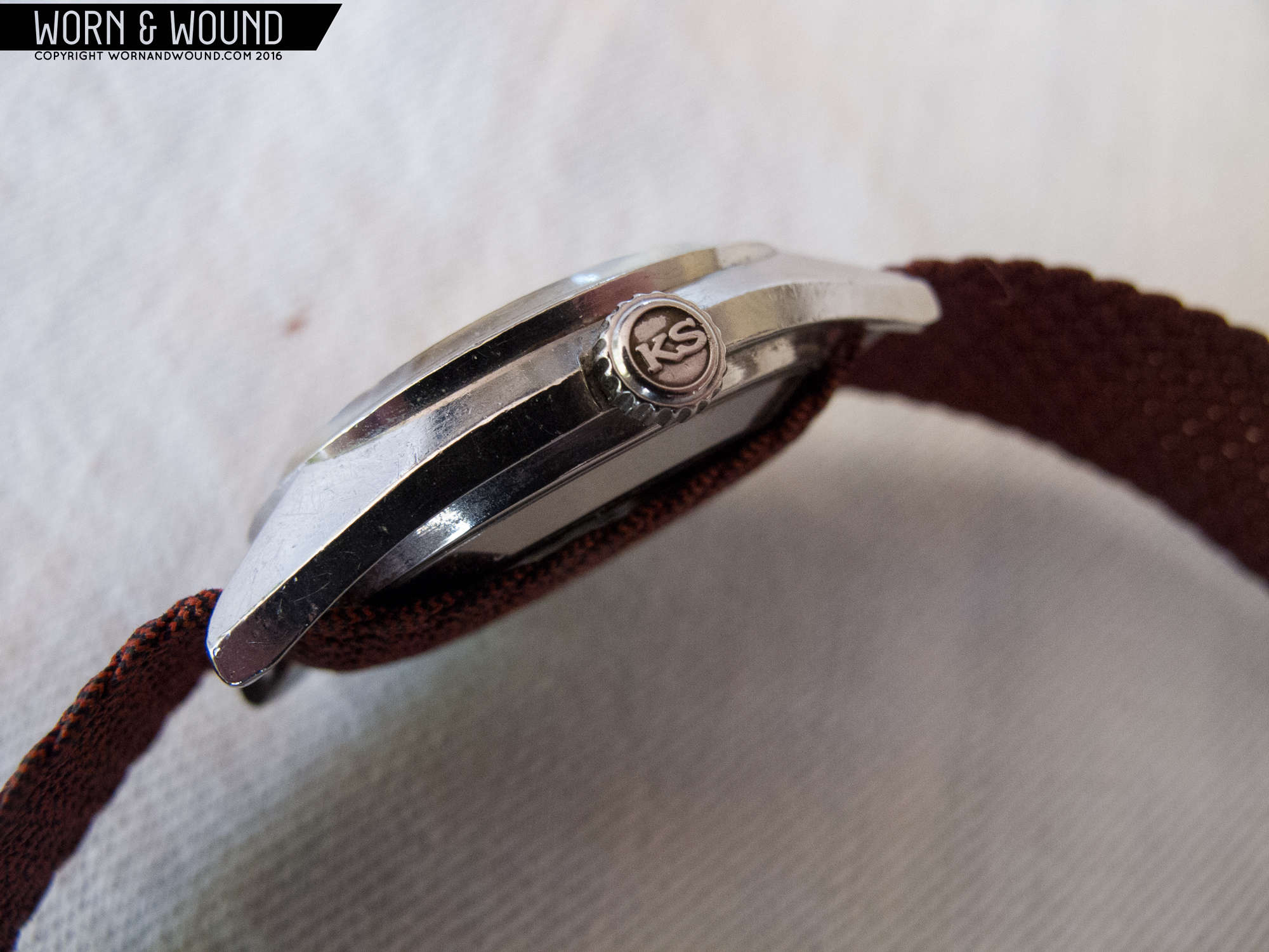
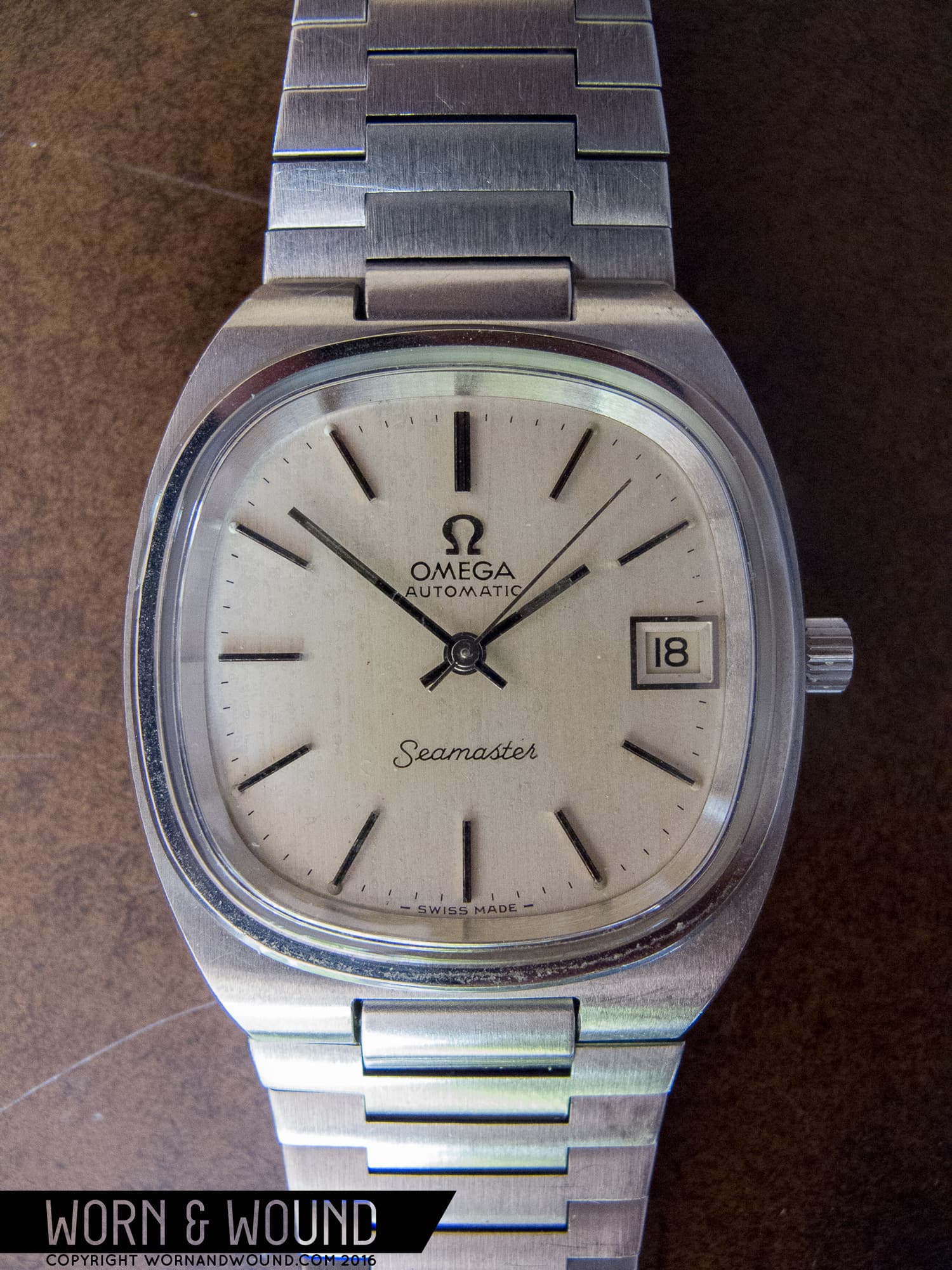
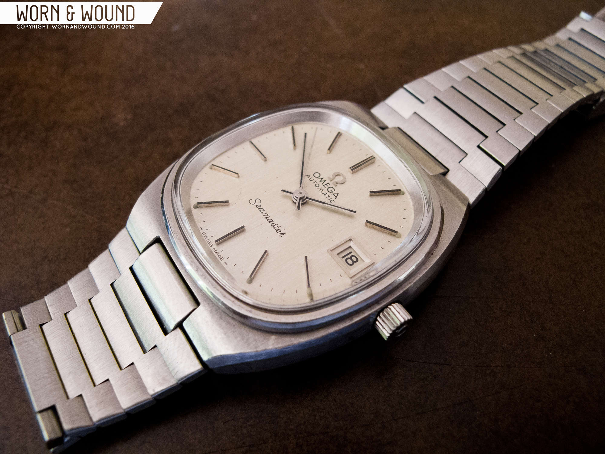
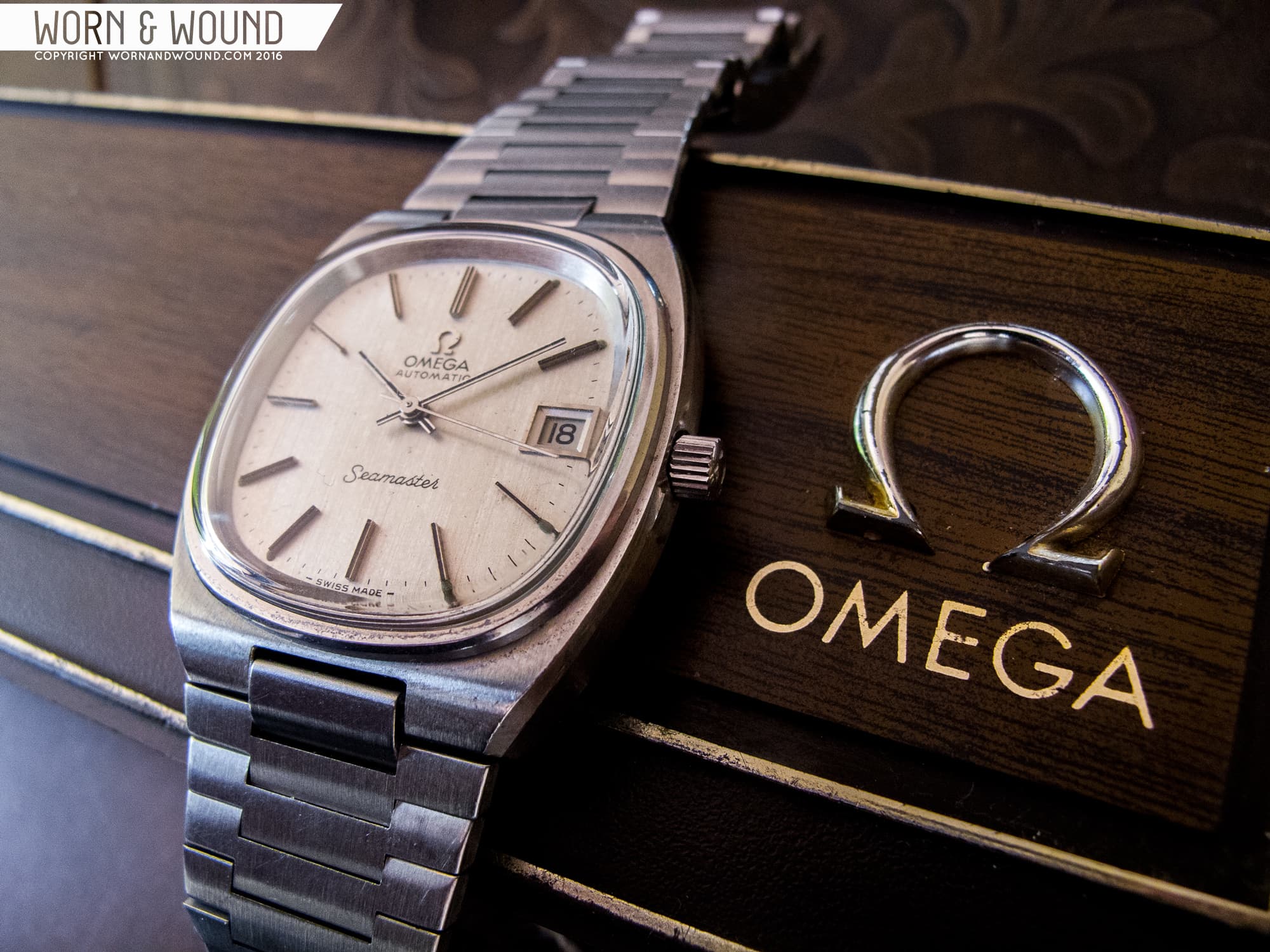
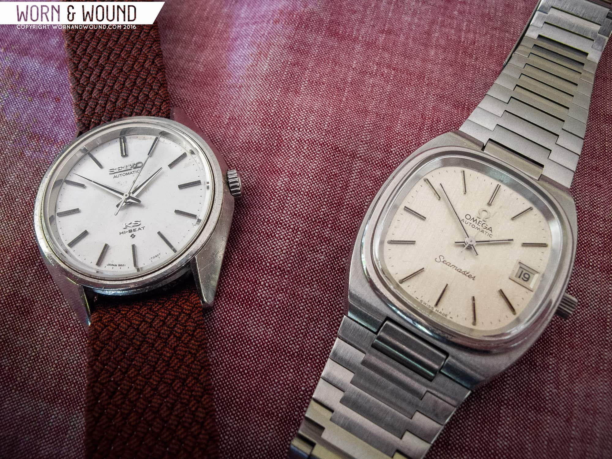
One of the most difficult things about watch reviewing is that it often exists in a vacuum. While you can easily get a sense of the quality of a piece it can be tough to say how well it might stack up against its competitors, especially with the razor-thin margins that often occur between two similar watches. With that in mind, I’ve set out to get a better sense of these qualities through the simplest possible solution: competition. For this installment of Affordable Vintage, I’ve chosen to tackle ’70s sports/dress watches with two extremely similar pieces from my own personal collection. In one corner, representing the Swiss, is the 1977 Omega Seamaster Caliber 1012, reference 166.0240. On the other side, hailing from Japan, is the 1972 King Seiko 5621-7030.
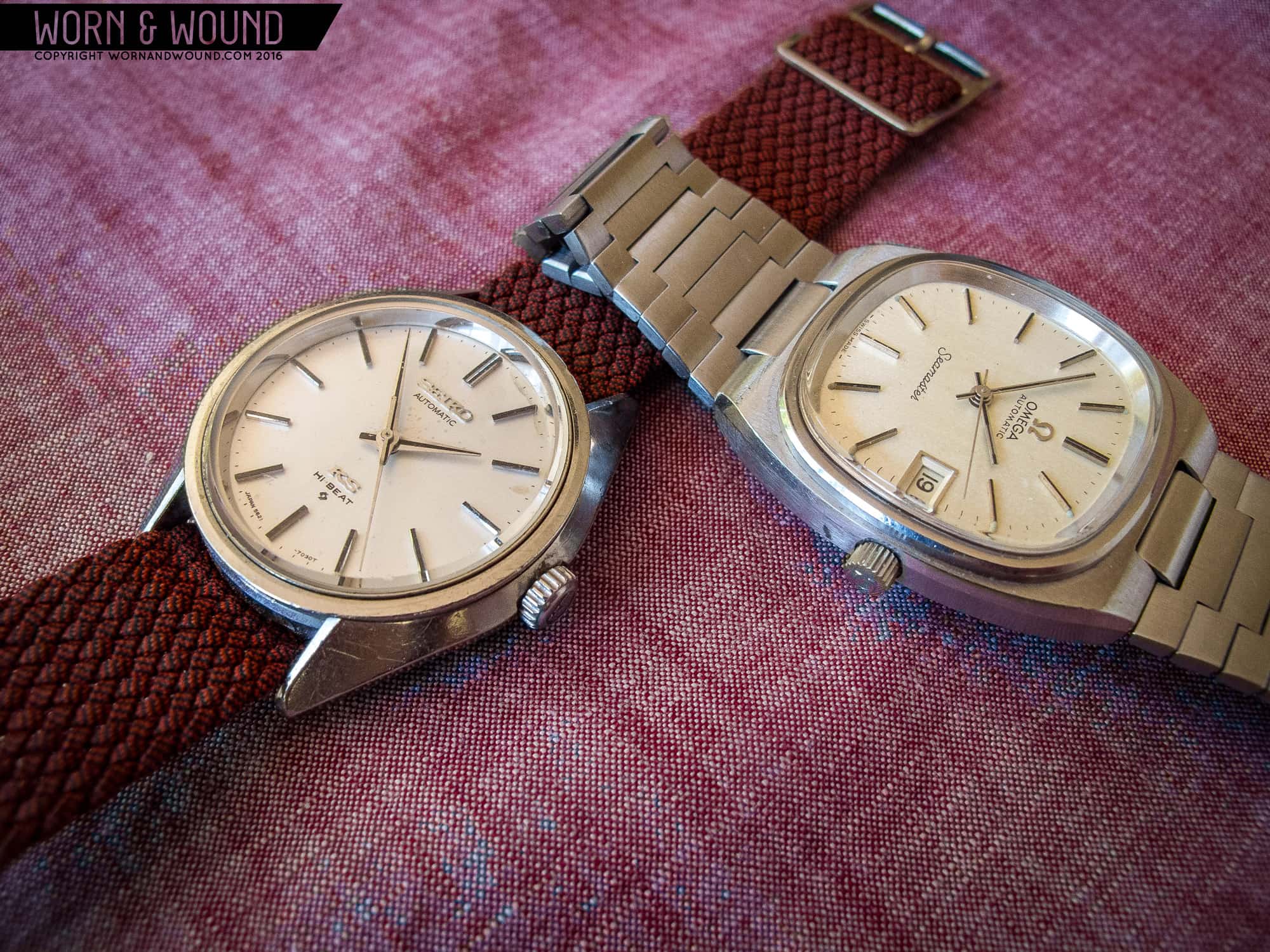
It’s remarkable how similar the two are on paper, although in execution they’re completely different. Both sport automatic movements running at a high-beat rate of 28,800 bph; both are under 40mm (the Seiko at 36mm, and the Omega just a hair smaller at 34mm, although the TV dial makes it appear larger); both have textured silver dials, signed crowns, faceted applied indices and both were at least somewhat created by a famous designer. What, then, really sets these two apart? As it turns out, quite a lot.

Save

Save

Save

Save

Save

Save

Save

Save

Save

Save

Save

Save

Save

Save

Save

Save

Save

Save

Save

Save

Save

Advertisement

First up, let’s take a closer look at the King Seiko (or KS, for convenience). Started as an in-house rival to Grand Seiko in the mid-’60s, KS produced some of the finest timepieces ever made under the Seiko banner. While not as groundbreaking as the hand wound Cal. 45, this later model 5621 is still no slouch. The unpolished original case is a textbook example of chief designer Taro Tanaka’s “Grammar of Design” philosophy. The case sides and lugs form one continuous curve, all angled and polished to a brilliant uniform shine. It’s perhaps the more austere case design of the two, but the simplicity of form works well in its favor here. The overall effect is definitely Eastern, with the tapering curve evoking the point of a Japanese sword.

To learn more about Taro Tanaka’s “Grammar of Design” Philosophy, click here.

In terms of the dial, the King Seiko is similarly elemental. The 5621-7030 is a time-only variant, with no date window to break up the dial symmetry. Like the case, Tanaka’s design takes a highly polished approach here: the dial indices, for example, are surprisingly tall and thinly beveled to throw highlights from any viewing angle. The dauphine hands are a near perfect match for this. They’re mirror polished with a contrasting black center line, and they gleam like jewelry but maintain a slim elegant profile. The dial surface itself is a point of difference from its Omega counterpart, however. While both watches might use silver dials, there’s a world of color difference. Here on the King Seiko, the silver is cool, almost an ice blue in the right environment, with a light sunburst that only comes alive in direct sunlight. It’s an extremely attractive surface overall, and one that seems like a partial inspiration for the modern classic SARB065 “Cocktail Time.”

Save

Save

Save

Save

Save

Save

Save

Save

Save

Save

Save

Save

Save

Save

Save

Save

Save

Save

Save

Save

Inside the King Seiko is the Cal. 5621 automatic movement, what might be called the workhorse of mid-tier King Seiko. It’s not the award-winning chronometer that the earlier hand wound King Seiko movements were, it doesn’t have the super high-frequency 36,000 bph sweep, and the finish is actually quite plain. What the 5621 does have, however, is reliability. Removing the plastic date wheel assembly of other variants eliminates the one real weak point of this movement, leaving a simple but incredibly well-built design with a reputation for impressive longevity. The actual specifications for the Cal. 5621 are far from unimpressive, either­–it’s still classed as a high-beat movement at 28,800 bph, and it boasts a solid 47-hour power reserve.

These movements are perfectly capable of chronometer-grade accuracy as well, given the proper regulation and tuning (some 5621s were regulated and marked as chronometers from the factory, however the majority were not).

As far as overall wearability goes, this is definitely the dressier of the two. The King Seiko’s restrained lines and overall simplicity seem to demand more formal occasions, but it’s not as though these can’t be dressed down for everyday wear. I’ve been wearing mine on an oxblood perlon strap lately, and it’s made for an attractive, if odd, daily companion. A grey suede strap would also look killer on here, playing off the cooler tones of the dial.

Save

Save

Save

Save

Save

Save

Save

Save

Save

Save

Save

Save

Save

Save

Save

Save

Save

Save

Save

Now, we switch gears. The best way to describe the Omega Seamaster Cal. 1012, ref. 166.0240 is that it’s the Rolling Stones to King Seiko’s Beatles. While the Japanese brand was clearly revolutionizing its line with new design concepts and increasing standards of production, Omega was creating something more visceral: a bit louder, a little punchier, a lot more rock n’ roll, but no less impressive.

First, a bit on the design pedigree of this Seamaster. Legendary watch designer Gerald Genta did work for a stint at Omega during the mid-to-late 1960s, helping to pen such classics as the “pie-pan” Constellation, but by the time this watch rolled around his time at the brand was long since over. However, Omega’s design team clearly still had their eye on his work, and the watches he was creating at the time this was made in the mid-‘70s obviously influenced this piece.

To learn more about Gerald Genta and some of his iconic designs, click here.

In fact, some collectors call this Seamaster variant the “baby Nautilus” due to its resemblance to Genta’s Patek Philippe masterpiece. While it’s not exactly a copy, many of the same themes are still there: TV-dial, integrated bracelet, rectangular indices and similar case styles. It may not have the cache of the Patek, but this Seamaster is an attractive product in its own right. The case is a small, slim cushion with a stark overall design. It doesn’t give the impression at a glance, but 90-percent of the case is just a broad, flat chunk of brushed stainless steel. What elevates it, of course, are the details.

A sharp polished bevel runs the length of the case, fulfilling several visual purposes. It differentiates between the case top and sides, and it adds a contour to the overall curve of the case side creating the illusion of length and making an already svelte case feel even thinner on the wrist. Meanwhile, the only real visual separator for the fully integrated lugs is the slight downward curve the case top takes near the bracelet. This gives the appearance of coherence to the whole package, and supports a visual flow downward into the brilliant original bracelet. Framing the dial is the Seamaster’s only other polished element–a striking raised bezel. Like the King Seiko, Omega had some impressive tricks at the time for adding a little extra sparkle, and this bezel is it. Not only is it a bright highlight in different lighting conditions, it’s an important aesthetic break in an otherwise very monochrome package, orienting the dial as the focal point.

Save

Speaking of the dial, this is an area where the Omega really shines–literally and figuratively. Right off the bat, the dial shape is a bold choice. This was the 1970s, when drugs were everywhere, fashion was crazy and watchmakers did a lot of experimenting of their own. While many of these experiments are best left on the midden heap of history, others stand the test of time with their own unique flair.

The rounded-square TV-dial is rather tame in comparison to many of these, but it remains just different enough to be interesting. Handset choice here is lower-key–simple polished batons with a thick contrast center line that leaves them looking black in indirect light. Similarly, the indices on the Seamaster clearly take a back seat to their similar counterparts on the King Seiko, and without the beveling they fade to uniform black when viewed straight on. On the other hand, this allows the dial surface itself to take center stage, and the dial here is much more vibrant than its Japanese opponent. Instead of a sunburst, Omega opted for a deep vertical brushed metal grain pattern that picks up ambient light far more readily. This dynamism in the light also shows off the depth of tone in the dial color, a warmth that contrasts sharply with the King Seiko’s colder tones. This almost champagne tone, along with the TV dial shape, give off much more of a vintage impression.

As opposed to the King Seiko, which looks like it could have been designed yesterday, the Seamaster is undeniably a product of its time, yet it still works. There’s something immensely charming about that.

Slightly less charming is the Omega Calibre 1012 movement. While it boasts nearly identical specifications to the King Seiko Cal. 5621, the Calibre 1012 is a far more fragile beast with a reputation for weak dial-side components. Broken quick-set dates are far from uncommon on these, along with positional timekeeping issues.

On the other hand, the bracelet on this Seamster may be the star of the show. It’s perfectly integrated into the main case, tapers smoothly to the buckle, and gleams brightly in almost any light. Not to mention it’s lightweight with solid links and is incredibly comfortable It’s hard to imagine this particular watch without it, really, and while that might seem to make this piece less versatile it’s quite the opposite. This dress-sports hybrid fits in anywhere but the most formal of occasions, and attracts more attention than the King Seiko does (for better or worse).

Save

Advertisement

With all this in mind, is there a clear winner? Most of what separates the King Seiko and the Omega comes down to personal preference, but a few general conclusions can be made. The prices on the current market are nearly even between the two–about $450 for the KS and $650 for the Seameaster–enough to the point where it should be called a draw. That said, there are some definite pros and cons here. Firstly, the King Seiko is more visually attractive overall, if only by a hair. The Taro Tanaka “Grammar of Design” holistic approach led to some timelessly beautiful and undeniably Japanese designs.

In addition, the King Seiko’s fine details set it apart–the indices, the hands, even the case back are just a touch nicer than what’s on display for its Swiss rival. Another point goes to the King Seiko for the movement. Although it’s a game of inches, the 5621 edges out the Cal. 1012 on reliability. While this might sound like a clear victory for King Seiko, that’s far from the truth. The Seamaster, while a touch less beautiful, is a more cohesive design with its bracelet and the dial is more interesting, both in form and that grained finish. Furthermore, and I conceded that this is a difficult thing to qualify, the Seamaster is more fun.

Save

In conclusion, allow me to bring back the analogy from earlier with the Beatles and the Rolling Stones. The King Seiko here is the Beatles’ “A Day in the Life”– groundbreaking, beautiful, technically perfect and elevating the group to new heights. On the other hand, this Seamaster is the Stones’ “Gimme Shelter.” It’s louder, more brash, and while it didn’t change the group in the same way it’s a hell of a lot more fun to sing along to.

Save

Related Posts
Hailing from Redondo Beach, California, Sean’s passion for design and all things mechanical started at birth. Having grown up at race tracks, hot rod shops and car shows, he brings old-school motoring style and a lifestyle bent to his mostly vintage watch collection. He is also the Feature Editor and Videographer for Speed Revolutions.
seanpaullorentzen
Categories: