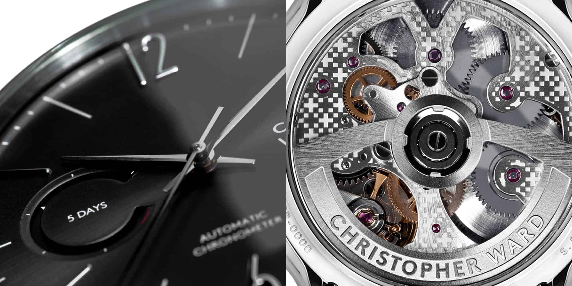
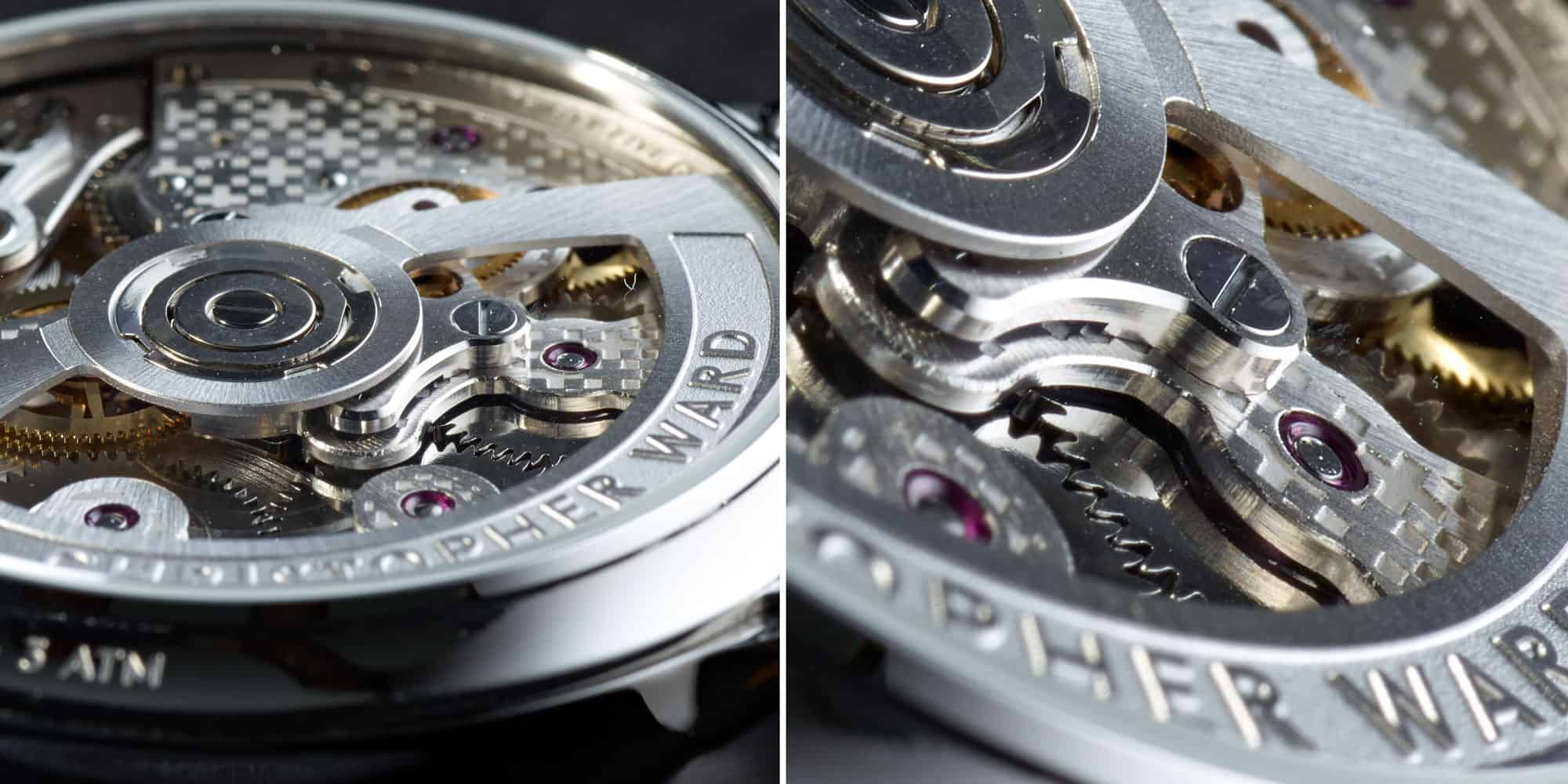
It’s been a bit of a bumpy road recently for Christopher Ward. Their peculiar re-brand was met with a less than savory response, which was followed by the release of a few higher priced relic-based watches that just didn’t feel like the brand we know and love. Things got better, however, with the release of their new C8 Power Reserve and UTC models, which built off of their existing pilot line, taking things into potentially new and interesting territory. This was particularly true with the Power Reserve model, which featured their most fancily decorated SH21 in-house caliber yet.
They’ve followed that release with what could be called a new flagship model, and a watch that shows that while C Ward might have hit a bump, they didn’t lose their way. The new C1 Grand Malvern combines the spirit of their first the watch, the beloved C5 Malvern, with their bolder and more horologically significant C9 line. The result is something more handsome and unique than either, speaking to what is the brand’s new design language. If their is one criticism I’ve had for the brand over the years, it’s that their designs, while enjoyable, have often bit derivative. The C1 (and C8 pilots) have begun to address this.
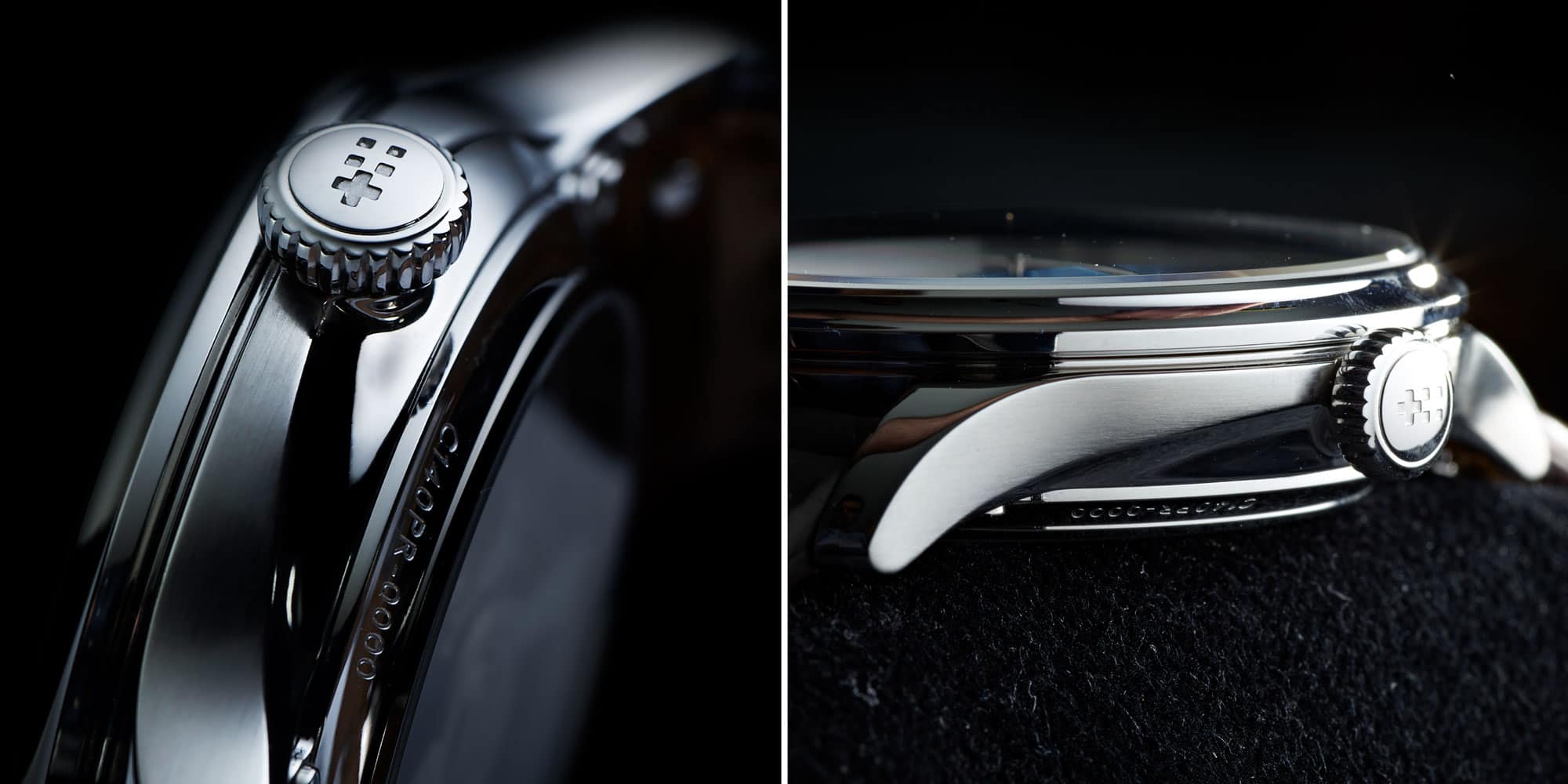
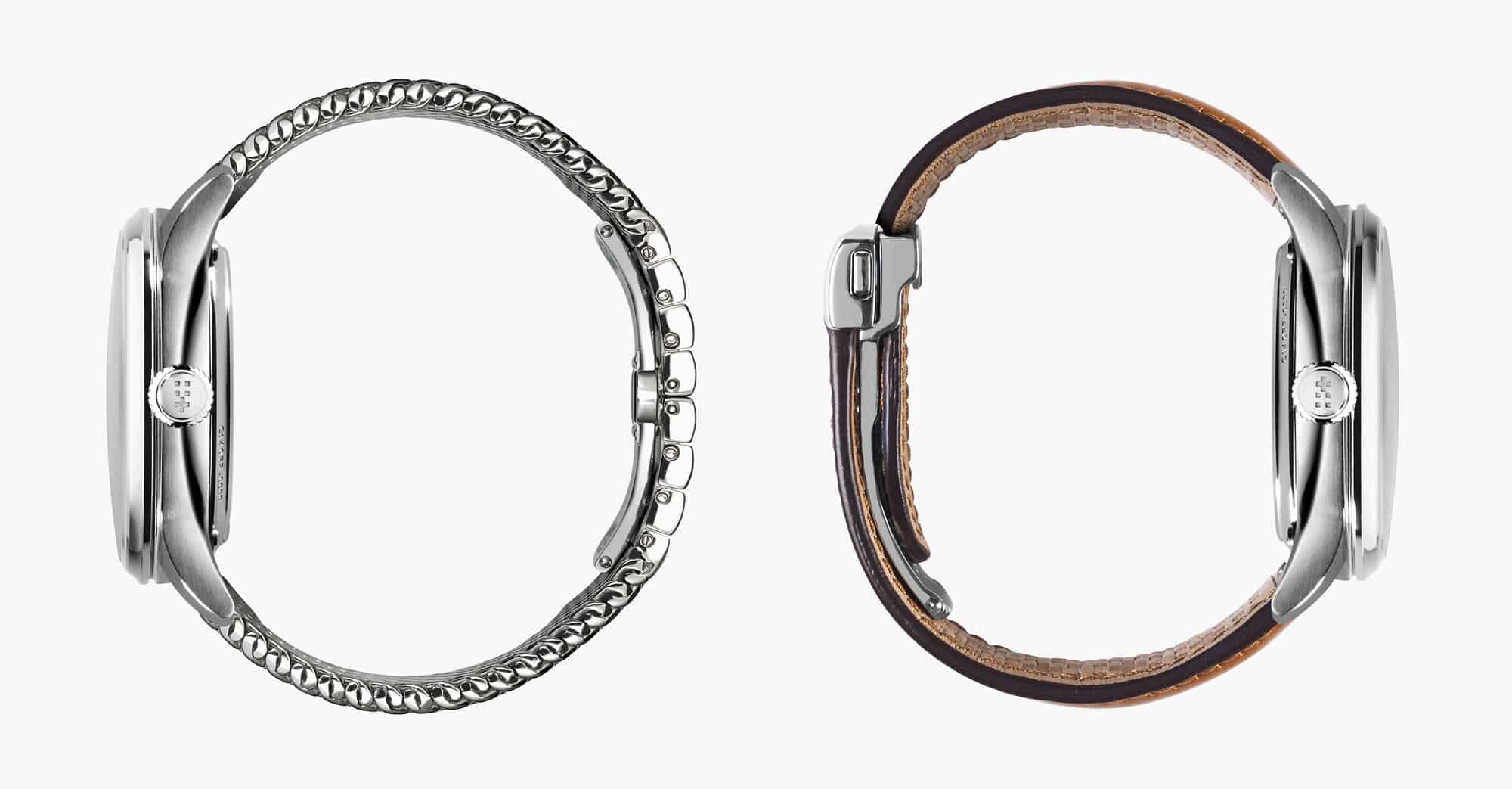
Jumping into the watch itself, the C1 features a new case design that is their sexiest to date. They’ve dropped the bland, but handsome slab-sided 40 or 43mm case found previously on their C9 line, instead going with a 40.5mm design with unique geometry. From above, it keeps much of the classic lines of the former version, but from the side tells a very different story. The slab-sided mid-case is gone, making way for a more parabolic overall shape and a dramatic arcing side. They use this aerodynamic swoop to bisect the finishing, featuring horizontal brushing above and polishing below the line. This should also help break up the 12.45mm case height.
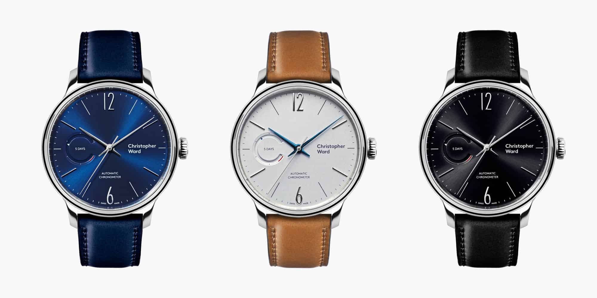
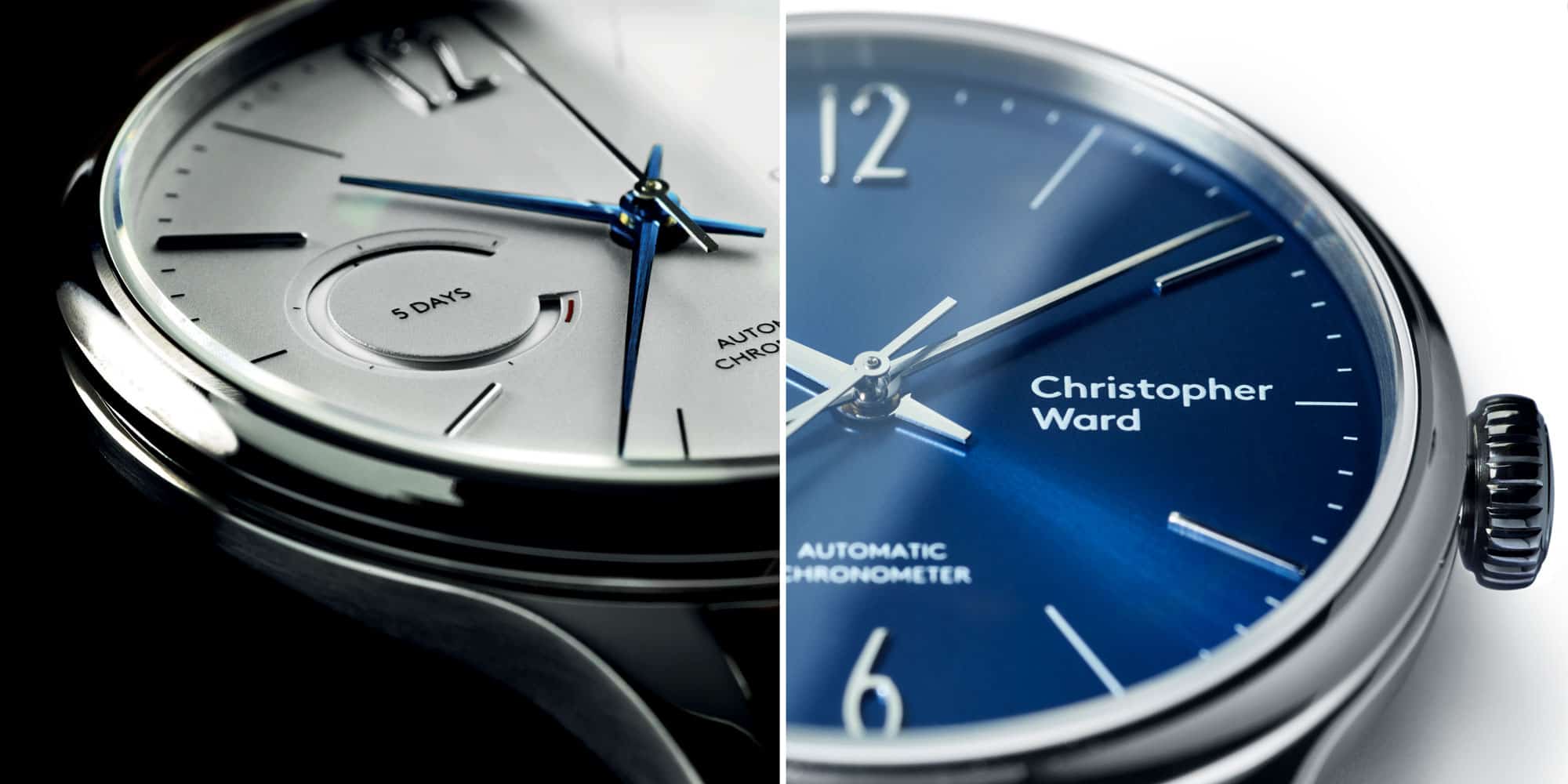
The dial draws on the C9 5-day, but immediately feels more refined and modern. Gone are the stuffy roman numerals, making way for large, applied arabic numerals at 12 and 6. In a move that could almost be called playful, the other hours alternate between thin printed lines and applied polished batons. The result is less classical and more mid-century than previous designs. It has a lighter and friendlier personality, and is frankly less bland.





 Featured Videos


