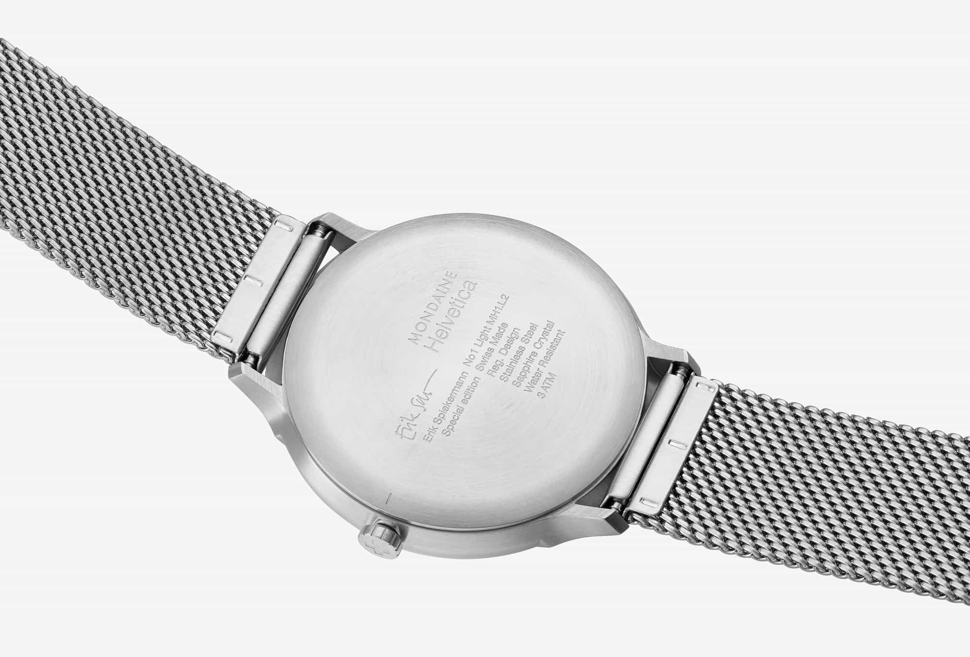
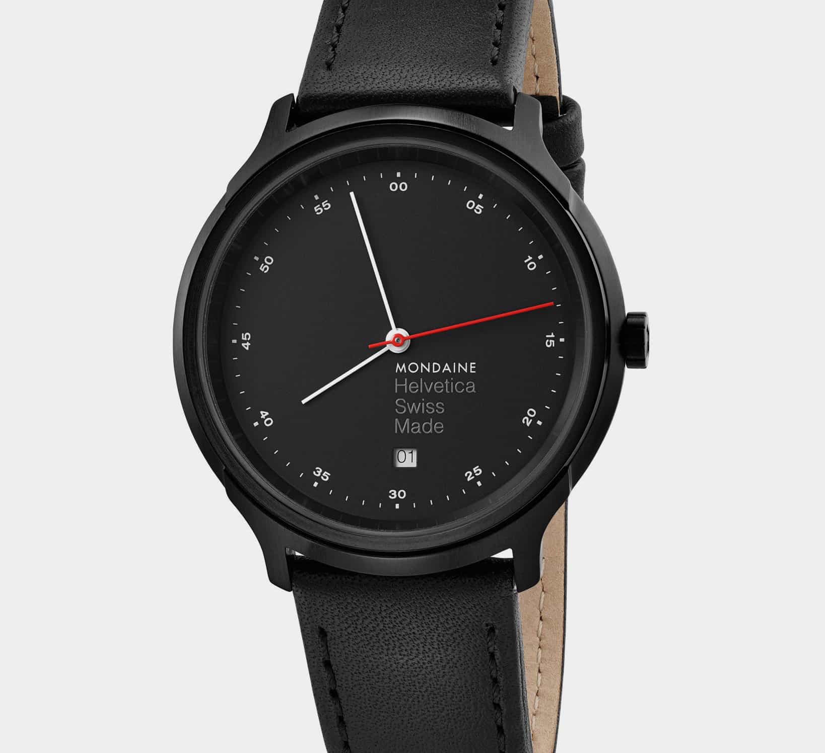
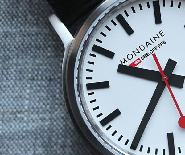
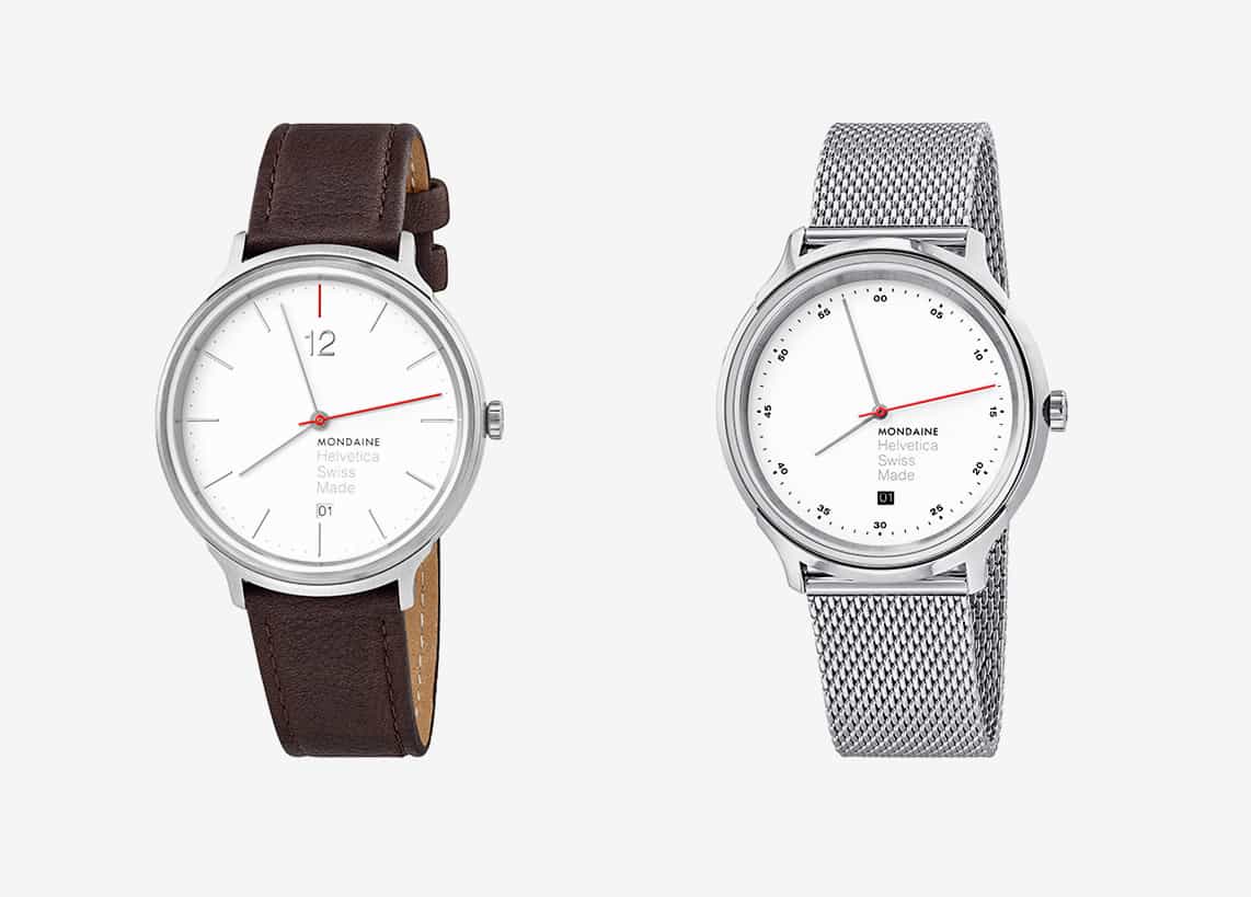
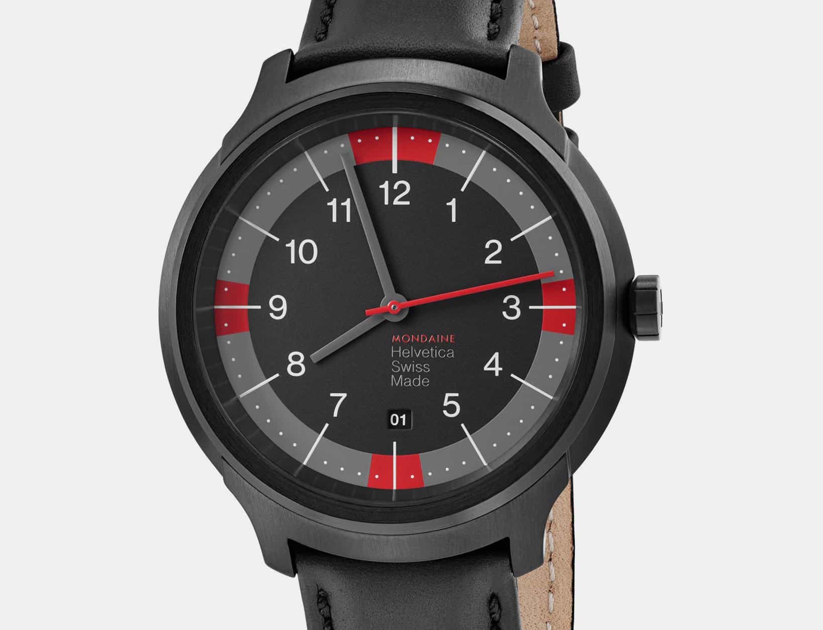
Bold, clean graphic design is bread and butter over at Mondaine. The Swiss brand’s hallmark style, best expressed in the Swiss railway-inspired Classic, has expanded in recent years to include the brilliantly minimal Helvetica series. The Helvetica watches are a celebration of that most famous of modern typefaces—a real love letter to typography in general. Now, for 2017, the Helvetica line has been spiced up with the input of one of the world’s greatest living typographers—Germany’s Erik Spiekermann. The new Helvetica Special Edition Erik Spiekermann models offer an attractive reimagining of all three Helvetica models, along with eye-catching new red highlights.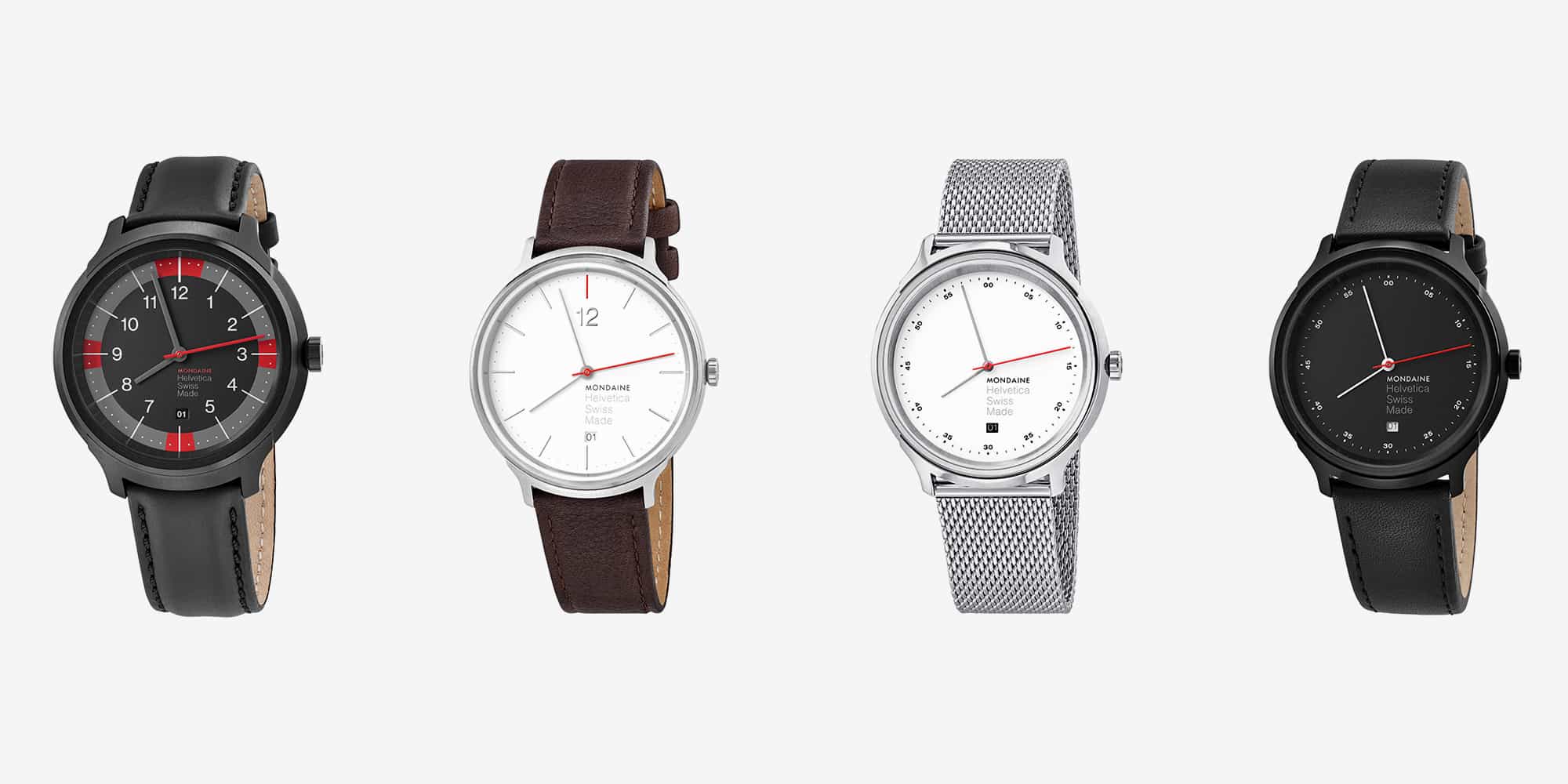 First on the list is the Helvetica No1 Light Spiekermann Edition. Ironically, the actual use of Helvetica is kept to a minimum here; the dial elements are more dominated by the long, airy printed hour marks than anything else (especially the eye-catching red mark at 12). The addition of a large, crisp Helvetica Light-rendered Arabic 12 below the index, however, is a focal point for the entire dial and a brilliant counterbalance to the oversized dial text above six o’clock.




 Featured Videos


