Until quite recently, Stowa was not a brand known for making waves. For much of its nearly 20-year history under the watchful eye of Jörg Schauer, Stowa has maintained a tightly curated catalogue of timepieces, among them the Flieger, Marine, Seatime, and Antea. The evolution of each watch has been an organic process, with small changes trickling out slowly over the years to include different case sizes, movements, and dial colors. Yet, few of these variations, including those released as limited editions, strayed far from the well established “look” of the brand.
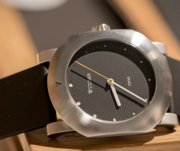
Then in 2013, Schauer, a designer as much as he is a watchmaker, sought to modernize the Stowa aesthetic, introducing the Flieger TO1 TESTAF and later the Flieger GMT. Muted and tactical, both watches looked more like something Sinn would put out and were unlike anything else produced by Stowa. That same year, Schauer also sought to modernize and unify the brand logo, announcing a redesign that spawned quite a bit of controversy online. Many questioned the decision to do away with the classic Stowa script–with its curvy “S”–in favor of incorporating the “W” logo beside the logotype (though, most did concede that the new design was well suited for Stowa’s newer, sportier models.)
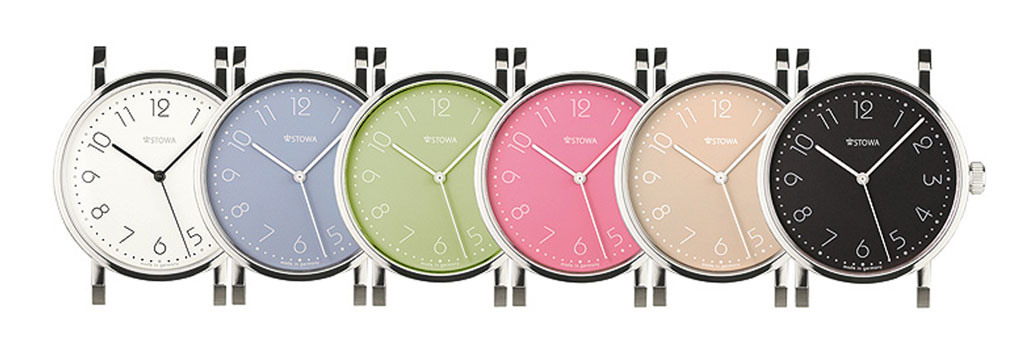
In early September, Stowa unveiled another design overhaul, this time shaking up the Antea line with the introduction of the Stowa Antea “Back to Bauhaus” series. This recent iteration–set to run alongside the classic line–re-imagines the Bauhaus traditions of the Antea, incorporating a new type (Bauhaus STD) and a dial in a multitude of muted colors. The “back to Bauhaus” line is the result of a collaboration between Schauer and German design legend, Hartmut Esslinger, who will also design a watch for Stowa that is slated for release this December.
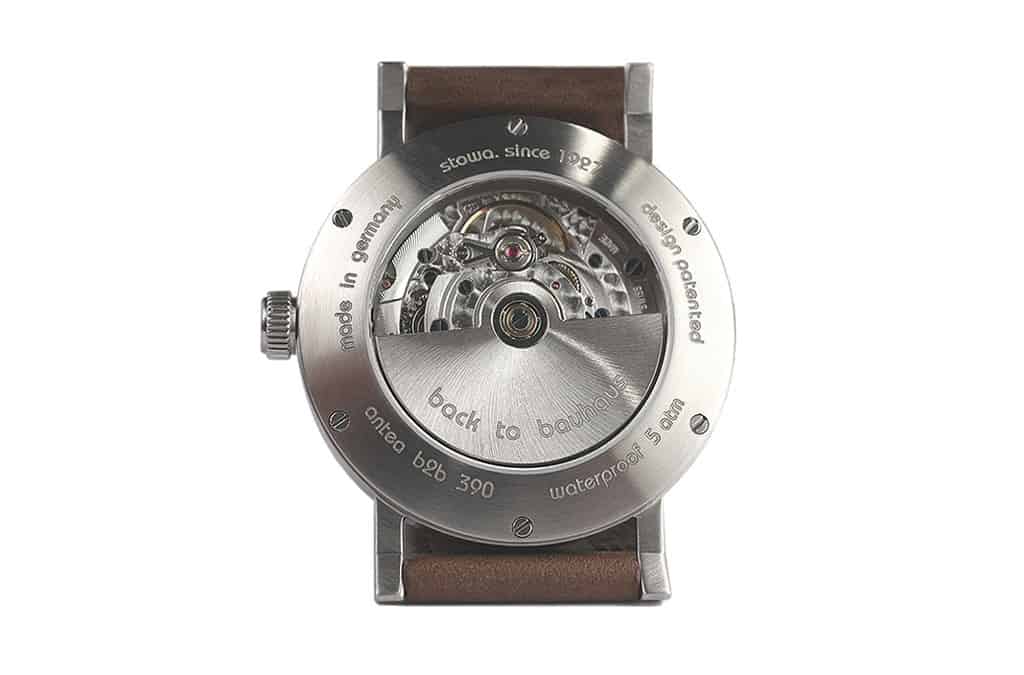
The “back to bauahus” will be offered in a brushed case of three possible sizes, (35.5mm, 36.5mm, and 39mm), with or without date, and with either a hand wound ETA-7001 or an automatic ETA-2824 (both of which, by the way, will be “Top” grade.) The white dialed version is the only model currently available for order (with a slated November delivery) at a price of €950, which translates to approximately $1028 without V.A.T.
Aesthetically, the “back to bauhaus” is certainly an interesting watch, though in all honesty I wasn’t too impressed when I first saw the announcement. To me, it felt like a dilution of a watch I love (and own), and apart from the case, it just didn’t feel like Stowa. But the more I looked at it, the more I began to appreciate the redesign. Despite its name, the “b2b” feels more modern than the current Antea line. The dial is light and playful, and the use of color, perhaps a page out of the Nomos playbook, may potentially open the brand up to more female fans. I also like the new crown, which appears a bit larger than what we have with the current offering and looks great against the case. Though it’s not a watch I would purchase, I can see its appeal despite my reservations.
Ultimately, now that I’ve had a few days to mull it over, I now feel as though Stowa didn’t go far enough with this release. The “b2b” lacks a certain cohesion of design; the softness of the new dial clashes against the angular lines of the classic Antea case. Though intentional–Esslinger was asked to leave the case alone–I think that a new softer case would have been a better complement to the dial. As it stands, the whole thing looks a bit incongruous.
My other issue is the price. The “b2b” is priced higher than any other watch in the current Antea line. While this likely has more to do with the fact that Schauer is using “Top” grade ETA movements–movements that command a pretty penny these days–I can’t help but think that a cheaper alternative might have been a better route. Dare I say, maybe even quartz? At its current price, the “b2b” may be a tough sell.
What are your thoughts on the “back to bauhaus” from Stowa?


 Featured Videos


