


 Featured Videos


The MAEN Manhattan is a great representation of where the watch world is today. A thin, well-finished riff on the 70s integrated bracelet sports watch but with an accessible price tag, beyond its sheer aesthetic appeal, what makes it profound is that it was made by a small, young brand. The level of fit and finish packed into this sub-$1k watch was not possible by a “micro” brand even a few years ago, especially with a Swiss-made automatic inside. Now, it seems achieved with ease and grace (though we’re sure it was a lot of hard work).
Additionally, this very style of watch has become emblematic of the aesthetic moment. The depths of mid-century watch designs have been largely explored, with just about every permutation of 60s dive watch conceivable having hit the proverbial shelf. Logically, eyes progressed to the next decade, the 70s, and honed in on the Genta-born luxury sports watches from which today’s integrated designs all pay homage.
Today, we’re proud to announce the MAEN x Worn & Wound Manhattan Limited Editions, our first collaboration together. A duo of watches that attempt to take the iconic integrated sports watch concept into different terrain. Minimal but evocative, sartorially inspired, and with tasteful use of color, they lean more into the formal side of the Manhattan than the sporty side for a stylish result.
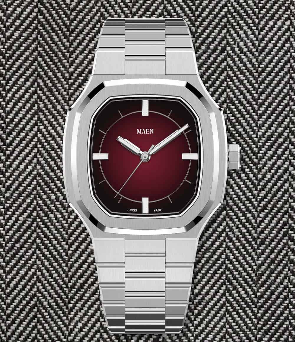
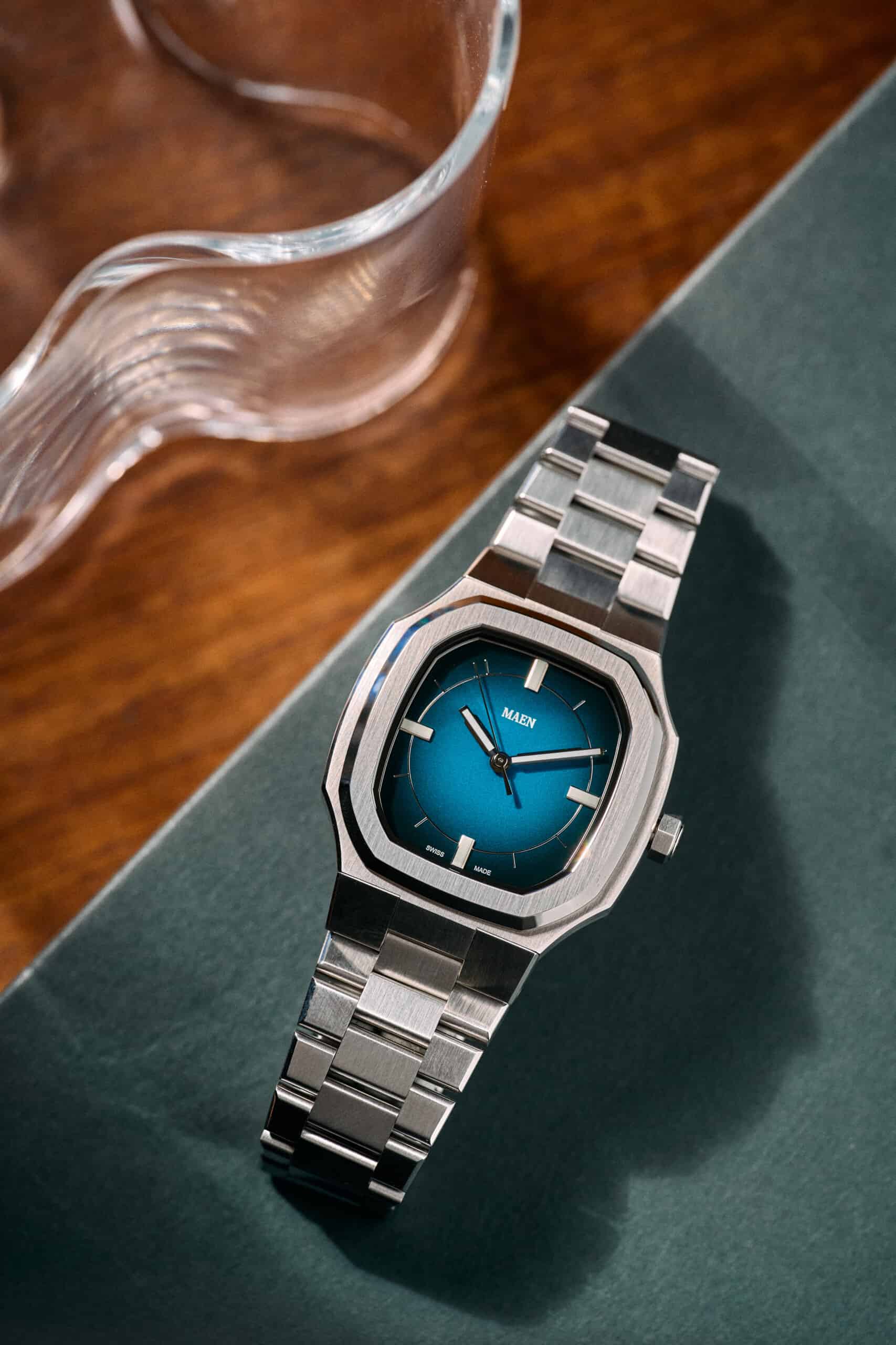
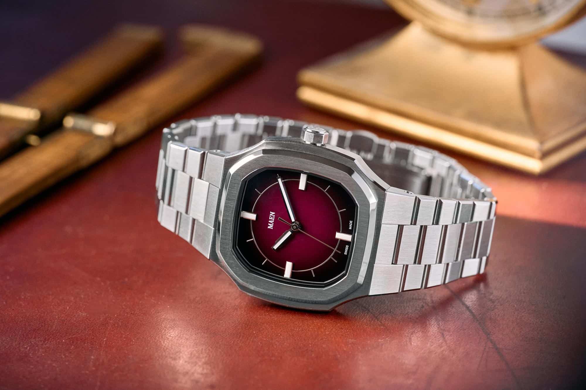
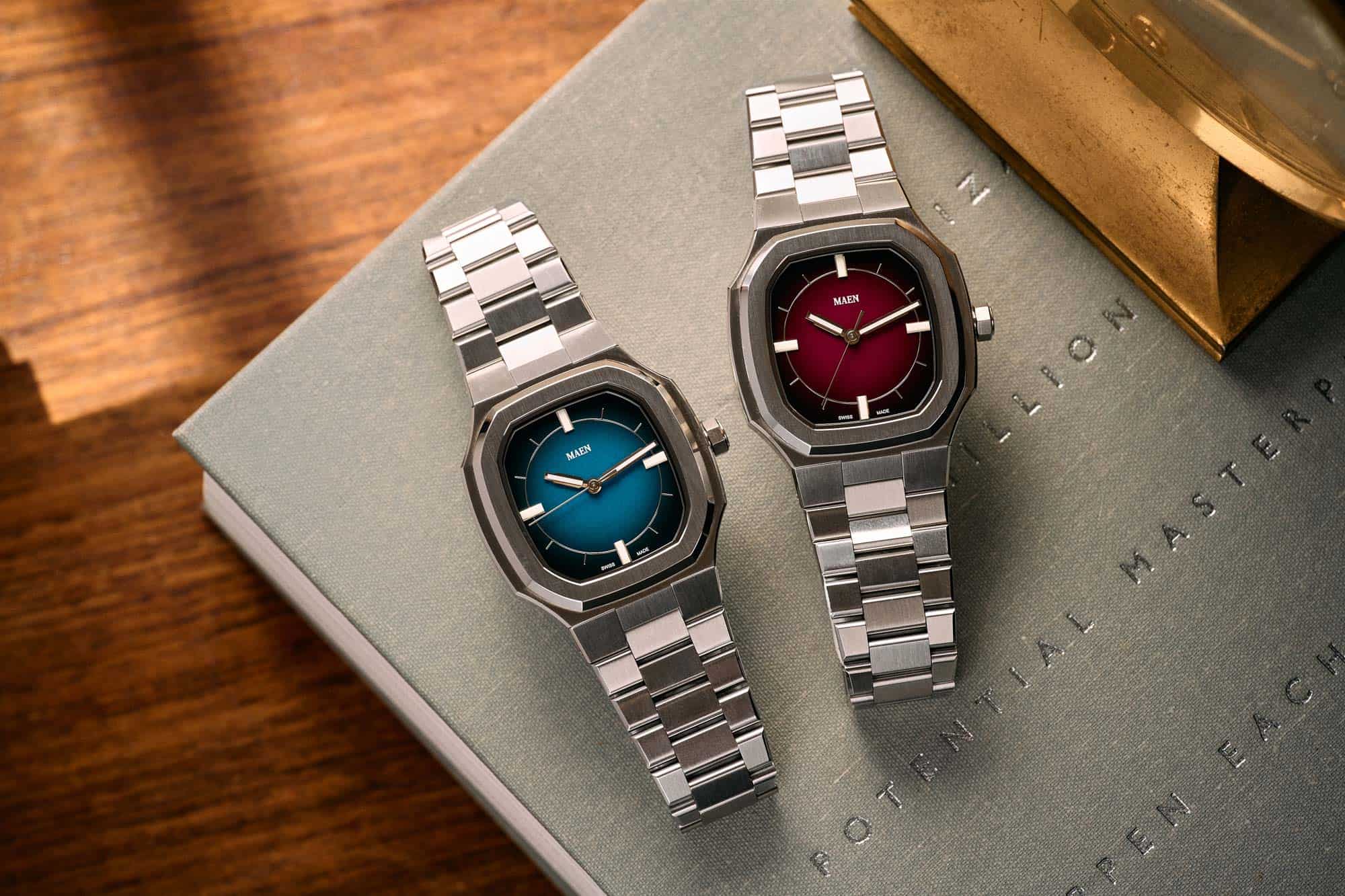
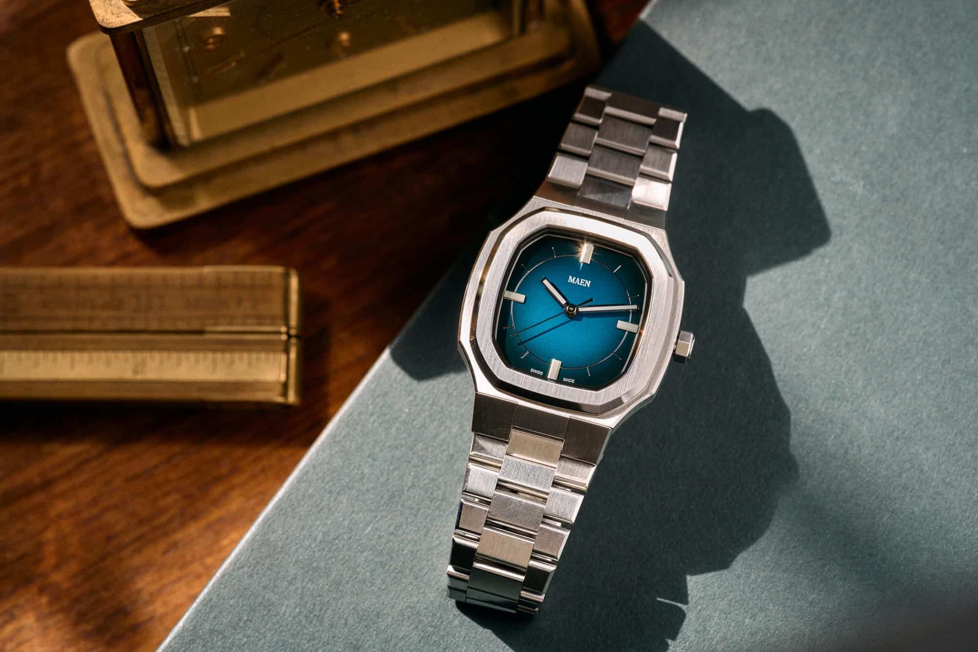
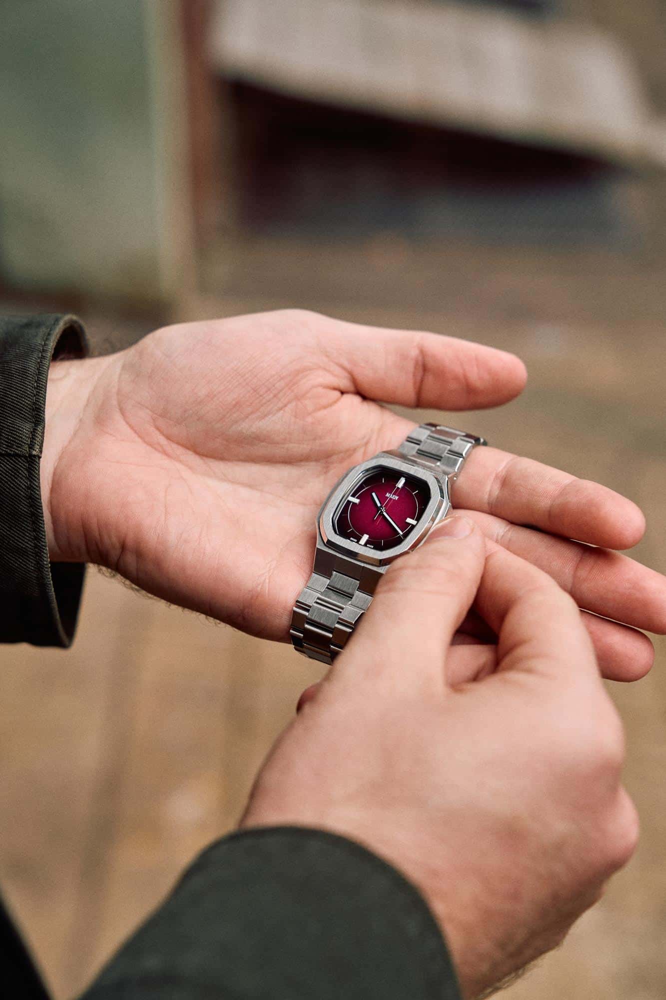
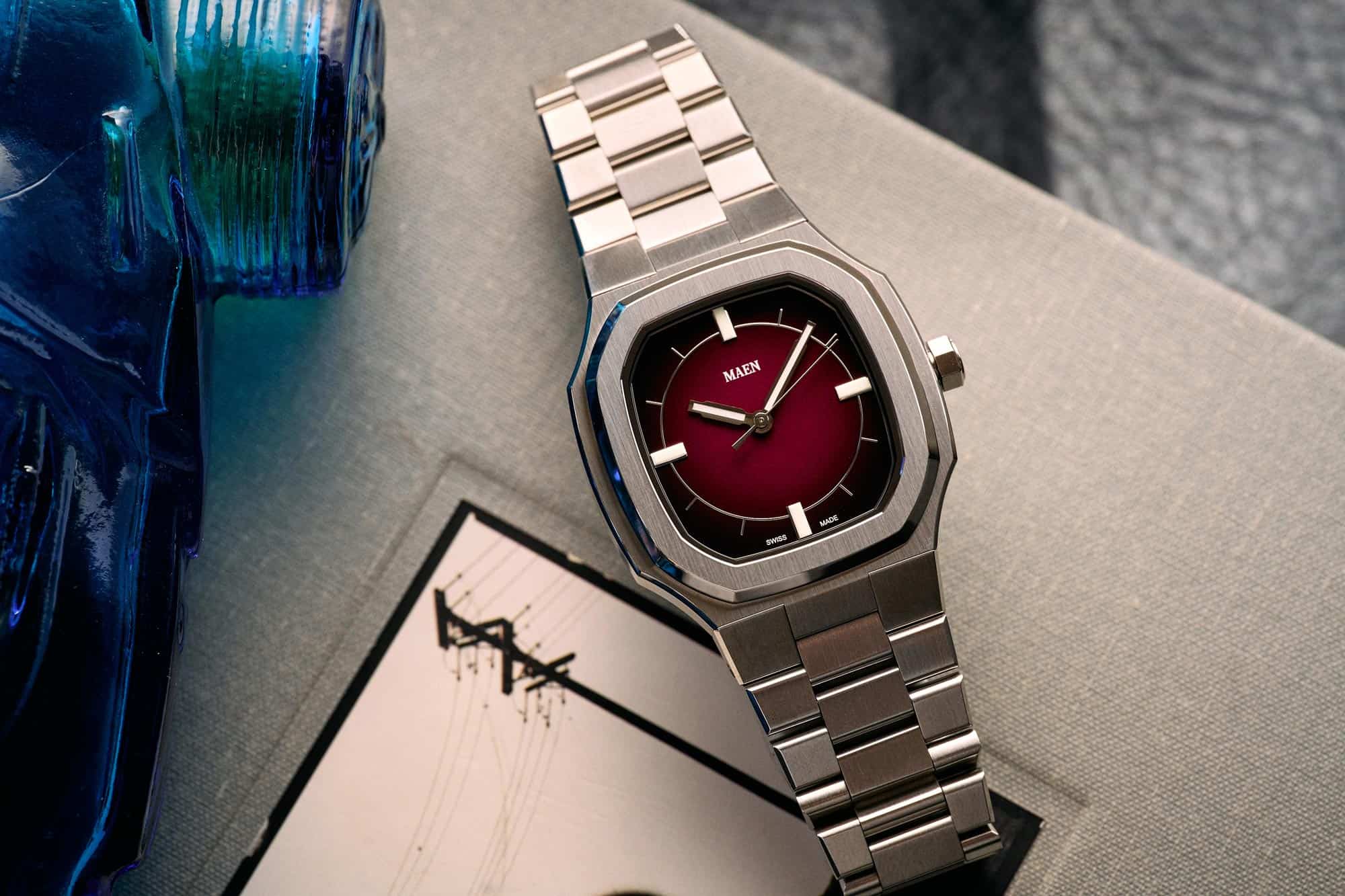
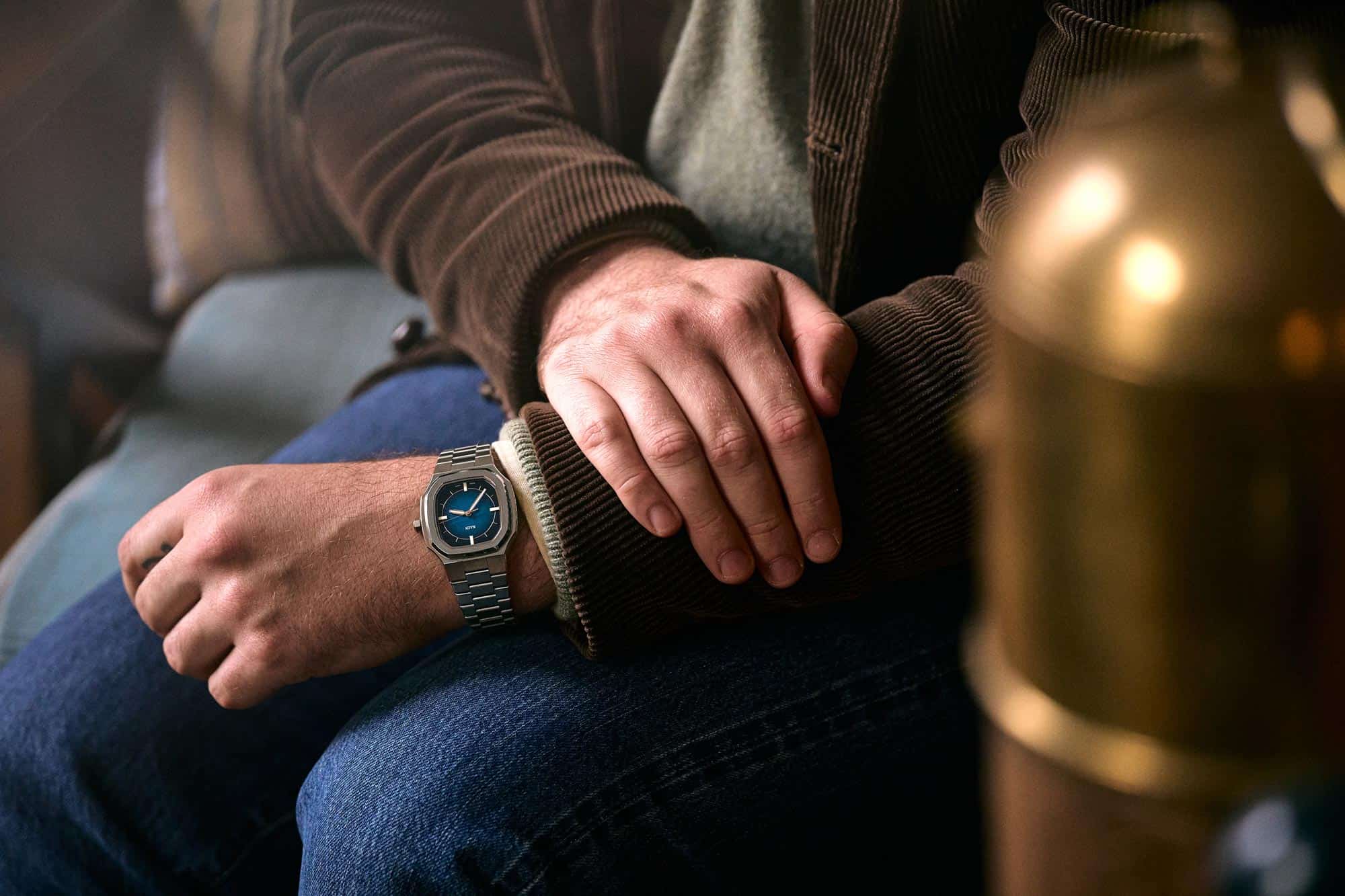
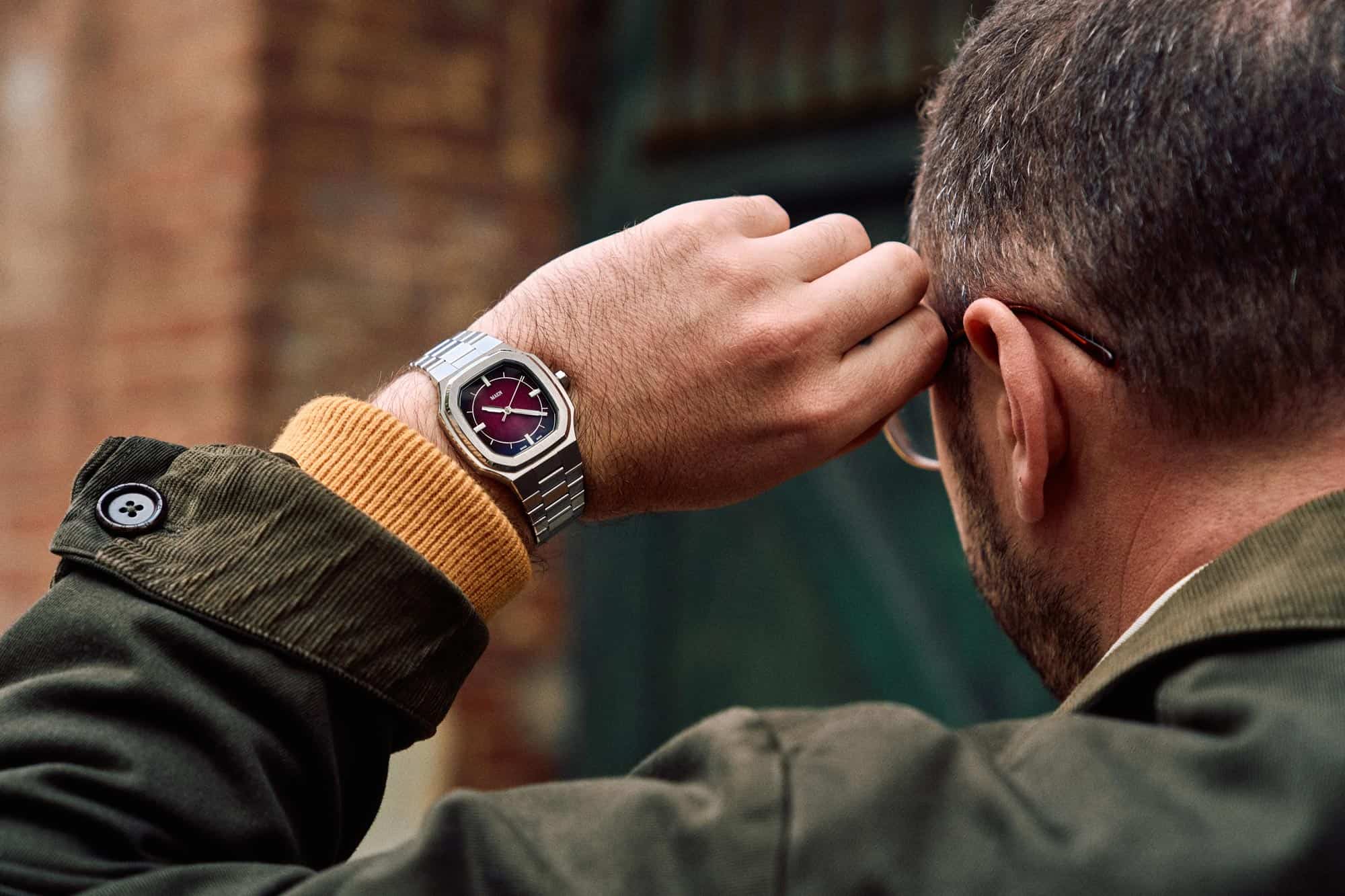
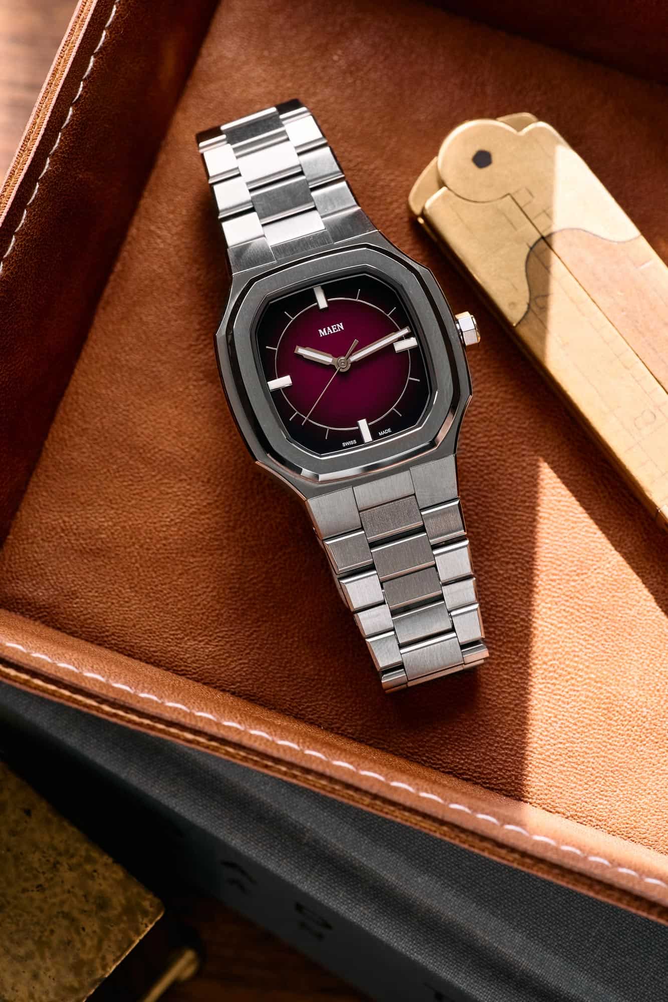
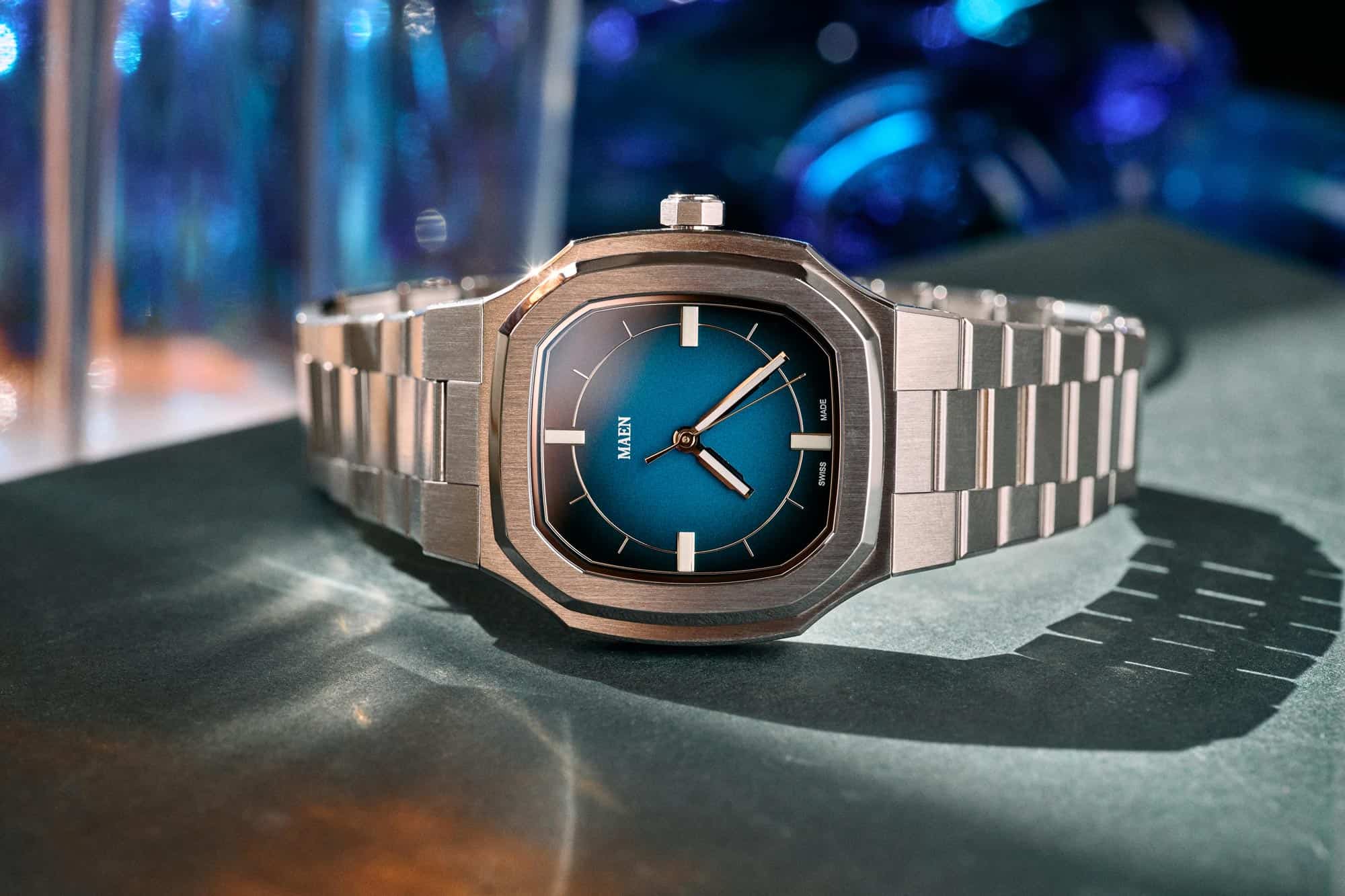
Many contemporary attempts at integrated bracelet sports watches blend together in their overall look, but the MAEN Manhattan stands out. Neither a circle nor a rectangle, the elongated octagonal dial opening is reflected in the case, which is narrow in width at 37mm, but 47mm long, adding visual mass. A thickness of 9.3mm keeps it close to the wrist and under the cuff, an impressive measurement for a watch with a Sellita SW 200 automatic inside. Subtle curves and bevels come together for a refined package with an elegant wrist presence.
As the Manhattan is an integrated design, the lugs flow directly into the bracelet which features a 3-link construction. Flat, brushed top surfaces and polished edge bevels, as well as full articulation, further belie the Manhattan’s price point. It’s silky smooth on the wrist, a mark of quality. Keen eyes might notice a similarity between the case and bracelet of the Manhattan to a short-lived watch from the early 70s, but the dial is its own thing.
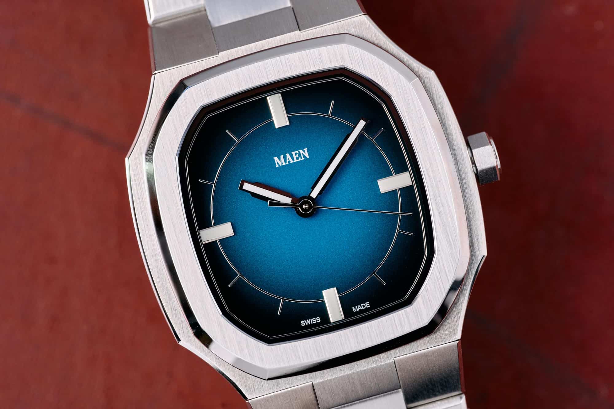
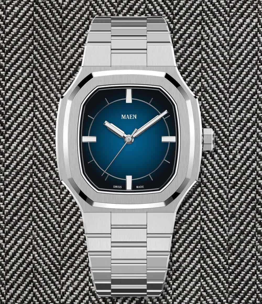
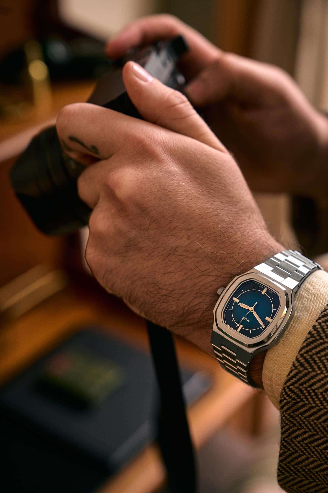
For the collaboration, we started by removing elements from the dial. Typically featuring a full set of indices and a pronounced “Côtes de Genève” texture, we decided to remove the texture and the text at 6. We cut all but the markers at the poles, which are larger than the rest, creating a visual anchor that allows the rest of the dial to be opened up. We kept the lume because a little lume can’t hurt.
With the dial stripped down to just the four markers, hands, and the brand logo, the look was intriguing but too severe, too formal. We then began playing with the idea of adding a gradient, or fumé surface. The shift from a rich color at the center to blackness at the edge was a subtle way of activating the empty space.
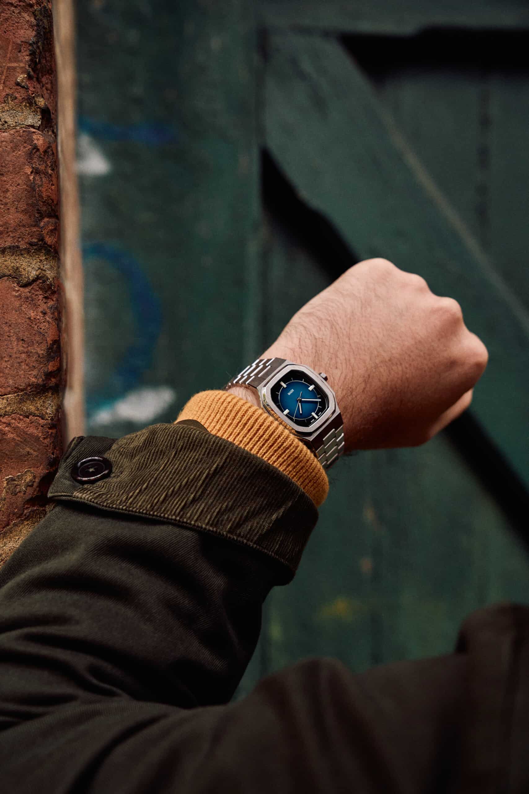
We chose two colors (from many) for the final product. The first is a medium blue. Close to a denim hue, it’s calm and reserved, but alluring. Depending on the light it can appear more or less saturated, with a full blast of sunlight making appear to almost glow from within. A versatile color, this blue is complementary by nature, making it go well with almost everything.
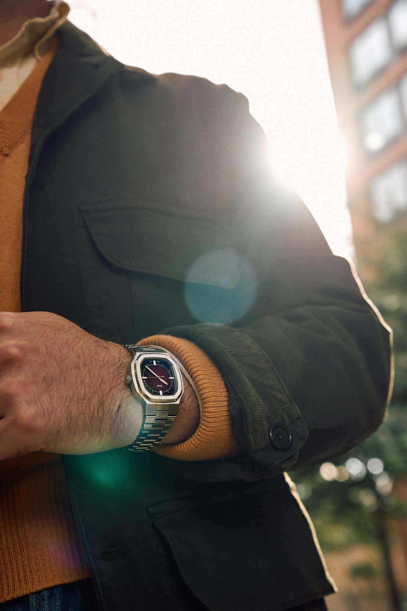
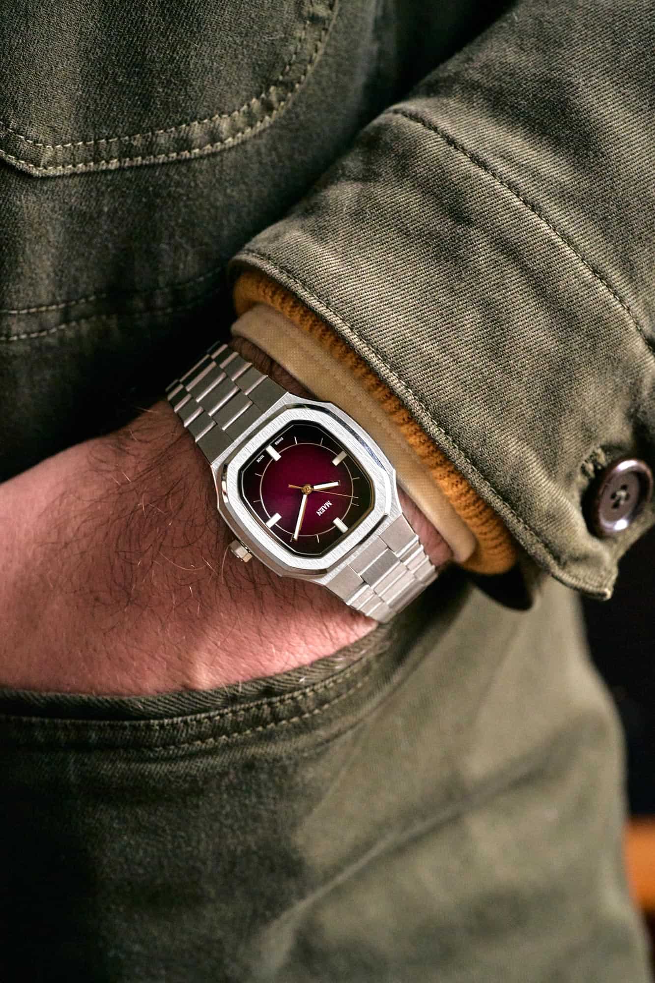
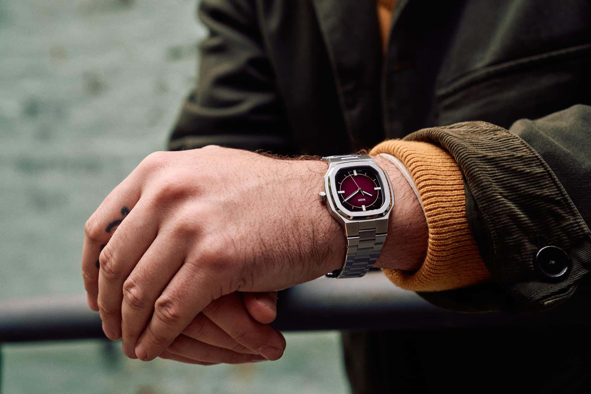
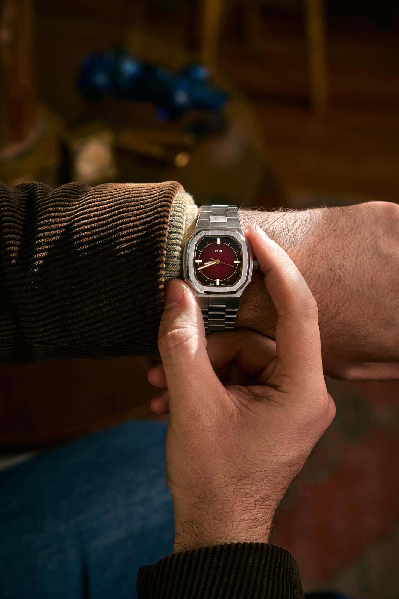
The second is a deep burgundy. A sensuous color, it’s every bit as complex as the wine from which it takes its name. Dancing between dark red and magenta, it can also vary in warmth. As the color gets darker it appears to get slightly cooler to a beautiful effect. Overall, the more subtle of the two colors, the burgundy is perhaps also the more unexpected.
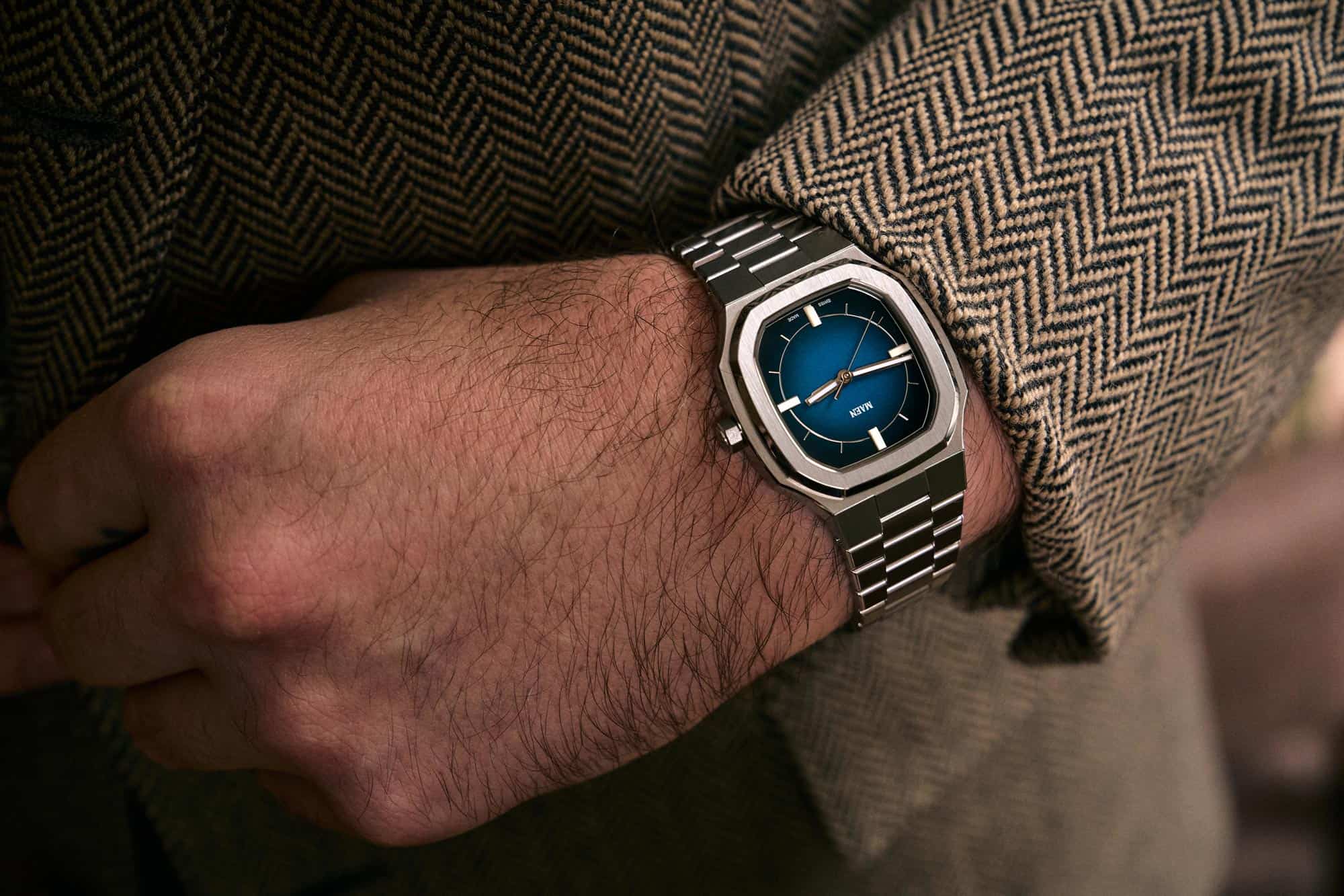
Finished with a gloss lacquer, both dials have remarkable depth. With the color concept set, there was still something missing, something to tie the dial together. We decided to bring back an index but in a wildly reduced form. Nothing applied, rather a silver ring with lines coming off per hour. Aligned to just touch where the gradient transitions from color to darkness, it completes the composition by engaging the negative space. A reflective surface as well, the ring can have varying levels of presence depending on your surroundings.
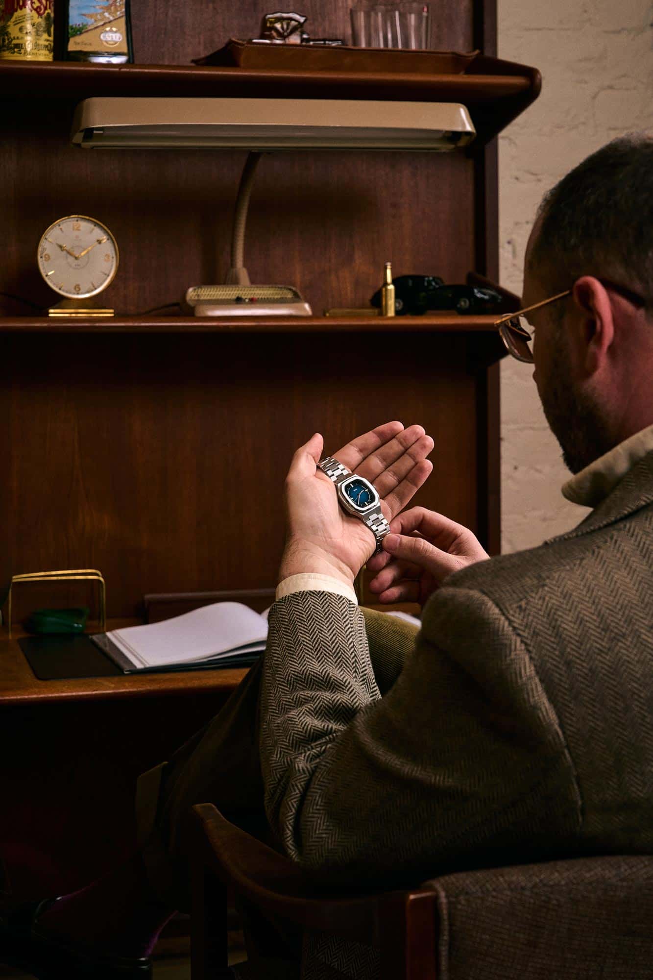
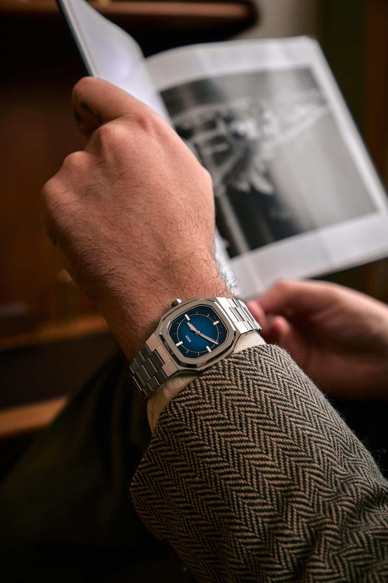
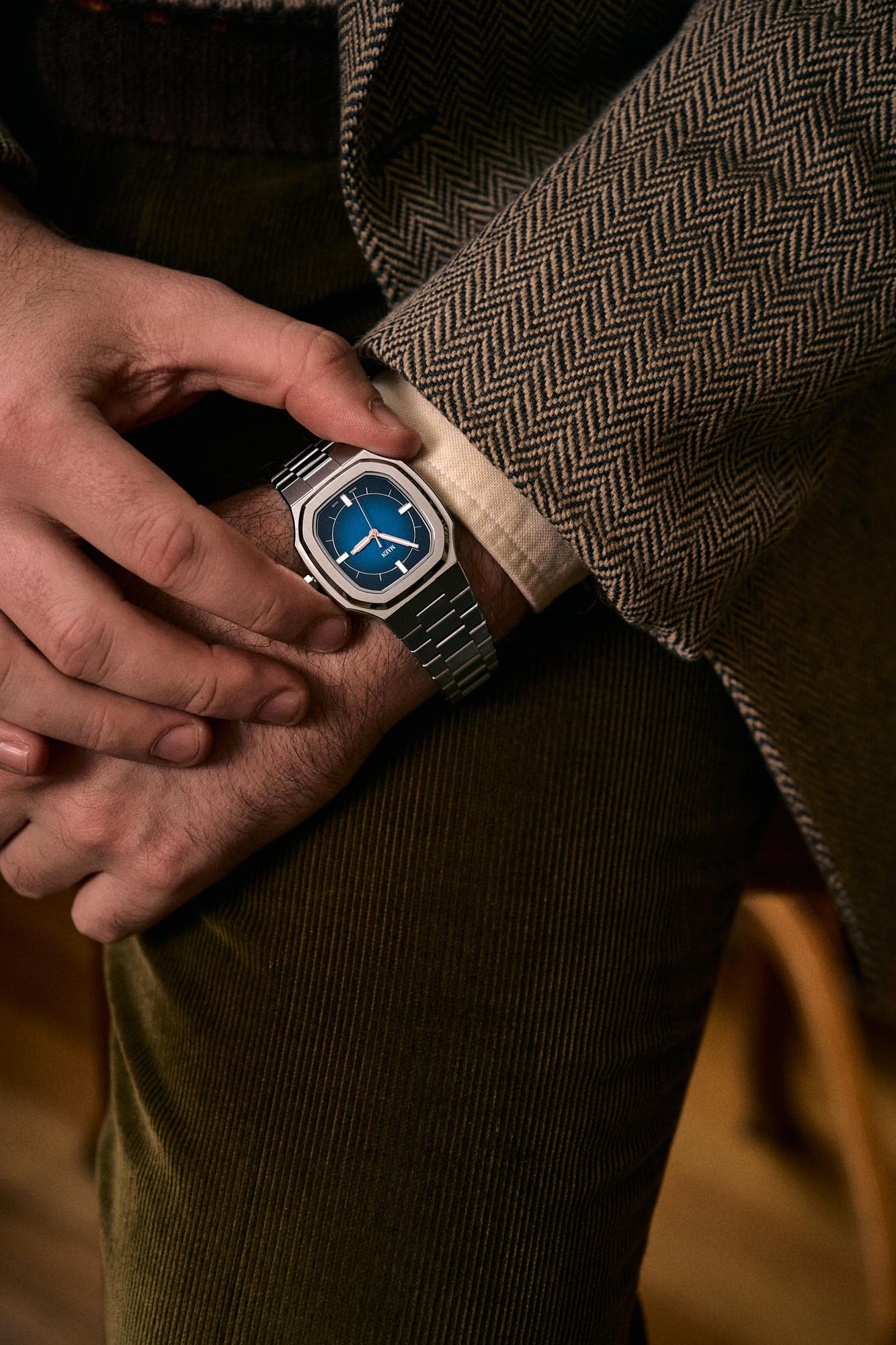
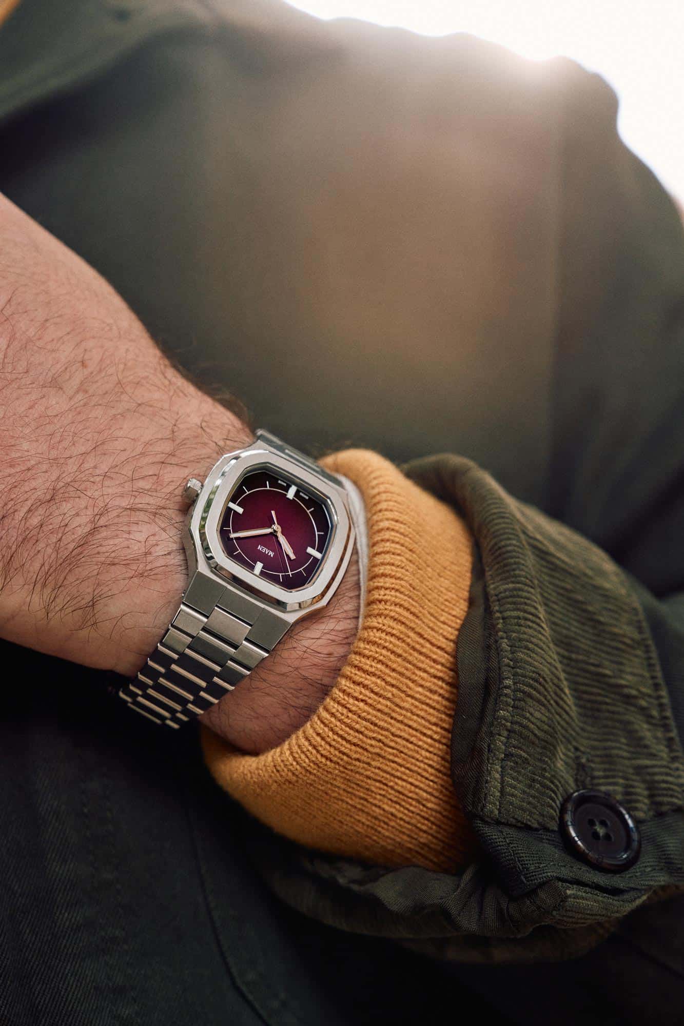
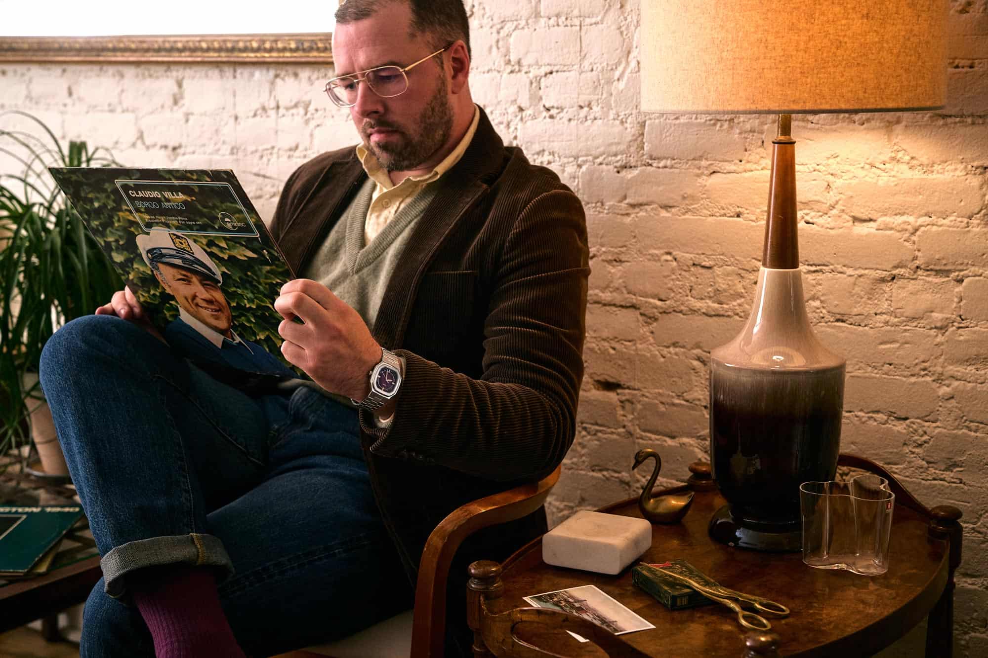
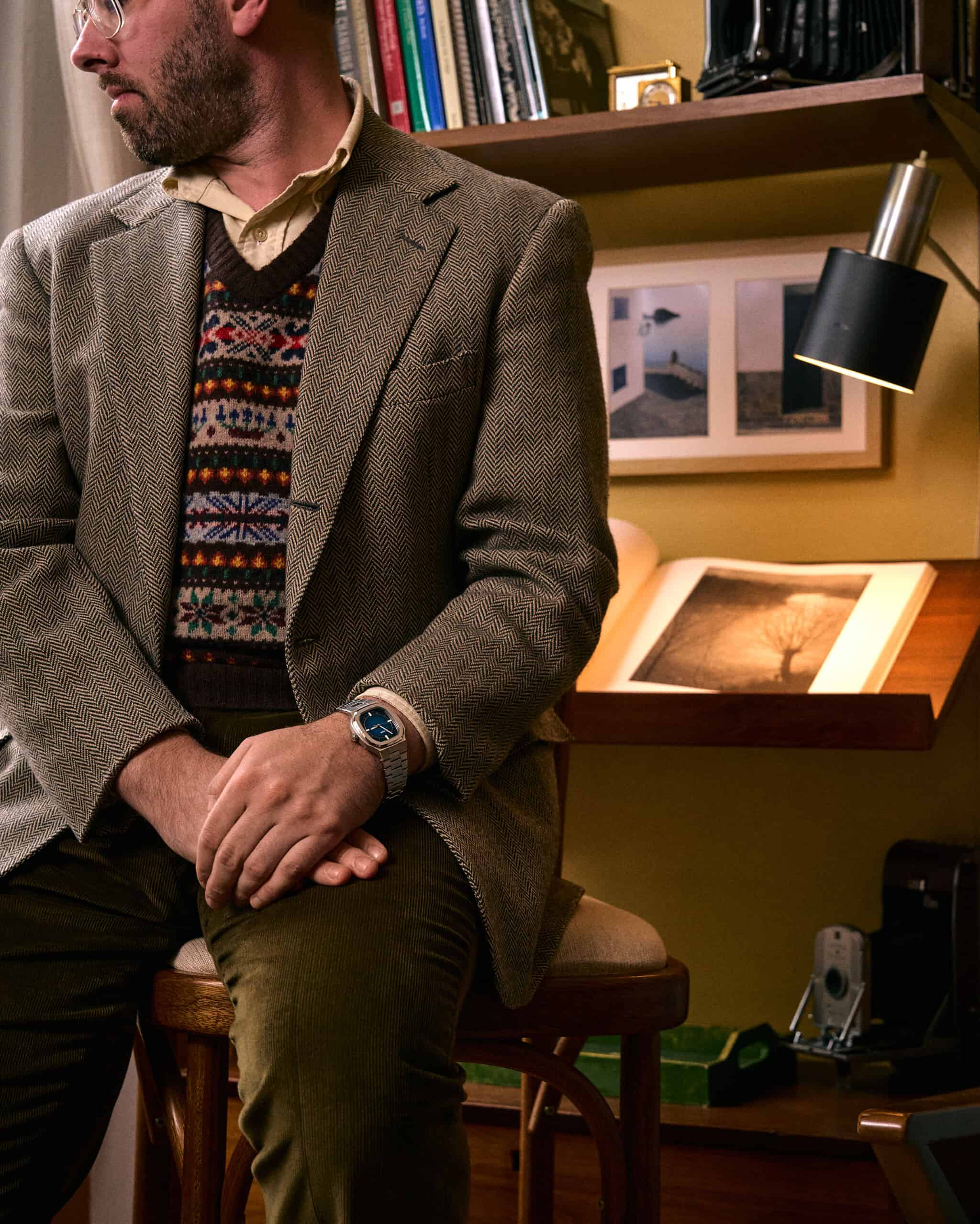
On the wrist, the MAEN x Worn & Wound Manhattan Limited Editions are a sophisticated accent. A combination of shimmering steel and deep tonality, of vintage and modern tastes, of hard lines and soft gradients. They can be worn casually, with jeans and corduroy, or more formally, and are well suited in style and color for the coming colder months.
The accompanying photos show that the MAEN x Worn & Wound Manhattan Limited Editions are a great match for hearty fabrics and textures. Styled and worn by a friend of Worn & Wound, Shane Curry, a mix of vintage and new articles were chosen, all tied together with a classic, if slightly retro sensibility that perfectly suited the underlying 70s DNA of the watches. Shot on a day that quickly dropped into the low 50s, the cool air and late afternoon light provided the perfect setting.


Available at the Windup Watch Shop, the MAEN x Worn & Wound Manhattan Limited Editions are $899 and will begin shipping in November. This is a limited edition of 150 units, with 75 per color. Click here to purchase.
Special thanks to Shane Curry for providing the excellent wardrobe and wearing it as well – give him a follow at @shanejoseph_