I’ve always been fond of the more tasteful varieties of design and fashion focused watches out there. Watches with weird displays, novel and quirky designs. Watches that don’t play by the “rules” that others do, such as Issey Miyake, Void, Uniform Wares, Nixon, Bravur, etc… But while I enjoy them, we don’t cover them often as they tend miss out on some of the features that we like to find regardless of the design. Namely, mechanical movements, sapphire crystals and occasional build quality. While there might be room for a fun quartz in your collection, a quirky mechanical is far more tempting. Enter Minus-8 watches, a new design and style focused brand out San Francisco, and named for their timezone, that seems to be getting the details right.
Now, not all of their watches are mechanical, but they have a series called the “Layer” that features the Seiko NH35 and the “Layer 24” that features the Miyota 9120. So, not only do these watches feature mechanicals, they feature ones we know and trust. Great start. The watches themselves? Well, these are some very interesting, overtly masculine watches with an emphasis on metal, tonality and finishing.
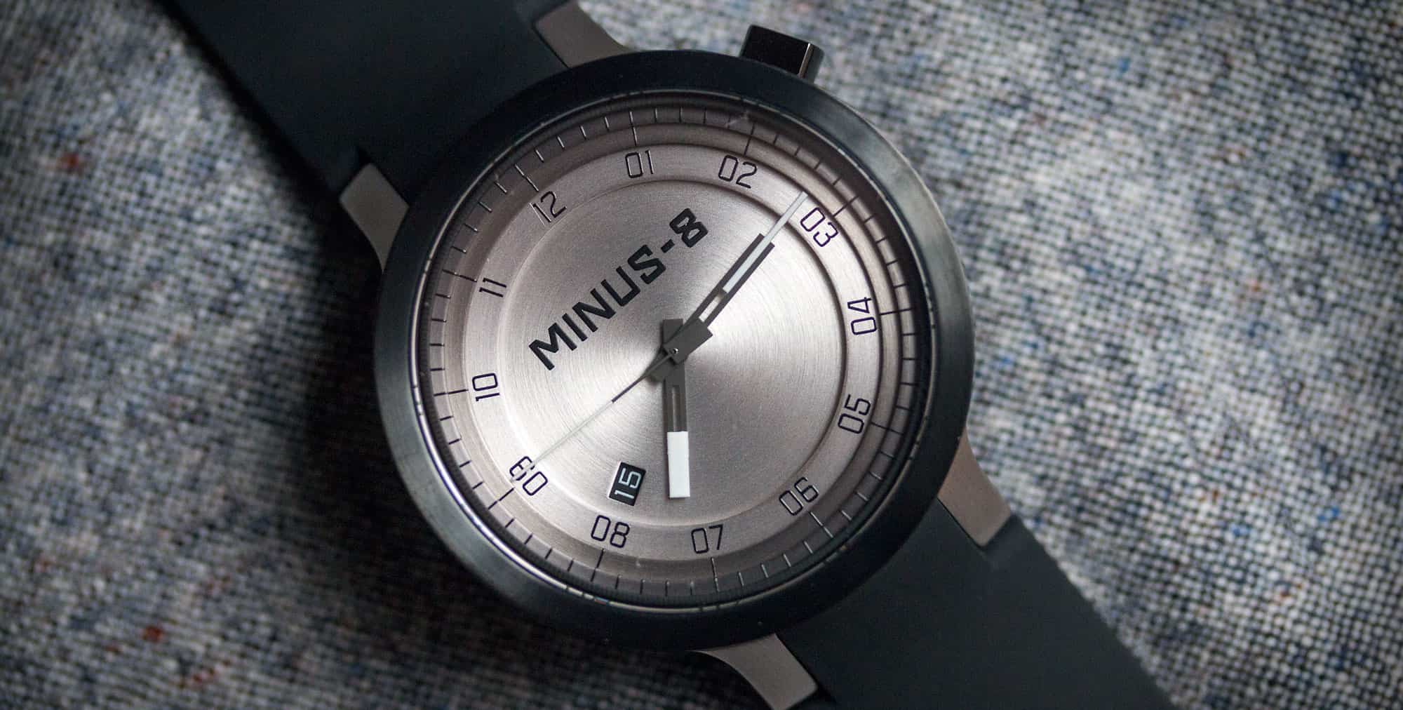
The case of the “Layer” is unlike any I’ve seen before, featuring a unique layered construction, hence the name. One look at the watch from the side, and you can see that the case consists of a base, and then four stacked rings, creating a sort of bezel/mid case. On the version I received to check out, each layer featured a different finish or PVD coating, starting with vertically brushed steel as the lightest, and stepping incrementally towards black. It’s gorgeous, plain and simple. The subtle shift in tones look like the PVD is almost melting down the case. It’s unique, in fact they are the only people to do something like this, and a clever way to activate the case without using more typical methods. On a personal note, I love mixed finishes on cases. Black and steel, rose gold and black, etc… and think it’s an under utilized method of creating interesting cases, so the Layer really does it for me.

Measuring 45 x 52 x 14.25mm, this is a big watch, with clean modern lines and an overall bold appearance. As such, I’d classify it as a sport watch in the vein of Nixon and Tsovet, as it’s sort of youthful and hip. That said, it’s not loud or garish, which is a plus. The design is straightforward save the layering. The case is a straight cylinder with slab sides and lugs that are nearly straight, but meet the case with a round corner. It’s within the lugs that my biggest complaint with the watch exists; it features a proprietary strap fitting. The lugs from side to side are 24mm, but the gap is about 16mm. The strap is then 24mm wide, which suits the case, but you can’t drop your own in.
One of the more peculiar elements is the crown at 2. It’s a rounded rectangle shape in black PVD. What’s cool about this is that when not in use, it fits with the lines of the case very well. What’s bad about it is that it’s annoying to use when setting the time. It’s hard to turn smoothly or consistently, but not so much as to be a deal breaker. Flipping it over, you have a display back showing off the NH35a movement. As per usual, it doesn’t feature much in the way of decoration, but they did get their logo on the rotor. To be honest, the rawness looks good here, as the whole watch has a stylized, industrial feel. It’s worth noting that the build quality is excellent, with sharp edges, clean brushing, and nice solid heft, and the watch features a sapphire crystal and 100m WR.
The layered theme continues on the dial again with a nice effect. But before getting to what I like about the dial, I’ll start with what I don’t: the branding. The Minus-8 logo dominates the top half of the dial and thus the dial as a whole. It’s so big it’s as though the whole watch was really made to just convey this logo, and frankly their logo design leaves something to be desired. Why they couldn’t have just used the “-8” portion, or simply a logo 50% is beyond me, but it is what it is, so let’s move one. The dial then consists of a base surface and several stacked rings with incrementally larger inner diameters and darker finishes, mimicking the case. So, the base is then raw steel color with circular brushing. You the super-logo here, as well as as date window at 8. Though unconventional, I like it as it creates a line across to the crown at 2.
The next layer up is also steel toned with double-digit numerals for each hour in a thin black font. The following layer is a touch darker, closer to titanium gray, and has a line per hour. The penultimate layer is a shade darker still nearing gun-metal, and has black lines per minute/second. The final layer is a thin black lip that actually has a very faint sub-seconds track, but you really can barely see it. I really like the stacked approach and that each layer was used for a slightly different bit of information, with each unit out getting finer. One thing that is quite impressive is that the lines on the rings actually line up… There is no room for error there.
The hands are a cool block design. The hour and minute have a fork shape in gray, followed by a white, lume tip. The hour hand is wider, ending a millimeter or two before the hour ring. The minute hand extends over the hours to the titanium gray ring. I quite like how they point to different layers as there is a visual logic at play. The second hand is a wispy thin stick with an oversized counter weight. This hand extends to the same ring as the minutes. I wish it would have extended one further, but there might have been clearance issues there.
The dial is very interesting to look at, having a lot of depth. It feels like you could jump in it. The relation of the tonally graduated case and dial is then just beautiful. When you look at the watch from an angle and are able to get it all in, the watch takes on an architectural quality, looking less like a watch and more like an environment.
On the wrist, the Layer wears well despite its size. In fact, I’d say it feels much smaller, maybe even around 42mm. The height is very noticeable, but is used to create the cool case effect, so very welcome in this instance. Despite being 52mm long, the lugs also curve down appropriately, forming to the wrist, so you don’t get much of an overhang effect either. That said, it’s still big, and very masculine. There is something almost piston like about it. It’s definitely also a sport watch that wouldn’t look right with an oxford and khakis so much as black jeans, a t-shirt and some Vans.
The strap is a thick, plush rubber that is quite comfortable. It’s straight cut 24mm and features a matte black deployant buckle. The underside is interesting as there are raised areas with a Minus-8 pattern molded in. I’m not sure if it’s decorative or meant for comfort. As mentioned before, the watch has a proprietary fitting for the strap. While annoying, it doesn’t look bad, giving the strap and case a nice flow. Honestly, leather or nylon would look odd on this watch, but I hope for the sake of their customers they do come out with a secondary bracelet option.
All in all, the Minus-8 Layer is a cool alternative-type watch. Something modern and design driven, but still solid and sporty. Of a watch of this type it’s definitely the most solid and best finished I’ve seen. As for the price? The Layer is $448, which all things considered seems reasonable. It does have a sapphire and a Seiko NH35A movement, not to mention a case and dial with many parts and seemingly complex construction. So, should this one do it for you, and the logo not bother you much, head over to Minus-8’s site to pick one up.




 Featured Videos


