


 Featured Videos


Autodromo is one of the brands that has really surprised us in the last couple of years. When we first saw their watches, we were thrilled by their unique designs, nothing being stock, and attention to detail. As the brand has matured, so have their designs and knowledge of watch making, which was very clear in their second offering, the limited edition Monoposto mechanical. One of our favorite pieces from last year, this utterly unique watch has character and finishing that far surpassed its sub-$1000 price point.
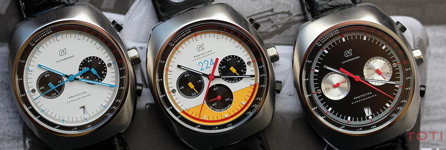
Their newest line continues this trend of development with what will likely be their most popular watch to date, the Prototipo. Where the previous Autodromo watches were inspired by the history of Italian race cars, with elements translated into the watch components, the Prototipo is inspired by late 60’s and 70’s racing chronographs. These watches, namely those by Heuer, were inspired by the tracks and vehicles themselves, with lively designs that used color and form to recreate the excitement of racing on the wrist.
The Prototipos draw heavily upon that history, paying close respect to what made those watches so gorgeous then and collectible now. Yet, despite their historical roots, they created something that is very unique and very different from what else is out there, with a level of finishing that will take your breath away. The Prototipos also mark a few firsts for the Autodromo brand; use of sapphire crystals, use of Seiko Meca-Quartz movements and collaboration with a historical figure. From a practical standpoint, the sapphire crystal and Seiko Meca-Quartz movements are a great addition. The Seiko movements, in particular, add the affordability of quartz with the functional benefits of a mechanical chronograph.
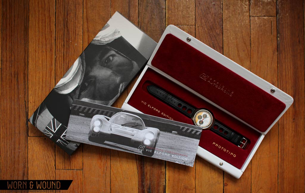
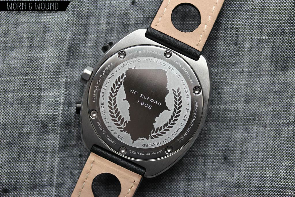
The collaboration with a historical figure then adds a background story and collectibility that was previously not there. The unfortunately already sold out special Vic Elford edition, which was limited to 224, has a different design inspired by Mr. Elford’s history and vehicles. This epic racer was setting records and winning races during the late 60’s and early 70’s, tying in perfectly with the design inspirations of the Prototipo. The watch is also accompanied with a signed booklet and special packaging, and retailed for $775.
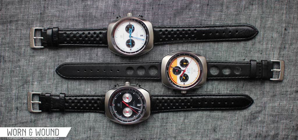
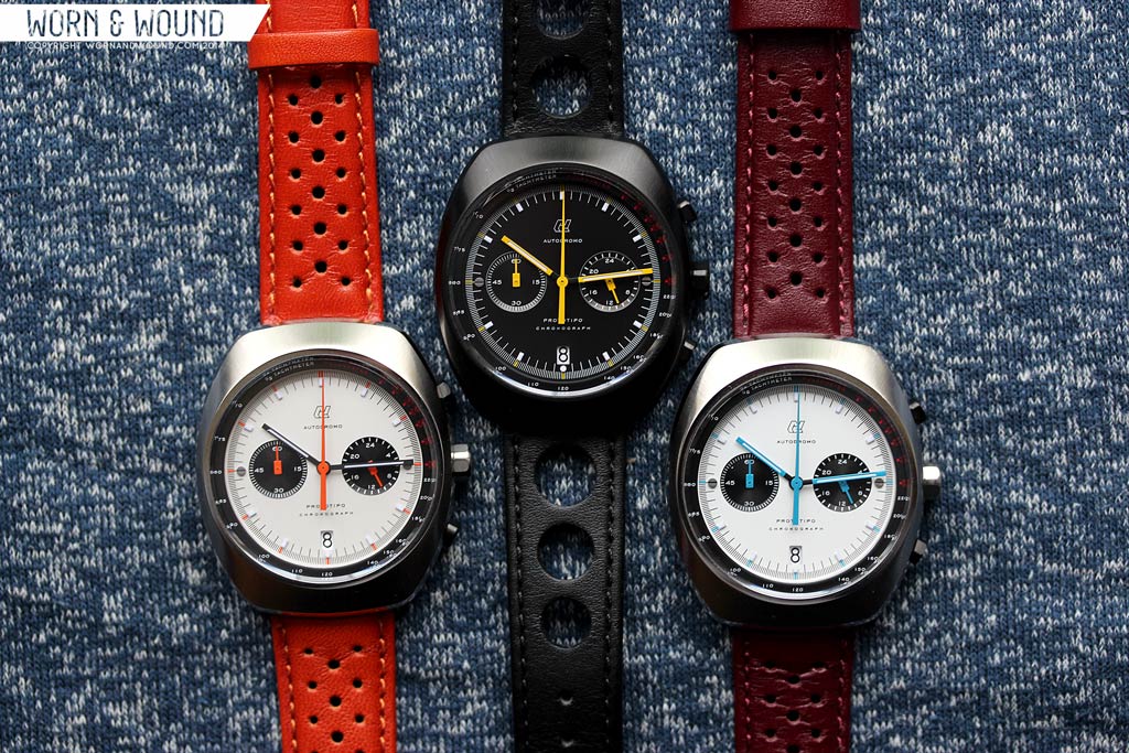
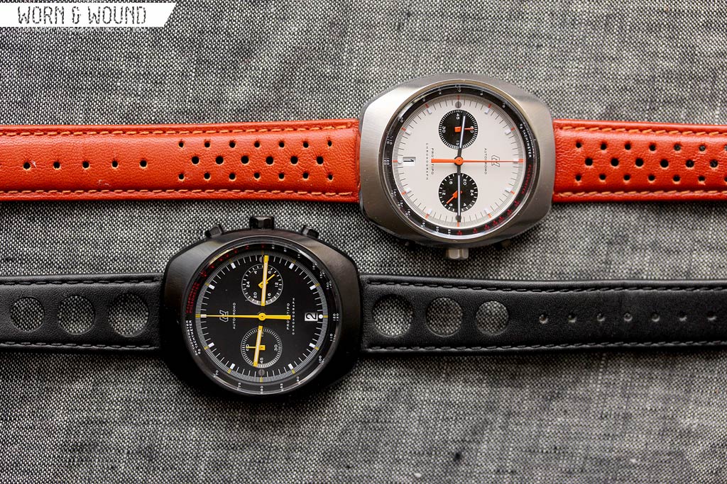
Luckily, there are two open editions of the watch that are still available and extremely cool. With dual registers designs, exciting flashes of color and an abundance of cool details, these watches are desirable, memorable and unique. Either will run you $625, which is on the high-side for a quartz watch, but more than made up for in design, build and finishing.
Autodromo Prototipo Review
 Case: Steel
Movement: Seiko VK64/63
Dial: White/Black
Lume: Yes
Lens: Sapphire
Strap: Leather
Water Res.: 50M
Dimensions: 42 x 48 mm
Thickness: 11.5 mm
Lug Width: 20 mm
Crown: 6.5 x 3.5mm
Warranty: 1 year
Price: $625/$775 (Vic Elford edition)
Case
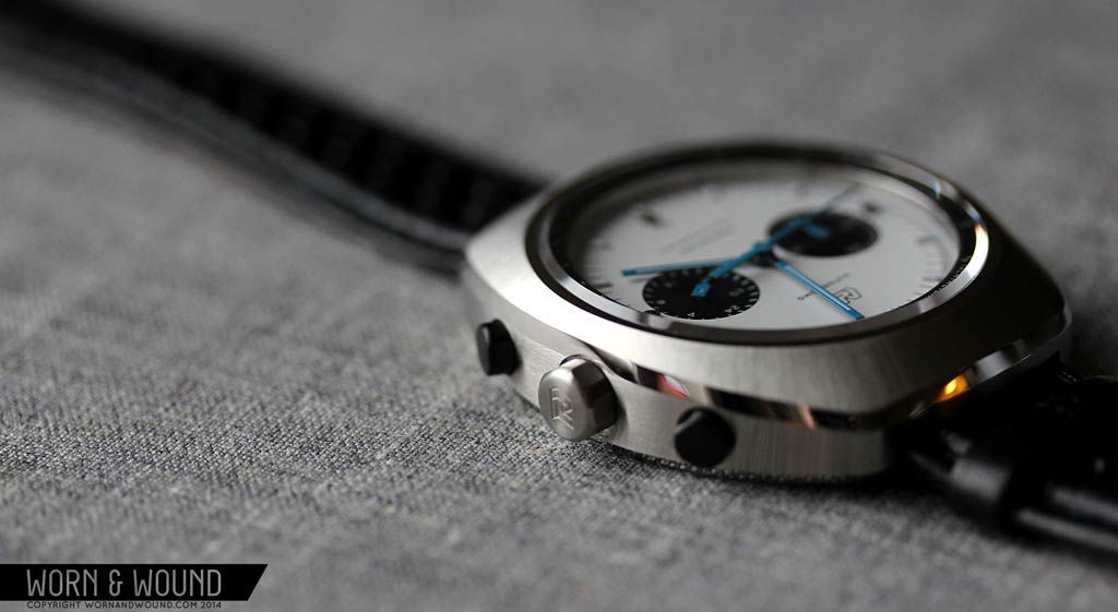
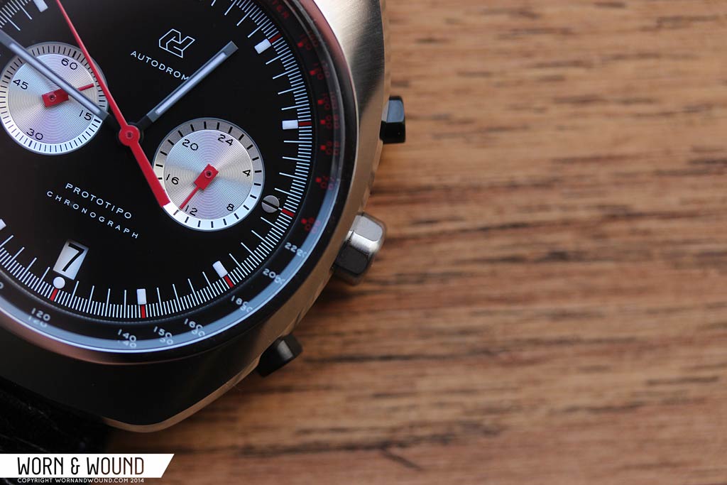
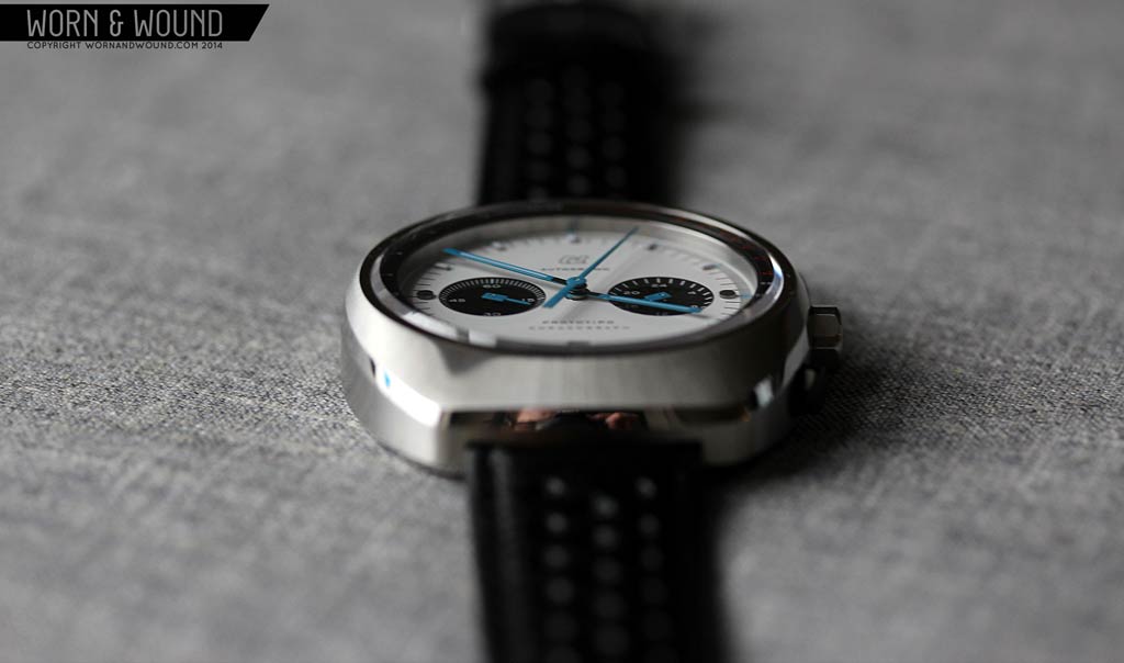
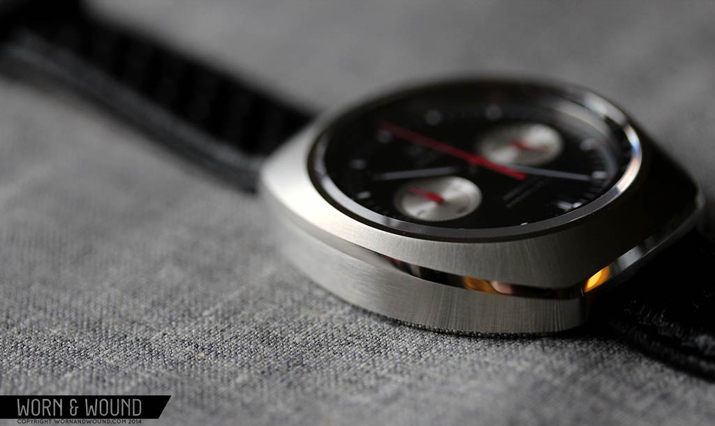
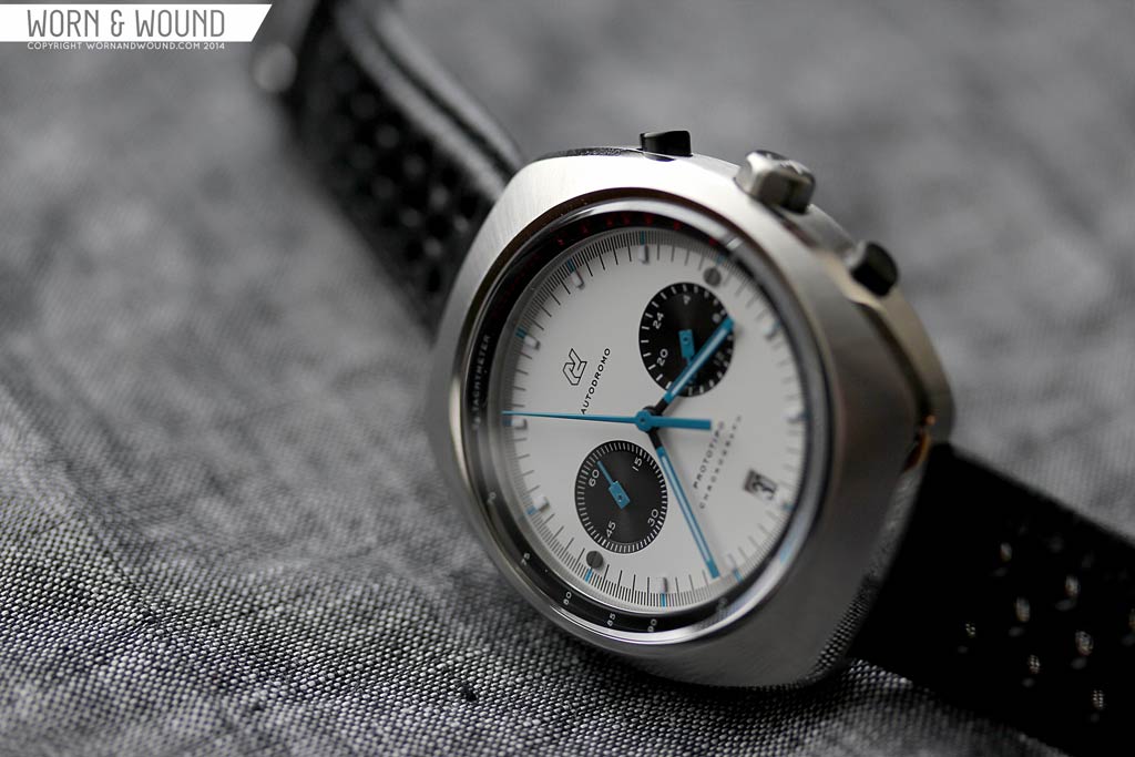
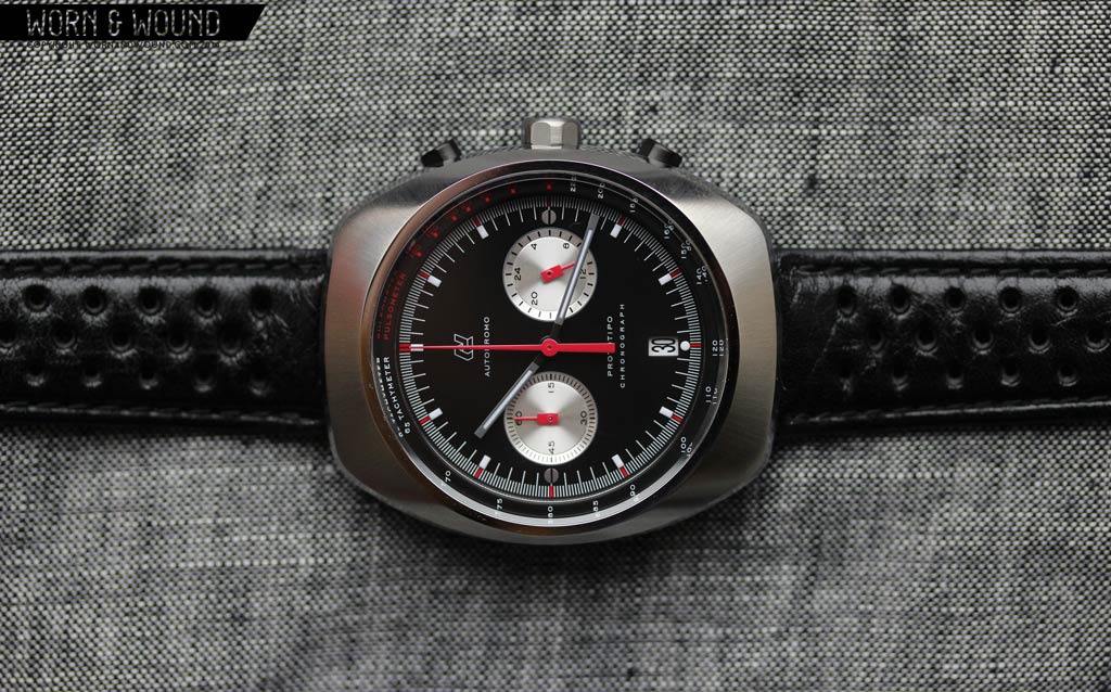
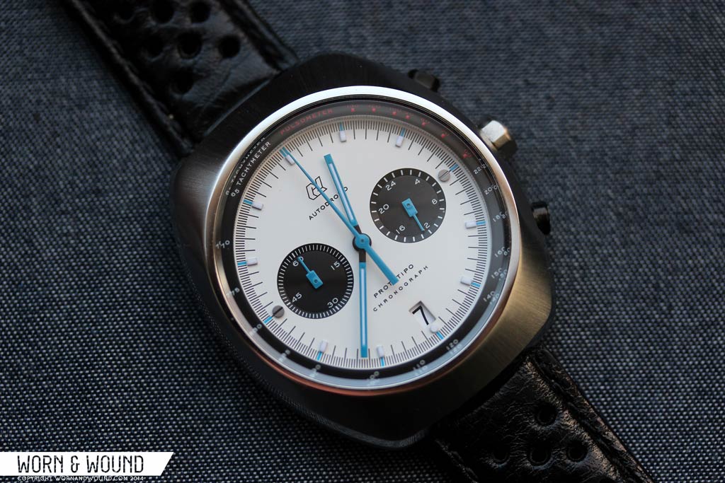
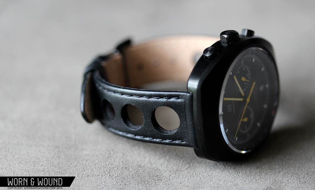
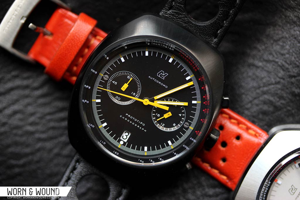
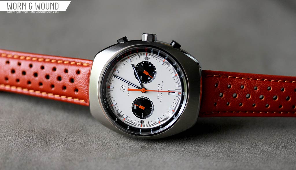
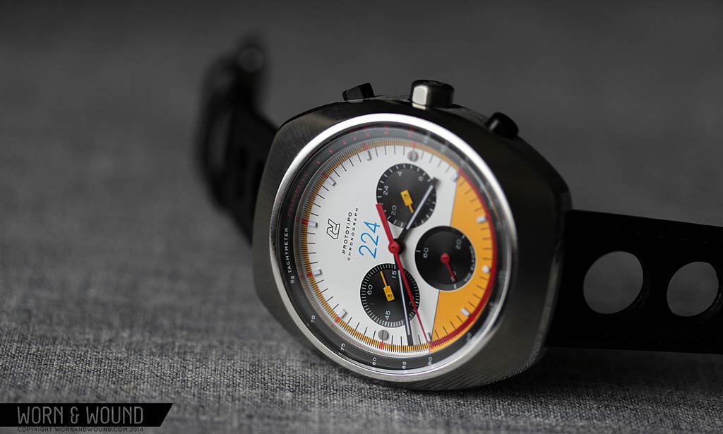
The deceptively complex case of the Prototipo is nothing short of gorgeous, mixing fluid geometry and sharp finishing. Measuring 42 x 48 x 11.5mm the 70’s barrel shape design makes for a robust and sporty watch that still comes off as elegant. From above, the “barrel” designator is quite clear in the form. The lug-less mass is taller than wide, with bowing sides, giving is a slightly inflated look. From above, the top surface might look flat, but it in fact has an ever changing dome leading up to the sapphire crystal. This creates a dynamic surface that plays with light and softens the overall masculine watch.

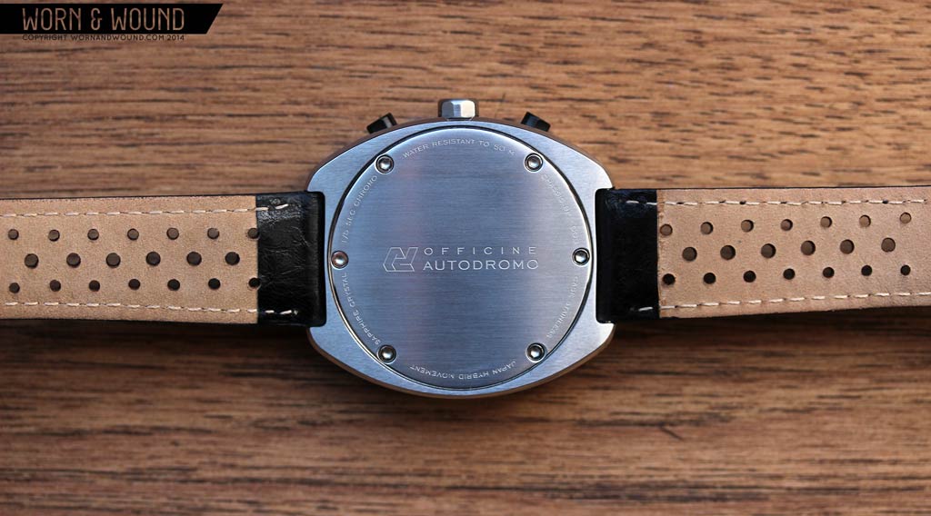
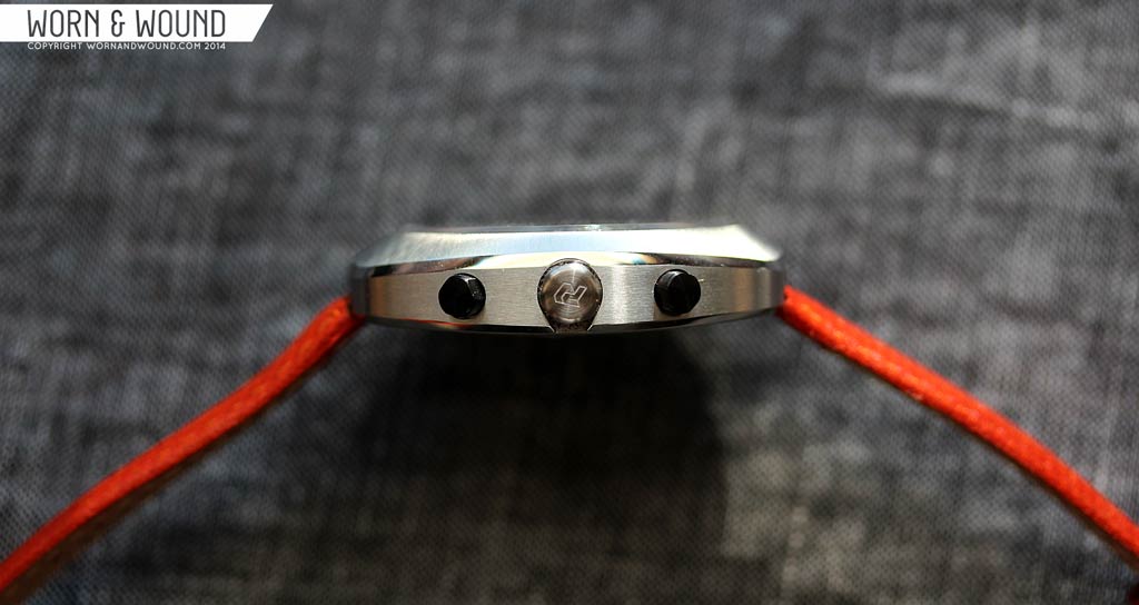
From the side, the case has surprising lines. The whole case back curves from lug to lug away from the wrist. Rather than cupping and hugging the wrist, it actually stands off somewhat, minimizing watch to skin contact. Though this might seem counter intuitive, it makes for a very comfortable wear. The case back itself is then a plate studded with 6 hex-screws, which was meant to evoke the hub of a Momo racing wheel. Around the perimeter of the back are various details and there is either a simple Autodromo logo etched in the center for the open models or a special design with a map of “Circuito Piccolo Delle” and a reef for the Vic Elford edition.
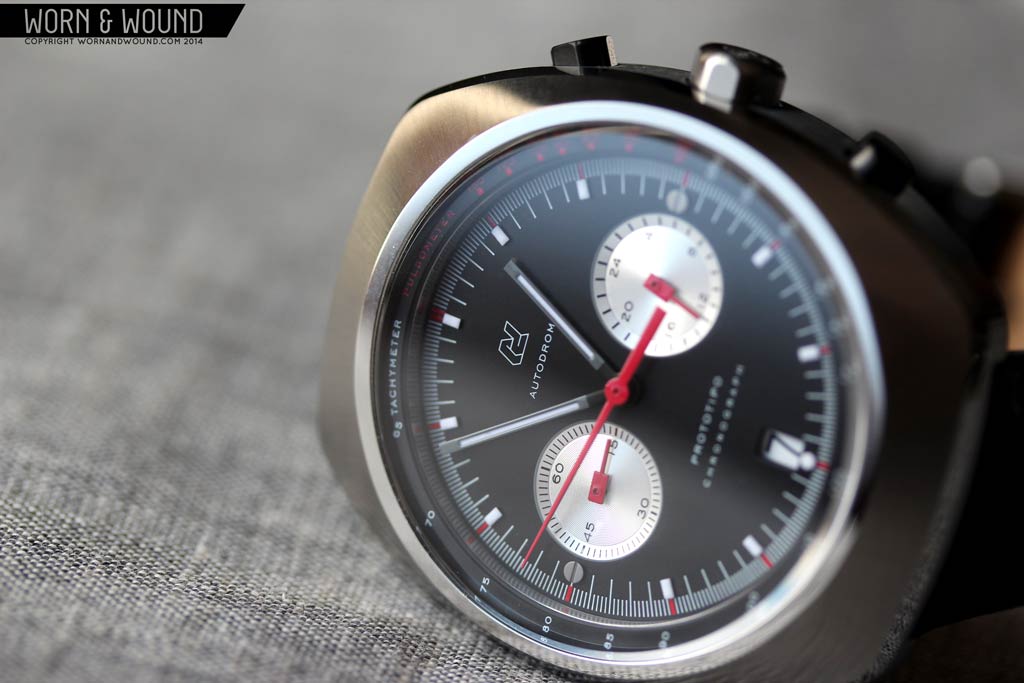
Perhaps the most remarkable aspect of the case is actually the finishing. In terms of both execution and design intent, the mix of brushed and polished surfaces on the Prototipo surpass what we typically see or expect at this price point. The domed top surface has a radial brushing from the center of the dial out, that starts just after a polished bezel area and ends at a polished bevel that runs the perimeter of the case. The brushing adds to the already dynamic surface, creating a beautiful play with light and reflection. The contrast at the polished bezel adds a point of interest just before the dial.
My favorite detail is the polished line that runs the perimeter of the case, separating the brushed sides and top. In terms of execution, it’s a remarkably sharp and clean detail. The edge between the brushing and polishing is perfect all the way around, making for a crisp line that reinforces the case geometry. It’s also an eye catching bit of glitz that is hard to not stare at and ogle when on your wrist. The sides are then brushed horizontally, ending at a second polished line along the bottom edge of the case, which balances the line above.
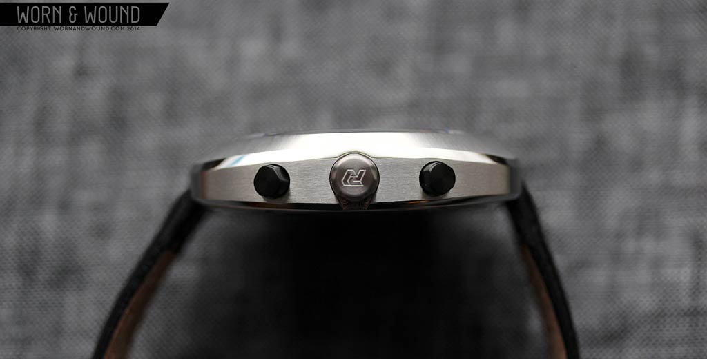
On the right side of the case are the two chronograph pushers and crown. Like the finishing, the detailing here is remarkable and beyond what is expected. Immediately, you’ll notice the the pushers are PVD coated, distinguishing them from the crown and case. It’s a small detail, though one that is quite uncommon, very cool and speaks to vintage Heuers, such as the 70’s Monza (thought that was the inverse).

The push pull crown, which measures about 6.5 x 3.5mm, is nicely proportioned and fairly easy to pull-out thanks to a slight cutaway in the case under the crown. What’s particularly interesting here is the shape of the crown. Rather than doing a typical coin edge, the crown is a cylinder that has had portions cutaway, giving it a more industrial bolt-like look. Pushing the detailing even further, the rounded areas are then brushed while the flat areas are matte. Similarly, chrono-pushers have a mix of rounded and flat sides, though in a more triangular arrangement.
Dial – Prototipo Open Edition
Speaking directly to its 60’s and 70’s inspirations, the dial of the Prototipo is a welcome throwback to vintage designs. Though largely personal taste, I find the racing chronographs of that era to be far more exciting than today’s standard designs. Whether by Heuer, Seiko, Omega, Breitling, Hamilton or a plethora of other brands, the use of color, contrast, applied markers and 3-9 sub-dial layouts make for edgy and stylish watches that look as good today as they did 40 years ago.

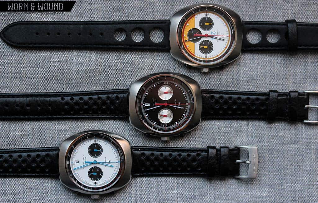
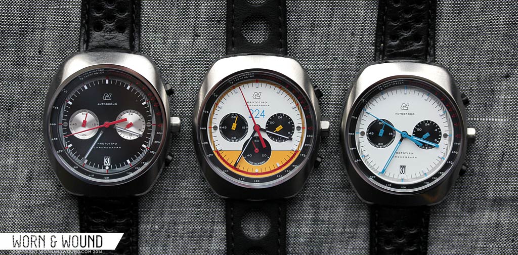
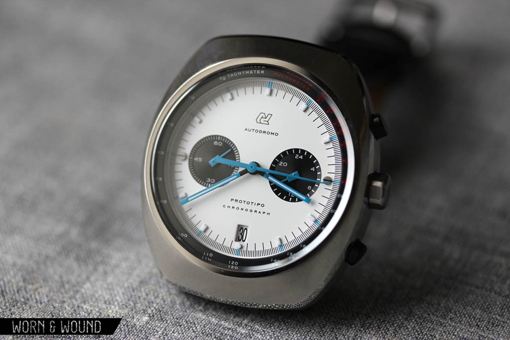
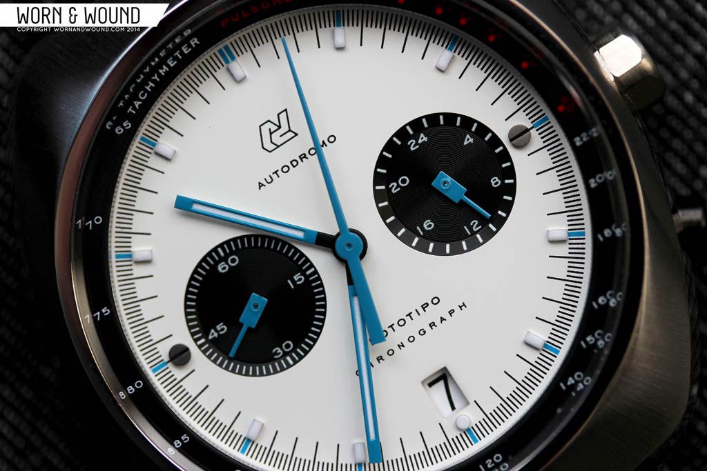
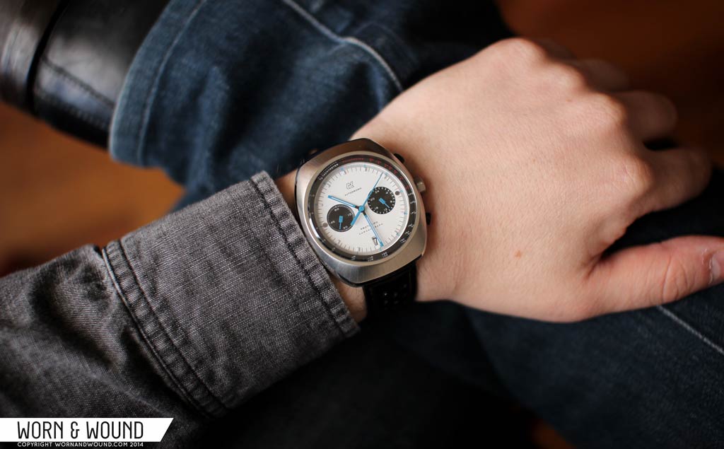
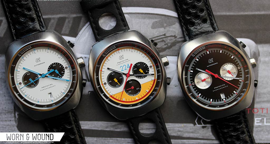
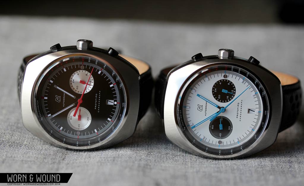
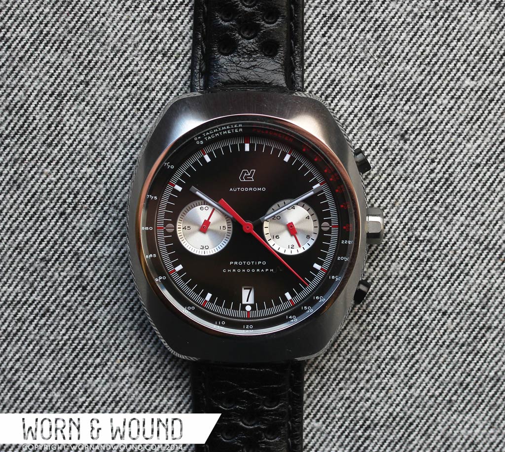
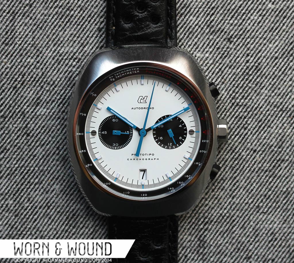
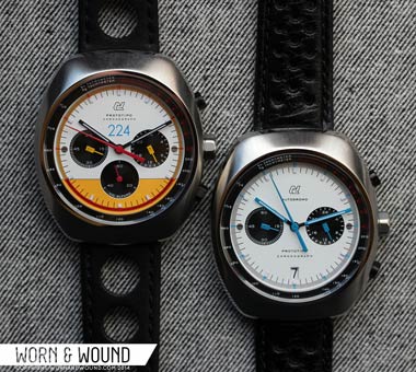
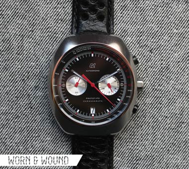
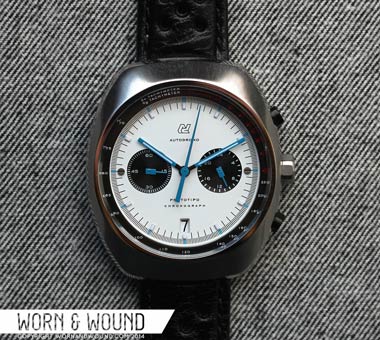
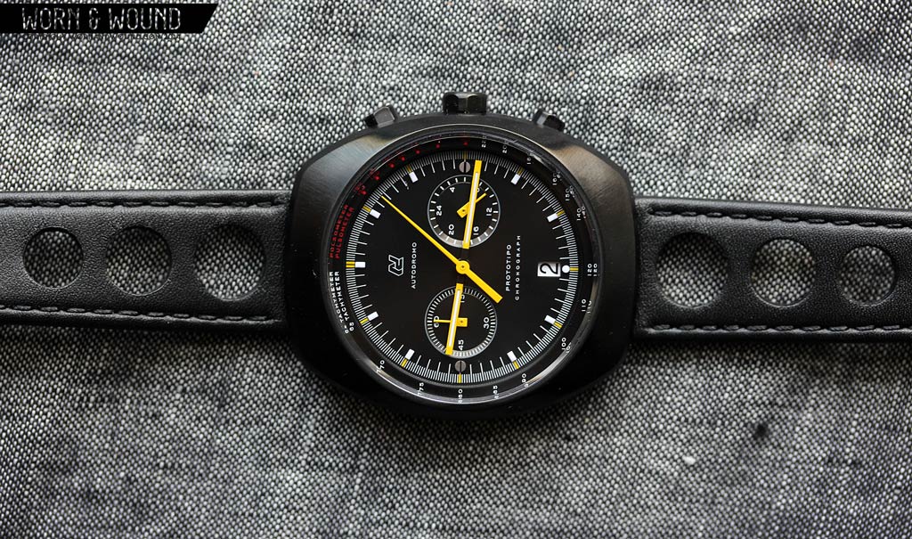
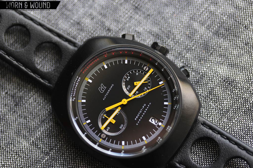
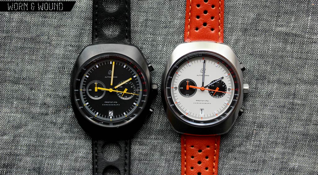
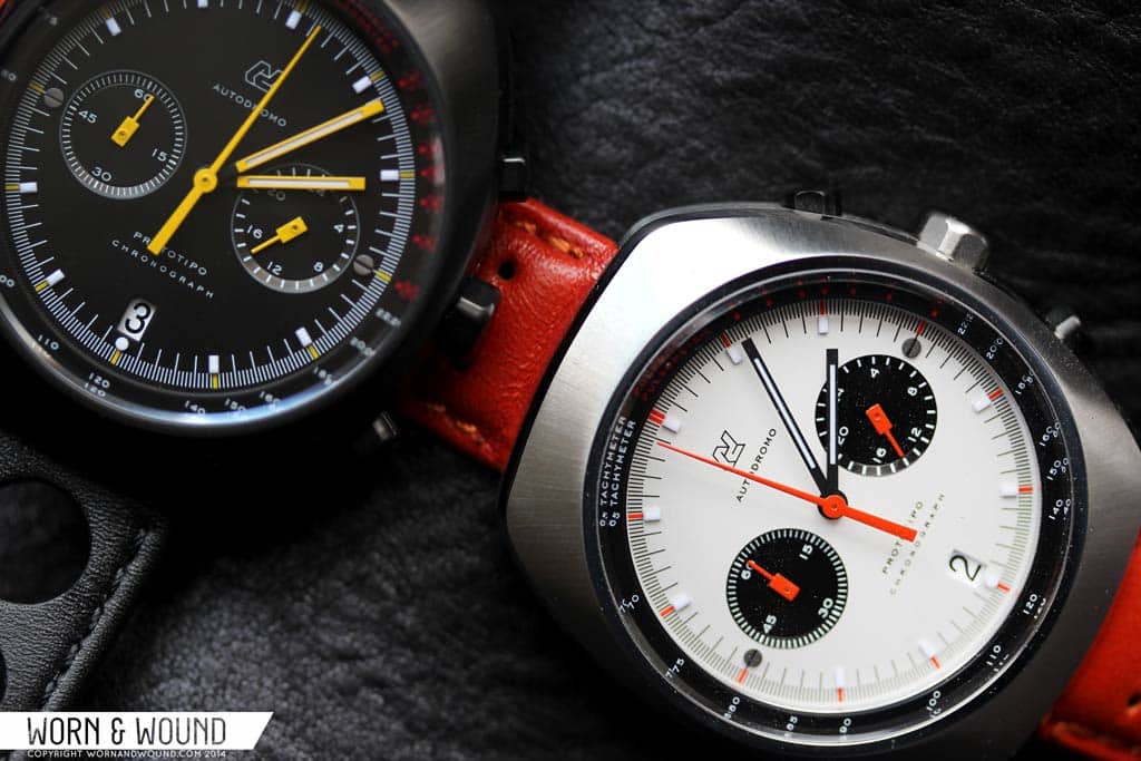
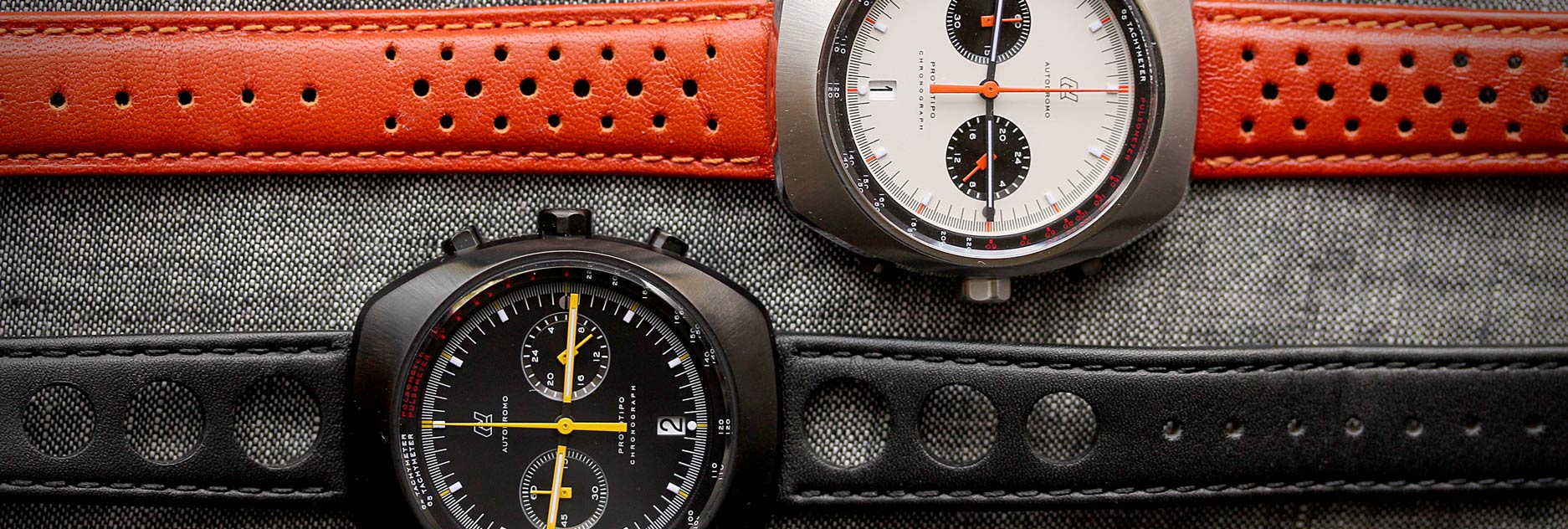
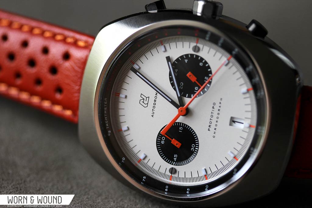
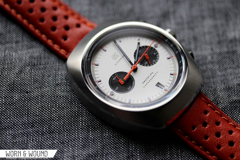
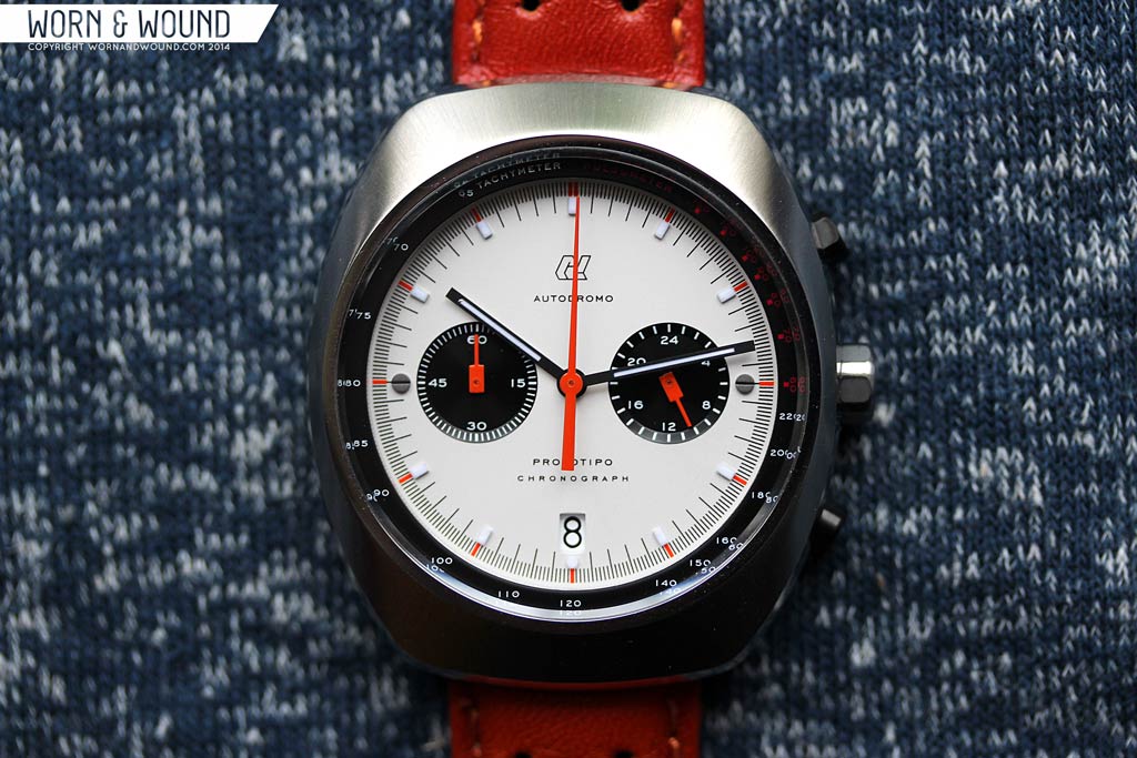
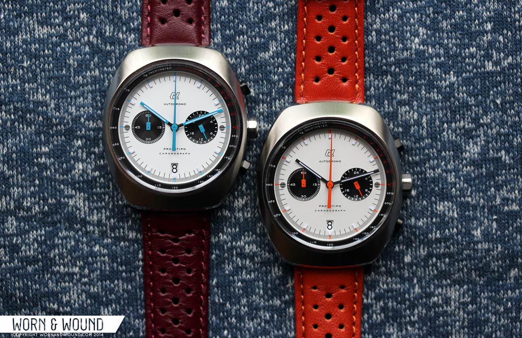
The two versions of the Prototipo (not including the Vic Elford) have the same basic layout, but with very different colors for distinct looks. The white dial version has a “Panda” design (black sub-dials on a white main dial) with primarily black markers, blue highlights and blue hands. The black dial version has contrasting silver sub-dials, white markers, red highlights and a mix of grey and red hands. Both feature black on white date wheels, visible through a window at 6, which keeps the dial’s symmetry intact.
The primary index consists of applied luminous markers for each hour/5-minute interval, except at 3 and 9 where there are Autodromo’s signature screw head detail. Between these are contrasting lines for the individual minutes/seconds. On the outer edge of the dial is the chronograph seconds index, with lines at 1/5th second precision to maximize the usefulness of the Meca-Quartz movement within. There are also markers in the model’s respective highlight color on the outside of each hour marker. Though the main dial is entirely without numerals, they are quite legible and easy to read. That said, the applied markers standout more on the black dial, making it the more legible model.
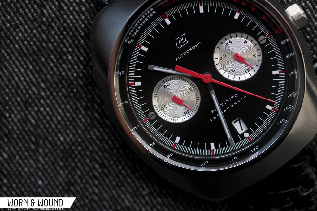
The sub-dials at 3 and 9 are for the 24-hour hand and the chronograph 60-minute totalizer. This is perhaps the greatest departure from the classic chronographs in that they typically would have had either active seconds and a 30-minute totalizer, or a 12-hour totalizer and 30-minute totalizer, without any active seconds. This is a result of the Seiko VK64 movement’s design, and though a bit odd, does not hinder the performance of the watch. While the 24-hour hand is out of place, it’s still something one can refer to and the 60-minute totalizer is actually preferable in my book to a 30-minute totalizer. The stillness of the dial when the chronograph is not in operation makes the Prototipo also feel a bit like certain vintage chronographs, such as those with Seiko 6139’s, 6138’s and Heuer/Breitling/Buren Caliber 11 and 12 movements.
The sub-dials themselves are debossed into the dial, with a beveled edge and circular graining that gives them nice texture. The indexes on both are thin lines printed on the angled bevel, with numerals on the surface within. Visually, the 3-9 layout gives the dial an eye-pleasing symmetry, while the contrasting colors add a center point.
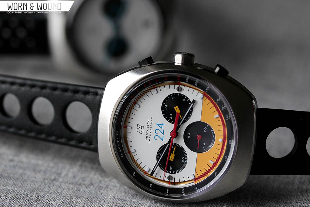
Lastly, the bezel of the watch, which sits below the sapphire and above the dial, features both tachymeter and pulsometer scales. This elevated design is reminiscent of the Omega Speedmaster MKII, nodding to the past while being a cool detail. Since it stands so high above the surface, it increases the perceived depth of the dial and makes it easier to visually line up with the chronograph seconds. The pulsometer is also a fun and somewhat uncommon element. To use it you simply find someone’s pulse, start the chronograph and stop it when you’ve counted to 15 beats. The number the hand points to indicates their approximate pulse.
The hour and minute hands of the Prototipo are long, slender rectangles with thin strips of lume. They are a touch similar at a glance, but after wearing the watch for a few minutes, it’s easy to tell them apart. The chronograph seconds is a thin tapering needle with a long counter weight that has a strong presence on the dial. The sub-registers both have small block hands with elongated tips, which while a bit quirky looking, fit right in. On the white dial, all of the hands are are a bright, rich blue with a subtle hint of green. On top of the “panda” dial, this makes it speak to the Heuer Autavia “Jo Siffert” which had similar coloring.
On the black dial, the chronographs seconds hand and sub register hands are bright red, while the hour and minute are a charcoal grey. This give the black dial version a different balance, with a visual emphasis on the chronograph function. This was a smart move as the red would have been a bit too loud on all of the hands.
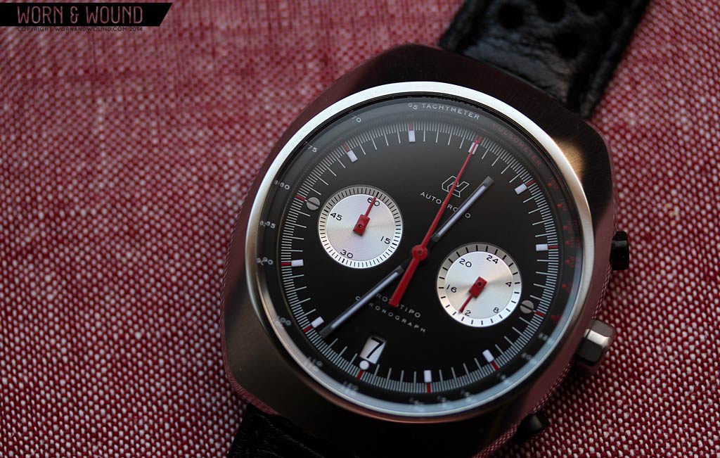
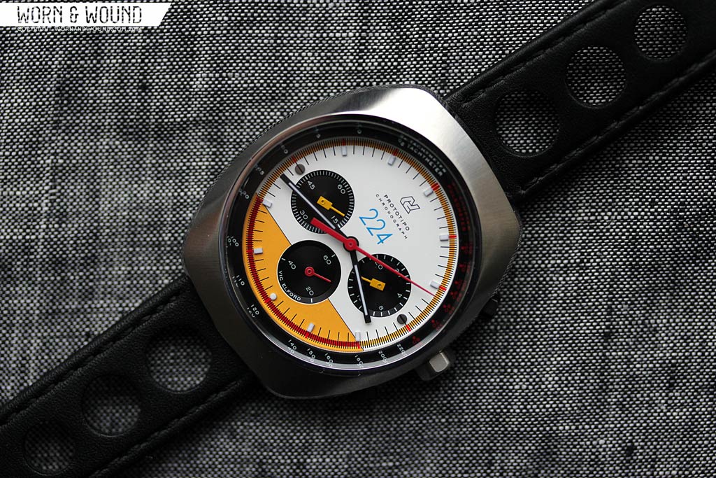
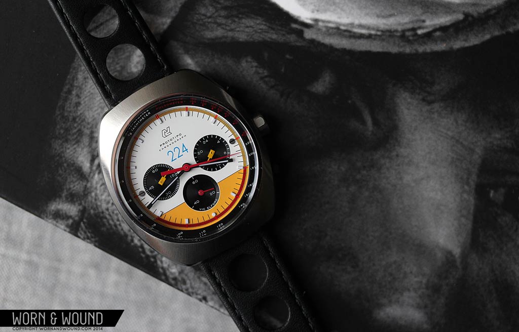
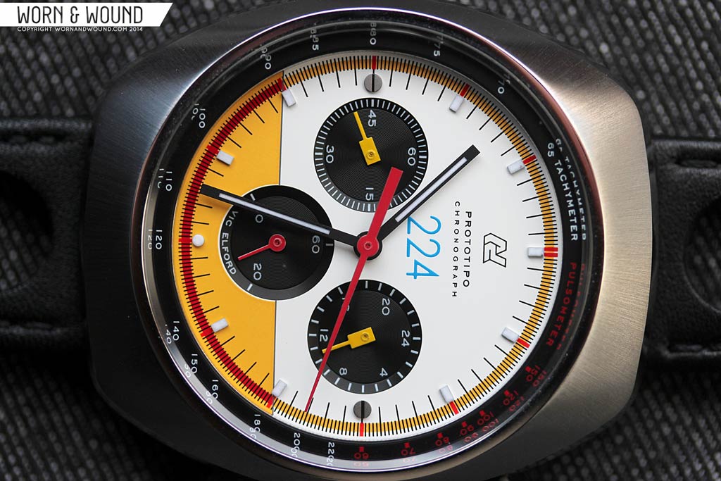
Dial: Vic Elford
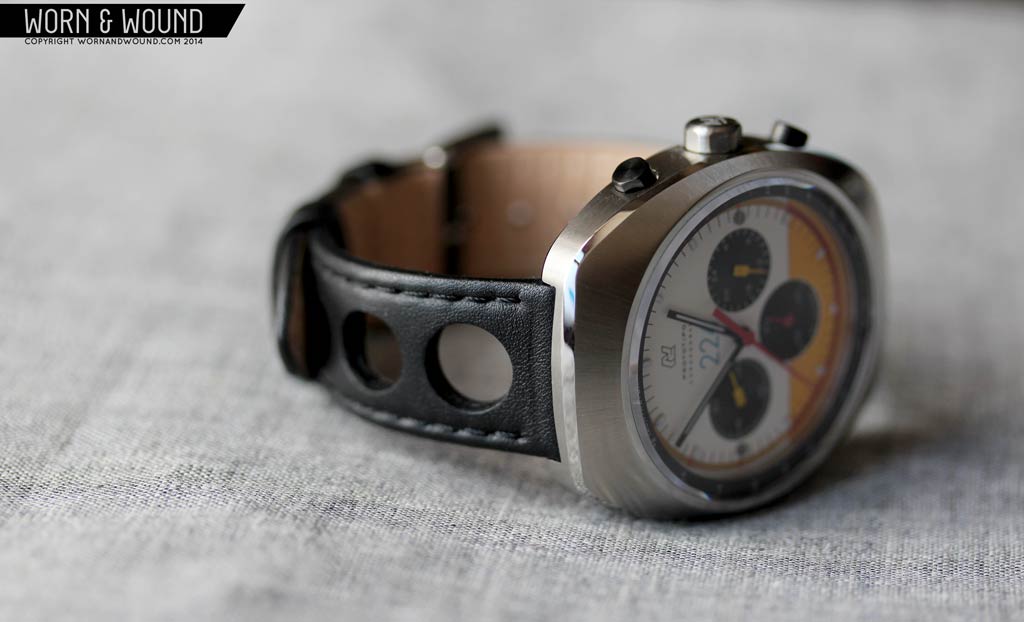
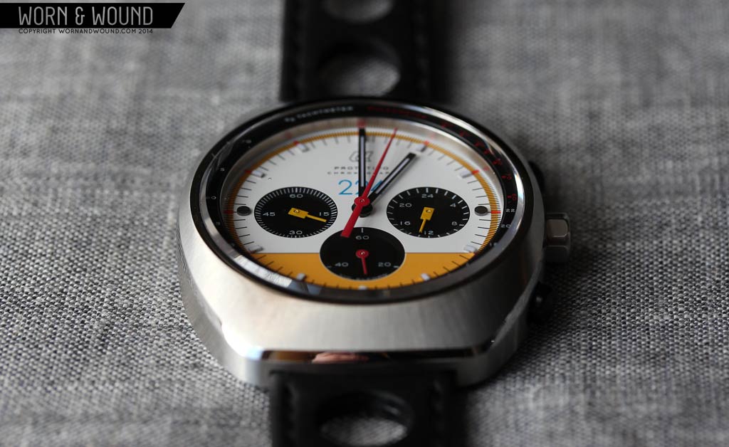
The Vic Elford edition has several significant differences from the open model, making it more distinct than just in name. Functionally, the Vic adds an active seconds hand and drops the date window. The additional sub-dial changes the feel of the dial tremendously, increasing the visual density and making it more aggressive. In order to accommodate the sub-dial, all of the text had to be moved below 12, where there is an additional “224” printed, which was Vic Elford’s racing number as well as the amount of limited models that were made.These added elements plus the active seconds make this model more kinetic and intense, as though it were ready to drive away.
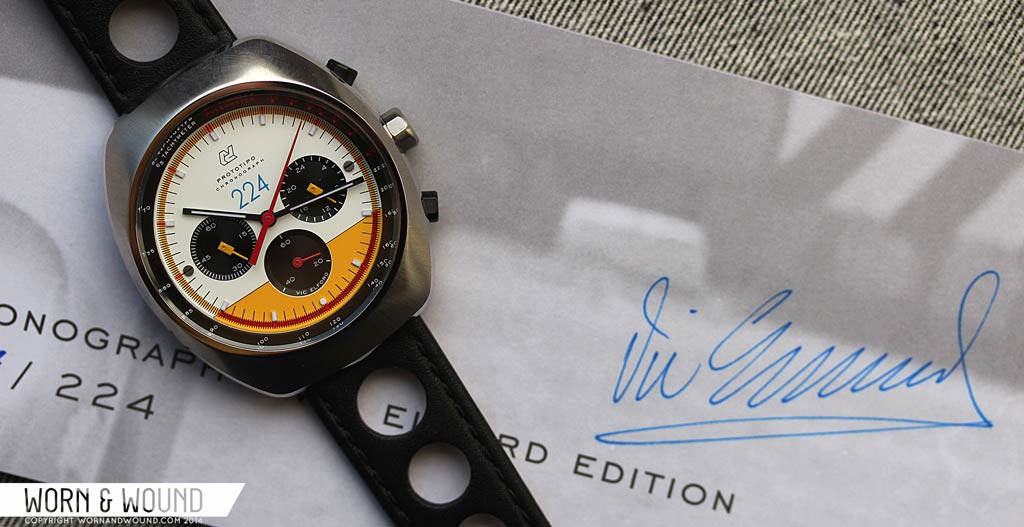
On top of this, the Elford Prototipo has wild coloring based on Vic’s Porsche 907 paintwork. The dial is broken up with a line that runs from 4 to 8, separating white and bright yellow surfaces, all of which are lit up with hot yellows, reds and oranges for a loud and highly visible design. The outer index has been highlighted yellow with hot orange accents on the white portion while it’s deep red over the yellow. Correspondingly ecstatic, the 60-min and 24-hr registers have bright yellow hands, while the active seconds and chronograph seconds are bright red. The hour and minute and then matte black, which provides its own high contrast.
Though it sounds over-the-top, and sort of is, it’s also really gorgeous and instantly appealing. The colors don’t come off as cheesy or derived, but rather strong and energetic. It’s this sort of risk-taking that feels like a lost art in watches these days. On paper, yellow, red, orange, white and black all together seems like it would be too bright, too clash-y for a man’s wrist (and likely would get shot down in a focus group). In practice, it’s exciting, but it took a leap of faith to try it. Now, the Vic Elford’s are sold out.

Movement: Seiko VK64/63
The Seiko Meca-Quartz movements are nothing short of awesome. It gives you quartz watch accuracy with a mechanical chronograph’s functionality. The benefits of this hybrid movement over a typical quartz chronograph are easily noticeable when actuated. The chrono seconds sweep with a frequency of 5 beats per second, rather than the typical full-second jump, giving you greater precision and smoother motion. Once stopped, it can then instantly reset, rather than travel all the way back around.
The other benefit is in cost. Considering the limited supplies of Swiss automatic chronographs, their high prices and the few alternatives, it’s incredibly surprising that there aren’t more brands using this movement to create affordable chronographs. That said, though we’ve found the Seagull ST19 movements to not have the greatest tactile feel, and their long-term reliability is still a question mark, that would have been a possible mechanical option for the Prototipos.
In use, the VK64/63 movements function as expected; the top pusher starts and stops the chronograph while the bottom pusher resets. The action on both buttons is rather crisp and stiff, providing an enjoyable snap when pressed. On the open models, the date is changed by pulling the crown into first position and turning it clock-wise. As with other quartz watches, they keep exceptional time.
Straps and Wearability
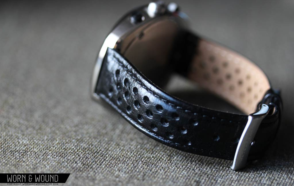
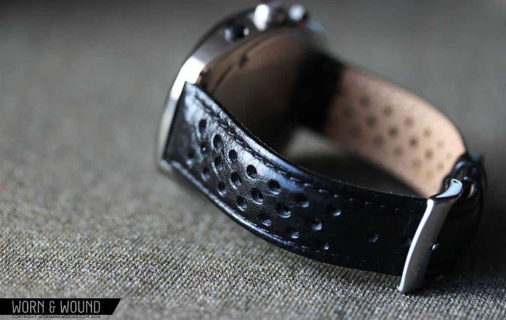
The Prototipos comes mounted on 20mm black leather rally style straps. The logical and ideal choice for watches this style, they not only look the part speaking to the chronos of the 70’s, but happen to be well made and comfortable. On the open models, there is a “small hole” style rally with padding. It has a slight greasy sheen to it, which looks good with the brushing on the case. The straps design is interesting as it’s basically a simple dress/casual strap, but the added holes give it an unexpected sportiness.
The Vic Elford edition comes on a “big hole” rally without padding. This more aggressive style matches the intense coloration and dial design of the Vic. The leather on this is also matte, creating a duller and more industrial look. In both cases, these are the right straps for the watches. The only thing I would want to switch would be to a medium brown on occasion for purposes of matching with attire.
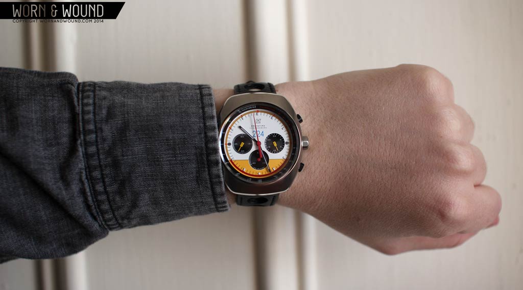
On the wrist, the Prototipos wear very well. At 42 x 48mm I found it sat properly on my 7″ wrist and would work on wrists both smaller and larger. The 11.5mm thickness is also quite thin in practice, giving the watch svelte profile that is easy to slip under a sleeve. Proportionally, the size is large enough to have a strong presence, but tempered enough to not be too flashy. They also have a nice weight, that makes them feel more solid than many quartz watches, but not as massive as many mechanical chronographs.
In terms of looks, it’s hard to take these watches off… any version. From the dials to the spectacular finishing, there is a lot to pull you in. The mix of polished and brushed surfaces add an elegance that belies the sporty intentions of the design, making them at once aggressive and elegant. This adds up to a versatile watch that is easy and fun to wear. The dials too have a refined and restrained layout, making them handsome in an unexpected way. And though they don’t feel vintage, since they are so new and well made, they do have a styling that speaks to a different time. Luckily, it doesn’t feel contrived or out of place with contemporary clothing.
Packaging
The Vic Elford edition’s packing deserves some special attention as a lot of effort went into its design. The outer box is a matte cardboard with a full-bleed print of a close up of Vic Elford. It’s a bold outer box that gets you pumped for what’s inside. The inner box, which is of more permanent construction, is a flat white leatherette bound case with gold foil print, which is the same design that was found with the Monoposto.
When you open it up, you are presented with the lush red velveteen inside and a special Vic Elford booklet, which is the real prize (aside from the watch). The book, which is hand signed by Vic Elford on the first page, contains the story of Vic’s remarkable win at Targa Florio in 1968, and then a collage of clippings from news papers, posters, magazines, etc… It’s a beautifully designed and conceived booklet that builds up the story and mystique of both the racer and the watch. Finally, under the booklet, is the watch itself, which after a quick flip through the book, you’ll be undeniably excited to put on. Naturally, this stuff is all very worth hanging on to.
The open edition comes in the same box that the first Autodromos. This black leather cylinder is based on vintage camera lens cases, and while not as elaborate as the Vic Elford’s packaging, still very nice and above average in both presentation and quality.
Conclusion
It should be pretty clear at this point that I’m a fan of the Autodromo Prototipo watches. From their styling to their finishing, they really impress. If you’re a fan of vintage watches, specifically chronographs, these are going to get under your skin quick. And if you’re not specifically a fan of that era of watches, these likely will still interest you since they are so unique amongst today’s offering of watches, affordable or not.
The three different models also offer a nice array to choose from, though the Vic Elford is already sold out. For that one, keep an eye on forums, etc… though considering how cool they are and that only 224 were made, they will certainly be rare finds. The two open models are still great gets, and at $625 a bit more affordable too. Yes, the prices for these are bit higher than your average quartz chronograph, but they are also above average watches. It’s easier to get across in person, but like the Monoposto, the build quality, attention to detail and finishing on the Prototipos are top of their class. Plus, they are just so damn great looking.
by Zach Weiss
Review units supplied by Autodromo Watches

Simply gorgeous. I have been really tempted by these. If they had came in a fully mechanical version (even if it was hand-wound), I would have gotten the Vic Elford edition.
I have been a fan of Autodromo since they first introduced their first watches. These new chronographs are absolutely beautiful while paying homage to their historical counterparts from the 60s and 70s.
I would love to get my hands on one of these. The White dial speaks to me way more than the black dial. I see the Hamilton Pan Am in the black dial.
Great review and pictures.
Great review Zach. Autodromo definitely has an eye for detail.
I pre-ordered the black one and received it just before Christmas. In that time it has become my #1 daily wearer. I get a comment on it almost every single time I wear it out of the house. As cool as these watches look in the pics, they are even more gorgeous in real life. The design is classic-yet-modern, edgy, sexy, and sleek – You cannot go wrong.
Great review Zach, I have been saving up for a mechanical chronograph for my upcoming 40th birthday, was thinking of getting a Hamilton Pan Europ, as a vintage Heur Chrono is out of my price range, but I’m very tempted. Would love to see the white face model on a tan rallye strap. Just one note: Every time you said “Porsh” instead of “Porsh-uh” I had to wince. Just a pet peeve as dedicated Porsche guy.
Stuart, I’m from Germany and FYI we say “Porsh” not “Porsh-uh”.
I don’t know what it is, but I don’t understand the appeal to these watches. They’re hideous and everyone seems to love them.
Absolutely gorgeous! dont like the movement though
I’m not usually drawn to this style of watch, but count me in as interested in this particular series. Very striking.
So in love with the Vic Elford edition! I was just one click away from ordering one last December, but my budget was too close and it ended up being a good decision not to buy it because this year it hasn’t gotten better. But maybe you are thinking of a giveaway?! 😀
Besides that, I love the reviews and news… Worn and Wound is awesome! Keep up the great work.
Great design, but what bugs me about these and other quartz chronos is that they only time up to 60 mins, then stop, not continuing to go around the register again like a true mechanical chrono.
Good to know, I had no idea!
People are so picky about the fricken movement!? Find a watch that looks this good with a better movement and then compare, before complaining about wanting everything for nothing.
These are beautiful.
The Vic Elford & white dial models are fantastic. I was lucky enough to try one on my wrist at a show in NYC last month; it felt right at home after having several vintage chronographs on there. And the folks running the booth were very friendly as well.
Someday I will probably snag one!
Hi Jay,
These are Asian made.