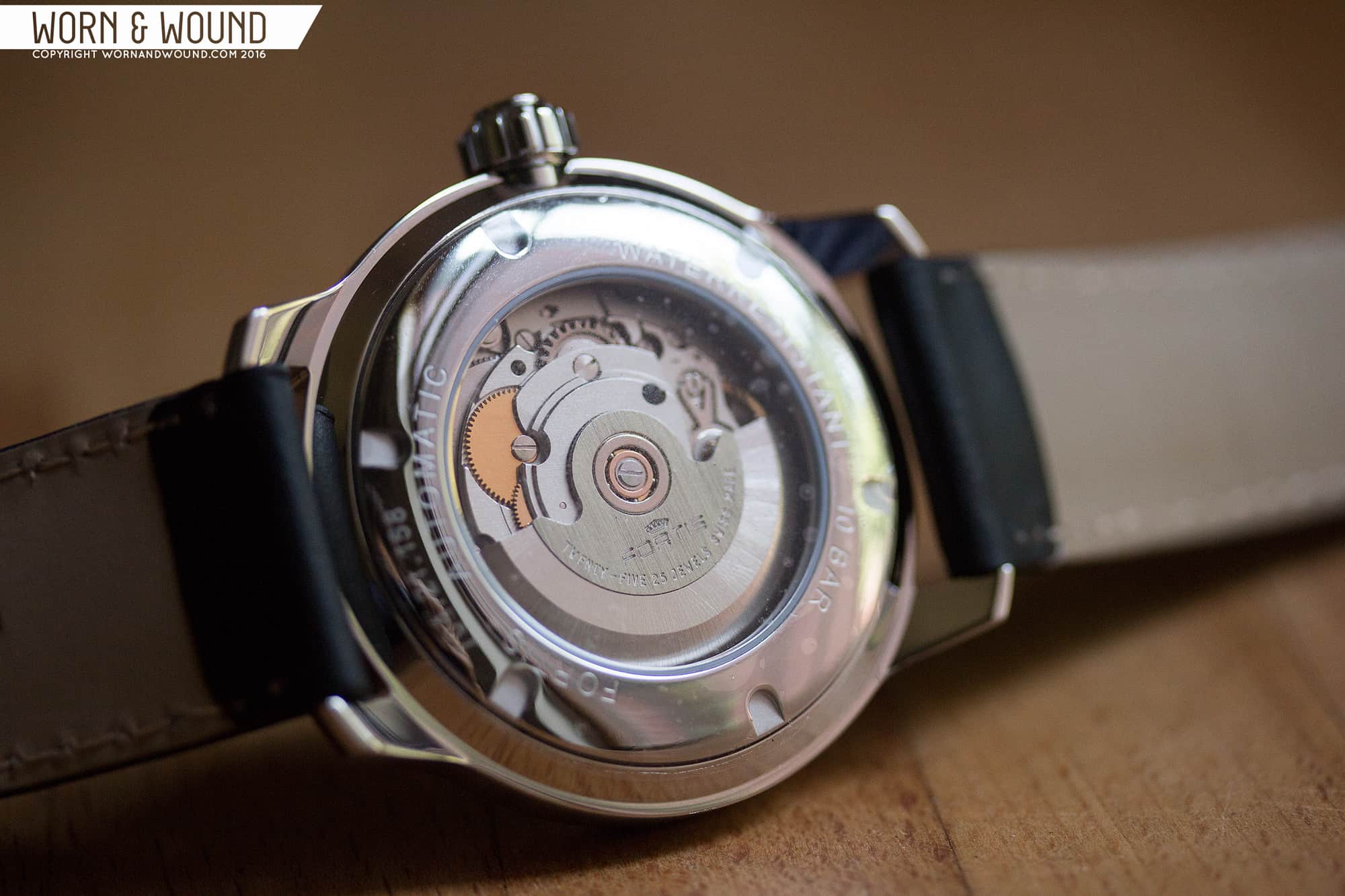
Flipping the watch over, you have a very plain case back with a display window. Through the window, you can see the ETA 2836-2 movement, which is fairly undecorated, save the Fortis logo on the rotor. It’s not the most exciting movement to look at, though any movement has its charm… That said, had there been a sold case back with a cool engraving, I wouldn’t have missed seeing the movement.
Dial
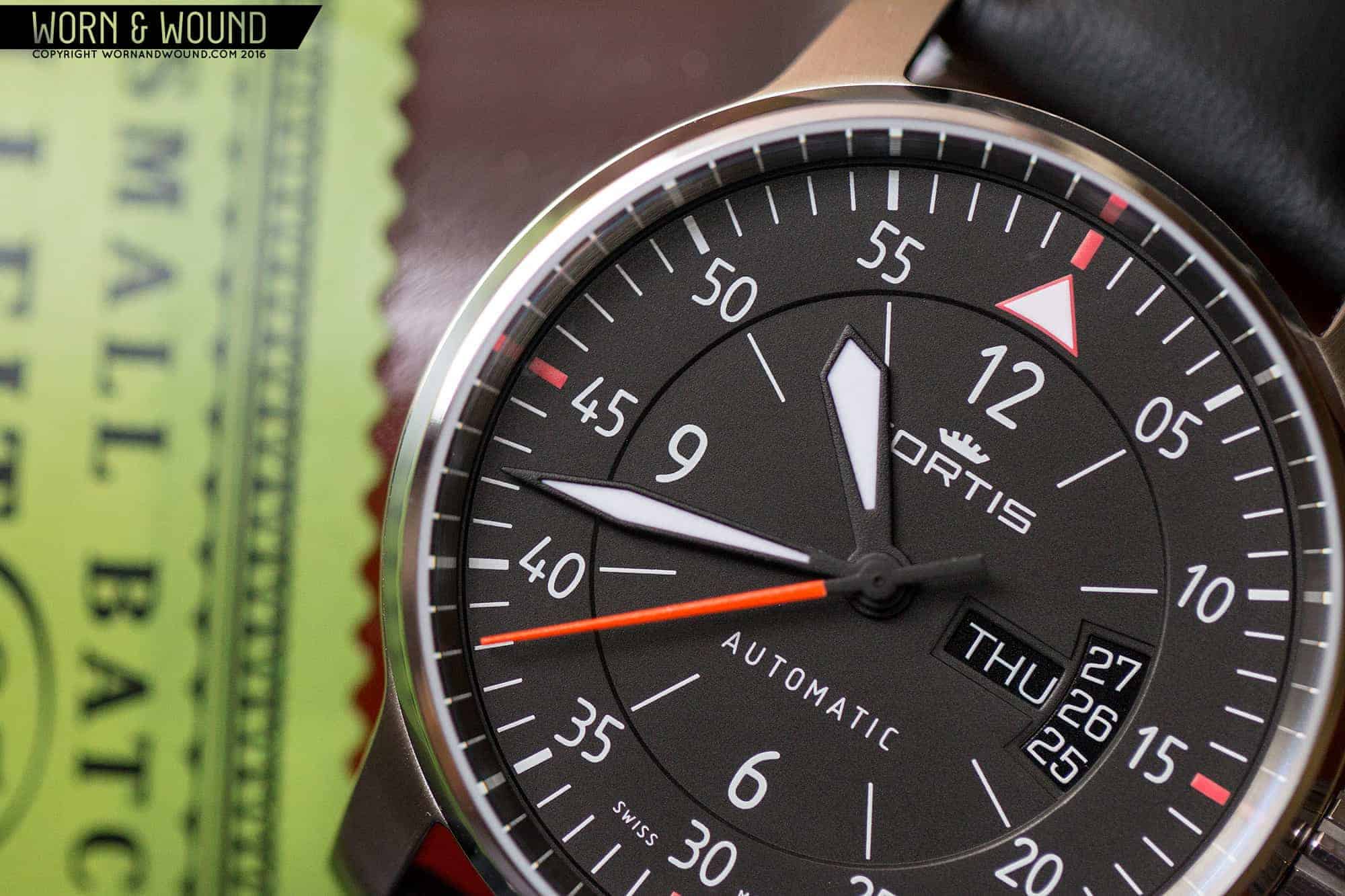
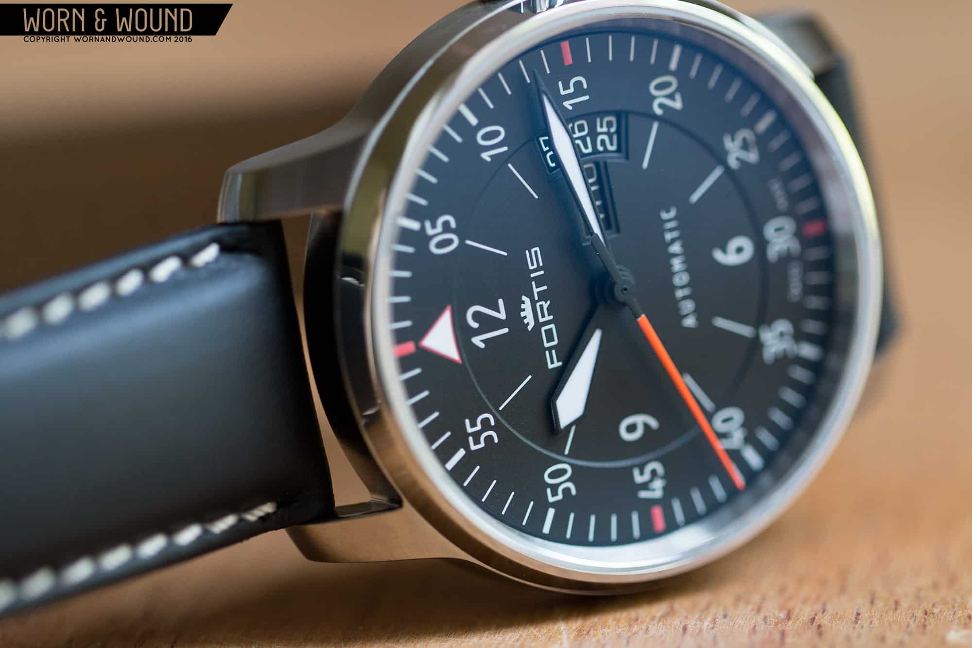
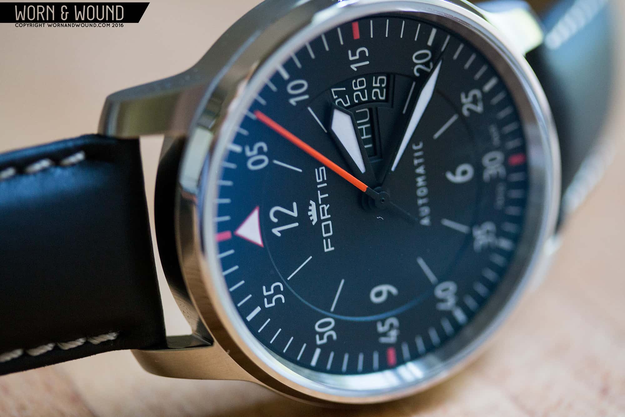
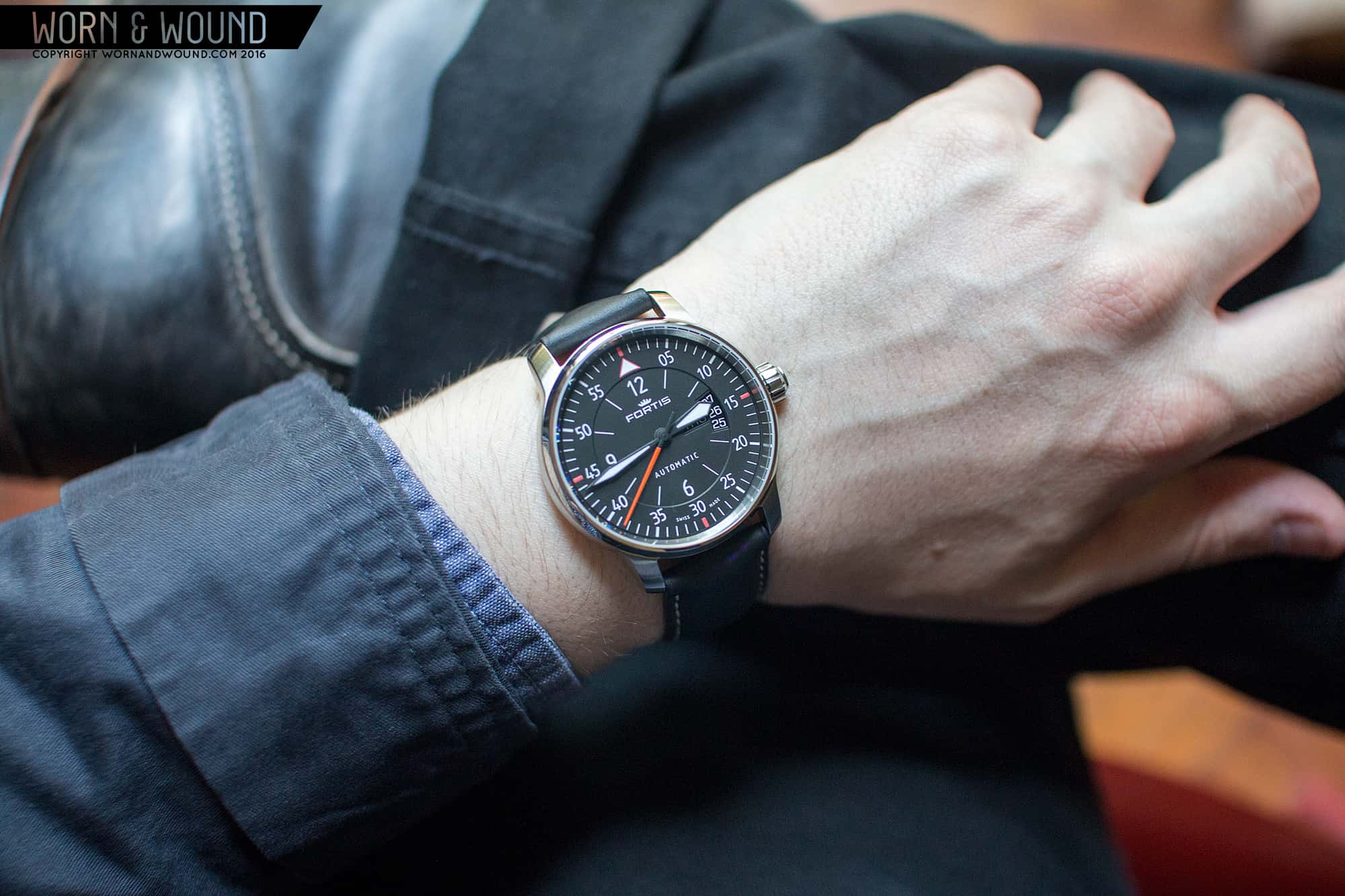
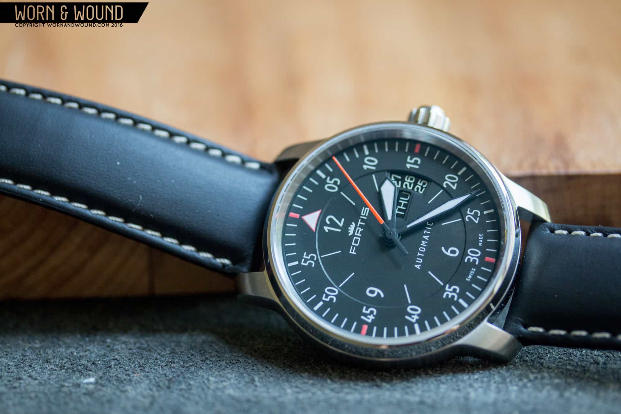
The dial is really where the Cockpit Two comes to life. It’s broken into two areas, and inner hour track and an outer minute/second track, which are separated with a slight elevation change. The inner area is depressed down a bit and features an index of long lines per hour, save at 12, 6 and 9 which feature numerals, and 3, which features an altimeter style date window. This area hints at the classic aviation layout, that puts weight on 12, 3, 6 and 9 over the other hours. But, by placing inside of the minute/second index, they also refer to the “B-Type” flieger layout.
The outer index surface is then raised a bit, and features a full index of markings with lines for every minute/second getting heavier at intervals of 5. There are also double digit numerals at intervals of 5, save at 0/60 where there is a triangle. On the Cockpit Two, these numerals are all white, at there are color accents at 15, 30, 45 and 60, adding a bit of a cross-hair feel, as well as giving the design a more contemporary, aggressive look.
![FORTIS_AVIATIS_COCKPIT2_DIAL_7]()
My favorite aspect of the design is the typeface they used as it’s very atypical for a pilot. It’s thin, with quirky lines that have an almost hand drawn feel. That’s not to say they are sketchy, they are in fact very crisp and clear, but there is still something gestural about them. They also give the dial a bit of a field watch feel, which plays well against the more obvious pilot/aviator elements. Most importantly, it manages to give the watch a unique personality while maintaining the high legibility that defines the genre.
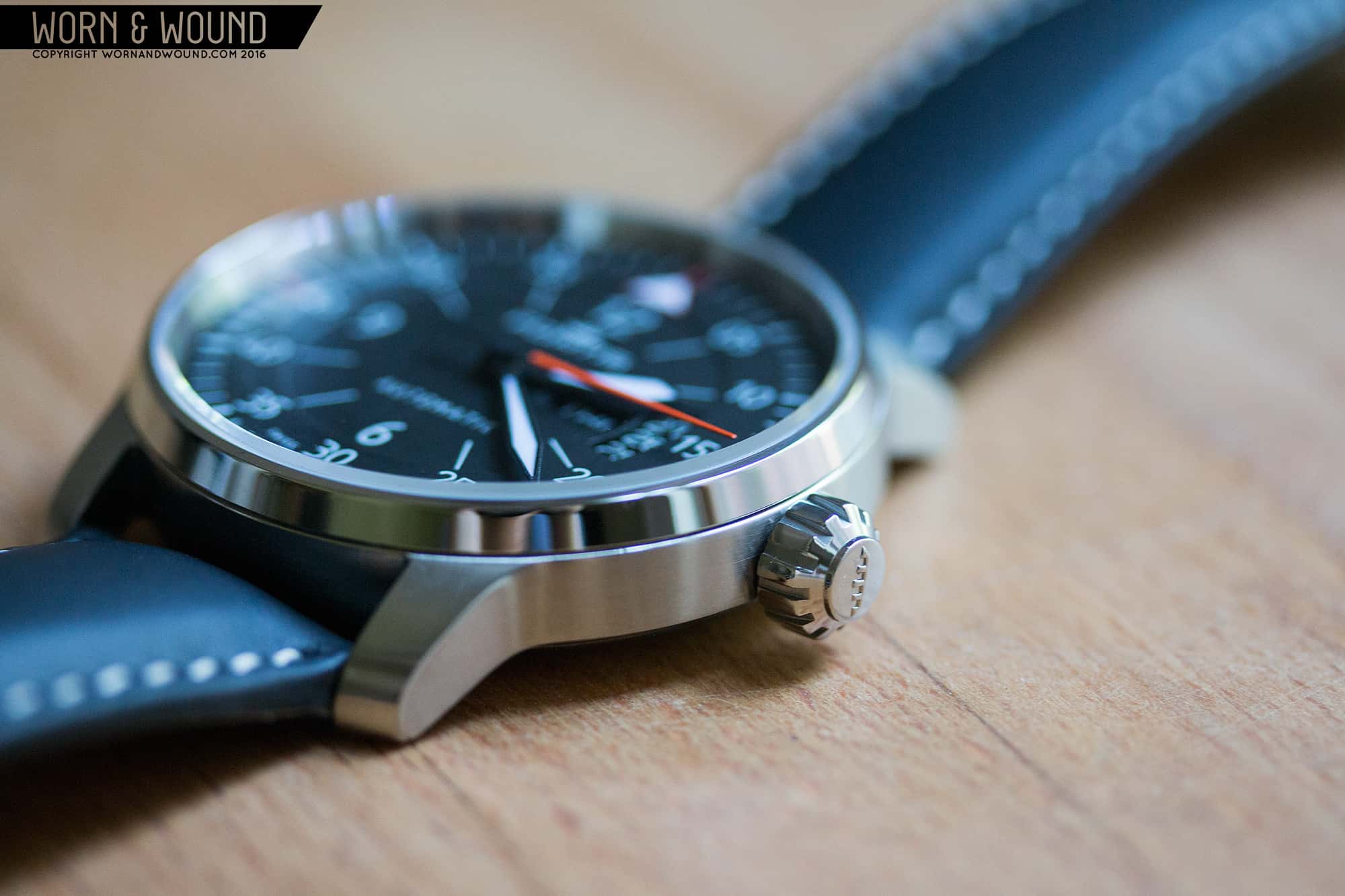
Perhaps the most divisive element of the watch is the altimeter-style date window. These arc-shaped windows show the day before and the day after the current date, while visually referring to elements of cockpit instrument panels. On this watch, they did a few interesting things with it. First off, they match white on black coloring of the dial, immediately making it more subtle, which is great as the larger window could have been distracting. Next, they use the day too, which aligns with the current date, creating a line for the eye to follow. Lastly, they clearly designed the sizing of the lower area so that the curve of circle would match with the arc of the window. This prevents anything from feeling like an after thought or forced element, integrating everything together. Generally speaking, I’m not a huge fan of altimeter-date windows, but it really does work on this watch.


 Featured Videos


