Hands-On with Foto Nouveau

Watches and gear go well together. You can often find watch guys, when not discussing timepieces, eyeing various types of EDC from interesting keychain gadgetry to pens. This of course is not to mention cars, wallets, shoes, bags, whiskeys and all the other things that appreciators of fine goods (if I were to blanket label us) can agree upon. But there is one object that while perhaps appealing more to a subset of the larger group, really resonates with watches: cameras. Like watches, cameras are metal and glass, with finely tuned parts and knobs and pushers. A good camera and a good watch often share certain characters; feelings of weight, smooth motion, materiality… And like watches, cameras too have evolved from pieces of pure mechanical artistry to something more synthetic, prompting a revival of the old aesthetics and build.

So, it’s only natural that a photographer who loves watches would set out to combine the two. Enter Foto Nouveau, a new brand founded by William Bon; a photographer, Art Director and Industrial designer. Inspired by the build quality, textures and iconic designs of vintage cameras by brands like Hasselblad, Leica, Mamiya and Olympus, Foto Nouveau attempts to distill those traits into objects you could wear everyday.

FOTONOUVEAU_VIEWFINDER_10

When brands take inspiration from outside of watchworld, they can either go literal or abstract. Both have their pros and cons. Literal can be cheesy while abstract can just miss the point. Foto Noveau rides the line between the two, abstracting some concepts while being pretty on the nose with others. The result works. They don’t look like little cameras on your wrist (thank heavens), but clearly pull from the physical designs of camera, in particular lenses. If you know cameras, you’ll pick up on it immediately. If you don’t, you might need to be told what’s what. Powered by Ronda Quartz movements, the Foto Nouveau watches come in two styles; Objective and Viewfinder for $279 and $299, respectively.

Advertisement
$299

Hands-On with Foto Nouveau

Case
PVD Steel
Movement
Ronda Quartz
Dial
White or Black
Lume
On Hands
Lens
Domed Sapphire
Strap
Black Leather
Water Resistance
5 ATM
Dimensions
42 x 49mm
Thickness
11.6mm
Lug Width
20mm
Crown
Pull out
Warranty
1 Year
Price
$299

Case

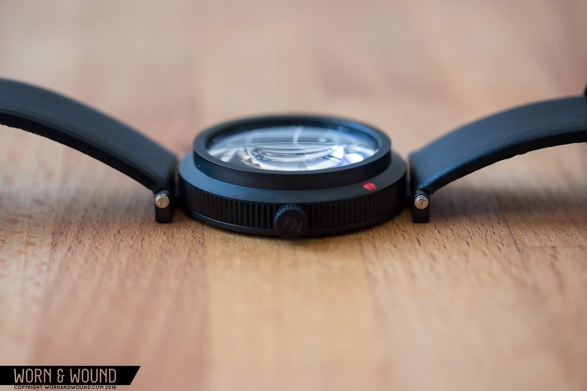
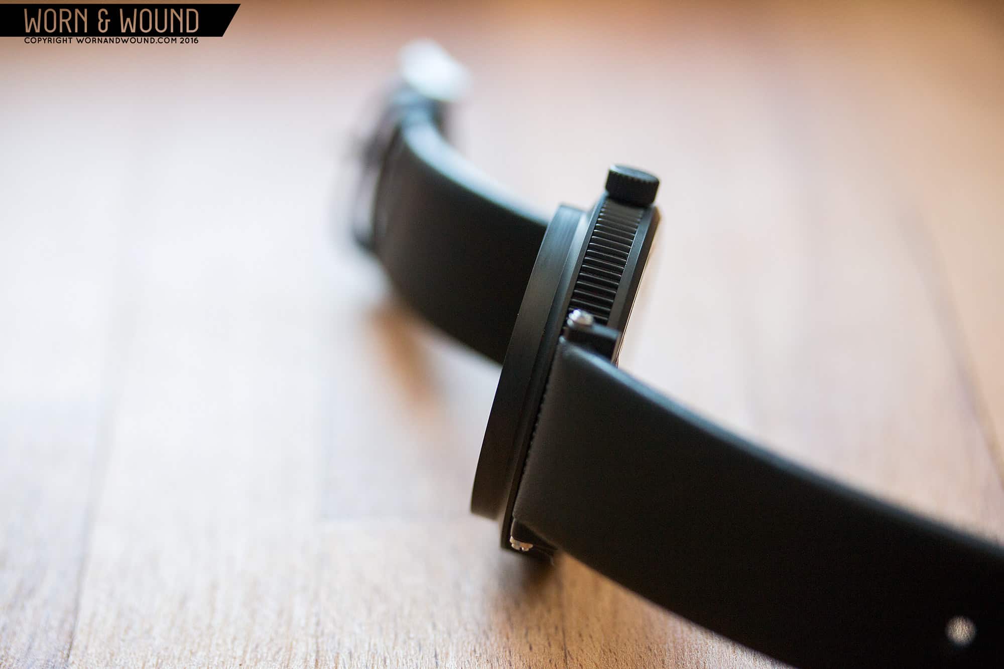
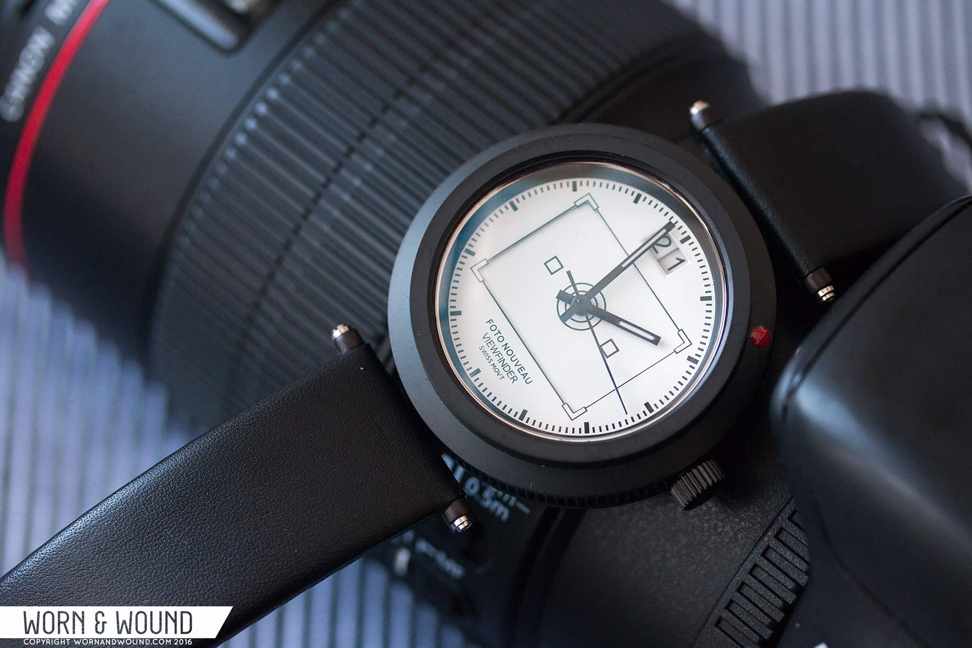
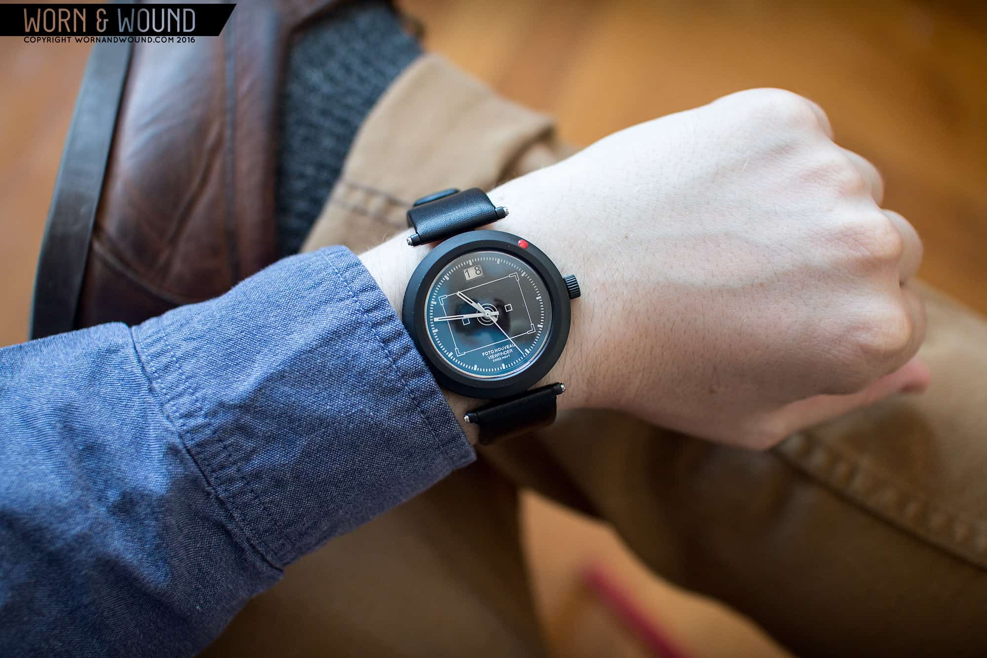
The case is altogether different than anything I’ve come across before and more importantly, their cool and unique looking. They are medium sized at 42 x 49 x 11.6mm, but the design is so atypical that they don’t really wear like a classic watch, rather more like a lugless design. The case consists of a circular central body, all in black, with a brutalist form. The sides are straight with a toothed edge, clearly speaking to a tactile texture used for grip. This reaches a wide, dominating bezel that inclines over a few millimeters, before shooting straight up. This clearly speaks to the front of a lens, which is further emphasized by the sunken, domed sapphire crystal. I love the geometry here. It’s architectural and a bit harsh, but very attractive.

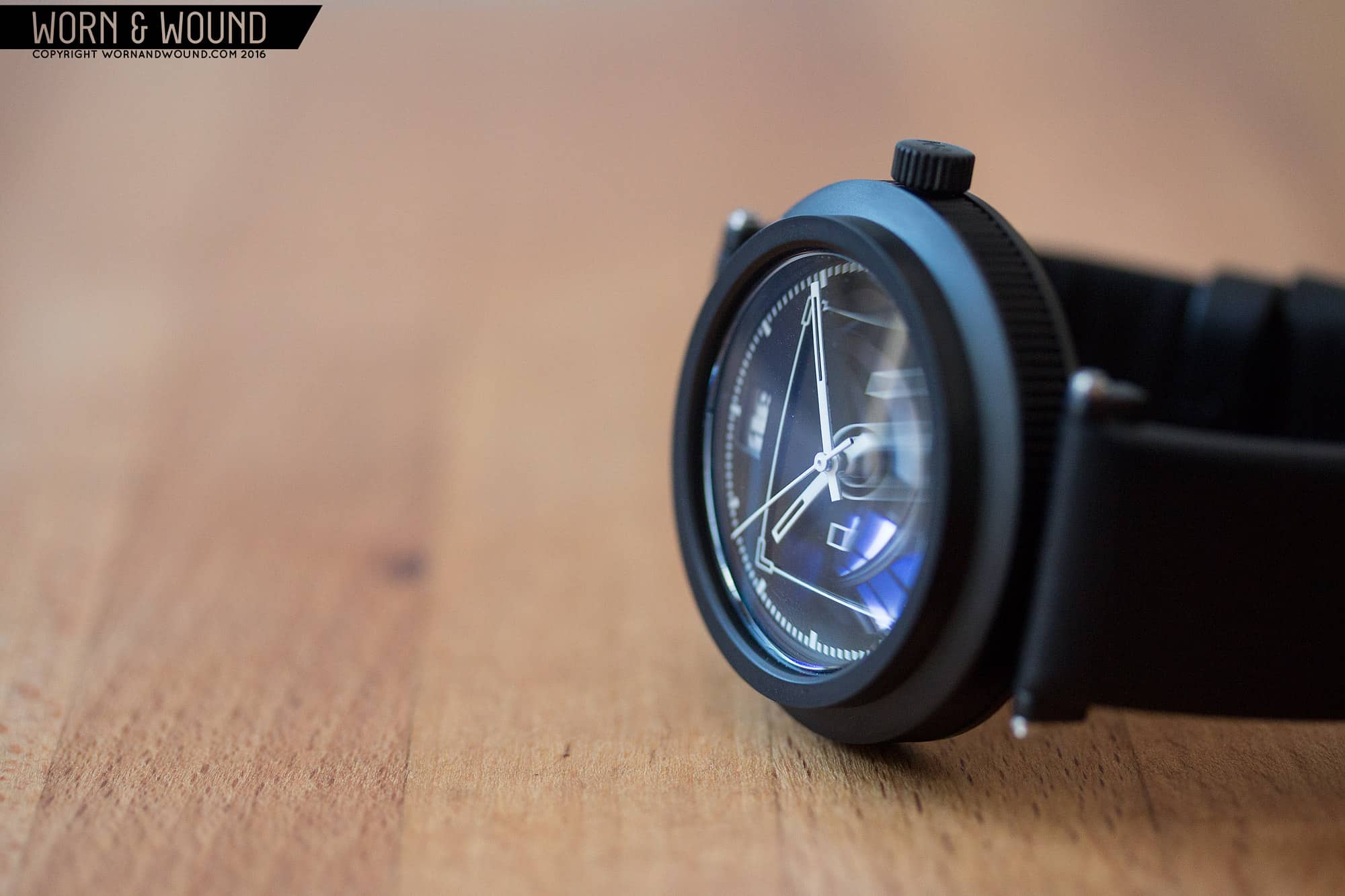
You never see crystals, well rarely at least, that sit below the edge of the bezel. This has a dramatic effect, especially as the top of the crystal is level with the edge. To make things even more visually intriguing, the sapphire is not-double domed, meaning that it distorts at oblique angles. This gives you a real sense of the glass being present. You really do appreciate the look of this the same way you do a big lens.

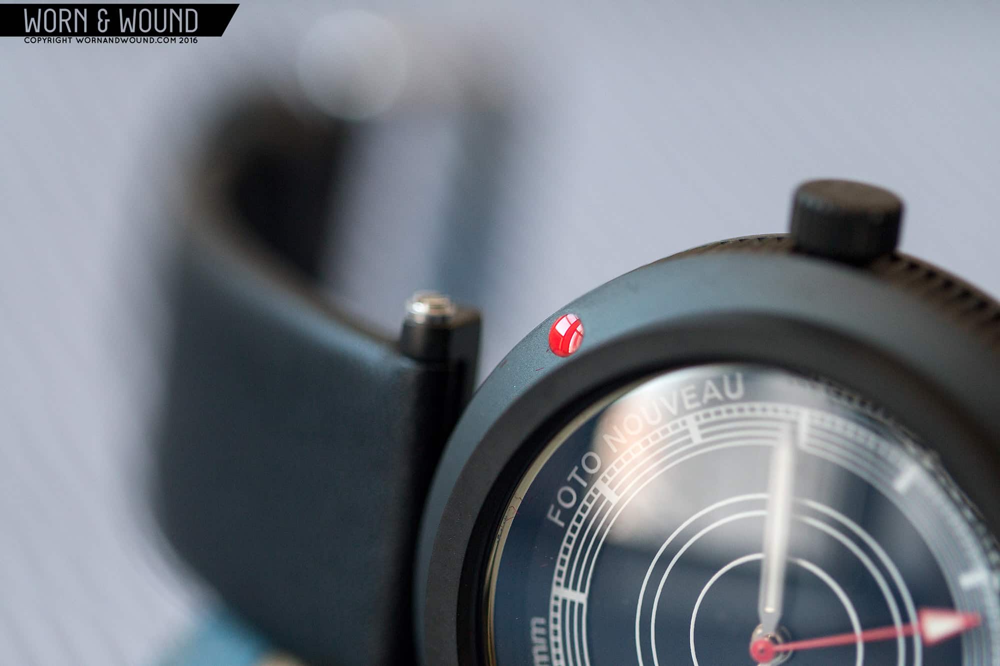
So far, the shape and texture allude to lenses without being too literal. To drive home the photo theme, between 1 and 2 (or 45 degrees from 12) there is a red dot on the bezel. Anyone with an SLR or other interchangeable lens camera will immediately know this refers to the dots used to align a lens when attaching it to a camera body. It’s on the nose, but only to those who know. It also adds color to the watch in an unexpected way.

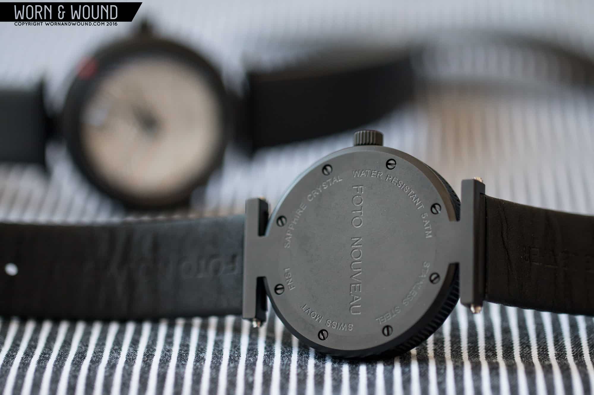
The final piece of the case is the back, which includes some very peculiar lugs. The back is totally flat, mounting to the mid case with 8 blackened screws. Coming off at 12 and 6 are short flanges that expand into floating lugs, that turn up. It’s hard to describe, but essentially there is enough space created to hold a 20mm strap with a screw bar, which is left raw steel color, contrasting with the otherwise entirely black case. It’s very industrial looking, playing off of the strong lines of the bezel. It also frames the circular mid case, thus making the watch wear more like a 42mm lugless design. It’s a totally novel design solution for a lug, and while a bit odd, I definitely like the looks of it and admire the unique approach.

FOTONOUVEAU_CASE_8

Dials

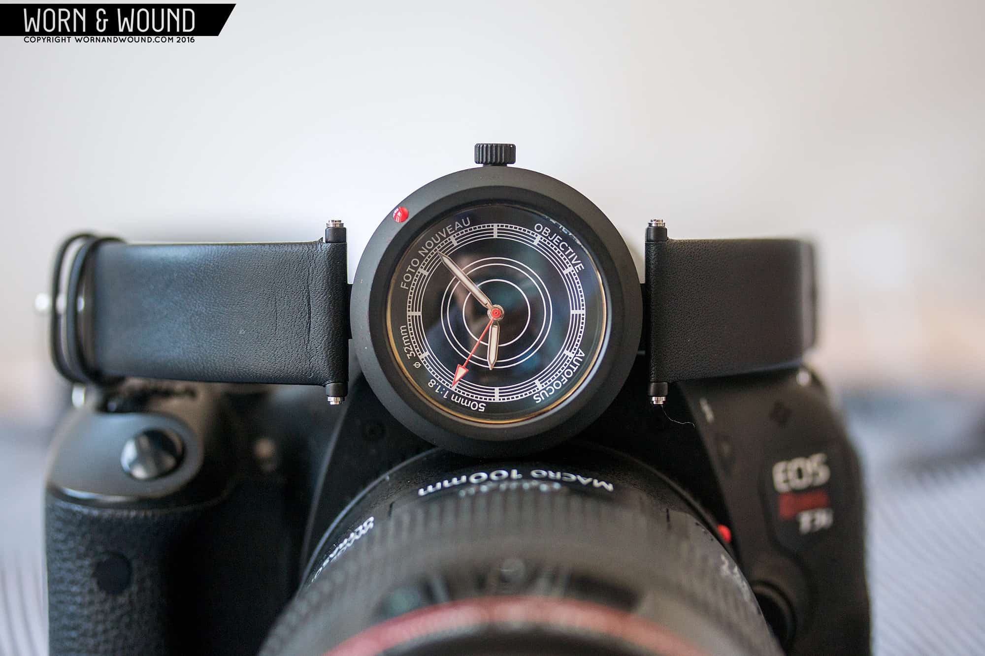
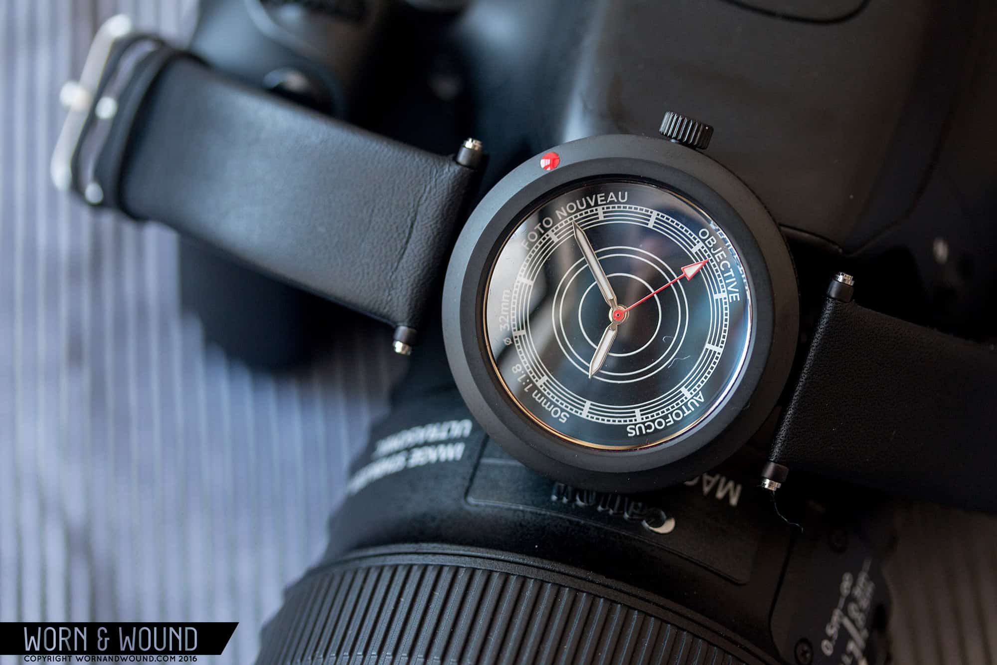
The Foto Nouveau watches currently come in two styles; the Objective and the Viewfinder. The Objective is inspired by 50mm prime (non-zoom) lenses, which is something you’ll generally find in every photographer’s lens collection. The translation is fairly literal here. The dial is black with concentric circles, playing off of what looking into a lens looks like. Then, there is an index/graphic that consists of more tightly grouped circles, on which there is an index of white lines per hour. It’s a bit hard to see, but the dial is actually two layers, with the inner circles on a lower layer. When the light catches it right, you can see the edge, which adds some depth.

FOTONOUVEAUS_1

Around the edge of the index is some white text reading “Foto Nouveau” “Objective” “Autofocus” “50mm 1:1.8” and “ø 32mm”. The latter three items I could do without. They are too directly taken from camera-land, and obviously do not pertain to the watch at all. Well, the ø 32mm does refer to the dial diameter, but is meant to look like a filter diameter, and is obviously not something you really need to know. Had “Foto Nouveau” been placed above twelve and “Objective” below 6, the whole thing would have been less obvious and more abstract, yet still felt “camera”. For hands, they went with polished steel fence post hands for the hour and minute and a red stick with a large arrow tip for the seconds. They work, but I prefer the hands of the Viewfinder model, which we’ll get to in a second.

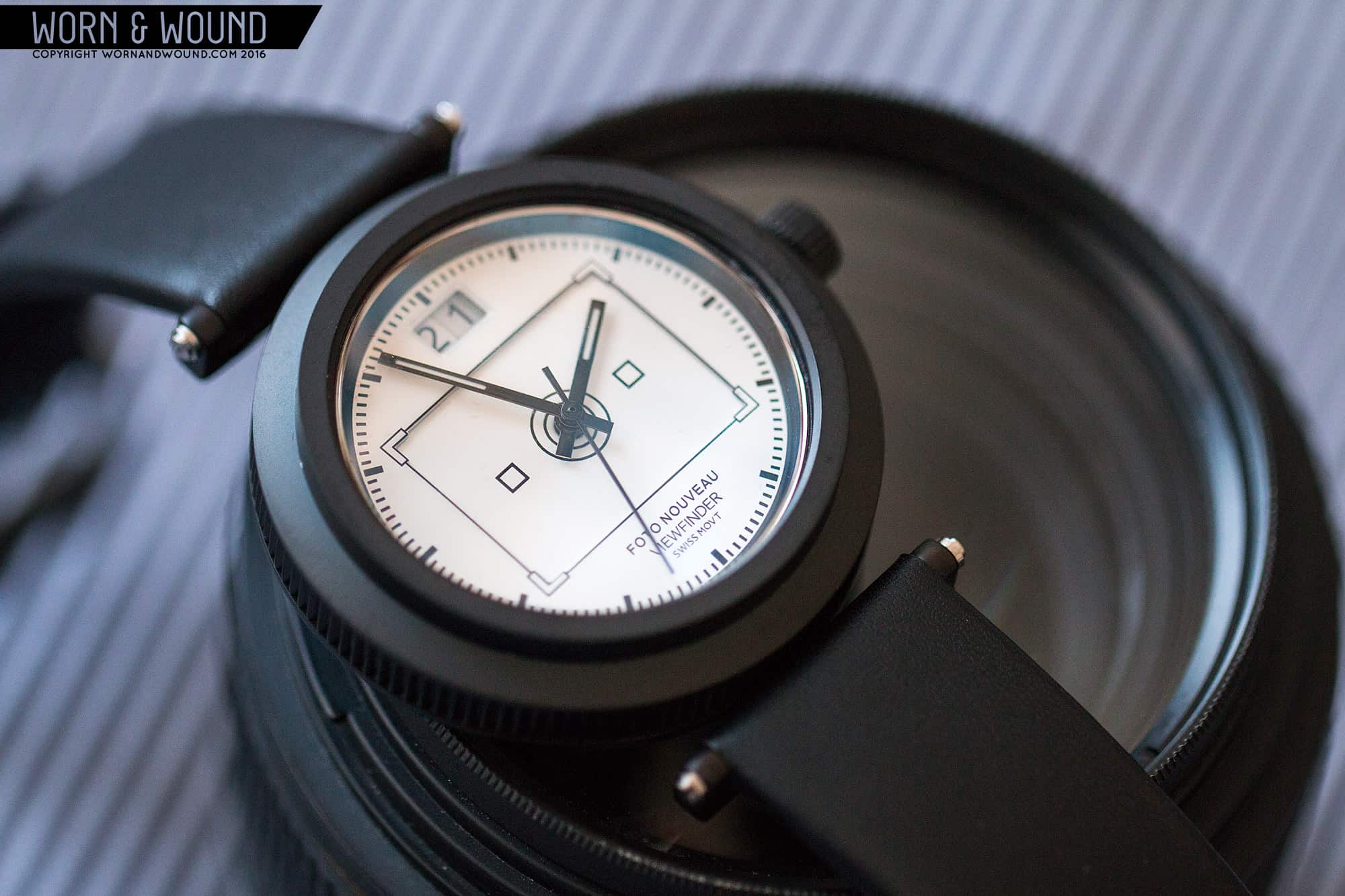
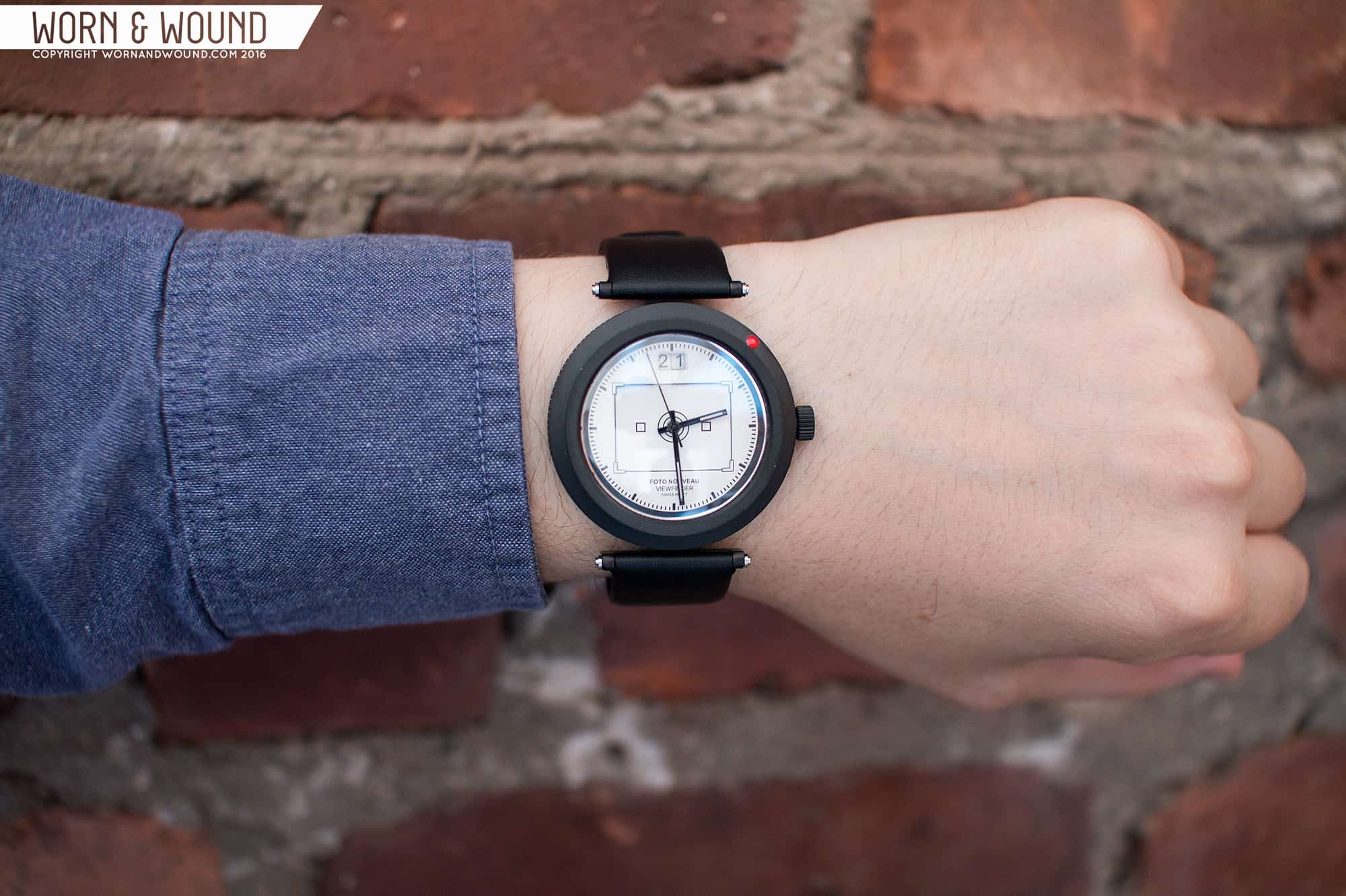
The Viewfinder comes in white or black and has a less obvious dial design inspired by, you guessed it, the viewfinder of a camera. Specifically, the compositional tools one sees when looking through a lens. Around the perimeter of the dial is an index with thick, but short black lines for the hour/five-minute interval. In between these marks are smaller lines for half-minutes/seconds. That creates some confusion, but generally time is easy to read at a glance.

The camera aspect comes from the large rectangle in the center, which, like the circle on the Objective, is dropped down a layer. On it, you’ll find marks in the corner, squares on either side of the center, and the circles around the very center. It’s suggestive of a view finder for sure, but by lacking text is an abstract graphic unto itself. Because it doesn’t quite align with anything, it’s an odd thing to have on a dial.

Additionally, the Viewfinder has a double-date window at 12. On both the black and white versions, the date is in black on white disks. This is a great addition, speaking to the various counters one finds when looking through a viewfinder, whether shutter speed or f-stop, but clearly makes sense on a dial as dates are a common thing. The placement at 12 is a nice change as well. It’s balanced out with some text just above 6, giving the whole dial a sense of symmetry.

FOTONOUVEAUS_1

For hands on the Viewfinder, they went with rectangles in either black or white, dial color depending, with thin slits of lume. The seconds are then sticks in black or white as well. These hands feel much more in line with the stripped down graphic style of the dial designs than the hands of the Objective.

Advertisement

Straps and Wearability

The Foto Nouveaus come mounted to heavy-duty 20mm black leather straps. They have a very minimal design, consisting of just a straight cut with folded edges, no stitching and a tapered, squared off end. This keeps the eye on the case and the dial. They have a remarkably nice feel to them with a stiff, but pliable texture. The only gripe I have is with the buckle, which is a fairly generic style in brushed steel. If nothing else, I think PVD would have made more sense here.

When you strap on the Objective or Viewfinder, the design clicks into place. Barring the camera elements for a moment, the stepped case design and floating lug system are striking. At a glance, it looks like the watch is mysteriously kept in place, with the edges of the strap framing the circle, making it jump out. It’s very sculptural and in many ways non-watch like. Then you see that beautiful sapphire, sitting within the black walls of the bezel, distorting light. Though the lens inspiration is clear, it’s an object in its own right with a unique personality. Then you see the minimal dials, which add subtle graphic elements to the overall form.

And it wears well too. It’s a very solid watch, feeling quite rugged. On my 7” the 42mm fit well, and since it feels lugless, I’m sure smaller wrists would take to it too. This isn’t a watch you’d want to be smaller. The proportions work very nicely, with the thick ring of black metal off-setting the rather small dial area in a curious way. I definitely grew to prefer the white dial Viewfinder over the others as the contrast from the dial surface added to the drama of the design.

Conclusion

The Foto Nouveau watches are very cool timepieces with unique styling. They did a great job of taking the ideas of a camera and photography and translating them into a watch that while speaking to both, doesn’t over do it. Instead finding some really inspiring forms and design ideas, particularly in the case, that made them genuinely unique designs. For me, I think they could take the format of the case and drop any literal suggestions of a camera or photography, and really play with the sculptural aspects. Perhaps the dials themselves can become more layered, more 3D, existing like dioramas within that massive domed crystal.

FOTONOUVEAU_VIEWFINDER_1

The only real miss for me, and I know you knew this was coming, is the lack of a mechanical movement… Now, I usually say this because it’s one of those things where the watch could just feel more substantial, etc… That’s not the reason here. These are very solid watches. For the Foto Nouveau watches, it’s conceptual. The cameras these watches refer to were solid metal, with wonderful precision mechanics of their own. Having gears and springs at work within these watches, or at least one model, would just bring it even closer to the source. To go even further, I would like to see it be hand wound, forcing you to wind it and interact with the mechanism.

Until then, for those who are looking for something unique, something that speaks to their inner photog, the Foto Nouveau watches are very worth a closer look.

Images from this post:
Related Reviews
Zach is the Co-Founder and Executive Editor of Worn & Wound. Before diving headfirst into the world of watches, he spent his days as a product and graphic designer. Zach views watches as the perfect synergy of 2D and 3D design: the place where form, function, fashion and mechanical wonderment come together.
wornandwound zsw