Hands-On: The Seiko Prospex SRPF81K1 Tuna

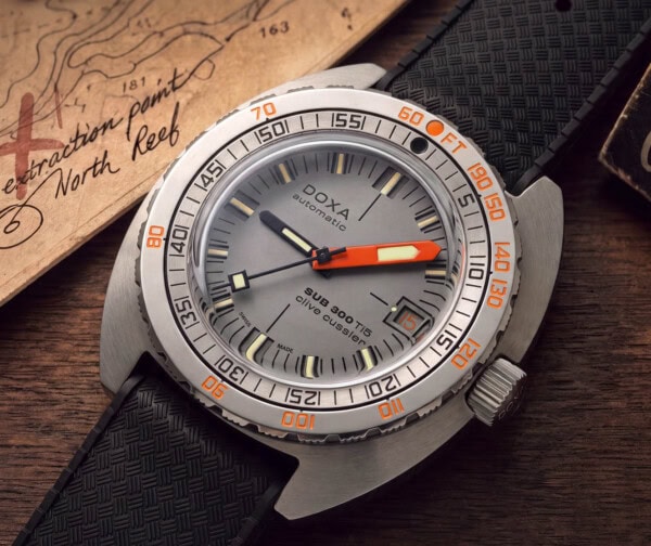
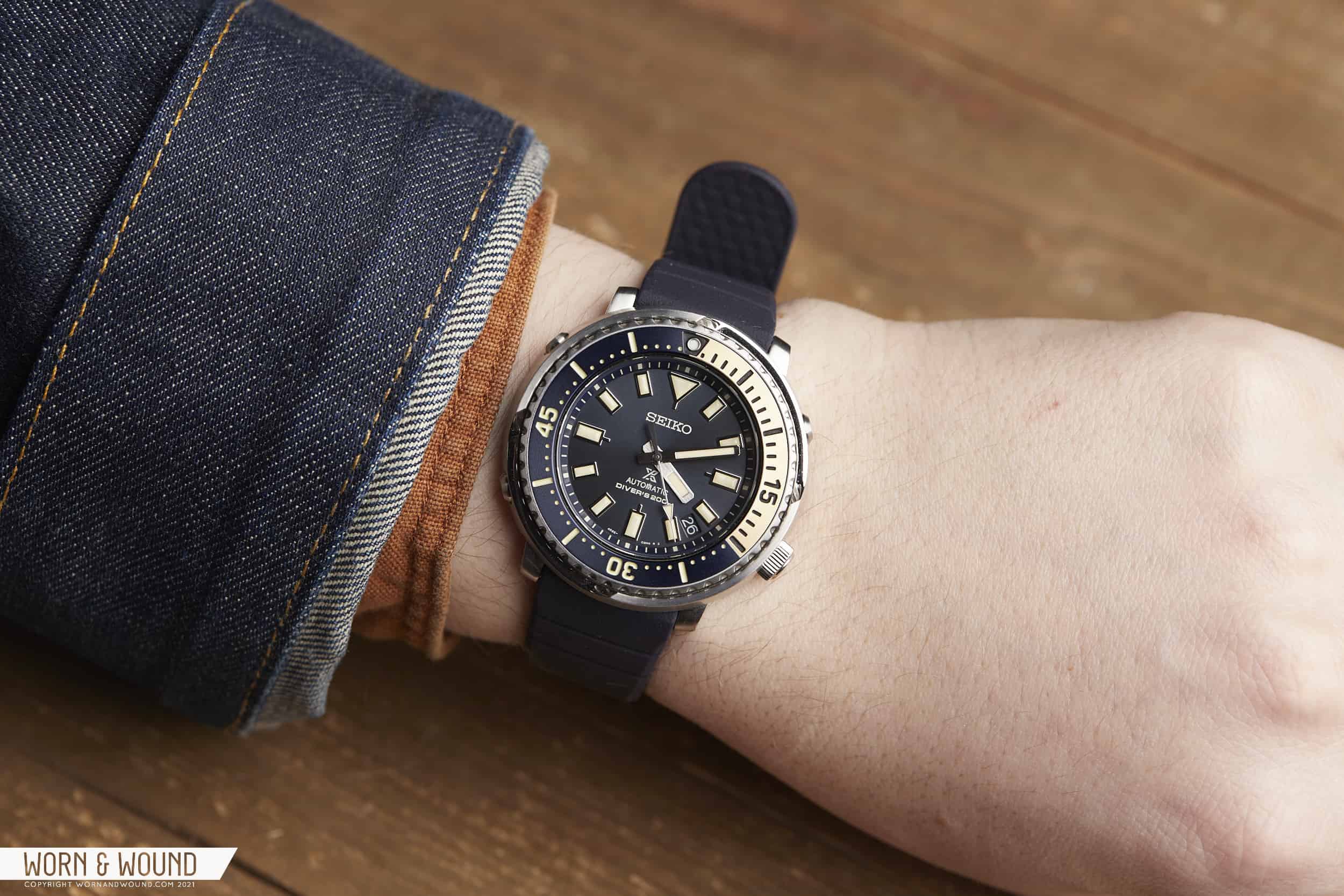
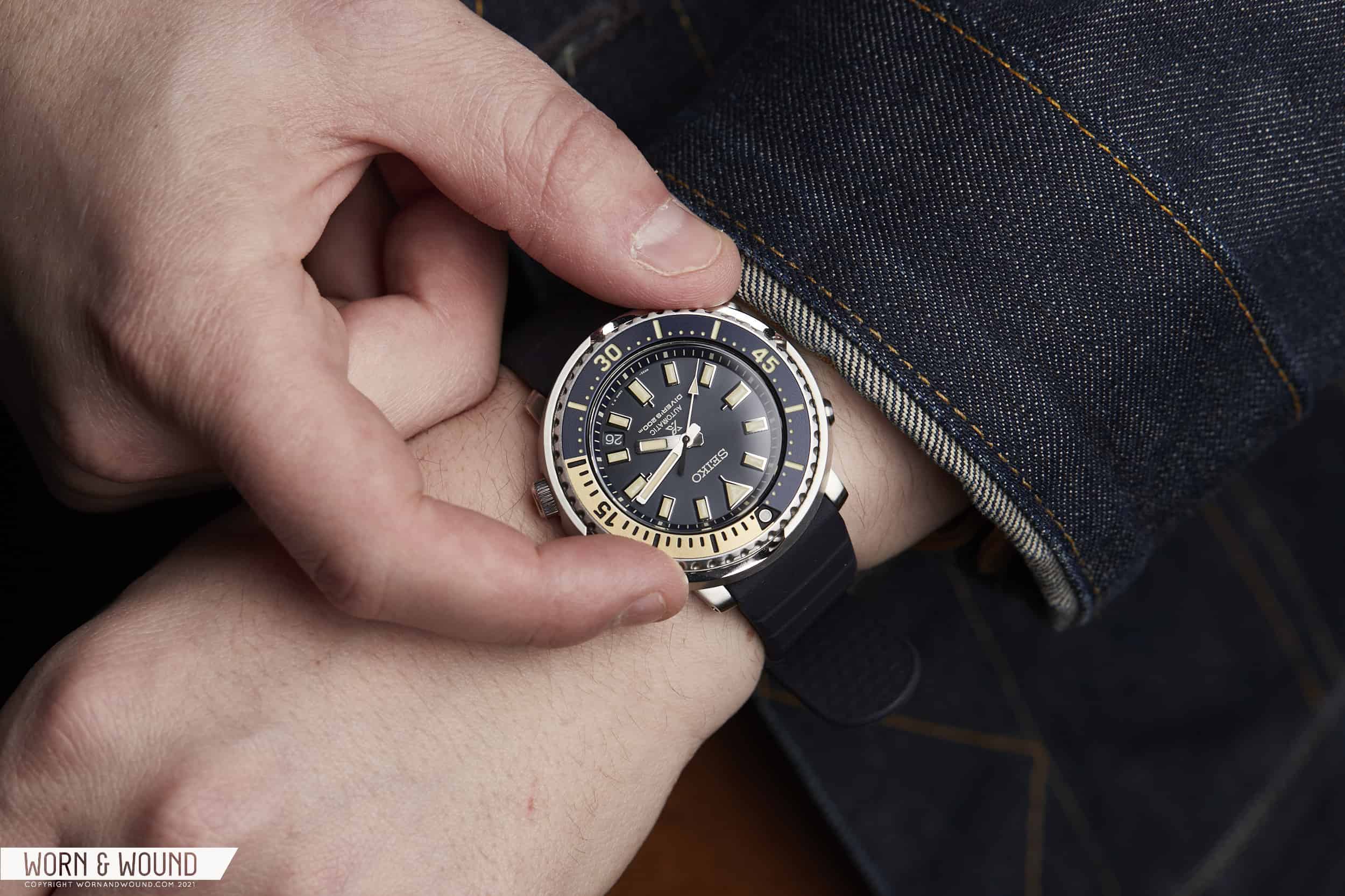
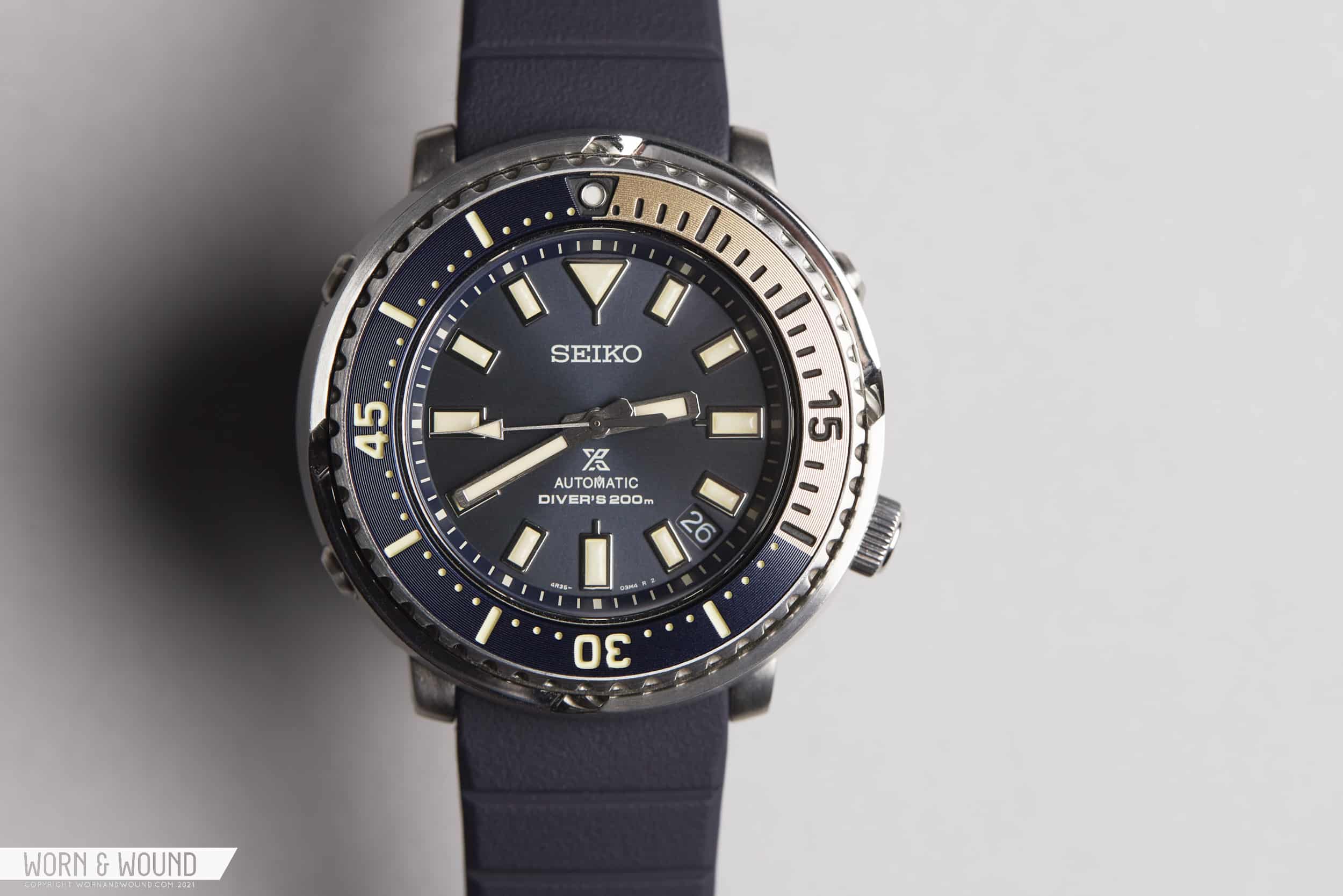
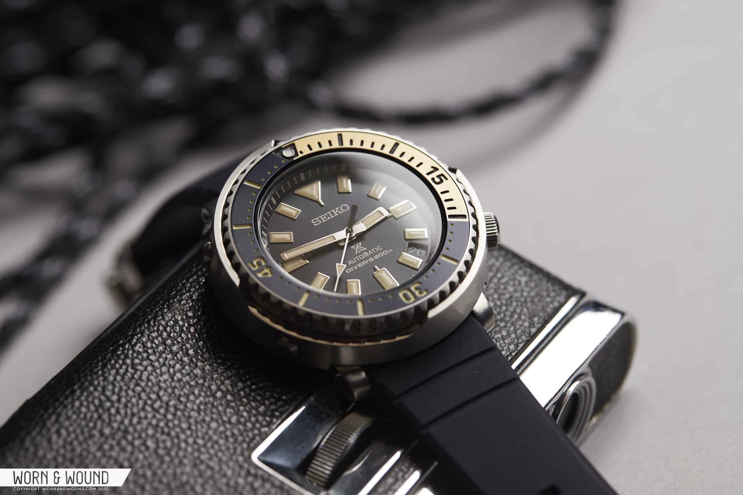
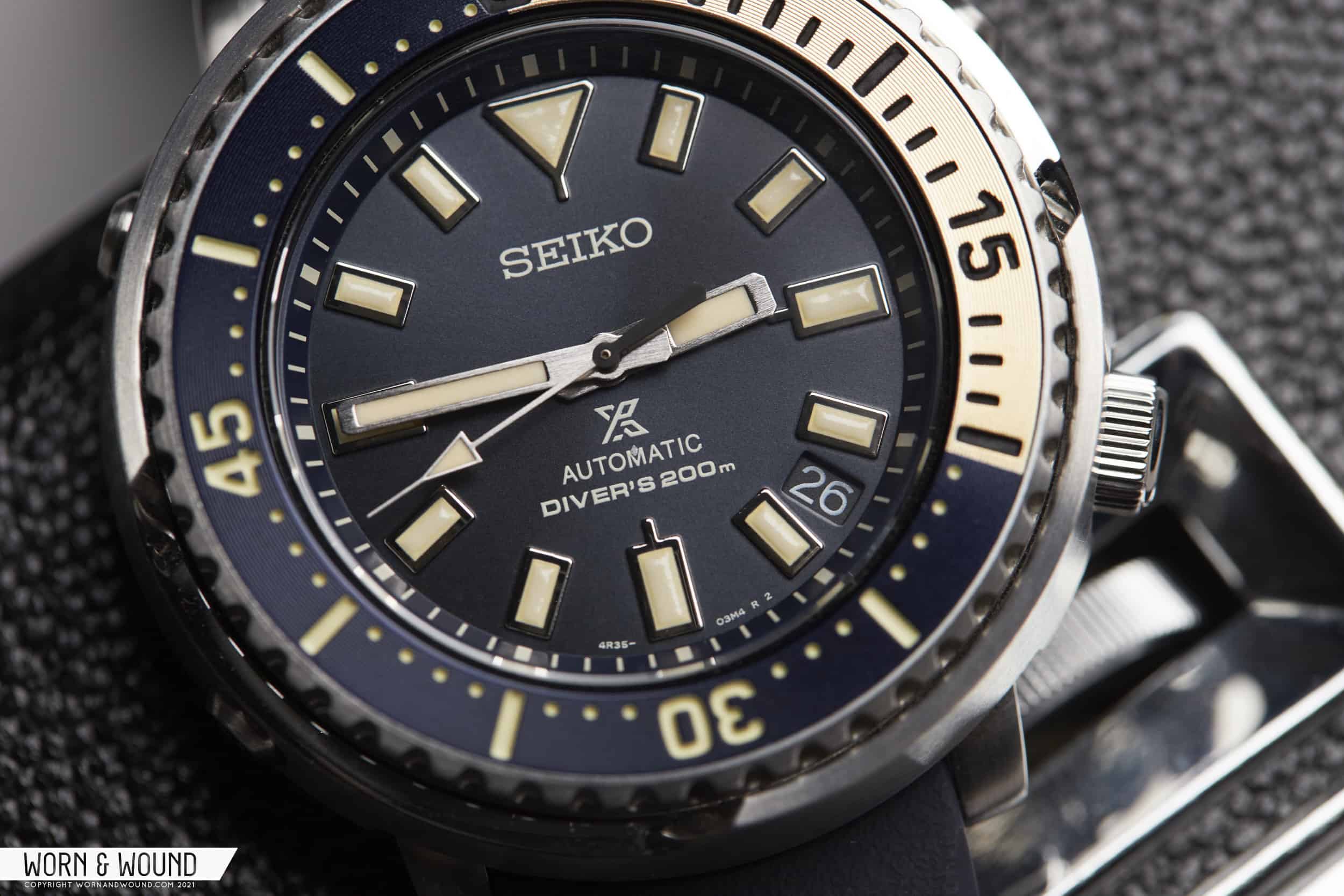
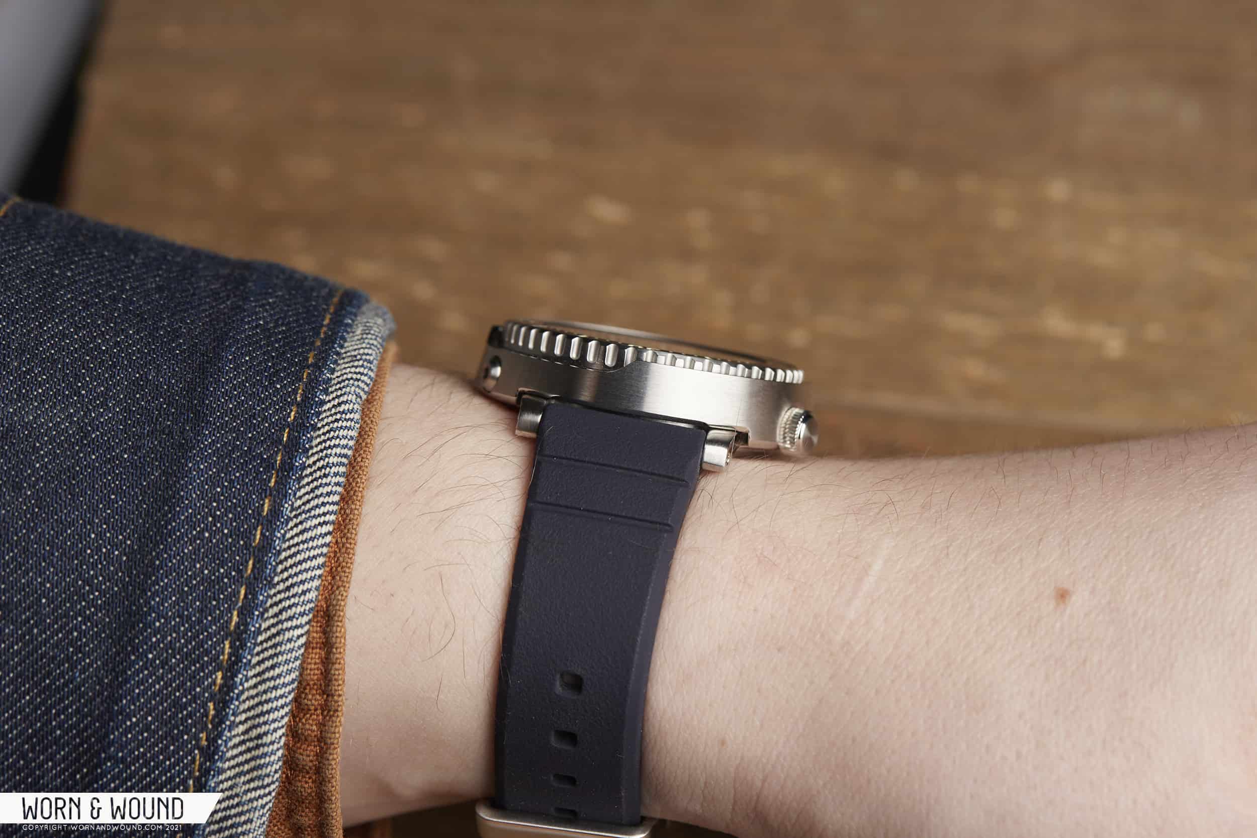
Part of the undeniable appeal of a classic dive watch is that it can be dressed up or down to suit the occasion. Kicking it on the porch with a beer on a summer’s day? A well-worn diver on a pale canvas strap is the perfect companion. Have a presentation at work (don’t tell me you aren’t still wearing a nice watch during Zoom meetings)? A diver on a bracelet says “I’m serious about this, but also a fun guy when the day is over.” They are versatile, effortless, and, simply put – stylish. Well, except maybe for Seiko Tunas.

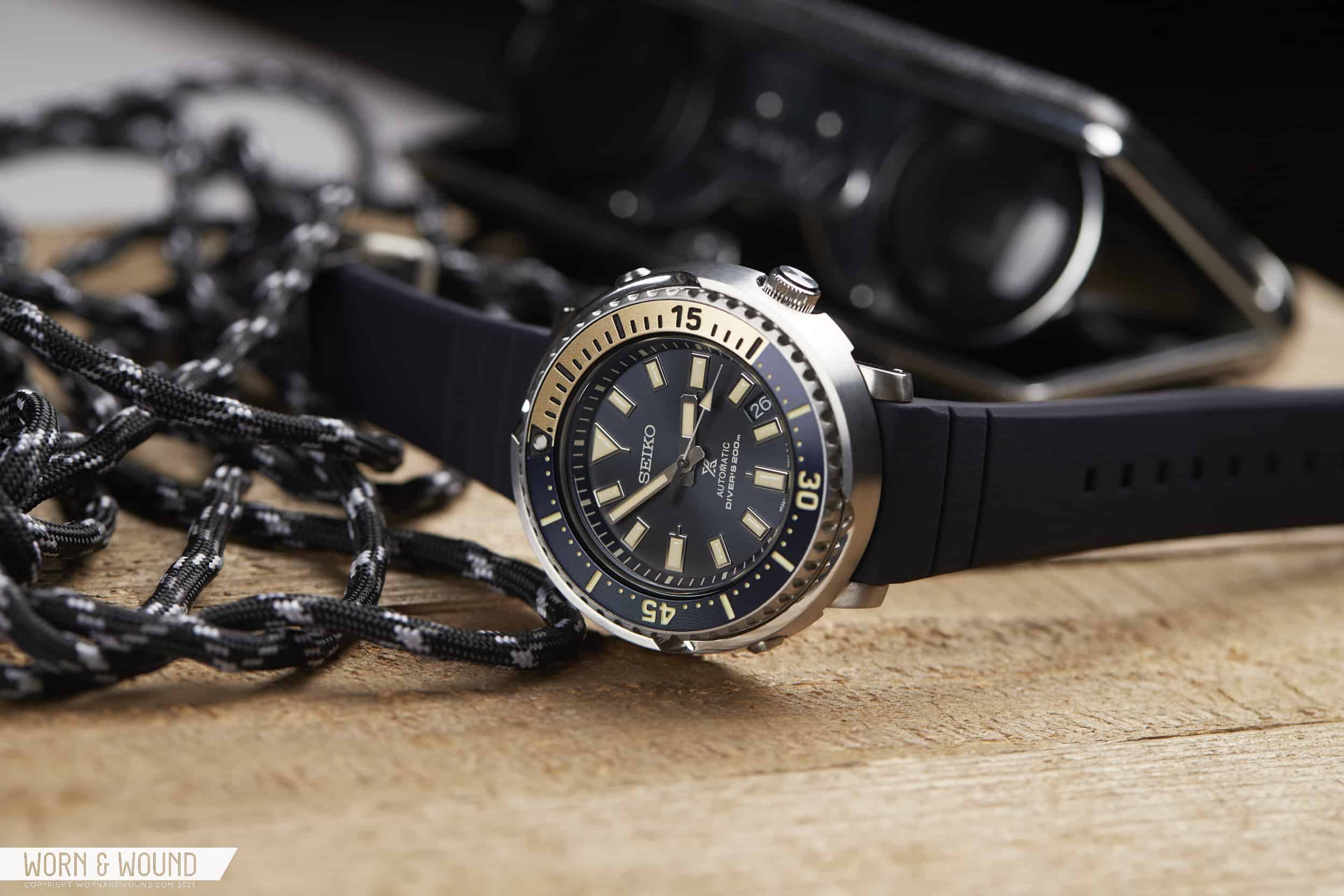
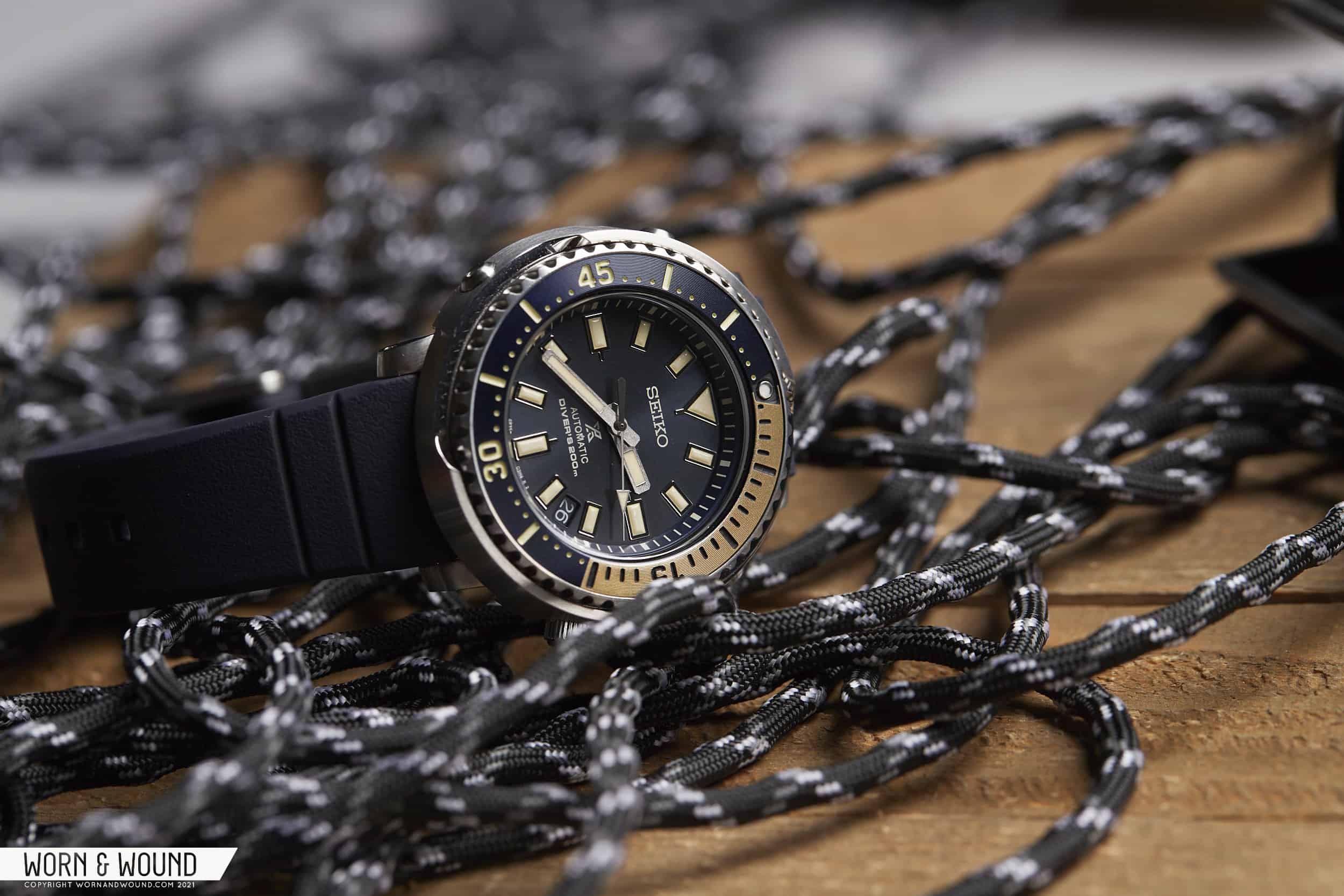
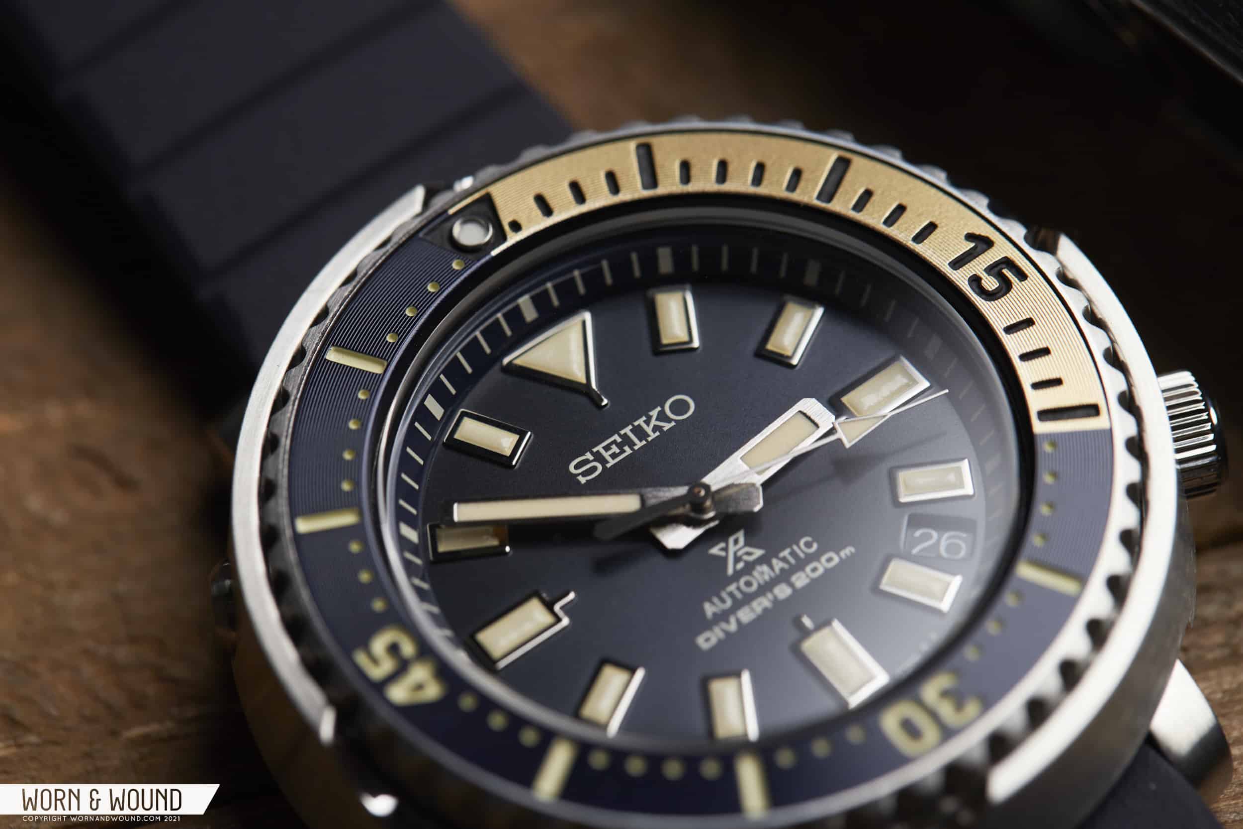
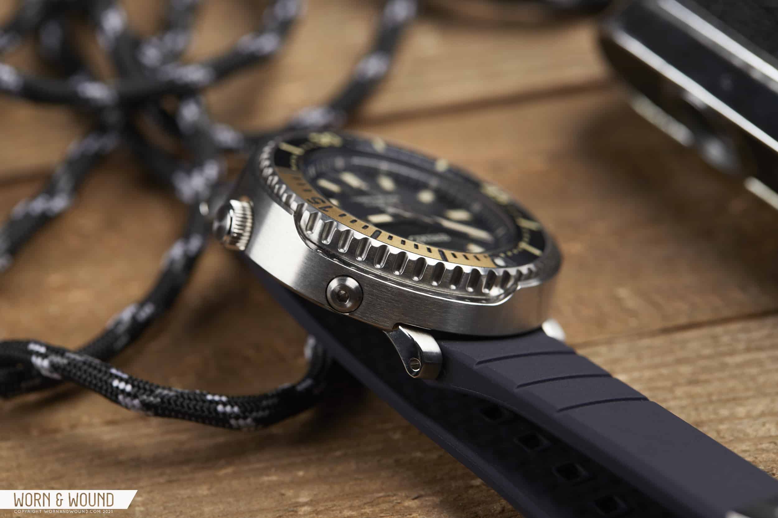
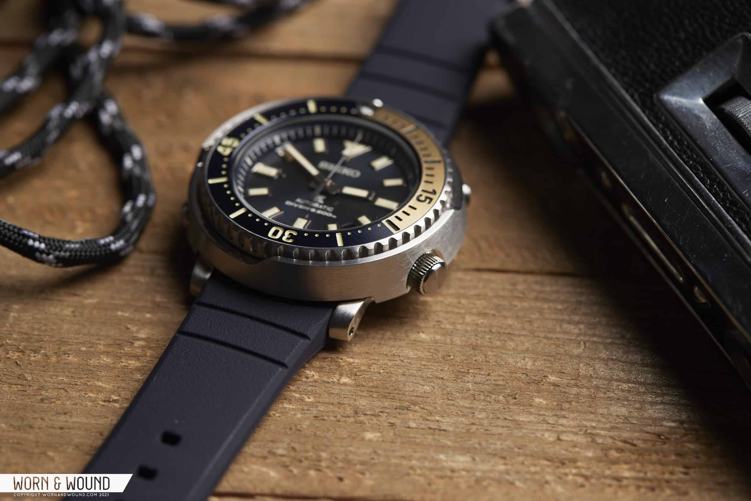
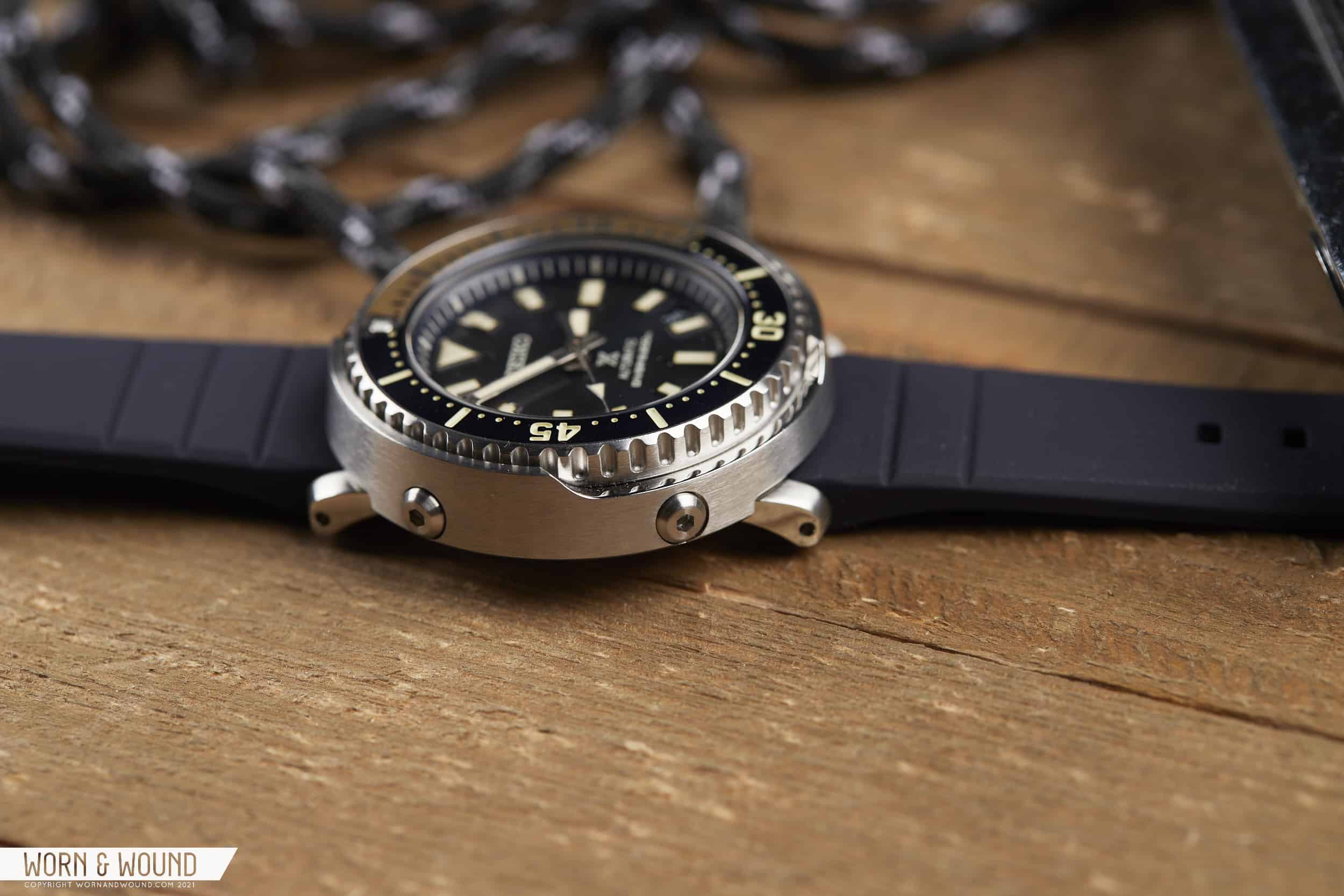
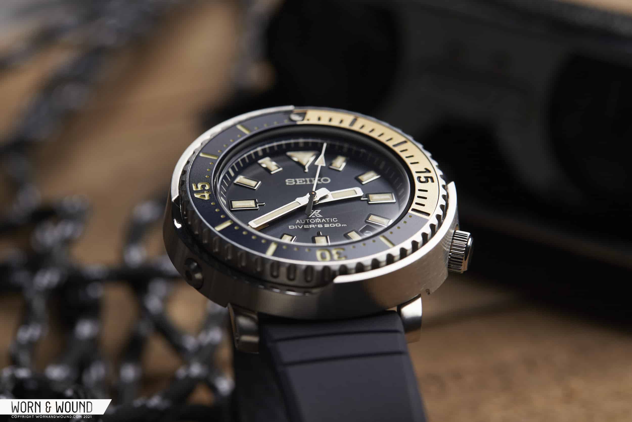
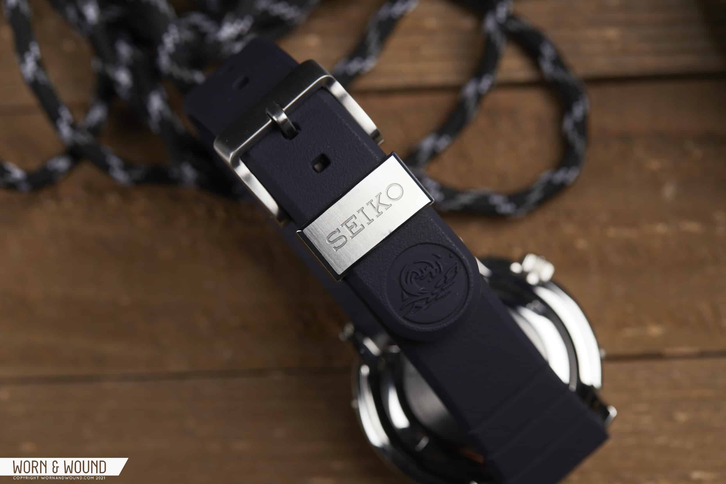
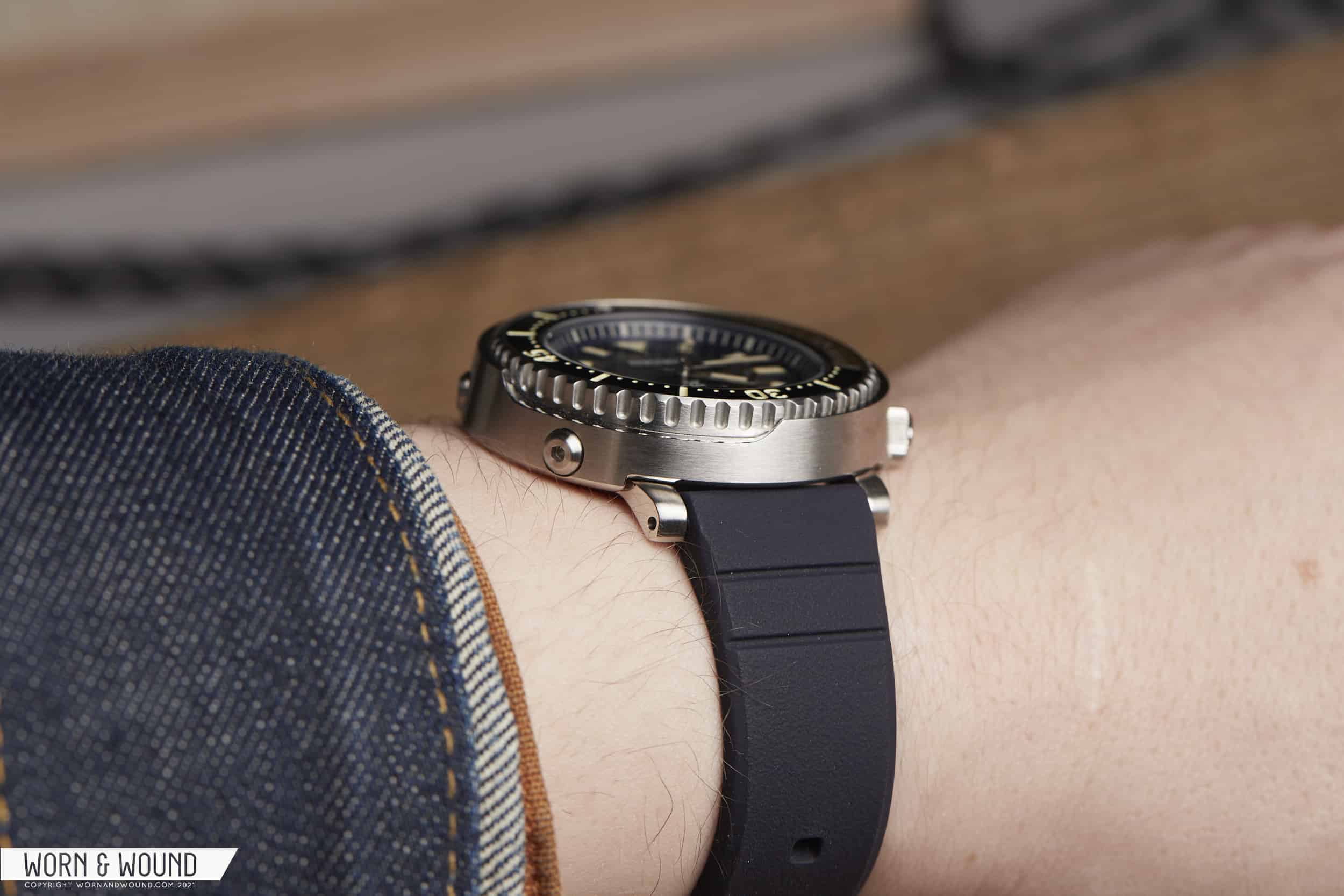
That’s not to deride these exceptional feats of engineering, rather to celebrate the fact that the various incarnations of Tunas starting in the 1970s were designed for, and actually in response to, the needs of professionals. Shrouded in armor, capable of diving to incredible depths, able to release helium without an extra valve for saturation divers; they were true tools for a purpose. Their wide, cylindrical designs bore no resemblance to typical dive watch designs, earning them their equally famous nick-name, while also making them appear more like equipment than a timepiece. And while perhaps not traditionally stylish, they have that kind of unintentional charm that only comes from a genuine disregard for aesthetics.

The Seiko Prospex SRPF81K1

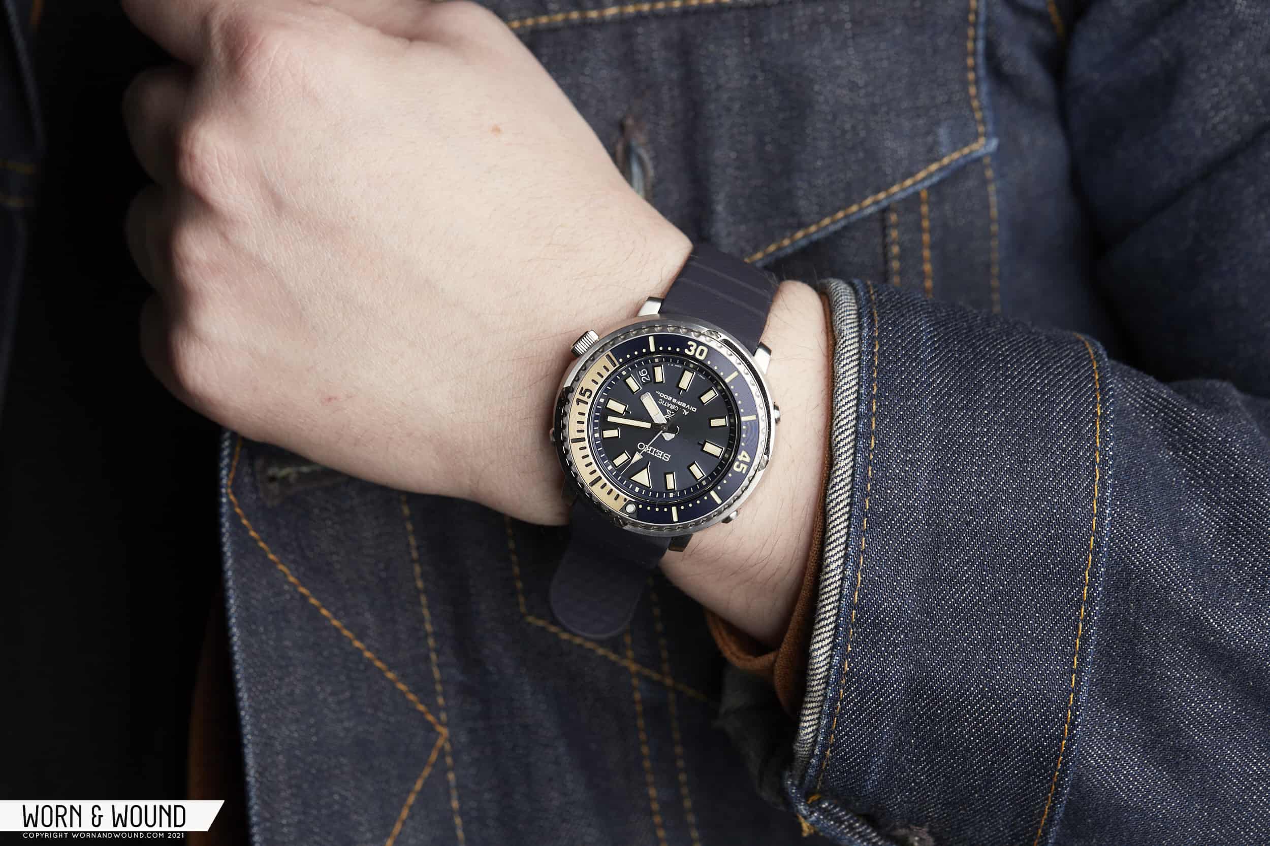
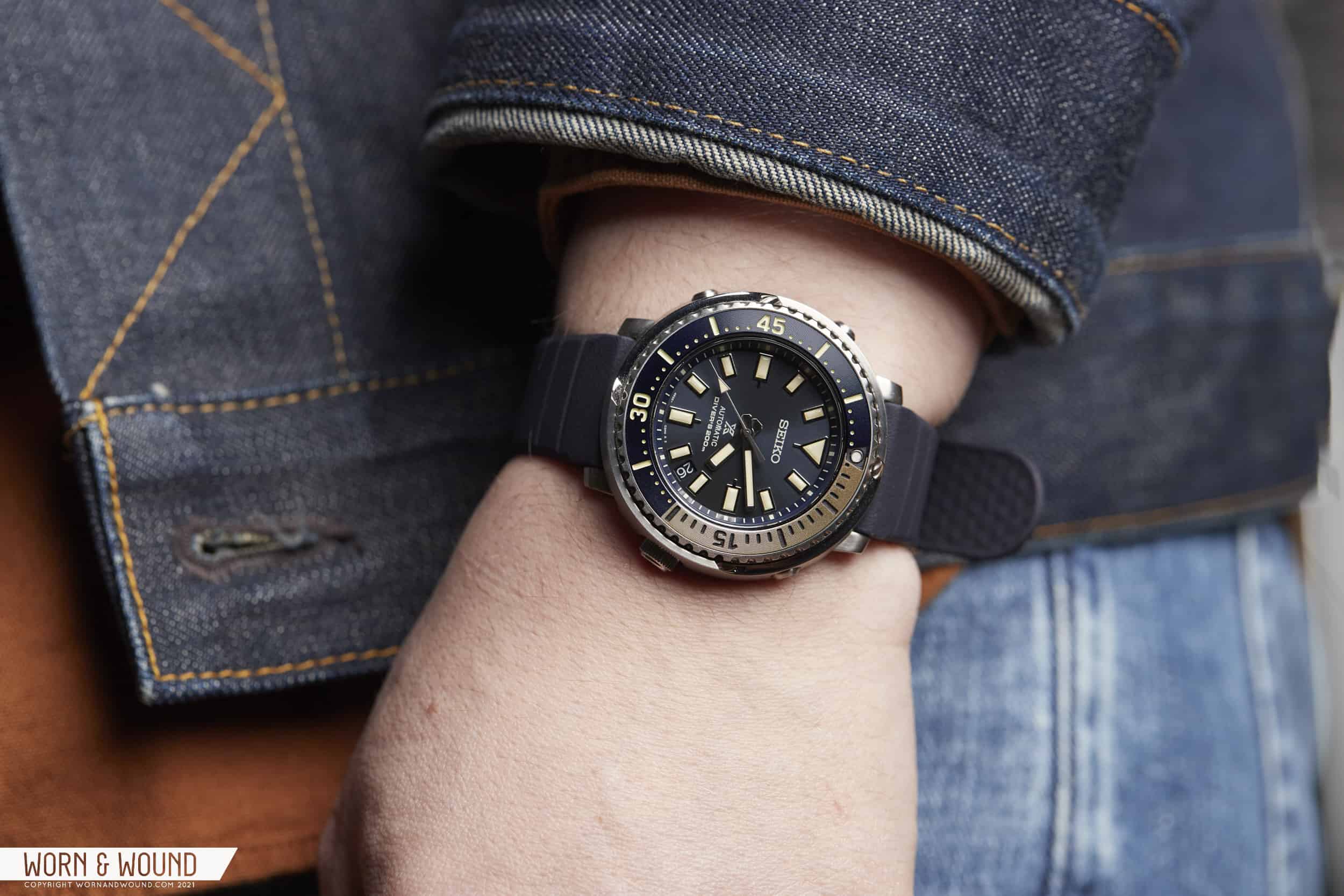
Over the years, there have been countless versions of the Tuna and other shrouded-case divers by Seiko, from Arnies to solar models and even digital takes on the format, with the most famous earning secondary nick-names, such as “Emperor,” “Golden,” and “Darth.” Often north of 45mm, and even up to 52mm, while there have been various case materials and movements at play, they were always massive unrepentant tool watches. Until recently, that is.

Advertisement
$600

Hands-On: The Seiko Prospex SRPF81K1 Tuna

Case
Stainless Steel
Movement
4R35
Dial
Dark Blue
Lume
Lumibrite
Lens
Hardlex
Strap
Silicone
Water Resistance
200m
Dimensions
43.2 x 44mm
Thickness
12.6mm
Lug Width
20mm
Crown
Screw-down
Warranty
Yes
Price
$600

The nickname “Baby Tuna” seems to have been in use for some time, though earlier versions were still in the 47mm range, and looked more like “Monsters” to my eyes, but starting in 2020 Seiko began to make Tunas with truly smaller dimensions, yet all the rugged heft and solidity of their larger counterparts. Packed with the tried-and-true 4R automatic movement, these were both affordable and wearable versions. In photos off-wrist, you’d never know they measured 43.2 x 44 x 12.6mm, which in Tuna-terms is tiny. Yet, on the wrist, these scaled-down Tunatini are wildly different from their ancestors.

New size, new style

The first to hit the shelves were the SRPE29 and 31, which were part of the “Urban Safari” series. Perhaps overshadowed by the wildly successful SafArnie models that were launched at the same time, these monochromatic, drab Tunas took the famed watch to a new scale, with a decidedly sexier aesthetic inspired by land. Unfortunately, those watches appear to not be available in the US, which leads us to the subject of today’s review, the SRPF81K1, aka the Forbidden Tuna. Nicknamed as such by Worn & Wound’s Managing Editor, and owner of the watch Blake Buettner, due to the fact that this model, its green sibling the SRPF83K1, and its aforementioned predecessors, are not available to those of us in the US of A.

Yet, here I am with the watch strapped to my wrist, going to show that where there’s a watch enthusiast, there’s a way (it’s called the internet). Anyway, the SRPF81K1 (81 from here out) is an all-together stylized take on the Tuna in a gorgeous deep blue and champagne gold colorway. Another variation on the safari theme, this one is far more dressed up, with the mix of metallic navy and pale gold tones coming across almost elegant. Which, in the setting of a Tuna seems counterintuitive, yet succeeds quite nicely.

Nice bezel texture

The bezel, in particular, shines as Seiko in recent years has found little ways to make even their more affordable watches look a touch higher end, in this instance by applying a concentric graining to the presumably aluminum insert. The texture, though subtle, elevates it, adding a more concentrated metallic sheen. Seiko also simplified the markings for these smaller models, going with numerals only at 15, 30, and 45, with long dashes and small dots in between, and the first 20 minutes highlighted in champagne tone. There is a caveat, however. The line dividing the blue and champagne region that bisects the origin marker is not centered. Yes, this makes the bezel insert look misaligned. Sigh.

The dial is then tightly packed and features a design more in line with other contemporary Seikos than its fishy forefathers. The dark, desaturated sunburst blue dial features large cream-toned lume filled markers with a triangle at 12 and rectangles for the rest, getting larger at the cardinal points. These markers also feature little legs pointing towards the center of the dial creating a subtle crosshair effect I love, and are also a nod to the “Grandfather” Tuna, which featured similar lines. A steeply angled chapter ring keeps everything contained and adds an appealing tension to the dial.

A very handsome watch

Nestled between four and five is a date window that fits the space nicely. Clearly something we’re going to have to get used to on new Seiko divers, the 4.5 date window seems to be troublesome as it breaks the watch’s symmetry, though it does allow for a full set of markers, which I personally like. On this model, I think it’s particularly inoffensive as Seiko maximized the size of the applied markers, which dominate the space. It’s also worth noting that the day is gone as well, which was present on the previous Urban Safari models, as they switched from the 4R36 to the 4R35.

The signature shroud
Small lugs and a protected crown
Large screws

Over the years, Seiko has tried a few handsets on Tuna models, and I think they’ve finally nailed it, at least for these smaller models. The hour and minute hands are straight blocks in brushed metal with rounded edges. The hour is a bit wider, but shorter, as expected, making distinguishing between them very easy. The seconds is then a stick with a lume filled triangle and a black counterweight. Simple, easy to read, and not distracting.

The case is everything you want from a Tuna, just smaller. As a longtime fan of the Tuna, but never an owner due to their size, I find this model just right. Steel on steel, the tapering shroud is brushed all around, save the two cutouts that allow access to the bezel edge, which are polished, adding a touch of contrast. The three allen-head screws that stud the sides like little bumpers are a favorite detail, and something I’m glad to see on this model, where perhaps a more subtle solution might have been used. As is, they are quite large, coming off as pushers. The crown at just-before-four balances them out. Lastly, tiny little lugs jut out from underneath allowing for easy strap connection.

A complex construction

Where as most cases are composed of just a few pieces, the Tuna truly feels like a construction or assembly. As such, it hits differently, as they say, very much feeling like a tool in the true sense. What it might lack in traditional dive watch panache, it more than makes up for by being truly different. You’re simply not going to find another watch like a Tuna. It’s the dive watch amongst your dive watches.

Seiko has come a long way with their rubber straps, and the one found on the 81 proves it. A beautiful, soft 20mm silicone in dark blue, it’s as nice as the strap that came on the SPB149. Sure, the metal keeper is not as fancy, nor is the buckle, but the strap is beautifully molded with a chamfer along the edge, a subtle texture to the top surface, and a more pronounced pebbling underneath. And like the one on the 149, it features metal sleeves for the spring bars, allowing for easier installation and a better motion at the lugs. Consider me impressed.

Seiko’s Superior Silicone Straps

But where the 81, and I imagine the other new “Baby” Tunas, truly impress is on the wrist. It’s almost shocking to say, but it wears pretty effortlessly and feels downright small. Even the large Tunas wear better than expected, so at 43mm in diameter and barely any longer lug-to-lug, this version is a straight-up delight. And don’t let the numbers fool you, the watch is only 43mm at the widest point of the shroud, but it reads much smaller. Furthermore, the thickness is deceiving (though 12.6mm is still a very acceptable number), as the watch looks like it ends at the bottom of the shroud, which would make it closer to 10mm.

This leads me to my proposal for the new nickname for this sub-genre of 4R-series, scaled-down Tunas – (drum roll) – the Everyday Tuna. “Baby” or “Mini” are, well, never great, and to me, what the rescaling of this watch has done has turned the Tuna from perhaps an oddity in your collection – that beastly, conversation-starting tool watch you break out on occasion but isn’t your go-to (though kudos to you and your large forearms if you do) – to a daily-wear. Sure, it still might not be as visually versatile as a classically styled diver, but at this size, it’s just as easy and comfortable to wear.

Advertisement
The Everyday Tuna – comfortable for all day wear
Wears thinner than expected
The bezel is still easy to use

As for the SRPF81K1 and 83, forbidden to you or not, Seiko has managed to dress up these by-definition-gnarly watches about as much as possible, creating versions that will likely please even the most stubborn of Tuna holdouts. In other words, they are pretty great. No complaints here. Between the build, the size, the design, they are just solid, good-looking watches that are truly “Seiko”. And they are in the neighborhood of $600, making them well-priced for automatic Tunas, if not on the high-side for a 4R. With that said, what I’m waiting for Seiko to release is the true Everyday Tuna: black dial and bezel with white/faintly green lume in this same case. Traditional, perhaps a touch boring, but the kind of watch all of us Seiko fans will likely have to pick up. Seiko Prospex

Images from this post:
Related Reviews
Zach is the Co-Founder and Executive Editor of Worn & Wound. Before diving headfirst into the world of watches, he spent his days as a product and graphic designer. Zach views watches as the perfect synergy of 2D and 3D design: the place where form, function, fashion and mechanical wonderment come together.
wornandwound zsw