Impressions
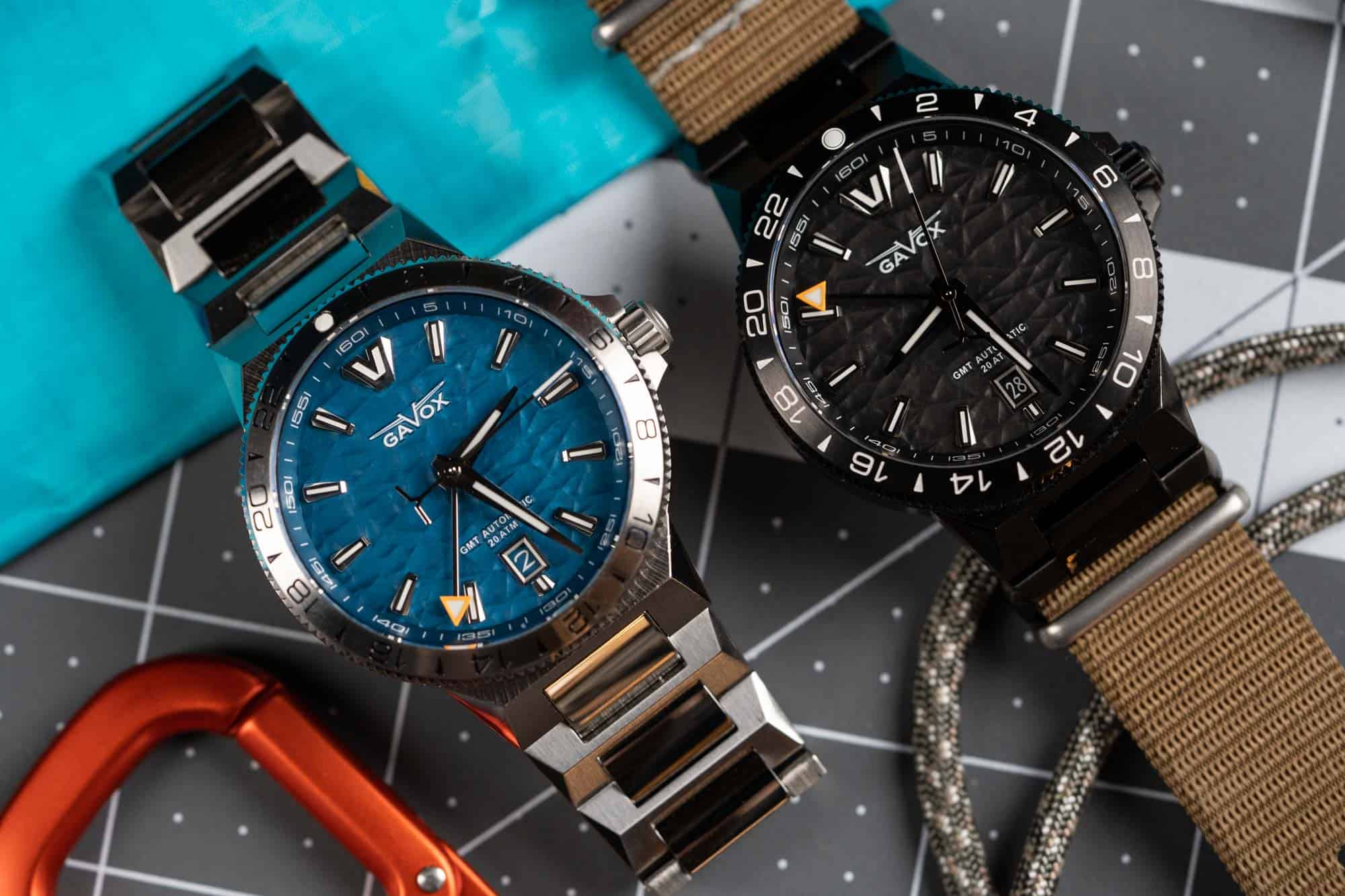
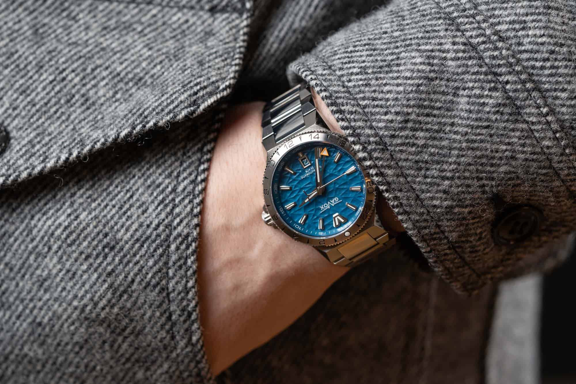
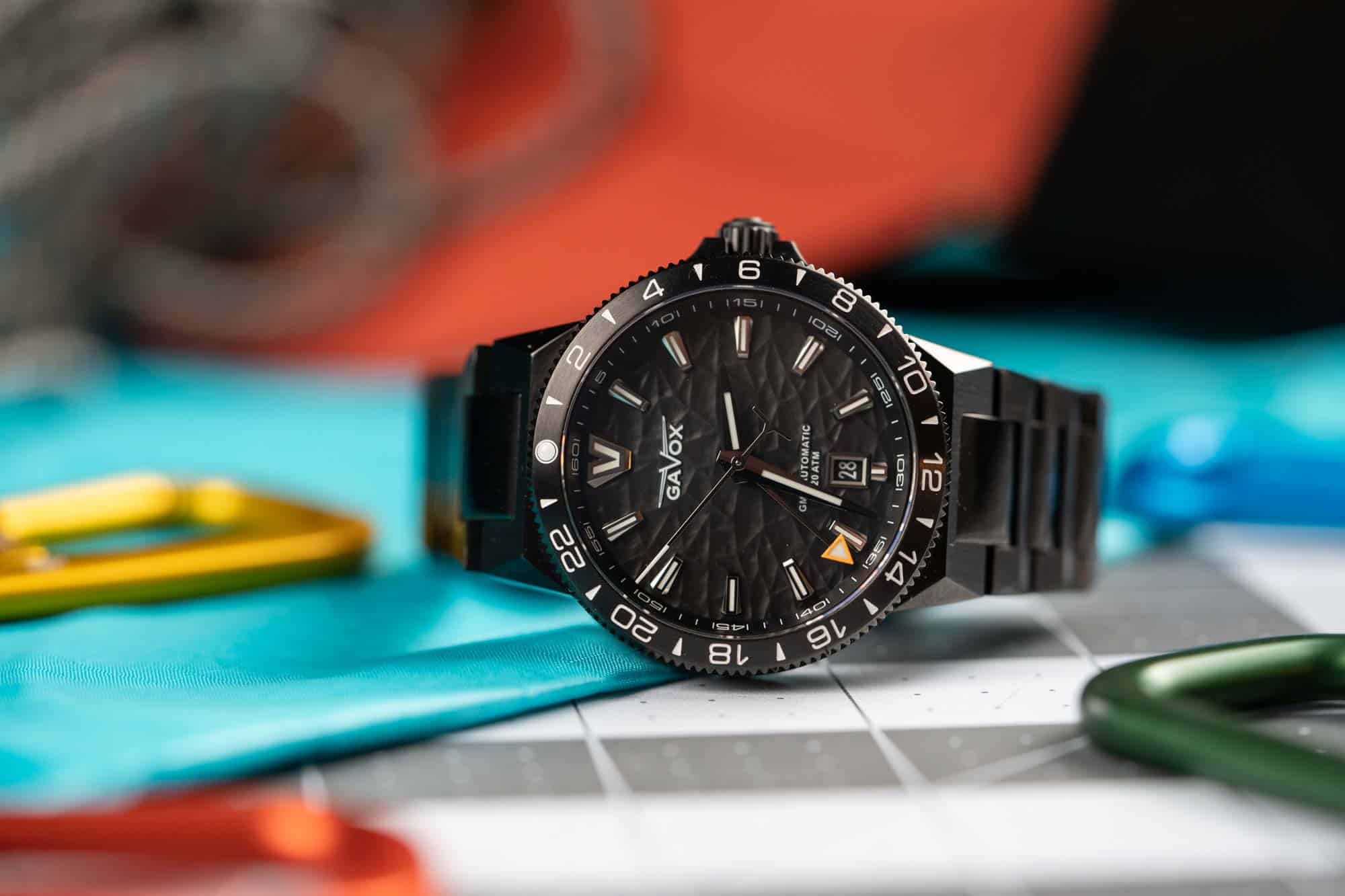
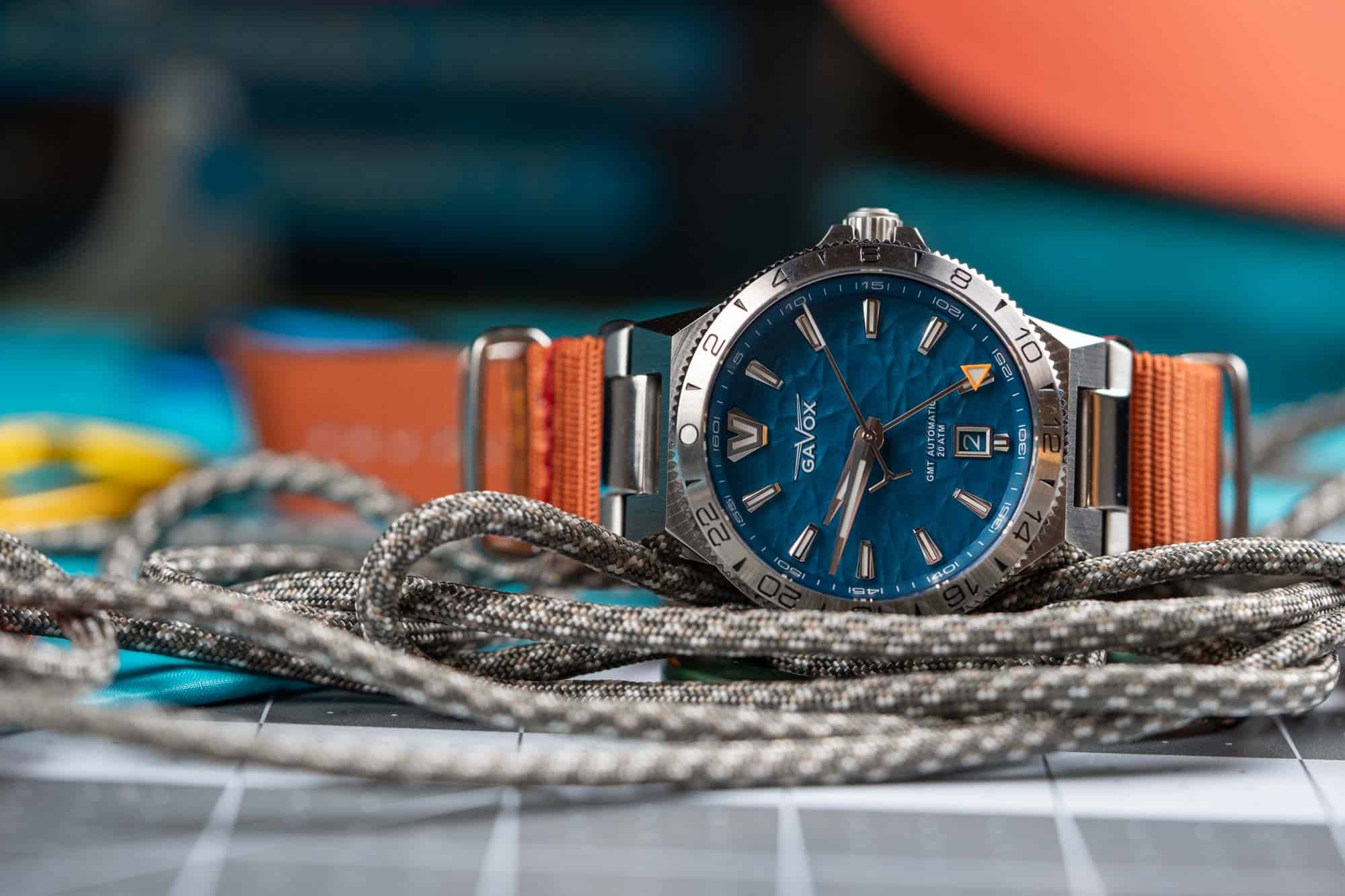
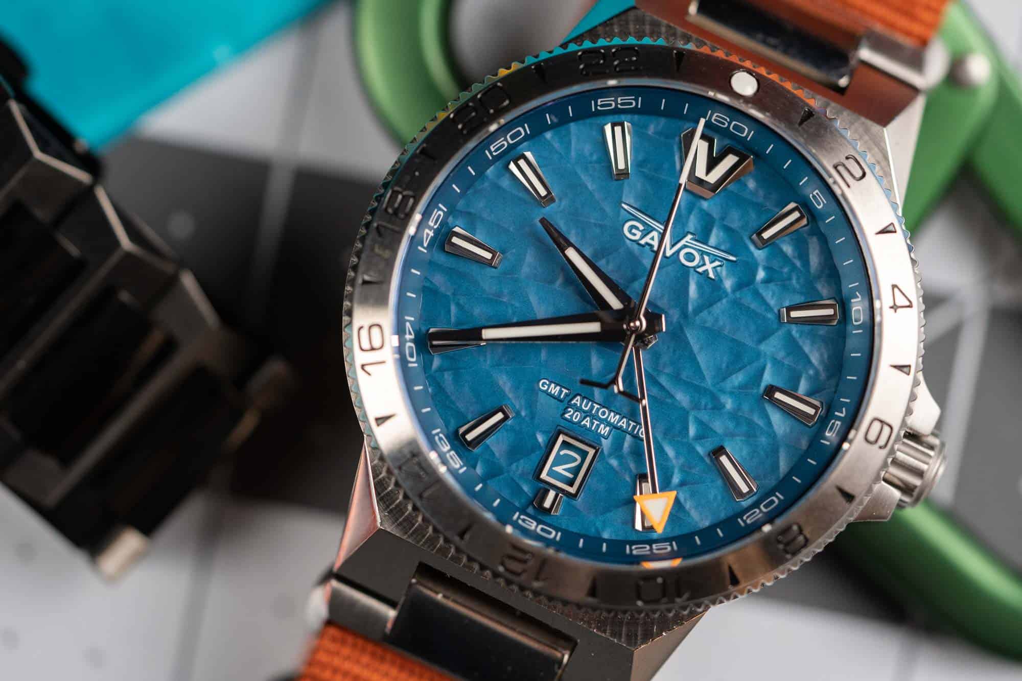
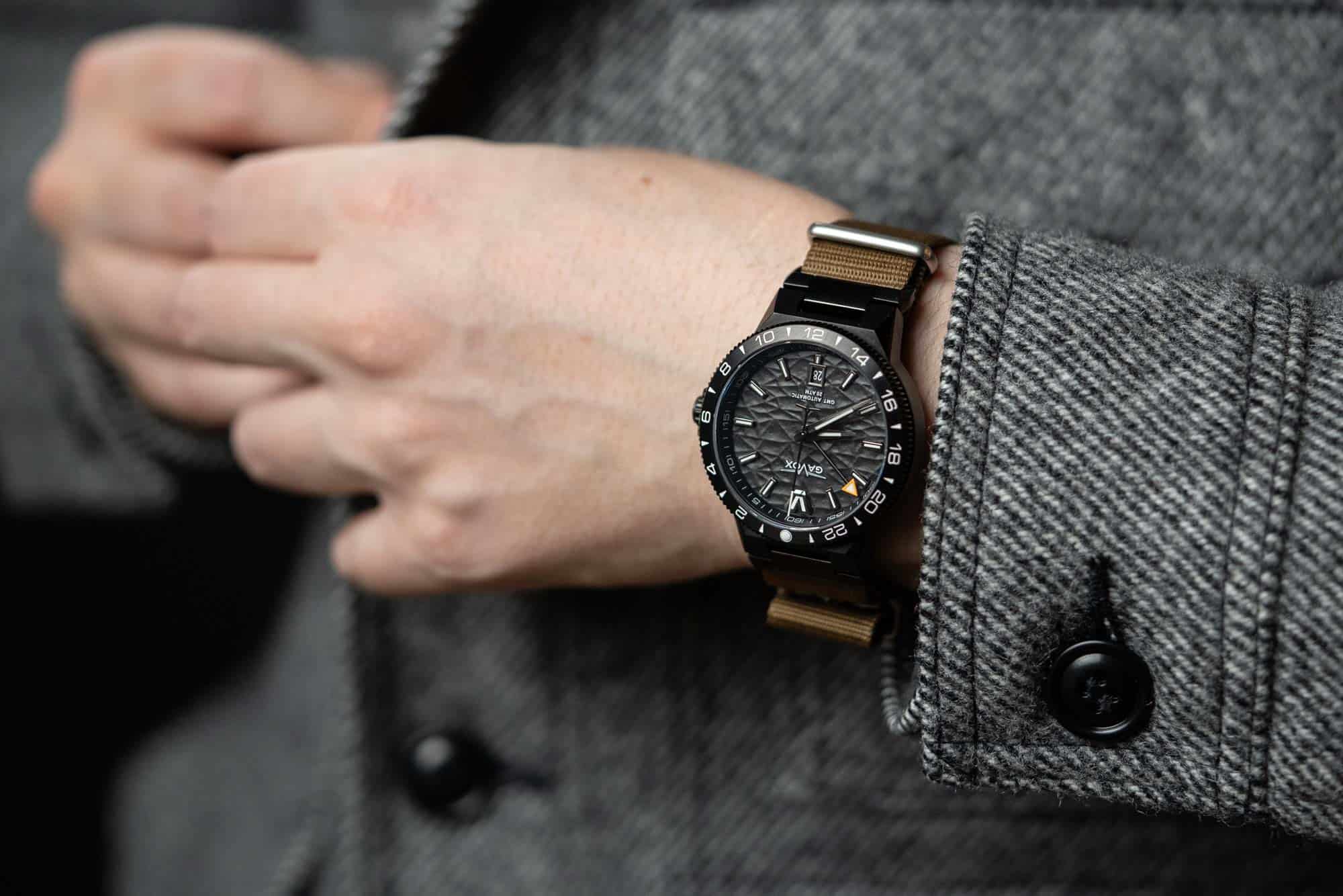
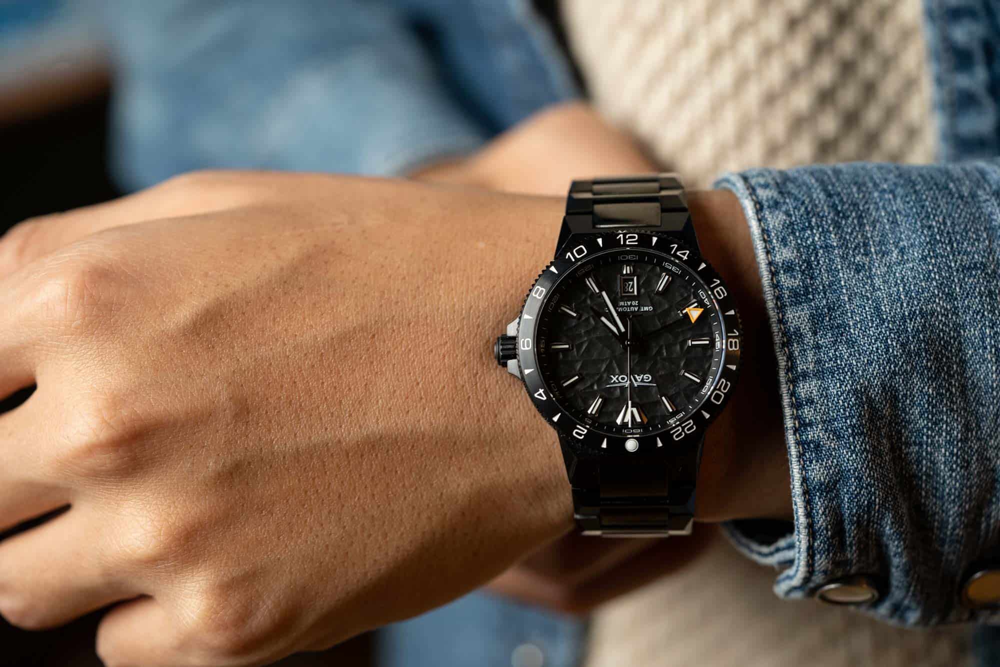
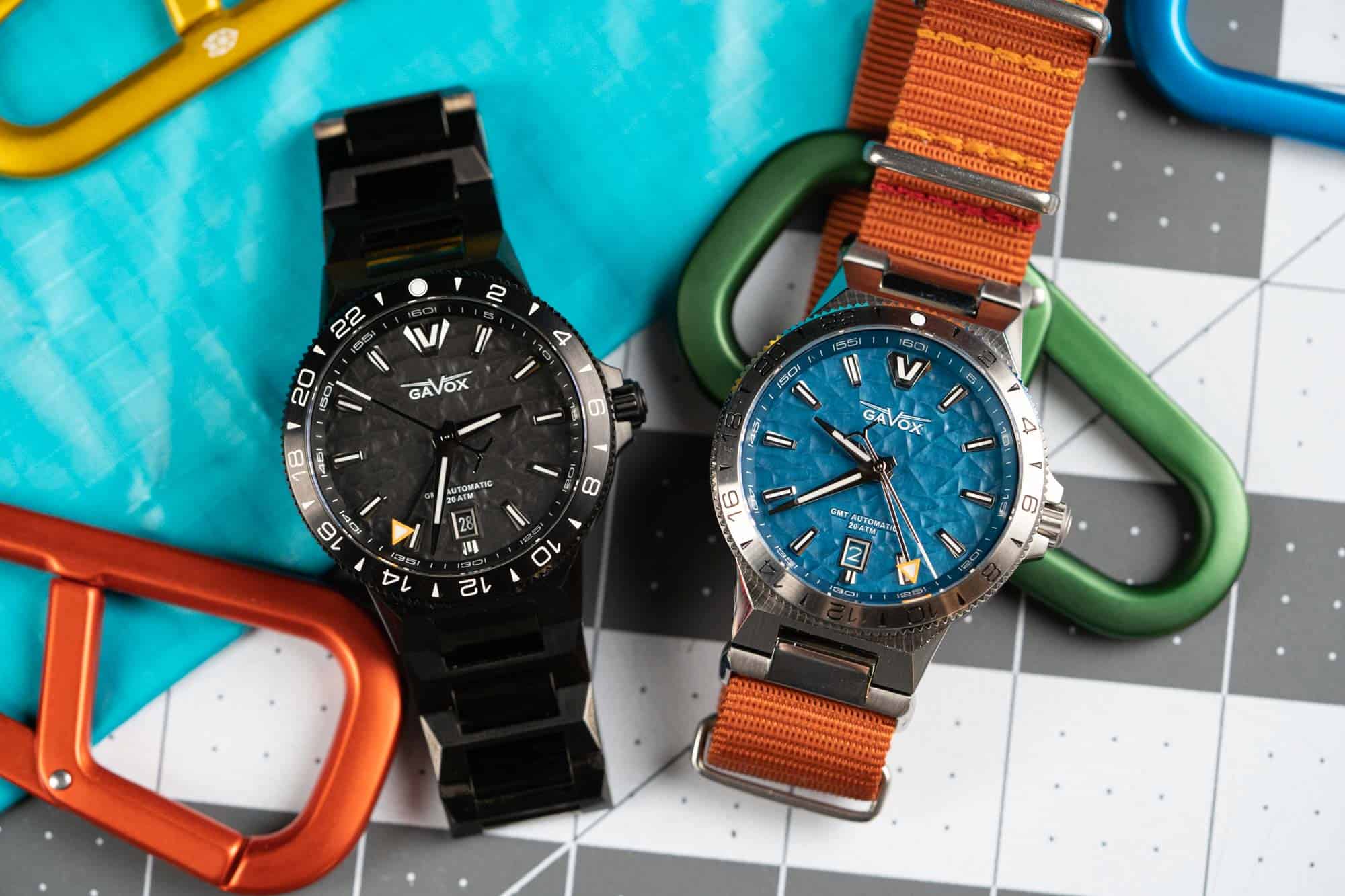
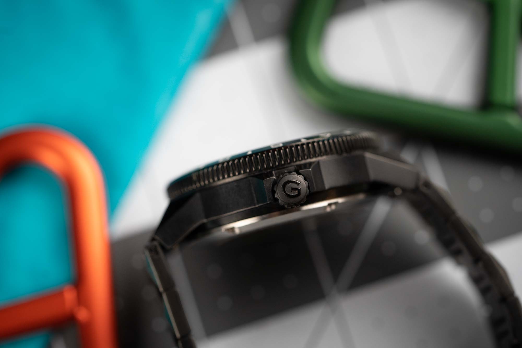
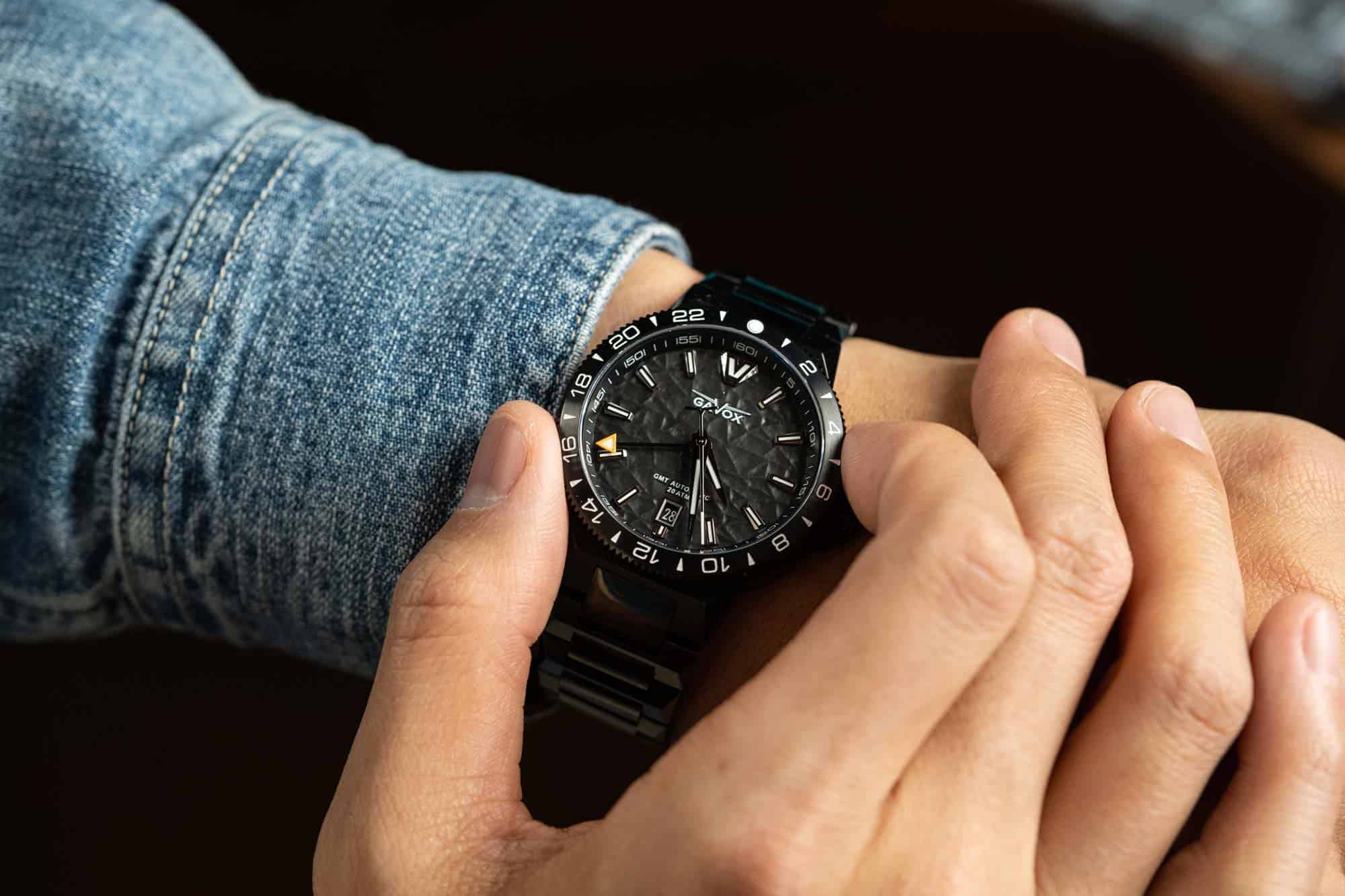
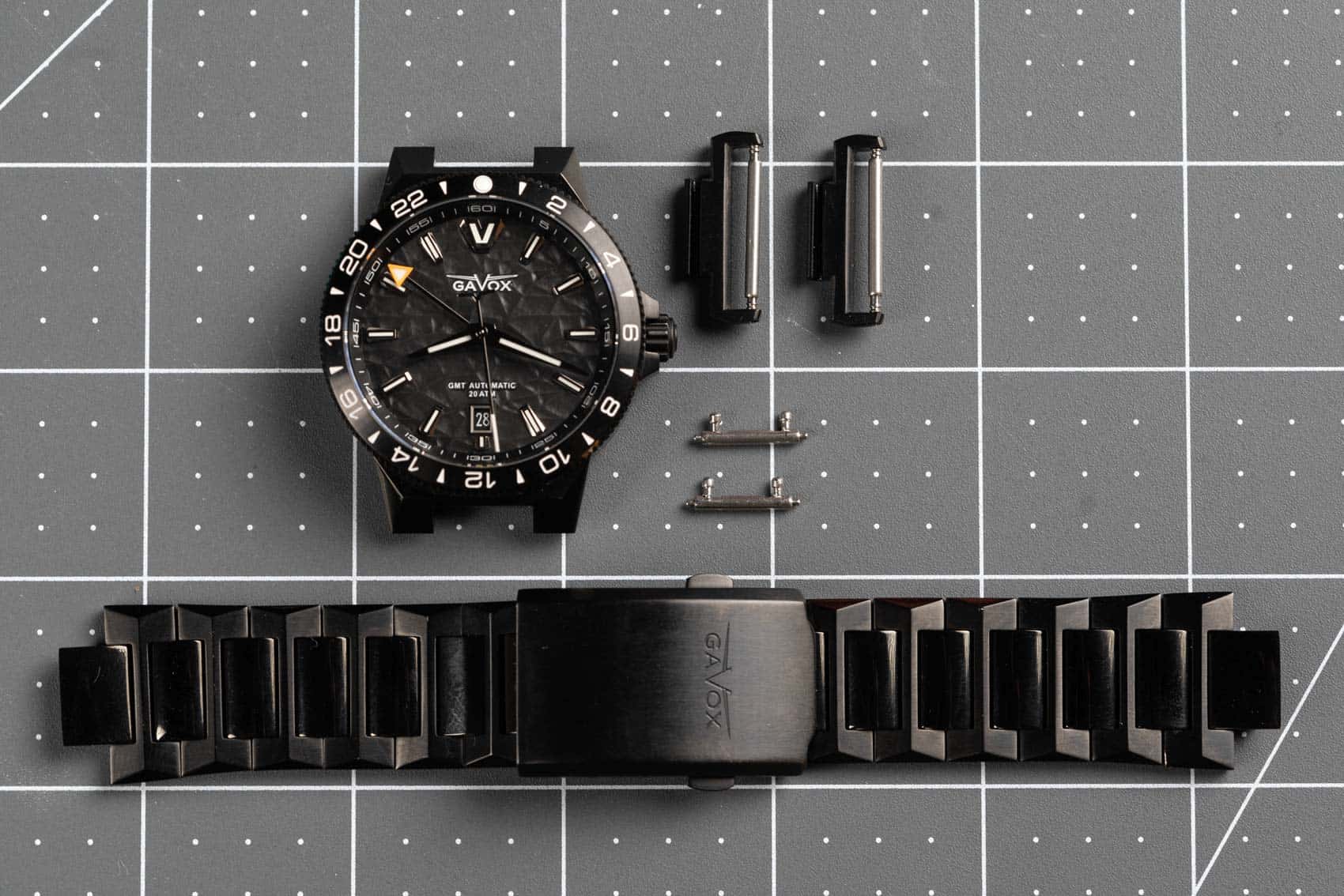
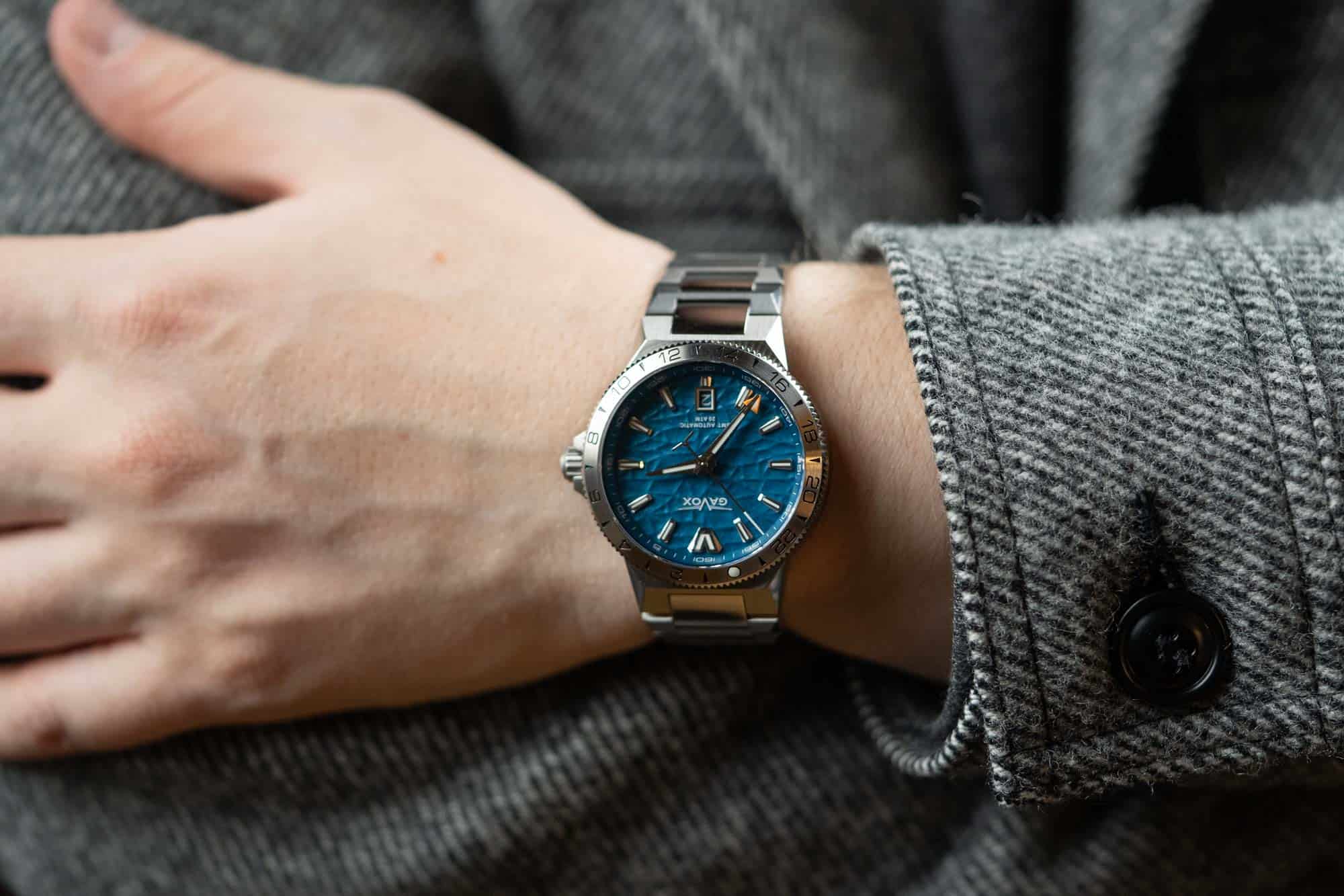
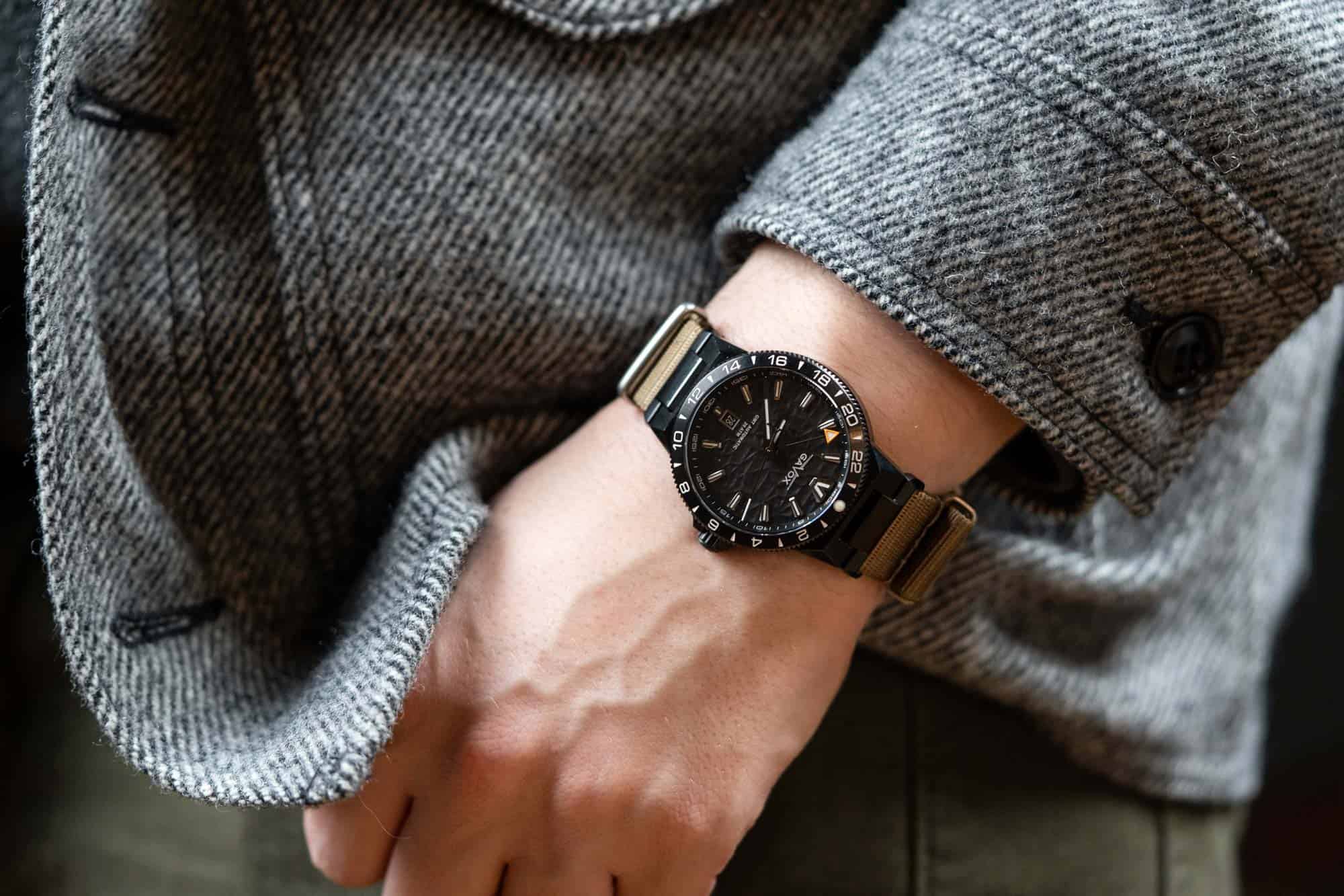
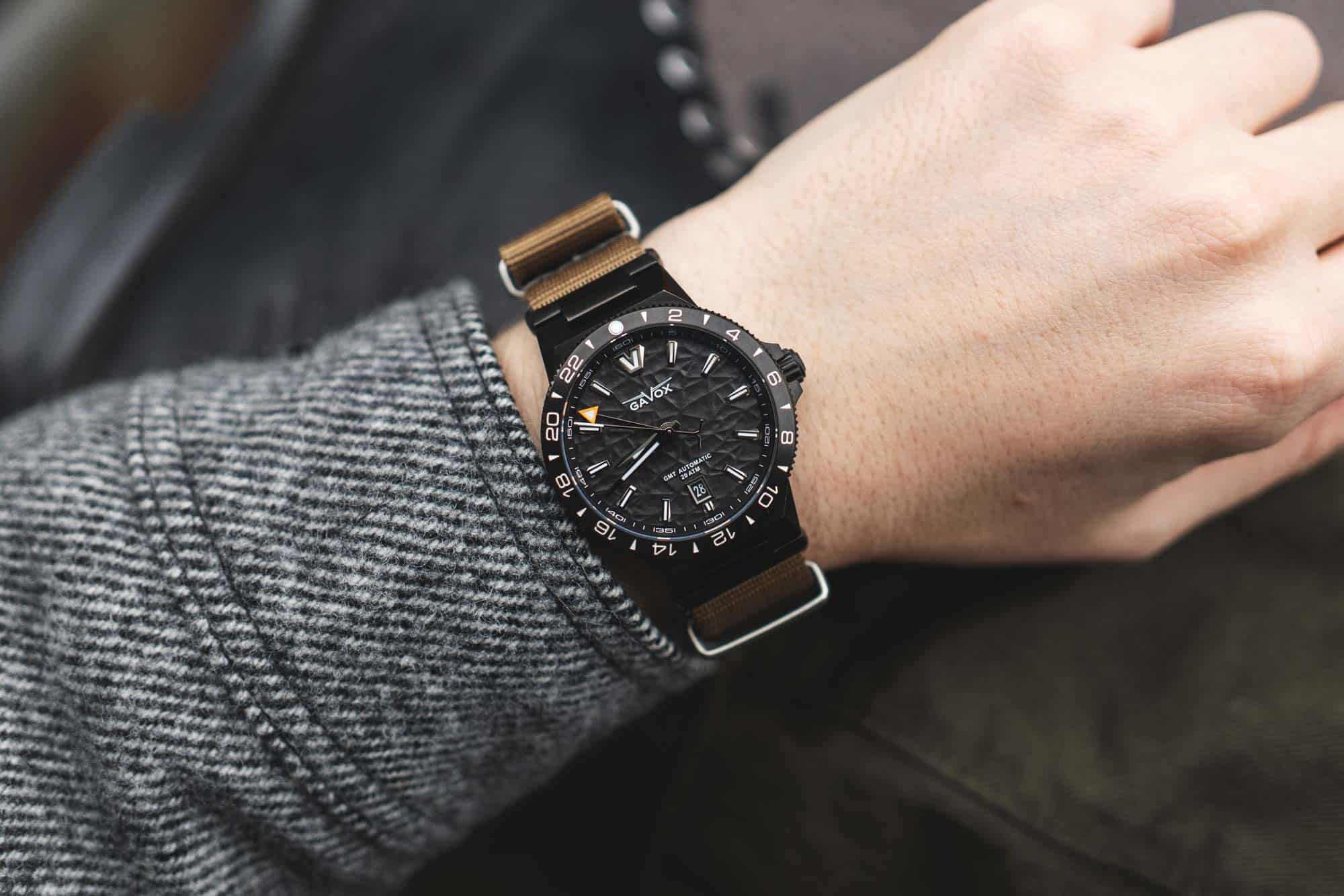
The Longitude is an appealingly different watch. At a glance, the overall package might speak to various concepts and watches from the past (admittedly, most watches do), and yet there is a novelty to the design up close. The 39mm cylindrical body puts a visual emphasis on the rotating bezel, which has a vaguely Explorer II appearance from the alternating numerals and triangles, yet feels more aggressive. The Rolex similarities quickly end there (and to be clear, are not an issue), as traditional lugs are replaced with a faceted appendage that transitions from the case to the bracelet.
There is a bit of a contrast in the style of the case and the bracelet that works in the watches’ favor. The case is simple, compact, and a bit mid-century. The bracelet is harsh, angular, aggressive, and contemporary. Had the aggressive design of the bracelet been pulled into the case it would have been too much or looked like it was trying too hard to stand out. Had the simpler, mid-century style of the case been dominant, it might have been boring. As is, it’s balanced.
![]()
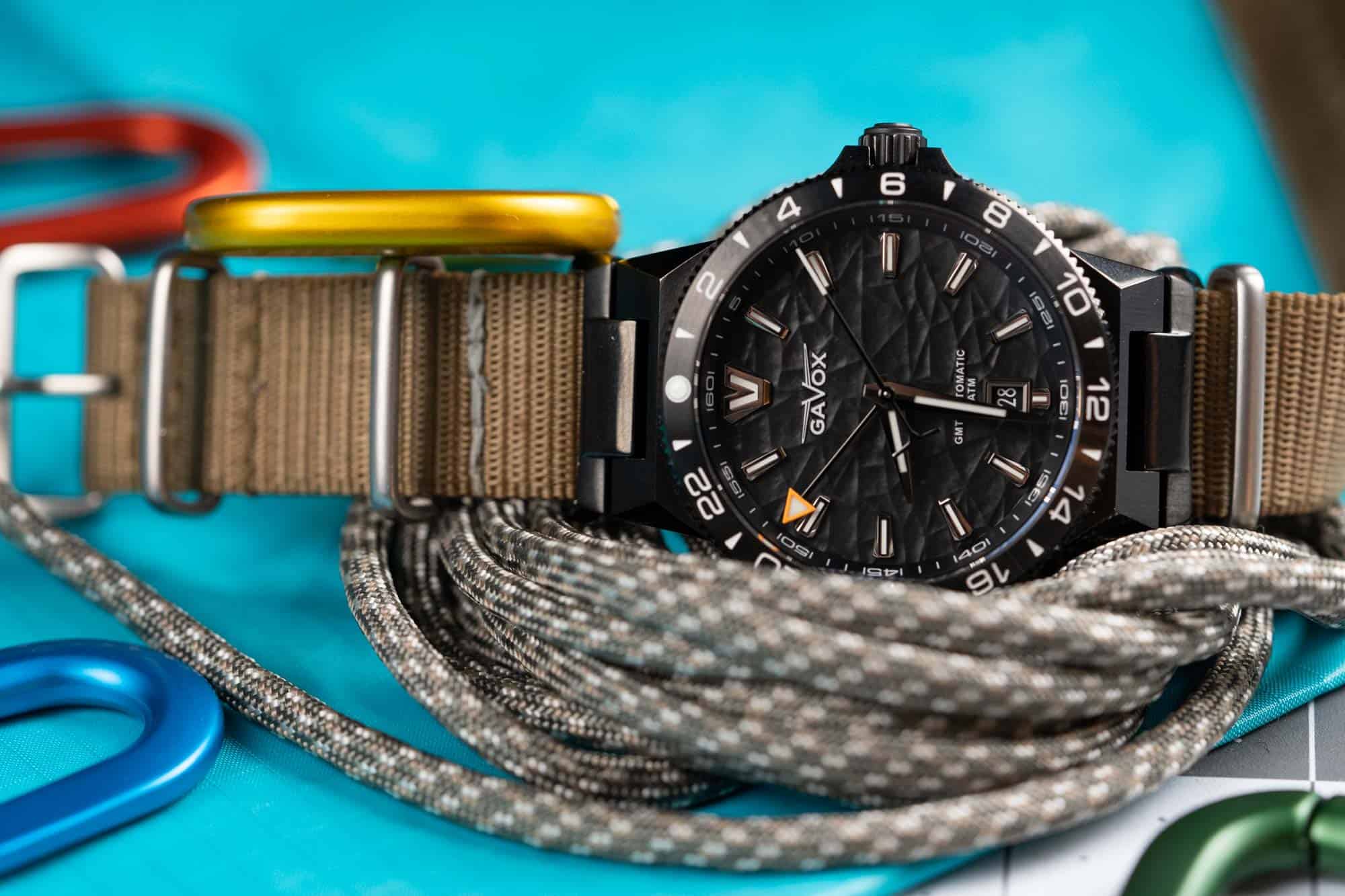
Of course, this is also to offset the heavily textured dial. Consisting of two parts and applied markers, the dial features a seemingly random motif of – well – you take your pick. Sometimes I think it looks like choppy water seen from above. Other times, it appears like chiseled stone. Yet others, fractured ice. No matter what you see, it’s a pronounced, organic but harsh texture that covers everything but the chapter ring. Whether or not the rise of Grand Seiko can account for the increased use of texture in new watches is up for debate, but regardless of the inspiration, I’m happy to see it here as it adds a different dimension to the watch.
The attention to detailing is carried to the markers and hands as well. Each marker has many facets, a mix of finishing, and lume fill. The dauphine hour and minute hands feature a play in finishing that gives them a sense of volume they don’t actually have, playing off of the markers. A steep chapter ring further adds depth to the dial. All in all, it’s quite impressive and engaging.
![]()
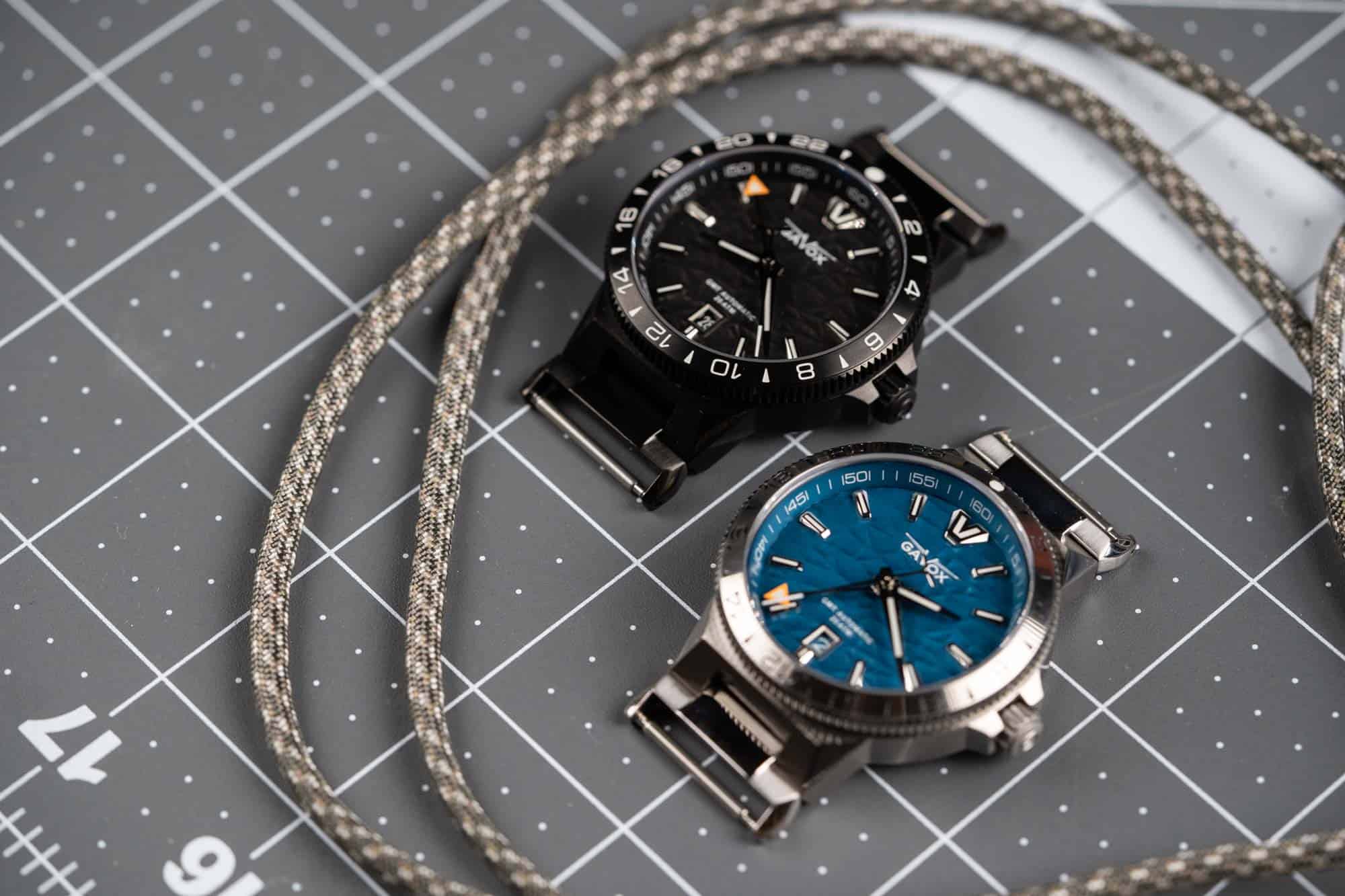
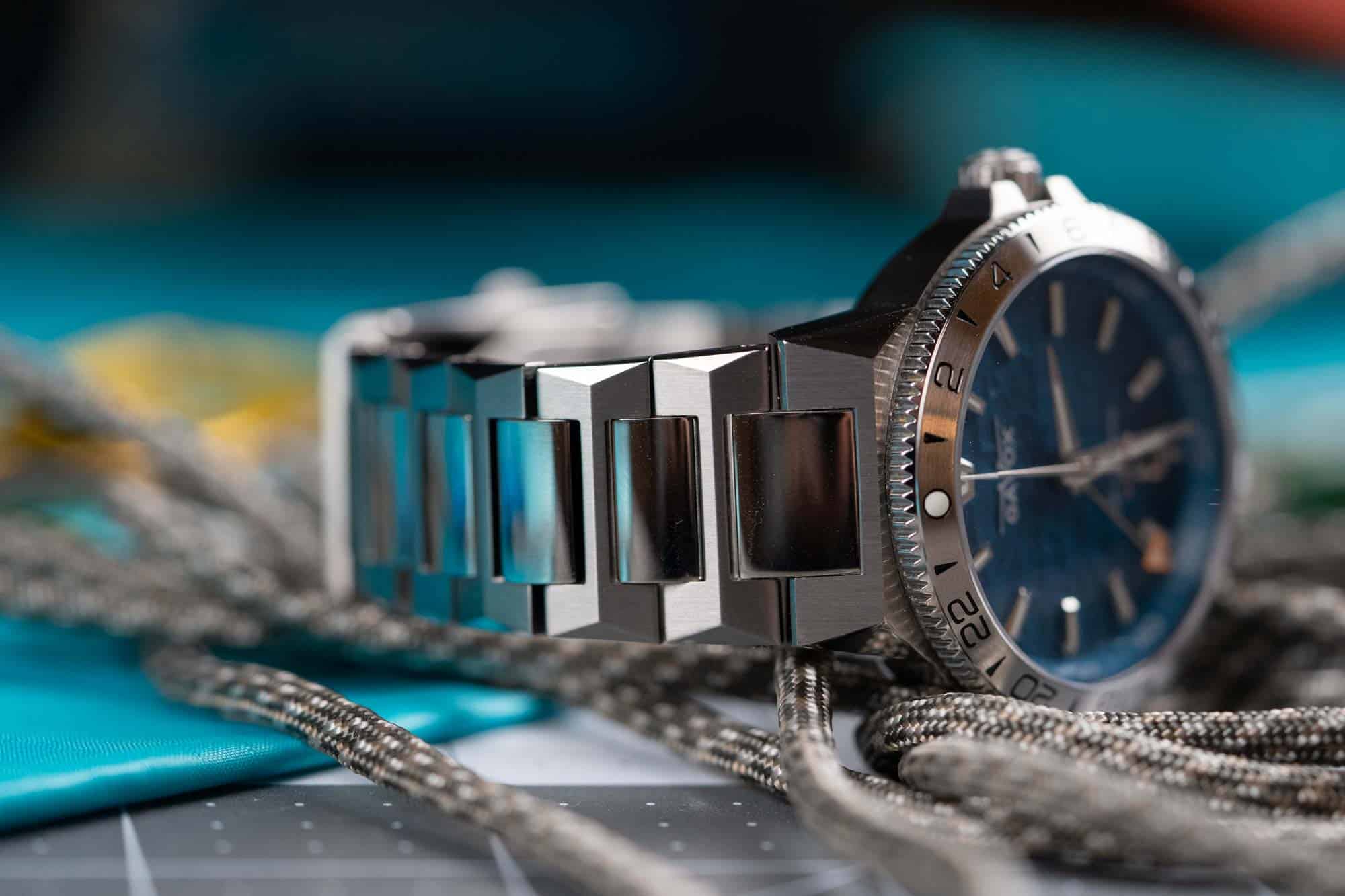
As you can see in the photos, I was supplied two versions of the Longitude. One in steel with a medium blue dial, the other black DLC with a black dial. Both looked great, though the contrast of the steel markers and hands against the blue dial did make it more legible than the very stealthy all-black model. That said, the black had a little extra attitude that made it call out to me more when I was deciding between which to wear.
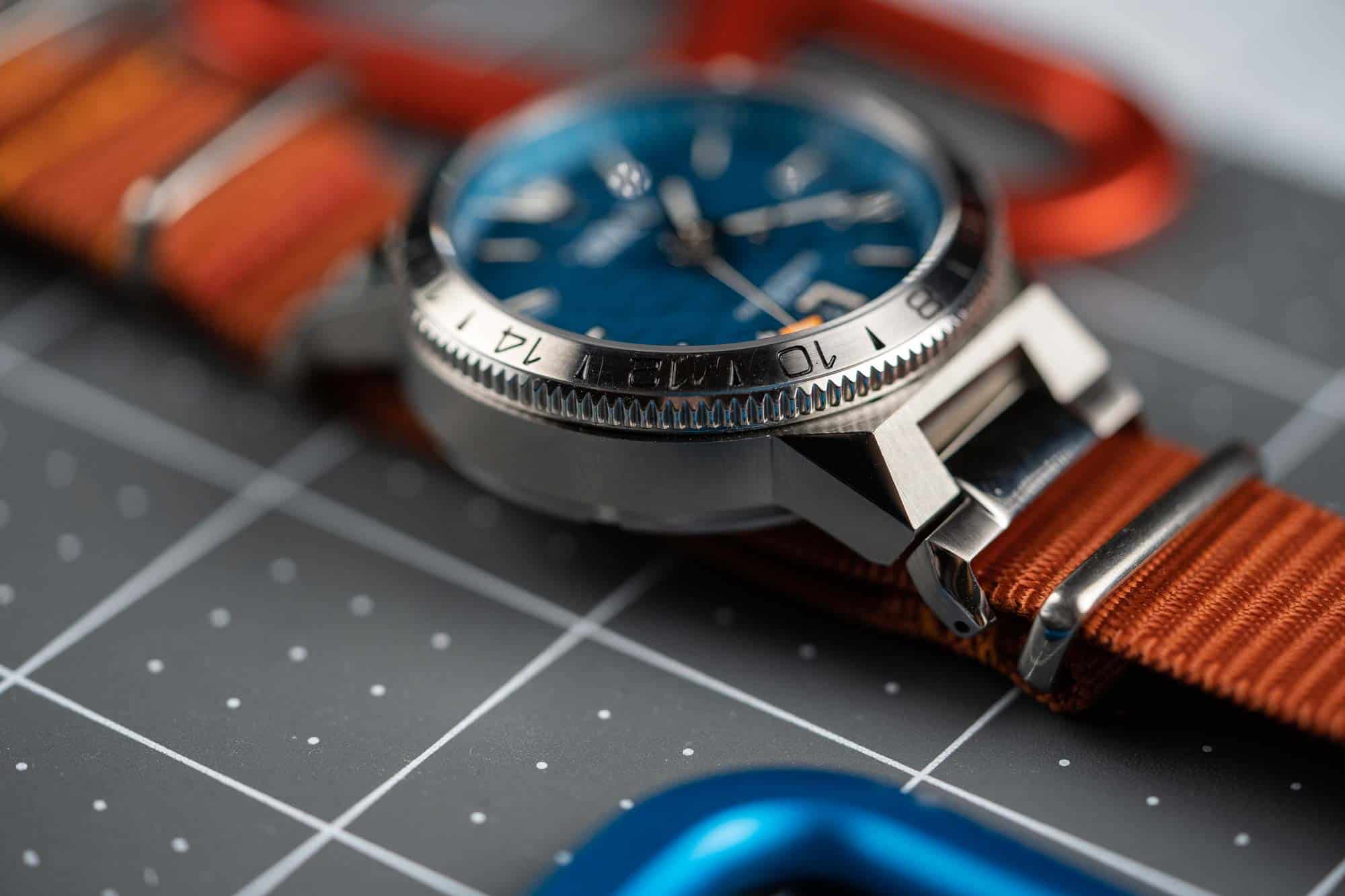
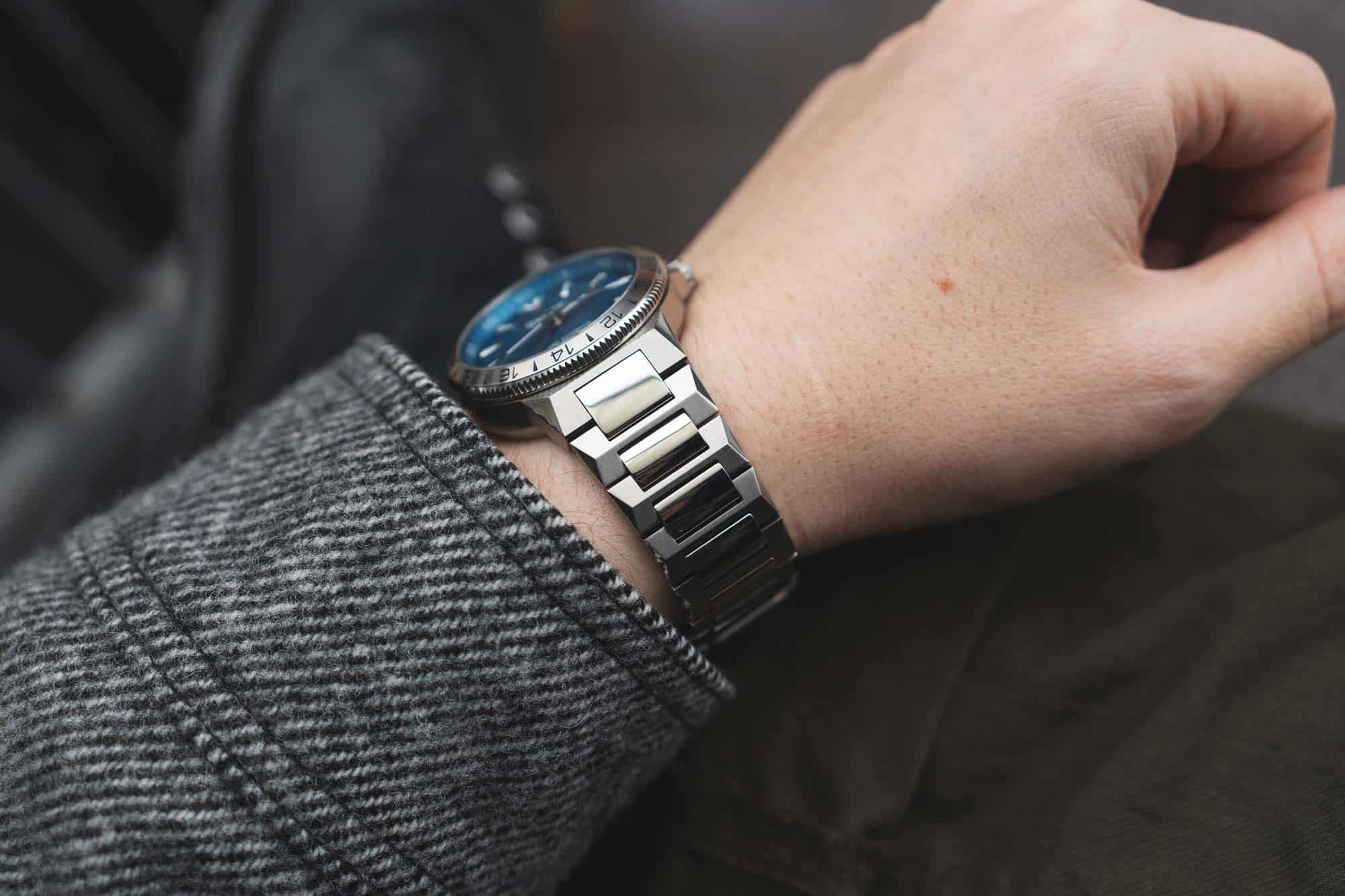
The bracelet itself is nicely made and finished. It features H-links with a pointed shape, brushed on the incline and polished on the edges. This creates the faceted look of the watch, playing off of the dial. The connecting links are polished and rounded adding contrast in finish and shape. It all works. My only issue, and this might be “just me” is the 2mm taper from 22mm to 20mm. It’s quite thick and hefty. 22mm looks great proportionally against the case. But the slight taper just feels very heavy on the wrist. Another two to four millimeters would have lightened it up significantly. Conversely, had the watch been titanium, the reduced weight could have compensated.


 Featured Videos


