Hands-On with the Tudor Black Bay Fifty-Eight Navy Blue

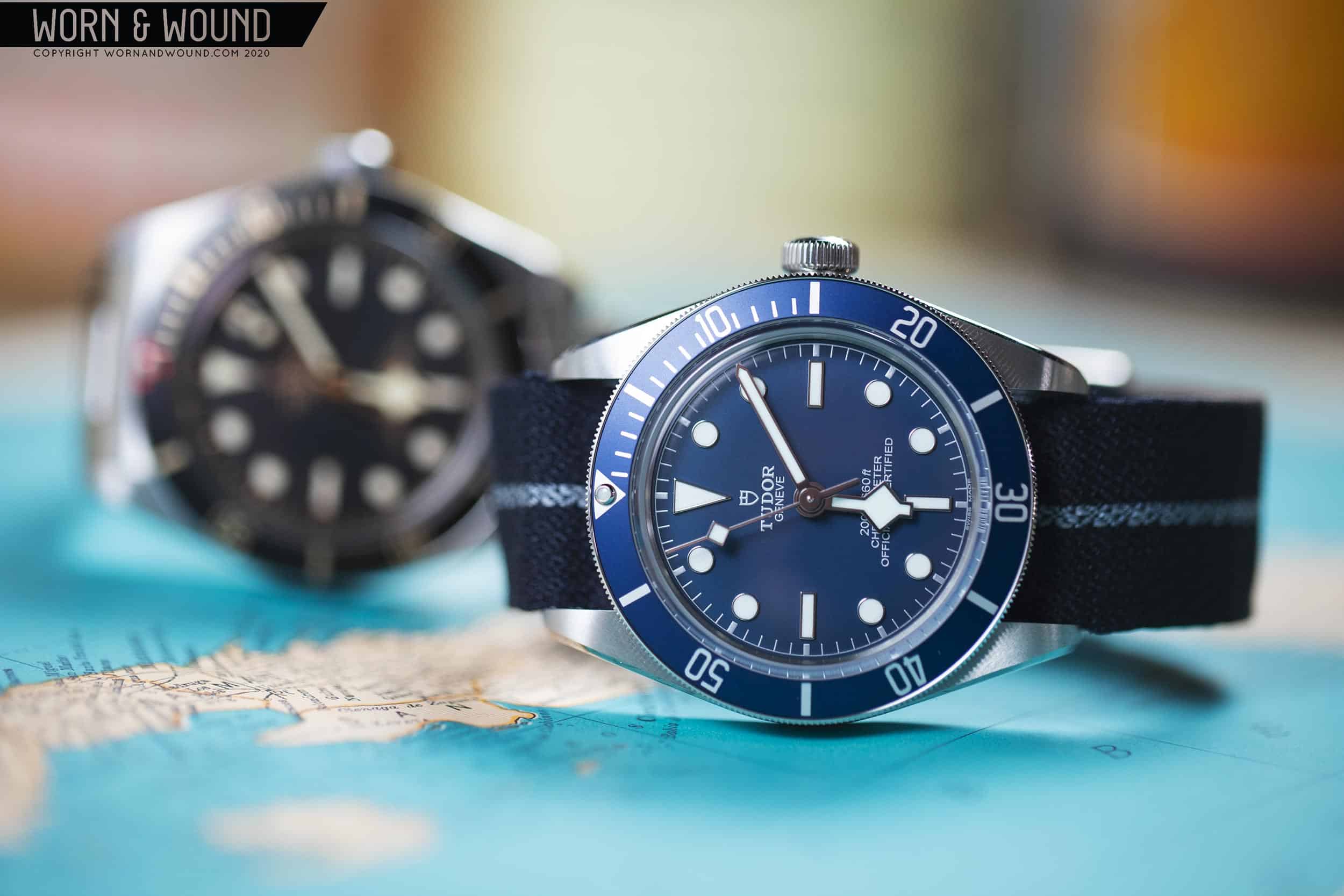
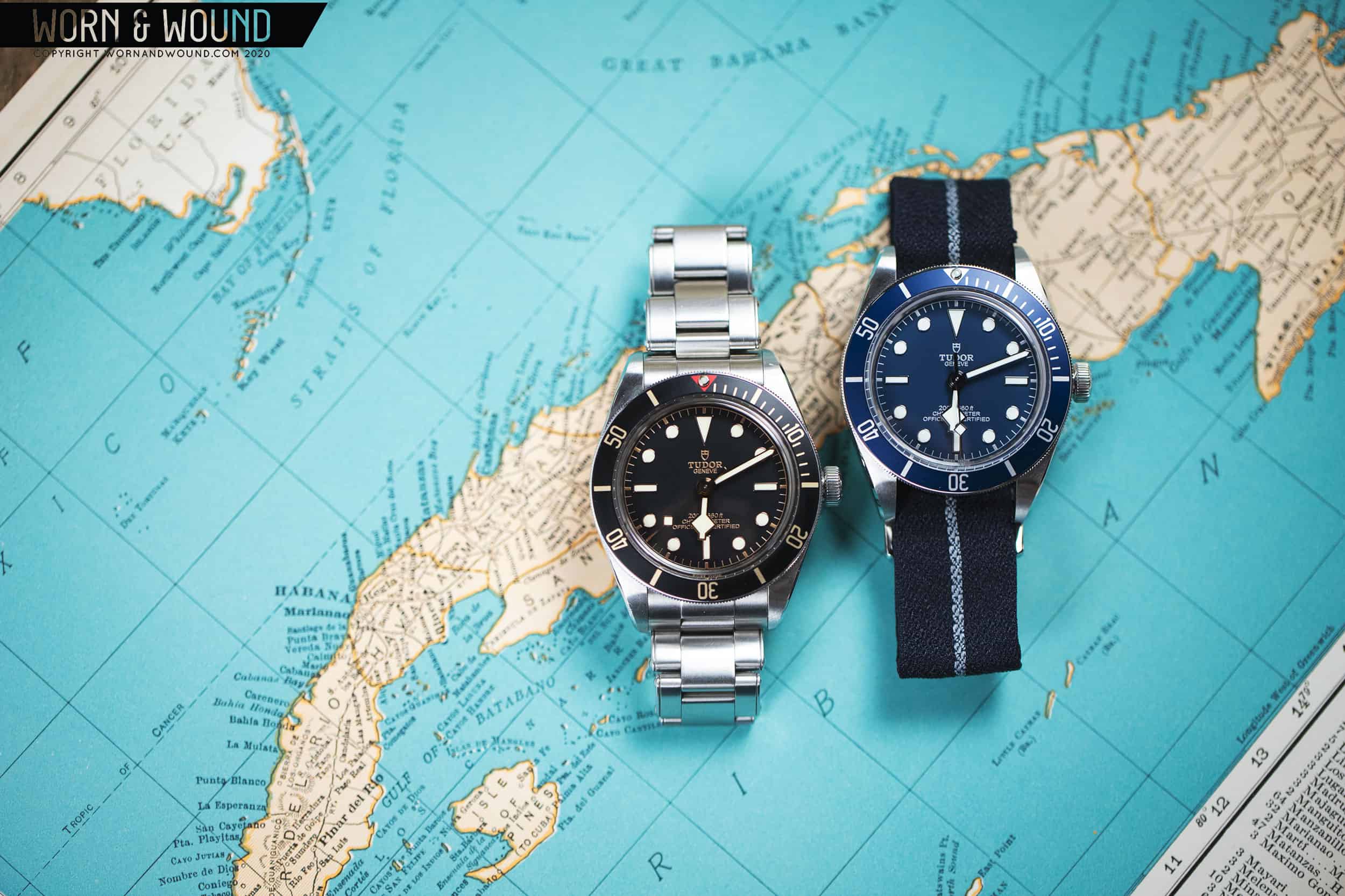
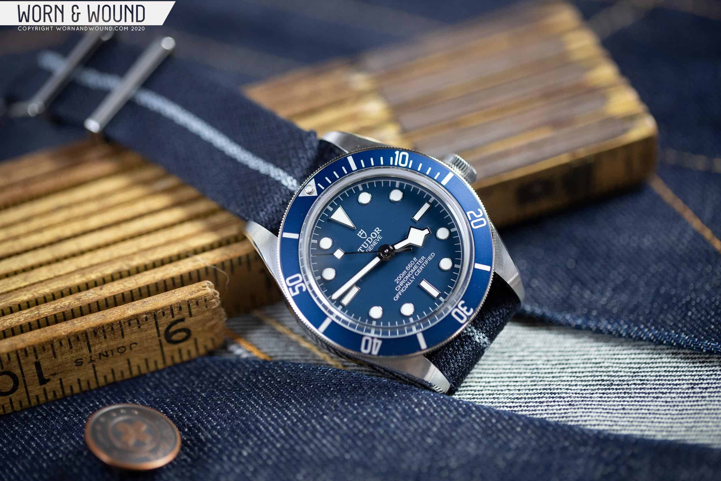
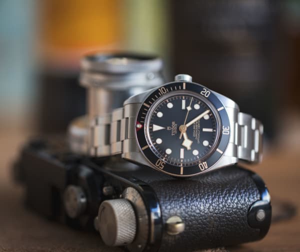
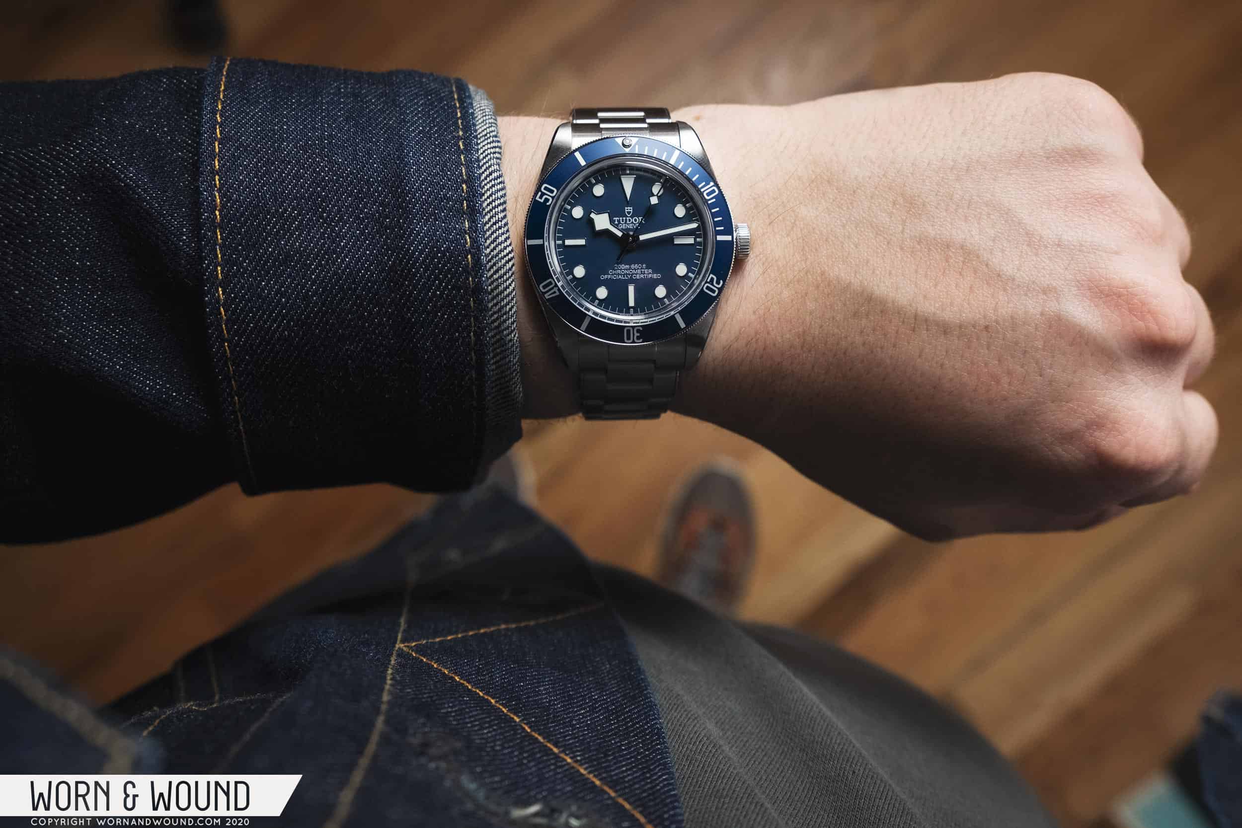
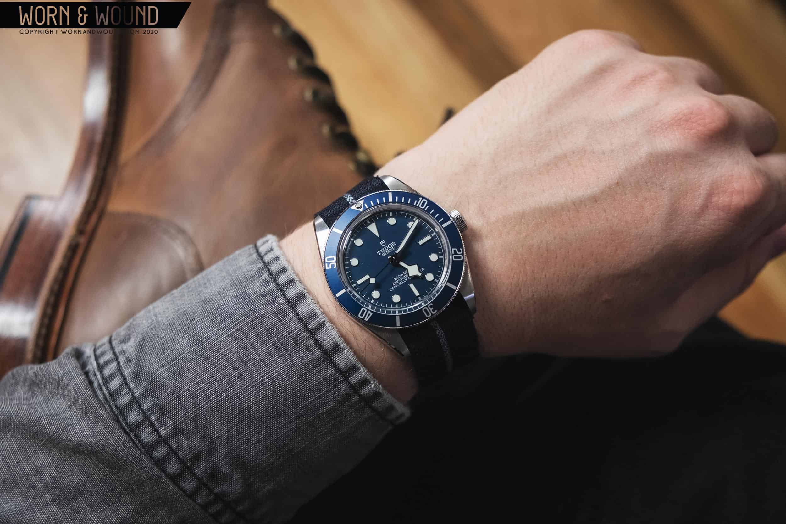
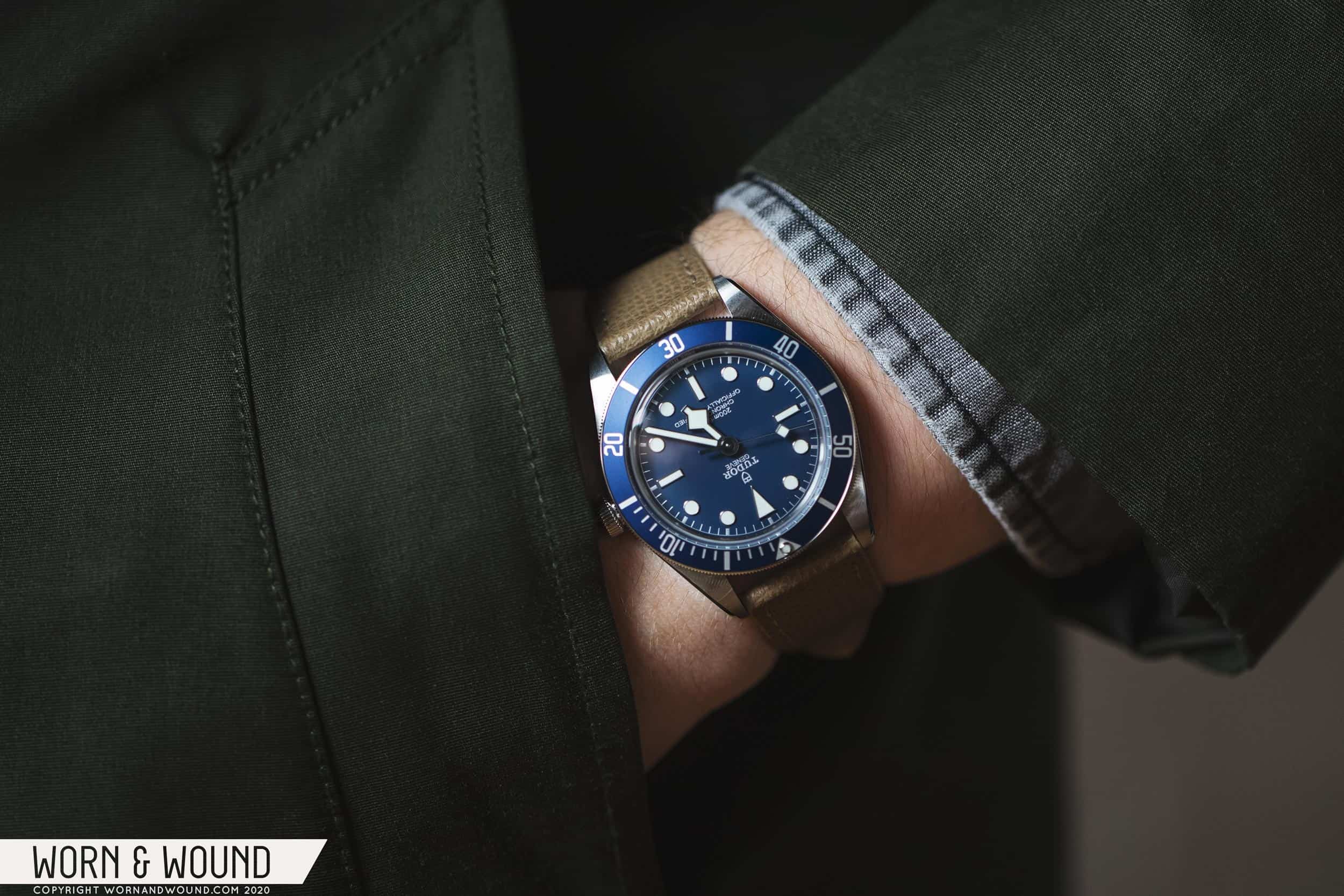
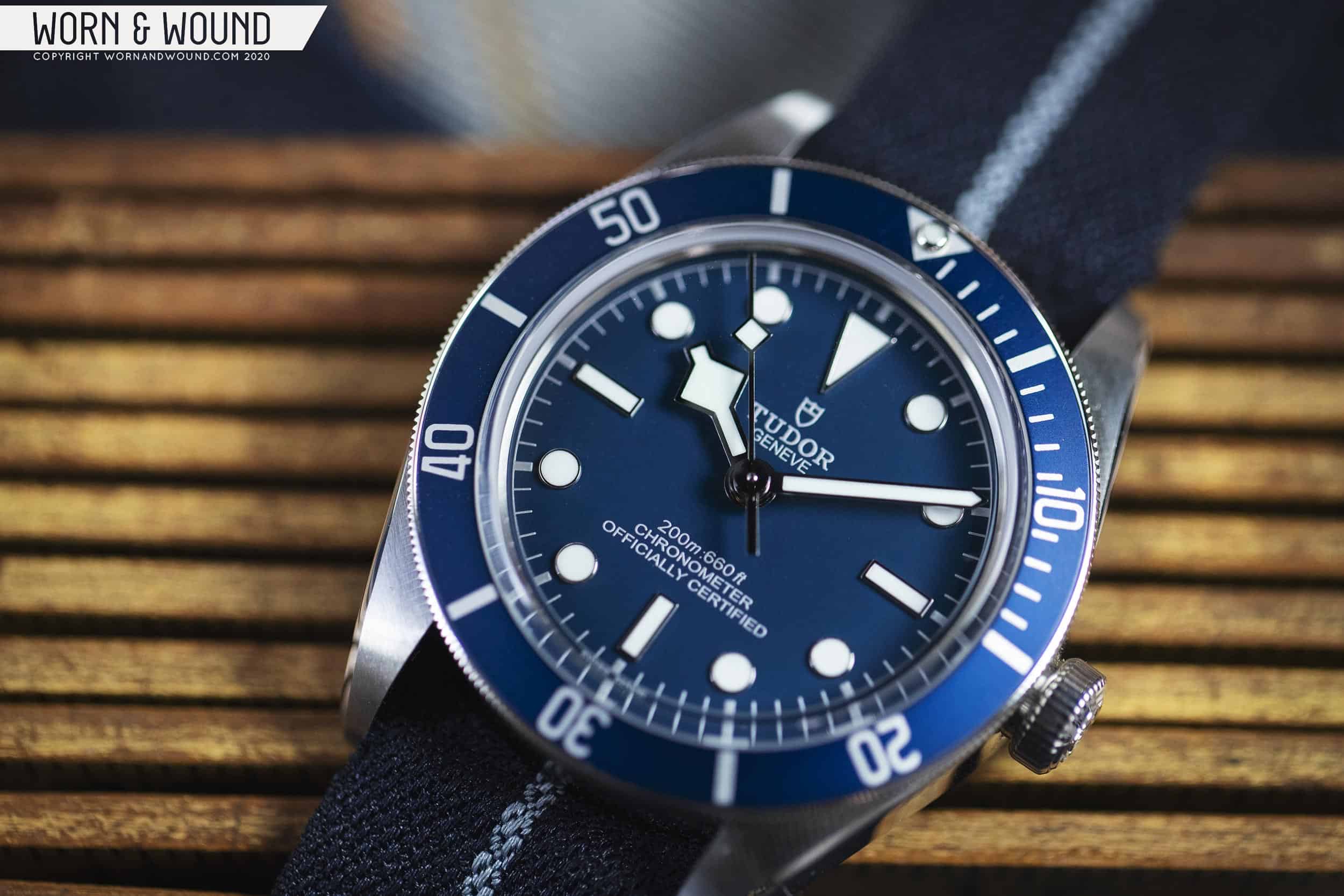
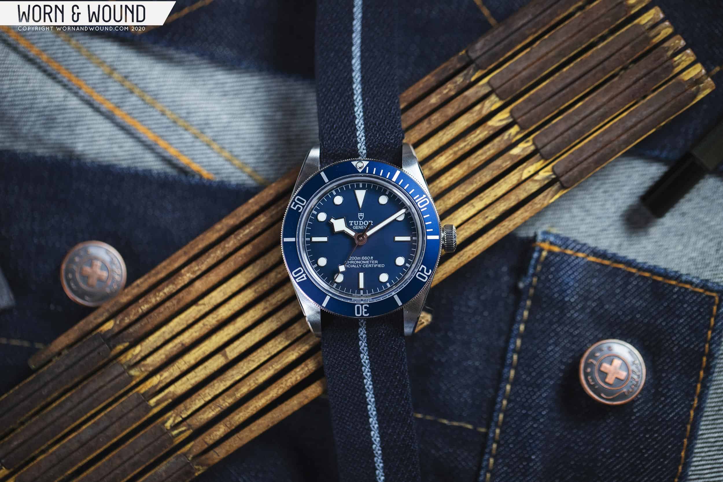
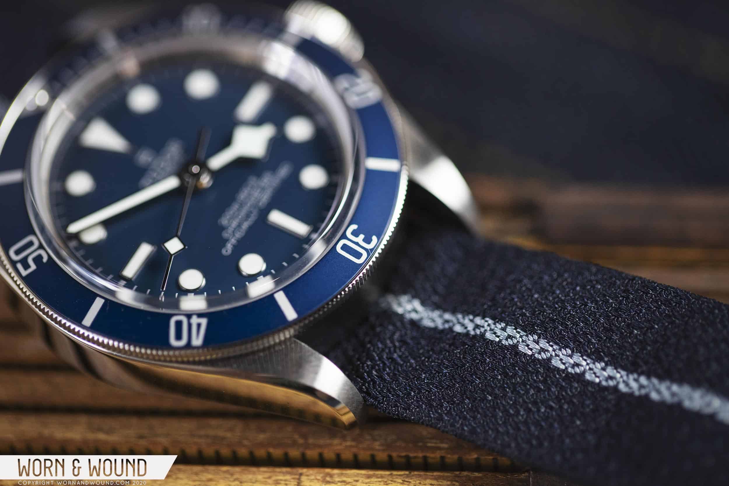
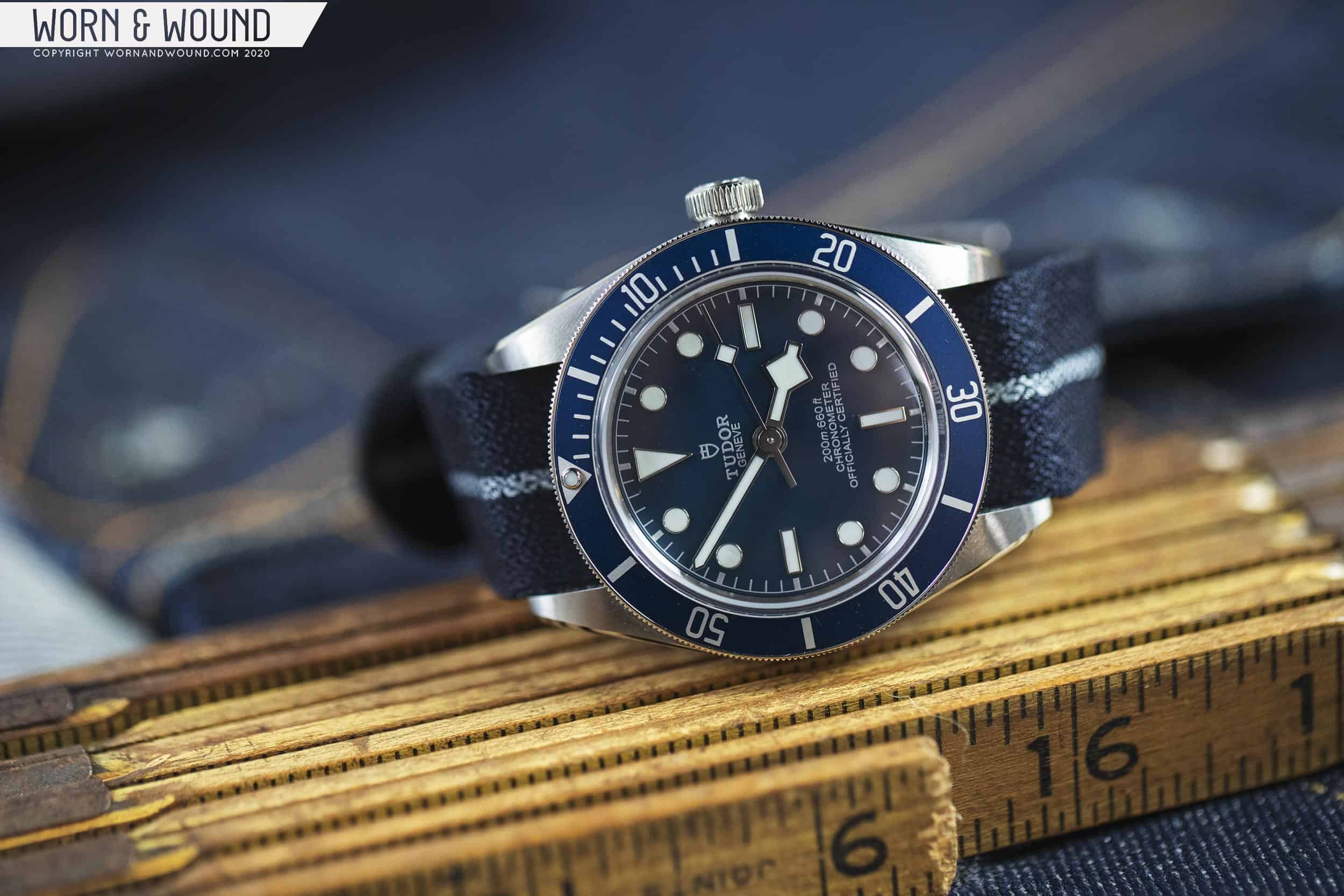
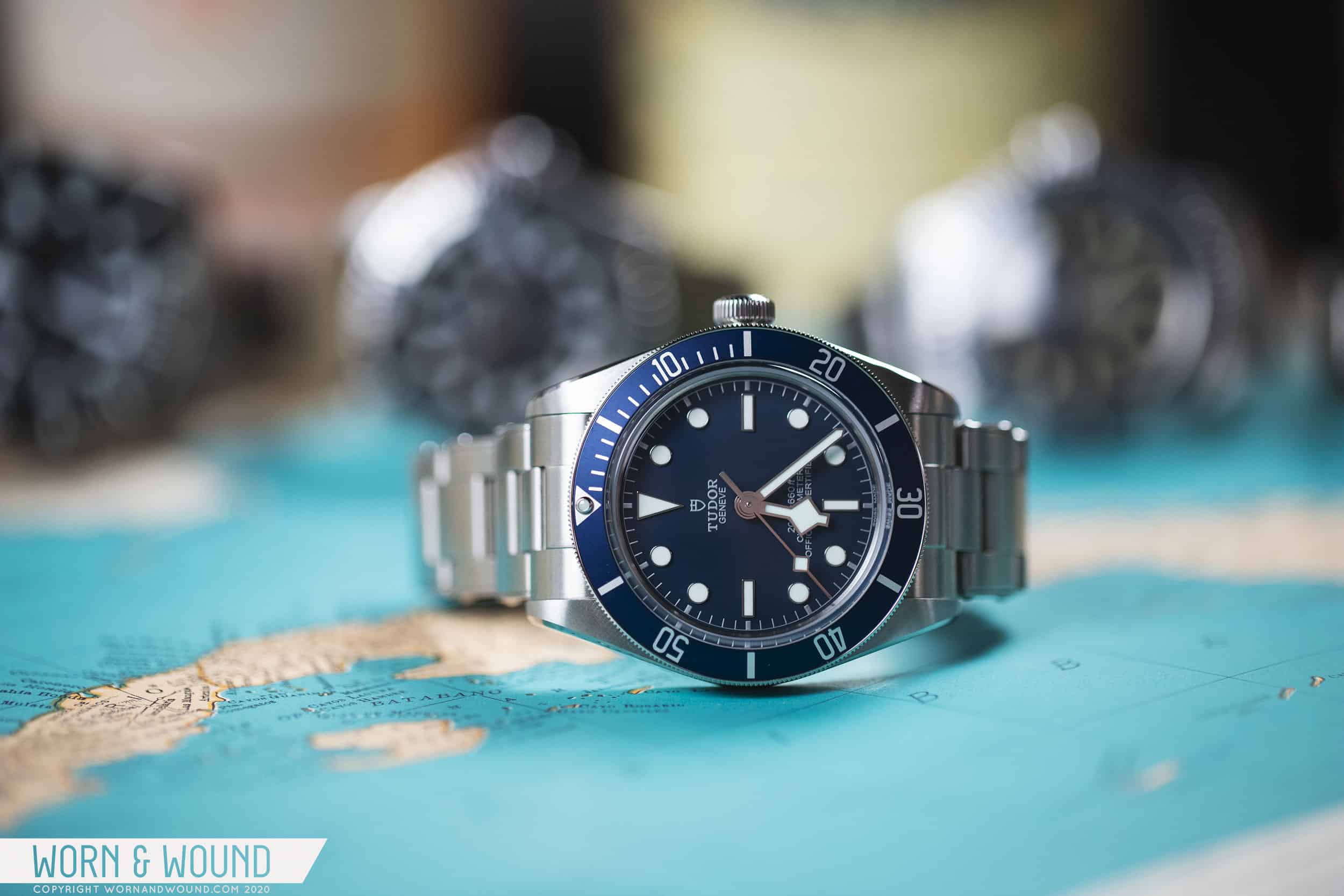
If there was one thing my blissfully-ignorant-self was looking forward to in 2020, back in the now seemingly idyllic days of late 2019, it was Tudor’s upcoming Baselworld releases. While nothing was promised, or even hinted at, we all expected that they would build on their runaway hit from the previous year, the Black Bay Fifty-Eight. Fast forward a bit and Basel was canceled, Tudor and Rolex pulled out of the show likely for good, new releases were put on hold, and – well, we’re all too aware of the current state of things.

The new kid fits right in

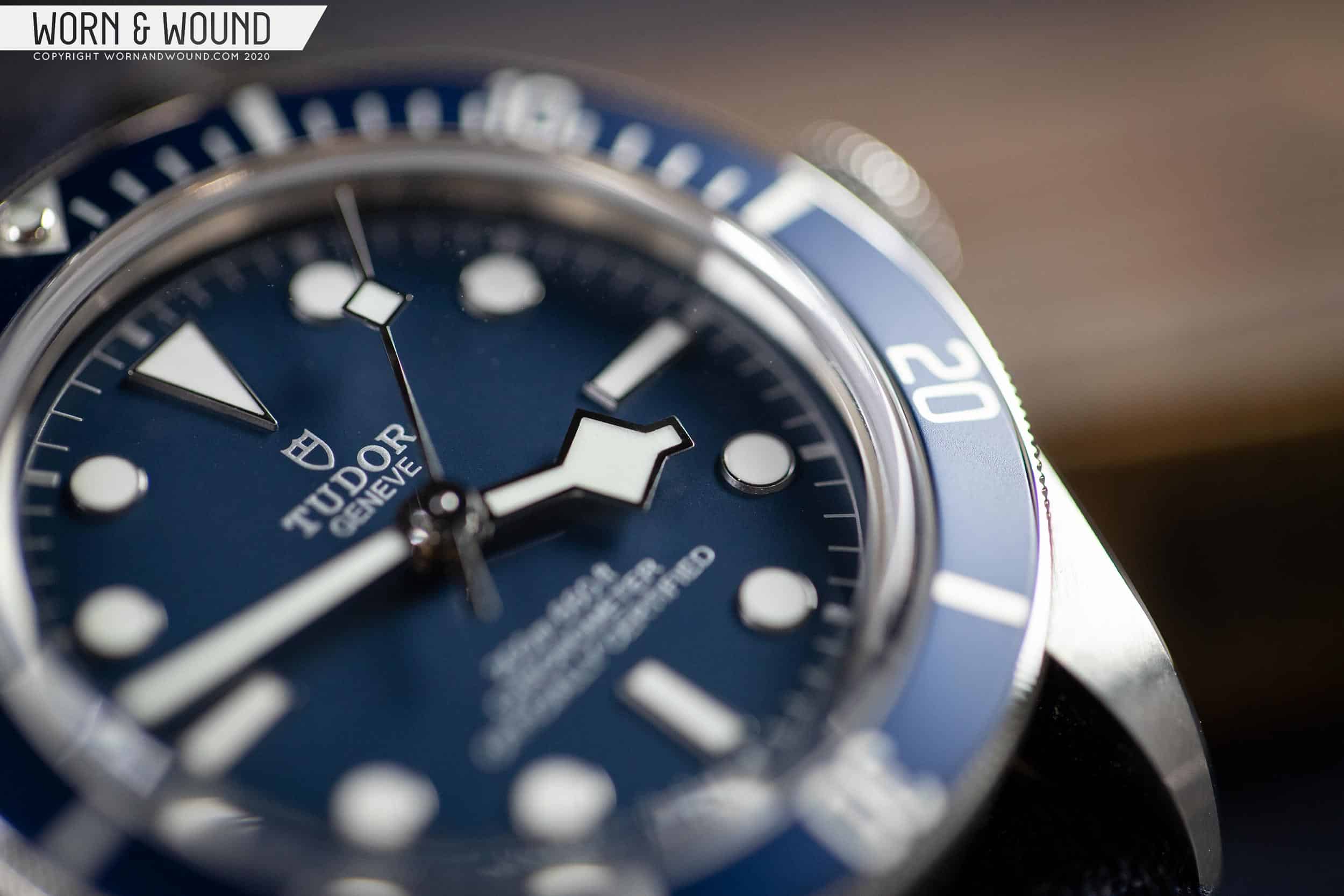
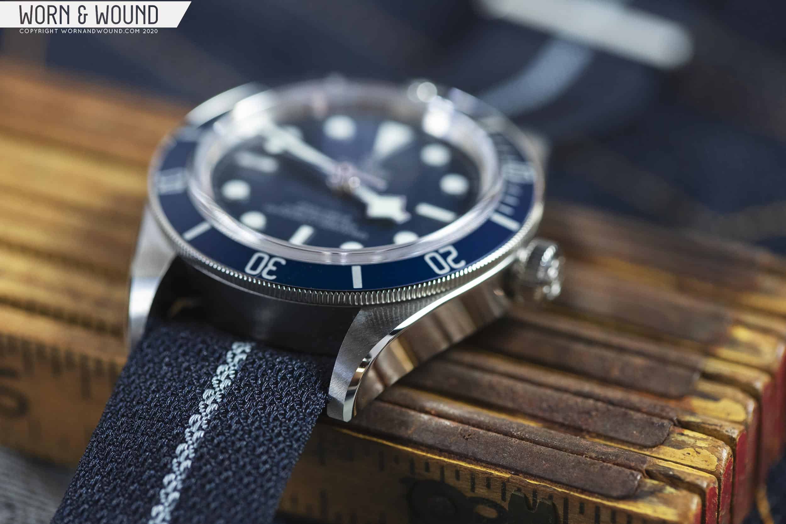
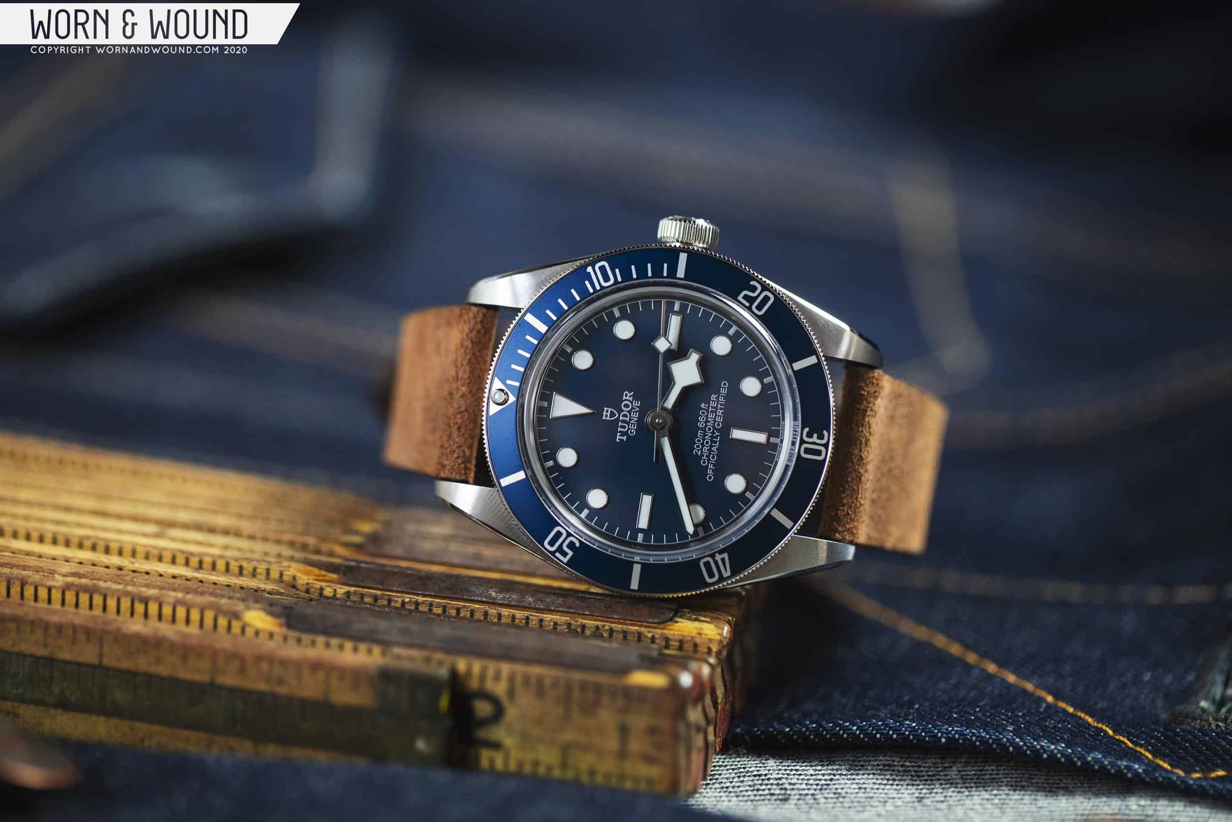
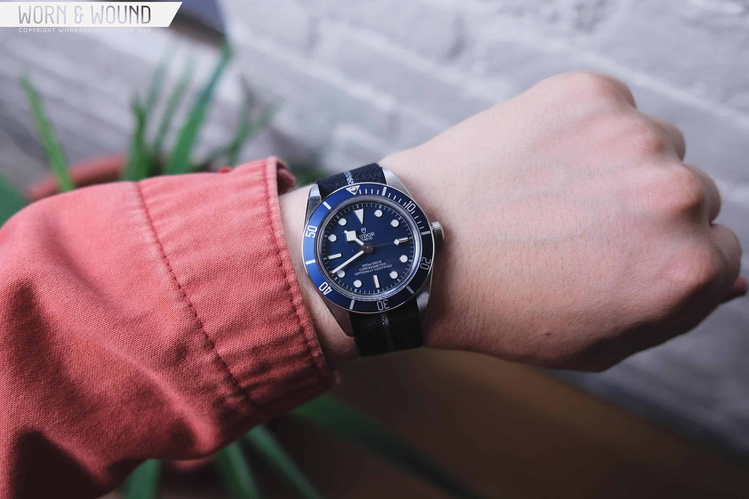
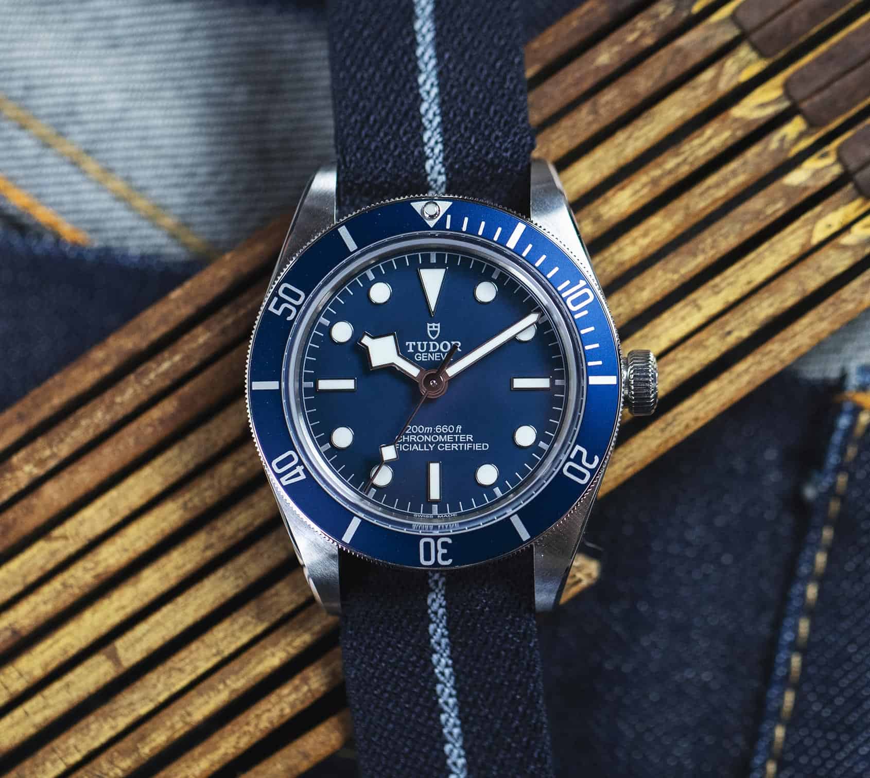
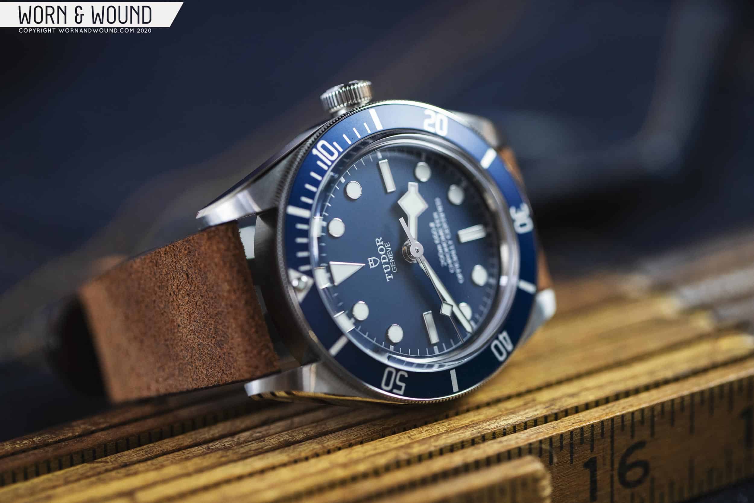
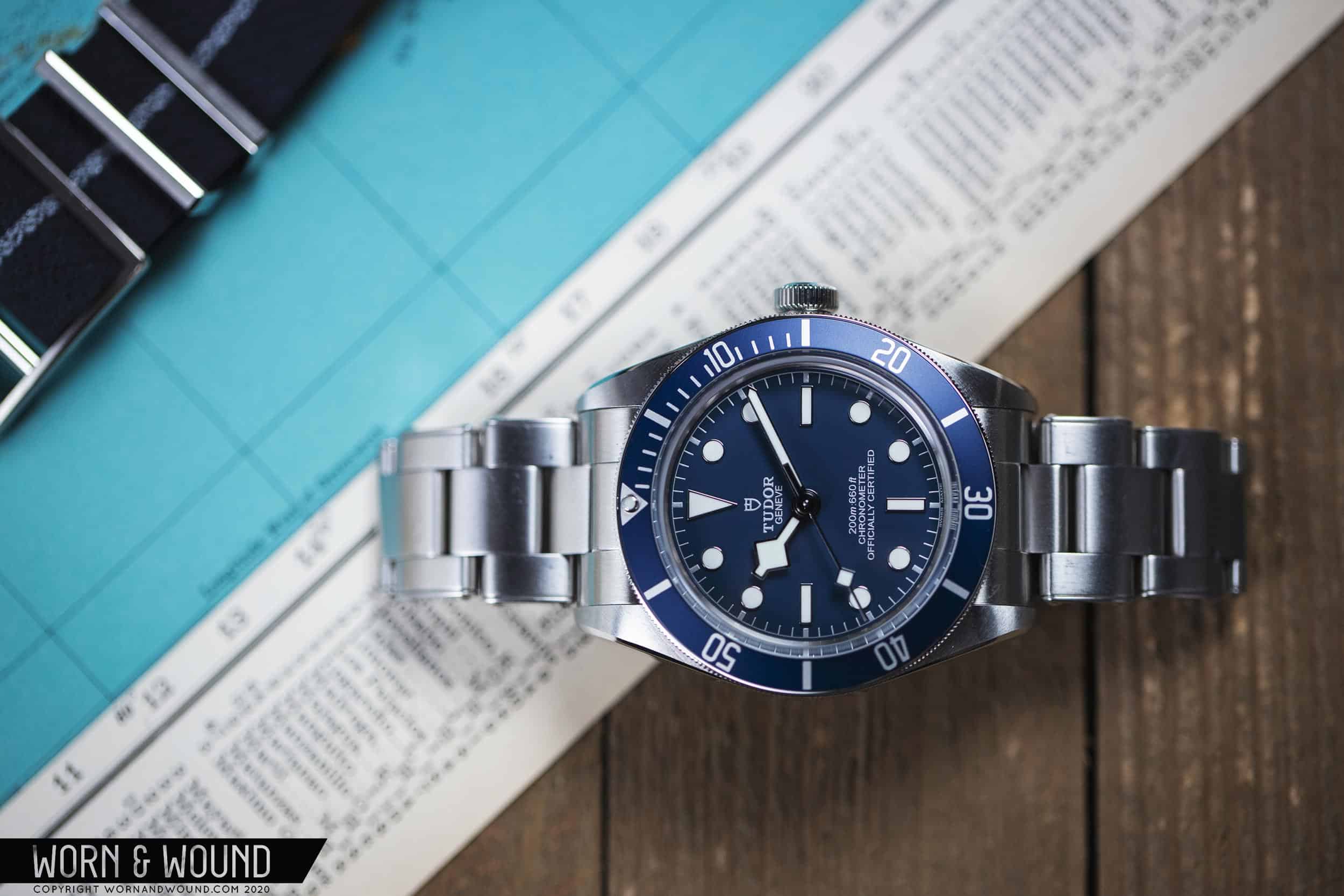
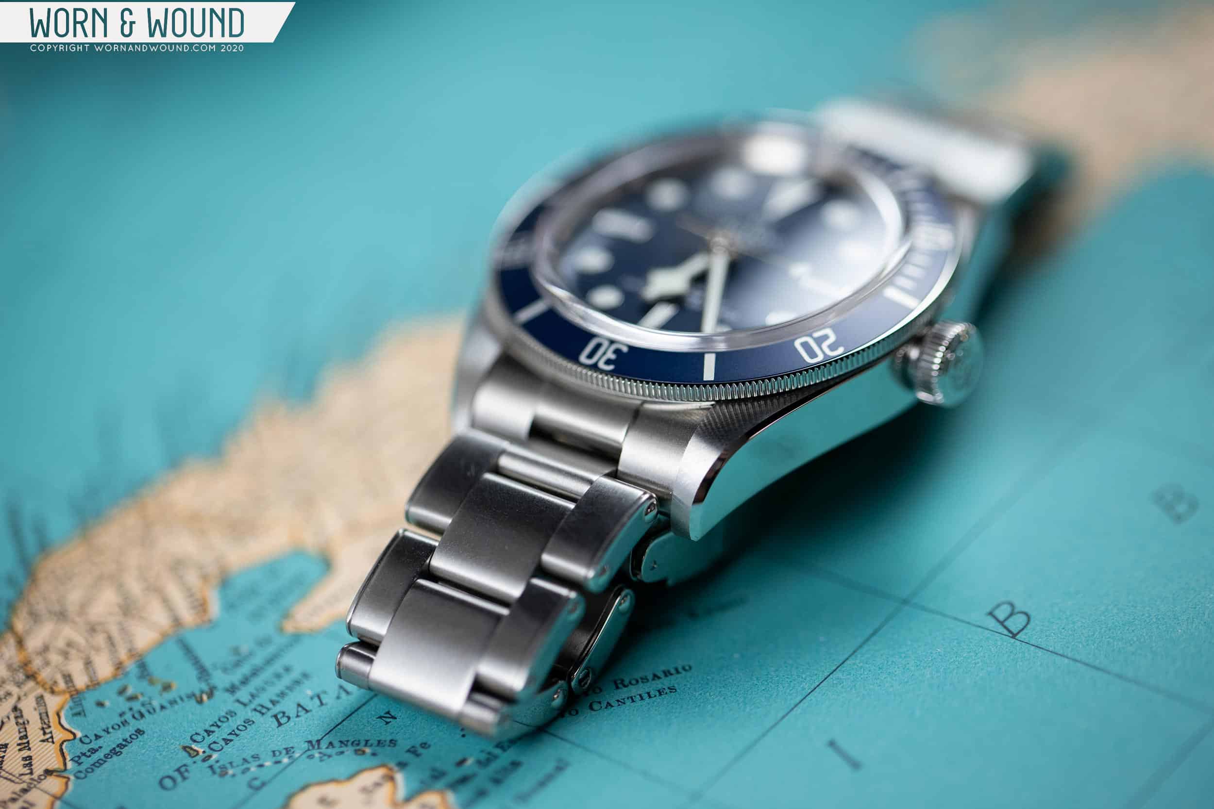
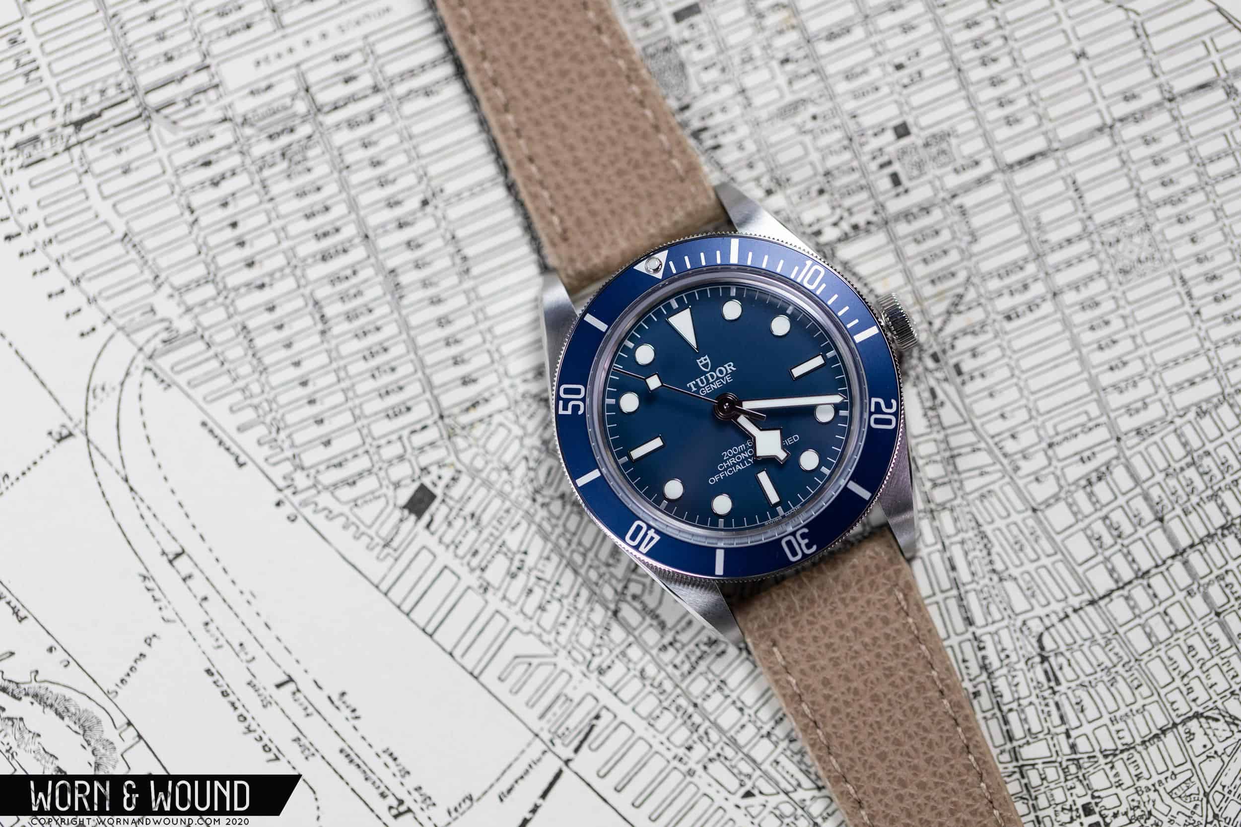
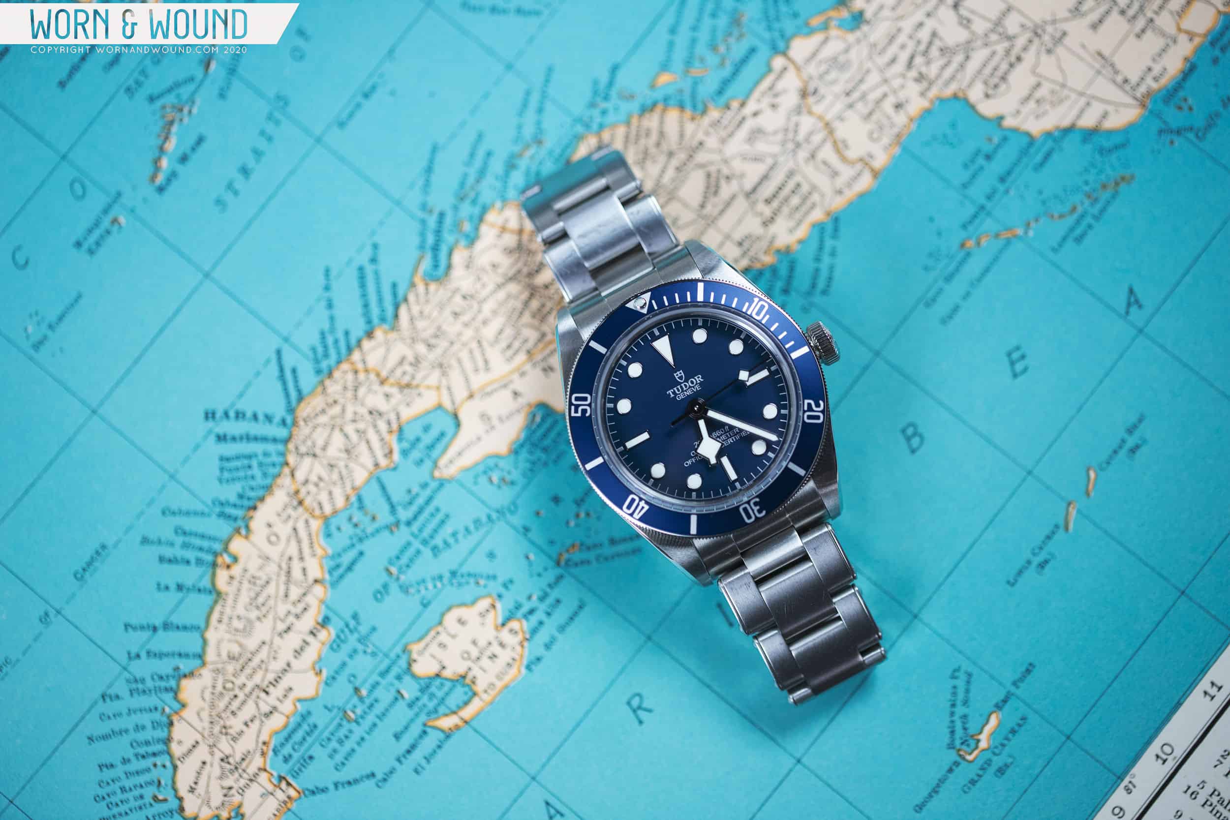
So, when Tudor sent us an email saying they had a new watch coming out and wanted to know if we’d like to get a sample for review at launch, sight unseen, with no actual indication of what it might be, we emphatically said yes. I mean, it’s a Tudor, and even if it ended up being something bizarre, like a P-01 chrono, it would still be fun to play with. Luckily, it’s exactly what I, and seemingly everyone else, was hoping to see this year from them, a new Black Bay Fifty-Eight. Now in navy blue, it was a logical next watch in the Fifty-Eight collection.

Advertisement
$3375

Hands-On with the Tudor Black Bay Fifty-Eight Navy Blue

Case
Stainless Steel
Movement
Tudor MT5402
Dial
Navy Blue
Lume
Yes
Lens
Sapphire
Strap
Fabric
Water Resistance
200m
Dimensions
39 x 47.75mm
Thickness
11.9mm
Lug Width
20mm
Crown
screw-down
Warranty
Yes
Price
$3375

But, of course, the salty seas of social media had to react poorly to it, at least at first (in fairness, there were plenty of positive responses as well). “Boring” said some, “why didn’t they make the dial black” said others, the occasional “meh” was even thrown around. Others still seemed disturbed Tudor didn’t read their minds to create the exact version of the Fifty-Eight they personally dream of. And, while I vehemently disagree with the negativity (I’ll get into why I like the watch later), I do think it highlights something interesting about the first Fifty-Eight, which I extensively reviewed here.

By making a 39mm, slimmed-down vintage-styled sub in black and gold with a red triangle on the bezel and creamy lume, Tudor made a watch seemingly for enthusiasts. And enthusiasts (along with international marketing campaigns and superstar celebrity brand ambassadors) have kept that original watch sold out around the globe. Now, they feel owed a new, even more, esoteric model.

why choose just one?

And don’t get me wrong, if Tudor had come out with, say, the exact same watch but with square markers, finally making a new Snowflake sub, I probably would have sold whatever organ I need the least to buy one. Instead, Tudor went the safe route. Rather than going deeper into the idiosyncratic depths of watch nerdom, they chose something universally appealing (hey, it did backfire with the P-01).

Something that you need to know nothing about the history of the brand to like. Dark blue with silver accents and crisp, white lume. It’s classic, it’s handsome, it’s… completely inoffensive. Imagine going into the watch store with your significant other, heading to the Tudor case, and seeing the two Fifty-Eight models side by side. One is dark and brooding, with a vintage swagger that only a black and gilt watch can exude. The other is approachable, friendly, and a touch more modern. Which will you, the watch nerd, choose, and which will they prefer?

It’s blue and silver and white and great looking too
A truly classic blue
The crisp white lume adds a modern touch
The excellent case finishing is still present

And to that end, it’s also truly a tone of blue with broad appeal. Unlike the vibrant berry-blue of the Pelagos, or the inky-indigo of the Black Bay 36, this is a darker, more desaturated, classic blue. It’s not so dark as to appear black, not so bright as to call attention to itself. Unlike those previous blues, particularly that of the Pelagos, it also won’t clash with clothing. Gray suit, yellow board shorts, brown cowboy boots, you’re set.

Similarly, it’s a strap monster. The sample sent was on Tudor’s fabric strap in blue with a silver line down the center. While not the way I would purchase this watch as the bracelet is so exceptional, it is a cheaper option and looks good for obvious matchy-matchy reasons. Luckily, a friend with the original Fifty-Eight was nearby and brought over his watch and bracelet. On steel, it’s cool, clean, and mature, and really brings out an appealing modernity that might come as a surprise on a 39mm diver with obvious vintage heritage. The bracelet also downplays the blue, giving it a more neutral, desaturated look.

Blue watch and brown leather, can’t go wrong

But, you also don’t have to be shy with different color combinations. On a Mai Tai ADPT, the watch was immediately more energetic and fun. The pink/orange hue made the blue more saturated, and the watch more youthful. On a taupe leather strap, it was reserved, sophisticated, and ready for a long day at the office. The warm-khaki/gray color brought the intensity of the blue down again. Lastly, on a rugged brown leather strap with vintage character, the blue became richer, deeper, and undeniably handsome.

On the wrist, regardless of the strap, the Fifty-Eight in navy blue was wonderful to wear. No surprises there. The Fifty-Eight really is a study in proportions done right. The 39 x 47.75 x 11.9mm case is just a joy to wear. Every dimension fits, it’s comfortable, it holds its own on the wrist, it’s compact, it’s rugged, it’s svelte. I could go on. Tudor just got it right, what else is there to say?

This picture says everything you need to know about the Fifty-Eight Navy Blue

Which brings me back to the color. People, myself included, are acting like this is a whole new watch, when it’s really a watch you know and love, just in a different color. When it came in, at first glance I thought it was undeniably appealing but not as sexy as the original. But, I think it’s one you have to live with for a minute to fully appreciate. While ultimately both are very versatile watches, I think the navy might be even more so. That extra touch of modernness from the clean, cool colors goes a long way on the wrist. Perhaps this one will draw less attention, but it never will look out of place either, and it’s always a joy to look down at.


The bracelet completes the look
The Fifty-Eight just fits so well
taupe for a subdued look
Casual cool

In the end, Tudor Black Bay Fifty-Eight fans get another option to choose from, or, if you’re so inclined, a second Fifty-Eight to add your collection. While I understand that at first blush the announcement of a navy blue Fifty-Eight might not have had the wow factor people were hoping for, it’s a very very nice watch that I’m sure you’ll like if you give it a chance. Of course, internally it’s also the same watch, with the same, very impressive MT5402 chronometer automatic with silicon hairspring and 70-hour power reserve. For a far more extensive breakdown of the Black Bay Fifty-Eight that holds true for the blue version, check out my review from 2019.

As for me, if and when I decide to pick up a Fifty-Eight, I’m seriously going to have to weigh the two against each other (and hopefully even more in the future). The blue has really grown on me, and just seems like a natural choice for an everyday sport watch. One thing I did notice that I don’t love is that they raised the price on the bracelet version from $3,575 to $3,700, but hey, that’s par for the course in 2020. Tudor

Images from this post:
Related Reviews
Zach is the Co-Founder and Executive Editor of Worn & Wound. Before diving headfirst into the world of watches, he spent his days as a product and graphic designer. Zach views watches as the perfect synergy of 2D and 3D design: the place where form, function, fashion and mechanical wonderment come together.
wornandwound zsw
Categories: