Klokers Klok-01 Review

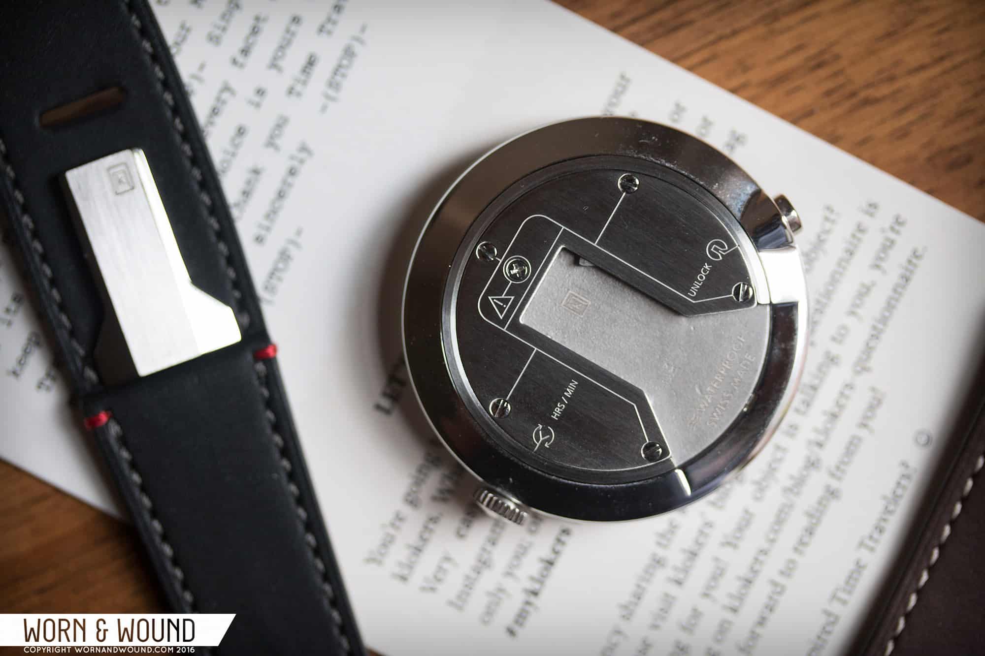
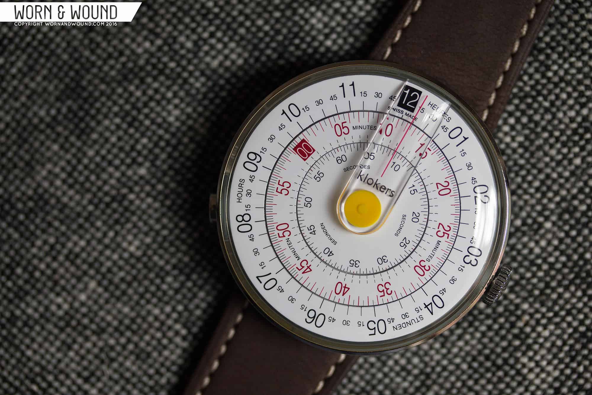
Last August (2015) we introduced you to Klokers, a new line of Swiss-made watches that were about to launch on kickstarter. Through their campaign, they raised 605,000 euros off of a 50k goal, making their project a huge success. The campaign actually consisted of two different watches built off of the same modular platform, the Klok-01 and the Klok-02. The first was a disk watch based on circular slide rules that used a unique Ronda quartz movement to rotate the disks counter-clockwise (more on that later). The second was a more ambitious timepiece with a unique world-timer display and retrograde minutes, based off of the Soprod Mecatronic movement.
KLOKERS_KLOK-01_DIAL11

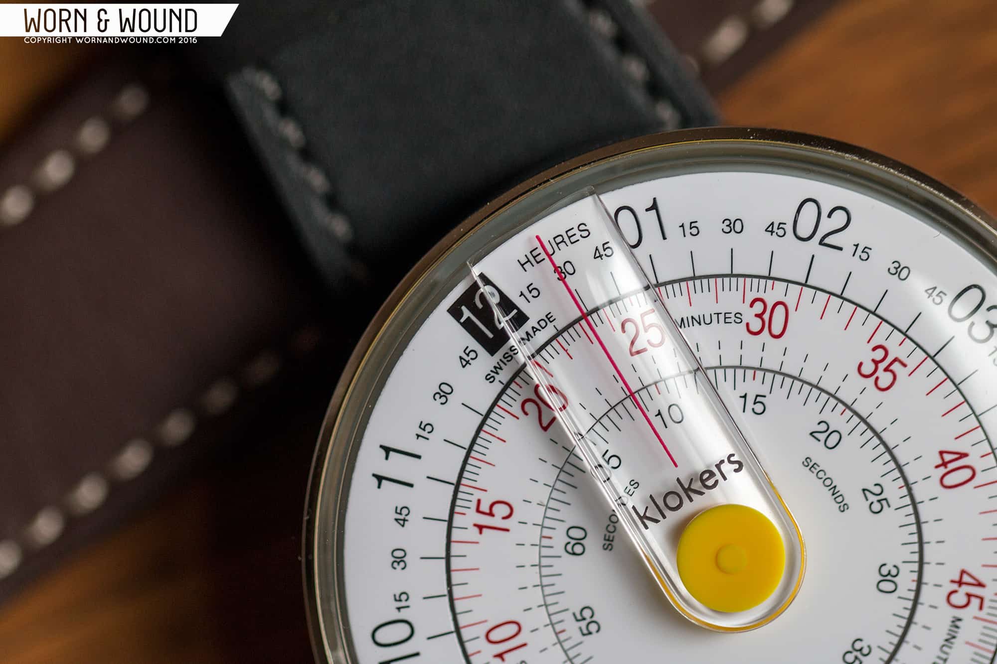
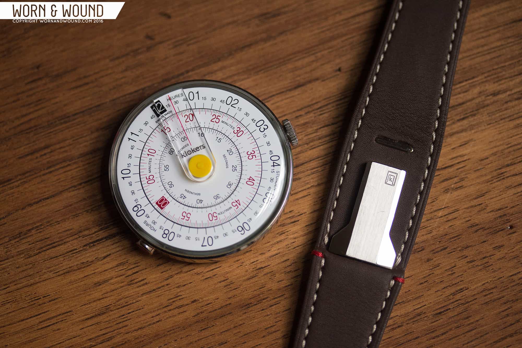
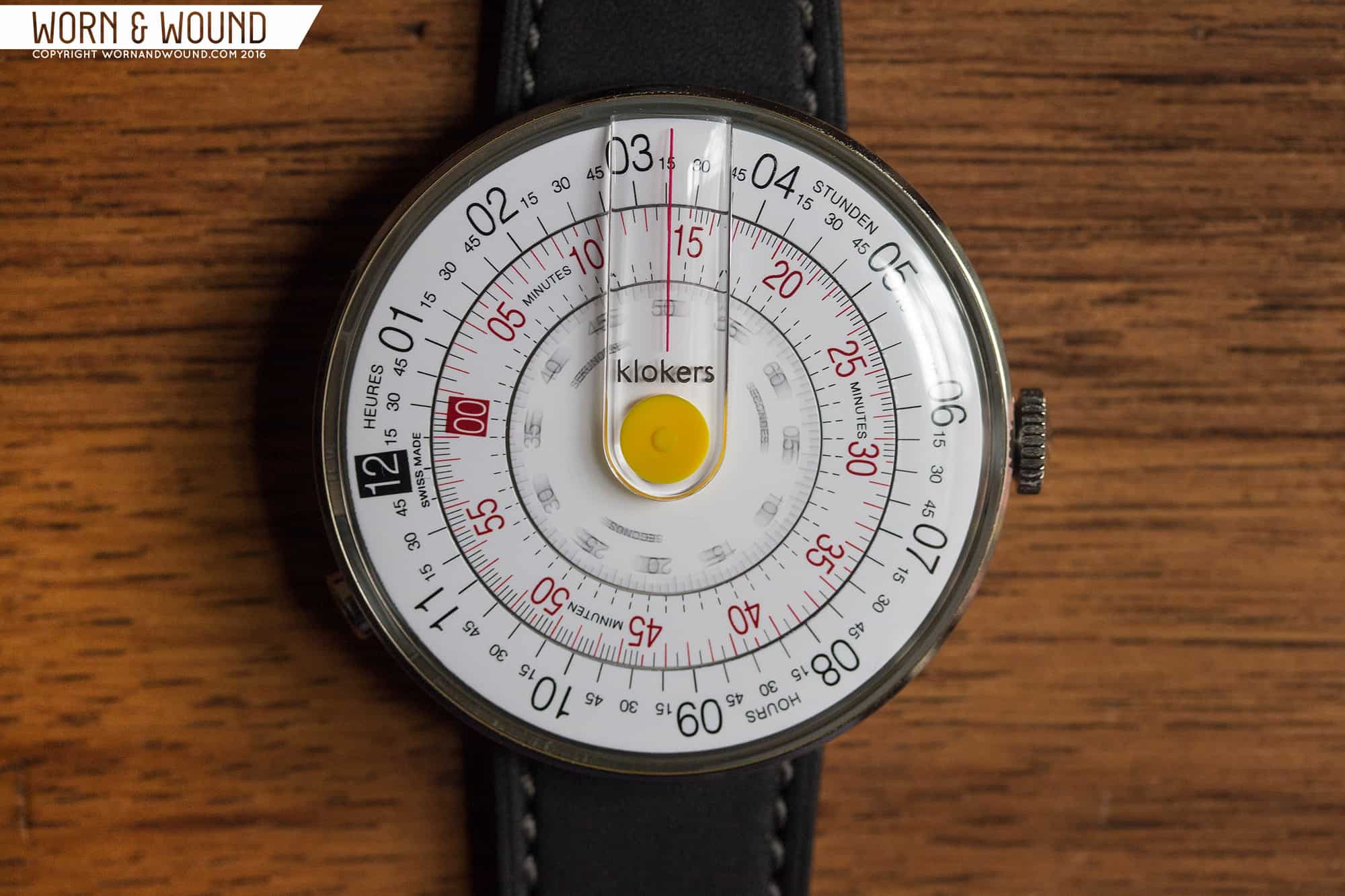
Today, I’m excited to go hands-on with the Klok-01. This watch really caught my eye last summer, as it had an aesthetic that we don’t often come across. A bit technical, a bit playful, it rode the line between a design/art watch and something more instrument based. As I said in my previous article, disk watches are not a new concept, but through good design and execution, this one stood out. By drawing inspiration from circular slide rules, a detail most notably seen in the crystal, the disk concept feels less novel, more serious. Add in various other details such as the movement and modular strap system, and the watch becomes a very unique piece.

Advertisement
$399

Klokers Klok-01 Review

Case
Stainless Steel
Movement
Ronda Quartz
Dial
White
Lume
No
Lens
Plastic
Strap
Leather
Water Resistance
5 m
Dimensions
44mm
Thickness
11.5mm
Lug Width
mm
Crown
Push Pull
Warranty
Two Years
Price
$399

Case

The case is simple in aesthetics but complex in design. Measuring 44mm in diameter it’s a sizable all dial watch, but entirely lacks lugs, so it fits well. From above, there isn’t much to see. The dial dominates, running edge to edge, only revealing a sliver of polished steel. On the right side at 3 is a thin crown. Since this is a quartz watch, you’re not going to be using it much. On the left side, off of what would be 8, is a more curious item.

Here you have a pusher with a red inlay that detaches the watch from the strap. No spring bars or screws, rather a simple to use, but likely complex to make mechanism for swapping straps. When you flip the watch over, you see the case back features a milled out slot, in which a flange on the back of the strap snaps into. It’s a multi-part piece that while hidden is likely the costliest part of the case to manufacturer.

And it works quite well making changing straps simple and intuitive, especially for people not used to popping out spring-bars. Actually, not just straps. Part of the Klokers concept for their modular timepieces is that you could attached them to pocket-watch chains, stands for home use, and perhaps more. Those have yet to be released, so currently it’s for their catalog of straps, or to impress your friends when they ask to see your watch and you just hand it to them off your wrist.

Dial

The star of the show is obviously the dial. Comprised of three rotating disks, it’s never still changing throughout the day, becoming something new and different with every glance. This is part of the magic and challenge of a disk watch. It never looks quite how you expect, meaning that every possible arrangement of the dial has to be designed well and look good. With the Klok-01, they achieved this.

KLOKERS_KLOK-01_DIAL14

Each disk or ring can be considered as its own index. The outer is the hours, consisting of large numerals per hour, and then quarter hour marks in between, displaying the minute. The quarter hours eat up the empty space, but also add a very convenient reference for at-a-glance reading. This way, you can look at the watch and very quickly see if it’s about half past or a quarter till… it’s not to the minute precision, but is often what you need. The hour index is all black type on a white surface, save “12” which is knocked out of a black square.

The next ring in is then the minutes. You have numerals every 5 and lines in between changing in scale every 15 minutes. For the first and third quarter hour, the lines display have minutes. For the second and fourth quarters the lines display quarter minutes. Frankly, you don’t need these additional lines, but they do add some more texture to the dial. Here the numerals are presented in red on white, with a mix of red and black lines. Similarly to the “12” on the hours the “00” is knocked out of a red block.

The inner most disk is the seconds. This one is the most simple as well, with numerals every 5 in a small type in black, lines per second and half second. If you look closely, you will see that the line that is at the hour is red. The half seconds here actually do something interesting. Since the watch is powered by a quartz movement, the second hand ticks once per second. Like most quartz watches like this, the seconds get out of position, but because there are more division lines, something always lines up.

Looking at the dial as a whole, the balance of the layout is very apparent. Each ring has its own sized type, getting larger moving away from the center, which also has a logic in how you read a dial. The hour is first, changing the least and thus is bold. Minutes next, with seconds being more of a vestigial unit that you can know if desired, though don’t really need. The typeface chosen is very clear and clean, definitely drawing from the utility of the circular slide rules the watch draws inspiration from.

The last element of the dial is actually the crystal. Made of plastic (they say transparent polymer), it’s domed and provides the reference line off which you read the time. Molded in is a wide internal magnifier of sorts, on which is a red line that acts as the reference for the time. In the center of the dial/crystal is a yellow cap that covers the central axis and completes the slide rule look. I love the giant cyclops. It’s different and gives the watch a strong instrument feel.

KLOKERS_KLOK-01_DIAL6

Reading the time on the watch does take a little getting used to, but Klokers did one really awesome thing to make it much more readable than other disk watches: they reversed the direction of the movement. While you can assume that the disks are basically replacing the hands of the watch, they don’t turn clockwise. This makes total sense when you think about how a watch works. Imagine if the hands on your watch stood still and the dial turned underneath. The dial would turn counter-clockwise. This also aligns with the logic of reading left to right. When you look at the time, you have to quickly grasp a few things. For the hour, the hour to the left of the line has past, and the right is approaching, as though it word the next words in a sentence. On most disk watches, you have to reverse that in your head, which is like trying to do something with your non-dominant hand; it just feels off.

Advertisement

Straps and Wearability

The watch straps are the other half of the modular system. They are single piece straps that once again have a simple aesthetic, but complex construction. They taper like two-piece straps, starting at 22, thinning to 18mm. They are made of decent leather, stitched with contrasting gray thread and feature two red knots on one side. On top of the strap is the corresponding male piece to the mechanism on the case back. It’s bolted on to the strap with a steel plate that sits on the opposite side, against your wrist.

The oddest aspect of the construction is that one side is thicker than the other, building up where the lug would be. This and the metal plate actually push the watch off center, making it wear more towards one side of the wrist. This irked me at first, and while I think I still would prefer the watch to sit center on my wrist, I have gotten used to it. The watch itself is very light, so you don’t feel an imbalance, it more just looks like it’s not sitting right.

Apart from the off-center issue, the watch wears very well. It’s 44mm, which is big, and all-dial watches tend to feel bigger still, but the watch just doesn’t look or feel oversized. The proportions make a lot of sense, especially since there is actually quite a lot going on with the dial. Each index is fairly dense, and there isn’t much dead space, so the breathing room things need comes from the scale of the watch. So, I think it works well on my 7” wrist and think it would work on wrists both larger and smaller. Considering the brand positions the watch as a unisex piece, I think it would fit much smaller wrists too, though it would eventually be a bit absurd.

Conclusion

The Klok-01 by Klokers isn’t just a cleverly designed watch, it’s a watch born of clever design. It doesn’t just look cool and behave a bit differently (as too many art/design watches do), it goes the extra mile to create a unique piece. Reversing the direction of the movement is the most obvious way the designers went further, pushing the concept of the disk watch into more useable and therein practical territory. The strap swapping mechanism then follows, which to those of us who are used to swapping straps might not have the most immediate appeal, but for general consumers it’s an obvious bonus. It also just goes to more well considered timepiece.

The only things I would like to see changed or improved is the positioning of the strap, and the tolerances of the disks on the dial. They are well printed and all that, but there is a bit of a gap between each disk, which seems to be a bit wider at some points, thinner at others. Ideally it would be a hairline. The jerkiness of the seconds disk is then also a bit irritating. Obviously this is an element of typical quartz movements, but more and more there are movements with sweeping seconds. ISA Swiss makes some, and so does Seiko.

KLOKERS_KLOK-01_DIAL4

The Klok-01 is available now on Klokers website for 399 Euros (that might include VAT). While I’m sure there will be comments saying “too much” I have to say for the complexity of what is going on in the case and crystal, the modified Ronda movement, the strap system, that price seems fair. This is especially true if the brand has retail aspirations, which I believe they do. While it might not be for everyone, for those who like alternative timepieces, design watches or disk watches, the Klok-01 is very worth consideration.

Images from this post:
Related Reviews
Zach is the Co-Founder and Executive Editor of Worn & Wound. Before diving headfirst into the world of watches, he spent his days as a product and graphic designer. Zach views watches as the perfect synergy of 2D and 3D design: the place where form, function, fashion and mechanical wonderment come together.
wornandwound zsw
Tags: