Owner’s Review: the Synchron Military

Homage watches are and will always be a touchy subject in the watch world. Sometimes shunned, other times adored – but most often ignored, they exist on a razor’s edge of love and hate. They bring about issues of authenticity, exclusivity, creativity, and likely some other -ivities as well. One brand can make a watch one day that flies too close to the sun, while a different band on another day can launch a new cult hit (or win at the GPHG). Should you happen to have the rights to the name of the brand that originally made the watch, even if you and your supply chain are far removed from that brand’s history, you get a pass. Change the name, you might be in for a rough time.

For me, at their best, an homage watch can put the spotlight on a design or story from the history of watches that might have been forgotten, or very obscure in the first place. In doing so, they give new life to something old, spreading the mythology to a new generation, of which I’m a part.

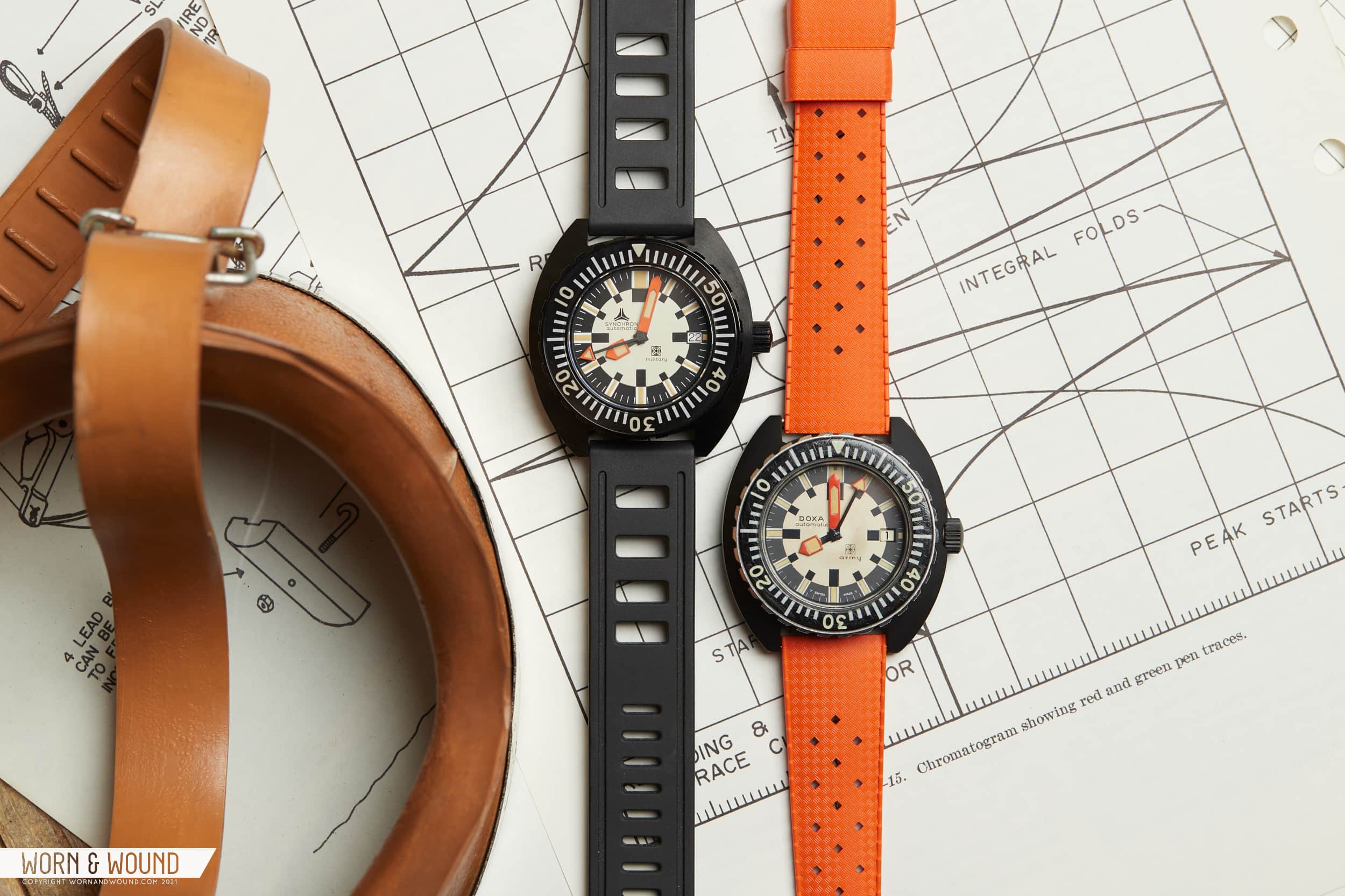
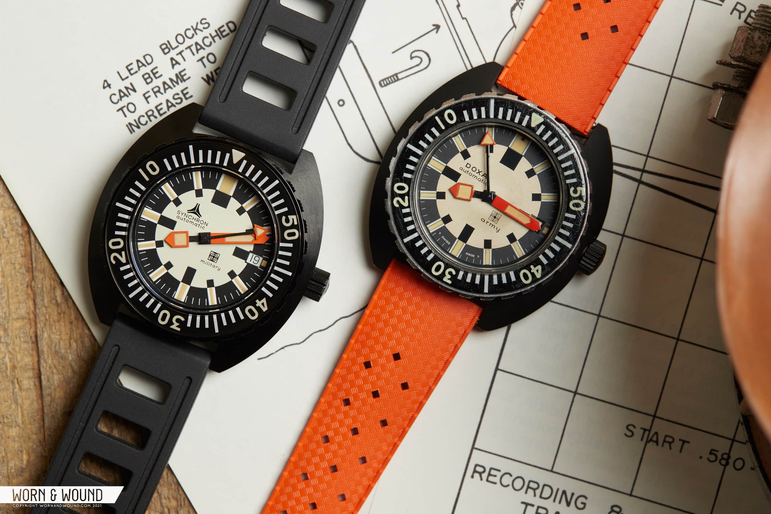
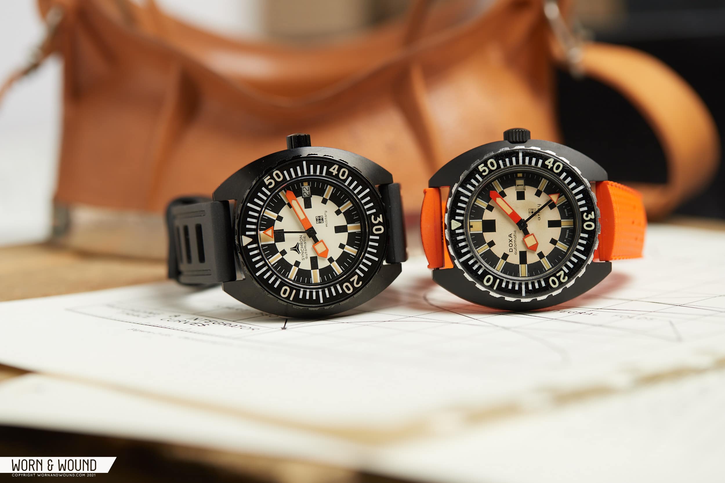
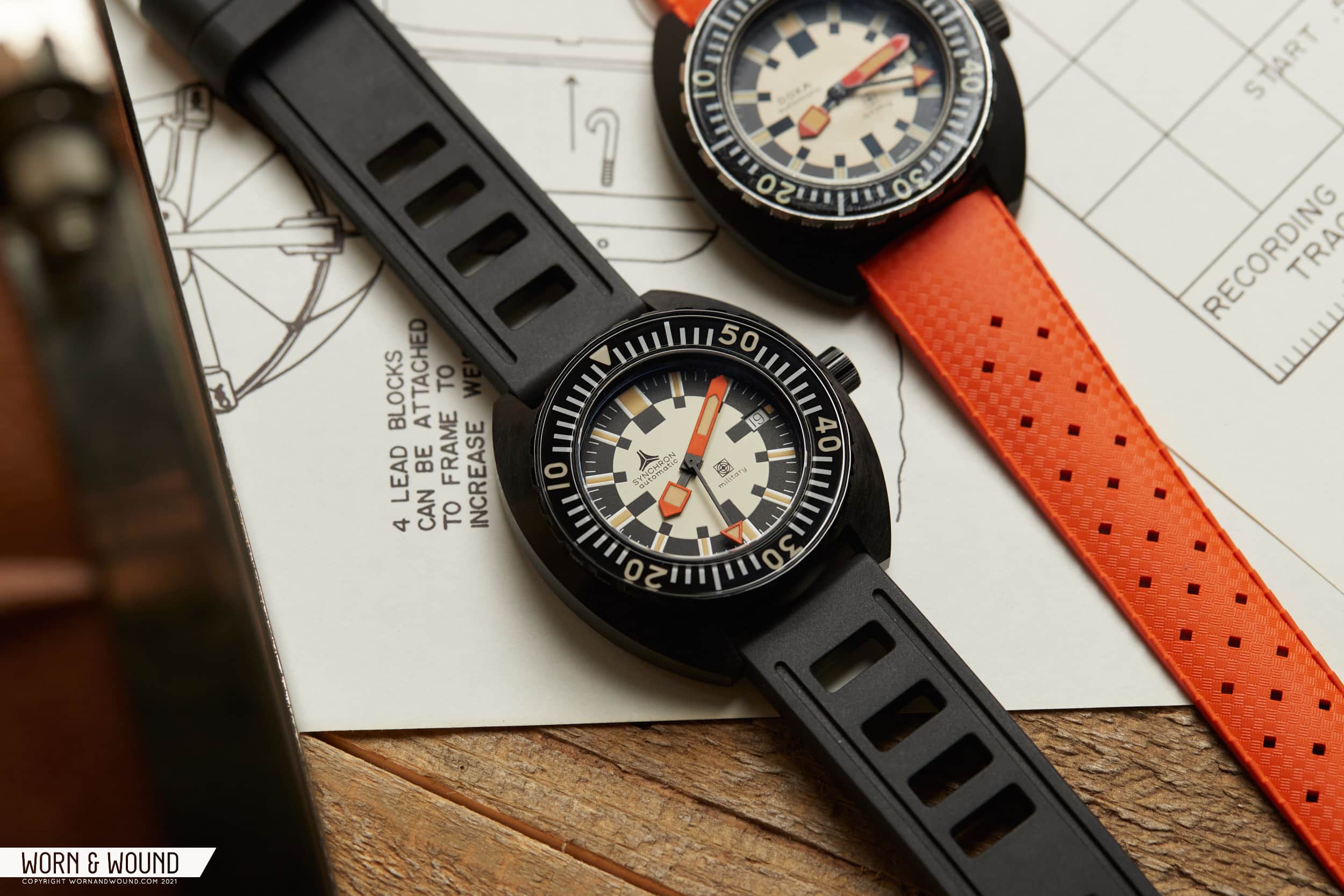
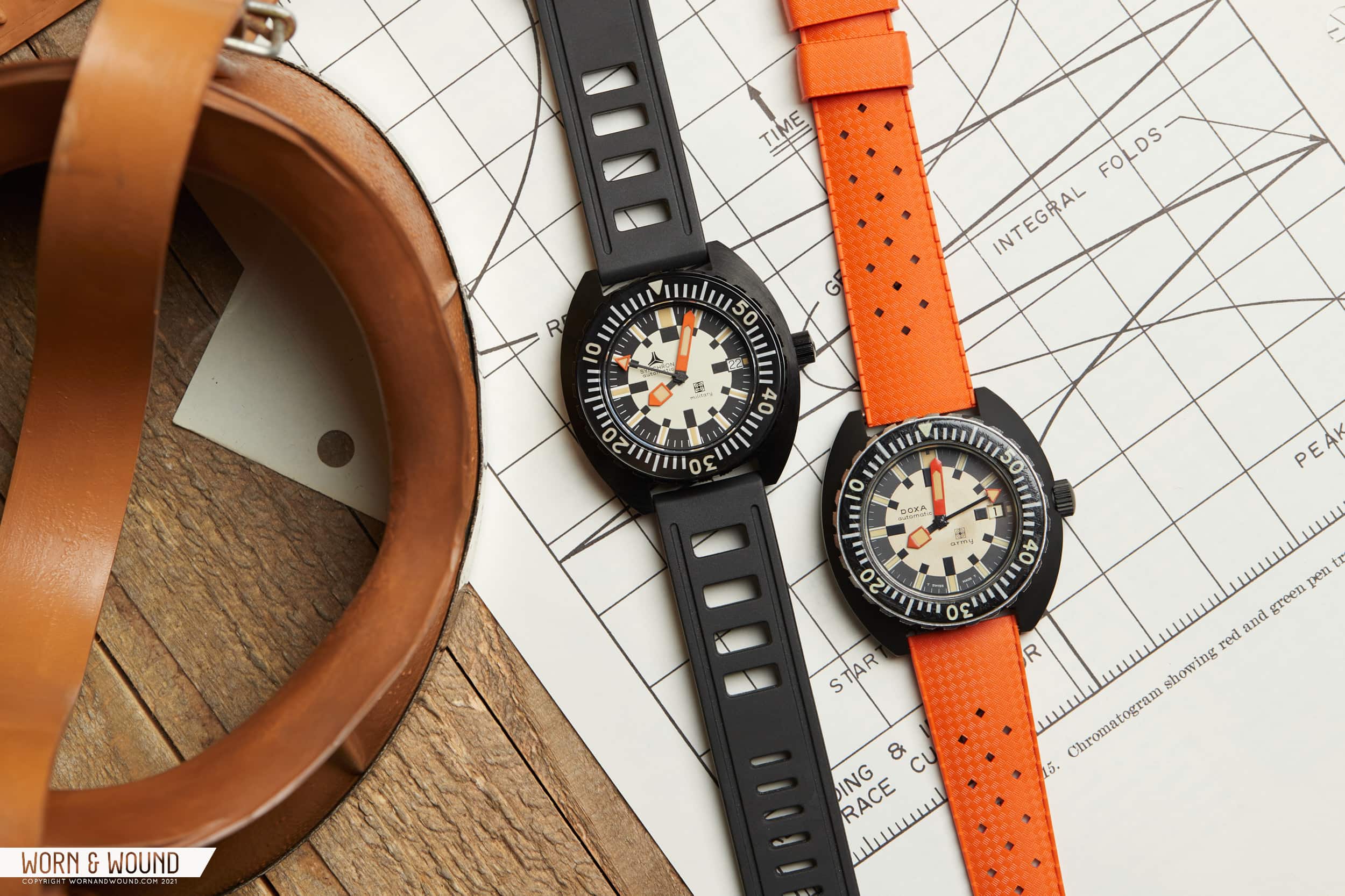
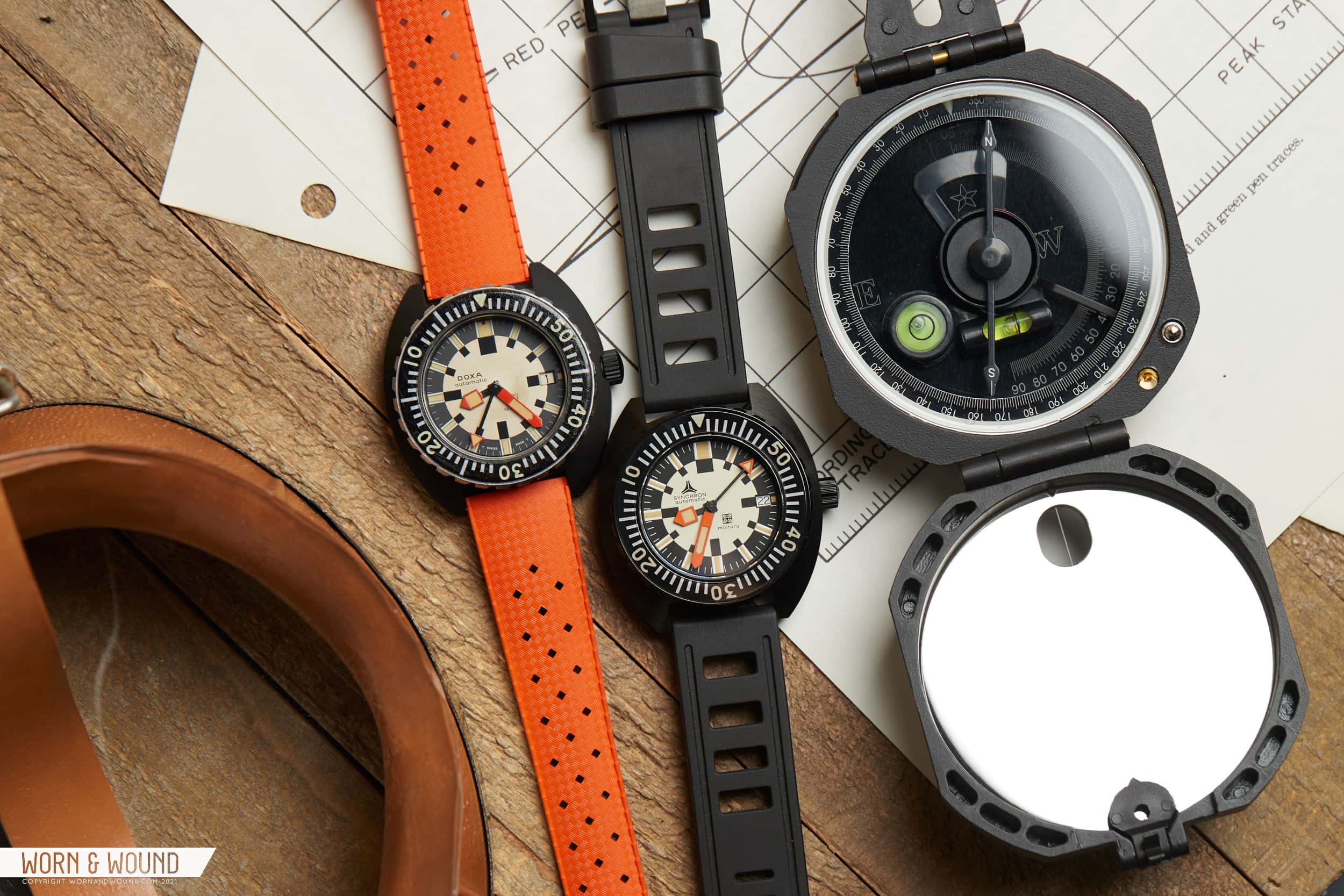
But, I’m not really here to philosophize about homage watches, rather to take a look at a watch that is an homage, and does exactly what I described above. In fact, had it not been for this watch, I likely would have never known about the original. Most of the time, homage watches are based on references that, as an enthusiast, I am at least somewhat aware of. Mil-subs, Fifty Fathoms’, Daytonas, etc. The Synchron Military, however, is based on a very rare and obscure watch I hadn’t heard of: the DOXA Army (admittedly, DOXA is not a brand I’ve spent much time researching).

Of course, if you were to head to Synchron’s website, you wouldn’t know about it either. Not to digress, but this release was one of the more “insider” releases I’ve seen in the industry. Heck, we didn’t even get a press release about it, and by the time we knew it had come out, they were all but gone. So, this review is actually the first time the Synchron Military has graced the pages of Worn & Wound. As for their description of the watch, all you get are some odd blurbs about the 1970s – “Land yachts, wide trousers, big guitar solos, bigger hair. And bold wristwatches. The Seventies was a decade that saw an explosion of style…” and some hyperbole about the watch – “The SYNCHRON MILITARY, with richly reproduced colors, and bold, high-contrast dial markings, this new Synchron Military Frogman Homage represents the pinnacle of dive watch utility.”

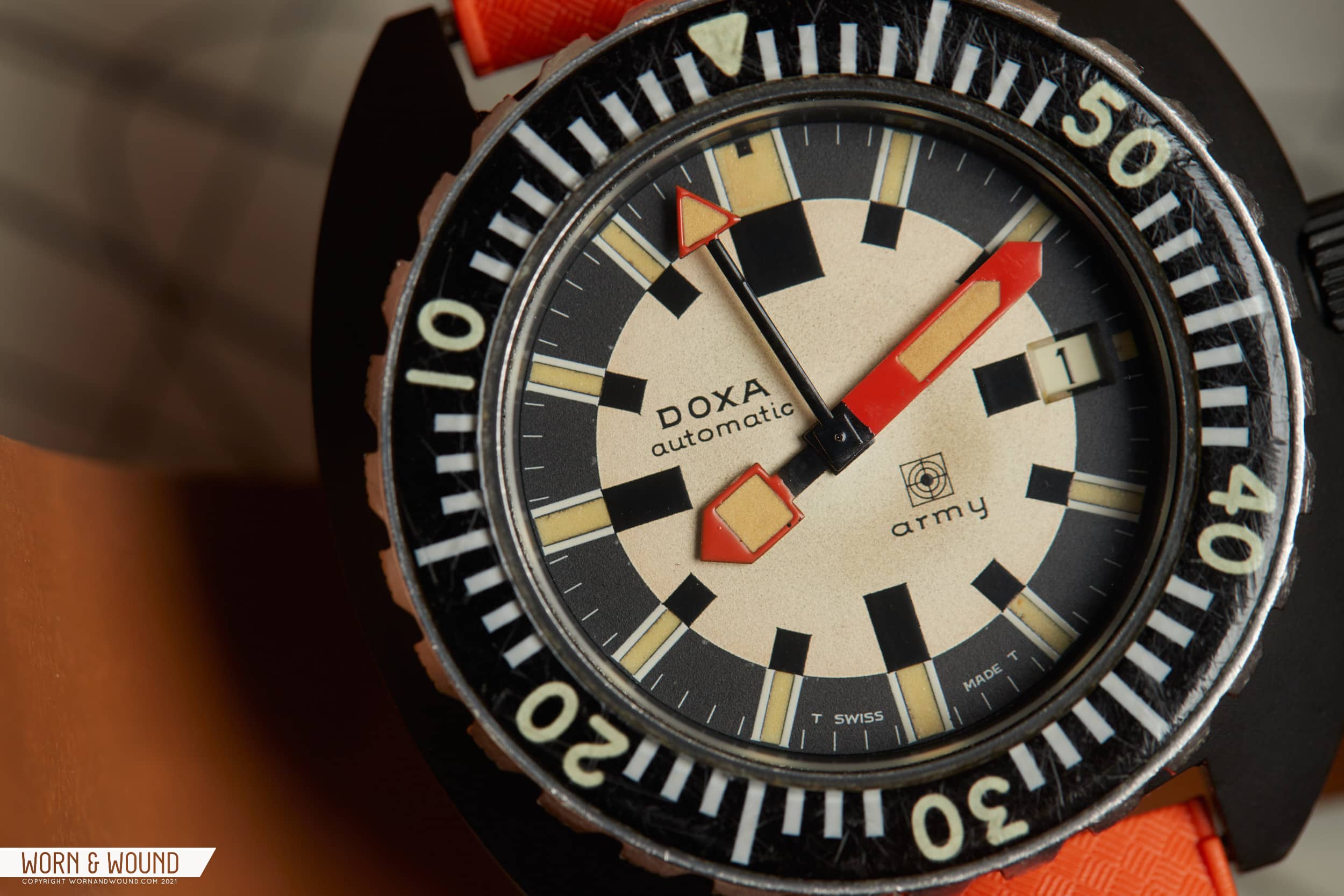
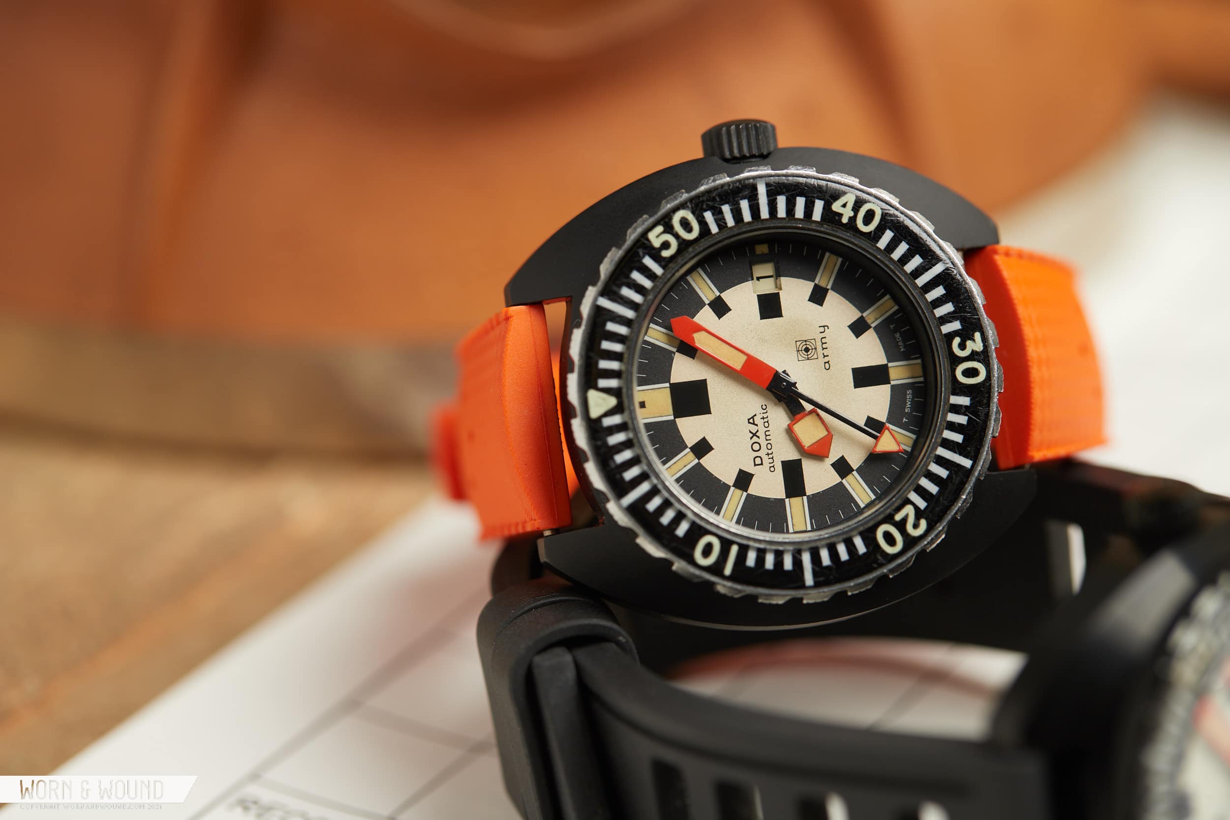
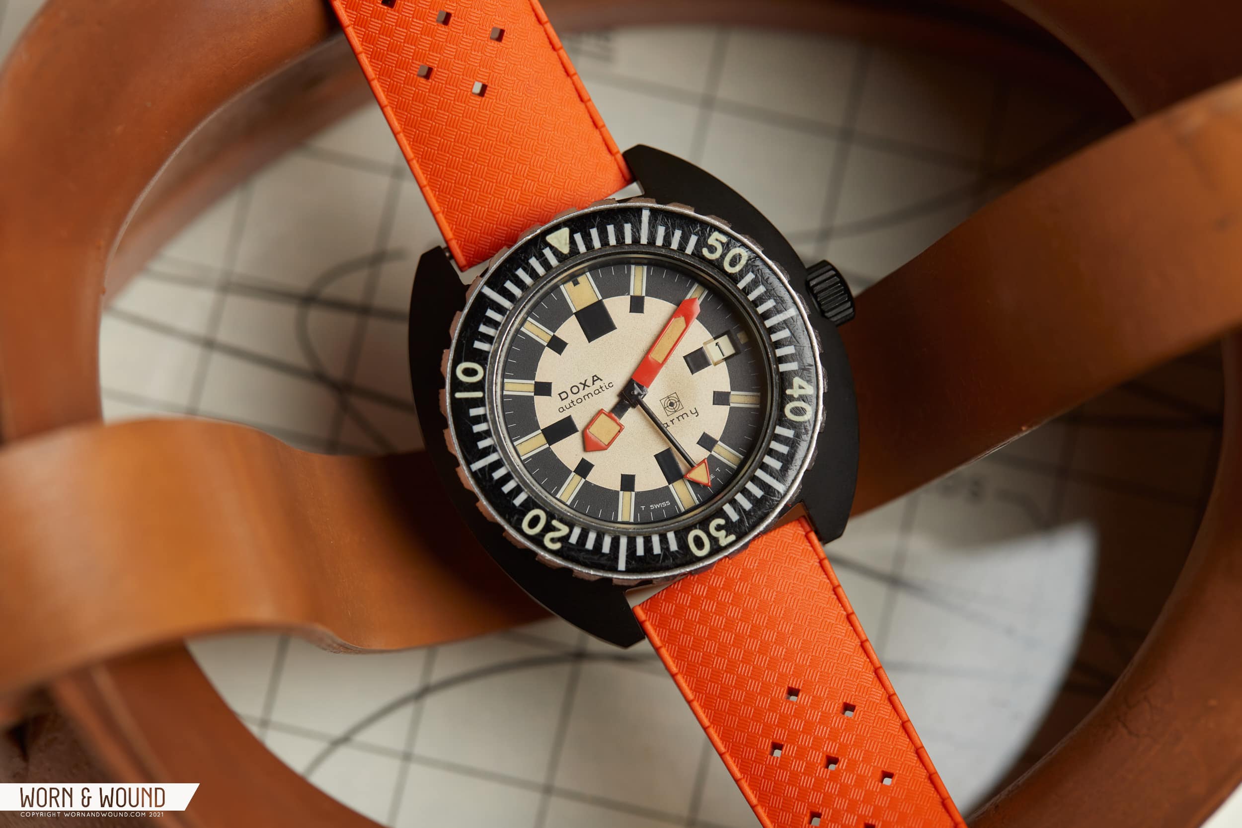
No mention of the DOXA Army. No mention of what made it special, or interesting. Nope. You had to know to care. Well, or, like me, just like the damn thing – but I’ll get more to that later. The DOXA Army is one of those watches that has a sort of mythical status. Rarer than hen’s teeth, as they say, allegedly only a handful were made, and likely fewer still exist today particularly in good condition. Some say they have real military provenance, others don’t. What is sure is that in all likelihood, you’ve never seen one before, and, like me, possibly never even heard of it. Luckily, being in NYC, I was able to borrow one (of likely only a few) from the folks over at analogshift for the sake of this review.

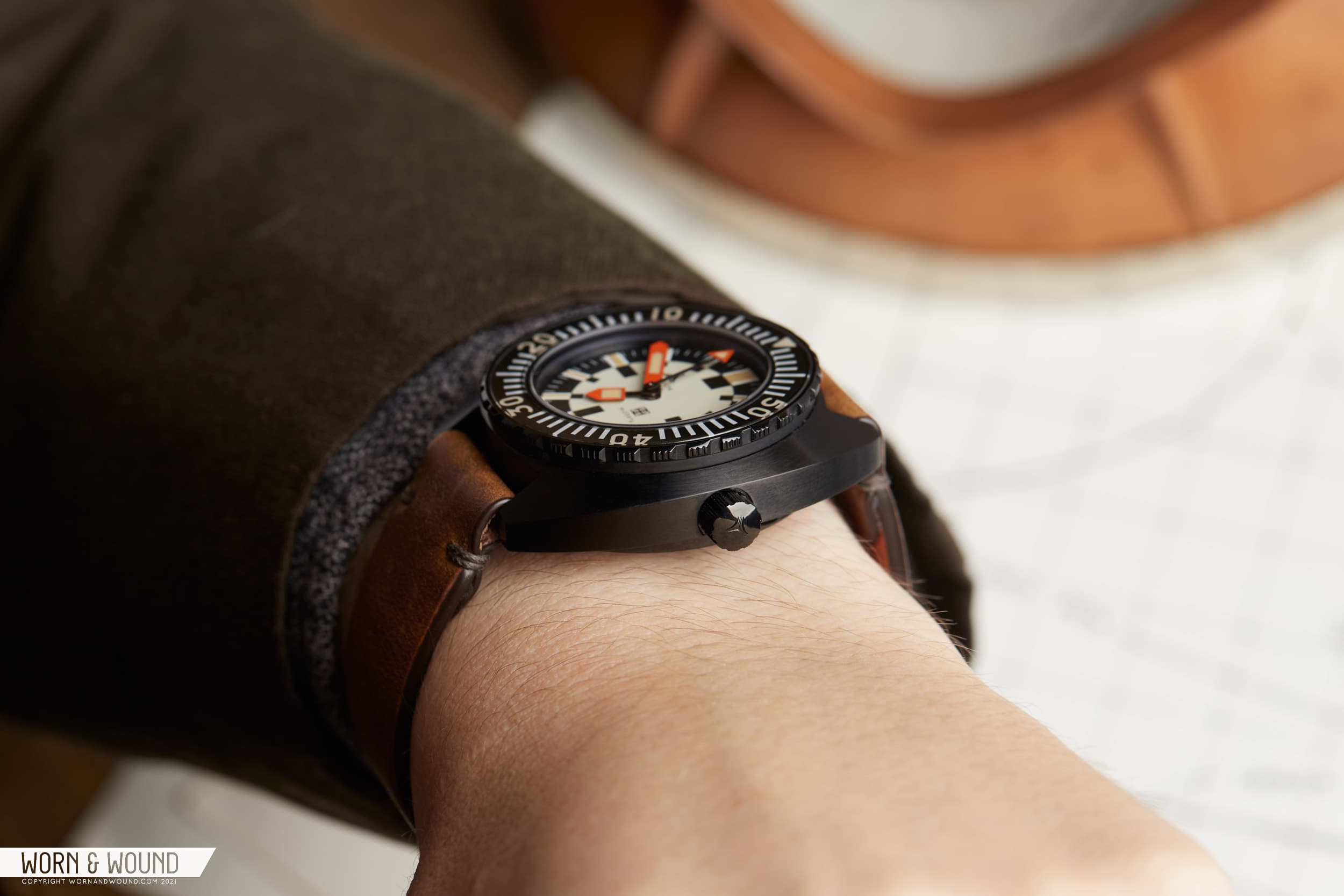
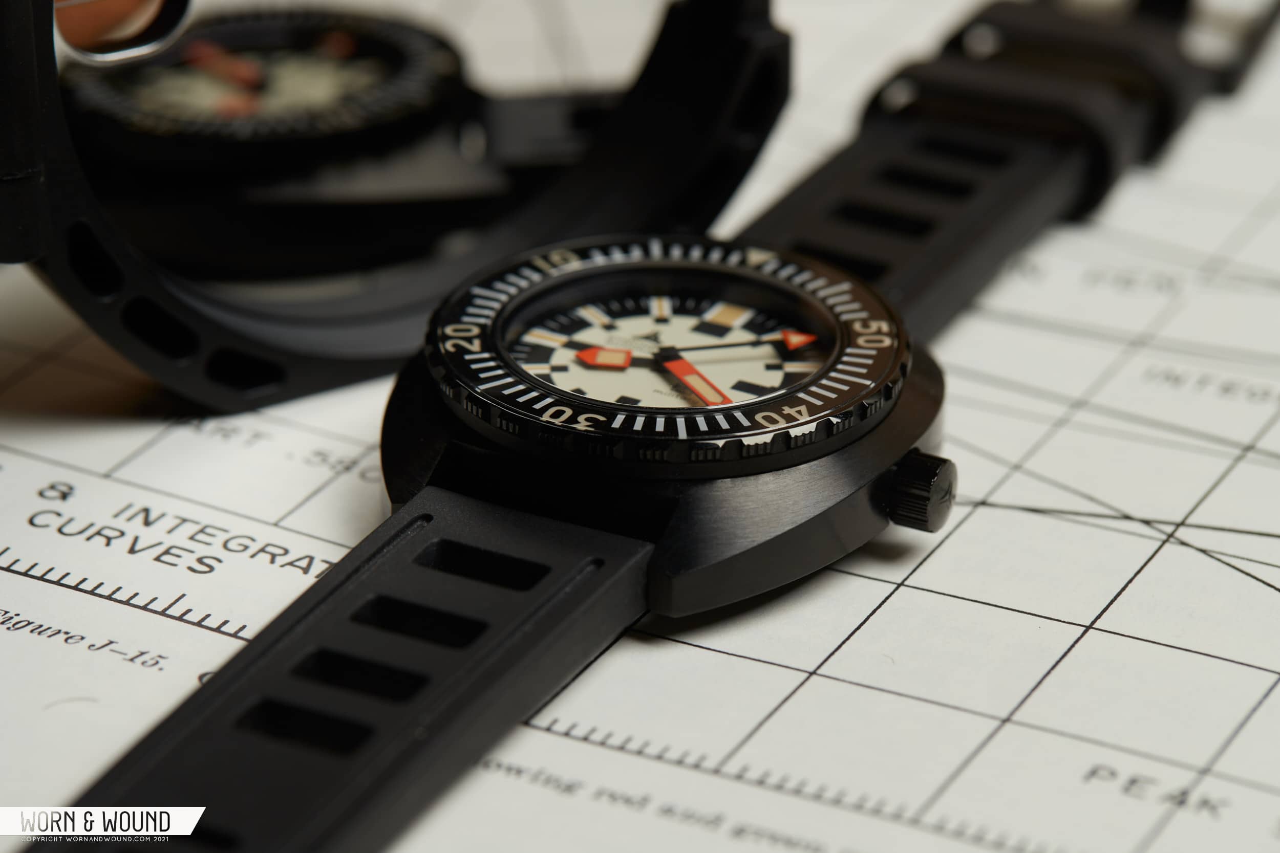
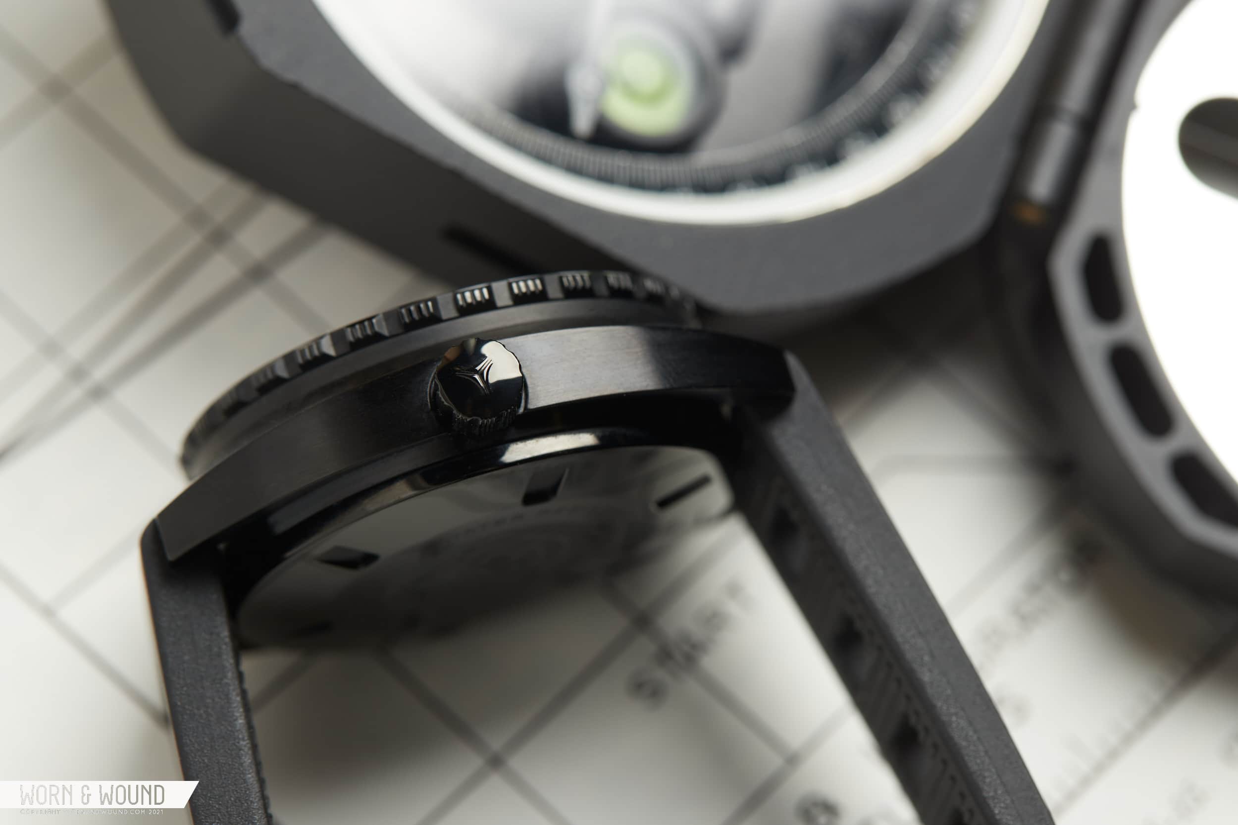
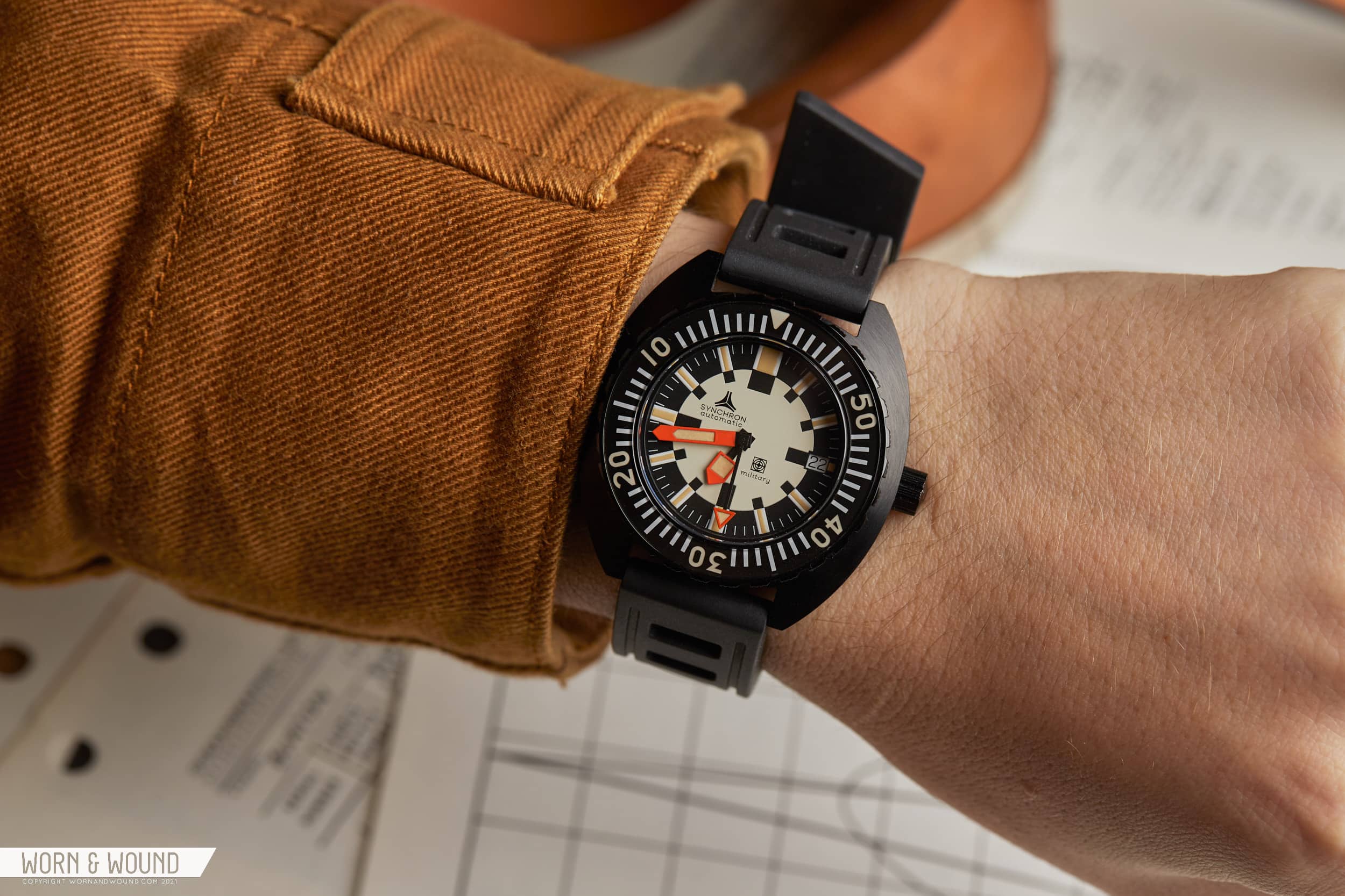
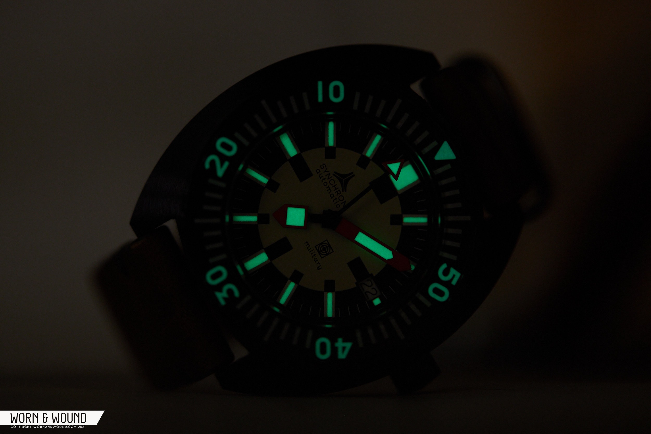
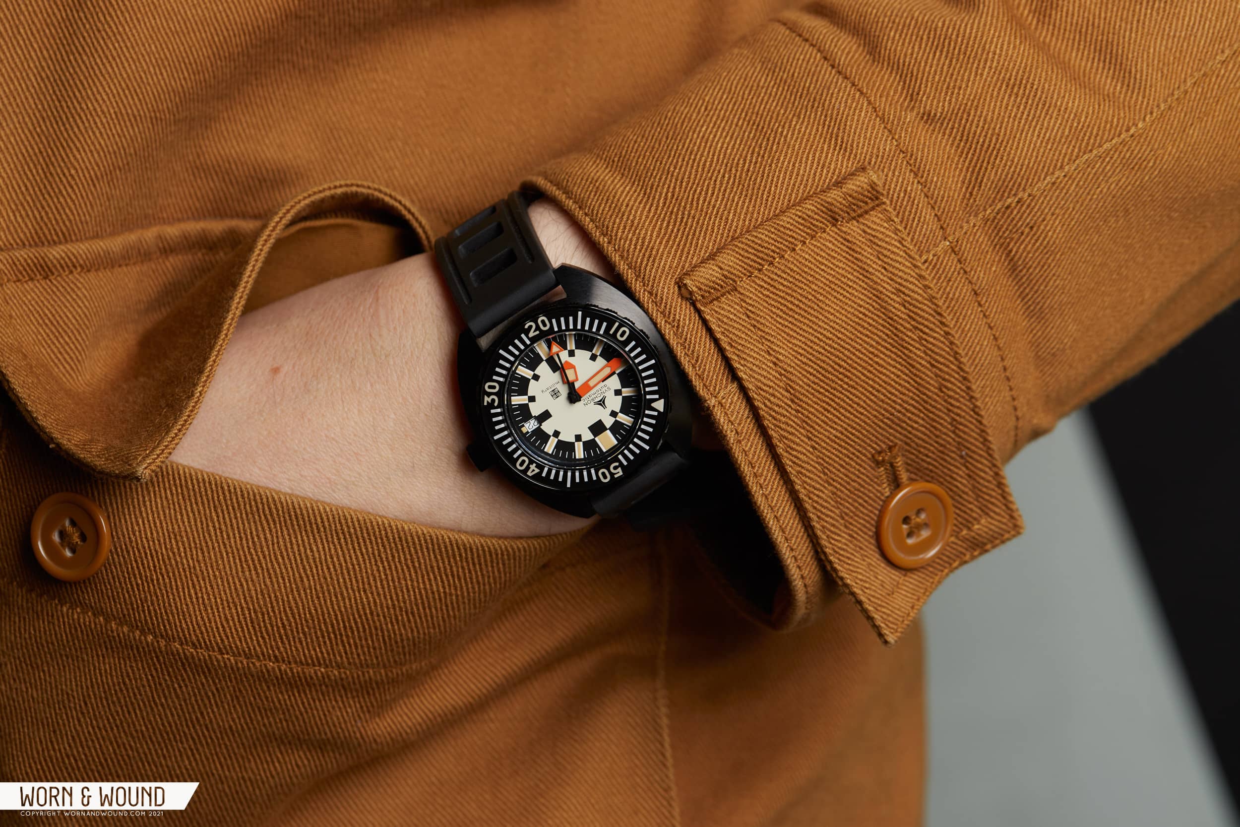
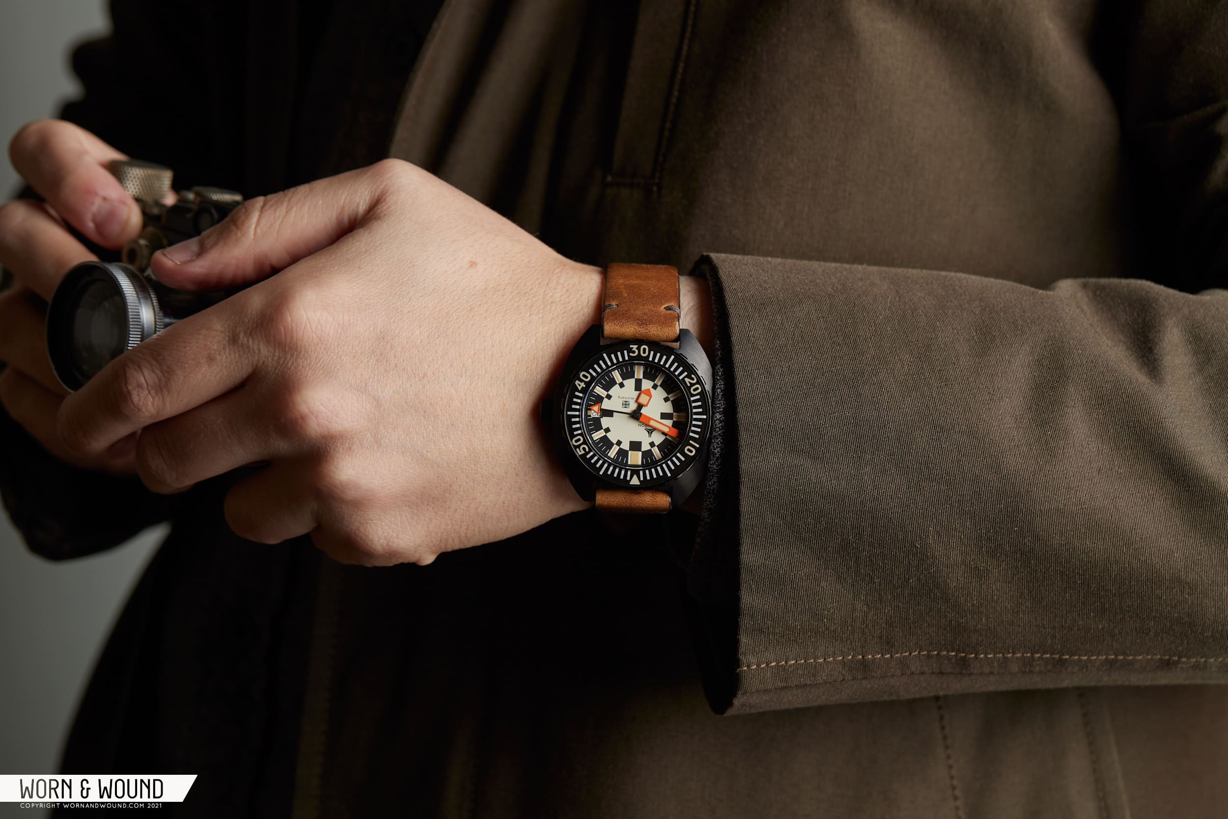
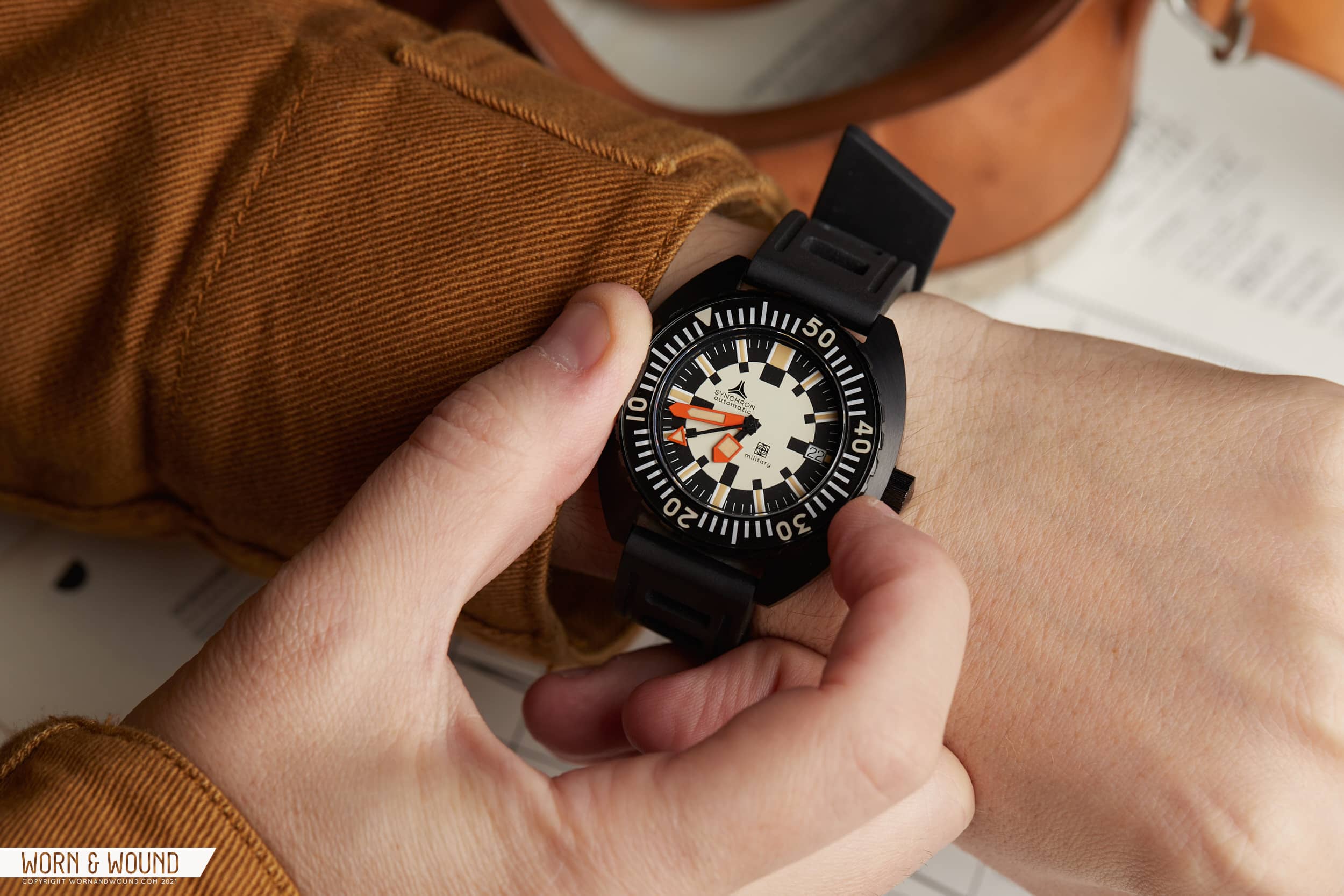
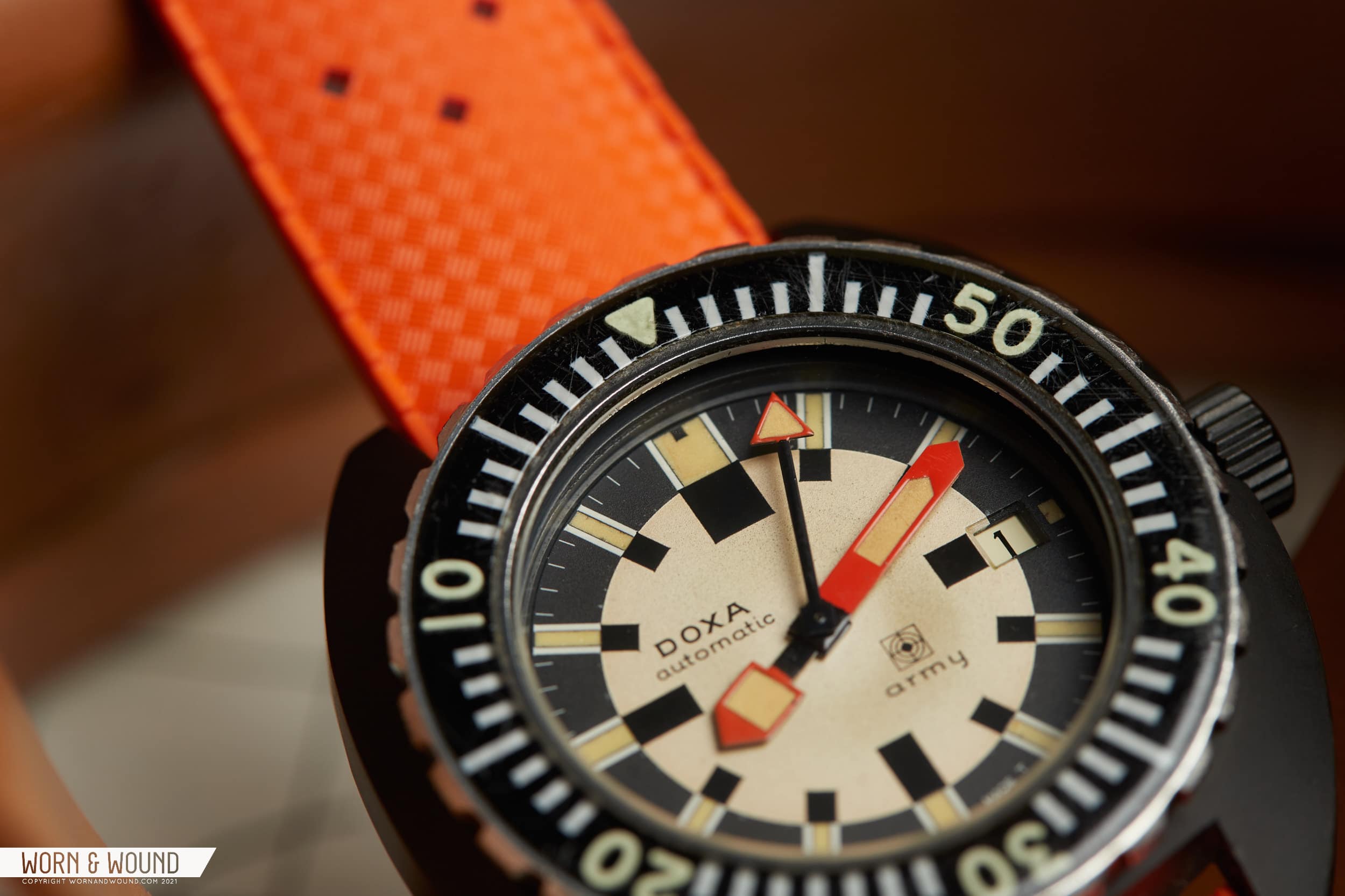
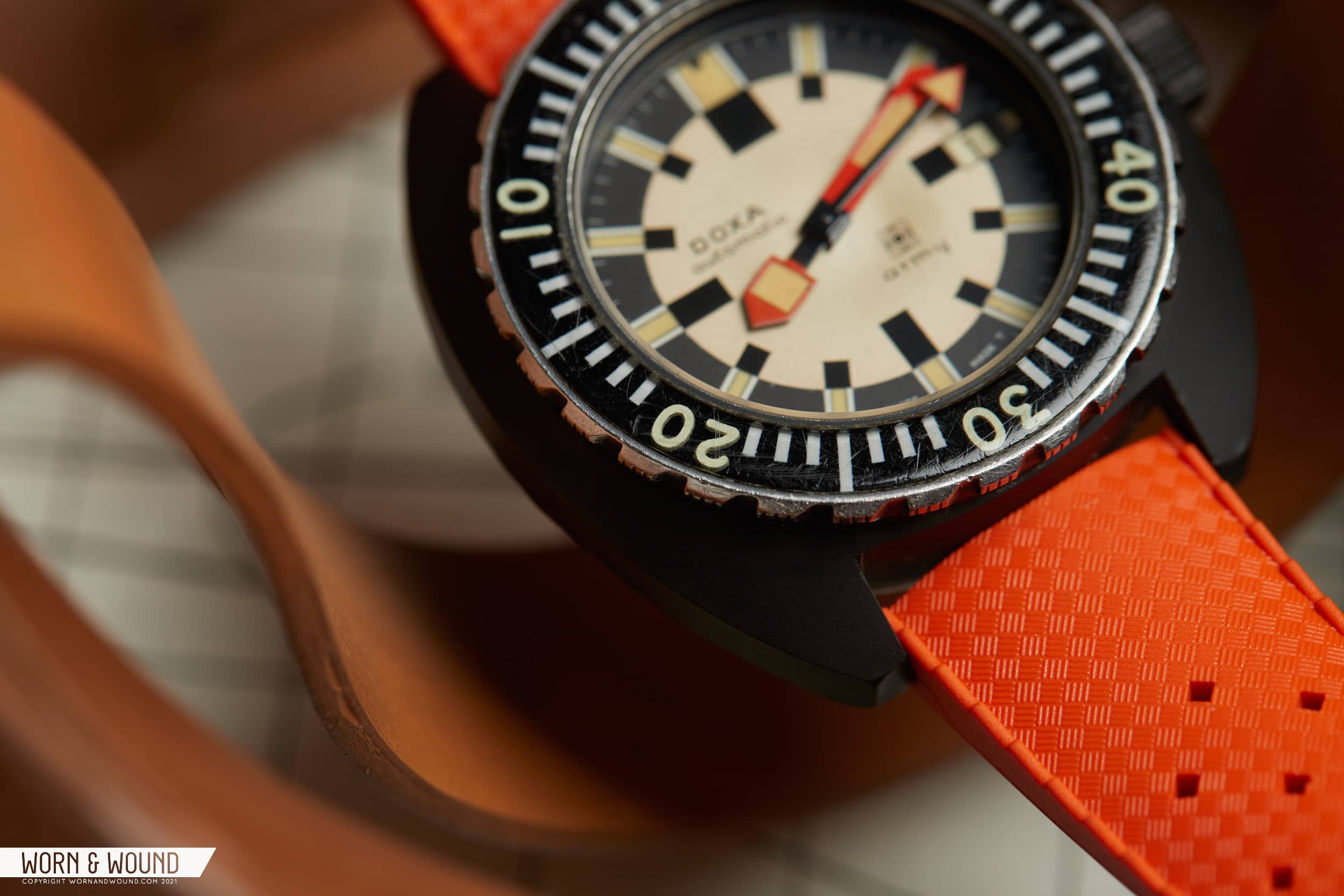
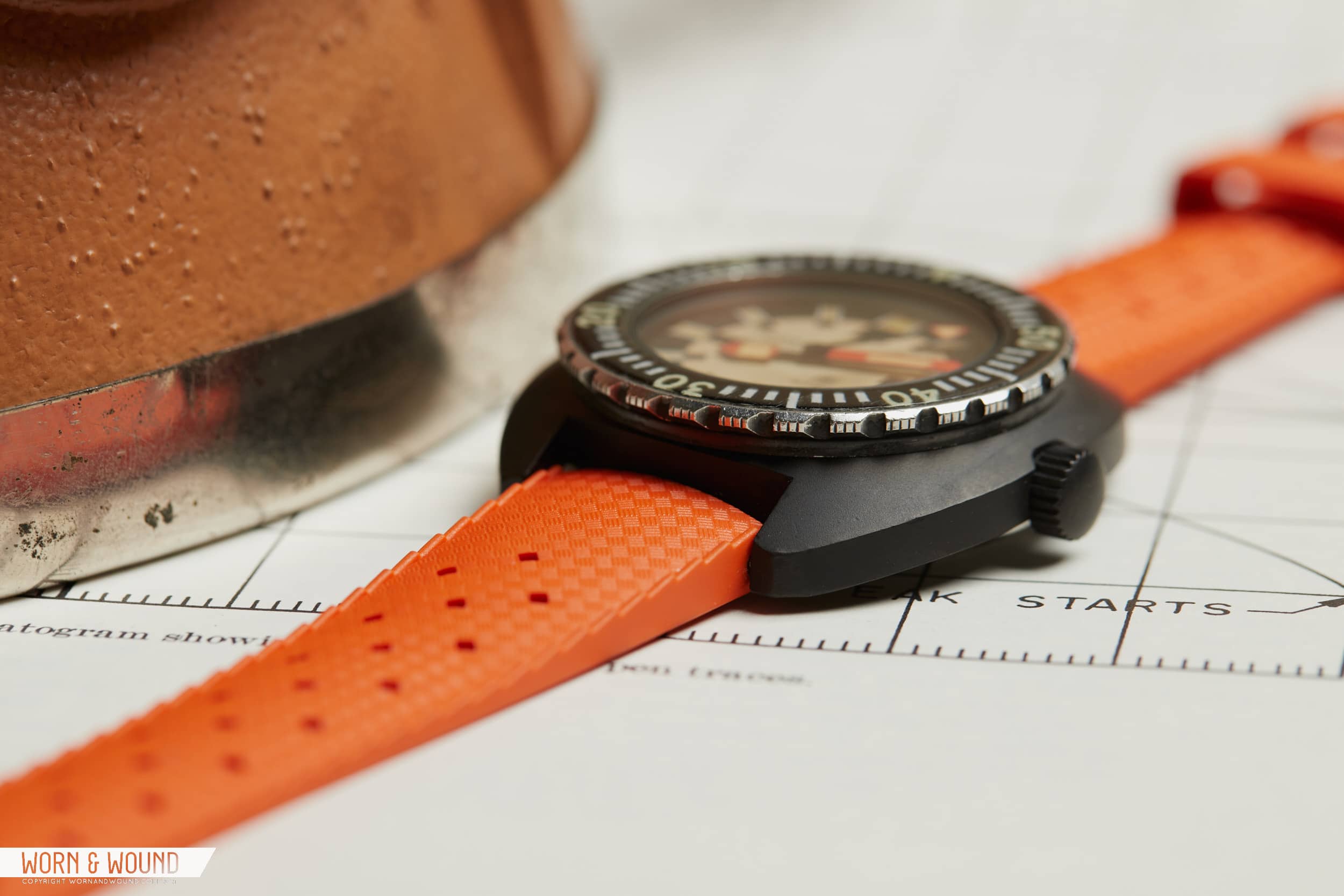
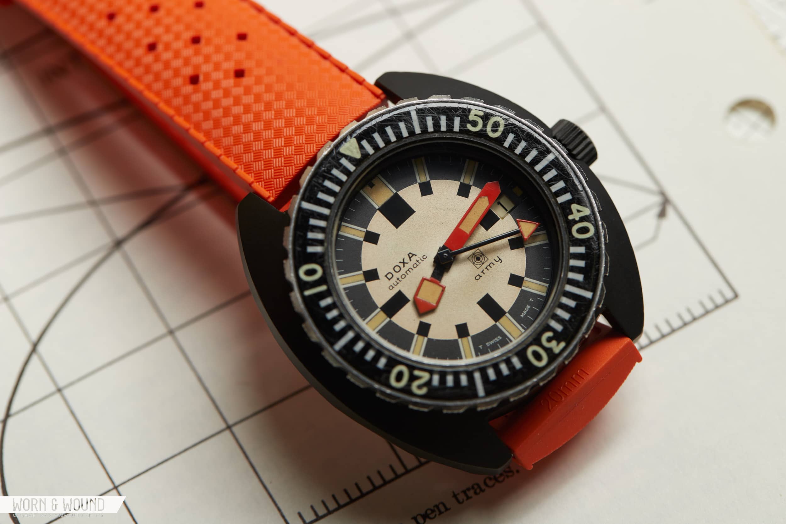
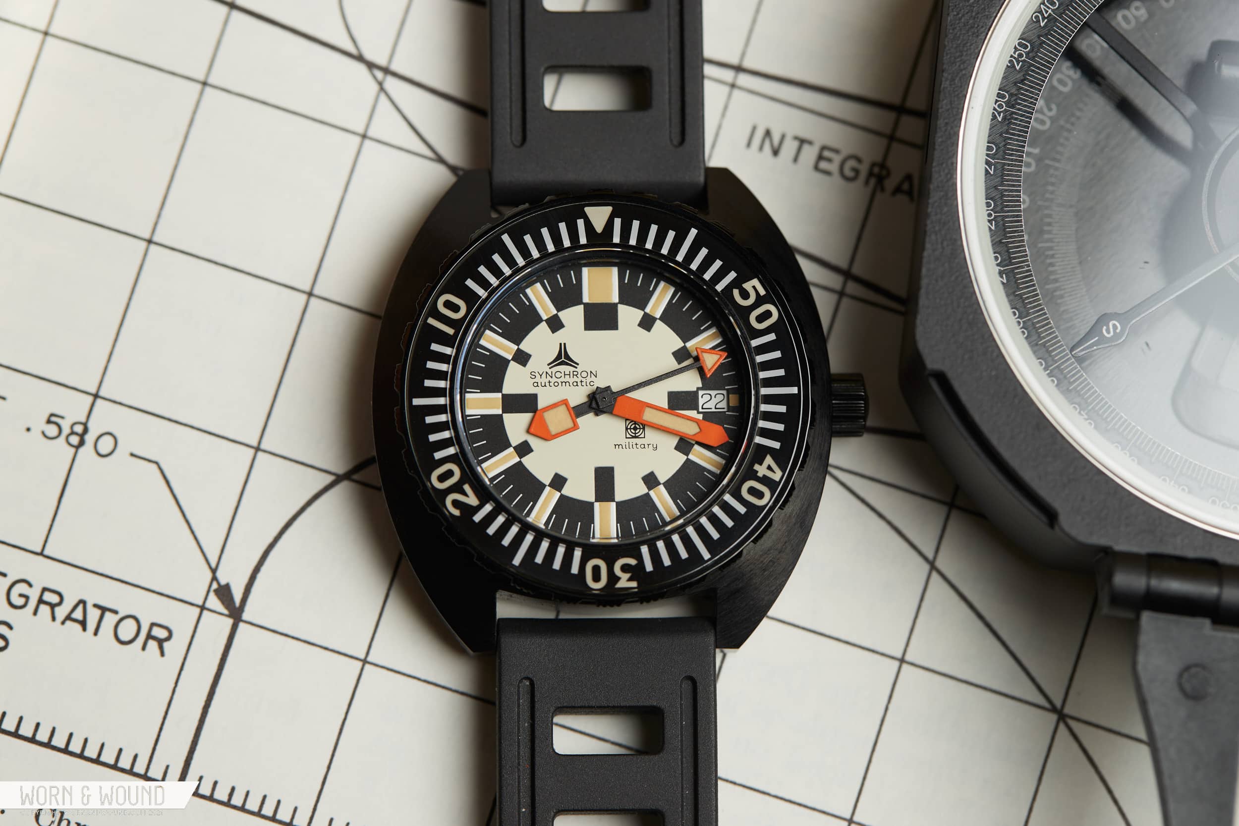
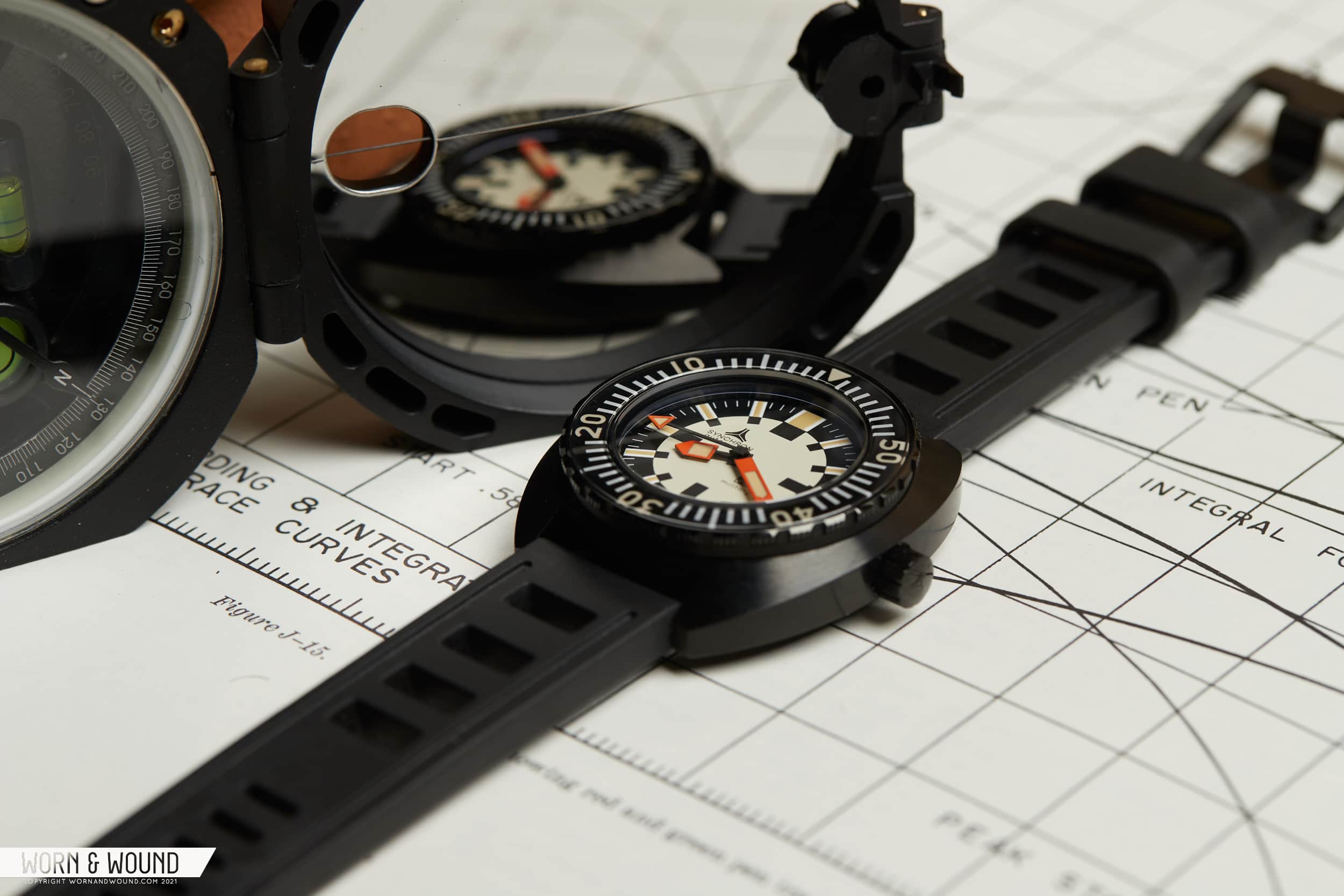
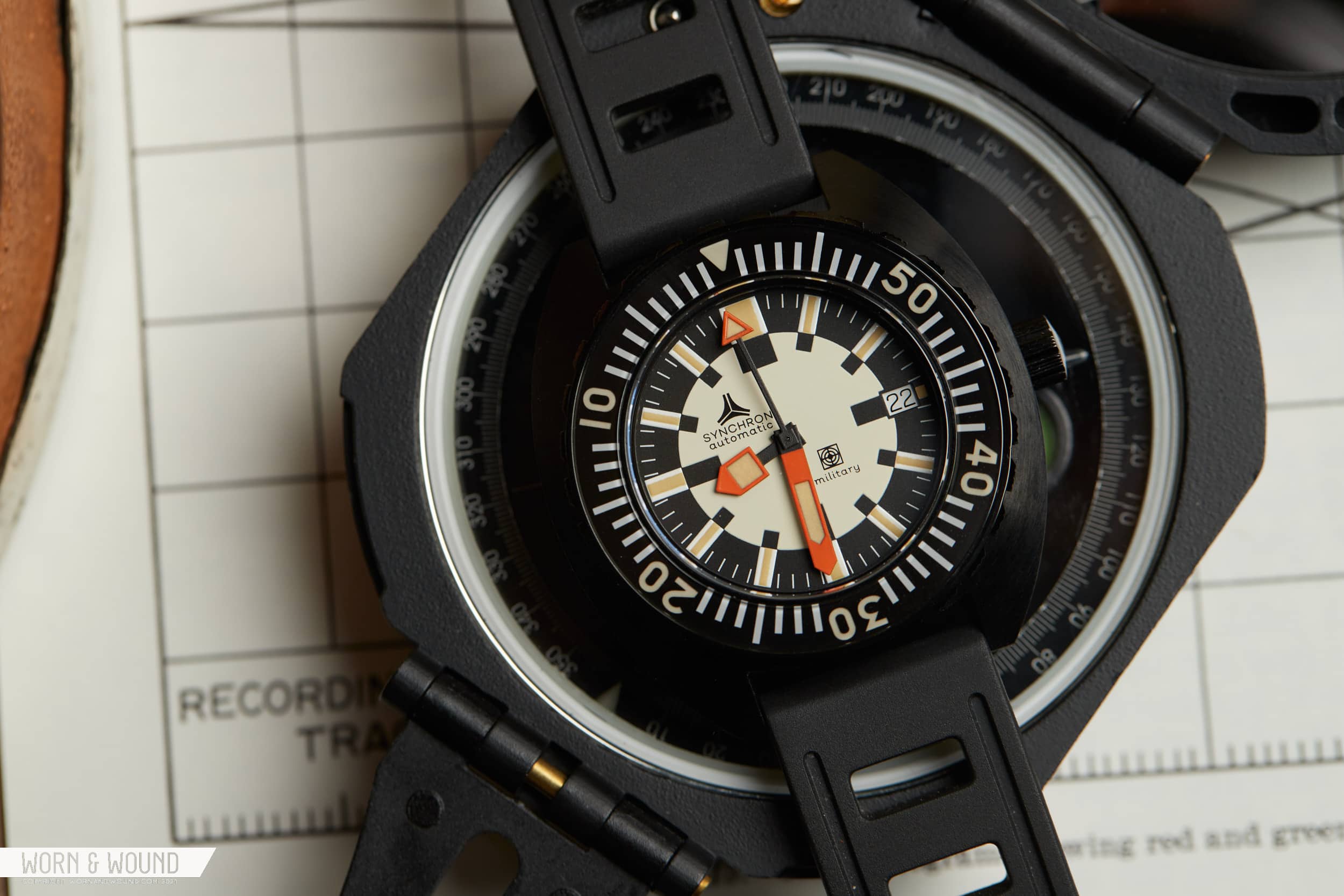
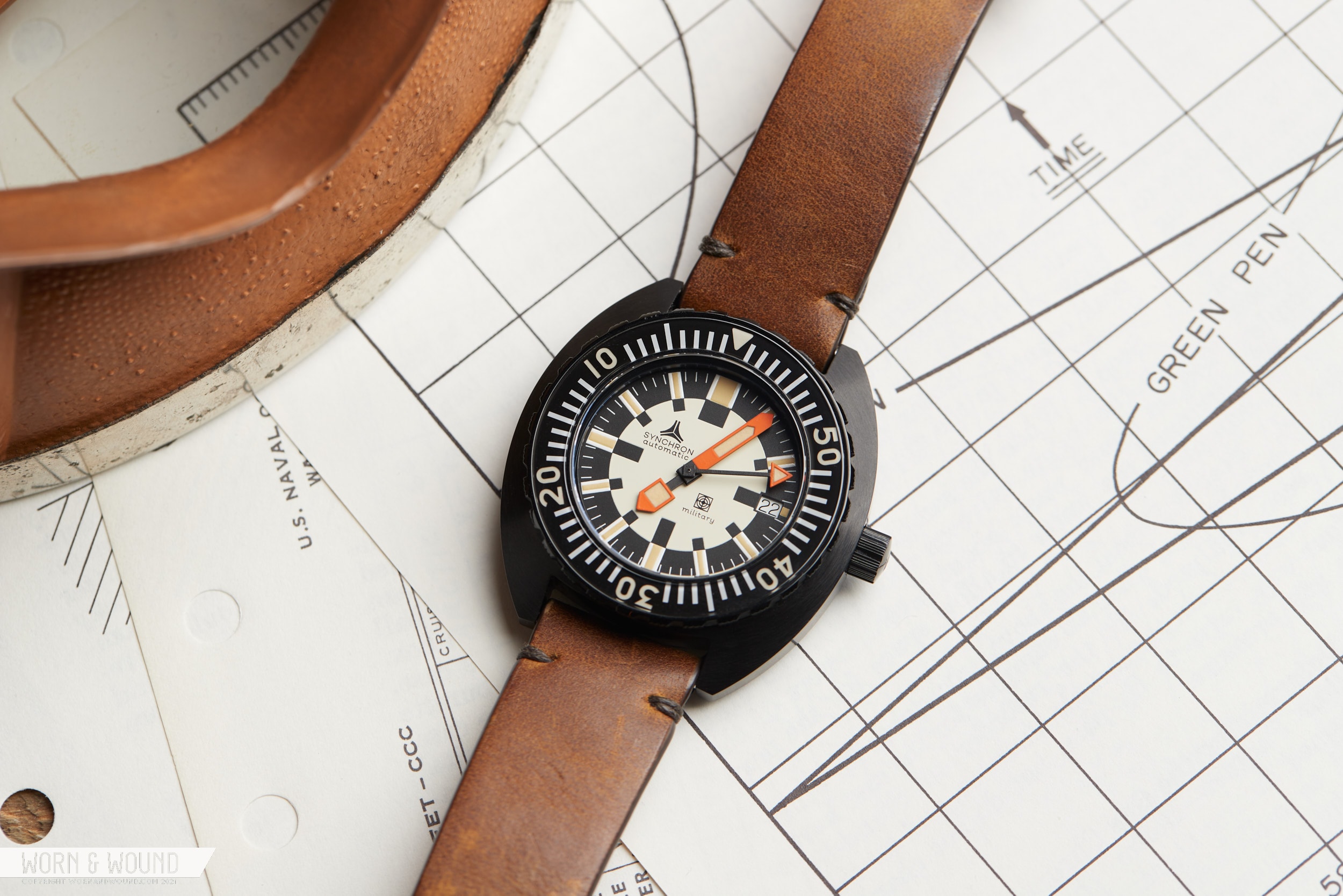
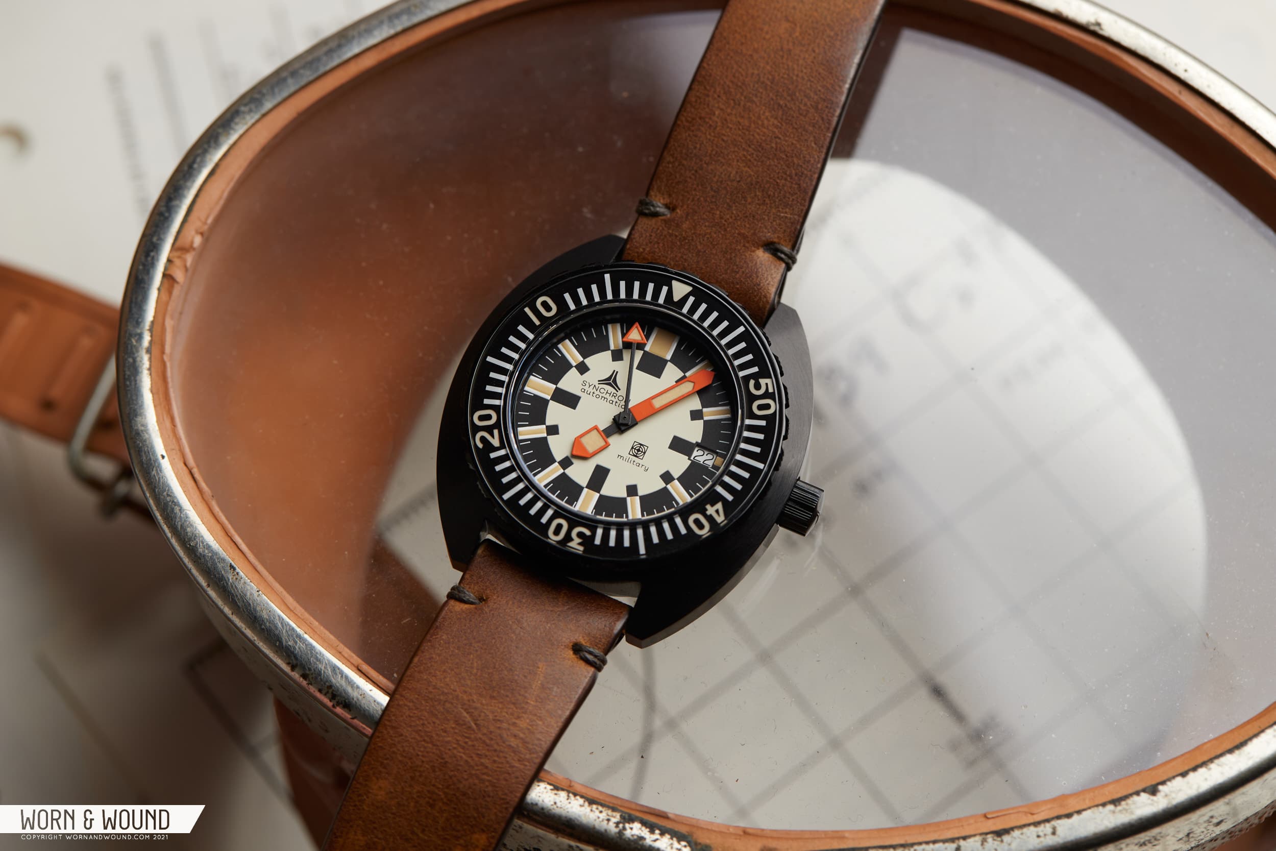
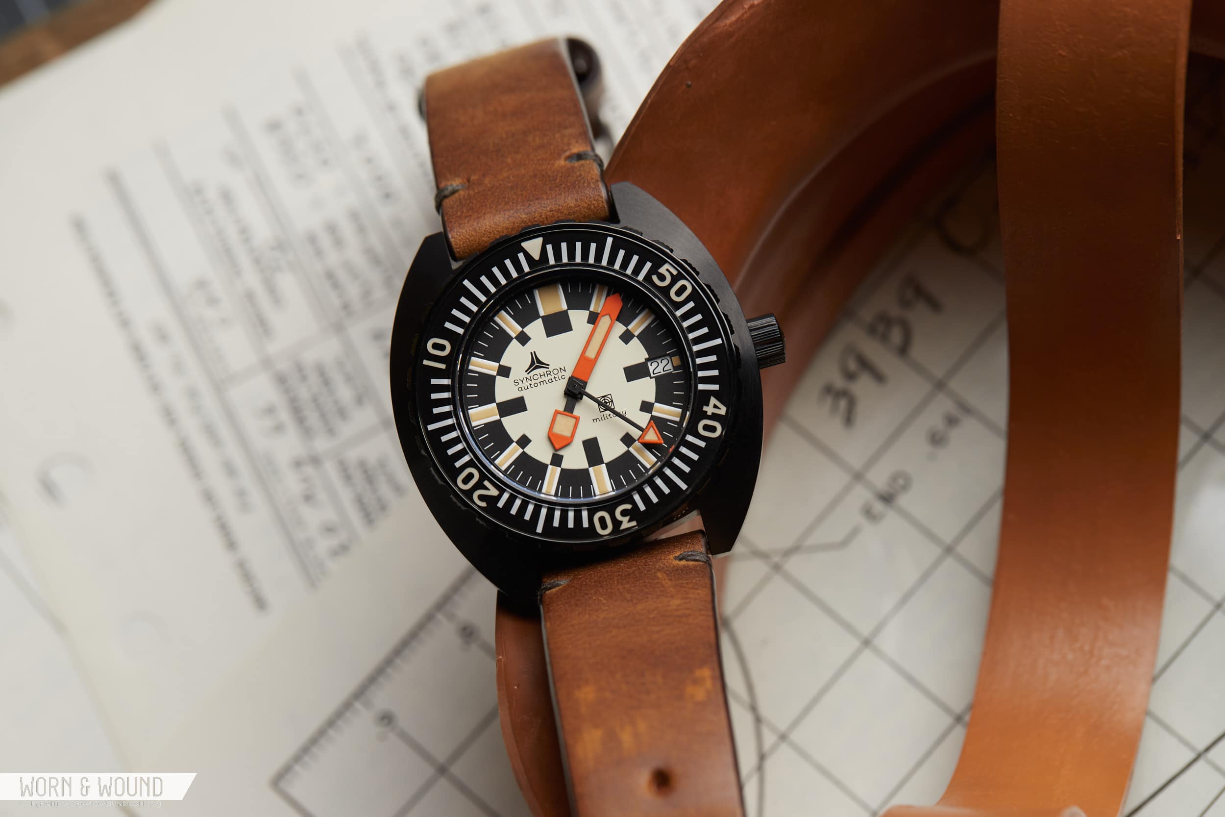
With that said, what I find most intriguing about it is its design language. At a glance, you wouldn’t necessarily think it was a DOXA. Their signature split-bezel insert is not present, rather one that is more Omega in flavor, nor their bright orange dial. The hands are odd blocky shapes, and the dial is a two-tone sector-of-sorts that is its own weird thing. Consisting of an inner circle in white/cream with black blocks for and index, and an outer ring in black/dark gray with strips of lume over white rectangles, it’s also not what one typically associates with military designs, which tend to reduce for the sake of legibility.

Yes, the barrel case is there vis-a-vis the Sub 300, but they were hardly the only brand to use them in the ‘70s. And it’s also matte black PVD… that early, scratches-just-by-looking-at-it PVD. It’s a weird watch. It’s a cool watch. It’s its own thing, to paraphrase David S. Pumpkins. Back to the point, as a watch to make an homage to, I think it was a good choice. It’s an odd blip in the history of a popular, if still-cultish-brand, that doesn’t look like a million other watches and is so rare you can’t really expect to ever own one (it’s also a five-figure watch). But, the story doesn’t end quite there.

You see, the brand that made the homage, Synchron, isn’t a new brand either, and they have a strange relationship with DOXA. An earlier version of Synchron actually owned DOXA for a period in ‘60s and ‘70s (vintage DOXA fans are likely aware of what is referred to as the “Synchron-era”). So, it’s possible they were the owner when the DOXA Army was made. Fast forward to 2021, and the modern Synchron is under new ownership, and both a brand, and the group name behind a couple cult-dive watch companies you’re likely familiar with, Aquadive and Aquastar, and they own and manufacture Isofrane and Tropic Straps. So, they know their stuff when it comes to tool watches and divers. Still with me? Well, it gets a bit weirder as the owner of Synchron used to work at… yeah, DOXA.

Does this really matter? No, but it gives the watch a little greater context, and at the very least a look at why they might have even bothered to make the watch in the first place. And, to be honest, none of this relates to why I picked one up. As said, the Synchron Military, which was produced as a limited run of 500, sold out before I even knew about it. But, I happened to see one on a wrist at our Pop-Up shop back in August, and just kind of fell for it. A quick search on WatchRecon a few days later, and one was mine. So, let’s finally review it.

Advertisement
$1290

Owner’s Review: the Synchron Military

Case
Coated Steel
Movement
ETA 2824-2 or Sellita SW200
Dial
Black and Cream
Lume
Yes
Lens
Sapphire
Strap
Isofrane Rubber
Water Resistance
300m
Dimensions
42 x 45mm
Thickness
14.7mm
Lug Width
20mm
Crown
Screw-down
Warranty
Yes
Price
$1290

Case

The Synchron Military is what I’d affectionately refer to as chunky. It’s 42mm x 45mm x 14.7mm thick, and essentially flat, so you see and feel that height. But, it’s also an unabashedly ‘70s watch (as Synchron’s copy already let us know), which was definitely an era when watches got bigger and bolder, if at the expense of ergonomics. In other words, it’s part of the charm.

The barrel shape is geometrically simple and keeps the lug-to-lug in check. No bevels or polished chamfers, just slab sides and a curved top surface that is dominated by the sapphire-inlay bezel. It’s nicely machined with sharp lines all around and a light, but even brushing under the black coating, which isn’t specified as either PVD or DLC.

The bezel does steal the show a bit. The buzz saw grip, a DOXA detail for sure, adds an aggressive texture, while the wide sapphire glistens in the light. The index underneath is intense as well, featuring thick white lines per minute all around, with numerals every ten and a triangle at 0/60. The style of the numerals is a bit odd. They look like they are trying to escape. They are also a bit out of balance, with the tens digit often being a bit wider than the zero next to them (i.e. 5 is bigger than 0 in 50), making me think it’s a mix of types. It’s almost so off it looks intentional and given the historic and military roots of the watch, part of its personality. If this were a new design, I’d say they need to talk to their designer.

The numerals and triangle are ”old radium” lume, definitely going for a bit of the fauxtina look here. That said, it works, in my opinion, but I might just like khaki lume in general, particularly with black cases. Flipping the watch over, the case-back is solid and is also fully black-coated. At the center is a target logo with Synchron underneath, playing off of the DOXA design. The watch is also numbered.

Dial

While I like the case, it’s the dial that keeps me coming back. As said before, this it’s own thing, and graphically speaking, is just something I really resonate with. The dial is a single surface and completely flat. The matte surface is two-tone, with a cream circle at its center, surrounded by a wide black ring. The ring visually bleeds into the bezel, creating a much larger region of black than cream. The result is a lot of pressure on the center circle, and a pull towards it, as though you’re looking through a tunnel.

The main index is a series of wide cream blocks with khaki lume strips that cut through the black ring. Once they hit the center, they switch to matte black blocks, giving them additional significance. I love this detail for two reasons. First, is that they use the same shapes, but flip the colors to create essentially two indexes, the inner for the hour, and outer for the minutes. That’s just clever and successful design. The second is just the visual effect, as it looks like the blocks hit some sort of filter or portal, turning them into shadow forms of themselves. Combined with the pressure mentioned before, there is something sci-fi about it all. As though they were designed for an elite ‘70s space force.

Text on the dial is odd, but faithful. On the inner circle at 10/11 is the Synchron logo, while across the dial at 4ish is a target logo (not that target) with the word military. Once again, a detail that’s so odd, it only makes sense and has charm given the historical roots of the design. At three is a date window which also keeps with the original. Though the date just sort of punches through, it doesn’t feel out of place on the design.

It wouldn’t be a funky ‘70s diver without funky ‘70s hands, and the Synchron’s got them. The hour hand is the weirdest of the three with what looks like a simplified house sitting on top of a black post with a single large window. It glides along touching the black marks on the inner circle. The minute hand is then a wide, straight sword projecting out to the edge of the dial. The odd bit here is that the lume sits at the center, sort of floating away from the tip. The logic here? I don’t know, but it makes it memorable. The seconds hand is a simple, but large, triangle sitting at the end of a long black stick. All are rendered in the perfect tone of burnt orange and filled with khaki lume.

Synchron vs DOXA

Homage watches come in two flavors, those that are very faithful to the originals, and those that look like the original, but differ in some significant ways, such as by being larger. The Synchron is in the former camp, yet there are a few differences I spotted with the original Army in hand. While the case width and length are the same, the DOXA is thinner at 13.7mm. While that isn’t much, it does look slimmer as the mid-case has a thinner profile with a slightly more curved shape, and would wear just a touch better. The coating on the original is also matte (the Army seen here was refinished but to original specs), which makes a bit more sense on a military watch (no glare).

The bezel retains the same general style, though the insert is upgraded to sapphire for obvious reasons. Looking closely, I will say that the typography on the original is nicer. The numerals are rounded and narrower, allowing them to fit in the index better. It’s awkward looking on both, to be fair, but the original is just a touch better handled. The detail that was off that I found most surprising was the crown. On the Synchron, it’s long and narrow, jutting straight off the side, and can be a bit of a wrist biter. The DOXA’s is wider and flatter, but more importantly, is nestled slightly into the case side, which gives it a little protection and pulls it in closer as well.

As for the dials, save the words changing, they are remarkably similar in terms of layout. The DOXA is showing signs of its age, which adds character one can’t account for, but otherwise, everything is as it should be, save a little tick mark at 12. Though a tiny detail, it’s one that I wish they kept, and I can’t think of a good reason why they didn’t. One thing that could either be intentional or from aging, is that the outer ring is charcoal gray, rather than black. Why I think this might be an original detail is that the blocks on the inner cream circle are deep black, so they should’ve aged the same, in theory. It’s subtle, but a nice play in tones that adds some more character to the already quite intriguing dial.

Movement

Inside of the Synchron Military is an ETA 2824. Or, maybe it’s a Sellita SW200 elaboré. I don’t know because the site doesn’t specify which and the caseback is closed. Luckily, I’m extremely familiar with both, as many of you likely are, and am confident either will provide a good timekeeping experience.

Wearability

The Synchron I picked up came on a 20mm Isofrane strap in black (remember, same owner). It looks cool on the watch for sure, but I don’t much like to wear them. They are very long, and I just find rubber uncomfortable. Good strap, just not for me. So, I put the watch on a worn leather strap (Model 2 Premium Yukon), and it did the trick. I’m not actually diving with this, as I imagine few are, so in terms of style, this made the warm lume, black case, and overall aggressive demeanor stand out.

In terms of how it fits? Well, it’s a chunky, clunky watch. It’s part of the charm, but it’s also not ergonomic. The watch sits like a metal stone on the top of the wrist. It’s flat, and short lug-to-lug, so it doesn’t hang over, but is just kind of plopped on top. It’s thick and has a bunch of lips, so it will also definitely catch your sleeve. It’s heavy too, so you’re not going to forget it’s there, and the crown is a bit long, so it does stick into your wrist on occasion. The question is, will you care?

And the answer is less than you’d think – or I’d think, in my case. This isn’t a watch I got because I was looking for a practical-everyday-wear. Nor am I trying to compare this to what I’d deem as the current best in the category (BB58, SPB149, U50 – potentially). I got it because it looks cool. It looked cool when I saw it on someone else’s wrist, and it looks cool on mine. From the case shape, to the black coating, to the very-vintage looking bezel, to the unique dial, to the burnt orange hands, and khaki-colored lume – it just brings a smile to my face, and sometimes that’s enough.

Conclusion

If an homage watch is an homage to a watch very few people know, is it even an homage at all? Yes, but unlike wearing a sub-homage, it doesn’t feel like you’re trying to emulate something else, per say, even if you are. If people don’t know the original, there is no reference point. Regardless, I don’t really care that the Synchron is based on a DOXA. Sure, it adds to the “why” and justifies some of the weirder/less appealing design choices, but what makes the watch of interest to me, and why I bought it, is because it’s odd and cool looking. I like wearing it, it suits my style. It’s a DOXA for a non-DOXA guy.

And, as a watch, it’s well made. It’s solid as a rock and decently finished. With a list price of $1,290, it’s neither a great deal or a rip off, and sold out in a flash regardless, so clearly that wasn’t an issue. Of course, if you’re reading this review and thinking “why is he reviewing a watch I can’t get,” well, they do come up fairly often on forums, at least right now, hence how I got one when I wanted it. So, should you be in the market for something odd, fun, and with esoteric historic roots, the Synchron Military is worth keeping an eye out for. Synchron

Images from this post:
Related Reviews
Zach is the Co-Founder and Executive Editor of Worn & Wound. Before diving headfirst into the world of watches, he spent his days as a product and graphic designer. Zach views watches as the perfect synergy of 2D and 3D design: the place where form, function, fashion and mechanical wonderment come together.
wornandwound zsw
Categories:
Tags: