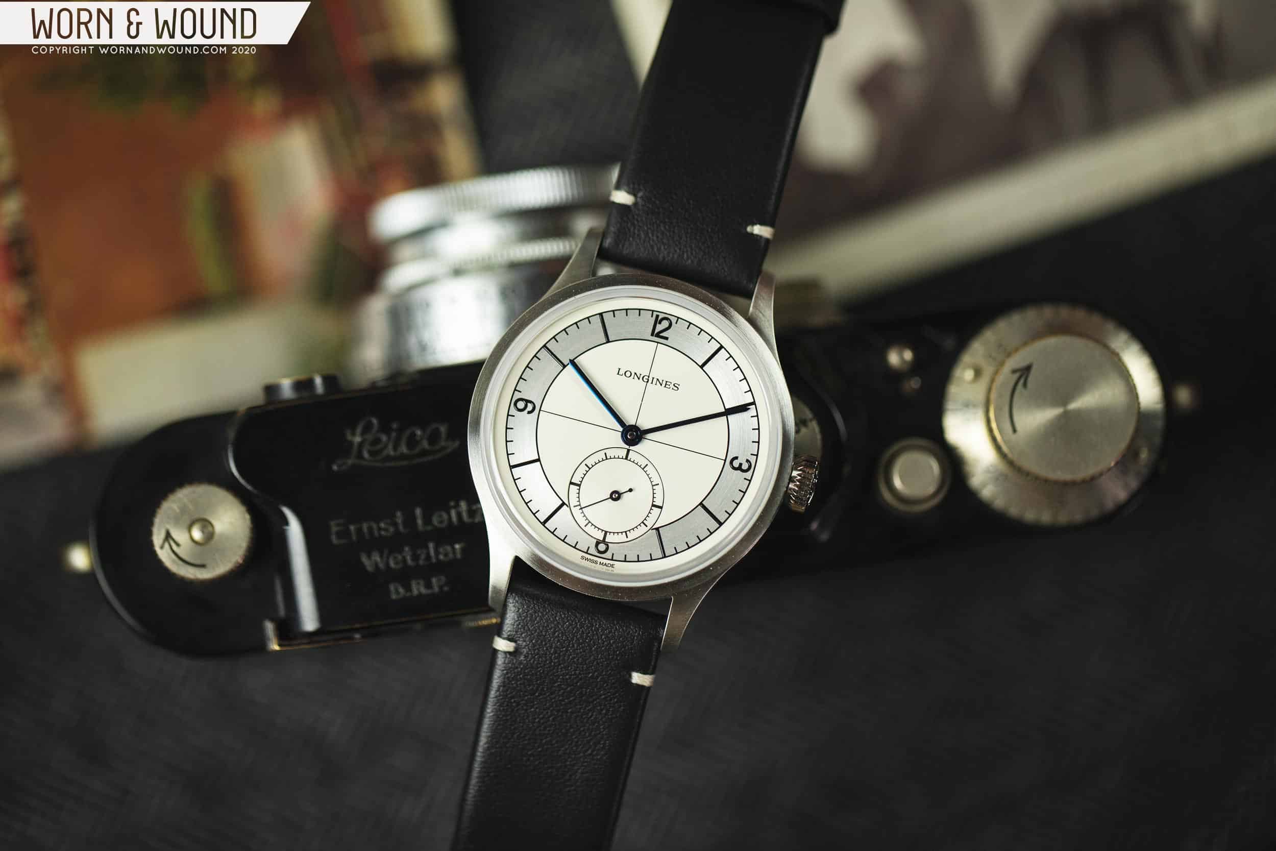
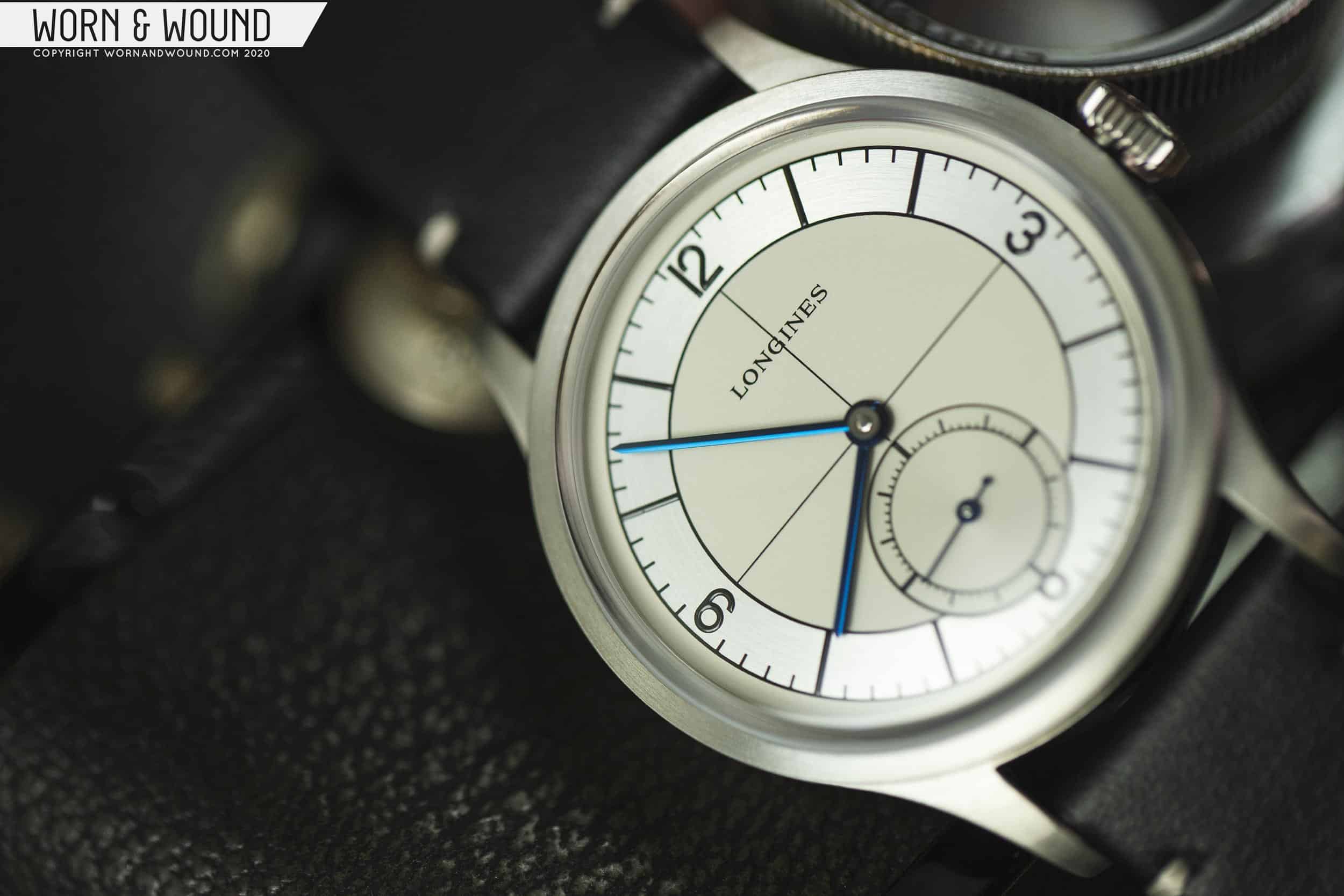
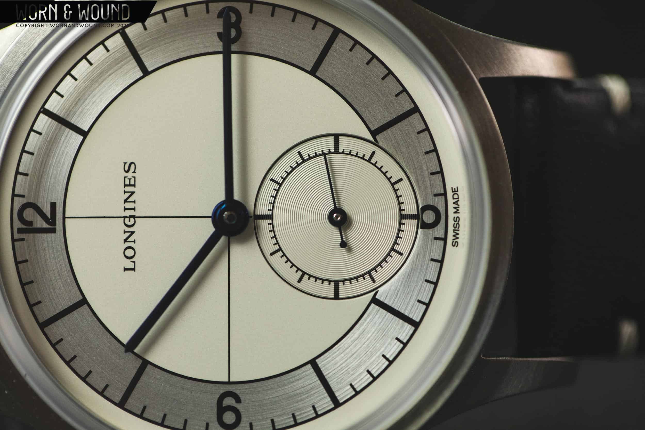
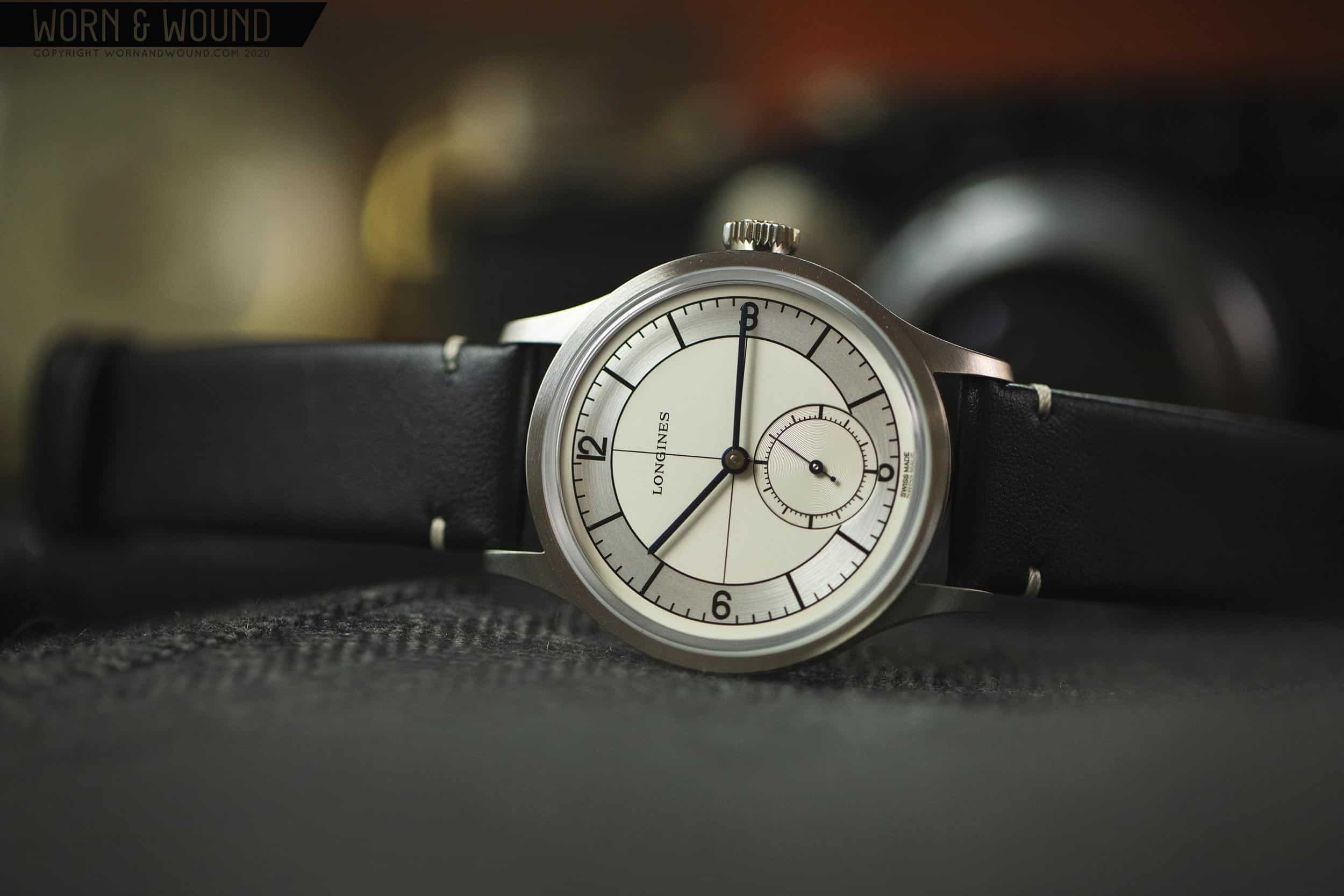
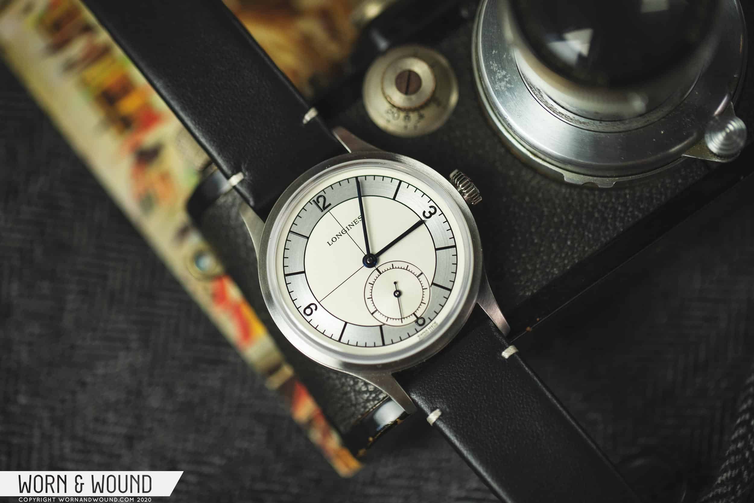
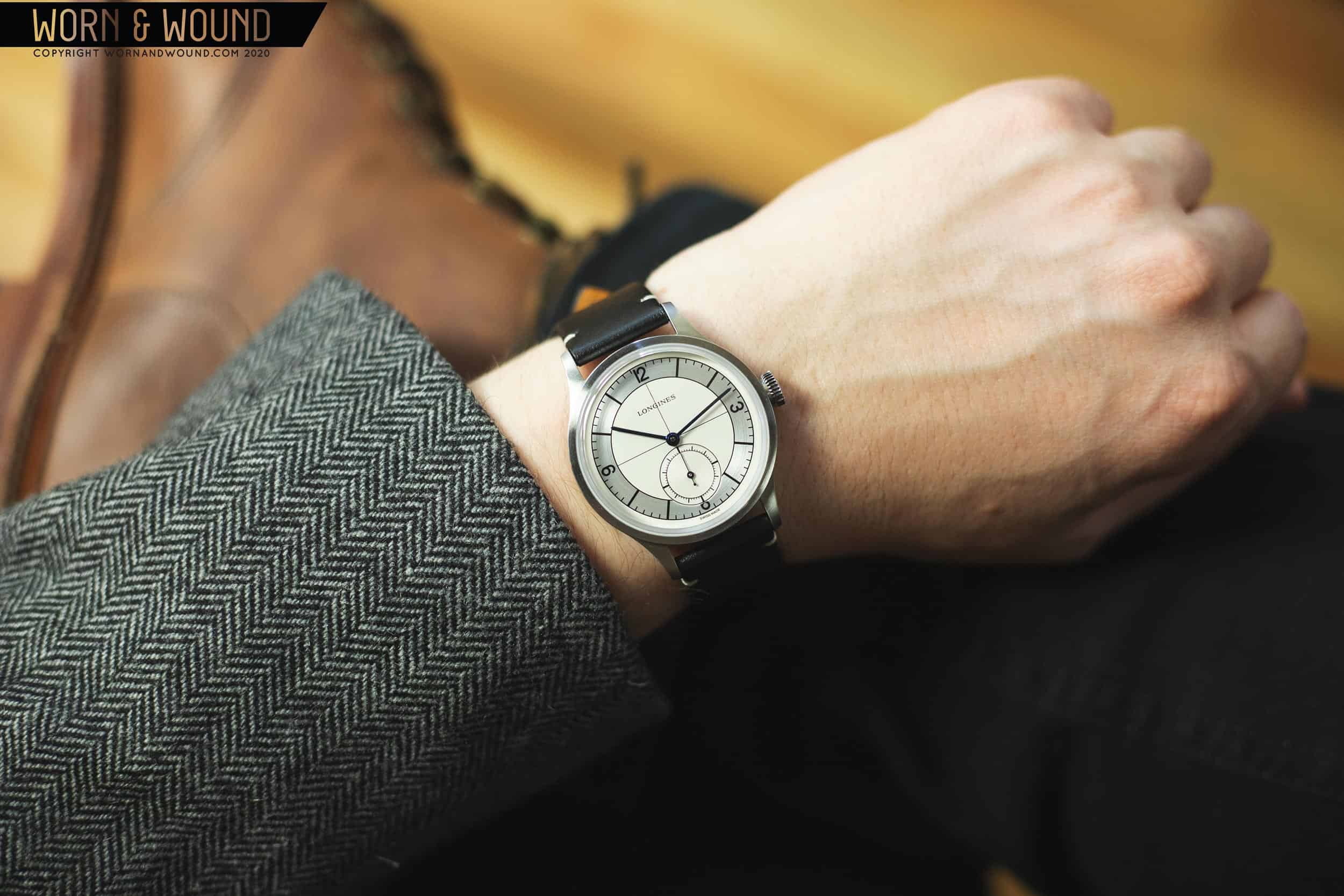
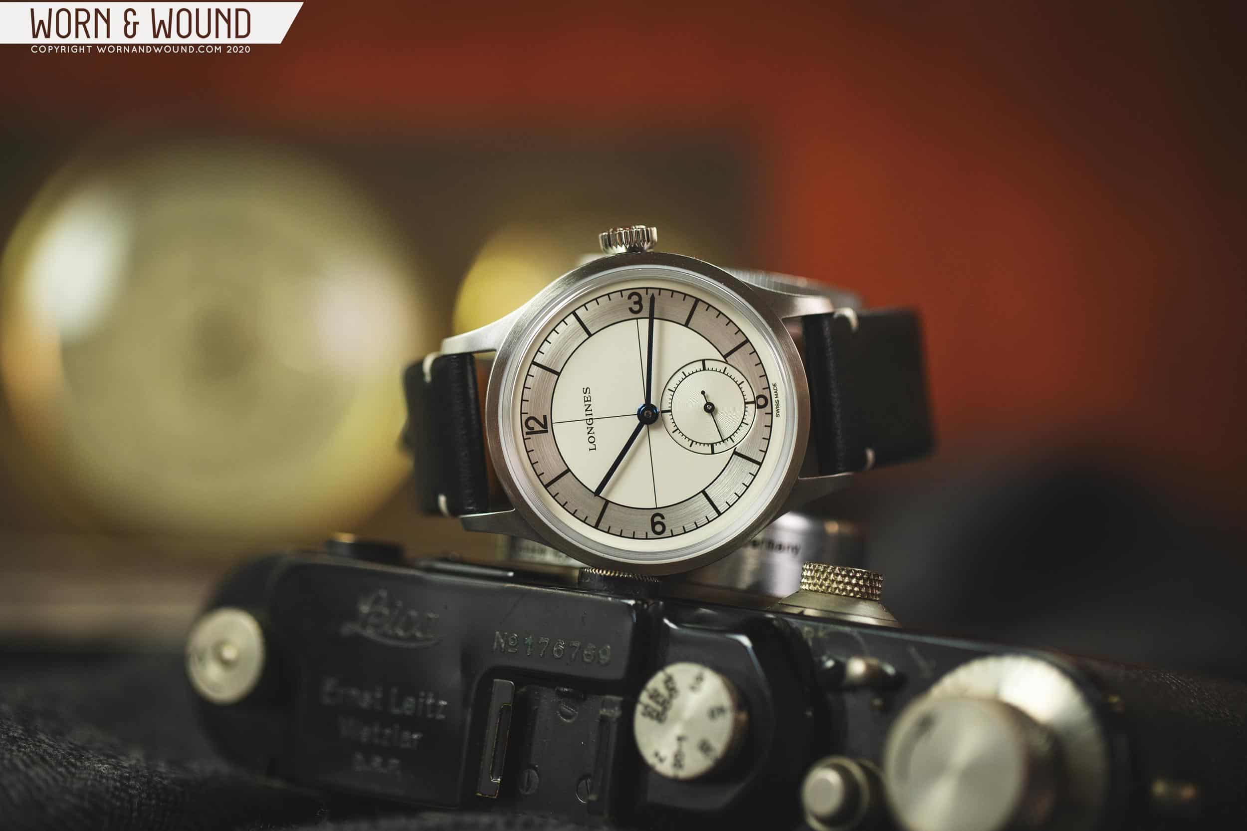
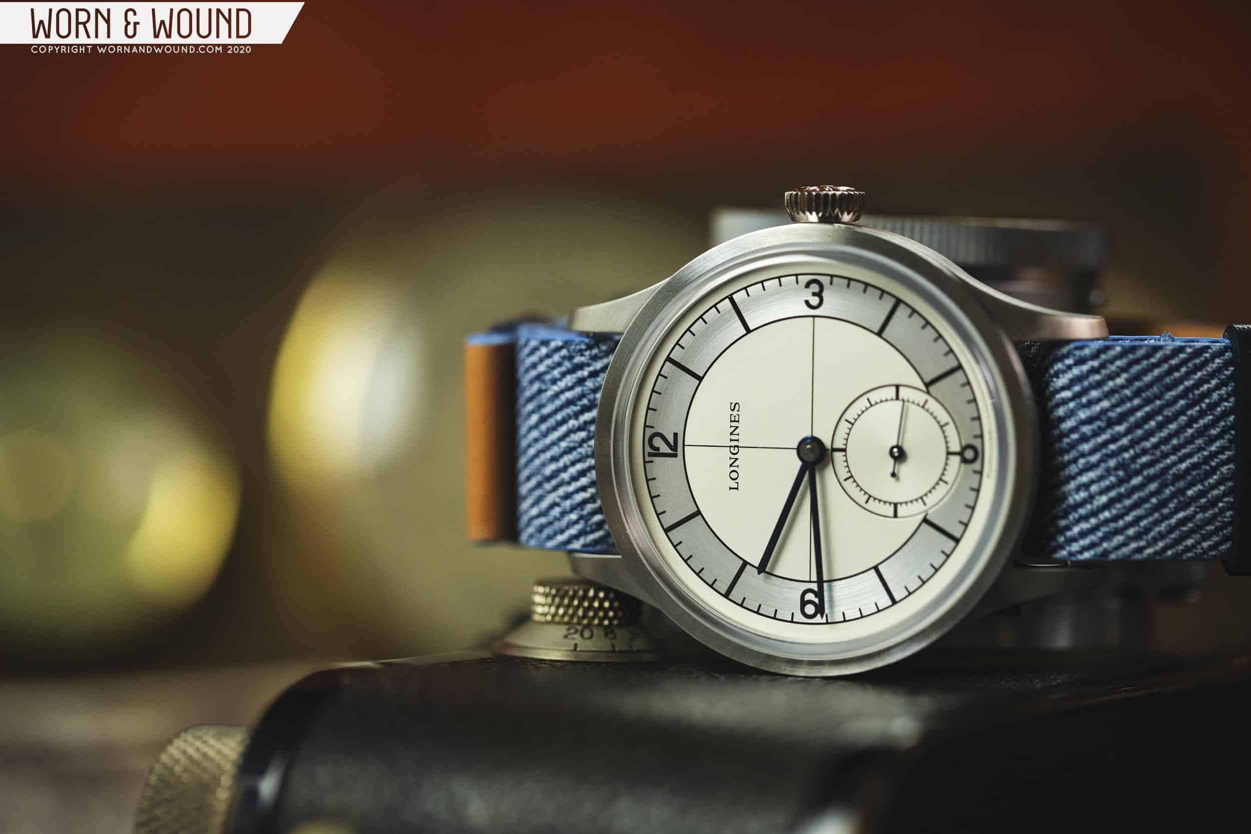
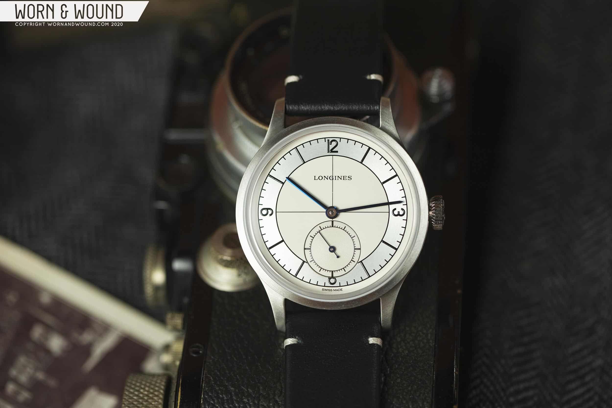
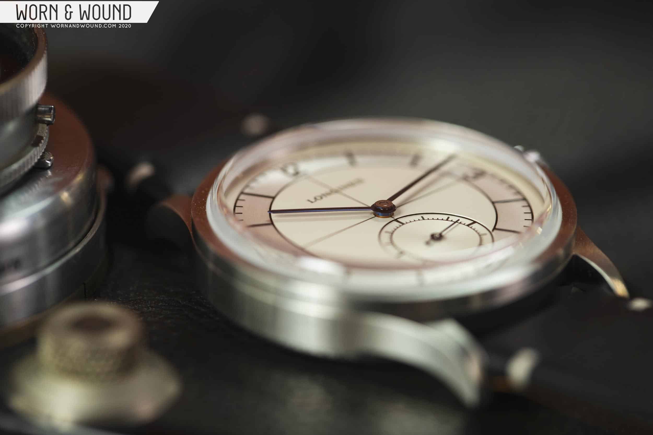
The hands are long, thin batons that have been blued, and come alive when the light hits them just right. Each hand is just the right length – the hour hand crosses into the gray time telling sector by mere microns, and the minute hand overlaps just slightly with the minute markers as it sweeps across the dial. Longines could have gone in a number of different directions with the handset here, including something much more ornate, but simplicity, with an eye toward legibility, was the right choice.
When I saw this watch in photos for the first time when it was announced last year, I was immediately jarred by what seemed like an odd choice in how the Arabic numerals at the cardinal positions were implemented, particularly the “12,” with its digits pushed together past the point that looks natural, at least to my eye. Having seen the watch in person, however, I can honestly say it doesn’t bother me in the slightest, and adds to the retro charm of the piece. I actually quite like the font that was chosen for the numerals. I’m equally nonplussed by the “6” being cut off by the small seconds register. While I recognize this is a deal breaker for some, this is a design choice that has never bothered me on a watch. While it doesn’t exactly excite me, it’s also not something that would prevent me from enjoying the piece, and it certainly doesn’t inhibit time telling in any meaningful way. You can put me squarely in the “neutral” camp when it comes to cut off numerals, for the most part.
![]()
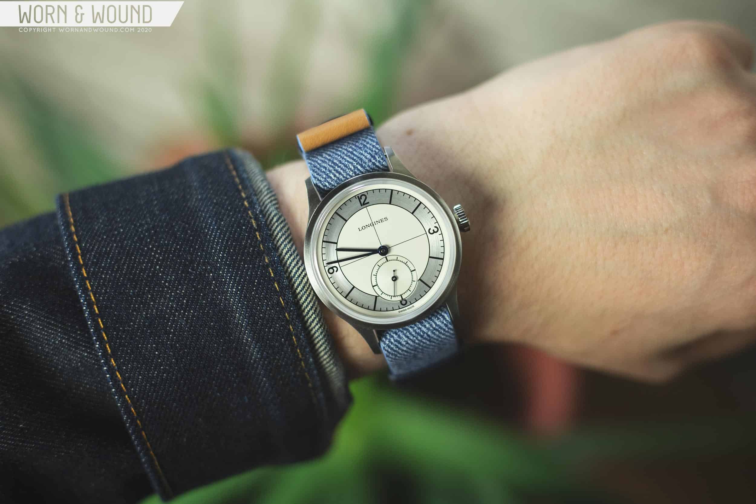
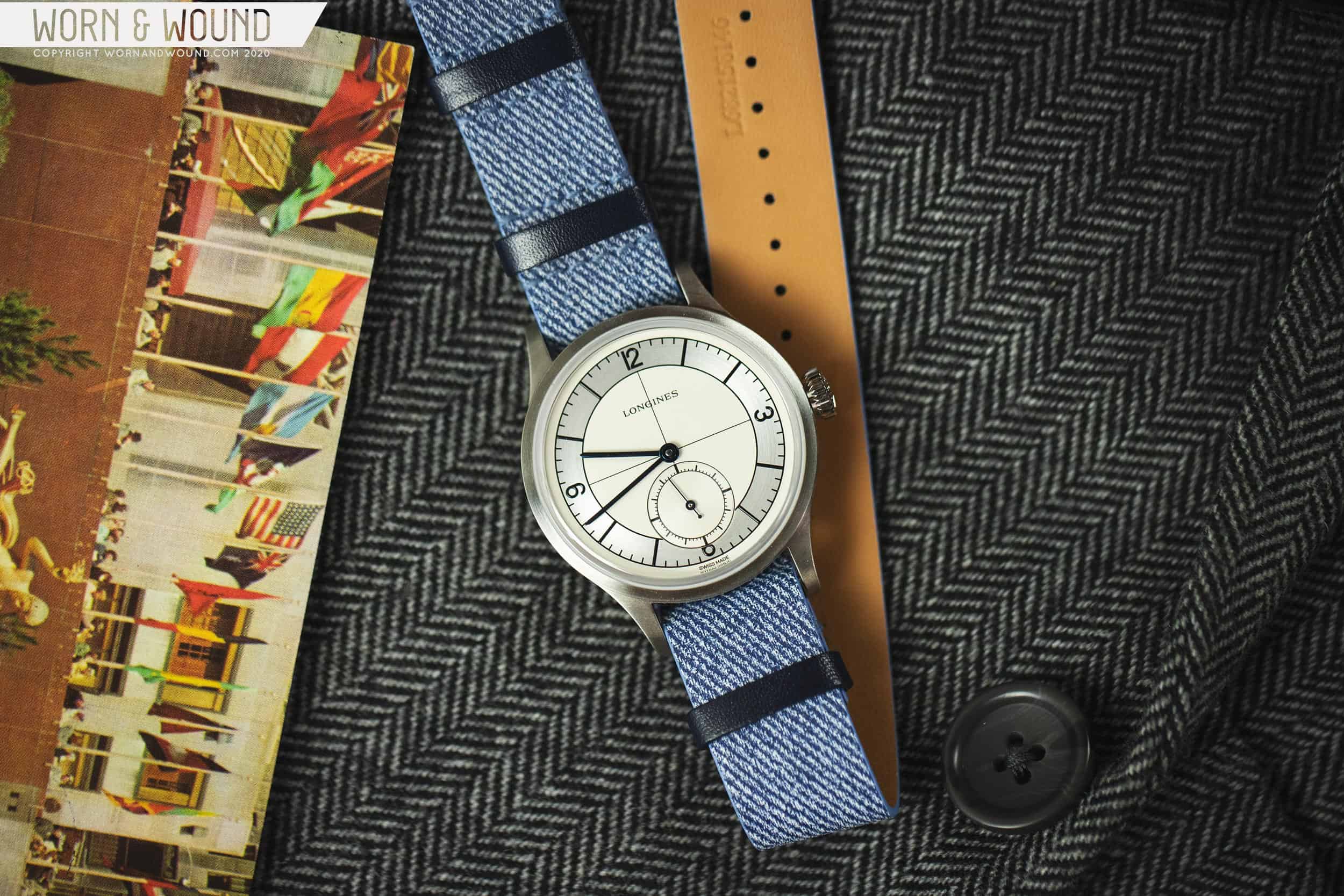
I guess it shouldn’t be a surprise that the dial on a watch whose name is derived from the layout of said dial is outstanding, but there you go. The Sector’s scientific dial is precise, pleasingly symmetrical, and hold up to scrutiny under a loupe to a degree that might surprise you for a watch at this price point. The finishing on the gray hours and minutes track is a highlight, and the circular brushing is easily visible with the naked eye in most lighting conditions, and the graining in the sub seconds scale is a nice Easter egg for those who choose to inspect the watch even more closely. The complementing colors (alternating white and gray, blue hands and black text) work exceedingly well too.
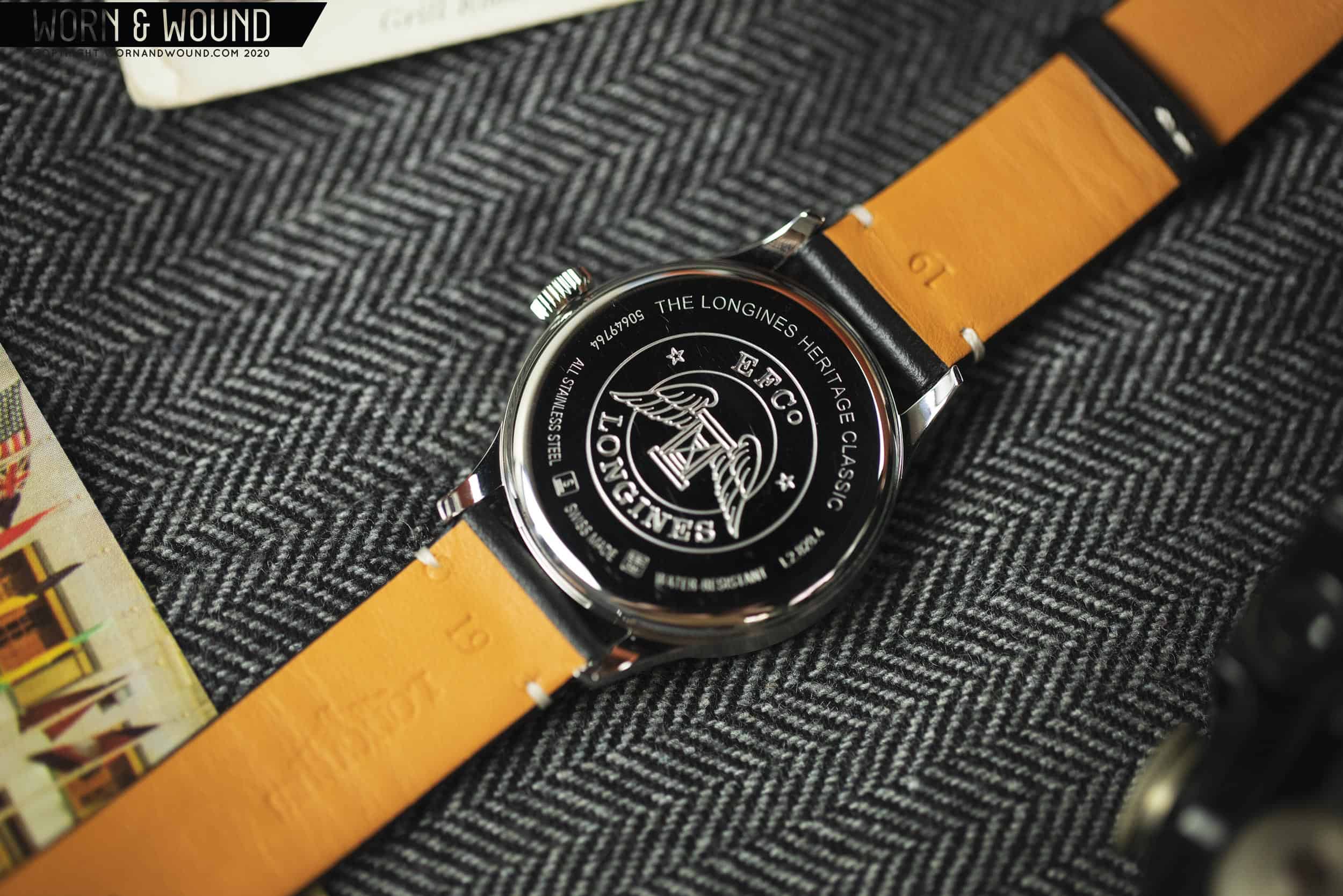
Case
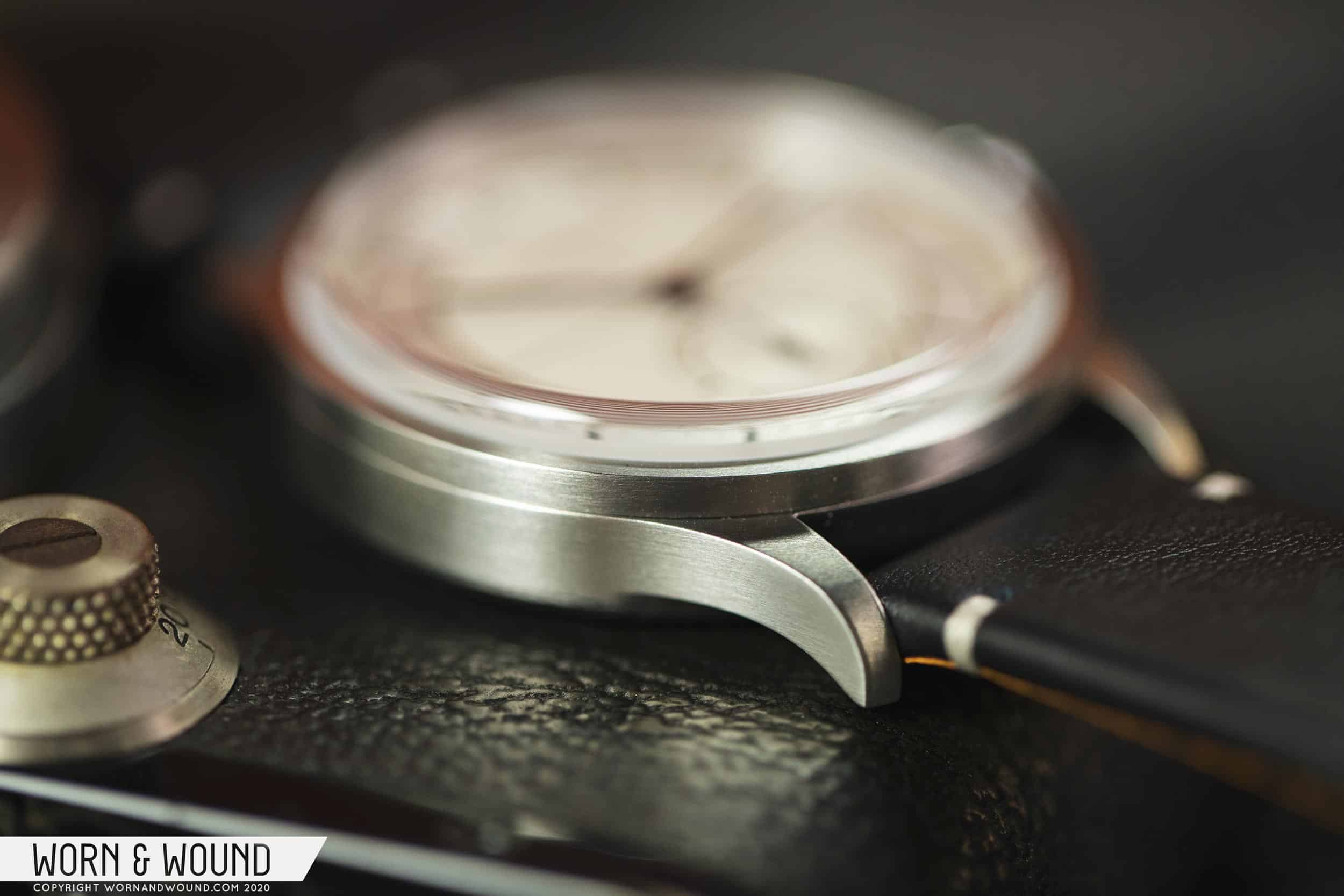
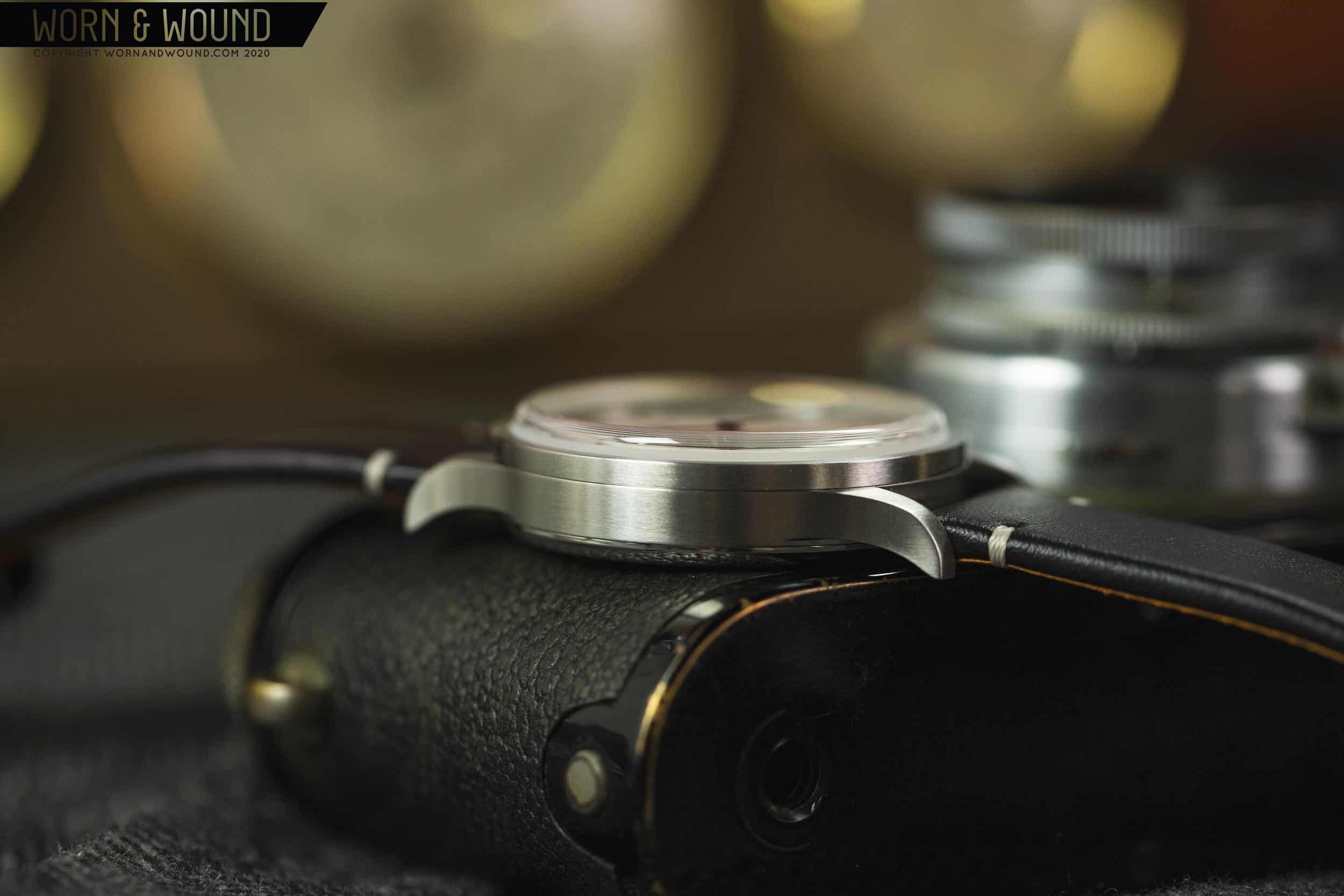
The Sector’s case can best be described as pleasantly nondescript. At 38.5mm in diameter, it wears comfortably and looks appropriate as a simple, everyday, casual watch on my 7.5 inch wrist. With a dial design so dependent on concentric circles, I don’t think I’d want this watch to be any larger – my gut feeling is that the circular shapes extending all the way to the edge of the dial (truly an “all dial” look) makes this watch wear a bit bigger than it otherwise might. I think this watch would be just as successful if it were one or two millimeters smaller, but might start to get a little silly if it were upsized by the same amount.


 Featured Videos


